


Charissa Ong Tse Ying, Head of Product Design at Pixlr, shares the process of redesigning Pixlr's logo, the brand's aesthetic for social media, and the importance of crowdsourcing for ideas.
Can you introduce us to Pixlr and the exciting things it is doing these days?
Pixlr is a free photo editing tool that aims to make design easy and accessible to all. It’s the world’s most widely used cloud and mobile photo editing suite and has garnered tens of millions of monthly users. It’s also currently leveraging AI and machine learning to revolutionize content creation.
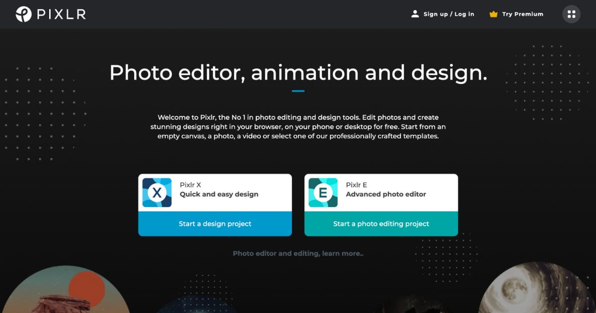
Pixlr is committed to continuously offering effortless usage of its photo editor to both experts and creative enthusiasts. It provides seamless image editing across both Pixlr E and Pixlr X.
With the all-new Pixlr 2022, it is more than just photo editing, users are now able to play with effects, designs, and animations all in one place. Users can experience next-level, intuitive photo editing, animation, and graphic design with AI-powered tools for quick yet professional edits. No steep learning curve and no design experience needed.
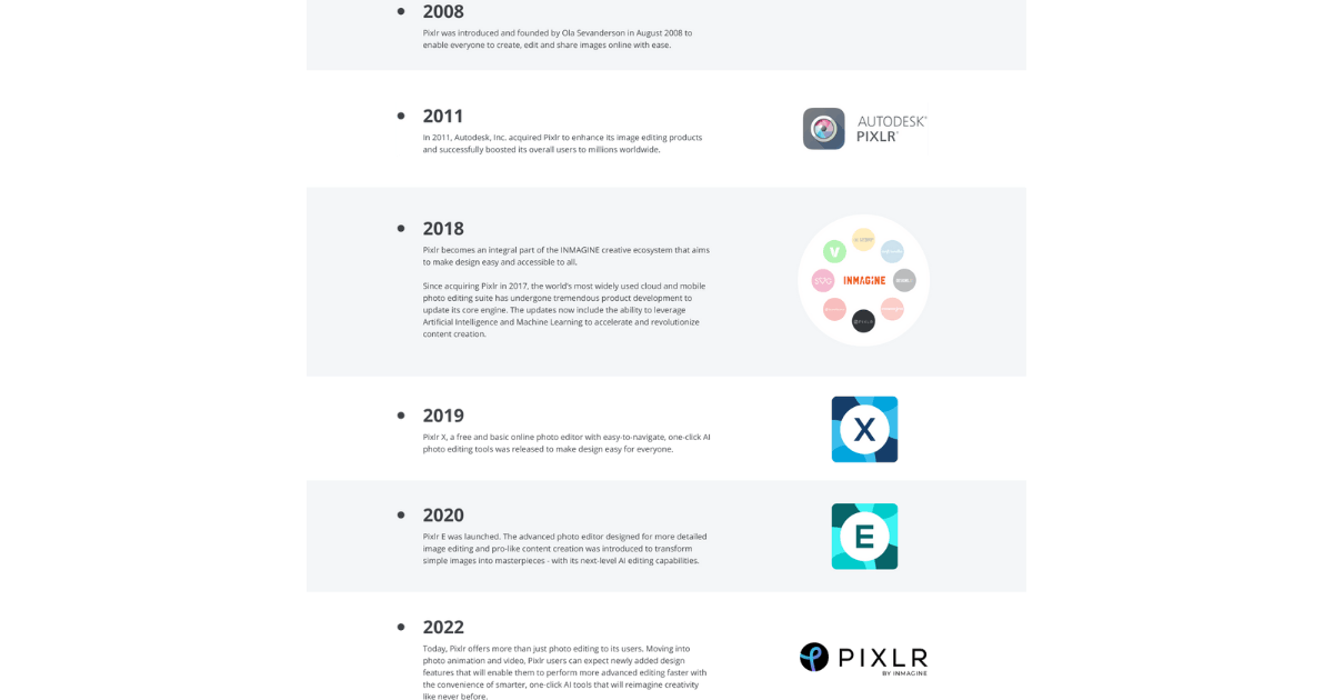
We are also working on more mini apps like Remove Background and Stories by Pixlr which you can now download on the Apple Store as well!
Walk us through your company’s brand identity through the years. How was the initial branding conceptualized?
2008: Taking a shot at the camera lens, the logo aims to communicate that Pixlr is a one-stop-shop for all things post-photography-related. The colors represent the versatility and variety users can get from Pixlr’s filters and effects.
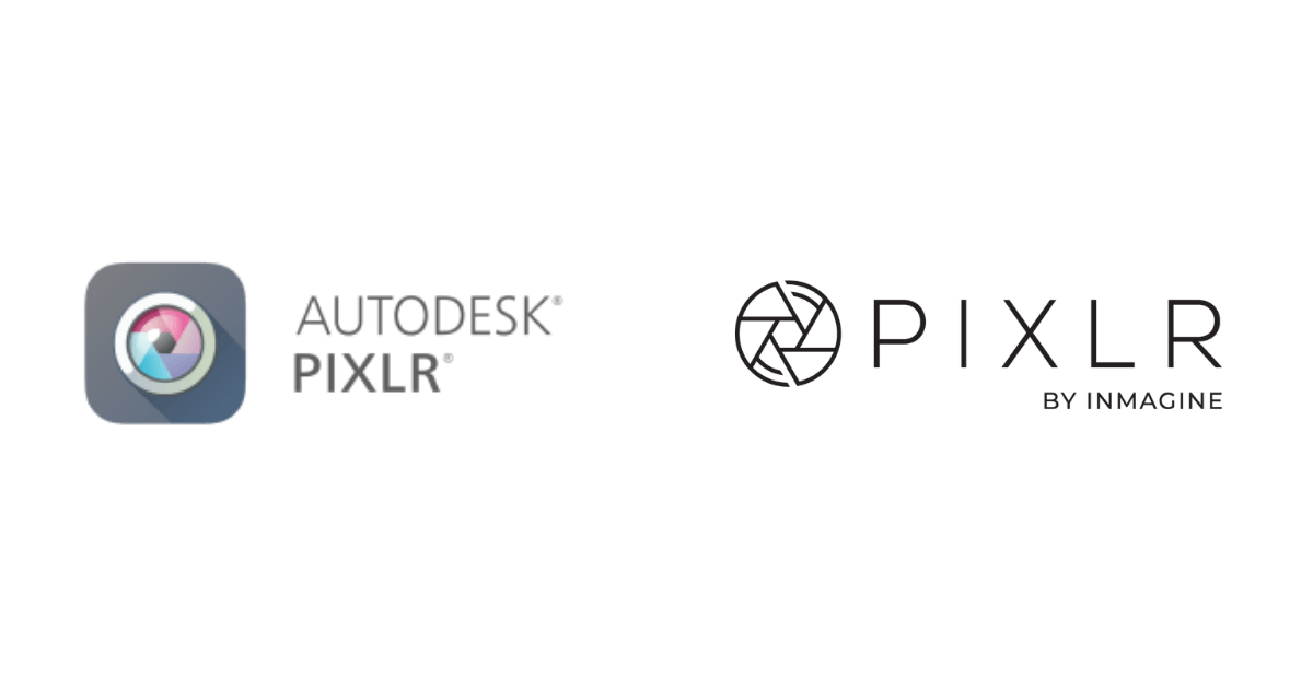
2018: Without straying too far away from the main message of post-photography editing, Pixlr revamped its logo to a more trendy, flat, vector version.
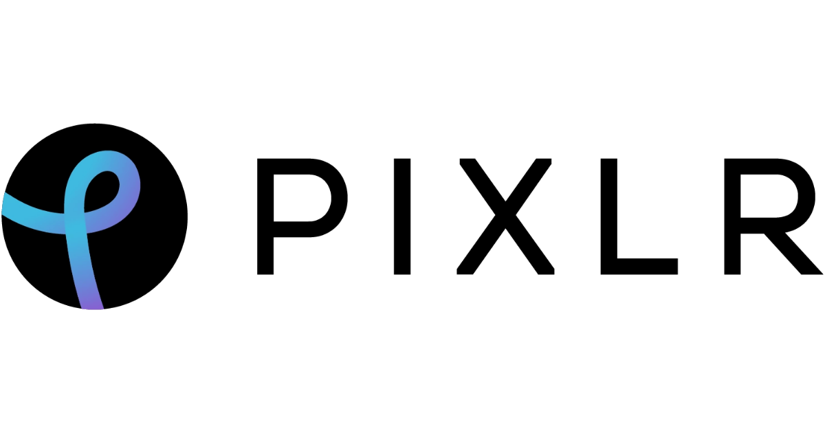
2022: Pixlr now symbolizes a holistic, free web-tool users can use to create animated and static visuals for any occasion. With more template designs, AI, and advanced video and photo tools launched and scheduled for release, Pixlr aims to be more than just a post-photography editing app.
Now about this current rebranding, how did it come about? How did that conversation start?
Ola, the founder and CEO of Pixlr, has been looking for a fresh look for a while. He also wanted to launch a new brand concurrently with Pixlr X and E’s major feature updates in 2022. It was going to be a ‘BIG BANG’, and it certainly was!
He just sent me a Slack message one day to work on it. I’ve never actually touched branding in a while as I am professionally a Product UI/UX Designer and not a Graphic Designer but I took up the challenge anyway.
How did the rebranding process go? Was it all smooth sailing? Were there surprising challenges along the way?
My design process included understanding the stakeholders’ needs and coming up with a few key messaging rationales.
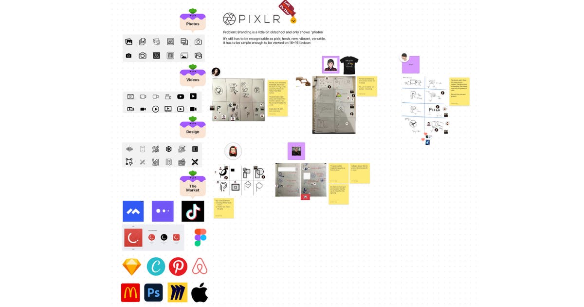
I mostly worked closely with Ola and had a few online sessions reiterating on line thickness, font, color, and gradient placements. There was a time difference as I was in Malaysia and he’s currently residing in Sweden. It was done within two to three weeks. We then had more feedback from our Inmagine colleagues. It was a joy to plaster the new brand all over T-shirts, lanyards, and mock-ads. It was a really satisfying sight!
To make sure that the logo isn’t similar to anyone on the market, I ran it over Similar Images on Google. Thankfully, it was unique! The structure is really flat and we communicate well so there were no major disagreements or delays. It was done way before the 2022 deadline and we were all quite happy with it.
Can you tell us the story behind your new logo? How was it conceptualized?
I first did a few sketches on my own and crowdsourced my ideas from my talented Inmagine Design Team through a Crazy-8 Workshop.
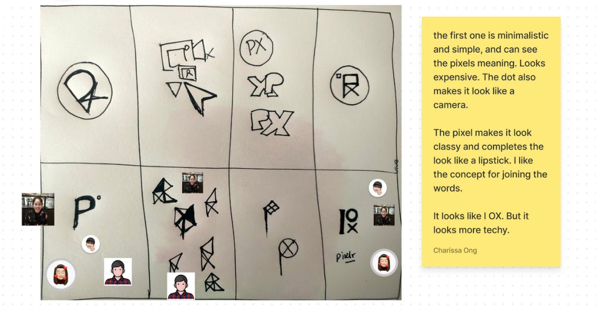
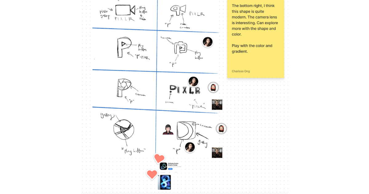
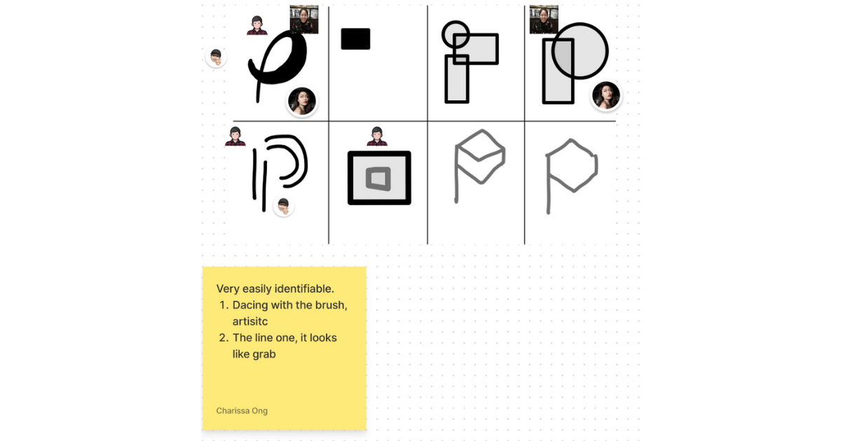
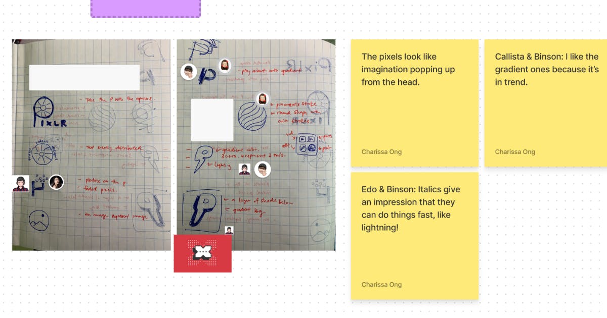
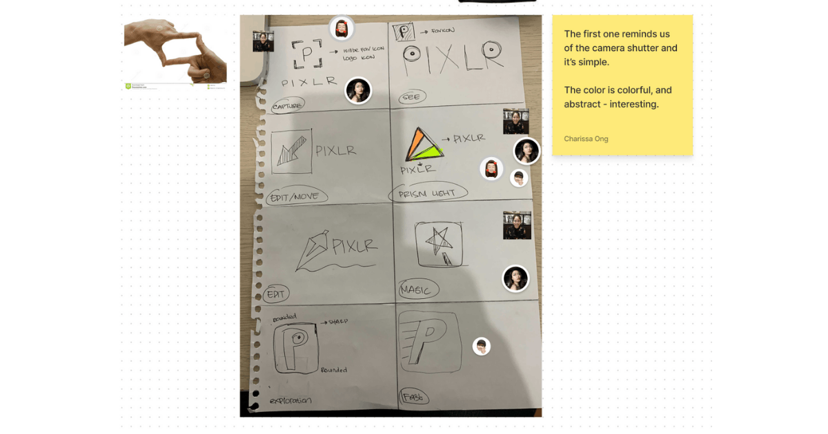
All their ideas were so amazing and I went with the highest votes and started to visualize them on Adobe Illustrator.
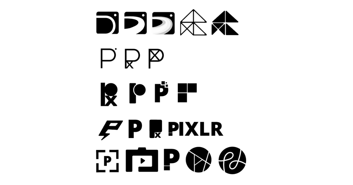
So after understanding and picking the ones I felt held the most story and rationale, I split them up into five stories.
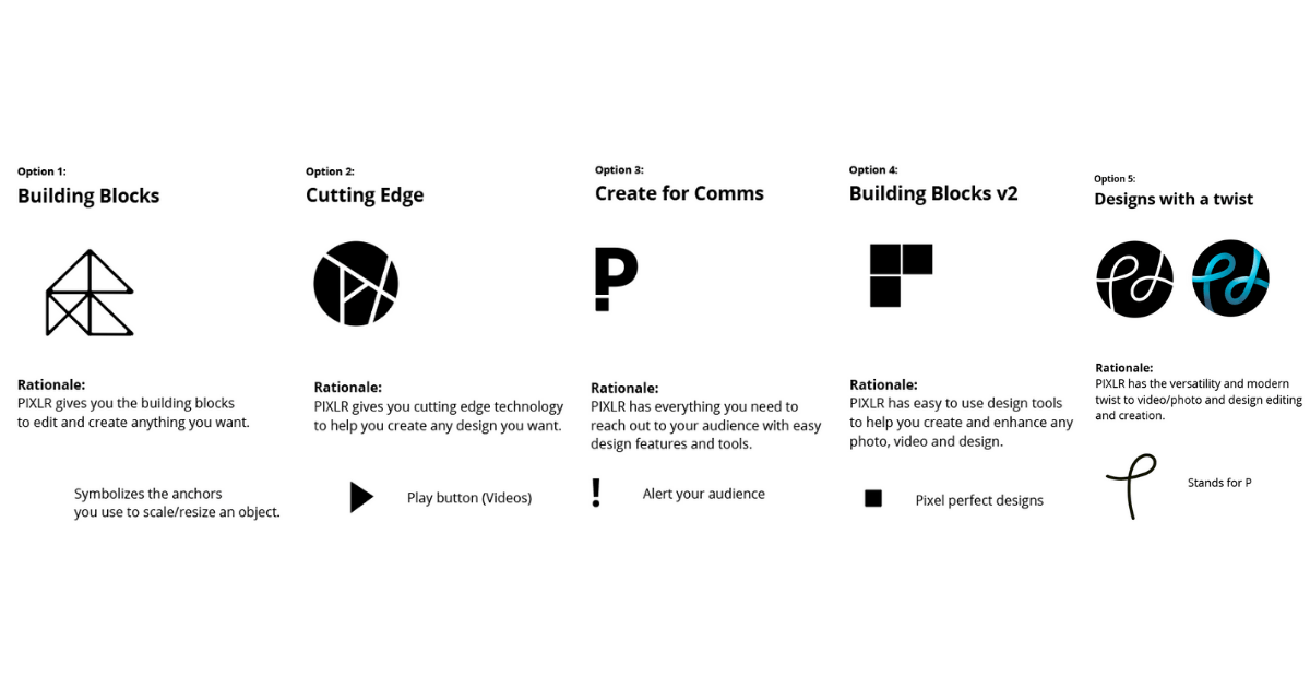
I presented the stories to Ola and some stakeholders from Inmagine and we ended up going for option 5.
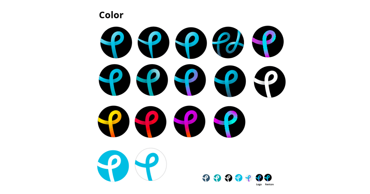
We dropped the X because we wanted a more general logo that caters for all of Pixlr’s products and not just for Pixlr X. The lines were also too fine to be used as a favicon or small merchandise.
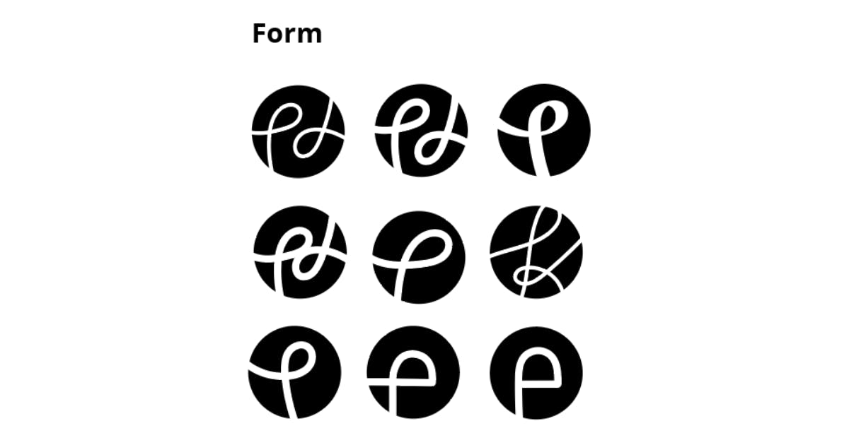
After choosing the story, I then branched out to different form variations of the direction.
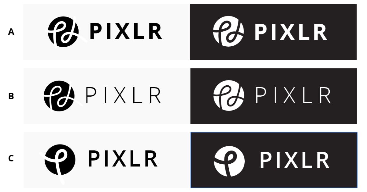
Synced up with Ola again and he preferred option C as did I. We were playing around with the font thickness as well and he helped test it out on the staging site to see how it looked.
How about your new colors? Why turquoise, sky blue, and purple?
The colors actually represent Pixlr’s main tools: Pixlr X, Pixlr E, and Stories by Pixlr.
The gradient was a major headache to deal with as there’s a shadow under the stalk of the P which made it impossible to save as an SVG for front-end purposes. The fact that it was a multiple gradient itself also gets messed up when exported in that format. The gradient just moves around if it’s not baked as a PNG or JPEG.
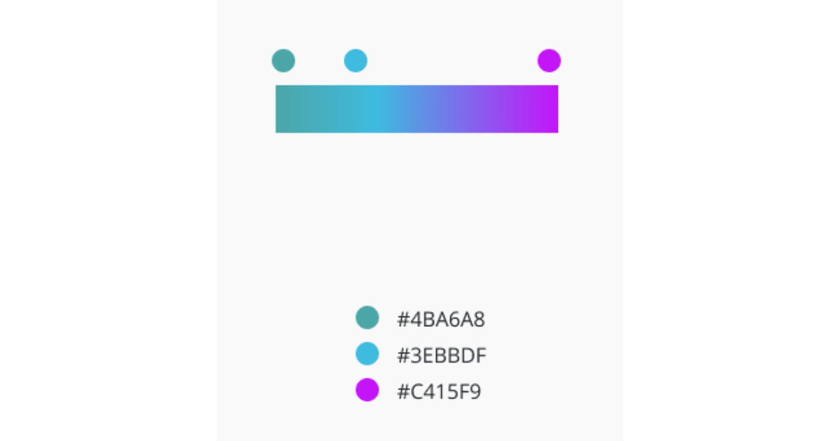
I think I spent more time troubleshooting this compared to actually sketching and designing the logo.
Can you tell us more about Pixlr’s new design aesthetic that you use for your hero images and social media?
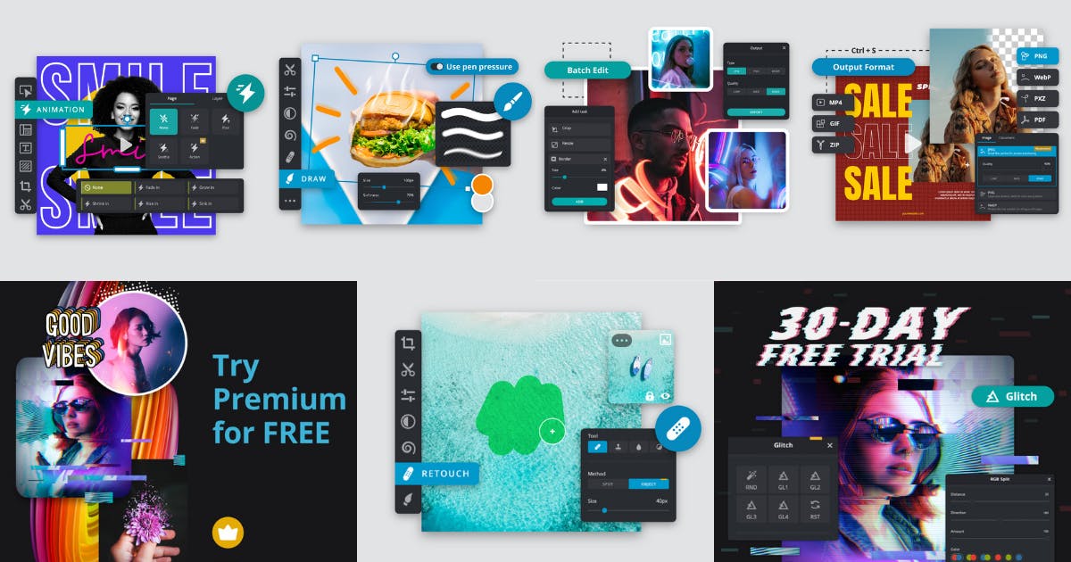
Our hero image actually took a bit of time to create. We wanted to showcase what you could do with Pixlr while giving emphasis on the main CTA buttons of Pixlr X and E.
Our branding has to stand out and be different from other competitors in the market so we did some competitor research and made sure we did not design anything similar.
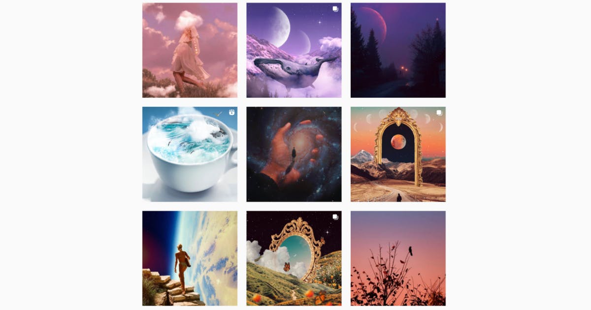
Most of Pixlr’s tools are in dark mode as well so it’s only fitting that all ads and social media are consistently dark and vibrant at the same time.
We know people can get vocal when it comes to rebrands. What has been the reception so far for your rebrand?
So far everyone has been really nice with their feedback.
Modern, clear, awesome, and versatile were some of the words mentioned.
If I were to be really honest, it’s actually my first time developing a full brand guideline professionally. I’ve always just designed the logos and handed them over to marketing or ad agencies in the past with a short description.
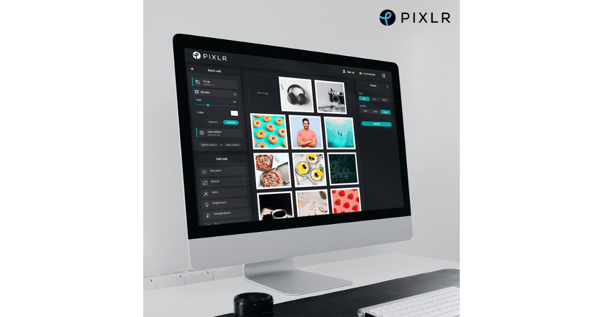
I decided that I really wanted to learn and understand the whole process for my own benefit. I’m just happy I was trusted with this task. Of course, the Creative Team in Inmagine helped to readjust the anchors and neaten up any loose ends of the logo when it’s time for them to use it on their ad collateral.
Lastly, what would you say is your main takeaway from this experience? Any advice for designers embarking on rebranding projects themselves?
Be the queen or king of options. More options never hurt.
A lot of designers get lazy over the years and stop giving options due to time constraints and burnout. I’d say, take time to crowdsource your ideas from colleagues and do inspiring activities to ignite the passion.
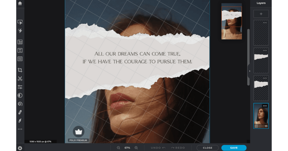
Reframe challenges. Learning new things enables you. It gives you knowledge you can use in the future even though it’s not part of your scope now.
Obviously don’t burn out (here’s where the prioritization and stakeholder management skills come in) and do it only if you have the bandwidth and not at an expense of your mental health.

