before

after

Interview with Daniel Nieuwenhuizen, Head of Design at WooCommerce on rebuilding the brand from the inside out—from fixing first impressions to helping merchants feel proud to choose Woo.
Can you share with us the history and development of WooCommerce?
WooCommerce actually started out as WooThemes. Back in November 2007, three founders—Mark Forrester, Magnus Jepson, and Adii Pienaar—teamed up online to build a new theme for WordPress. After a few months of selling themes together, they decided to make their working relationship official and launched WooThemes.
At that time, there was also this funny "woot" meme floating around the internet, which partly inspired the name and even the original peach-colored speech bubble logo—it had a bit of that playful, 2000s internet feel.

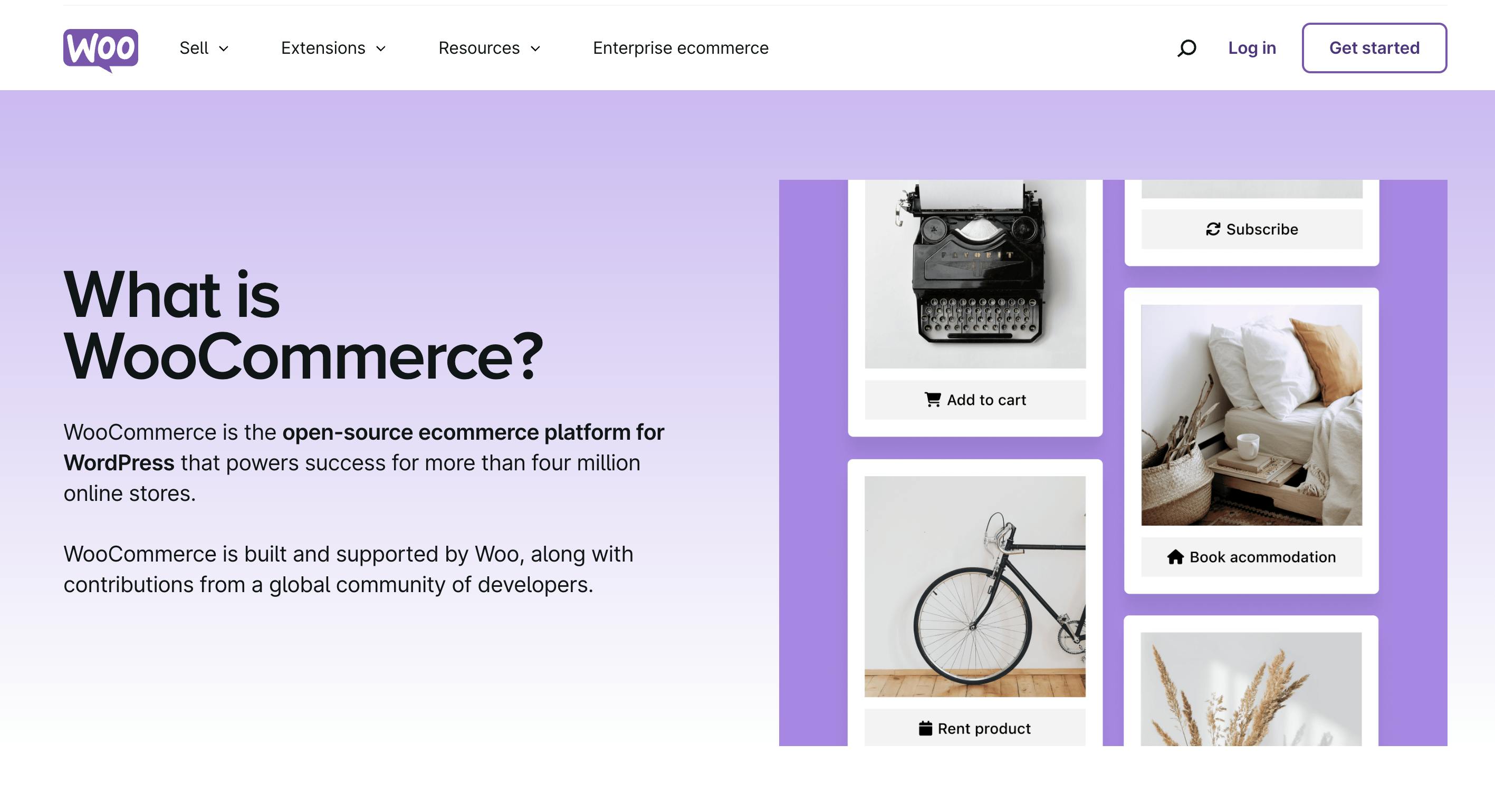
WooCommerce Old Homepage
In 2011, the team launched the first version of WooCommerce—a plugin built for WordPress that let users turn their site into a full online store. The idea took off. A small but global team, with folks based in South Africa and elsewhere, built something super flexible, and it grew fast.
By 2015, WooCommerce had grown so much that it was acquired by Automattic, the company behind WordPress.com. Since then, it’s become one of the most widely used ecommerce platforms globally—powering over 3 million stores, more than many of our competitors.
WooCommerce Old Homepage
What really sets WooCommerce apart is that it’s open source and free. You can install it yourself on your own host, and there’s a massive community of developers who help each other build new plugins and features that enable merchants to add all the features that they need, and remove the ones that they don’t. It’s always been about flexibility, freedom, and giving anyone the tools to enable merchants to build their dream stores and to sell anywhere.
That philosophy hasn’t changed since day one—and it’s still what drives Woo today.
What was the motivation or factors that led to the decision to rebrand WooCommerce?
There were a few reasons, including personal experiences. After I joined Woo, I started offering test accounts to friends—saying, “Maybe try Woo instead of the usual options?” But the reaction I kept getting was, “It doesn’t feel very polished.”
Even though they knew it was open source and the most popular ecommerce platform in the world, the brand’s first impression made them second-guess whether it was right for their million-dollar plus clients. We knew the product was good, flexible, and right for their customers – so we knew the challenge was to jump through this perception hoop.
"If the first impression of our brand was enough to make people hesitate, we were losing potential users before they even saw what the product could do."
To me, a brand is a shortcut for decision-making. When you’re shopping or traveling and unsure what to choose, the product that looks better—stronger colors, cleaner design, better packaging—usually wins. It signals trust. And I realized Woo wasn’t sending that signal. If people hesitated before even trying the product, we were already losing them.
Another key factor was the idea of pride and ownership. A great brand makes you feel proud to use it—like how people feel about owning an Apple product. I didn’t think Woo was delivering on that feeling, and that needed to change.
Image Courtesy by Woo
The rebrand wasn’t just about a new logo—it was about building a full brand toolkit: stronger visuals, photography, clearer messaging, and better positioning. Tools we could share with our community, so they could confidently bring Woo to their own clients. At the end of the day, we wanted people to feel even prouder to say they use Woo.
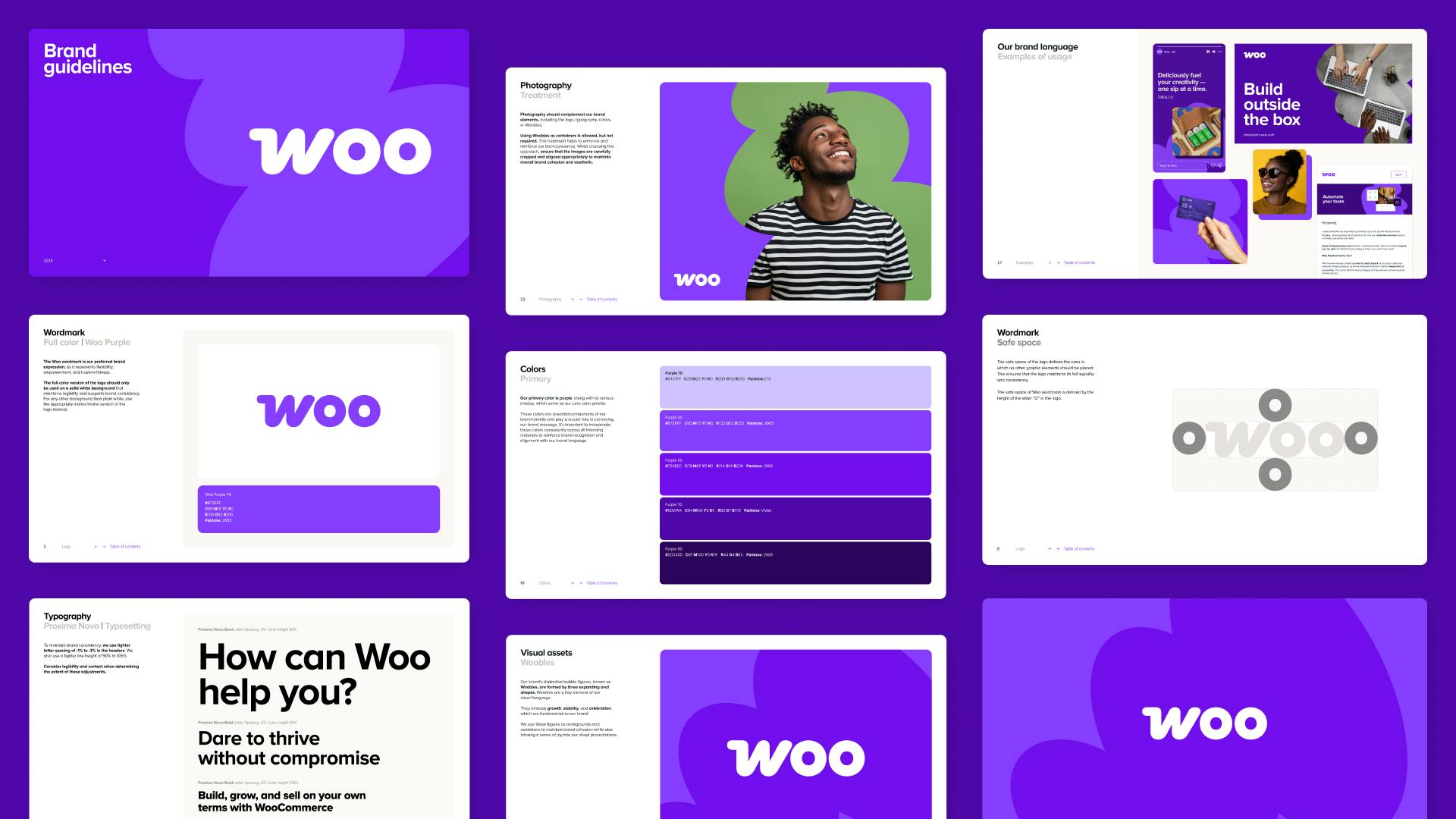
Image Courtesy by Woo
What was the reason for WooCommerce not collaborating with an agency studio for the rebrand?
I did consider it, especially since I’ve spent a big part of my career in agencies and consultancies—I know how valuable they can be when it comes to bringing in fresh ideas and perspective. But because Woo is part of the open-source space, we operate a bit differently.
Anyone can install Woo or WordPress for free, so we’re not directly profiting from every user, and that naturally means our budgets are more limited compared to other companies in the space. We had to be smart about where we put our resources, as well as making sure the team felt like they really owned the future of the brand.
Image Courtesy by Woo
One of the biggest challenges of doing the rebrand in-house was finding the right balance. We couldn’t just pause all our day-to-day work to focus fully on the rebrand—we still had campaigns to run, content to deliver, and teams to support. So we knew it would be tough at times. But what we gained in return was real ownership. The four designers I worked with truly took it on—they made time around their regular workdays, jumping on calls after hours, sketching ideas late on Fridays, slowly building momentum together.
Image Courtesy by Woo
With an agency, there’s a structure—you pay for dedicated time, and you need to be fully available to give feedback and stay involved throughout. That’s not something we could commit to in the middle of everything else I mentioned. And to top that, we realized we had the right skills in-house. We’ve got folks with strong backgrounds in branding, graphic design, and advertising. So once we really looked at what all the internal potential we had, it felt right to keep it internal and make it our own.
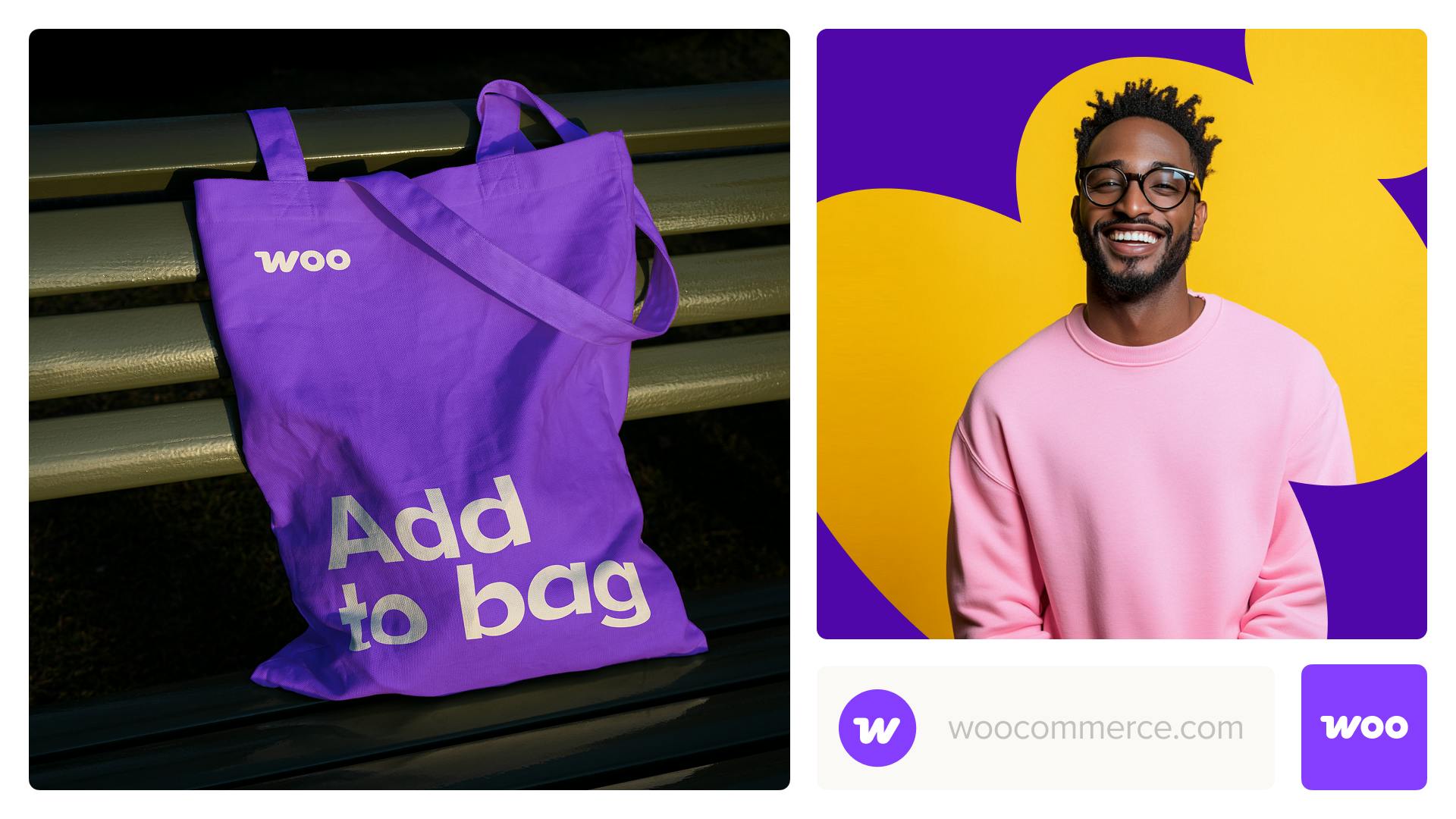
Image Courtesy by Woo
What did the internal rebranding process look like—from team collaboration to managing everything in-house?
We had a small but talented team—five designers, including a motion designer: Fernando Pérez, Marta Przeciszewska, Andrei Slobtsov, Meg Rosen, and the motion designer Nebojsa Jurcic—supporting everything from brand design, typography, campaign and tone of voice while collaborating with David Callaway and writers from our marketing team.
Fernando helped shape the early direction in collaboration with me and the Automattic leadership, and each other designer brought their unique skill set and flavors to design. The chemistry worked well, and since we’re a fully remote team, we leaned heavily on quick calls and async collaboration, meaning we could take work on whenever it was convenient.
Image Courtesy by Woo
The process kicked off around April 2024. We reviewed past logo redesign attempts to understand what worked and what didn’t, then explored different directions. By mid-year, we were refining concepts with a goal to present it at our October company meetup, and also share with the Woo community. The feedback was great, and we decided to roll out in February to avoid disrupting merchants during their busiest season—Black Friday through the holidays.
Image Courtesy by Woo
One of the biggest challenges was balancing the rebrand with ongoing work—campaigns, events, and day-to-day design. We had help from Randi Fields, our project manager, to find moments for check-ins. To make sure the rebrand played out well, the key was clear, honest feedback between all designers and leadership. We had to be direct—“this isn’t working,” “let’s tweak that”—which helped us move quickly and stay aligned. Working with Automattic’s Heads of Design Pablo Honey and Kelly Hoffman, also kept us grounded in shared values and standards.

Image Courtesy by Woo
We love the new cart icon and the way it cleverly incorporates the letter “W”! Can you share the creative process behind designing this icon?
It started with a simple question: how do we better communicate who Woo is? The old logo had a playful, early-startup feel, which made some larger merchants think it wasn’t for them. But Woo is extremely customizable—no matter what or how you sell. We wanted the brand to reflect that flexibility and scale. while keeping the fun and lightness of the original version. So we looked at some of our boldest merchants—like Brodo, Scrub Daddy, and Saratoga Wine—and leaned into a more confident, expressive direction.

Image Courtesy by Woo
As we explored design ideas, we noticed that most commerce brands tend to look the same. Interestingly, Woo felt more aligned with FinTech brands—those that speak boldly. That tone felt more “us.” At the same time, we knew the original logo meant a lot to our community and team, so we didn’t want to change just for the sake of it.
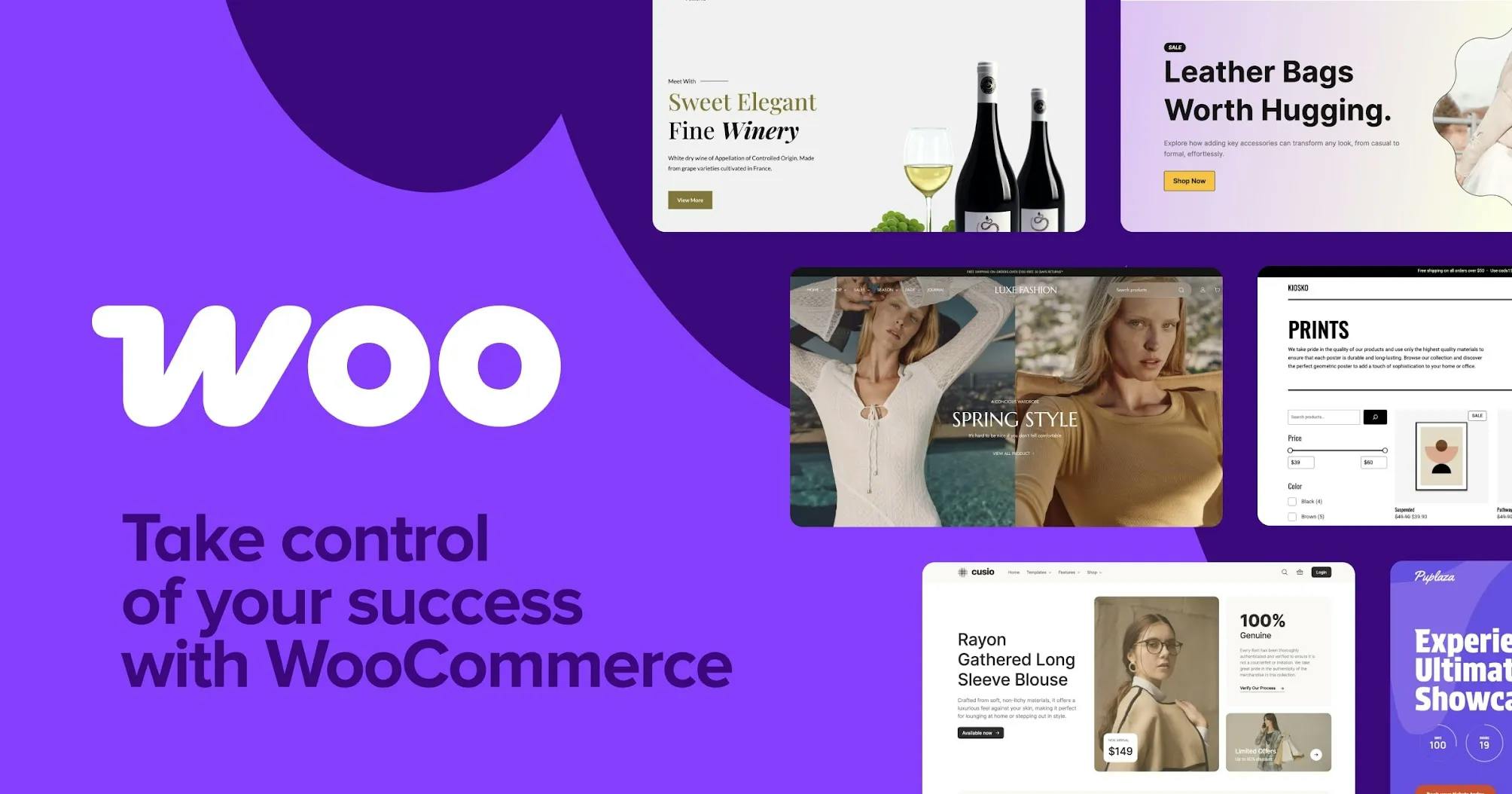
Image Courtesy by Woo
To explore possibilities, we created a framework with three directions: update, upgrade, and change. “Update” meant keeping core elements but improving technical flaws, like how the speech bubble scaled. “Upgrade” explored removing or reshaping elements, like turning the bubble into more of a call-to-action button. And “change” meant starting fresh.
That’s where the cart came in. It wasn’t some big genius move—it was honestly a happy accident. It didn’t feel quite right until we landed on the final version, where the “W” naturally forms a cart—even without wheels. That’s when it clicked.
Image Courtesy by Woo
The response confirmed it. People in the community—and inside the company—told us how proud they felt using or working with Woo. That meant a lot. From there, we collaborated with motion designers, copywriters, and marketers across Automattic. It was a very organic process, shaped by many people. In the end, it wasn’t just a design refresh—it was a deeper reflection of who Woo really is.
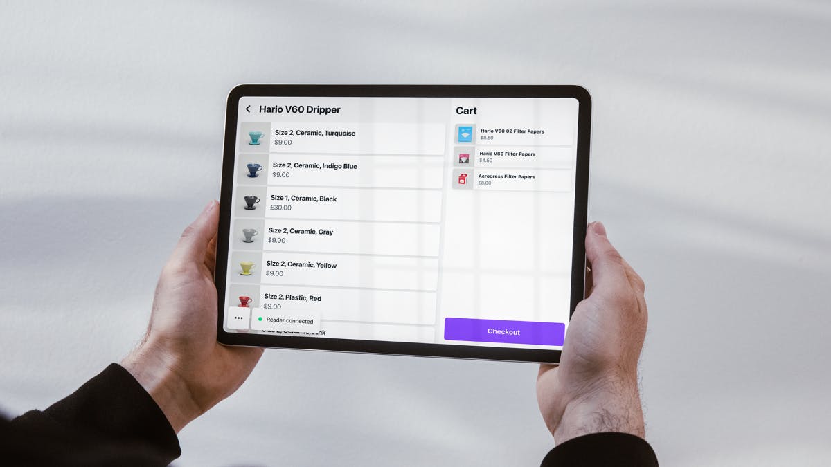
Image Courtesy by Woo
WooCommerce has been known for its signature purple. The new purple appears bolder and more vibrant. Why did you decide to keep it as the core brand color instead of choosing something entirely new?
We were already shifting a lot—changing the typeface, dropping the speech bubble, even shortening the name from WooCommerce to Woo. That’s a big move, and with so much brand equity being adjusted, we knew we needed something to anchor the transition. Purple had always been tied to Woo, and we didn’t want to lose that familiarity.
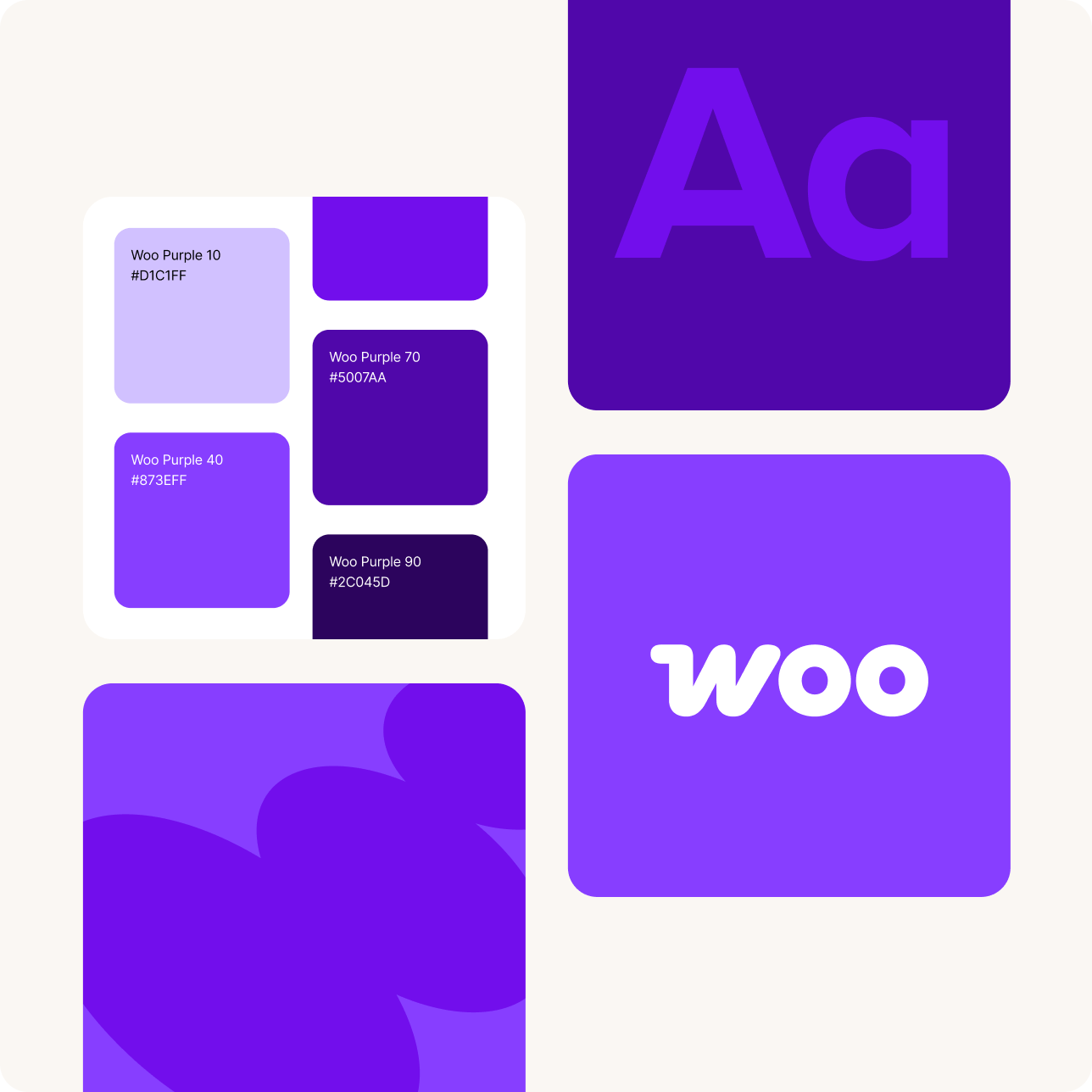
Image Courtesy by Woo
In our space, no major competitors were using purple in a way that felt ownable. We had that color lane to ourselves, and there was real value in keeping it. We did explore other options, but nothing else clicked—especially not in a way that still felt recognizably Woo. So we made the call to keep the purple, but evolve it.
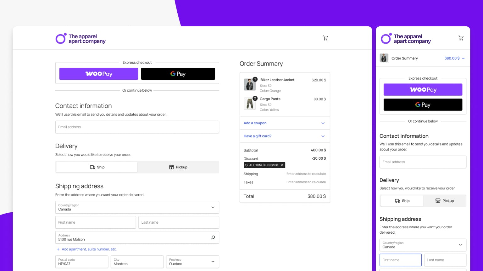
The old purple didn’t feel like a strong call to action. Our brief was simple: “Would you use this purple on a button?” The answer was no. So we started tweaking it—making it bolder, more vibrant, and accessible enough for high contrast with white text. Since we’re an ecommerce platform, and “add to cart” is part of our DNA, having a color that works great for CTAs felt like the right move.
Image Courtesy by Woo
Beyond the visual refresh, are there any new features or functional improvements introduced with the rebrand?
While the rebrand didn’t launch alongside new features directly, we timed it to line up with a bigger push to improve the platform. Woo has always been modular—its core is small, and you extend it with plugins. But we know that can feel overwhelming, especially for new merchants. So we’re now building up Woo Core to include more out of the box, making it easier to go from zero to a fully launched commerce in a short amount of time.
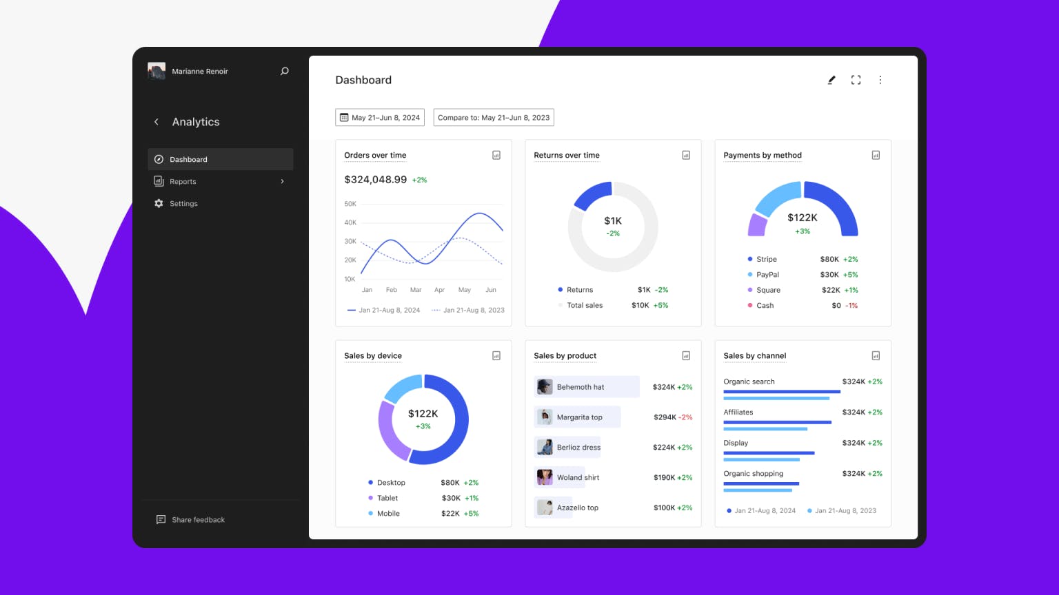
Image Courtesy by Woo
Some features have already started rolling out. You can now manage brands directly within the interface, and we’ve launched the beta for Woo Analytics, a highly requested tool that helps merchants track performance. That full version is expected to go live later this year. We’re also working on new themes—something Woo has been needing for a while—with plans to release by the end of Q1. And our Point of Sale product is coming soon, another big ask from merchants.
All of this ties into the broader goal: making Woo more powerful, intuitive, and merchant-friendly—while staying open and flexible. As we worked on the rebrand, I was also collaborating closely with product leads to stay focused on real merchant pain points. The brand may look new, but behind it is a whole wave of improvements our customers have been asking for—and there’s a lot more to come.
Was there a particular part of the rebrand that felt especially rewarding or significant to you?
For me, the most rewarding part was seeing the reaction from the community. People were saying things like, “I really love it,” or proudly sharing screenshots—even from a closed event, when someone snapped the new logo and posted it in a complimentary way. That kind of organic support meant a lot. You spend so much time and thought on something like this, and suddenly people are genuinely proud to work with the software that carries that brand.
Image Courtesy by Woo
Of course, releasing it was also the most stressful moment—you brace yourself for all kinds of feedback. And yes, there were people who preferred the old logo, which is totally fair. I don't think I’ll ever design something that pleases everyone. But overall, we got really positive responses, even from former Woo founders and folks at Automattic who reached out to say how much they liked the rebrand. That kind of feedback is rare—and meaningful.
But the most rewarding part was hearing from our own team. People messaged me and the designers to say how proud they were to work at Woo because of the new brand, how much it resonated with them. That’s priceless.
"Design is 80% really hard work and 20% reward—but when those 20% moments happen, they’re worth everything."
This was definitely one of those moments.