
before
after
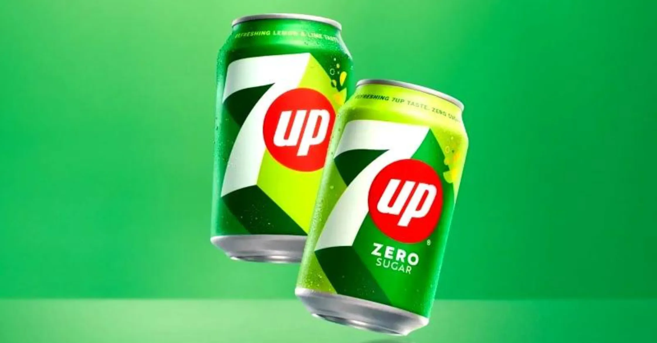
The popular soda drink revealed a new look and positioning.
"Our new visual identity for 7UP was inspired first and foremost by the brand's creation of moments of UPliftment throughout its history." says Mauro Porcini, SVP & Chief Design Officer of PepsiCo, about the new brand. "The new 7UP features the brand's signature punchy green, but with added citrus hues and distinct high-contrast lines that portray a feeling of upward energy."

7UP is a well-known brand of lemon-lime soda that was first introduced in the United States in 1929. It was created by Charles Leiper Grigg, who had previously worked for the Howdy Corporation, the makers of a similar soda called Bib-Label Lithiated Lemon-Lime Soda. 7UP has since become one of the most popular soft drink brands in the world, sold in more than 100 countries.
The brand is known for its distinctive green packaging and its crisp, refreshing taste. It is a popular mixer for alcoholic beverages, and is also enjoyed on its own as a thirst-quenching drink. The logo features the number 7 and the word UP, with a red dot in between, which is meant to represent the bubble in the drink.
Over the years, 7UP has undergone a number of changes and updates. In 2018, the brand released a new logo and packaging design that emphasizes its natural ingredients and refreshing taste. The new look features vibrant colors and bold, modern graphics that are designed to appeal to a younger, more health-conscious audience.

