


Parag Gogate, Chief Strategy and Innovation Officer at AgeVolt, shares the barriers and brand truths they came across as they refreshed the startup’s brand with a new strategy and vision.
Can you introduce us to AgeVolt and the brand’s identity through the years? How were the past brands conceptualized?
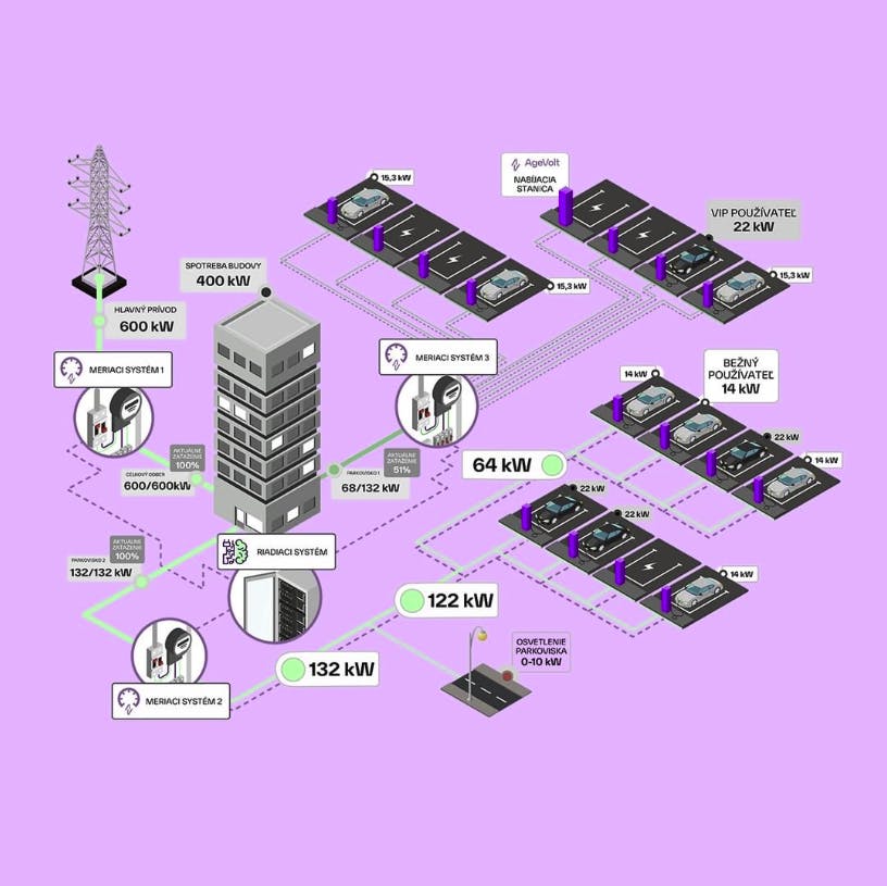
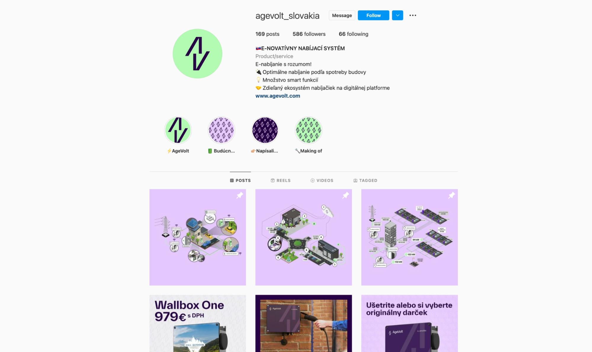
AgeVolt is a startup founded in Slovakia in 2019. We develop electric vehicle charging solutions mostly for business customers. We’re currently active in the Slovak markets with projects in Central Eastern Europe.
For the initial identity, it was quite simple. It was the founder’s idea. The name is the reverse of the word ‘voltage,’ which is related to electric current, electricity, and electric charging.
The way the initial logo was designed, there was no detailed deep dive into what the brand should represent other than it had to represent electric charging hence the plug and thunderbolt within the logo.
As for the colors, they were chosen because they were colors none of our competitors were using at the time. Typically, they fell back to blues and greens because of the sustainability angle.
Plus, yellow and black are really noticeable on the street, especially in Central Eastern Europe where it snows a lot. The yellow and black combination is also associated with transport.
The whole initial brand identity was very much DIY.

About this current rebranding, how did it come about? How did that conversation start?
The change of brand identity was a move to align with our new ambition, aspirations, and strategy. We had seed funding and we thought, “What should AgeVolt represent in the new world?”
The company’s history is rooted in the hardware side: the charges and the energy management system. But how do we connect that to the digital world? How do we connect it to the pains, gains, and needs of the customers? How can the brand be seen as international instead of one that is purely local or regional? How do we show a brand that aspires to disrupt the status quo? how do we represent the brand that is here to stay for a long time?
We call it a brand refresh, not a rebrand. Fundamentally, AgeVolt is not changing. We’re not changing our core focus, associated products, and services. In the founder’s eyes, it was a brand refresh–his baby that was growing up but not becoming something else.
We also got feedback from customers about the initial brand and one of the feedback was that it looked very much 20th century and not a fresh or modern brand. With feedback like that, we had the idea that as soon as seed investment comes in and we get other grants from the EU, we were going to refresh the brand.
How did the rebranding process go? Was it all smooth, or did you encounter challenges?
We experienced a few barriers during the process. One was internal where stakeholders who didn’t know the importance of brand identity started to question the process.
Another was because the funding partly came through grant, there was a problem with the procurement process where we had to go with the cheapest. We weren’t saying that we wanted to go with the most expensive agency, but we wanted to choose by quality and not price. We got over that barrier by chunking it down. We chunked it into three small phases that were able to bypass the procurement requirement thresholds.
The third barrier was needing to explain that brand is not just a logo, not just colors. We had to educate and say that we have to discover what AgeVolt needs to be in the future. It involves strategy, vision, then followed by the design.
Despite all of this, the process was still super quick. It was five months end-to-end. Two months of internal education on why we’re doing this, getting through the barriers I shared, and figuring out the right way of going about this. Once we found an agency, it only took three months until we had the first draft of the new brand identity.
The agency we worked with had a methodology they called ‘brand truths.’ We went through a series of workshops to understand our idea what AgeVolt was currently versus the future. They interviewed key people as well and we answered questions like, “If AgeVolt was an animal, what animal would that be and why?”
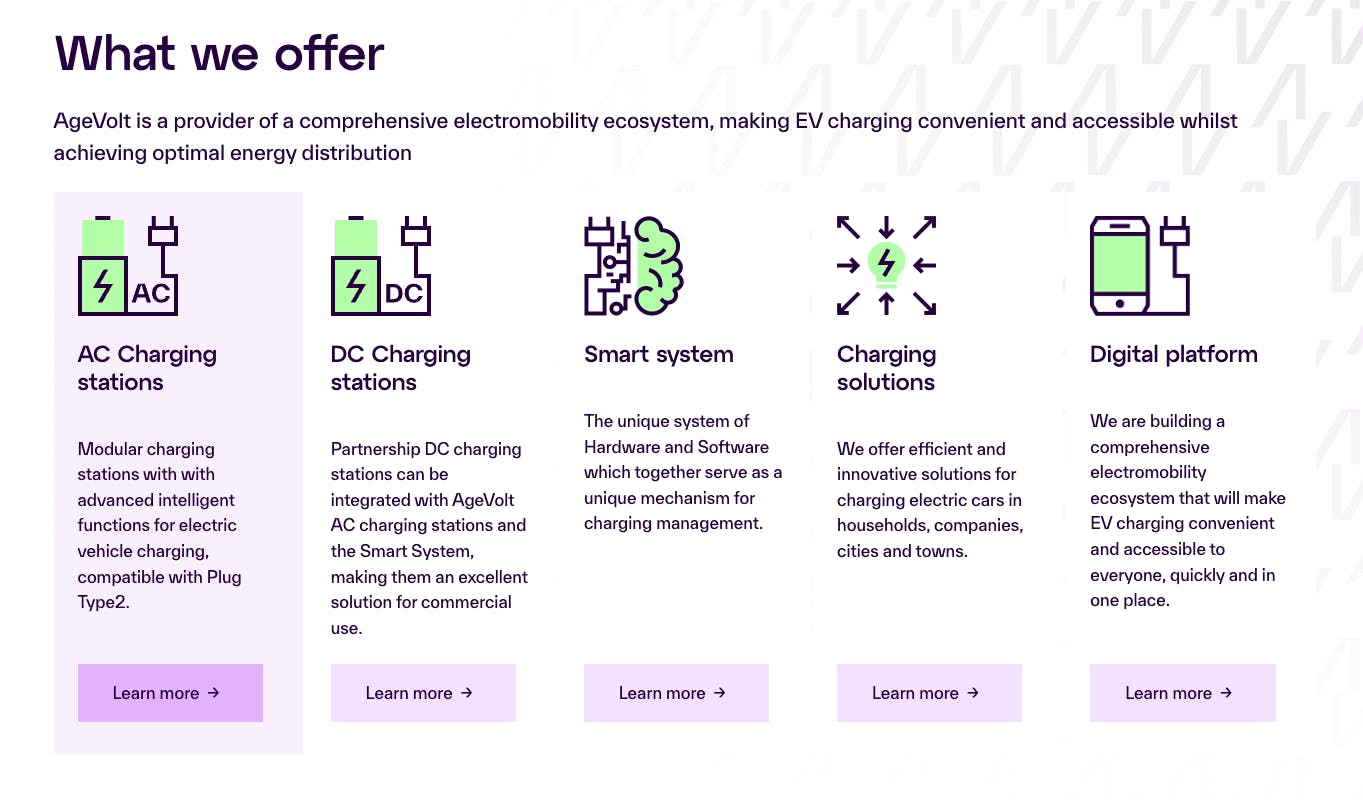
Then there was comprehensive competitor analysis not just of current competitors but possible future ones as we are building a comprehensive digital ecosystem for EV charging. They looked into how those companies were branding themselves–what colors they’re using, their taglines, their brand promise.
After that market research, the step was to figure out what AgeVolt should be about. What is AgeVolt? What are we trying to do? What are we not trying to do? How should we distinguish ourselves from the competition? How do we differentiate ourselves not just from a product or even brand perspective?
We had to figure out what kind of brand we wanted to be seen as. Did we want to be seen as innovative? Do we want to be seen as future-looking? Do we want to be more assured and corporate-like? Do we want to be more out there, breaking barriers? None of it? All of it? We went through all that.
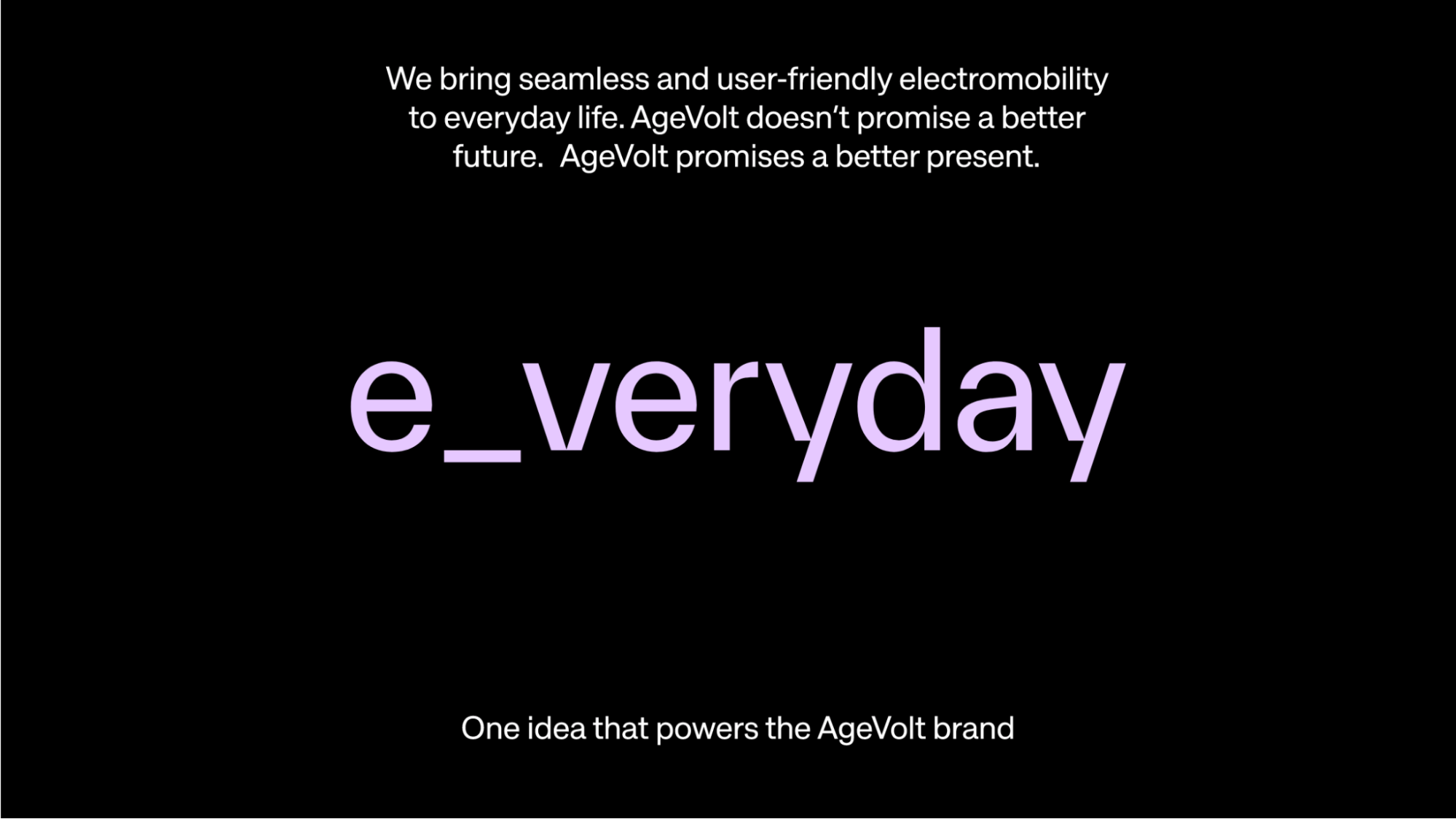
How did you come up with the use of ‘e_veryday?’
We came to this from an electro-mobility perspective. We’re B2B, but we still think about the car driver. Is charging convenient for them? Is it accessible when they need it? At what cost?
In our view, charging needs to be where mobile phones are right now. Nowadays, people carry battery charges, power banks. You can charge your phone in trains, in your cars, on the plane, wherever you’re going. That’s how we want electric vehicle charging to be. It happens as you go about your daily business.
Yes, we’re innovative, but we’re not promising something futuristic. We’re promising a better present. This play around words is how we came to this ‘e_veryday’ concept. We wanted for our version to have a distinction from ‘everyday’ so the agency played around with it.
The E-hyphen came from playing around with it. It became really important for us. We now use the E-hypen in ways such as, “E-njoy your ride.” We also use it for our brand values that came from an internal workshop. We wanted the values that we have internally to be the same values we show externally.
We’ve zeroed in on four brand values that use the E-hyphen:
- E-mpathy for our customers and their needs as well as the team.
- E-nergy which is related to electricity and the products we’re developing.
- E-nnovation, which is innovation that we use with the E-hyphen.
- E-cology for the sustainable aspect.
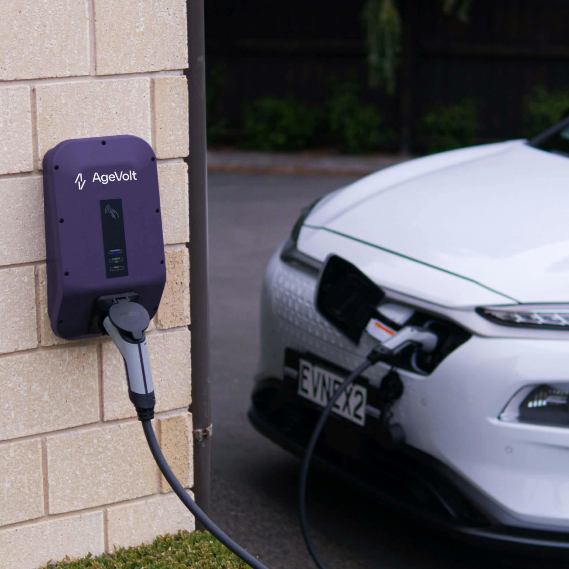
How about your logo. Can you tell us how it was conceptualized?
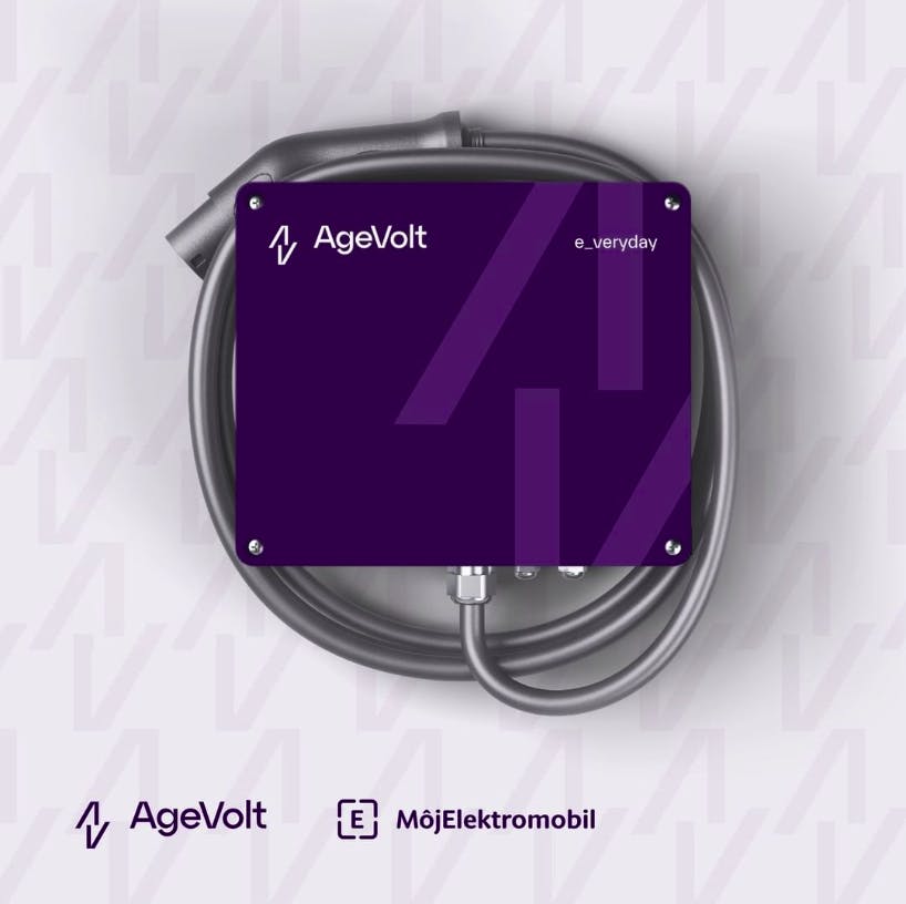
The founder requested that the flash be kept somehow so if you look at the new logo, you can see that there is a lighting bolt in there.
Other than that, we were able to do what we want with the logo such as the font and the colors.
We retained the lighting bolt and the agency played around with multiple fonts. We wanted the logo to be minimalistic, to keep it more modern instead of a very complicated logo.
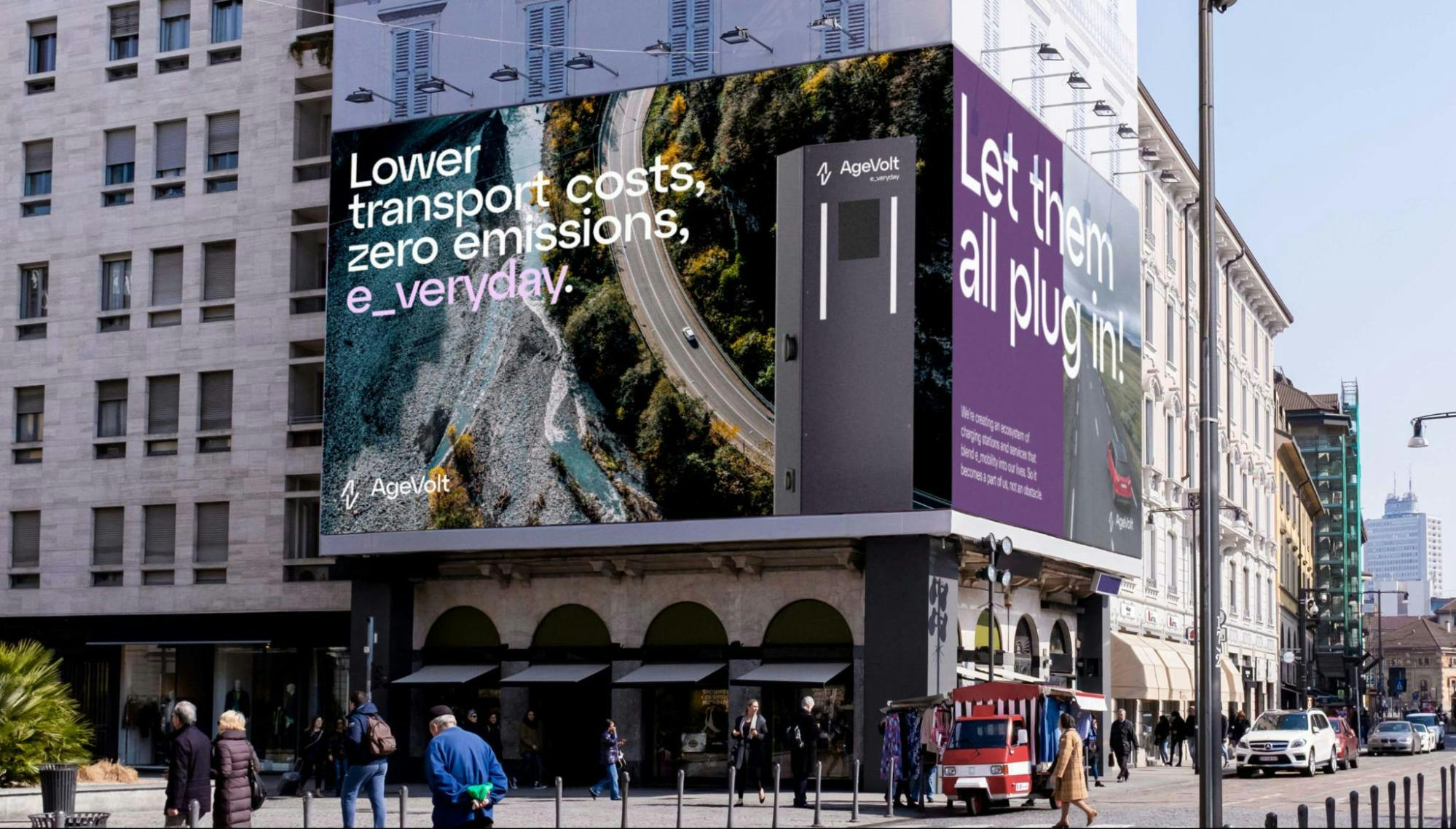
How about your color palette? How did you land on these colors, and what do they say about your brand?
We went through different color combinations. We landed on these because it felt that it was a more modern and fresh color combination compared to the yellow and black.

We have six different color palettes. The yellow and black is still in there. The reason for that is that there are still charges out there so we won’t get rid of it completely. It’s a slower transition so we don’t have to make a huge change overnight.
We didn’t want to use too many greens and blues simply because most of the competition use those colors already.
Can you tell us more about the fonts that you use? How were they chosen? Were they custom-made?
It’s very minimalistic and simple. We didn’t want anything complicated.
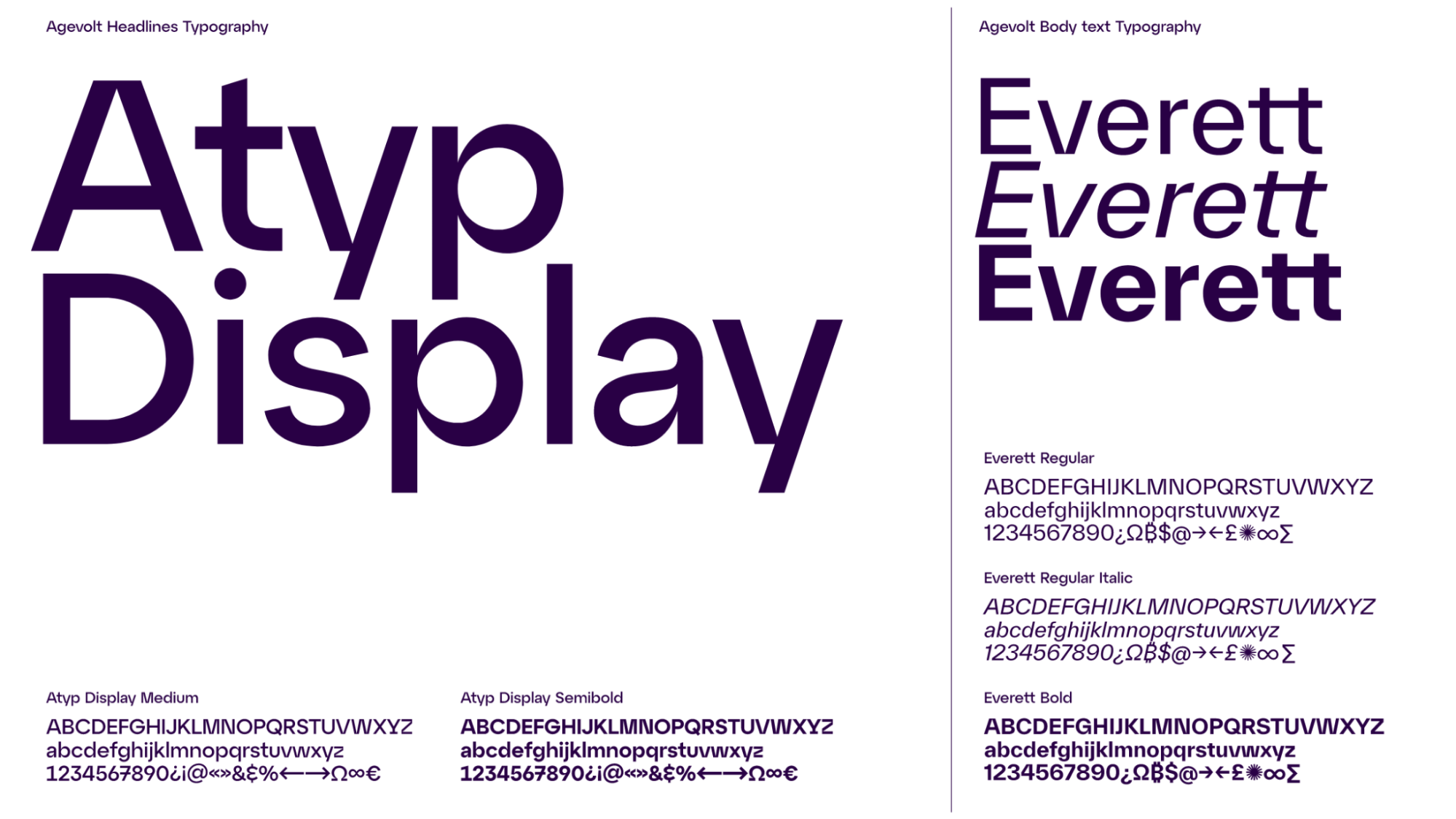
I don’t think anybody was very particular about fonts other than they should be legible and readable. They should look modern. They should be national, too so that when you print them on paper and charges, they don’t look odd.
We also imagine we’re sending it to a partner in Turkey or Kenya, they should not have a problem in printing materials with the font.
What is your major takeaway from this experience?
When you’re starting a project like this, you have to know your stakeholders. Not just the decision-makers, but those who are important for you to get the funding because these are the people who will help or be a barrier to your process.
Fundamentally, a brand refresh is about strategy and vision first. Design comes absolutely last for me. If you don’t spend enough time on strategy and vision, the refresh won’t be successful.
Speak to customers, look at your competitors. Understand internally who you aspire to be.
Educate internally the value of branding. Ultimately it’s a social construct. So, how do people within the organization see the new brand? It’s about feeling, having an emotional affiliation or attachment or a new way of imagining a new reality with the brand. It’s about mindset.
Another aspect is culture especially if you’re looking to go international or you’re already international. How do you want to be seen in Africa, Asia, or Europe? What colors will work in one country but not in another country? Those are also important considerations.
