


Katie Hayes, Head of Brand & Performance Marketing for Alamy, talked about rejuvenating the brand, the pros and cons of their neon green, working internally with an agency for their rebranding, and more.
Can you introduce us to Alamy and the exciting things it is doing these days?
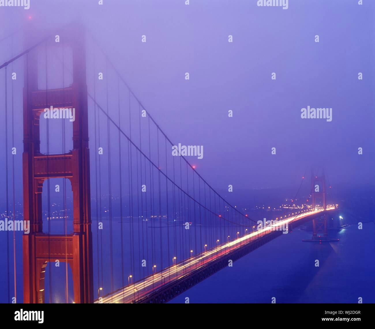
Founded in 1999, Alamy was built on a vision to change the world of picture buying. The collection offers creative and editorial content sourced from a network of over 100,000 photographers, content creators, and 650 contributing agencies and archives.
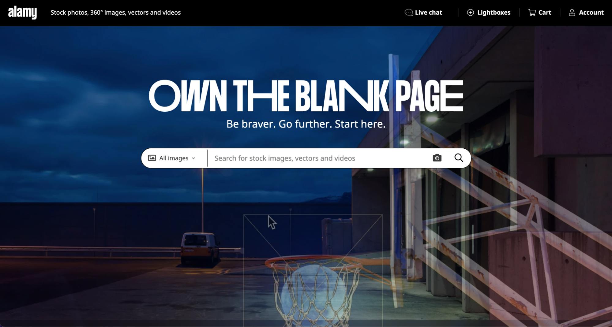
Alamy is the world's most inclusive content collection of creative and editorial photos, vectors, 360-degree images, and videos from individual photographers, picture agencies, and archives. Its global contributor base supplies upwards of 150,000 new images a day to the online platform.
Walk us through your company’s brand identity through the years. How were the past brands conceptualized?
Alamy’s former brand was simple, corporate, and started to feel dated and bland.
Over the past 20+ years, the brand has become well-known in the UK and globally but it needed a renewed energy and more creative personality.
Alamy’s brand tonality was approachable but a bit pedestrian, so in early 2021 we decided it was time to rejuvenate the brand so that it aligns with Alamy’s exciting new trajectory–goodbye navy blue!
About this current rebranding, how did it come about? How did that conversation start?
Following Alamy’s acquisition by PA Media Group, Alamy is heading in an exciting new direction with bold ambitions led by Managing Director, Emily Shelley.
We started the journey by asking ourselves, “What does the Alamy brand stand for and how do we bring that to life?”
From there, we created a detailed brief to outline the opportunity and started an agency pitch process. Following that process, we decided to work with the award-winning agency Phantom.
After many months of collaboration and ideation, we aligned on a bold, new brand positioning strategy and visual identity that will enable the Alamy brand to cut through the noise and differentiate itself from competitors.
We’re really excited about the brand’s new direction and we’re only getting started.
How did the rebranding process go? Was it all smooth, or did you encounter challenges?
We kept our internal team small on the rebranding project, which included a few select members of the senior leadership team.
We worked very closely with Phantom’s Strategy Director, Dom O’Hare, and his team on the brand proposition strategy and once we were aligned on the new direction, we moved on to the new visual identity design. Next, Phantom’s team of designers, copywriters, and strategists presented a variety of visual identities. We had two or three meetings to guide the creative direction and settled on what you see today.
What you first start with rarely mimics the end result and this was true for Alamy.
One of the reasons the Phantom team was such a good fit is that they are our target audience. Their creatives use Alamy imagery and some are even Alamy contributors who upload and sell their content on Alamy’s eCommerce platform. This meant that the team working on the rebrand had a thorough understanding of the Alamy brand from past to present and had an aligned vision on the brand’s new strategic direction.
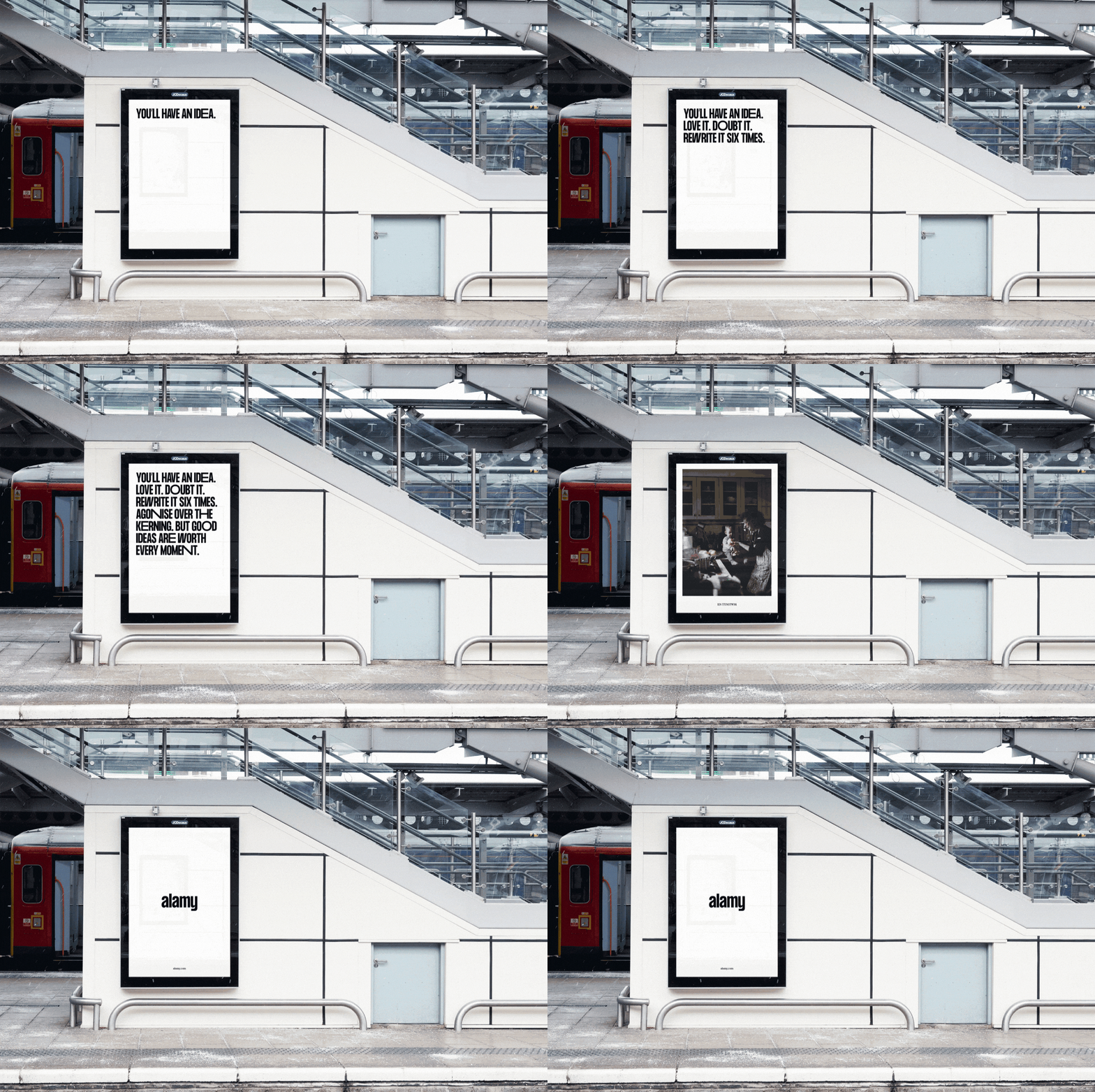
Following the delivery of the new brand proposition strategy and Brand Guide, our in-house Brand & Marketing team started to prepare for the October 2021 launch. We also worked closely with the Product team to ensure the new brand came to life in a seamless way online.
I cannot emphasize enough how important it is to collaborate with your design, SEO, and development teams. It takes a village to bring a brand to life.
We had multiple teams working tirelessly on the new Alamy brand. From rebranding over 125 million image watermarks to migrating our social media channels, reinventing every branded template you can imagine whilst ensuring our new brand merchandise is top quality–a rebrand is no easy feat.
Can you tell us the story behind your new logo? How was it conceptualized?
Our logos and lockups exert confidence through their simplicity. Their refined nature act as an anchor amongst the flexibility of the rest of the visual identity.
The cohesive, refined nature of our primary logo anchors the more flexible parts of the identity. Our logo fits into the creative world seamlessly but also feels at home in more corporate settings.
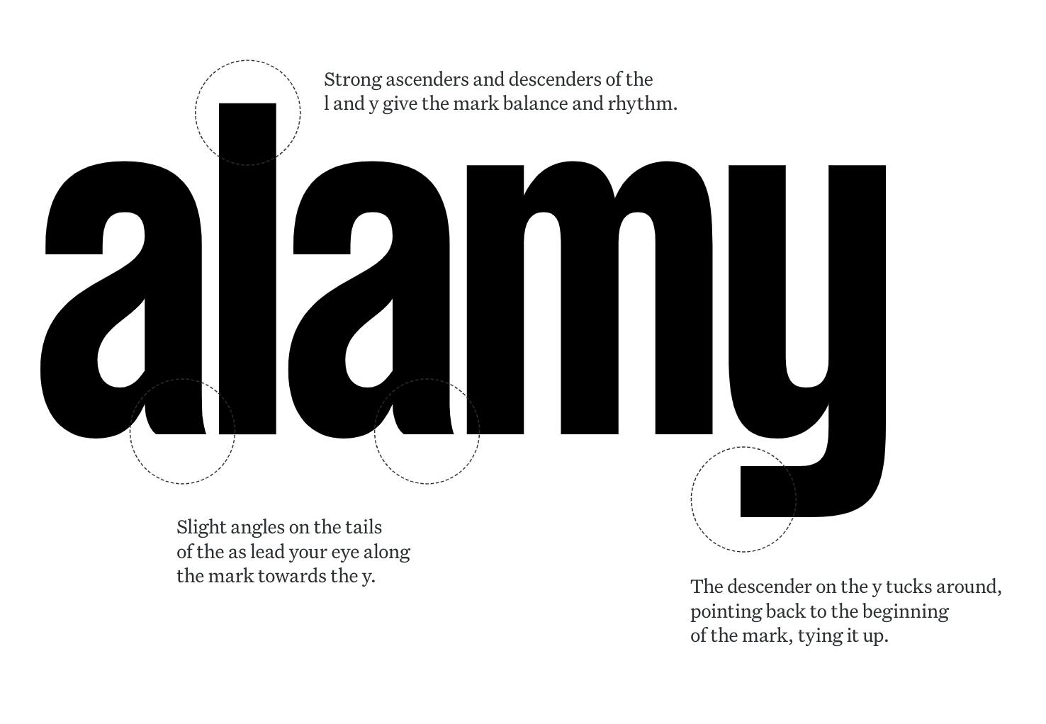
The simple typographic refinement of the logo creates a confident mark with a friendly rhythm that can flex to any situation.
In some circumstances, it may be useful to use our logo alongside our brand line.
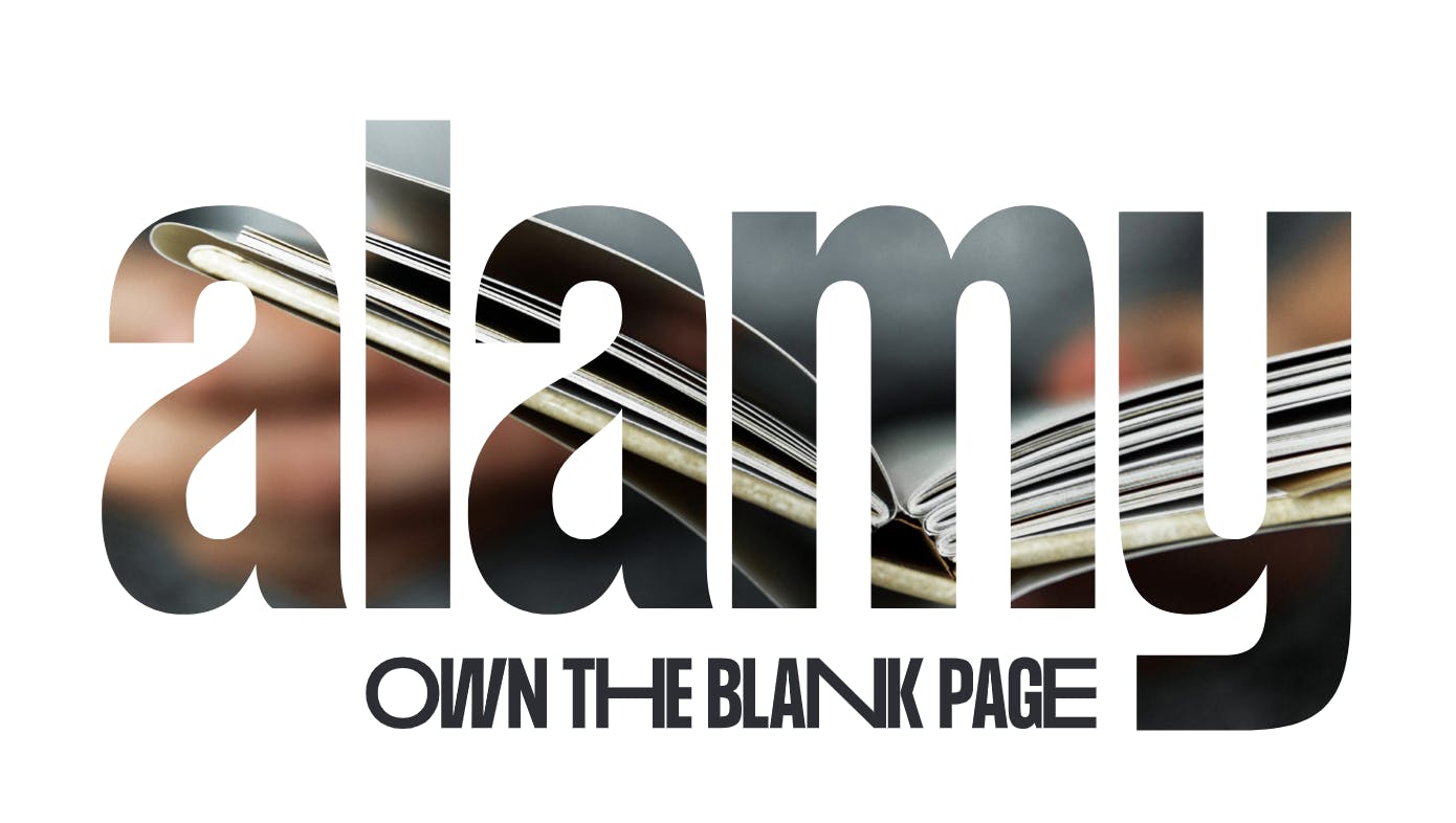
In these cases, we use this lockup, rather than fusing the two separate elements together. Due to its complexity, this lockup should only be used in limited circumstances where the logo is the focus.
Green is a distinct element in your new visual identity. How did you land on this color?
Green represents the start of something new, while the intensity and vibrancy of the color reflect the excitement of new ventures. Our color palette cuts through the noise and differentiates us from our biggest competitors Shutterstock, Getty, and Adobe Stock.
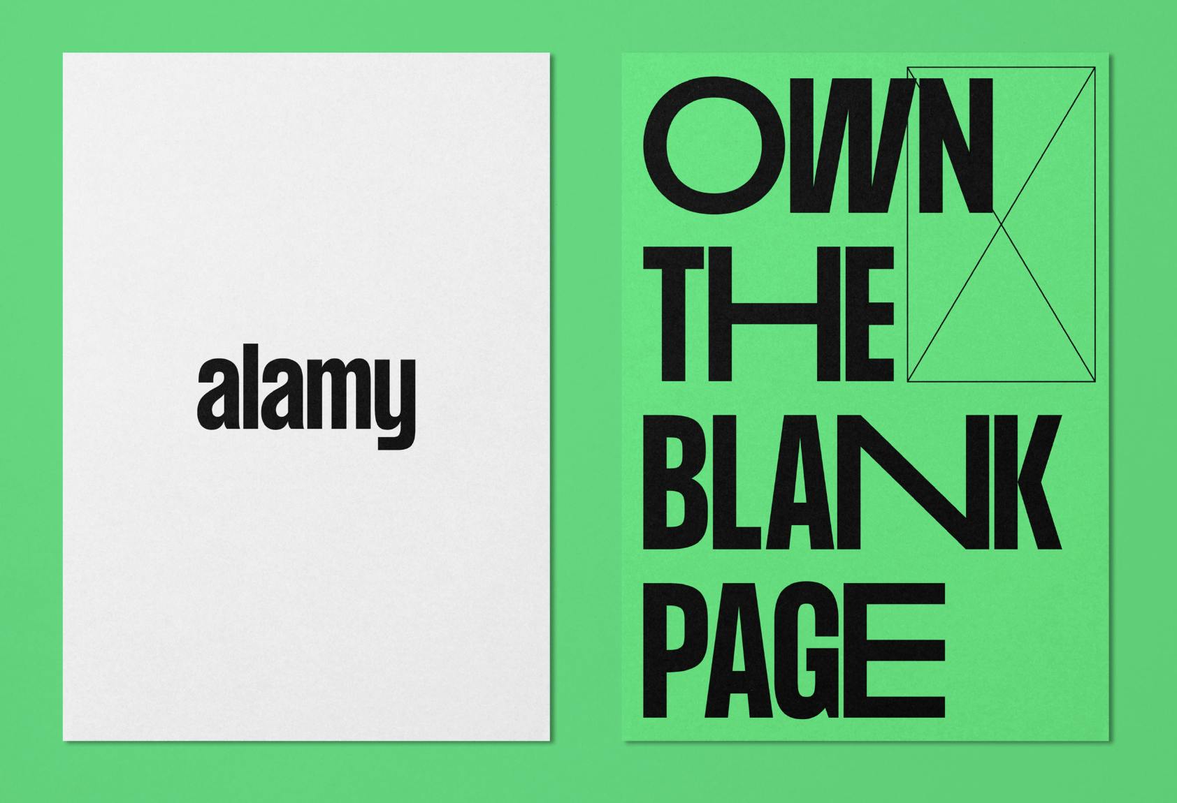
The beauty of the new Alamy branding is that it can also be dialed down to a black and white version reserved for Alamy Editorial, and then ramped all the way up for our creative audience.
We love your slogan, “Own the blank page.” Can you tell us more about it?
We launched the new Alamy brand with a bold manifesto that explains the concept.
Creativity is chaos. It takes patience. Hours of thought and exploration. It takes grit. To overcome obstacles. Sweat the details. Burn it all down and start again. It takes conviction. An unwavering belief that your vision is going to work.
Why do we do it? Because creativity is powerful. It brings people together. Changes minds. Sparks action. Because no matter how chaotic the process, there’s one thing all creatives share–we own the blank page.
When it comes to photos, how do you choose what is on-brand to officially represent Alamy for your hero images?
We use four brand values to guide our work and they underpin everything we do, including our image selection and brand tonality:
- Optimism: We accentuate the positive, and believe in possibility.
- Humanity: We know that creativity is not just business, it’s personal.
- Fearlessness: We’re bold, brave, and set aside the safe option.
- Inclusivity: We believe every creative person deserves the chance to be seen.
As you can see on Instagram and on our other social media channels, we celebrate diverse, authentic, inspiring imagery that represents the world we live in.
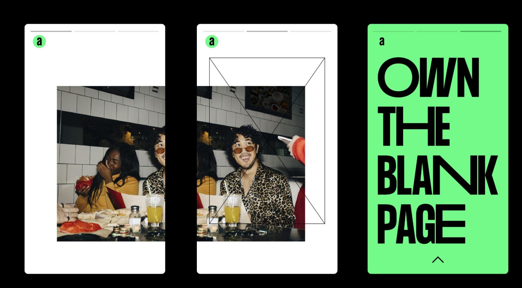
We also add six varied Editors’ Choice collections to the Fresh picks page each month to showcase the latest and greatest imagery in our collection. These collections are sourced by a team of content experts so if you’re seeking quick inspiration start your search there.
Can you talk about your use of the wireframe graphic into your visual identity?
It’s a playful, creative way to enable the viewer to own the blank page. We invite creatives to rotate the wireframe and crop the image to suit your eye.
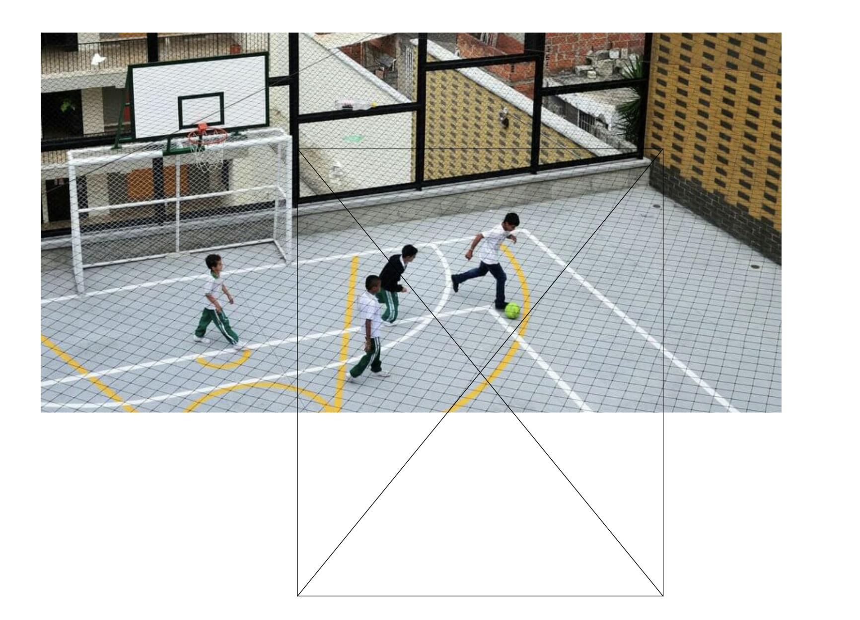
The wireframe, a graphic element derived from the creative world, flexes to capture the endless possibilities at the start of a creative process.
Highlighting work in progress (WIP) marks that aren’t usually visible aligns us with our audience, making us champions of the creative process that embrace its messiness.
Do you have any advice for designers embarking on rebranding projects themselves?
The Alamy rebrand has been a career highlight. I loved the creative process, working with the incredibly talented Phantom team and although there we many sleepless nights, our teams made it happen and on deadline.
Here are my top three tips:
1. Be aware of the primary color you select for your rebrand.
We chose a neon green which brings challenges when printing tangible branded merchandise on paper, fabric, and other surfaces.
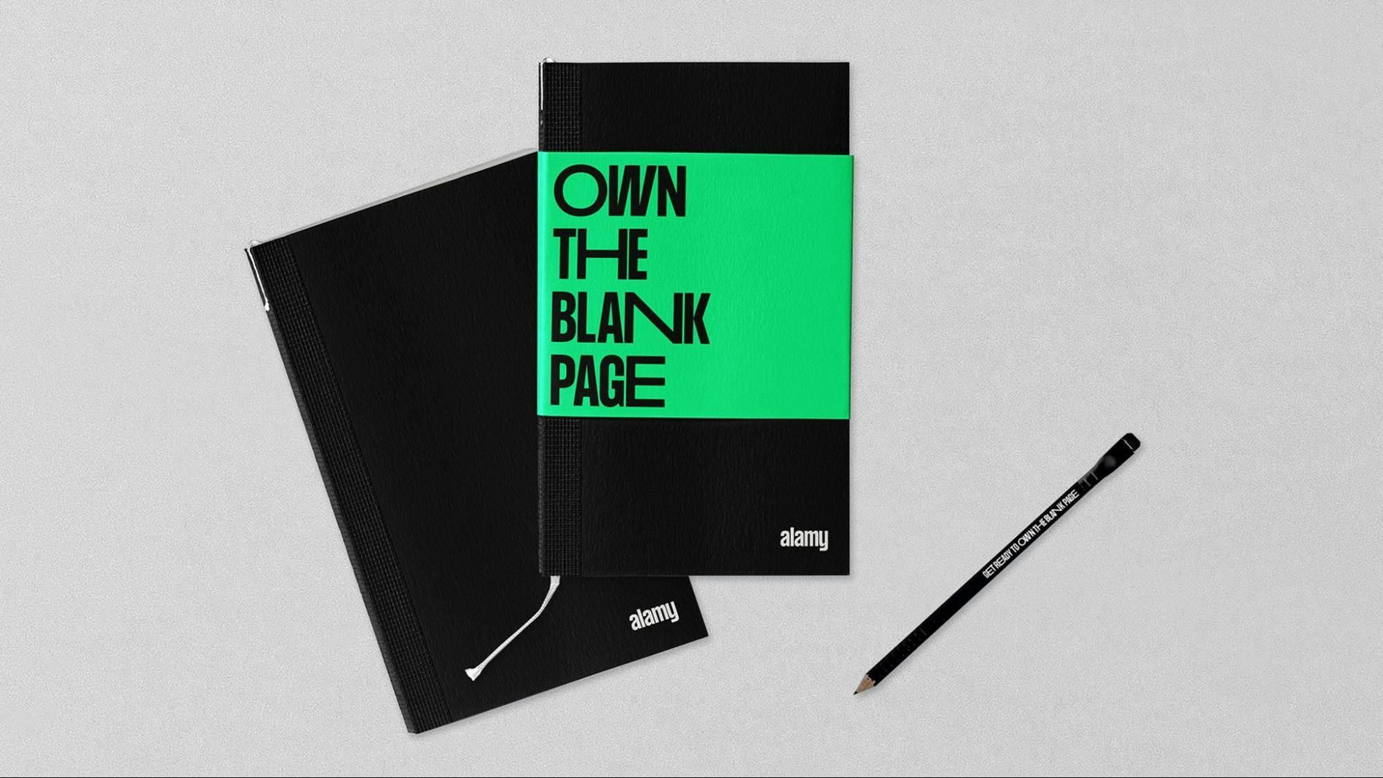
We settled on an online and offline green color that allows us to maintain consistency across our branded assets. There are certain colors used in your UX design that need to work within your new color palette.
2. Take everyone on the journey.
If you are leading a rebrand, ensure that you are presenting milestones to the senior leadership team as well as the broader business. Their input or general feedback is extremely valuable. The success of a rebrand starts with your internal stakeholders so ensure you plan an internal launch strategy before you share your new brand with the world.
There will be haters but if you get the majority of the business on board and excited about the rebrand, you will set yourself in good stride for brand advocacy.
Collaborate closely with your Product team from the start as your brand’s visual identity comes to life differently online versus offline. Think about UX design elements such as the visual language, typography, colors. Beware of extra costs such as font licenses for your website and accommodate an extended color palette to cater to your website needs.
3. Have fun!
It’s not every day that you get to do a rebrand so enjoy the process and ramp up your creativity. Be bold and brave. You’ll surprise yourself.


