
before

after

Mark Christou, Co-Founder and Creative Partner at ROOK/NYC.
Can you tell us how this project came about? How did that conversation start with Alicia’s Spice Co.?
The bond between family and food is the root of Alicia’s Spice Co. A lifelong passion for great food has driven founder, Alicia Haddad, and her venture into creating an all-natural, gluten-free, certified vegan, woman-owned spice company that celebrates healthy ingredients and simple, creative cooking. "Feed your body healthy" is the guiding principle behind the development of all the brand's products.
ROOK/NYC partnered with Alicia to breathe new life into her brand identity and packaging design. Bold colors and bright illustrations pay homage to the quality ingredients at the heart of her seasoning blend and spice recipes, while a modern touch of elevation is applied to the logo to maintain familiarity. The result is a refreshing, creative take on the art of cooking.

How did the branding process go? Can you tell us more about it? Where did you start?
The branding process was very collaborative with the client and founder, Alicia. She really wanted to elevate the brand and packaging experience, and was sold on our expertise and design aesthetic. The first round creative presentation was broad, including concepts from close-in to the former visual identity, to farther out (as we typically present to every client). This helps both us and the client truly gauge what the appetite is for change and disruption.
As with all brand evolution/refresh projects, we started with Alicia’s existing (at the time) brand identity system, digesting those equities and validating what we should bring forward, and what we should leave behind. Alicia’s desire to celebrate simple, creative cooking was the north star.
Alicia's Spice Co. Packaging
Were there surprising challenges you encountered along the way?
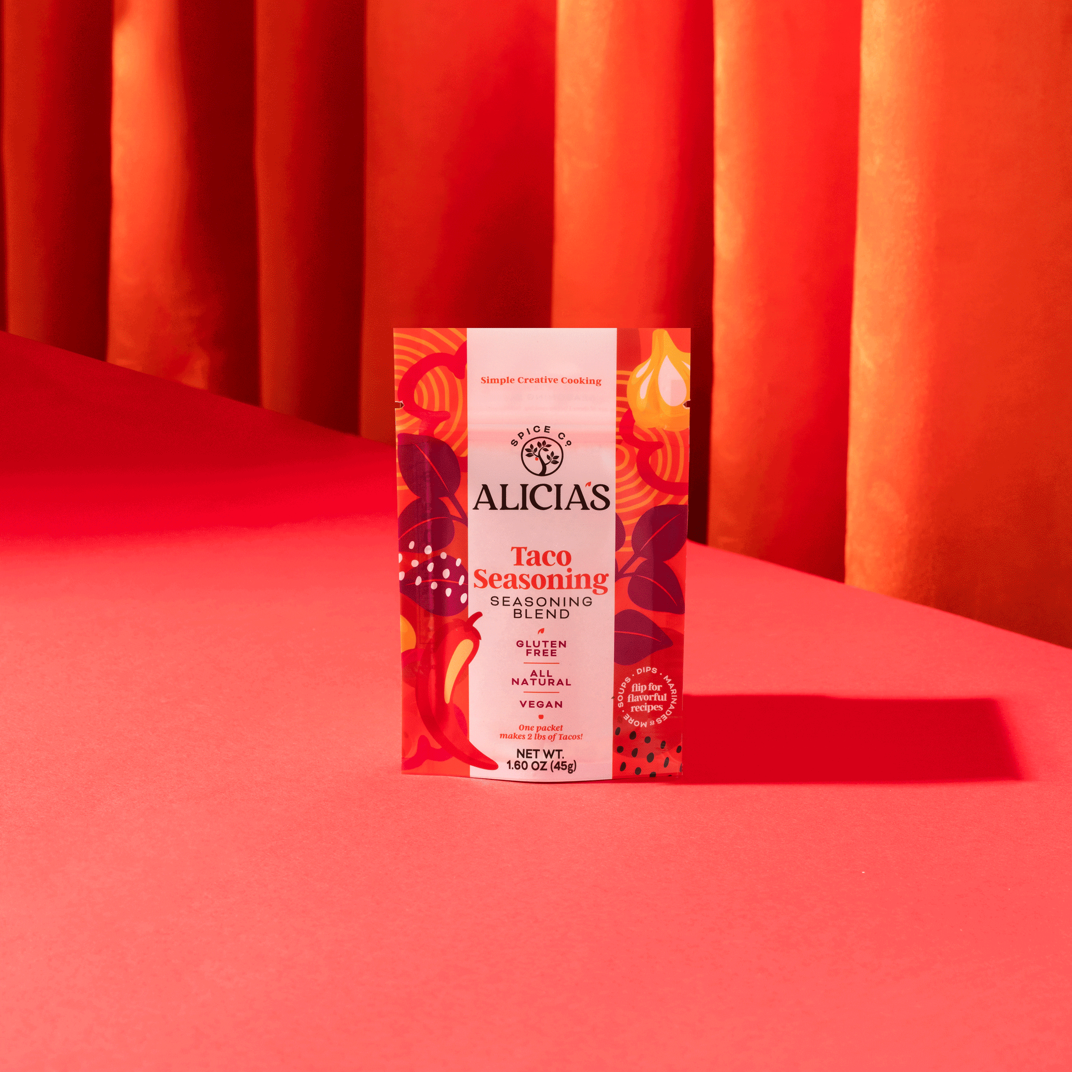
One of the biggest challenges we experienced along the way was to come up with a unique color palette for each SKU (Stock Keeping Unit), given the breadth of SKUs in the seasoning line and the overlap of ingredients across SKUs. Finding the right color base and color combinations, without it becoming visually confusing between SKUs (colors that are too close) or feeling overwhelming to the consumer (in some cases there are 8-10 colors per pack) was the goal.
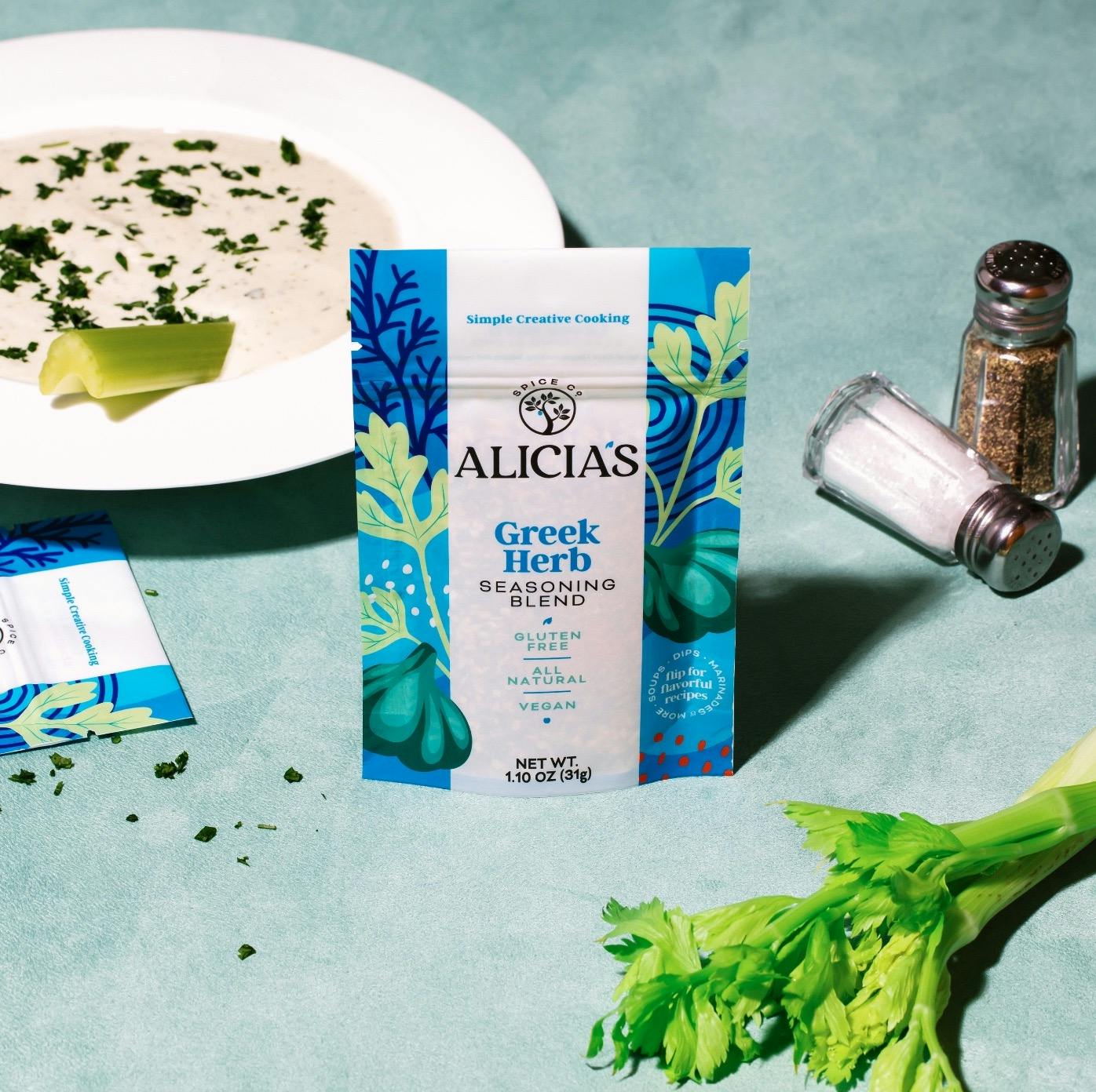
Alicia's Spice Co. Greek Herb
Can you tell us the story behind the rebrand? How was it conceptualized?
We modernized the existing wordmark with a more modern serif typeface, and simplified the tree and apple icons to feel more contemporary. Additionally, making the apple icon and the apostrophe match the SKU color added a new touch of depth to the identity.
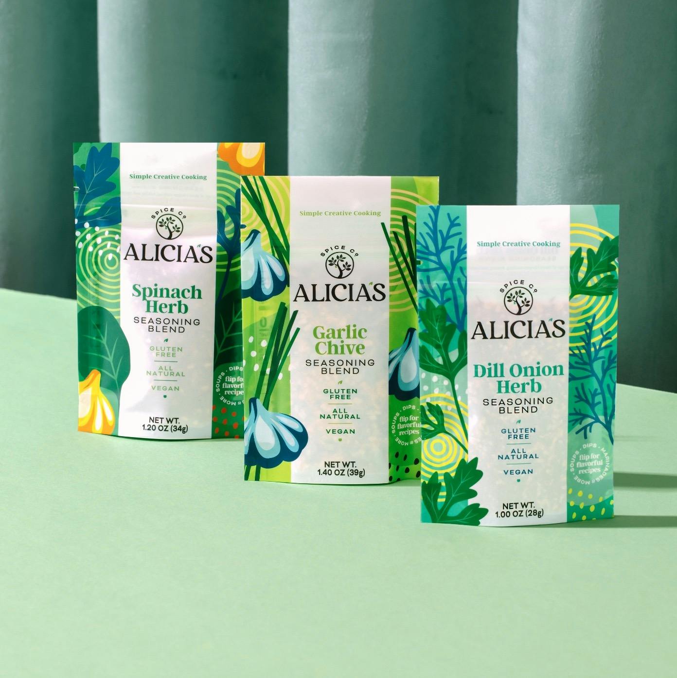
Alicia's Spice Co. Garlic Chive
Can you talk a bit more about the illustrations? How were they developed?
The illustrations denote the real ingredients that make up Alicia's spice recipes. The style establishes an iconic vision of the ingredient that then translates across SKUs. In other words, we use the garlic bulb illustration in yellow, blue and red (across multiple SKUs), but it's still classically and recognizably a garlic bulb.

The brand has different color palettes per product. How did you land on these colors?
It was a unique challenge to solidify the color palettes for each individual SKU. We wanted the SKUs to feel different enough that they were shoppable, while also not injecting too many colors into one SKU so they felt busy or overwhelmed the eye.
"We believed that the illustrations were so strikingly obvious that it allowed us to be more creative with the color palette of those ingredients across SKUs, and that was key for differentiation."
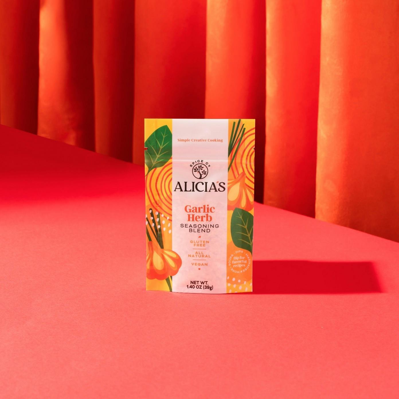
Alicia's Spice Co. Garlic Herb
The new brand identity is vibrant, joyful, and fun. In what other ways does this manifest in the new brand identity?
Our role as a creative partner is to bring our POV for how best to drive intrigue and conversion at shelf. The seasoning and spice aisle is traditionally functional and lacks personality, and we wanted to draw attention to the creative, vibrant aspect of cooking. Cooking is colorful, flavorful, passionate, and at times unexpected. This was our approach to reimagining the packaging design, and the founder, Alicia, was sold when we first presented the concept.
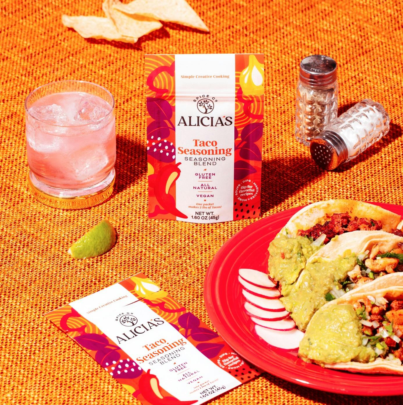
Alicia's Spice Co. Taco Seasoning
Lastly, do you have any advice or pro tip for designers embarking on branding projects like this?
Work to understand the unique value proposition of the brand, and embrace and support that via creative solutions. For Alicia's that UVP was “simple creative cooking” so we used that as our guiding principle and created a visual story that celebrated it.
