


Max Valiquette, Director of Brand Design at Attentive, talked about partnering with an agency, the concept of ‘Journeys’, and how and why they chose yellow as their prominent color.
Can you introduce us to Attentive and its initial branding?
From the beginning, our focus as a company has been on our customers.
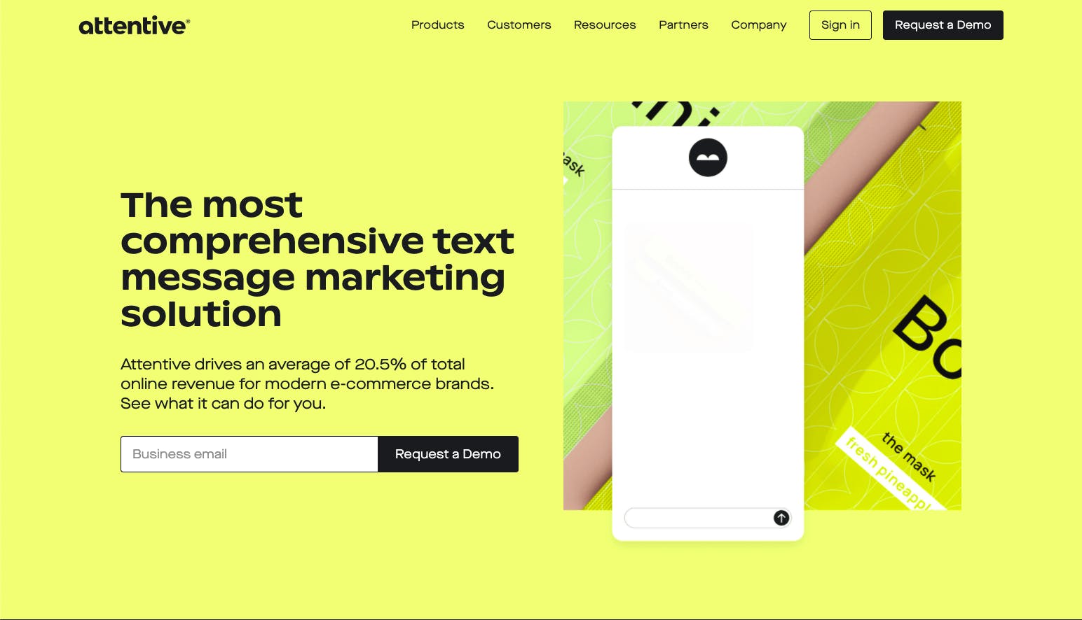
Our brand name, Attentive, was intentionally selected to represent our core goal: to be attentive to our customers’ needs while delivering thoughtful, engaging experiences to their customers through personalized messaging.
You mentioned on the Attentive blog that a rebrand should be tied to a catalyst. What was the catalyst that prompted you to rebrand?
We have grown so much as a business in the past two years and we work with more and more brands every day. We saw an opportunity to better tell the stories of these brands and how they use Attentive to better connect with their customers.
Another factor that comes with fast growth is it can be a real stress test for any design system.
Shortly after joining, I performed a full brand audit to allow myself and other key stakeholders to get a truly objective sense of what was working and what wasn’t. It’s always so helpful to see it all plainly laid out.
It was as a result of this exercise and the aforementioned “catalyst” that we were able to confidently forge ahead with a full rebrand.
How did the rebranding process go? Were there any challenges that you encountered?
We determined early on that it made a lot of sense to partner with an agency for the rebrand. It’s important to get an outside perspective in the mix.
I was able to staff my own team after joining Attentive.
They had a really unique perspective since they got a chance to work in the legacy design system, allowing us to identify where the system was falling short in terms of flexibility and our design standards.
So, I knew it was essential to work closely and collaborate meaningfully with any partner we brought on.
We sent out RFPs to several super talented agencies and in the end found High Tide was kindred in their approach and vision for what we could achieve.
The global pandemic definitely presented some challenges: High Tide was adjusting to remote work, I hired my entire team completely remote, and during the entire rebrand process, we couldn’t even meet in person.
What that meant to us was that good communication was even more essential. I don’t know what we would have done without collaborative tools like Figma and Miro.
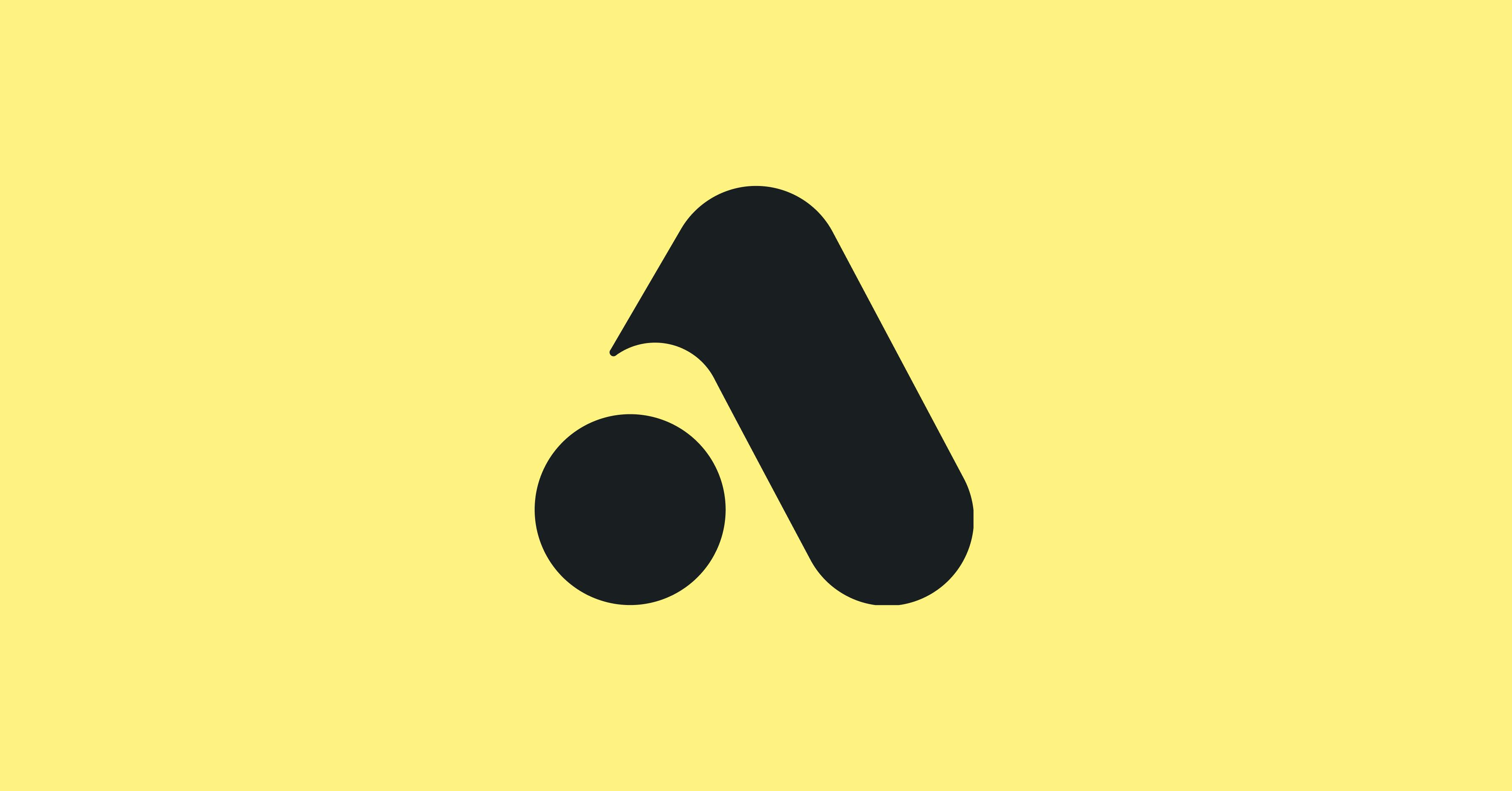
What’s the story behind your new logo?
You always hear stories about hundreds of logo concepts and iterations, but honestly, we landed on a logo design that we loved really early on. Of course, we tweaked and polished it from there.
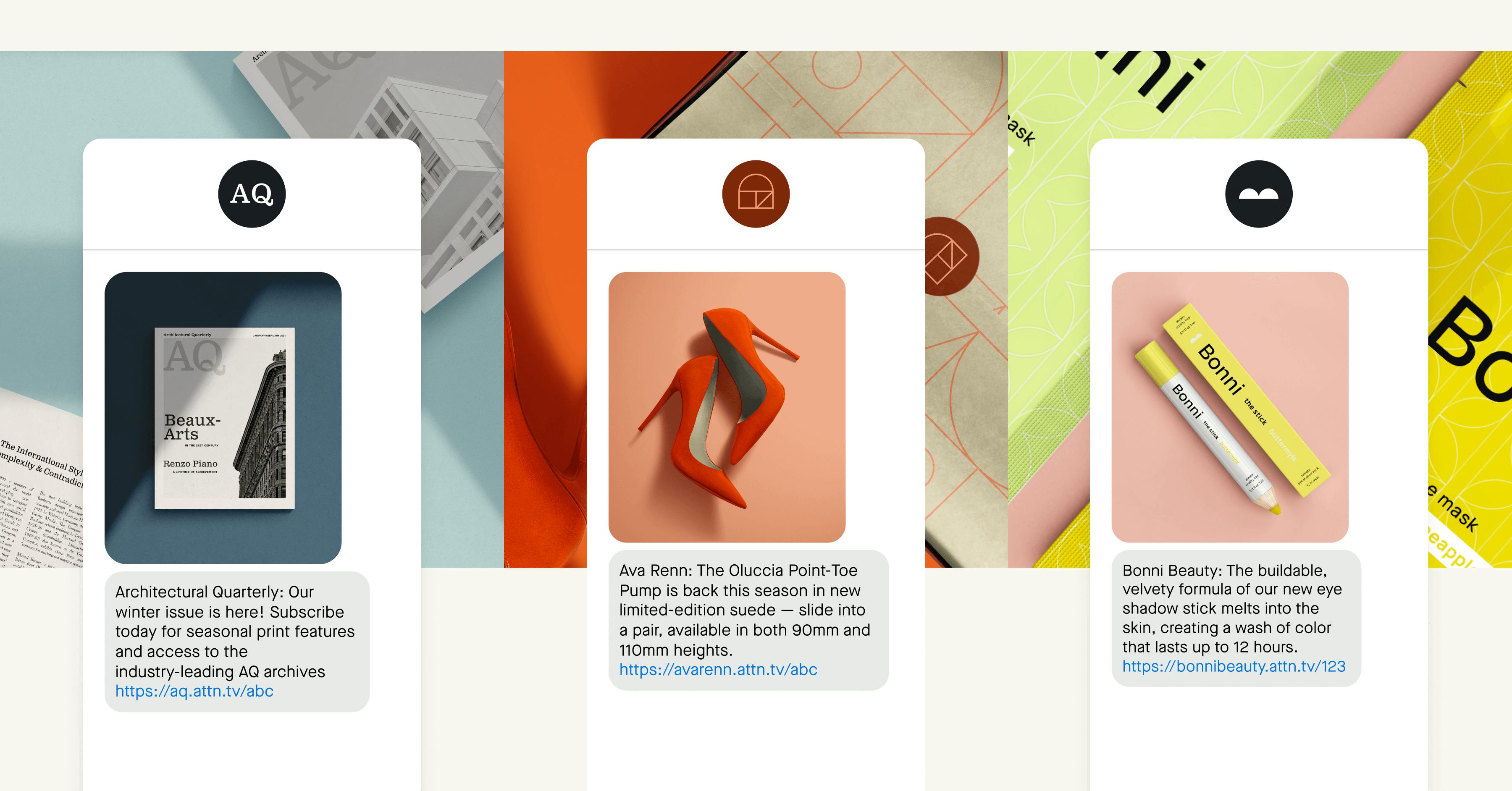
I think once we landed on our strategy—this concept of “Journeys” and the way a conversation can be like a remarkable journey—a lot of style definitions really started to come together pretty magically.
The logotype straddles current and fresh with an infusion of retro nostalgia.
Fun fact: The type designer who worked on the logotype with us is a contributing typeface designer at the foundry Sharp, which I am a huge fan of.
How about the colors? Why is yellow a prominent and important color for your brand?
Internally, we always considered ourselves a yellow brand, since our original logo used yellow. But in practice, we actually leaned pretty heavily on greens in the old palette.
Going into the rebrand, we wanted to put a heavy emphasis on explorations that embraced yellow as a primary brand color.
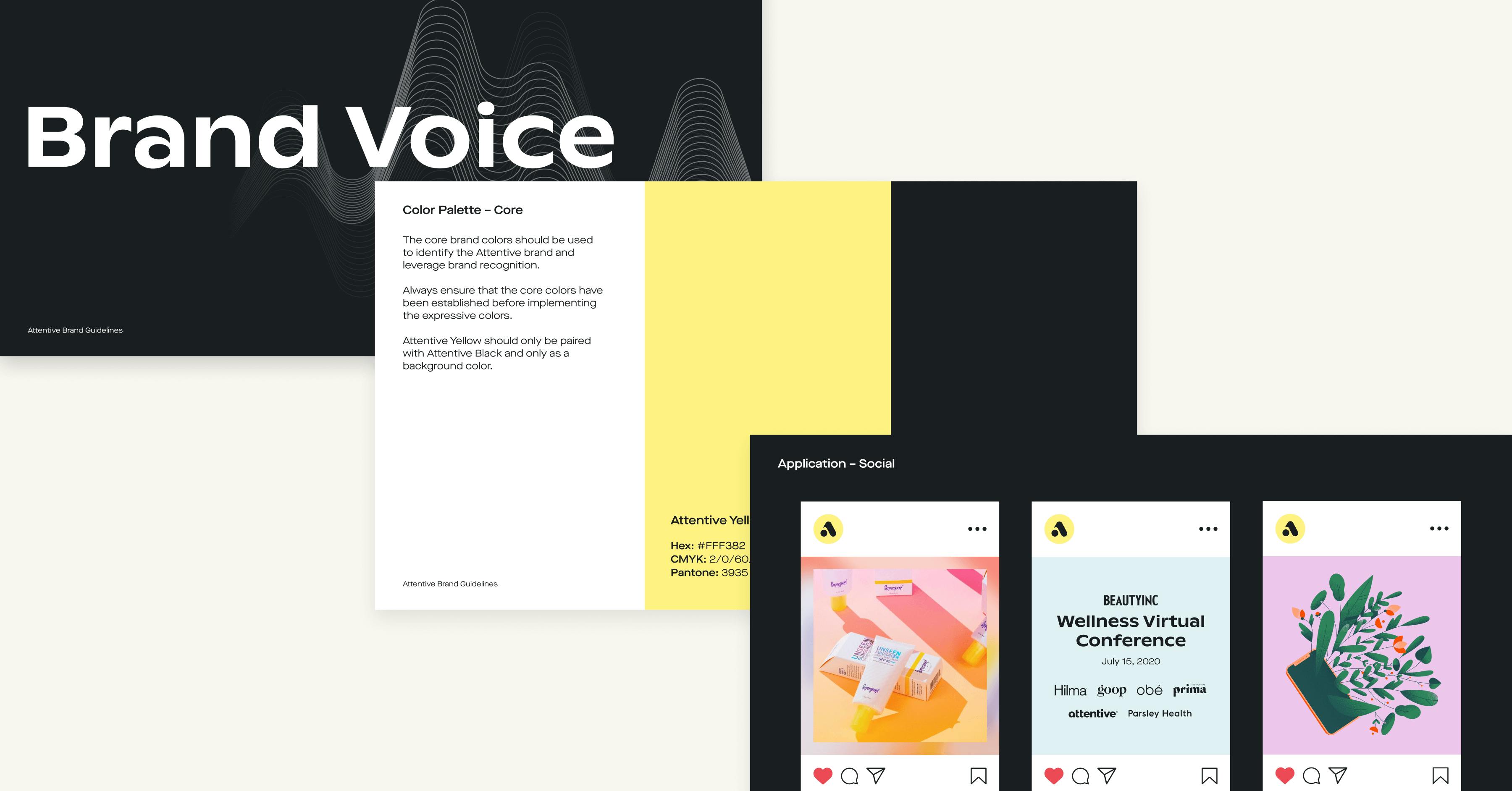
Yellow is super tricky. Contrast was definitely a point of close focus, given accessibility is a top priority across the work our design teams touch.
After countless hours of exploration, we landed on a shade that felt wholly cohesive with the brand and really distinct.
That’s the benefit of using yellow; because it’s hard, not a lot of brands use it.
We wanted to keep to a simple core palette, since that would help us continue to gain brand recognition. That said, we’re a friendly and approachable brand, and wanted to express that a little more when appropriate.
We developed a broad, expressive palette built from the ground up with contrast and compliance in mind to do just that.
What about your brand’s visual style? How did you land on a specific visual style?
The visual style is really rooted in the Journeys brand story.
Much like Casper is “the Sleep Company” and not just a mattress brand, we’re not just an SMS marketing company.
We enable connection and conversation and are building products for the future that expand far beyond text messaging.
This idea of Journeys gave us room to play, especially in our illustration, with dream-like elements—almost Escher-like impossible scenes.
Do you have any specific takeaways or learnings from this experience?
I’ve had the opportunity to do a few of these exercises in my career and this was by far the most rewarding and enriching.
Firstly, buy-in is essential. There’s no world where you can be successful in any rebrand or refresh without thoughtfully including senior leadership in the process.
I’d also say, especially when working with an agency partner, don’t be afraid to drive. You are the person/team that needs to use the design system every day. A beautiful brand book that doesn’t actually represent a thoughtful, flexible system is not going to work.
What’s next for Attentive?
Attentive has been building a platform to change how businesses interact with consumers - through personalized text message conversations and frictionless commerce experiences.
Attentive will continue to deliver SMS marketing programs for e-commerce brands that drive a significant portion of the online revenue.