


James Hughes, Co-Founder & CBO at Brewgooder, talks about evolving beyond their initial clean water initiative, collaborating with other creatives, and Brewgooder’s new visual style.
Can you introduce us to Brewgooder and the story behind its initial branding?
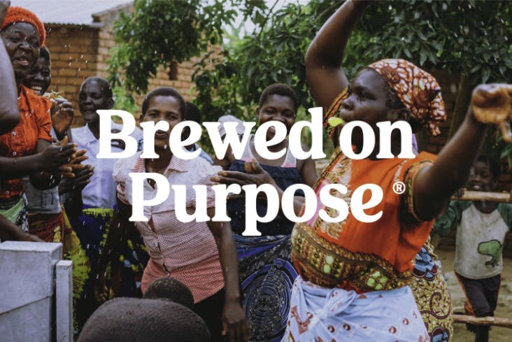
Brewgooder is a beer brand and B Corp based in Scotland. Our mission is to brew great tasting beer that can make better lives for others. We do this by ensuring that every beer sold supports ‘people positive’ initiatives globally and at home.
Our main means of delivering our impact is through clean water and sanitation projects. Since 2016, our drinkers have helped to fund over 150 projects across multiple countries worldwide, helping to empower over 150,000 lives.
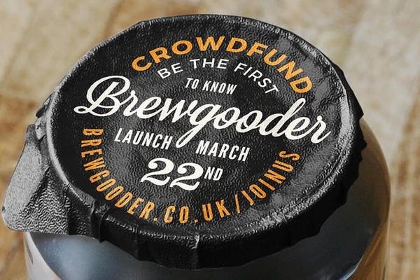
Our initial branding was very centric to our clean water project work, and specifically Malawi, where the bulk of the work was being completed. So all previous can illustrations, wording, and colors were heavily linked to this.

What prompted this rebranding? How did the conversation start?
The rebranding was prompted by the need to encapsulate far more than just one geography and impact mechanic in our visual communications.
Brewgooder’s reach and purpose had extended beyond Malawi, and was starting to evolve beyond clean water as the sole means of impact delivery, so whilst both remain at the core of what we do, we needed branding that allowed us to move ‘upstream’ from this original positioning and could represent a more wide ranging ethos and mission.
We’d also grown into our position in the market and had a better understanding of the types of consumers we wanted to appeal to, and it was decided that a more refined look was required.
Walk us through the rebranding process. What challenges did you encounter?
Rebranding was taken on by the team at Thirst Craft in Glasgow. I guess the main challenge was that we weren’t just rebranding our packaging with all else remaining constants.
Our positioning and impact model was in the midst of a significant evolution too, so the brief for the rebrand was based on a vision for a quite drastically different brand we wanted to be next year rather than just a better version of the same brand we are now.
Can you tell us how your new logo came about?
The logo was designed to best reflect the ethos and position we hold within the beer market. We aren’t a traditional beer brand in how we behave or are set up.
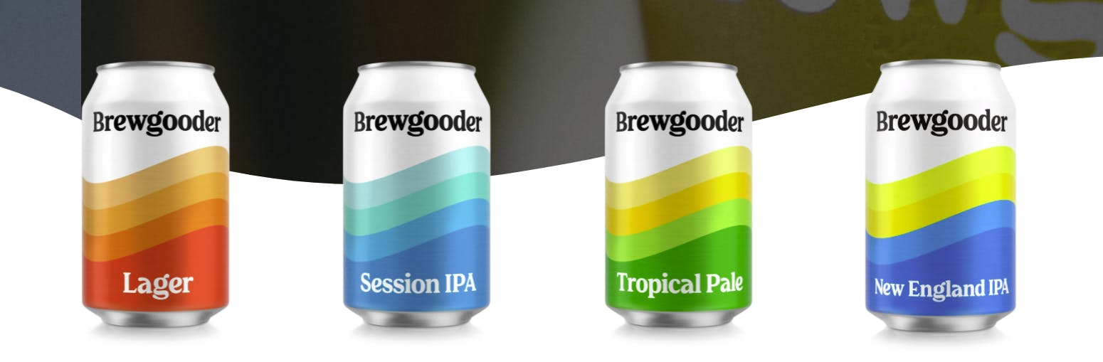
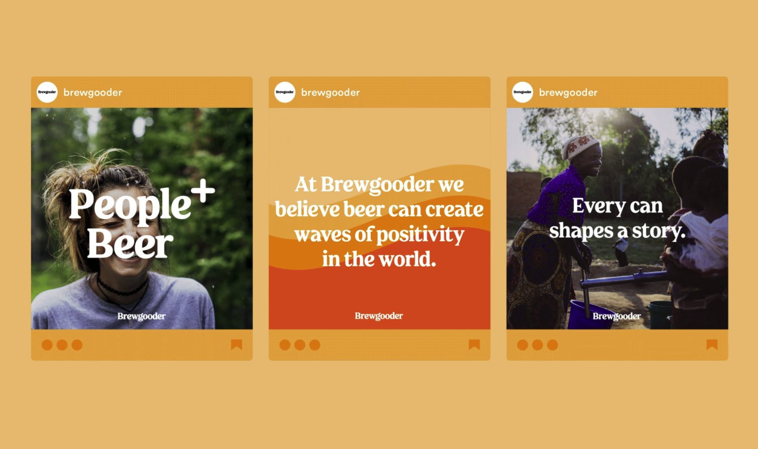
The beer industry has been historically dominated by brands that all fit the mold of masculine, sharp edges, and capital letters. We didn’t feel that this approach would reflect the ethos or difference that we bring to the category, so we went almost the opposite way: lower caps where possible, soft and round edges, and a font that looks inclusive, welcoming and friendly.

Can you tell us more about Brewgooder’s new visual style?
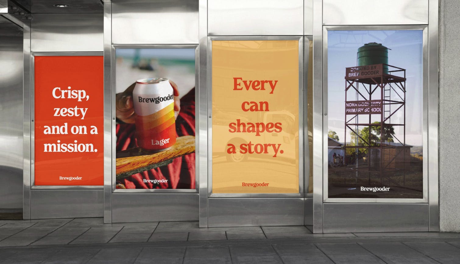
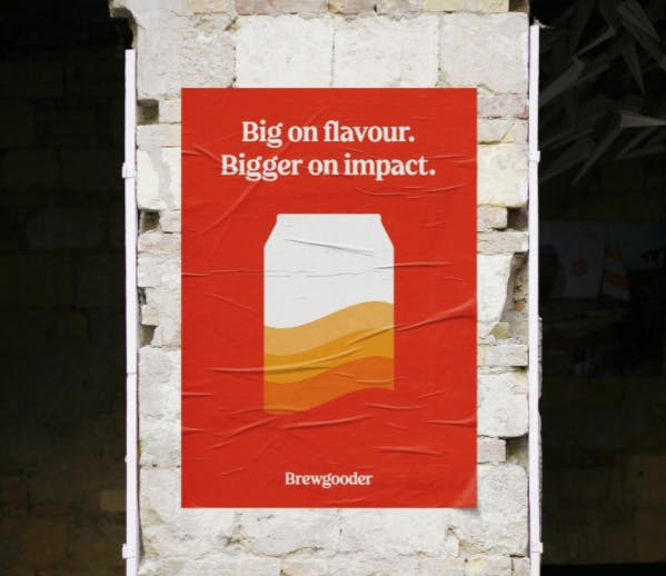
The wave pattern is the best representation of what our brand is all about: making waves of positive change in the world for other people. So having this on our cans and packaging acts as a ‘beacon’ in the hand of a drinker to show that they are making a difference in the world from the moment they open a can.
The versatility and applications of this as a visual style versus the illustrative look we had before is far greater in terms of extending the range, the purpose and impact that it can relate to, and ‘brand world’ which we are yet to explore in full but will be doing so from this year.
Your ‘Small Batch’ collaborations all feature individual and unique designs. How do you collaborate to come up with these designs?
We really like to give as much autonomy to the collaborating brand or partner when it comes to what goes into the middle section.
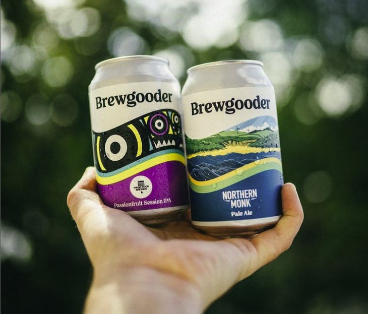
The great thing about the format for the collabs is that the Brewgooder lockup is maintained at the top for consistency across our full range, so the rest of the design acts as the canvas for the other brand to make it their own.
What has been the reception to your rebranding so far?
Overwhelmingly positive. I think whilst there are always some that prefer or remain loyal to the old look, once they understand the rationale behind the evolutions we are going through, it starts to make more sense.
But we’ve gained new listings not previously available to us, directly as a consequence of the new look, which is a strong indicator that it was the right move!
What is your biggest takeaway from this rebranding experience?
I think the tightness of the brief is important assuming you are outsourcing the work. There’s often an assumption that the designers know every detail or what you’re thinking when it comes to your brand, but unless you share this in full, there can’t be an expectation that they will produce exactly what you’re thinking.
I also think sourcing the right designer or agency fit is key. However detailed the brief is, you want someone that you trust in full and you get a sense of understanding your vision. We were luckily enough to have the guys at Thirst do exactly that, so we couldn’t be happier with the result.