
before

after

Roel Lammers, Head of Brand at Brite Payments, talks about rebranding a payments provider to make sure it cultivates trustworthiness and reliability.
Can you introduce us to Brite Payments and the brand’s identity through the years? How were the past brands conceptualised?
Initially, we didn't put much effort into our branding. Our goal was simply to create a recognisable and professional logo that could stand out among other payment logos.
Brite Payments
We followed the standard design theme typically used in fintech and payments, using black, white, blue, and green colours that are commonly associated with financial technology.
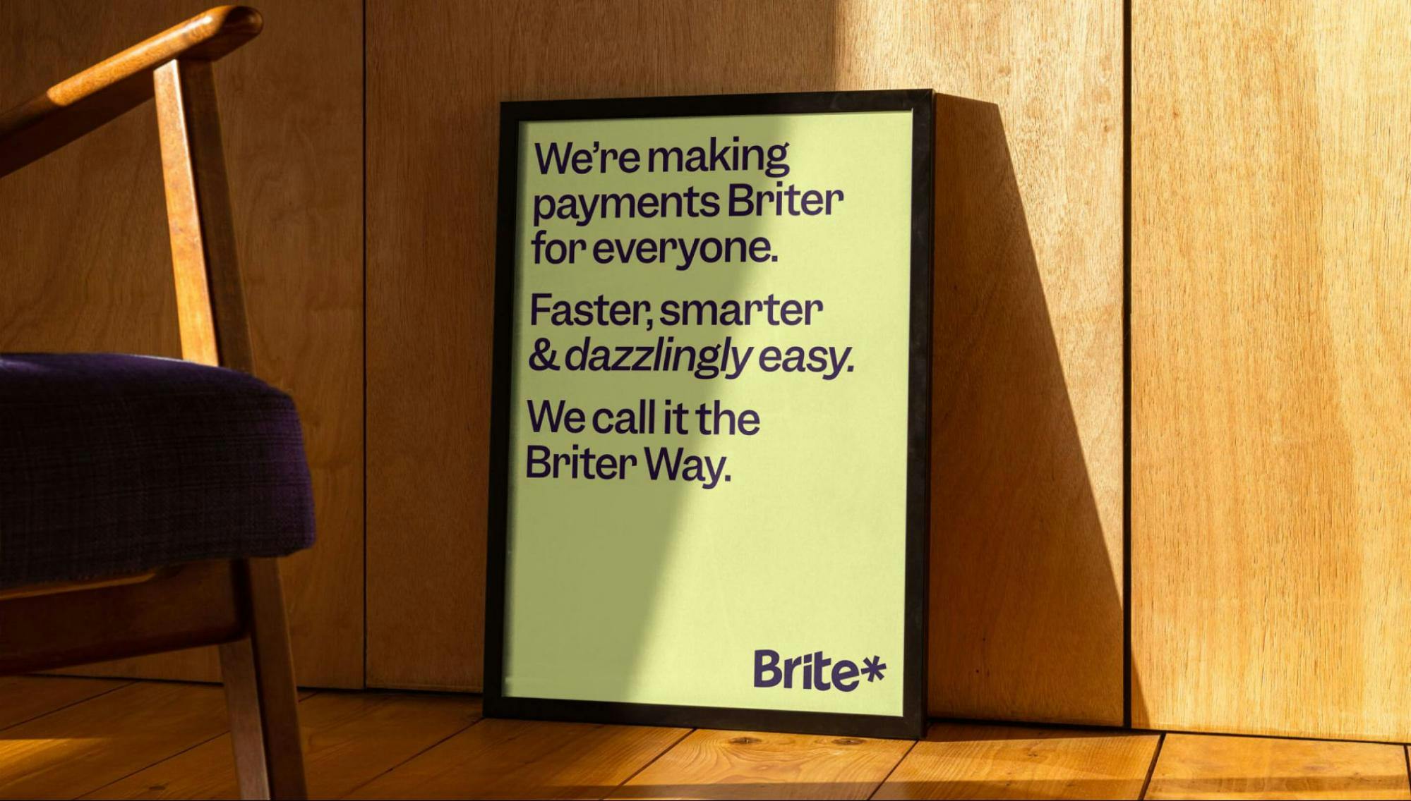
"However, we soon realised that this branding didn't match the level of quality we wanted to convey for our product. As a B2B2C brand, we needed to do more. "
Therefore, in 2022, we undertook a complete rebranding process to develop a new brand identity that would better meet our needs as the company grows.

About this current rebranding, how did it come about? How did that conversation start?
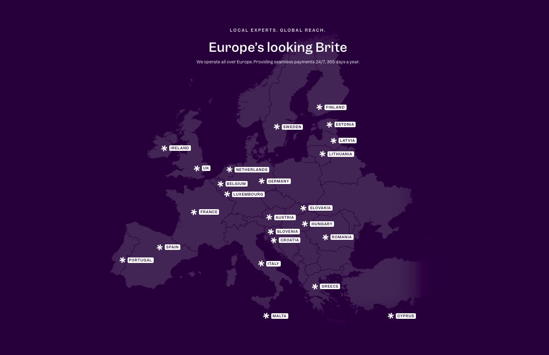
We realised that if we wanted to become a globally renowned brand, we couldn't just focus on branding ourselves to merchants, but also needed to consider the end users – the consumers that pay with Brite. This is often the case for B2B2C companies.
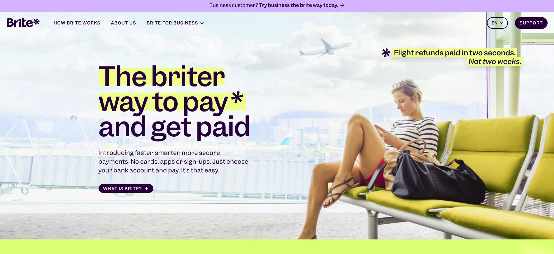
Brite Payments home page
Initially, our main priority was product development and commercialisation, understandably, as that is crucial in the early stages. Once we had established a clear direction and were ready to expand on a larger scale, we began the process of our new branding.
How did the rebranding process go? Was it all smooth, or did you encounter challenges?
While I haven't been involved in the full process, I've gained an understanding from both my team and my experience with a London-based agency. They proved to be an excellent partner, demonstrating attentive listening skills and an ability to grasp the strategic direction we sought for our brand.
Brite Payments website
However, our industry presents a unique challenge where people are naturally cautious about payments and money. This means we must cultivate a trustworthy and reliable image while also being appealing and authentic in order to foster genuine affection for our brand.
Brite Payments branding
I often emphasise that people buy from brands they know, trust, and love. Building this kind of brand requires careful consideration of branding as an essential tool, and it's not an easy task in a traditional industry.
How do you bring trust in a brand? What are the components of trust in your opinion?
Creating trust is crucial but takes time and effort. There are various ways to establish trust, such as partnering with a reputable brand, which can enhance credibility instantly.
Brite Payments website
However, becoming a category leader in the industry is vital for merchants and customers alike to trust your company.
To achieve this, you need to provide sufficient and well-presented information online, assuring customers that your company is reliable. For merchants, you must deliver accessible and relevant content that helps them understand and choose your payment product.
"Consistency is key in branding when creating trust. You must maintain a consistent and appealing brand image that sets you apart from the competition."
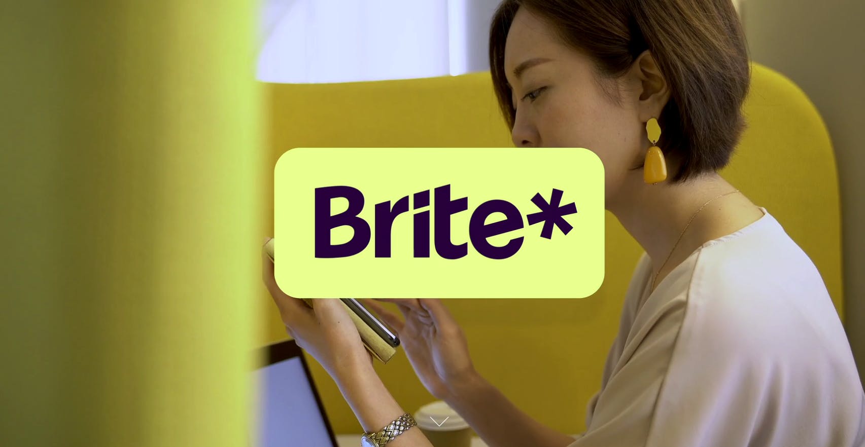
A big change was to your logo. Can you tell us how it was conceptualised? Why the asterisk?
Our logo must be instantly recognisable, conveying the positive and inspiring qualities that we want associated with our brand.
Brite Payments logo
It needs to be clear, fast, and brilliant to capture attention, especially in the small space of an ecommerce checkout amidst other providers; this is why our payment badge is yellow. We strive for a logo that is eye-catching yet remains legitimate, even when presented in a small size.
Regarding the asterisk, it serves as the visual symbol for our brand philosophy, "The briter way" and is a fundamental component of our logo, ensuring immediate recognition.
Brite Payments poster
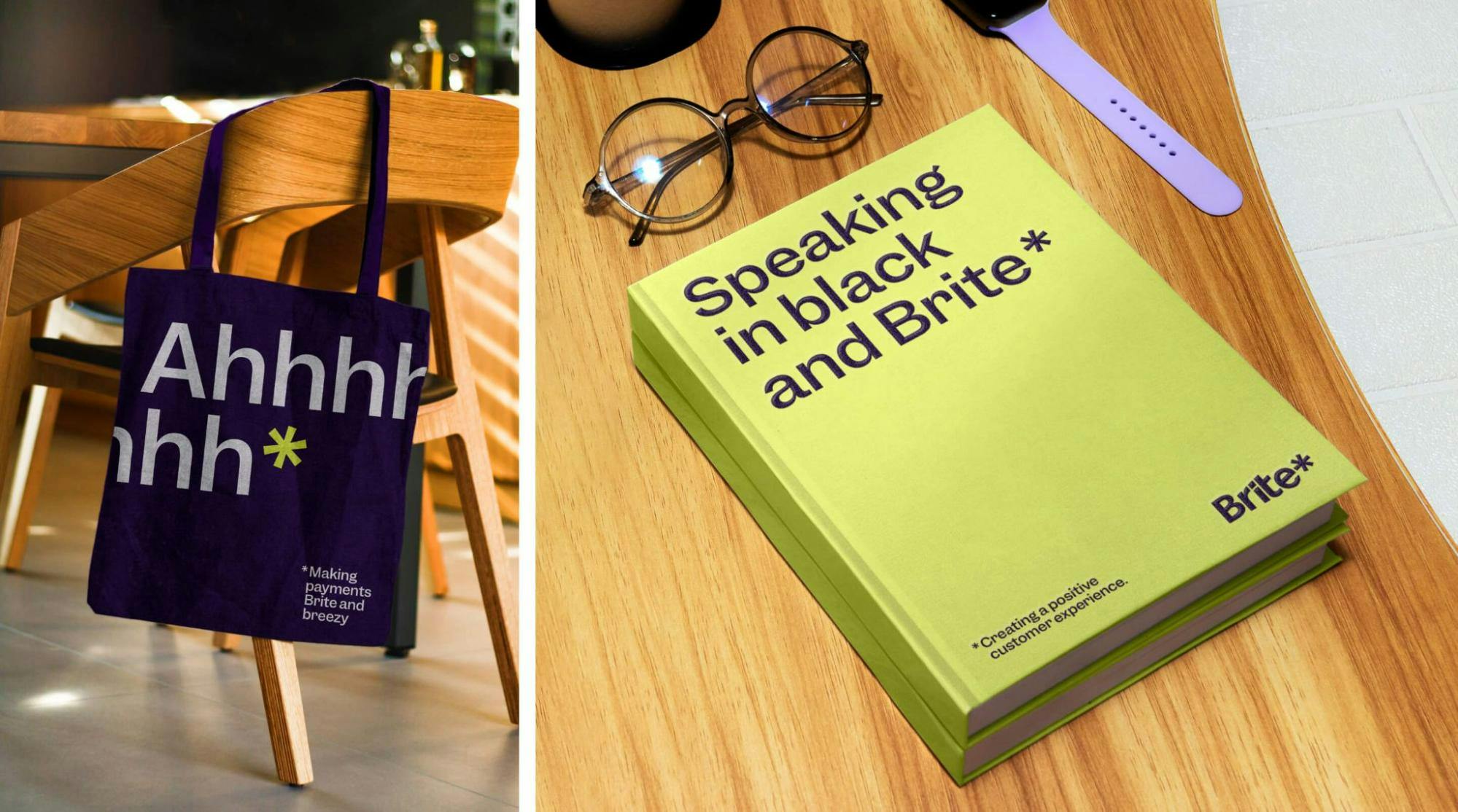
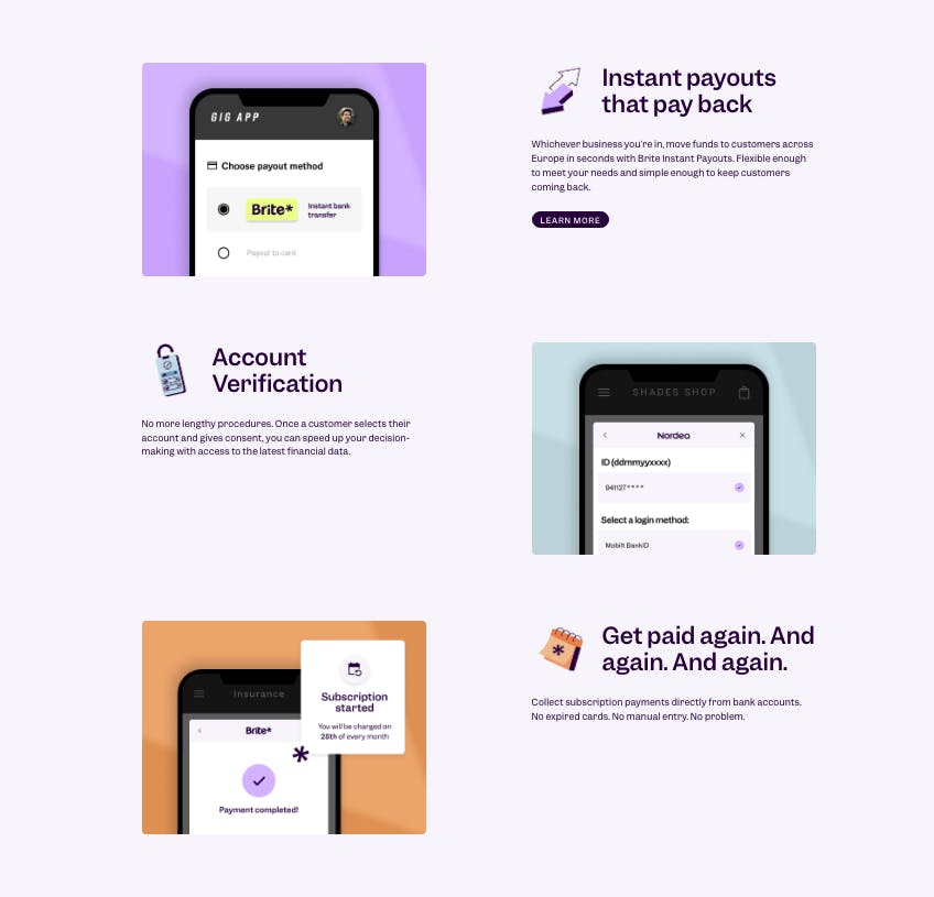
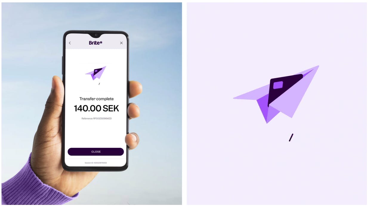
The asterisk draws the audience in, highlighting key information and subverting the traditional use of an asterisk in the world of payments. This versatile asset is utilized throughout our brand, in messaging, illustrations, photography, and background layout, identifying key benefits and reflecting our brand identity in a visual form.
How about your colour palette? How did you land on these colors, and what do they say about your brand?
We aimed for our brand to stand out, while also considering the surroundings. It was important to avoid colors that were already claimed by other brands, so we explored and settled on a unique shade of yellow that suited our identity.
Brite Payments merchandise examples
However, we were mindful not to choose a yellow that was too bright, as it could be associated with lower quality products, which was not reflective of our premium offering.
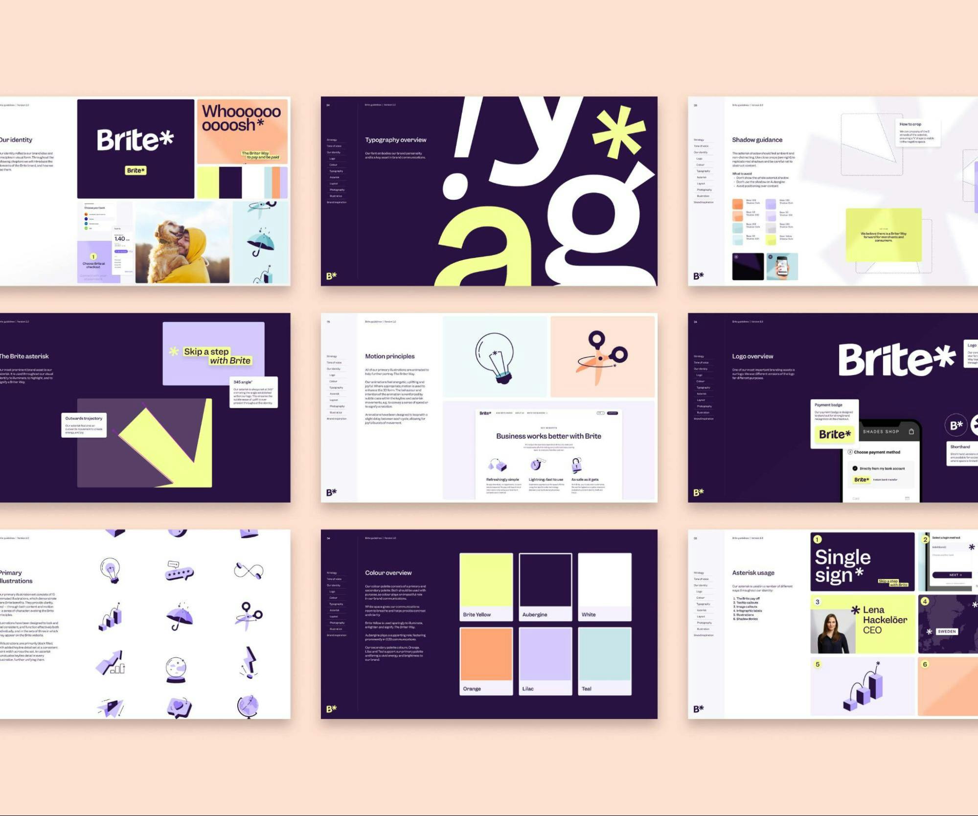
Through several iterations, we arrived at our current color palette, which prominently features white. In our B2C profile, white is crucial in providing ample space, clarity, and context. Yellow is used sparingly to highlight and illuminate certain elements. Meanwhile, aubergine plays a supporting role.
Some of Brite’s colors
On the other hand, for our B2B profile, we see white being the dominant colour but supported with aubergine in a secondary role. Our palette also includes secondary colours like orange, lilac, and teal, which add vibrancy and brightness to our brand.
Can you tell us more about other aspects of the brand like the font, iconography, and other visual elements?
We use a custom version of the Garnet typeface as our brand font. As for Google Docs and online usage, we utilise Franklin.

Brite Payments hero image
When it comes to photography, we have some guidelines that we follow to ensure high-quality visuals. For hero images, we prioritise full bleed with yellow tones to make the hero stand out.
We also pay attention to composition, making sure to draw attention to the subject and leave plenty of room for headlines. To avoid clutter, we aim for at least 50% clear space in the hero image.
Brite Payments visual elements
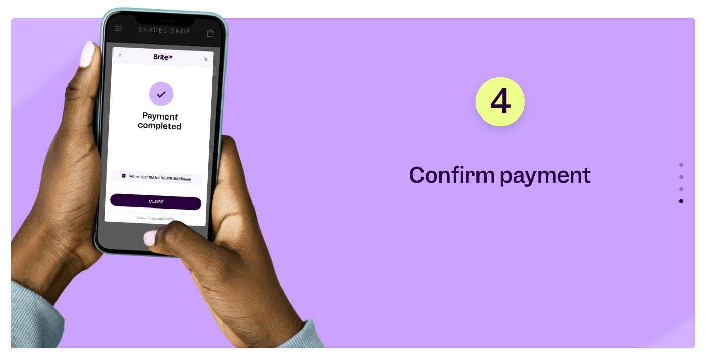
For product imagery featuring hand-held devices, we steer clear of overly bright or artificial lighting, low contrast, or busy backgrounds. Instead, we strive for natural poses and neutral backgrounds. Additionally, we use an asterisk shadow overlay to align with our brand.
Overall, our goal is to create images that are visually appealing and engaging while staying true to our brand's aesthetic.

