


Teodora Gavrilut, Chief Operating Officer at Creatopy, who talked about involving the whole team in their rebranding, their ‘Glow’ as a representation of that creative “Aha!” moment, and the challenges in defining a new brand.
Could you introduce us to Creatopy and its beginnings as Bannersnack?
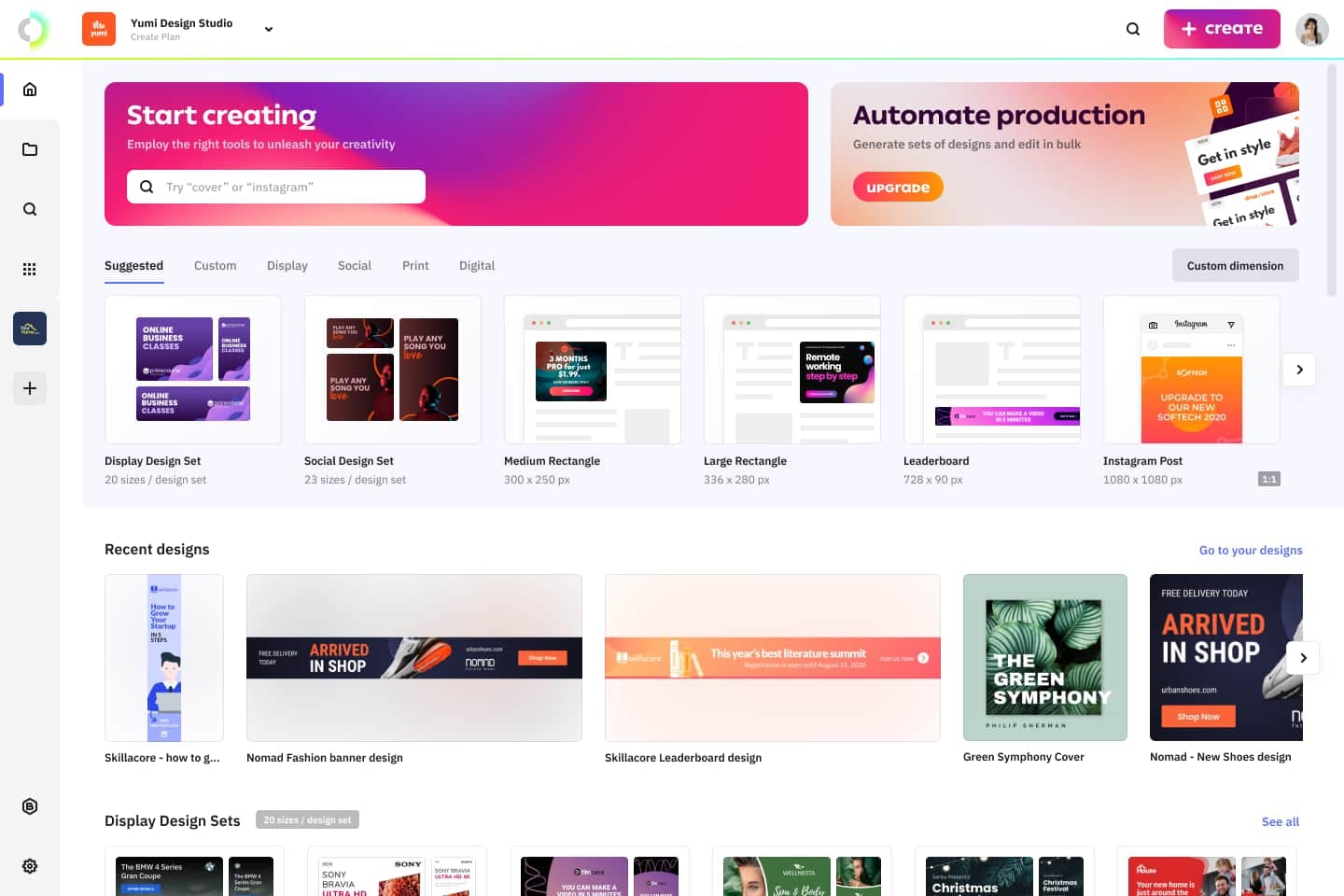
The company we now call Creatopy is a SaaS that started out in 2008 in a small city in Transylvania under the name Bannersnack. It was founded by Romanian entrepreneur Gabriel Ciordas.
The goal was to build a platform for web developers that creates online banners quickly and easily.
Bannersnack developed throughout the years, managing to help more than four million users and Fortune 500 companies make powerful designs for their advertising campaigns while also growing to become a bootstrapped company of more than a hundred employees.
However, by 2019, we came to the conclusion that the product was too small for our ambitions. That was how we decided to go through a full rebranding process, changing the name and the visual identity while upgrading our mission and vision statements.
What was the rebranding process like? Were there any challenges you experienced?
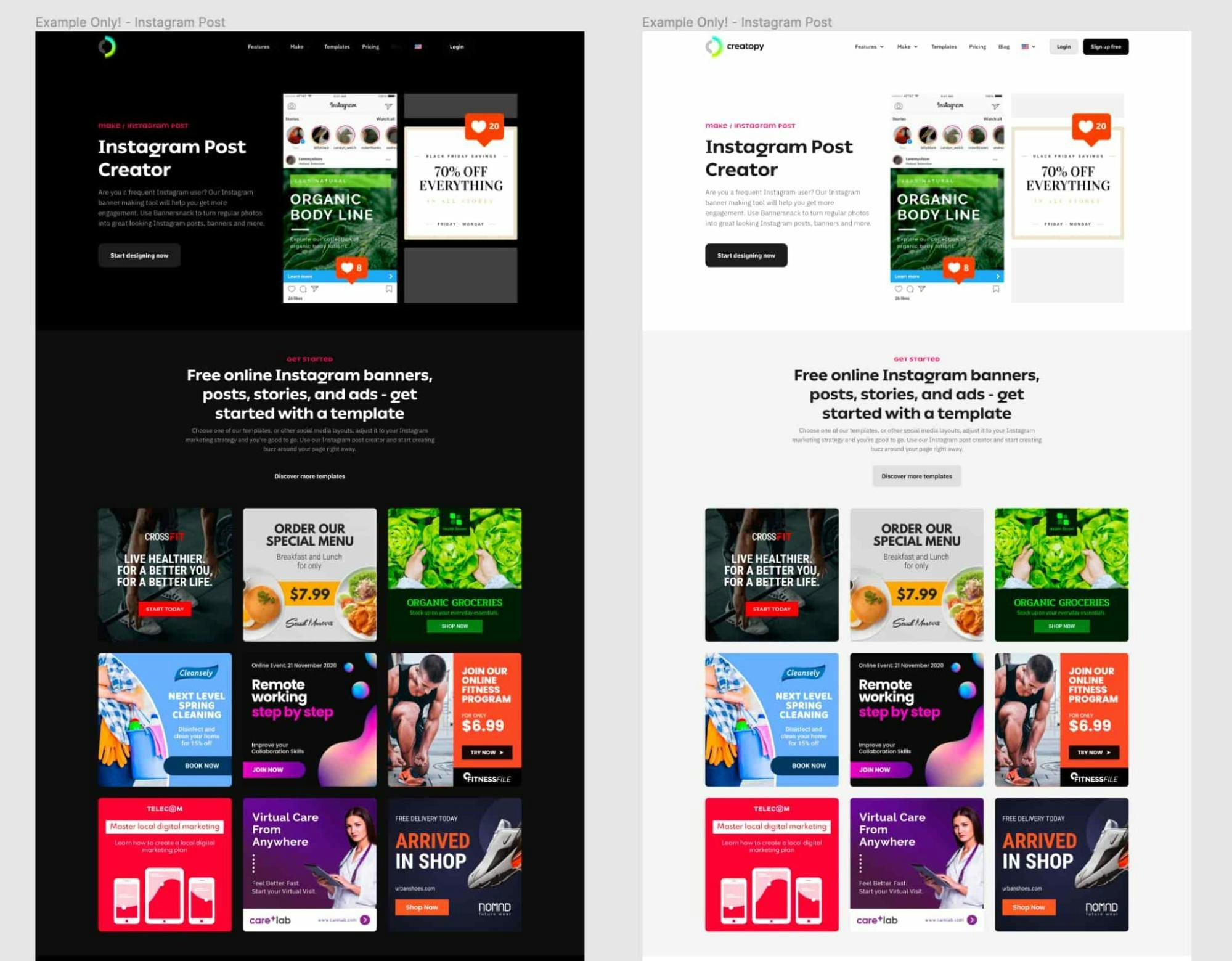
We enlisted the help of the team at Brandient, a mobile task force of multidisciplinary experts specializing in brand innovation in emerging markets and industries.
With their help, Creatopy was born.
A blend of two words, “creation/creativity” and “utopia,” the name stands for the concept of perfect creation and vast imaginary potential--the best place for creativity.
The brand was revealed internally in January 2020 in a brand engagement session with all employees. Soon after, we started working on the transition. However, in March 2020, Covid-19 was declared a pandemic, which meant our already complex rebranding process became more complicated.
We shifted to remote work. We adapted as best as we could—here, the newly adopted SAFe agile framework came in handy. Still, I’m proud to say our team did a fantastic job, and soon, we set the deadline for the release of Creatopy into the world: February 8, 2021.
I also have a funny story to share here, a challenge if you will. Right after we decided on Creatopy’s identity, Figma revealed its rebranding, having the same typeface as we initially had—Whyte, from Swiss foundry Dinamo.
I guess it’s a brand designer’s dream to let imagination run wild when working with design platforms. It’s still funny to me, in a very good way.
What’s the story behind your new logo?
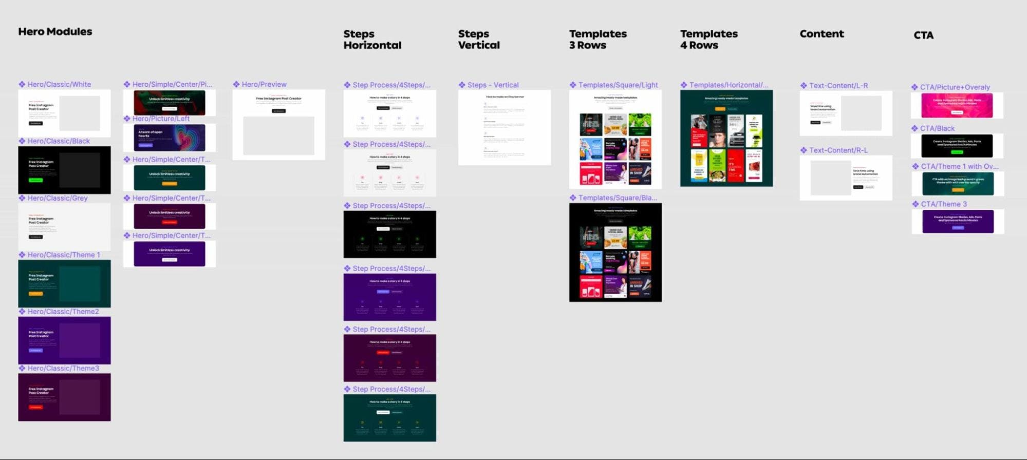
In accordance with our new brand idea, which is creative empowerment, our new logo dramatizes the core concept of creativity with the help of a widely-used metaphor: the bright light or the Glow.
The logo, designed by Ciprian Robu, a Senior Designer at Brandient, encompasses three main elements: the C-monogram, which stands for Creatopy and creation; the Ideal—a sphere (utopia) and lastly, the Glow signifying idea, creativity, intelligence.
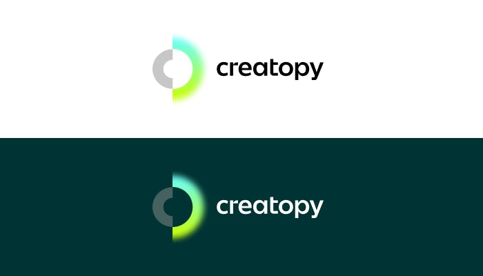
The logo is flexible. It has a glowing gradient, shifting its color from the primary green-cyan gradient to the next-in-line hues in the color circle—blue to indigo, violet to magenta, red to orange, and orange to yellow, like the Northern Lights.
The logo can also borrow colors from its surrounding elements, creating chromatic harmonies and demonstrating that the creative spark--or the Glow--can be found anywhere in nature.
The Glow, or the moment of inspiration, is our metaphor for the nature of creativity. With our cool esthetics and design minimalism, we aim to show glimpses of the visual magic and the great unknown.
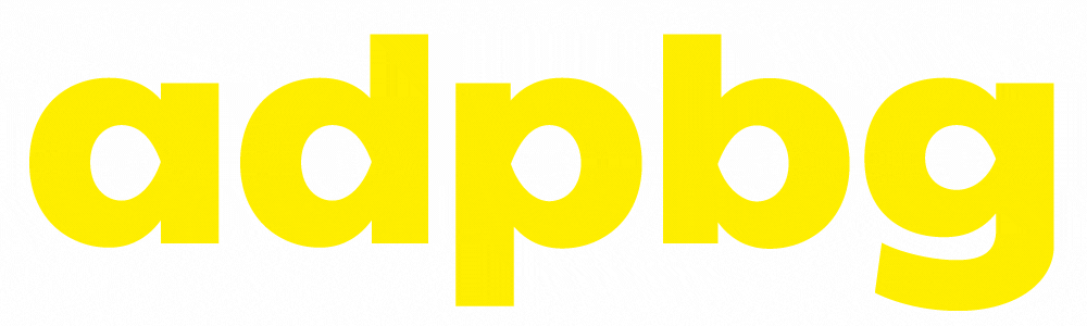
We also adopted a new wordmark, the Ping typeface, which is both humanistic and geometrical. unlike other geometric typefaces, it doesn’t reject the influence of the human hand. Its simplified letterforms are constructed with the least number of pen strokes. Designed by the Dutch foundry Typotheque, Ping has received in 2019 the Gold European Design Award.
How did you land on the design style you call the ‘Glow Update’?
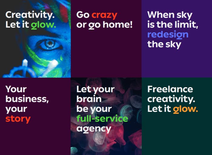
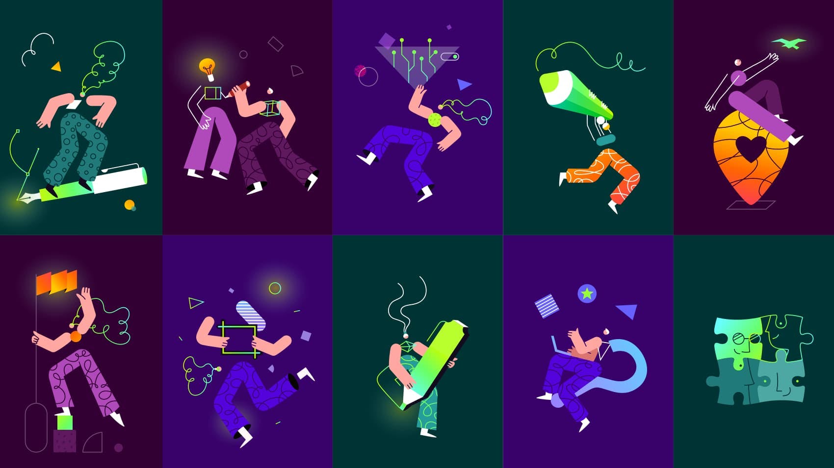
The Glow we are using represents the euphoria--or the “Aha!” moment of creativity, when your idea emerges--transposed into a key element of our design language. We used the Glow in contrast with a darker color palette to illustrate and show this effect.
Altogether, we wanted to emphasize this bold, modern, shining style.
We explored other initial creative directions, ranging from a more faded, geometrical style to a more playful, funky style to match the fun aspect of creating. However, as soon as we saw the ‘Glow’ approach, we knew from the start that it was the right fit for us.
It’s safe to say that this blurry, glowing style suits our communication and messages better and goes along with our new identity elements.
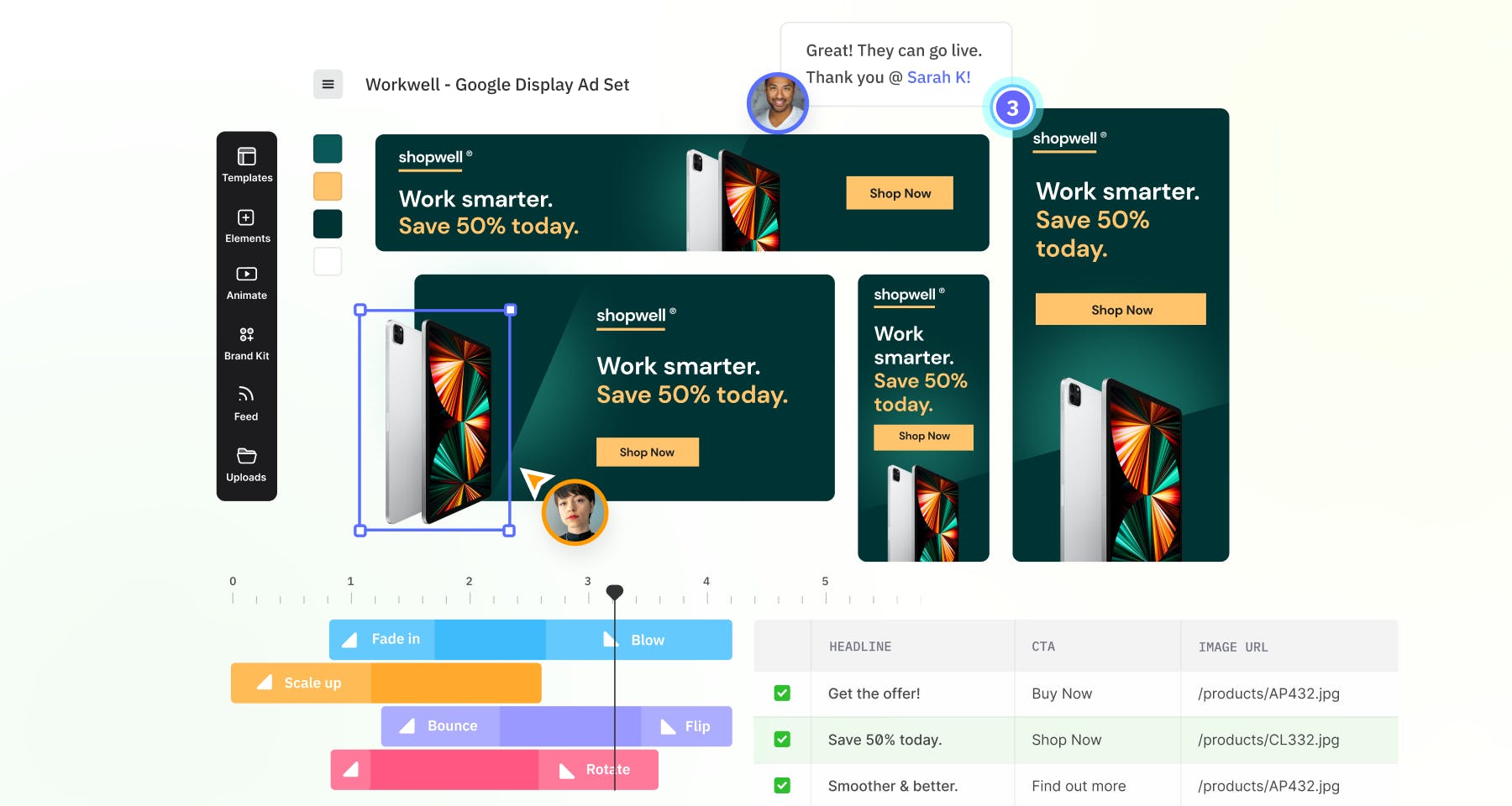
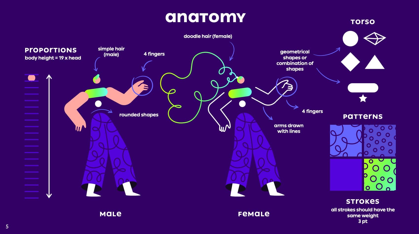
We also tried to infuse this into other visual elements like illustrations and some UI elements, banners, and digital advertising, to go along with the general ‘Glow’ concept.
How do your company values reflect on Creatopy’s branding?
Our five values are the foundation of what we believe to be Creatopy’s organizational behavior, so I guess it’s safe to say that these are internal values we display so that people who want to join our organization know what we expect from them.
They are used throughout our internal communication regularly. everything we do internally and externally reflects these five values of ours. They are:
- I belong to an A-team of beautiful minds and open hearts, allowing me to think sharp, to glow bright, and to stay agile.
- I mean technology, which is pretty much self-explanatory, given that we are a tech product. We live and breathe tech.
- I care about delivering the best customer experience. Our product couldn’t have gotten to where it is now without our customer-centric approach, which is an asset because we were paying attention to what our community wanted from the very beginning.
- I create beautiful design is again, self-explanatory, for we are a tech product which is destined for creators and communicators.
- I love Oradea, our hometown—which is to say we get involved in the local community. We aim to make it grow and glow.
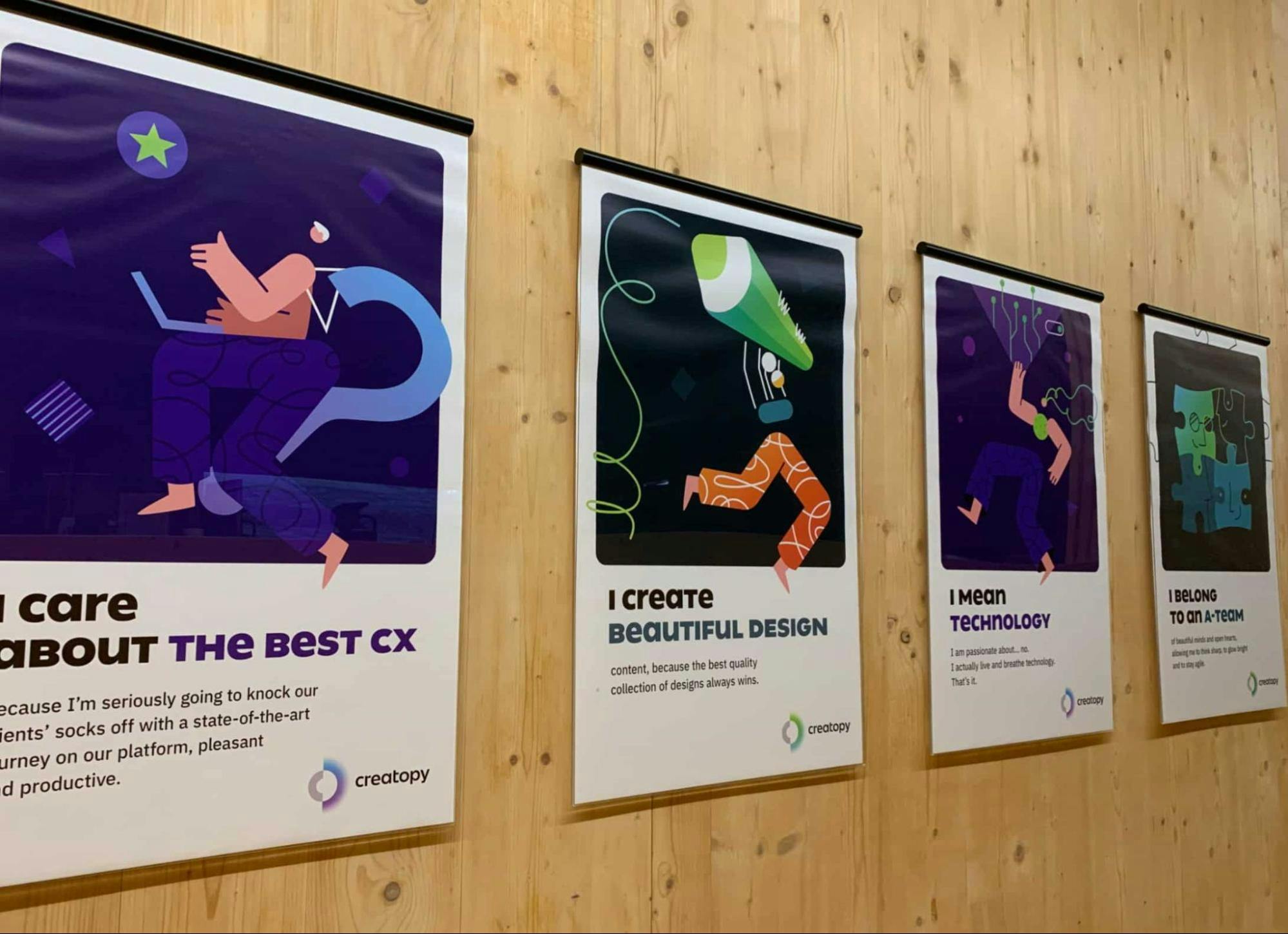
As soon as these values were announced, we used the new brand’s illustration design to display them all over our new office space, The Home of Glowing Ideas, which is Eastern Europe’s largest low-energy building.
What would you say is your biggest learning or takeaway from this rebranding?
The rebrand was a challenge from start to finish. However, if I were to pick the most complex part in the whole process, I’d have to go with the actual implementation, starting with the education and acceptance from the entire team.
You have to make sure you’re conveying the same messages and understand all the layers to get people on board, from the inside out, to really build upon this identity and develop the messaging.
It’s a tedious process because you need to make sure everyone knows and understands your brand’s mission, core values, and communication guidelines.
Designers need to embrace the same style, art direction, and stick to your systems, assets, and processes.
What worked for us was organizing creative sessions with the entire design team, pushing the boundaries of the new brand. We worked especially hard on training the team and getting them to use the same system and implement the same rules.
In the words of our Head of Design, Gery Meleg, “Consistency is key. Rules are essential. Creativity is mandatory.”
What’s next for Creatopy?
We have big plans and dreams for Creatopy. We want to be the digital collaborative tool that empowers its users in every aspect of their creative process. Creativity is serious business. Creativity is boundless.
Yet we’re all challenged in today’s world to explore our creativity when most of our time is spent on mundane, repetitive work.
So it’s safe to say that addressing the burning question of the millennium and the mantra for future success for anybody—“How can we do more with less?”--is what we’re focusing on.
‘More’ usually doesn’t mean ‘better,’ and this is another essential part of our future development. Living in a cookieless world, where personalization and creative differentiation are critical, we’ll focus on understanding expectations, emotions, and future needs that ultimately drive that increased number of leads or conversions.
Whether we’re talking about users being brand consistent, scaling or automating design tasks, or collaborating with all stakeholders, we want them to find in Creatopy the all-in-one, encompassing solution.
We’ll keep adding innovative solutions and cutting-edge technology so that our community of makers can see the added value Creatopy brings to the table.