


Sisian Boghossian, Head of the Tourism Committee for the Ministry of Economy of the Republic of Armenia, and Nairi Khatchadourian, Founder of AHA Collective share the fascinating process of rebranding their beloved country and using sound as basis for a visual identity.
How did this rebranding come about? How did that conversation start?
SISIAN BOGHOSSIAN: Armenia has never had a consistent destination brand. At the very most, we had an old logo that was recycled over the years with different colors.
But branding is so much more than a logo. There was no storytelling, no consistency, no single message being expressed where Armenia could represent itself in all the different branding elements: logo, tagline, colors, tone of voice, fonts, music, etc. The essence of the brand didn't exist for Armenia before now.
There is a positive trend over the last few years where travelers are becoming more interested in finding out more about Armenia. And so this was the time for us to create an identity for Armenia on an international level in order to become more recognizable. We've seen consistent growth in tourism - on average 10% year over year over the last 10 years.
Armenia is still a small country with a 3-million population. There are still instances where you say, "Armenia" and they say "Romania," or "Albania." There's still that confusion of, "What is Armenia? Where is it on the map?"
From my perspective, that was the importance of us needing to create a unique brand, so much so that there's never going to be another mistake of what Armenia is or where it is on the map.

How did the rebranding process go? Was it smooth, or did you encounter challenges?
NAIRI KHATCHADOURIAN: It was a very enriching and interactive process. We did intensive research with focus groups and interviews with the target audience. The Tourism Committee had provided key target countries for Armenia from a tourism perspective.
We conducted interviews with the target audience, but it was also important for us to include locals: Armenians born in Armenia, repatriated diaspora Armenians, and foreigners living in Armenia.
Those are all the perspectives that were interesting for us to create the brand. It is important for the locals to have a sense of belonging with the new brand, both in terms of its storytelling and its visual identity.
We gathered different insights throughout the iterative research process from a country perception and experience perspective: What's the perception of the country from people who have visited? How about from people who have never visited? How do visitors experience their travel journey in Armenia?
SISIAN: The AHA Collective team had done tremendous research when I joined the project and I used that information as the basis for our creative brief which AHA Collective then used to begin their creative process.
For the creative process to succeed, there has to be an element of trust. Obviously, it's not always smooth sailing. Especially when it came to the tagline, we had many brainstorming sessions together with partners, the AHA team, and our own employees internally. Then, we went through multiple stages of focus groups. We also opened a poll online so we could gauge stakeholders’ views about the taglines.
However at the end of the day, the more you ask for feedback, the harder it becomes to make a decision. You get so many different opinions and viewpoints that it's easy to get lost. There's this element of pressure to want to get it right, because it's THE destination branding.
There came a point when we needed to make a decision in order for the project to move forward. We went back to the creative brief, what our objective was, and let that be the deciding factor. We ended up with Armenia, The Hidden Track. At first, I was a bit hesitant but eventually I came around.
I go back to, "You need to trust the creative process, you need to trust your creative people.''
I think when you have these projects and when you're a marketer, there's a tendency to assume you know it all and you know what's best. But I think when you have a creative agency, at some point, you need to let go a little bit and give them the trust, freedom, and room for creativity to shine and bring you what you didn't know you needed.
Let’s talk about the logo. How was the previous one created and how is this new one different?
SISIAN: We used the old logo for over a decade. Armenia has a strong association with pomegranates. There's a tendency with countries that have a deep-rooted history and culture where they constantly fall back on symbols.
The apricot and pomegranate have always been a very strong symbol related to Armenia. And so, when you look at the old way of branding or marketing, there's a connotation that you need to always attach something that is strongly related to the country and literally put it in the logo, front and center. I appreciate subtlety, so the old logo for me was very outdated.
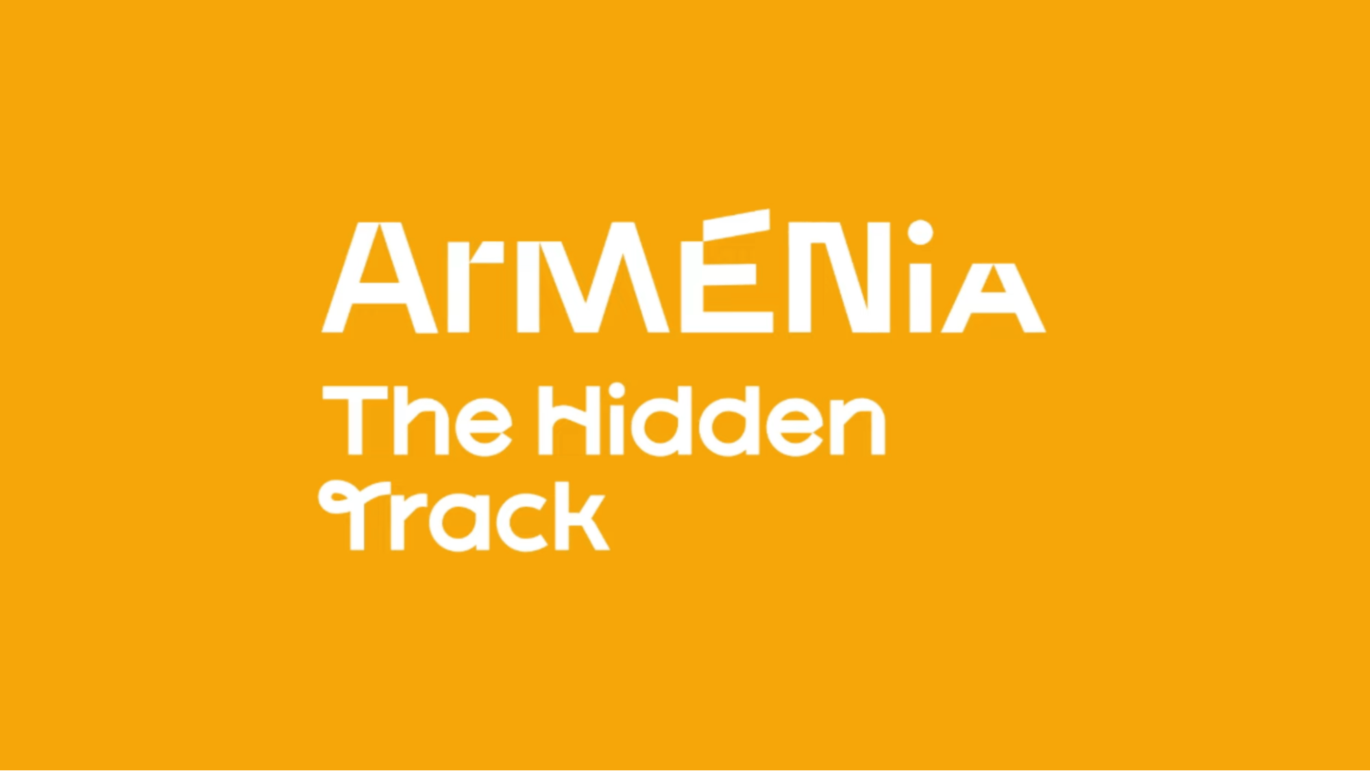
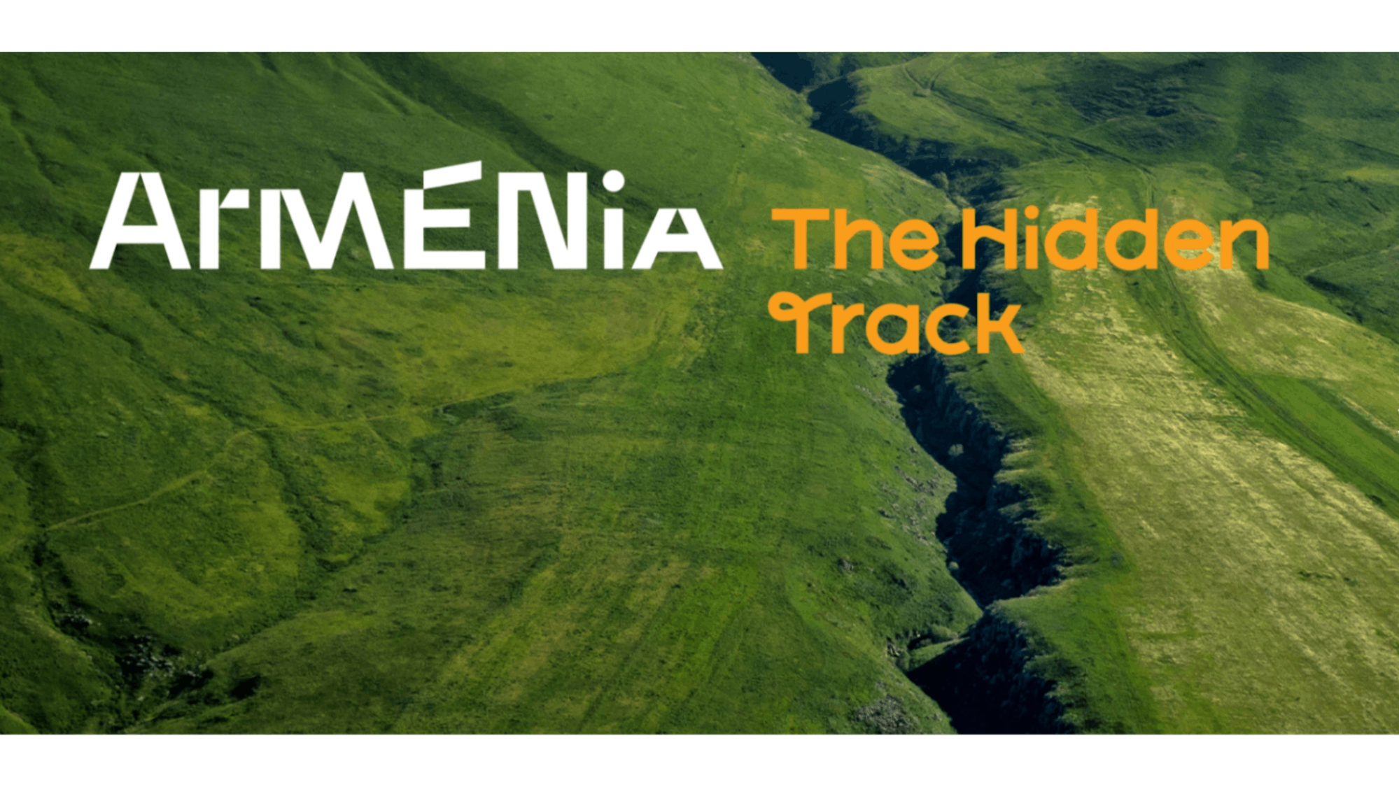
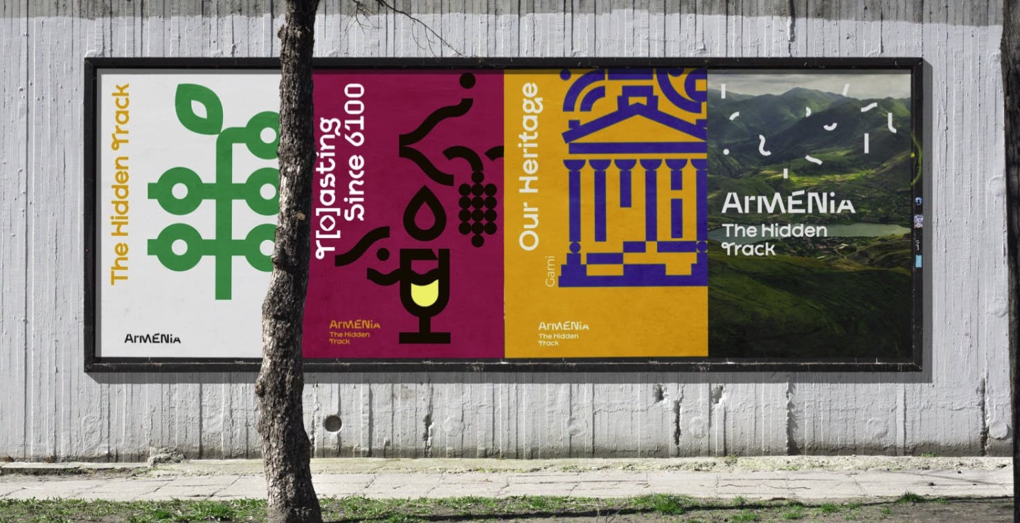
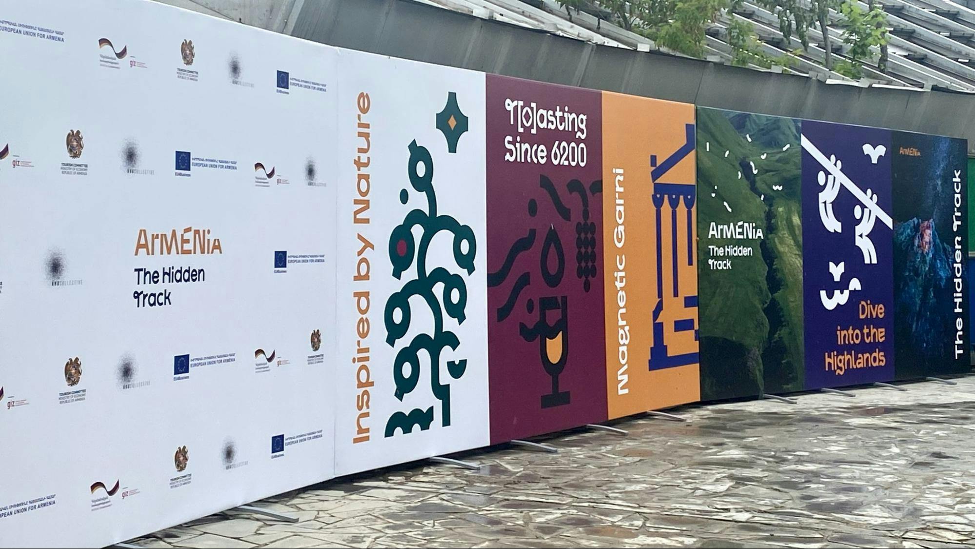
The new wordmark visually represents Armenia. Armenia has a very rugged landscape. It's very mountainous. It's also a contradiction. In one area, it's very mountainous and desert-like. Then you go to other areas and it's lush forests and beautiful greenery. So I think you also see the contrast in the writing through the rugged ‘Armenia’ and the softness of ‘The Hidden Track.’
Armenia is a hidden gem, off the beaten path, waiting to be explored and discovered. For us, that constant exploration was key. We wanted to bring forth this feeling of constant discovery, which is why you see multiple different ways of writing the letters.
NAIRI: We didn't create a logotype. We created a wordmark, because it's a typographic design based on the word "Armenia" with no additional symbol attached to it.
Armenia has always been associated with symbols, which sooner or later become cliché images devoided of their meaning. We wanted to go beyond the unique symbol usually embodying logos as tourism is about experiences, journeys of constant discoveries, and those rich moments have to be told visually with an equally rich visual system, which we aimed at creating.
Through the wordmark “Armenia” and its tagline “The Hidden Track”, we introduce the new typography named “Soundscape”. It is custom-designed for Armenian, Cyrillic, and Latin alphabets.
Sound plays a big part in this new brand identity. Can you tell us more about that?
NAIRI: In the data collected from the target audience during the research process, there were repeating patterns that resulted in valuable insights. One of the interesting repeating pattern that we had is that Armenia’s perception is connected with music.
Together with our collective, we broadened this initial insight to the concept of sound to highlight both its physical meaning (the vibration that propagates as an acoustic wave) and its socio-cultural layers (language, dialects, music…).
The entire brand story and visual identity elements are embodied in the brand manifest: an invitation letter addressed by Armenia to the world.
The tourism experience in Armenia is very sonic. The medieval Armenian monasteries hide acoustic marvels, each region greets people with its own dialect, the mountainous landscapes offer wild natural soundscapes, and one won’t leave Armenia without having sung folk songs with locals at a table! All those experiences are felt as intense sound wave vibrations to a visitor, which became the core concept of our brand. The idea of sound was translated into both our tagline and the entire visual identity.
We've conceptualized the visual identity as a built-in soundscape. That's why it's dynamic and rhythmic. From the wordmark design with the introduction of the “Soundscape” typography to its derivative flexible illustration system.
We have created a modular visual system in order for the Tourism Committee and all the stakeholders to be able to be flexible and to always present Armenia in a fresh, dynamic, and unique way.
We’d love to know more about the unique typography you’ve developed for this brand identity.
NAIRI: The brand’s wordmark introduces the unique typography designed specially for the Destination Brand of the Tourism Committee of the Ministry of Economy of Armenia. Entitled “Soundscape”, the typography is a dynamic typeface including alternative glyphs. A great number of the letters have alternates inside the same typeface family in order to provide a broader palette of typographic possibilities.
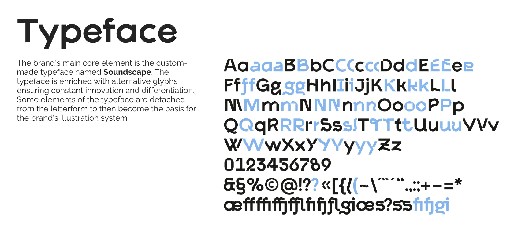
We designed alternative glyphs so that in any type of communication material for offline and online channels, the design looks always different yet within the same aesthetics.
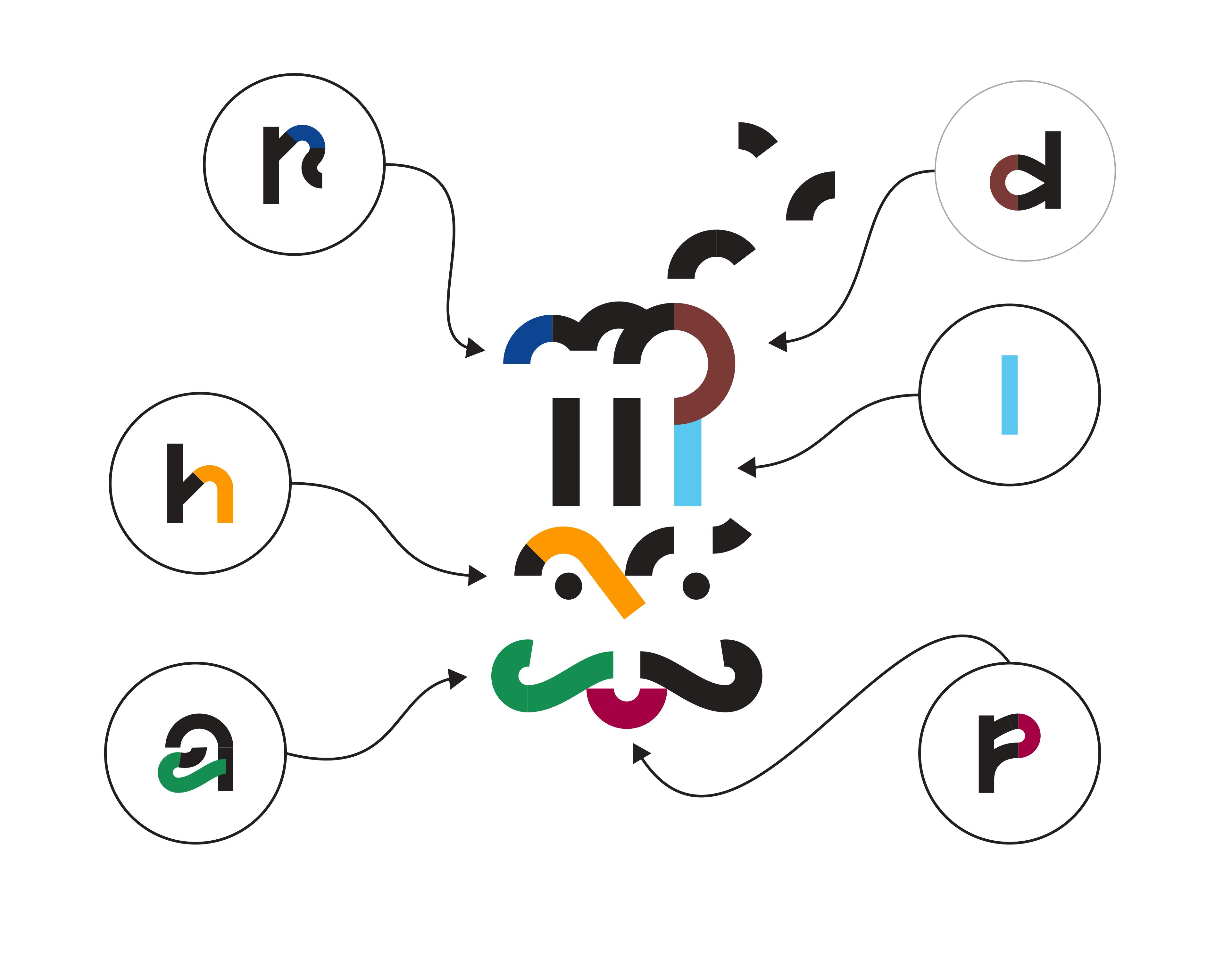
The “Soundscape” typeface became the basis for the illustration system of the brand as some elements from the typeface become patterns, which in turn become part of the illustration system.
Can you tell us more about how the illustrations and other elements were developed?
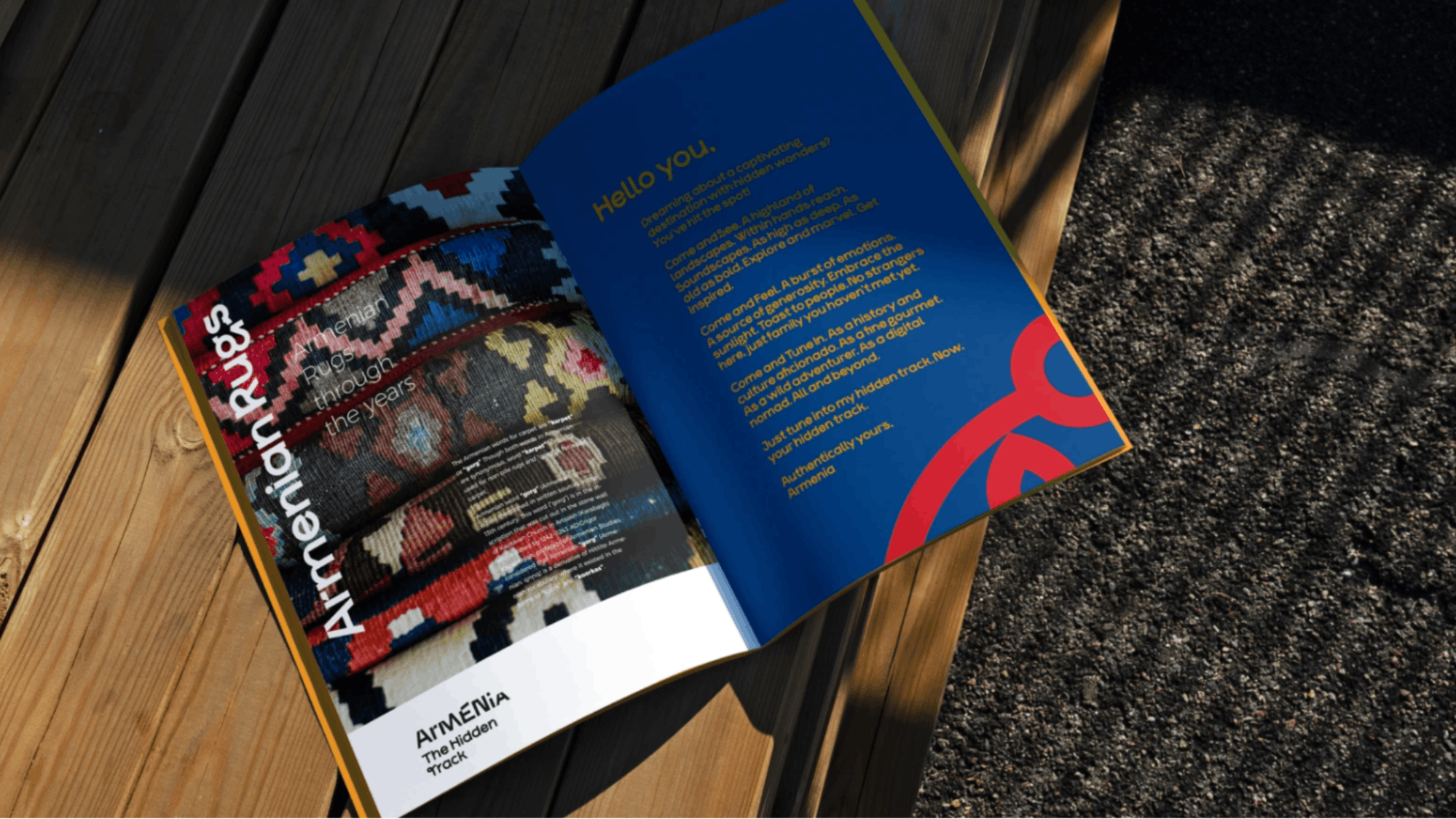
NAIRI: We have created illustration blocks for the four clusters that the Tourism Committee highlighted in the creative brief: nature, adventure, culture, and gastro.
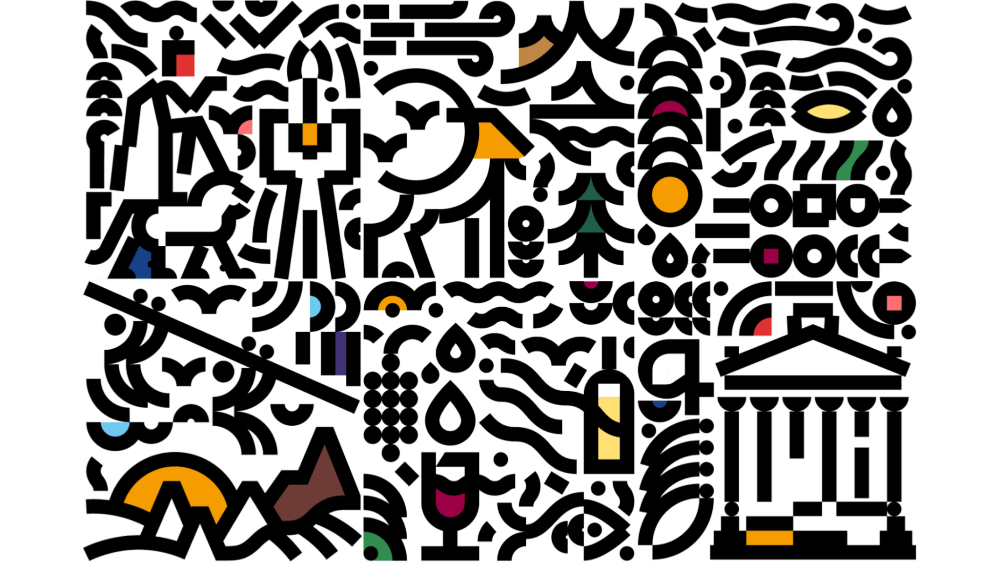
The brandbook includes a library of illustrations for the four tourism clusters but designers, based on the grid created for the visual system, can develop and expand it depending on the storytelling of the marketing campaigns. We have developed clear guidelines in terms of how to create illustrations, how to combine the illustrations with the typography, how they have to be placed, how they have to be matched with the color palette, etc.
How about your color palette? How did you land on these colors, and what do they say about your brand?
NAIRI: For each four tourism clusters, we developed four colors. In each cluster palette, there is the brand’s main color, which is the Wild Apricot: luminous, vivid, positive.
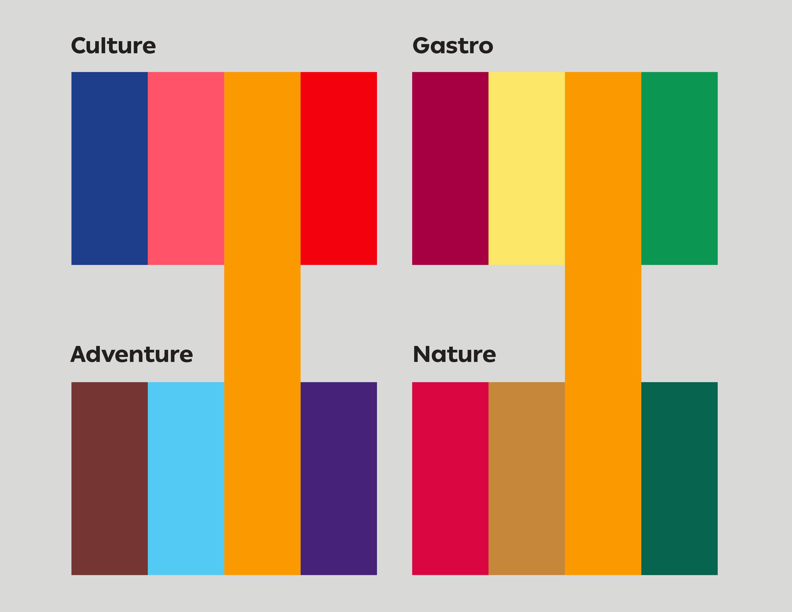
The main color, “Wild Apricot”, reflects the warm atmosphere tourists experience in Armenia. The four clusters’ color palettes embody the different assets the country has to offer.
Can you tell us more about ‘The Hidden Track’ and the significance of this tagline?
NAIRI: The brand is comprised of the visual identity and the editorial identity. The editorial identity was developed based on the tone of voice given in the creative brief: friendly, bold, passionate.
With the tagline “The Hidden Track”, we wanted to highlight not only the main competitive asset of Armenia as a tourism destination, its mountainous landscape and mesmerizing hidden trails, but also transmit the emotion people feel when traveling to Armenia: the emotion of surprise. In the recording industry, the “Hidden Track” was the secret piece placed at the end of the album in such a way to bring surprise to the listener.
This way, the tagline embody’s the concept of sound at the basis of our brand and reflects the brand’s vision: Make Armenia a Constant Discovery.
How do you approach photography for this visual identity?
NAIRI: We have developed three photography styles following the art direction of the brand. One of the styles is called “Focus” to attract the viewer’s attention on a specific topic, a detail, a fragment, to raise awareness and arouse attention on the value of Armenia’s diversity of wealth.
We have another photography style that is more atmospheric in order to introduce people to the aura of the country through photos that attract the viewer’s attention into an immersive environment evoking a sense of a bewitching journey to explore.
The third photo style is called “Pattern” through images of urban, rural, and cultural assets that have repetitive graphic arrangement of lines/shapes creating a targeted connection to the subject matter.
What advice would you like to give designers before starting a rebrand journey? What was the most impactful decisions you made?
NAIRI: I think it's very important to take the time to first do the research to have all your future creative directions grounded in reality. Of course, the research can take a lot of time but it's important to iterate the research and testing process with the target audience. The creative process becomes successful when the key insights and patterns from the research are integrated through different means into the creative direction and the brand’s story arc.
It's important to have a brand system that is not static, but is built with a modular approach through both the visual indentity and the editorial identity so that it will always evolve while always involving the beholders throughout the way.
Project Director is Nairi Khatchadourian, Art Director is Sargis Antonian, Strategy Designer is Tatev Petrossian, Graphic Designers are Artashes Avetyan, Edik Boghosian, William Karapetyan, Garegin Martirosyan, Copywriter is Artavazd Yeghiazaryan, Tourism Specialist is Lilit Khachaturyan, Photo Editor is Vahan Stepanyan, Photographers are Vahan Stepanyan, Karo Sahakyan, Tigran Mehrabyan, Davit Hakobyan, Davit Abrahamyan, Motion Designer is Davit Gyumishyan, Sound Design Director is Miqayel Voskanyan, Sound Designer & SFX by Raffi Hayrapet, Sound Production Assistant is Nate Nakhian, Musicians are Grigor Davtyan, Rafik Avagyan, Vardges Shahinyan, Nubar Hayrapetyan, and Sound Production by Oberton Music.
Read more about this project on AHA Collective’s website.
