


Sean McVey, the Chief Marketing Officer of Freethink, talks about improving brand perception and legibility, their ‘multimedia notebook’ theme, and finding the balance between ‘mild’ and ‘wild’.
Can you talk about how the publication and its initial branding come about?
Freethink was founded by a group of documentary filmmakers that wanted to build a different kind of news company. No politics. No gossip. No clickbait.
Instead, they wanted to tell stories of people making a positive impact on the world--entrepreneurs, activists, engineers, artists, and anyone working to shape a better future.
Our brand vision has always stemmed from the idea that we’re reporting news from the frontier of change.
Whether you look at our previous identity or the new one, they both reflect that vibe--adventurous, a bit chaotic, slightly rebellious, and definitely not perfect. Building the future is messy, and so is our brand.
From a design standpoint, we’ve been lucky to have incredible talent, mostly in-house or in our close network.
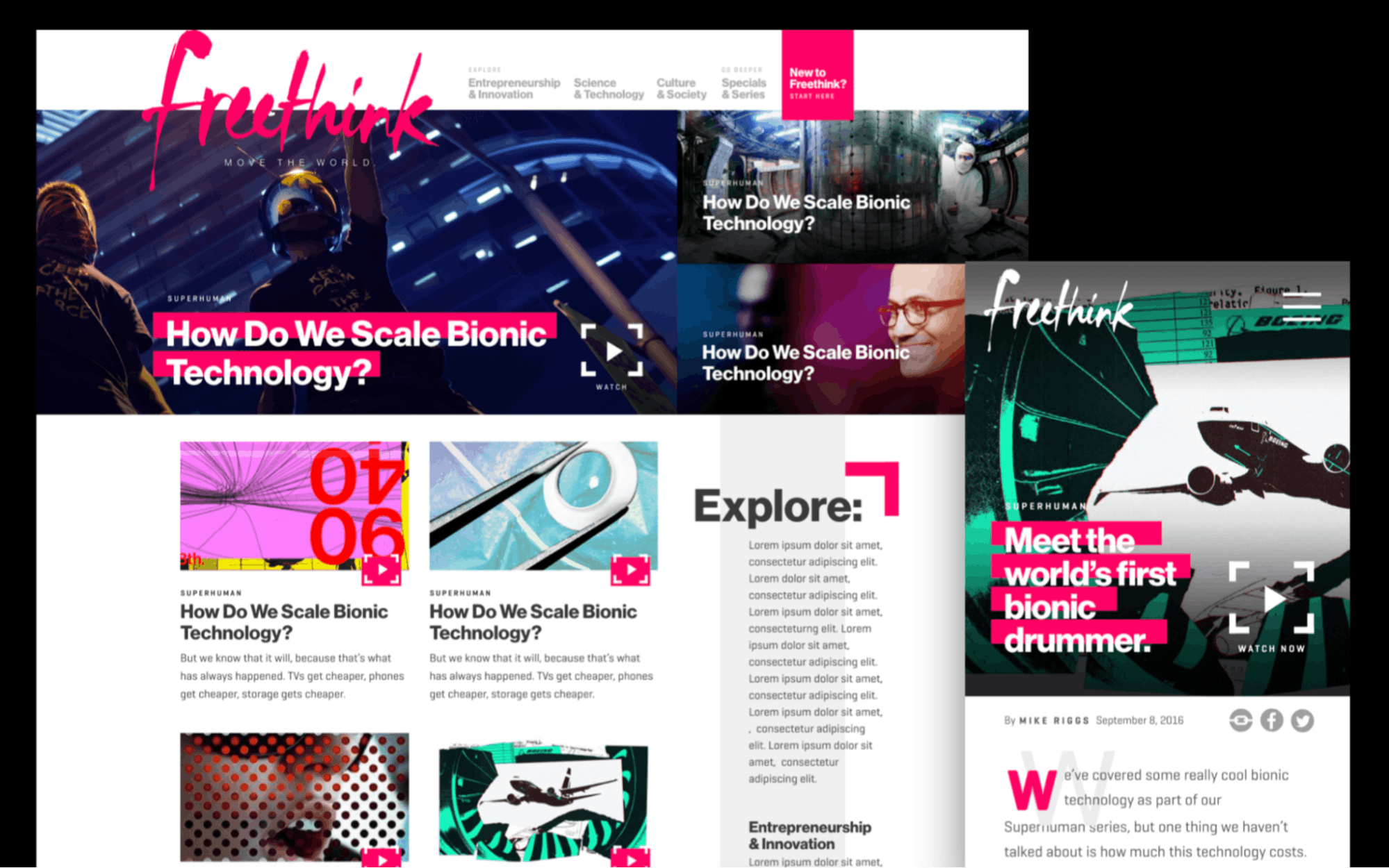
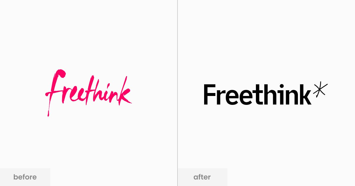
Our original mark, website, and design language were created by our CEO, Chandler Tuttle, who was a creative director in a previous career.
Our current brand, website, and design language were created by two fantastic designers, Taylor Simpson and Ana Kova.
What prompted Freethink’s rebrand?
Most of the Freethink team actually really liked (or loved) the previous identity. The wordmark, in particular, was around since the beginning and represented something special to those that started the company.
However, we decided to rebrand to address a few specific challenges. One was that we needed to be perceived as “news.” Freethink has a culture of being different and standing out from the crowd. And so historically, we leaned into being as unique as possible.
The bright pink hand-drawn work mark is a good example.
But what we concluded from user research is that most people didn’t know what we were at first glance. It wasn’t obvious to people that we were a modern digital publisher like Axios, Vox, or Wired.
Our conclusion is that we had to fit in before we could stand out. This was a theme throughout the rebrand.
Tell us about the rebranding process. How did you go about it?
We started out by getting 3 or 4 pitches from agencies and quickly realized that approach wasn’t going to work for us.
The feeling on our team was that this undertaking was going to take time and a ton of exploration. And frankly, we didn’t want an agency rushing us through revisions and hounding us about hours.
There is nothing worse than putting out a product that isn’t your best just because of a made-up deadline. Fortunately, everyone on our team got this and embraced the exploration process.
The team we put together for the rebrand and website design was intentionally small, but diverse in skillset. Everyone was in-house with the exception of Taylor Simpson, our Identity Designer.
For this project, our UX Designer & Illustrator is our now-Art Director, Ana Kova. Chandler and I also worked on this project as well as our Director of Community, Emily Cullinan, Engagement Editor, Jana Roose, Creative Strategist, Clifford Usher, Motion Designer, James Heredia, and Motion Designer, Vicky Chao.
We’d meet as a group once per week to explore, debate, and discuss what felt right and what felt like us as a brand. This process went on for months. Some ideas were mild and safe, others were crazy and uncomfortable.
It was important for us to cross that line of “oh that’s too crazy, even for Freethink.” We had to make sure to pull back on the craziness and not let it get too wild. At the end of the day, we needed to create a perception of a credible news brand.
The one thing that stood out to me in the process was how long it took. Everyone on the team had a voice and it was important for us to all feel good about the big decisions.
This approach of course took longer than having one person call the shots. But I think we all agree it was worth the wait to get that team alignment.
You mentioned that the idea behind your rebranding is “multimedia notebook”. Can you talk more about that?
Our CEO Chandler often talks about how building the future is really messy.
We tell stories of startups all the time that are breaking things, failing, pivoting, and then moving on to the next stage. Innovation is hard and certainly doesn’t happen in a straight line.
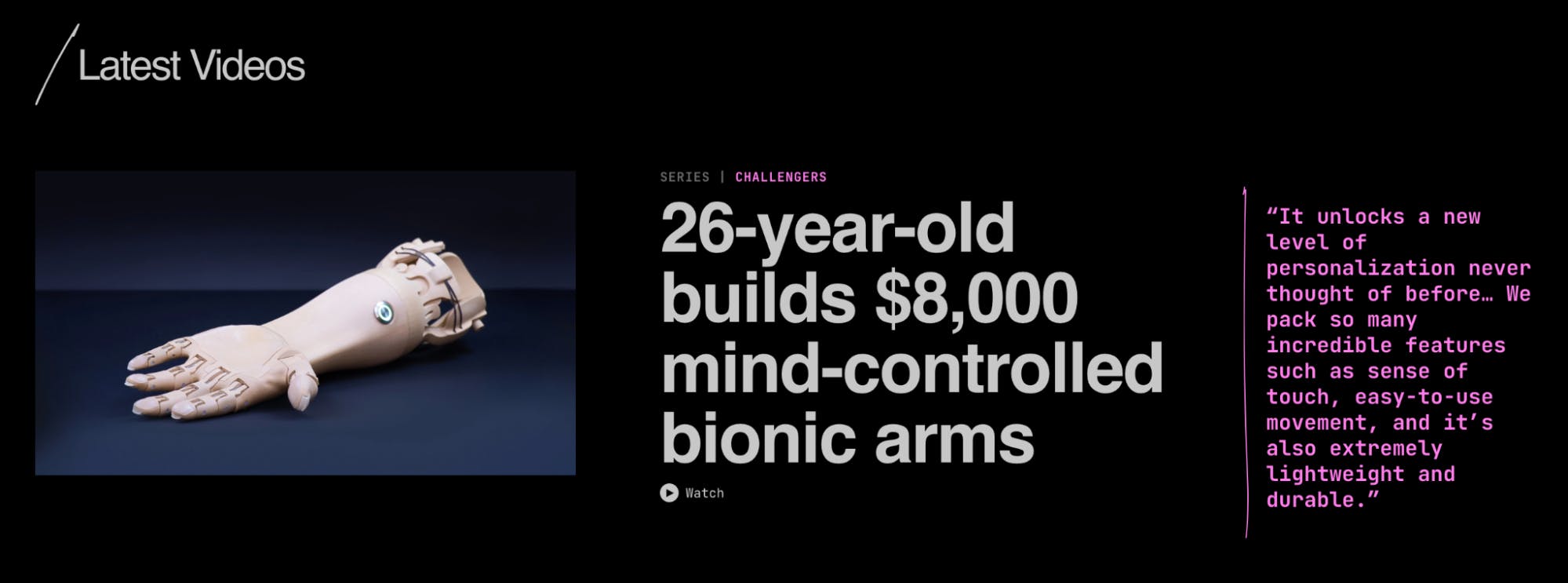
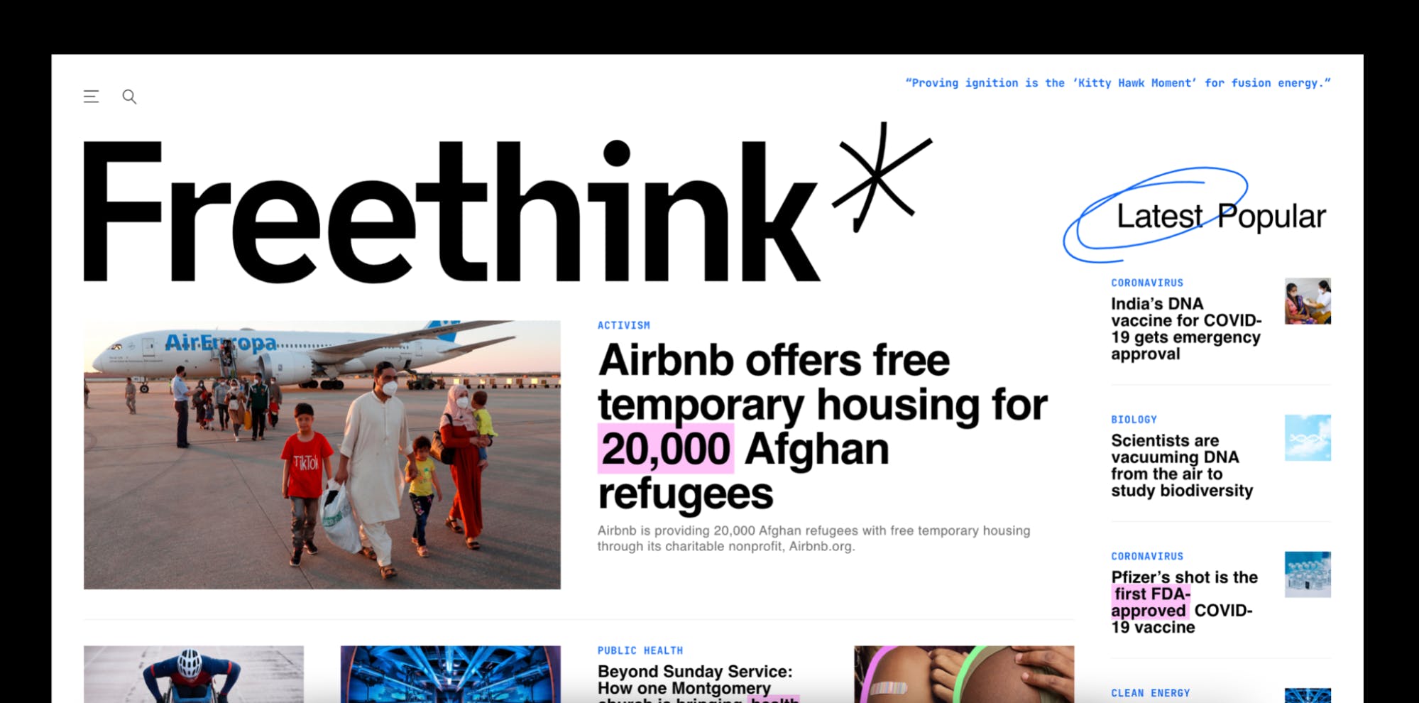
One way to visualize this kind of spirit is to use the elements of a notebook--the kind you carry around so you don’t forget ideas. Notebooks like this have highlights, mark-up, circled information, underlines, and messy borders.
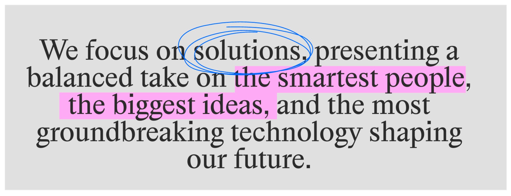
We wanted to create the digital version of that, mixing those notebook elements with interesting typography. On our site, you’ll find hand-drawn notes in addition to fonts like Archivo, Happy Times, Utopia, and Jetbrains Mono.
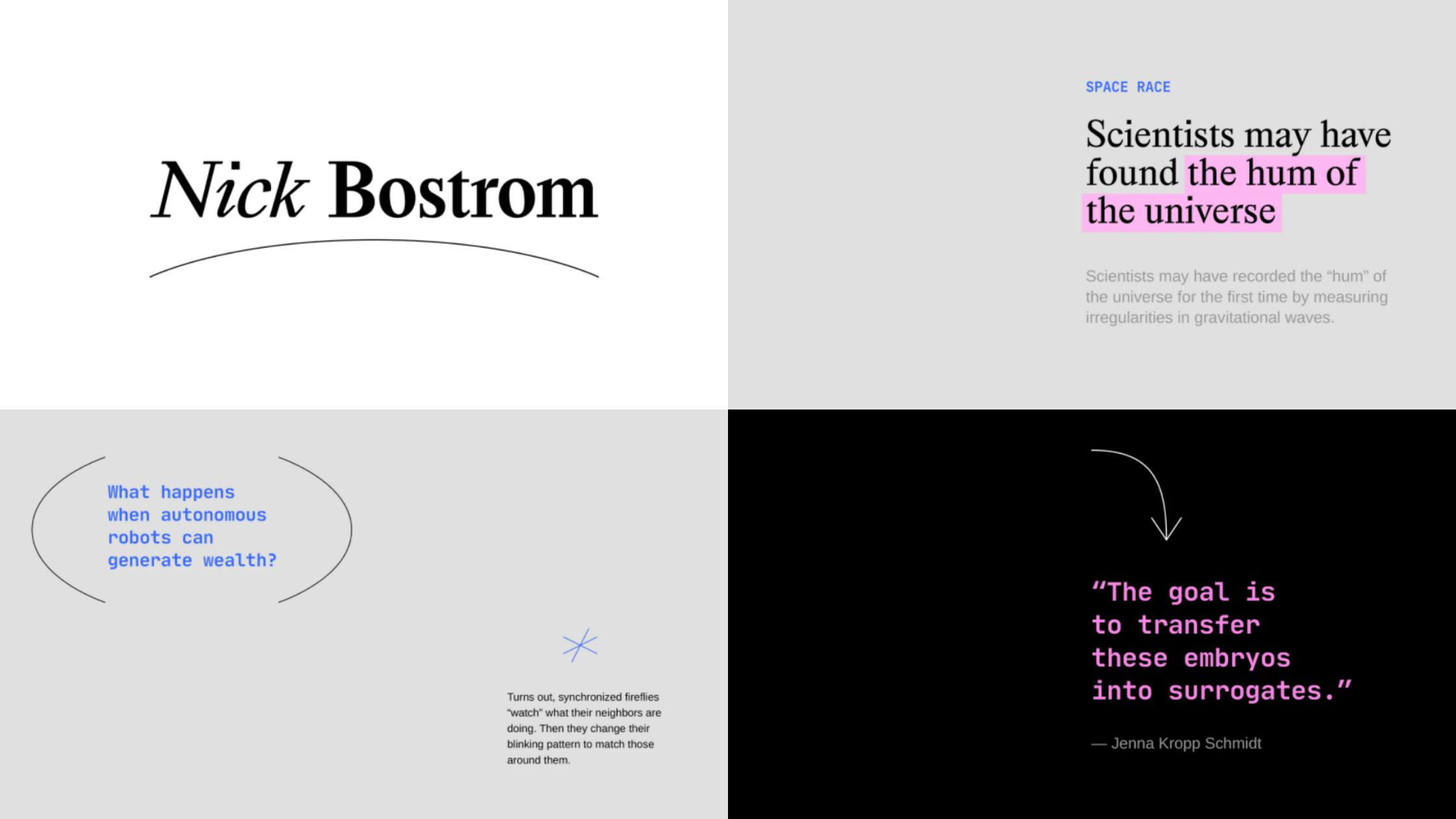
This style is not only distinctive, but also functional. We use the markup elements all of the time in our editorial content.
For another example of the multimedia notebook in action, check out our Freethink eBook on Documentary Storytelling. This is the first big asset our Identity Designer, Taylor, created using the new brand language.
Your logo has also changed. What is the meaning or story behind it?
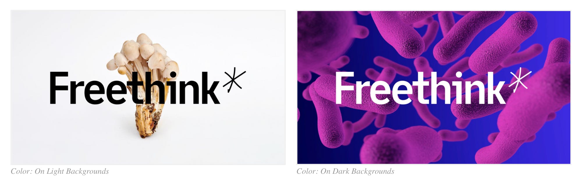
We designed our wordmark from scratch with the primary design challenge being legibility across platforms and devices.
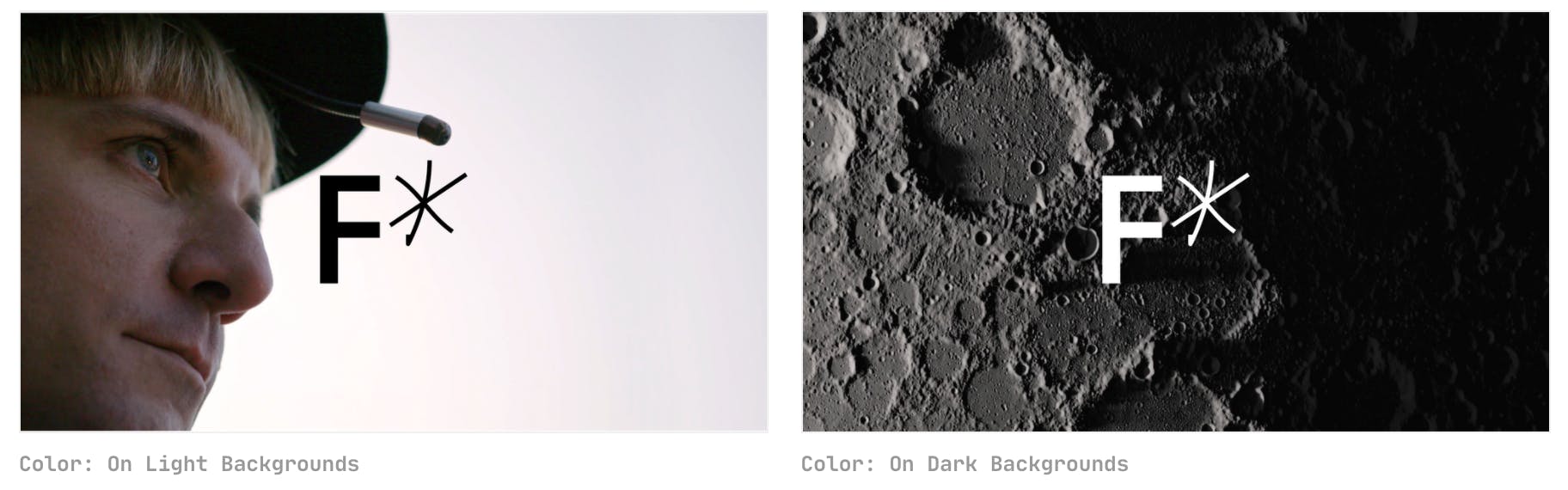
We kept hand-drawn elements, including the Freethink asterisk (a symbol we used in our old system), to maintain that fun, scrappy feeling. But especially at small sizes, designing for reliability was a huge win for us.

There were many debates on how “mild” or “wild” we should look. But ultimately I think we found a perfect balance.
Having an easy-to-remember icon is important for a publisher, especially since we have large social media audiences.
Previously, our icon was simply an asterisk. We evolved our icon to the F* which we feel is more ownable and works well in animation.
How is Freethink’s new look now more aligned with its values, voice, and mission?
Our mission is to reimagine the news for a generation that’s changing the world. And we do this through great content--short documentaries and articles.
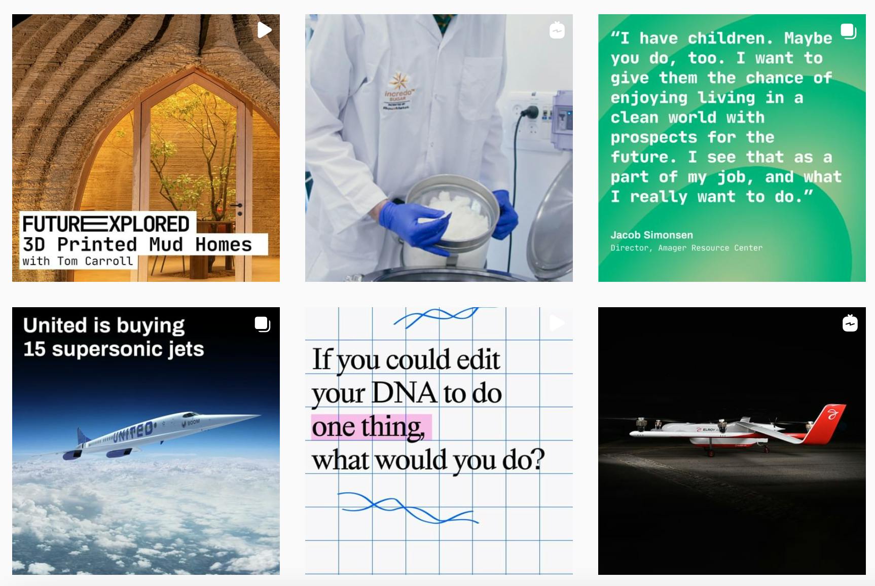
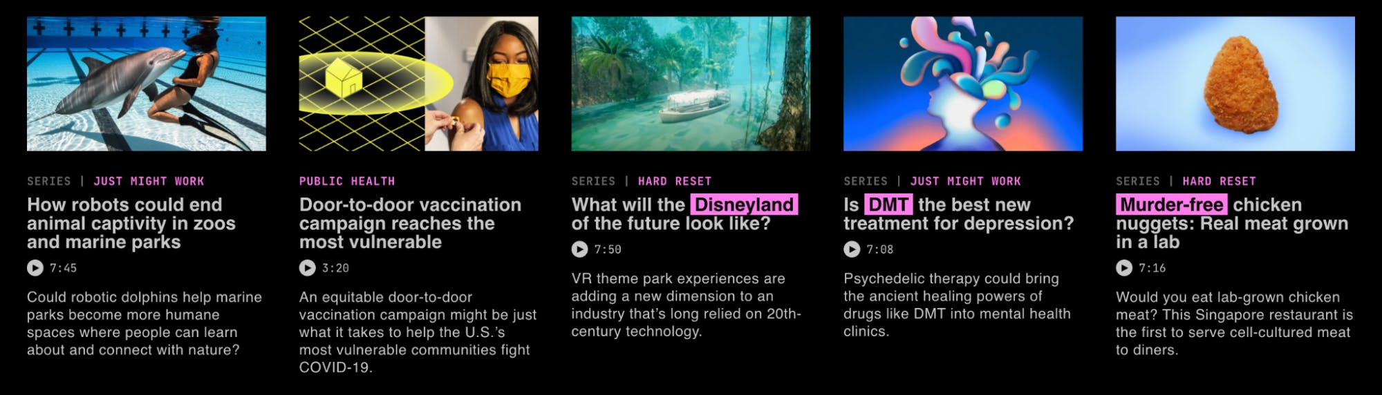
In many ways, our brand is our content. The thumbnail artwork and video packaging represent our brand voice day in and day out, and seeing our new identity reflected in our editorial content has been very rewarding.
One unique thing about being a digital publisher is that your design work needs to shine at a brand level, but also perform well.
If people don’t click on our videos and articles, we can’t complete our mission. Finding that balance of refined design vs. clickable news has been a fun challenge, and so far the content being published in our new brand has been performing better than ever.
We love your slogan, ‘Move the World’! How did it come about?
Our creative strategist, Clifford, came up with this tagline and it captures everything we hoped to express in a few words.
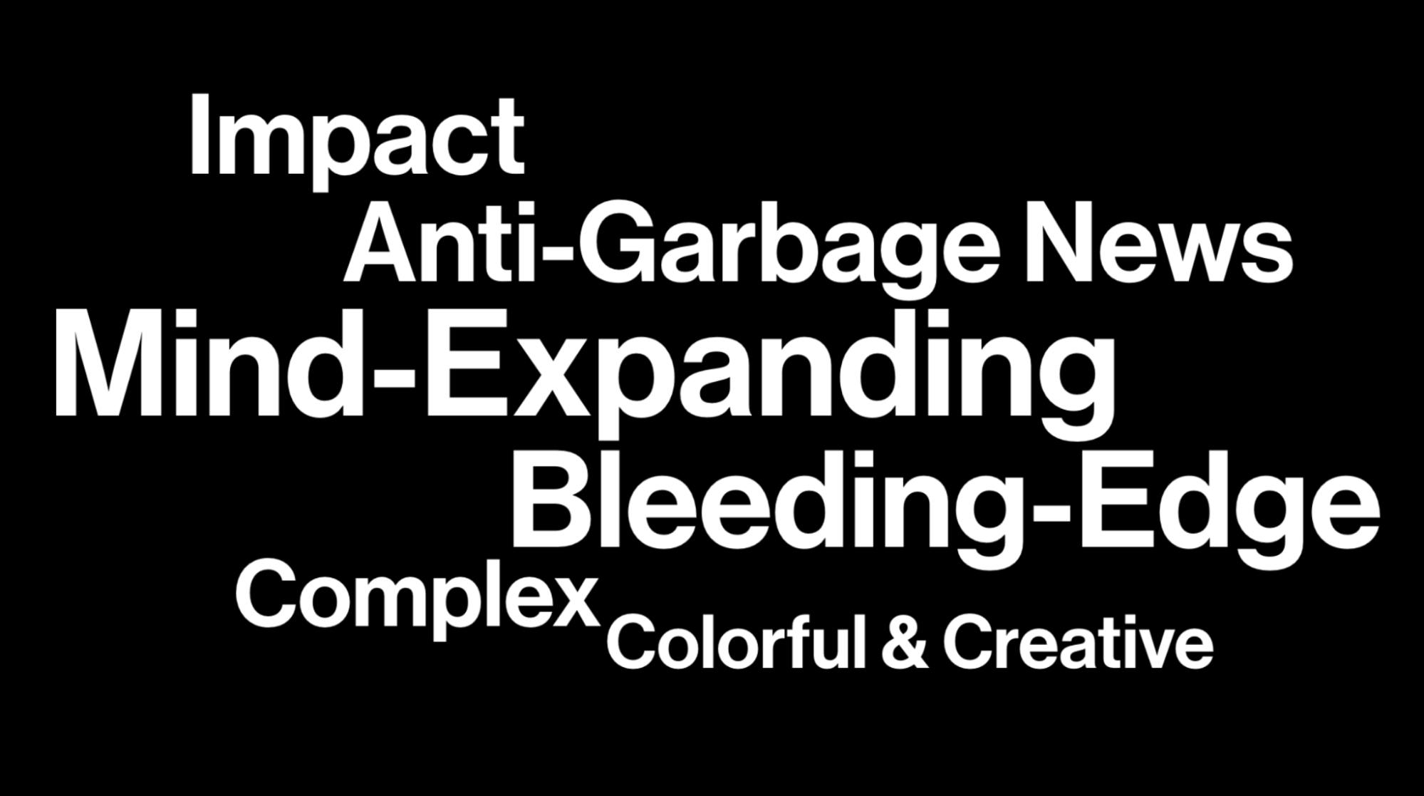
When he and I joined Freethink initially, we interviewed everyone that worked here and flushed out pages and pages of words, phrases, and what you could consider to be the DNA of our culture.
In fact, here is an old slide of some of those phrases:
Clifford comes from the music and arts world. He has a knack for lyrics and naming things (ie band names, albums, song titles). And so he put his skill to use for our tagline and ‘Move the World’ just clicked.
Lastly, what has been the reaction to your rebranding?
I had some amount of fear going into the launch, especially since the previous brand meant a lot to the original Freethink team.
But fortunately, we have a very supportive family here and people were definitely energized. The brand was so much more than a logo and I think people embraced the new design language, website, and video elements.
We got good feedback from our community and it definitely felt like we landed this one (you know when you don’t). The team was very pleased with where things ended up and we’re excited to continue building on top of our new foundation.