
Sarah Barron, Communications Lead at Hexa, shares how they started from scratch in creating an ecosystem to house their three brands, eFounders, Logic Founders, and 3founders.
You’re creating a new brand from scratch with Hexa. We’d love to hear more about the process of creating a parent brand for three sub-brands.
We created Hexa in 2022 to scale the startup studio model, a model we pioneered with the creation of eFounders in 2011.
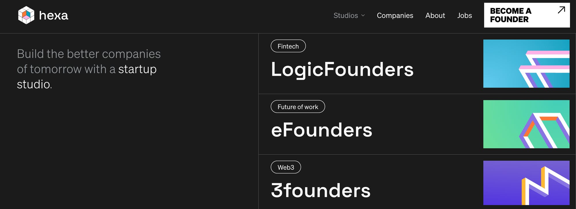
In the last couple of years, we started to scale this model with the launch of two new startup studios Logic Founders with Camille Tyan, and 3founders with Florent Quinti. We decided to create Hexa to bring together eFounders, Logic Founders and 3founders into one ecosystem.
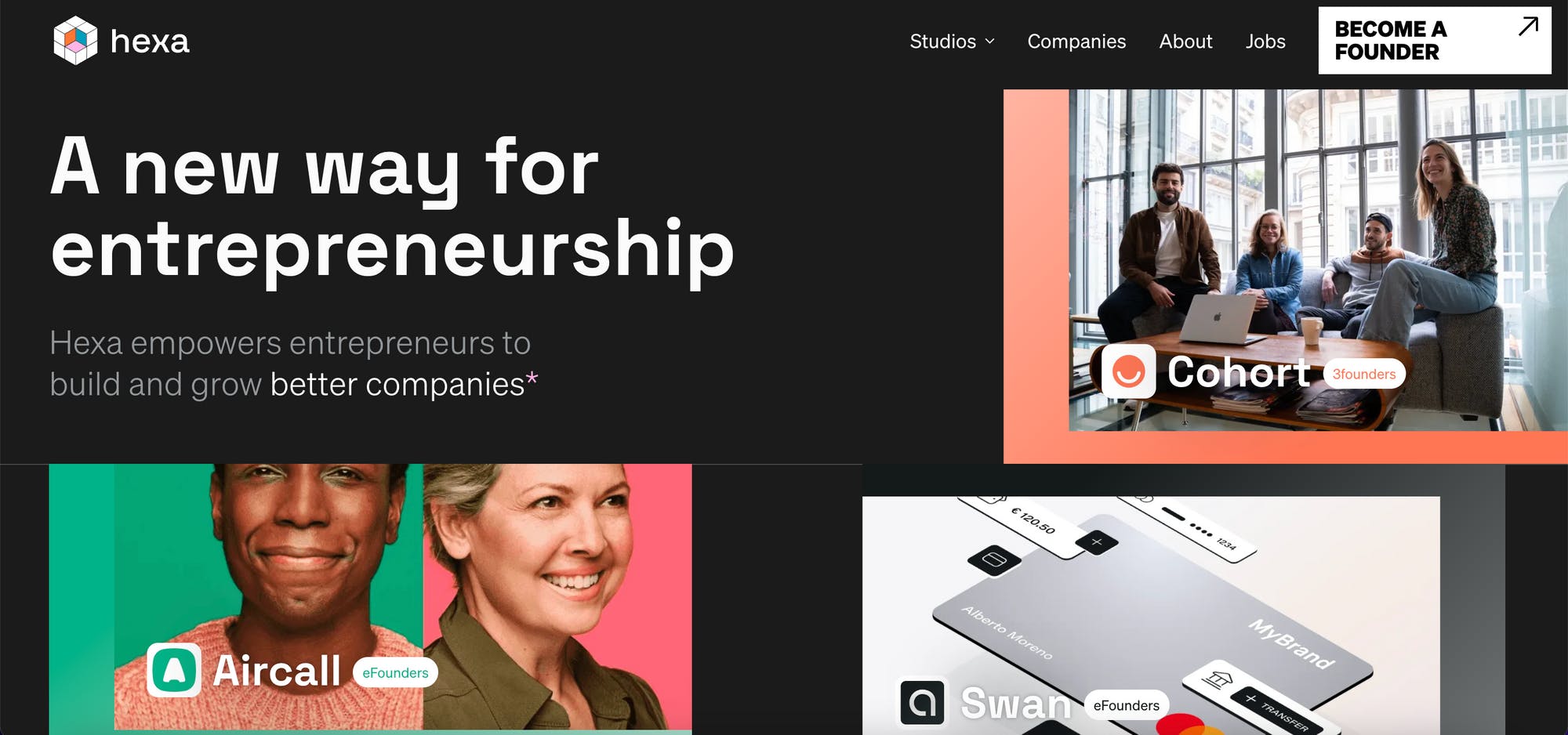
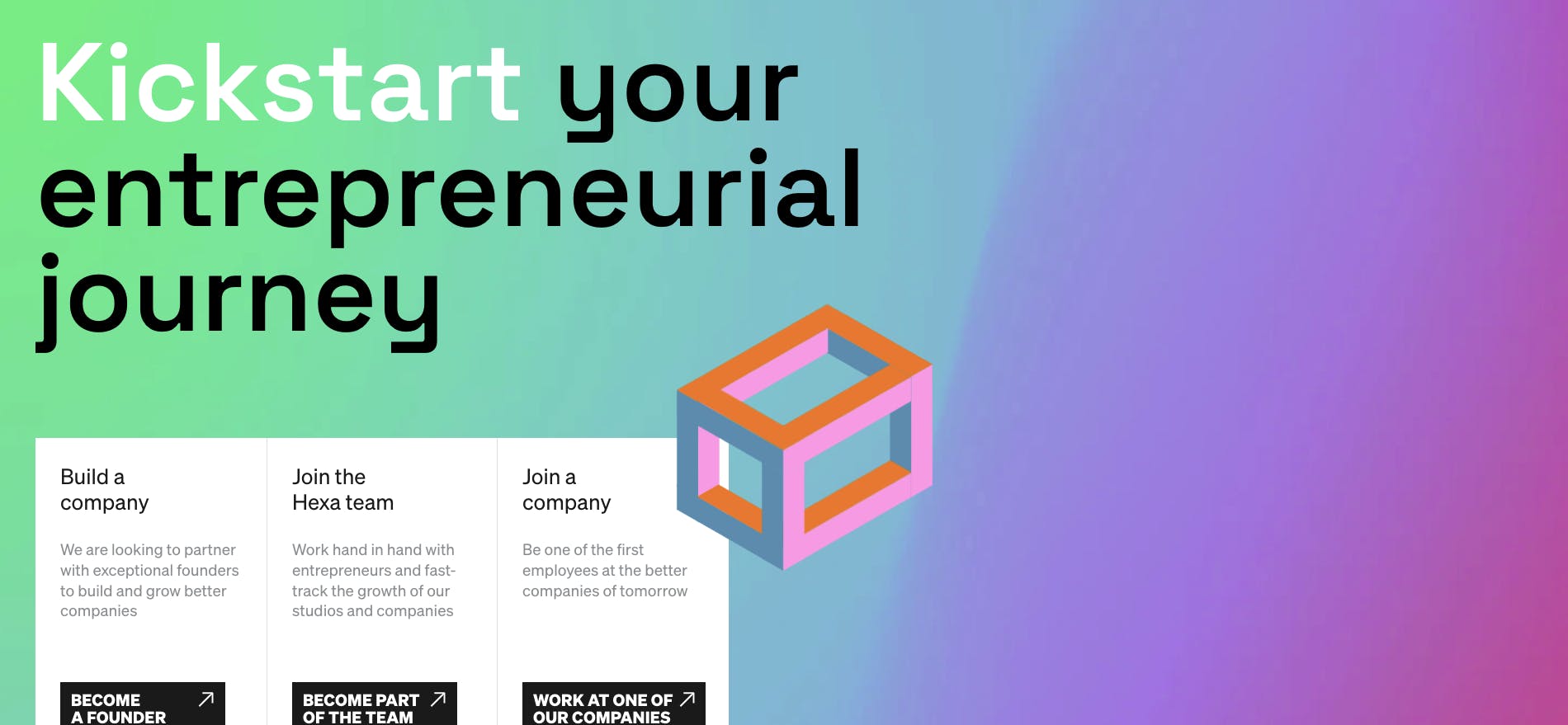
Hexa website
We prefer to talk about Hexa being an ecosystem rather than a parent brand with three-sub brands. We wanted eFounders, Logic Founders and 3founders to feel singular but a part of something big and exciting, to feel empowered and supported by Hexa - rather than limited by a parent brand.
This is visually shown on our website, each studio page has its own visual identity, with distinct logos and fonts. But they are still part of the Hexa ecosystem.
What are the challenges you encountered in this process? Especially as you unify three different brands visually under one brand?
We worked with the Branding & Experience Design agency Alasta to create the Hexa brand. The main challenge was to visually define the concept of an entrepreneurial ecosystem - which is quite new! We didn’t want to transform eFounders into Hexa, we wanted to start from scratch.
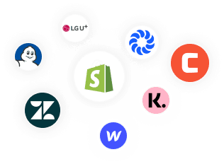
Hexa sub-brands
Our first task with Alasta was to define Hexa with words, what it is, what it does and how it co-exists with the startup studios eFounders, Logic Founders and 3founders. The startup studios get support from Hexa but they are also independent. Making sure that this whole ecosystem was coherent from a brand content perspective was definitely a challenge, we had to make sure that anyone could understand what Hexa was and how the startup studios related to them.

Hexa: An Entrepreneurial Ecosystem
We then worked on visual concepts that created the idea of a family, a sense of belonging that allowed each studio to remain unique. What we wanted to achieve was a brand with a strong identity that would create a common feeling but still allow each studio to stand out.
Can you tell us how the logo for Hexa was conceptualized?
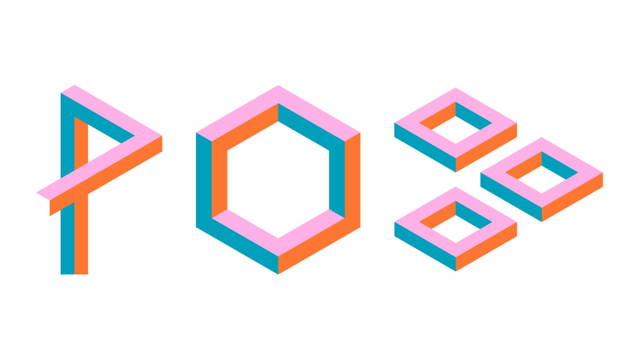
We worked closely with the team on each element of the new brand. Alasta came up with some first ideas and concepts. They realized fairly on that a visual system with grids and shapes was a viable graphic concept. We loved the idea of modules that we could use a building blocks with to create a new universe.
Hexa logo
“Sometimes, building companies feels like making the impossible possible. That’s why M.C. Escher and R. Penrose came as main inspirations pretty quickly. We were drawn to their impossible figures because they break the laws of geometry and physics, yet they exist in our minds and we can visualize them.” - Joel Schillio, co-founder of Alasta
Behind the Hexa logo
How about your color palette? How did you develop the color palette for Hexa, and then for the three sub-brands? Or was it the other way around?
With Hexa, the realm of possibilities is huge. That’s why we came up with the idea of a color gradient. Hexa will create many studios, that will create many companies, through rich synergies. A color gradient offers limitless possibilities and combinations.
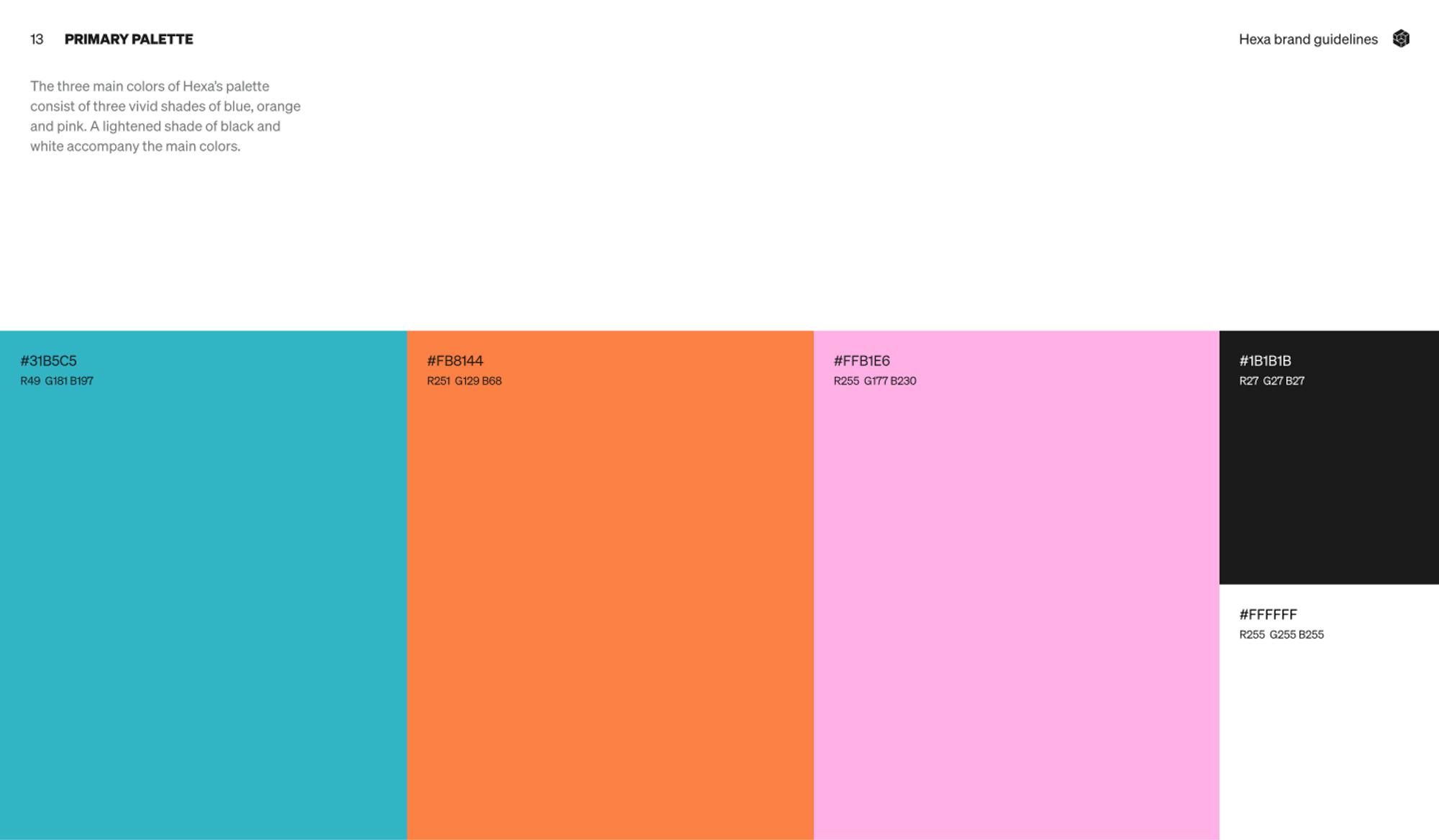
Hexa Color Palette
We also wanted the brand to be vibrant, to stand out from the rest of the tech scene - but not in a flashy way. The three colors we picked for the heart of the logo allow just that.
Can you tell us more about the fonts that you use? How were they chosen? Were they custom-made?
The main font we used is Space Grotesk originally designed by Forian Karsten. Grotesk is a type of sans-serif font characterized by its simple, geometric shapes and lack of decorative elements. Grotesk fonts are often used for their clarity and legibility, and are commonly used in newspaper and magazine headlines.
Hexa website
Since each new company coming out of Hexa is a kind of an event, we loved the idea of finding a font that could be used for headlines or to promote something big. Since the brand is very geometric, this font fits perfectly.
We also used the Söhne font for labour texts. Space Grotesk is perfect for big titles and headlines, but not for longer texts that require more focus.
For the logo, the great team at Alasta created some custom letters.
"“We wanted to make some letters more distinctive. When we were looking around for fonts, we tested the Maax Unicase from Daumien Gautier. We loved the “X” and felt that it looked like the combination of the symbols “>” “<” used for code snippets - we thought that was a great match for Hexa.” - Joe"
How about other visual elements such as illustrations? How were they developed?
All the geometric shapes were developed by Alasta when we decided to explore the Escher direction. The process was pretty natural, very organic. The shapes Alasta created are pretty simple, but they move, they morph into something new, can be combined to create something more complex.
Hexa vector images
What is your major takeaway from this experience? Or, do you have any advice for brands or designers embarking on rebranding projects themselves?
Do not underestimate the amount of work it will take! A rebranding takes time and involves a lot of different stakeholders who all have their own agendas. Make sure that you plan for different scenarios: best case scenario (right on schedule), average case scenario (a little bit behind schedule) and worst case scenario (far behind schedule).
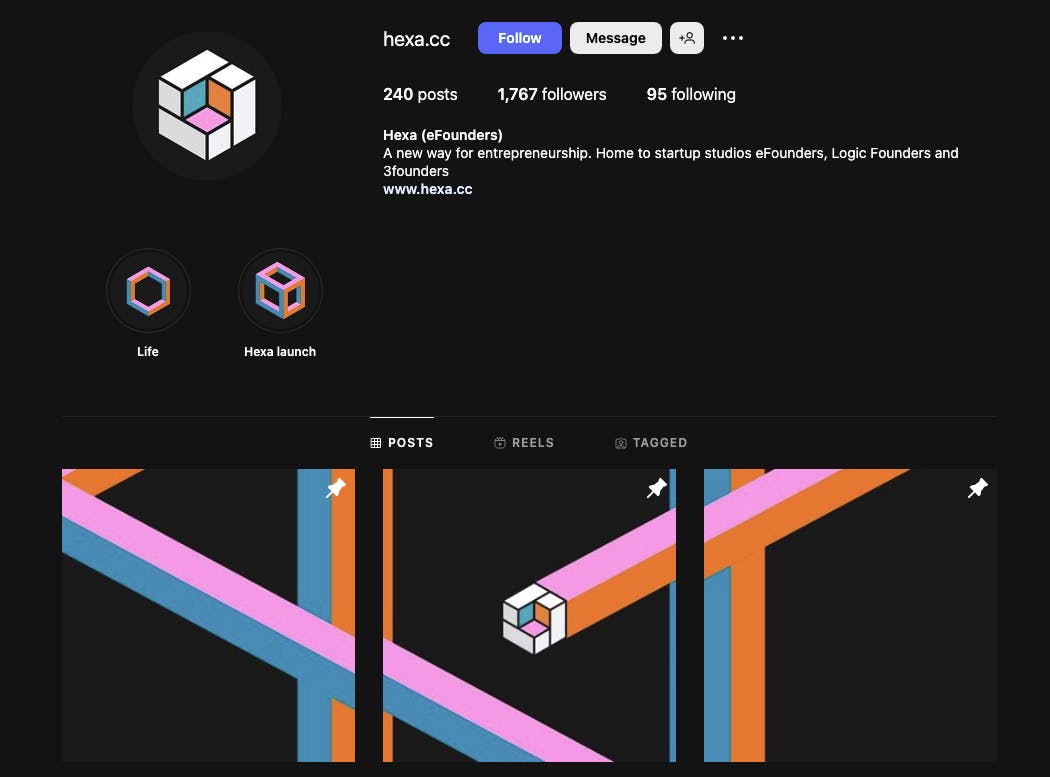
Hexa on Instagram
Another big takeaway from this experience is that time spent on defining the brand is not waste. We spent a considerable amount of time defining the Hexa brand, its vision, mission, ambition and values.
Sometimes, we jump too quickly to the visual part. It’s really important to understand the essence of a new brand, its purpose, what it wants to achieve, what it stands for. Once you have that understanding, you can get creative and wild with design!