before

after

Hamish Boland-Rudder, Online Editor for ICIJ, shares how they’ve rebranded to embrace their independence from their parent organization.
Can you give us an overview of ICIJ and what it’s about?
The International Consortium of investigative journalists has been around in some form since 1997. We're a US-based nonprofit news outlet focused on international investigations. Five years ago, we were spun off from our parent organization to become an independent organization.
We pulled together some of the world's biggest global investigations, working with teams of reporters from more than 100 media outlets–up to 600 journalists on any given investigation.
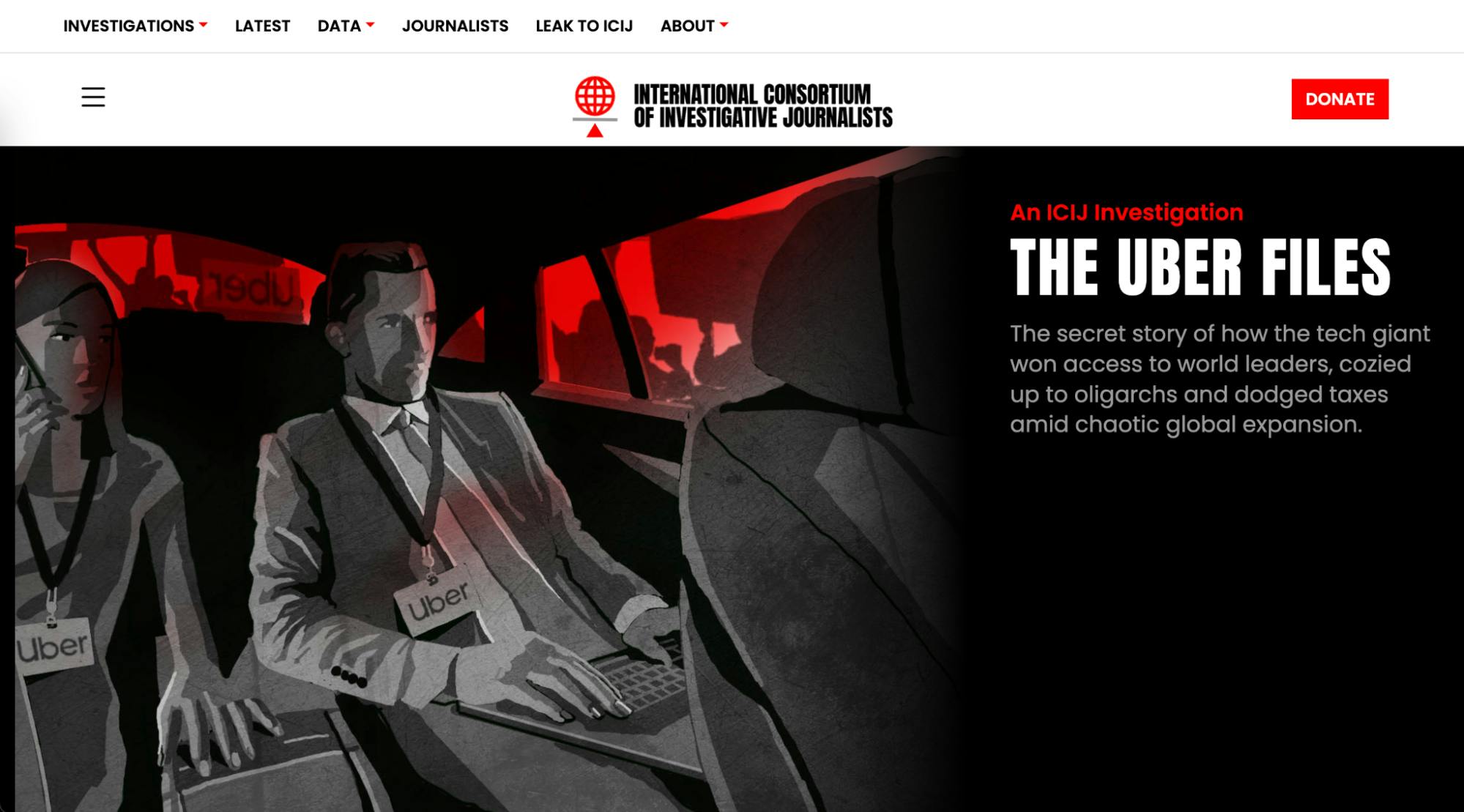
ICIJ website featuring red and the black and white monochrome scheme
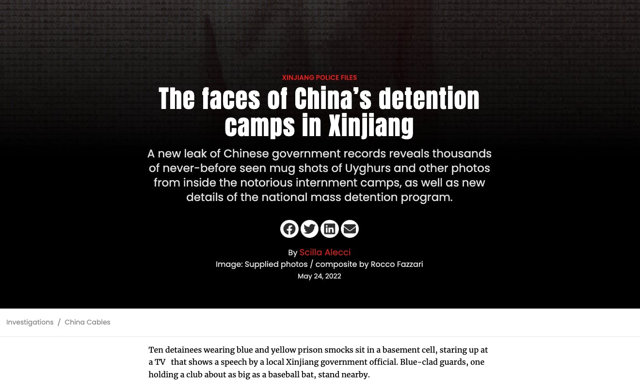
We're pretty well known for our major investigations like the Panama Papers, and more recently, the Pandora Papers, the Luxembourg leaks in Europe–a lot of big financial investigations as well as investigations into all sorts of wrongdoing, corruption, and abuses of power.
A big part of what we do is taking huge, often leaked data sets, processing them and analyzing them, and then building tools so that journalists around the world can access, search them, and find leads for stories.


How would you describe the initial ICIJ brand? Who started it? How did it look?
The original idea behind ICIJ was that a lot of investment of journalism stops at a national border, and once you start having to try and chase the story across to a different country, it becomes increasingly difficult.
The founder of ICIJ, Chuck Lewis, an American journalist, wanted to bring together a network of trusted journalists in countries around the world. When one journalist in one country had a story that went to another country, they knew someone there they could contact and work with to tell a better story using local expertise.
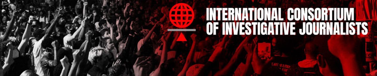
ICIJ banner
In terms of branding and messaging, ICIJ has been through many different iterations over the years. For the first 20 years, a lot of that was really in alignment with its parent organization, the Center for Public Integrity, which is an American-based nonprofit news outlet that focuses on US news.
ICIJ is the international arm, so it inherited a lot of the original branding and messaging from there.
About this current rebranding, how did it come about? How did that conversation start?
When we went independent five years ago, we were still known as the organization that did the Panama Papers.
One of the big challenges for ICIJ's brand has always been that our big investigations, our big projects, have more recognition than we as an organization. So people may have heard of the Panama Papers, but they don't necessarily know who or what ICIJ is.
That was one of the huge challenges that we really wanted to solve, and to start building an identity for ourselves that could stand alone.
"For the current rebrand, conversation started about a year ago between myself and my boss, the director of ICIJ, about that exact challenge: about trying to get ICIJ as a name out there in the community in the same way that our projects get the same penetration."
We were working on another huge investigation, our biggest yet at that stage, and trying to figure out a way to put our stamp on it so that we would be known as the organization that led that investigation.
We realized quickly that we didn't necessarily have the in-house expertise to do something like that. And so we were really fortunate to make contact with an Irish agency called Thinkhouse that specialize in youth marketing.
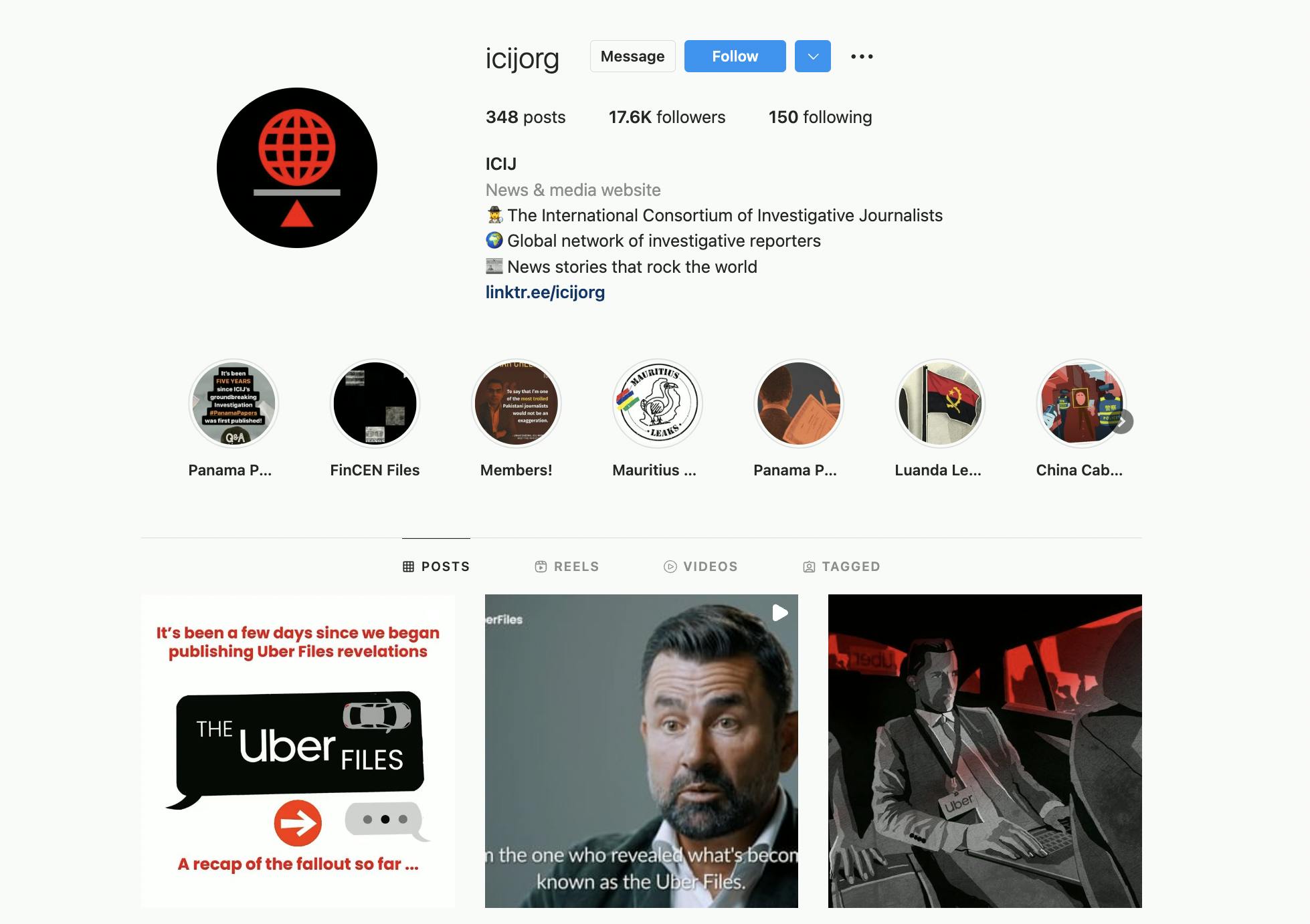
ICIJ on Instagram
They were interested in working with us as something really different from what they do. Up until then, a lot of their expertise was much more corporate and commercial. They were drawn towards us as a mission-based, mission-driven nonprofit with a really unique place in the world.
We were drawn towards them because they were marketing to an audience that we felt we really need to get into, which is a slightly younger audience that is engaged with the world around them.
In your collaboration with Thinkhouse, how did that process go? Were there any challenges here?
We were lucky as they were doing this for us pro bono but it was a long process. There was a lot of back and forth as we were working with people from around the world. I'm here in Australia. ICIJ is mainly based in the US, they're obviously in Ireland. There's a lot of logistical coordination to begin with.
ICIJ article featuring different fonts
Because it was a whole new area for them, they came at it with really fresh eyes. They started with a full review of what ICIJ was up until that point, where we sat within the market of investigative news outlets, and what other brands were doing in that space that we could learn from.
Once we had a good sense of where we sat, that's when we started talking about trying to refine how we talk about our organization and our mission and how we then potentially translate that into something visual and recognizable.
"The really nice thing for us was that this wasn't just an aesthetic refresh for us. It was really a core questioning of who we are, what we do, and how we talk about ICIJ's mission and vision."
We started with words, which as journalists, we were very comfortable in writing out some of the language. Then the gurus over at Thinkhouse started applying design thinking to it to come up with a few different options for directions that we could go.
Can you walk us through the different iterations of the logo through the years?
The blue was very much inherited from the parent organization. I don't know where the original rusty red came from, but through my time there, we were slowly making our way away from that rusty red because it felt quite dated, like rust.
In one of the iterations under my time here, we moved to a slightly more defined red which was still quite deep. What I noticed was that because of so many iterations over the years, we started to have a lot of confusion around which red was the real ICIJ red. We didn't have enough definition around it.
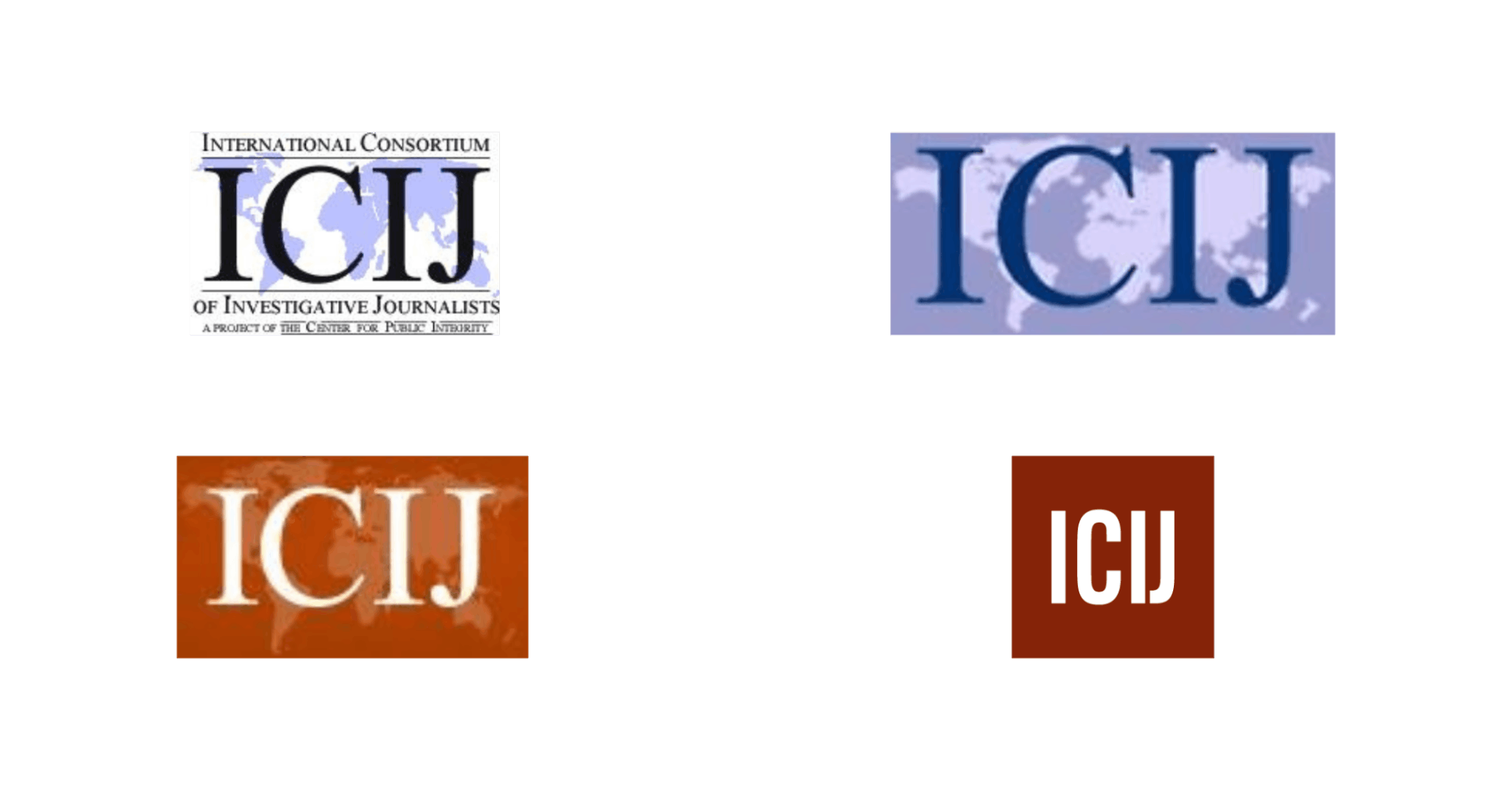
Past ICIJ logos
Our logo in itself was just the letters in a square box. It didn't say anything about us. It was really just an easy way to bring our branding again into alignment with our parent organization.
This is our first big rebrand since going independent, and we really wanted to break away from the old ICIJ with something fresh and much more interesting and recognizable.
The way Thinkhouse put it to us was that with a name like the ‘International Consortium of Investigative Journalists,’ you're never going to get good brand recognition on your name. People are going to struggle to remember what ICIJ stands for.
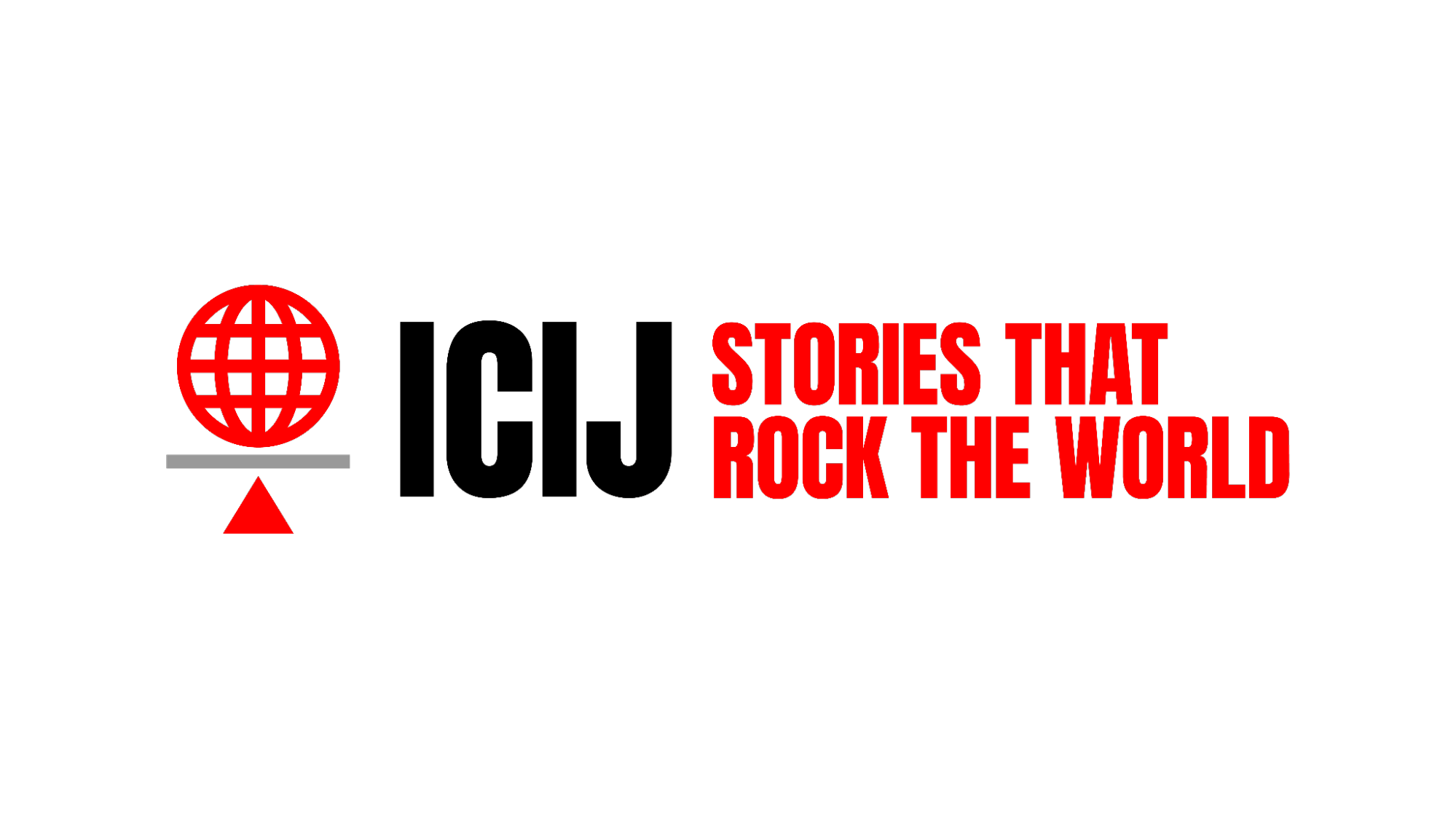
ICIJ current logo
You're better off trying to go for something that visually represents who you are but that is still simple enough that it is instantly recognizable in much the same way as the Nike Swoosh or McDonald's Golden Arch.
You don't need to see a full name. You see a logo and maybe a good catchy phrase, which is where “stories that rock the world” came from. You can achieve the same recognition without people needing to remember the full lengthy name of ‘International Consortium of Investigative Journalists.’
The new symbol really seems relevant as it looks like the world in an equilibrium state. Can you tell us more about the symbol?
It’s kind of inspired a bit by the Scales of Justice. It's also a visual play on that tagline that we came up with: “stories that rock the world.” There's an animated version of the logo that rocks back and forth slightly on the scales to really drive that point home.
ICIJ animated logo
The idea is that visually, it's supposed to convey the globality of what we do, but also that sense of restoring justice or seeking to find justice and equality in a world that is rife with inequality and injustice.
Did you choose the red color for the exact same reason of standing out with something that people can visually, instantly recognize?
We played with a few different iterations of colors. We looked at green for a little while.
We looked at a couple of different versions of the red, and we came back to that really vibrant, fiery red to convey some of the energy behind what we do, to give a hint of the danger in some of the investigative work that we do, and to really try and up the urgency.
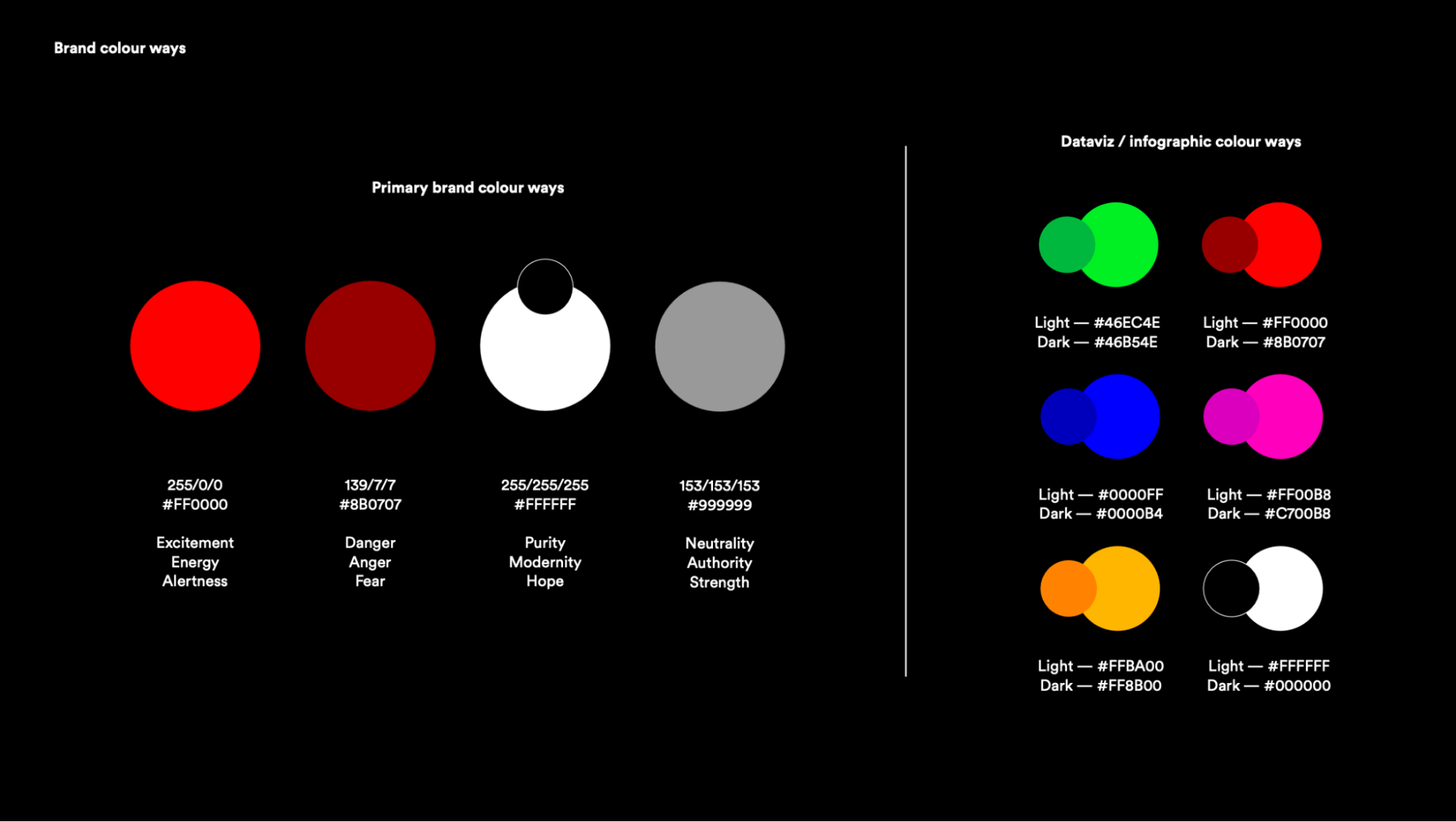
ICIJ’s new color palette
Along with the red and falling back a lot more on the black and white monochrome scheme, we really wanted to up the contrast to create a lot more impact visually, both in our branding, and in translating that across to the editorial styling of our content.
We're now focusing more on monochromatic imagery and photo, like striking photography with those red accent colors to really bring out the contrast and urgency.
You use two to three types of fonts. You have this easy-to-read font for the articles, but the title is very modern. How did you land on your typography here?
The typography within the logo, we use it for just the top-level headlines on the website.
The H1 headline is the Anton font that we felt conveyed that urgency that we were trying to achieve with high contrast colors. We felt it also helped modernize ICIJ a lot more from the older fonts that we had been using.
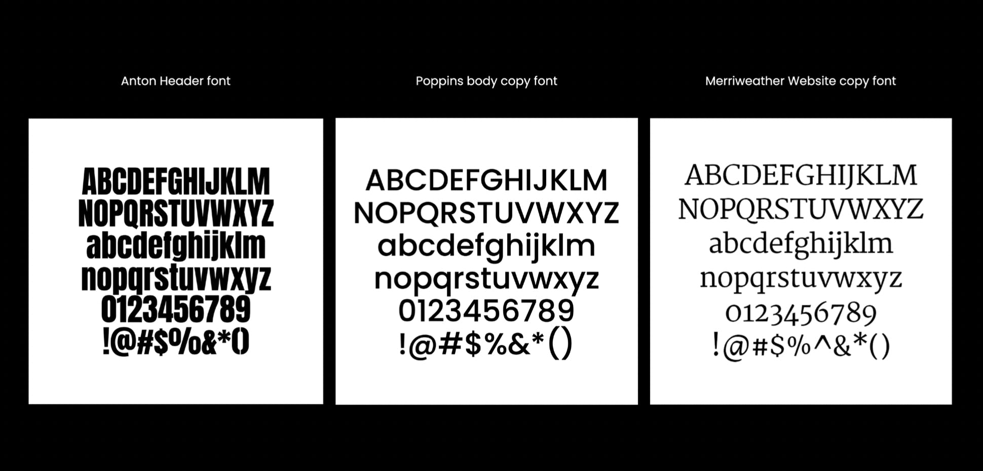
ICIJ fonts
But at the same time, we wanted to maintain some of that decorum and sense of tradition that comes with the sort of journalism that we do–that long read, deep dive investigative work–so that's where we fell back on Merriweather as the serif font for the bulk of our articles.
We've got Anton at the top that's conveying a modern urgency, and then Merriweather that is hopefully easy to read and gives a sense of that newspaper tradition for really deep dive investigative journalism. Then to supplement it, we use Poppins for secondary headline text because we needed to have a bit more hierarchy.
"These were not accidental. Our model is to work collaboratively with media partners. So everything that we do, we have to make easy for our media partners to adapt to."
We didn't want to go too deep into custom fonts or overly complex design schemes. It needed to be simple enough that we could share it with any number of media partners. Whether it's a tiny investigative newsroom based in the far-flung regions of Africa, or a major newsroom in the UK or the US. Everyone needs to be able to use what we have.
How would you describe the impact of good design on your organization?
I think what we've achieved with this is we've given ourselves a touchstone or laid a foundation for all the design choices that we're going to make.
I mentioned before that it was about so much more than just the aesthetic for us. We've been really big on sharing this internally with the team first and bringing them into the process a little bit so that they understand not just what our new design looks like, but the messaging that it's supposed to help us convey about our mission.
"So having a really clear and distinct design helps everyone understand and visually see how their work fits into the overall mission of the organization."
For us, it creates a lovely baseline of consistency that then filters through everything that we do, whether it's visual styling for a new page or a new news app that we're building, or even through to how we write our stories and think about conceptualizing our stories with a view to how it will fit into ICIJ’s mission and vision.
What's the major takeaway from this experience? What are things you wish you knew when you started this process?
I think we probably underestimated not just the amount of work that was involved, but how deeply introspective the process was going to be.
I think that when we went into it, we thought it was going to be quite surface level. We'll come up with a new logo and some new colors and then we'll just do a five minute update of the website to refresh the style sheets and be done.
"But what we walked away with was both much more complicated in terms of the work, but so much more valuable in terms of trying to get a brand that really truly reflects who we want to be as an organization."
Making sure that we allow the time and head space for that really important, preliminary, soul-searching work, I think, in hindsight, we probably would have been better prepared if I had thought about that earlier.