


Per Åsberg, the Senior Brand Director of IFS, talked to us about rebranding to communicate their new approach, leaning into being “the purple company,” and the meaning behind their new logo.
Can you introduce us to IFS and its past brand identities through the years?
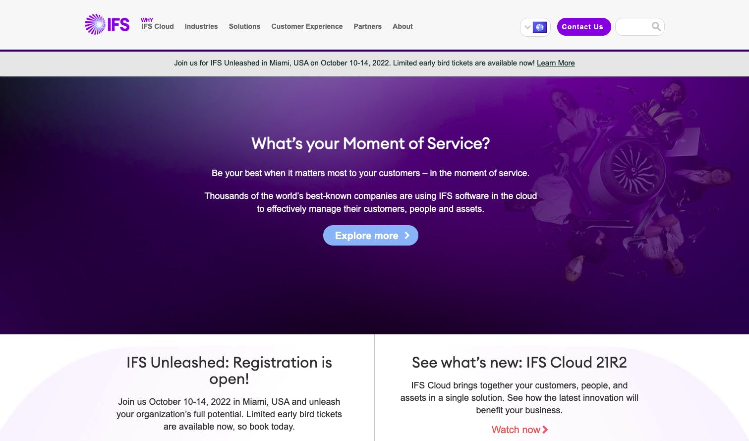
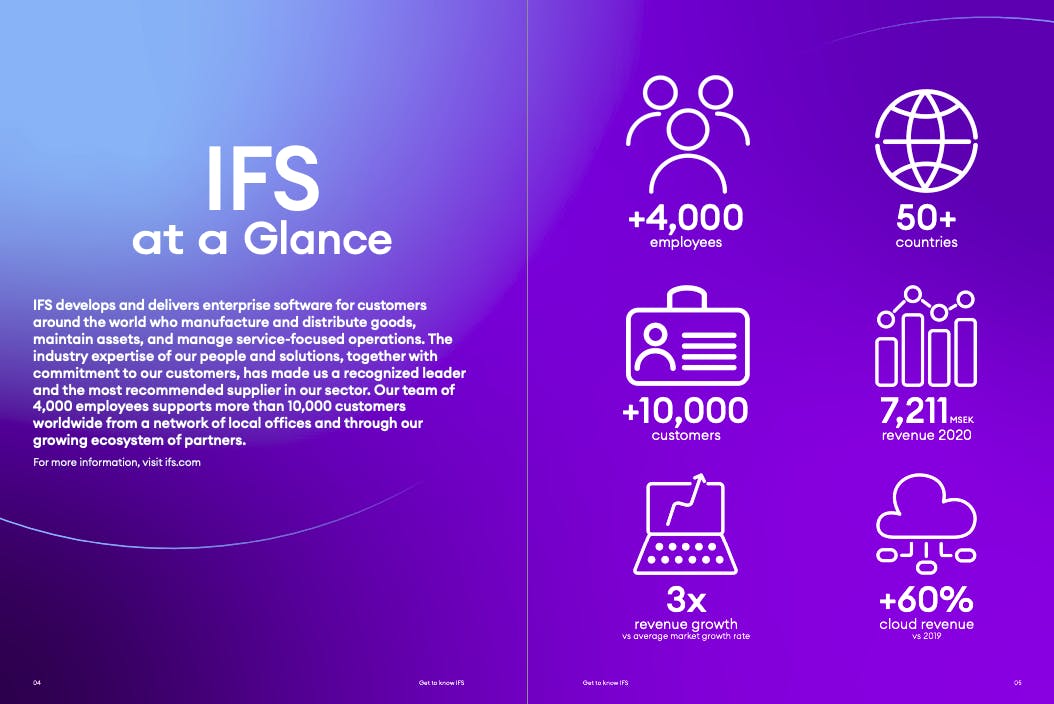
IFS develops and delivers cloud enterprise software for companies around the world who manufacture and distribute goods, build and maintain assets, and manage service-focused operations.
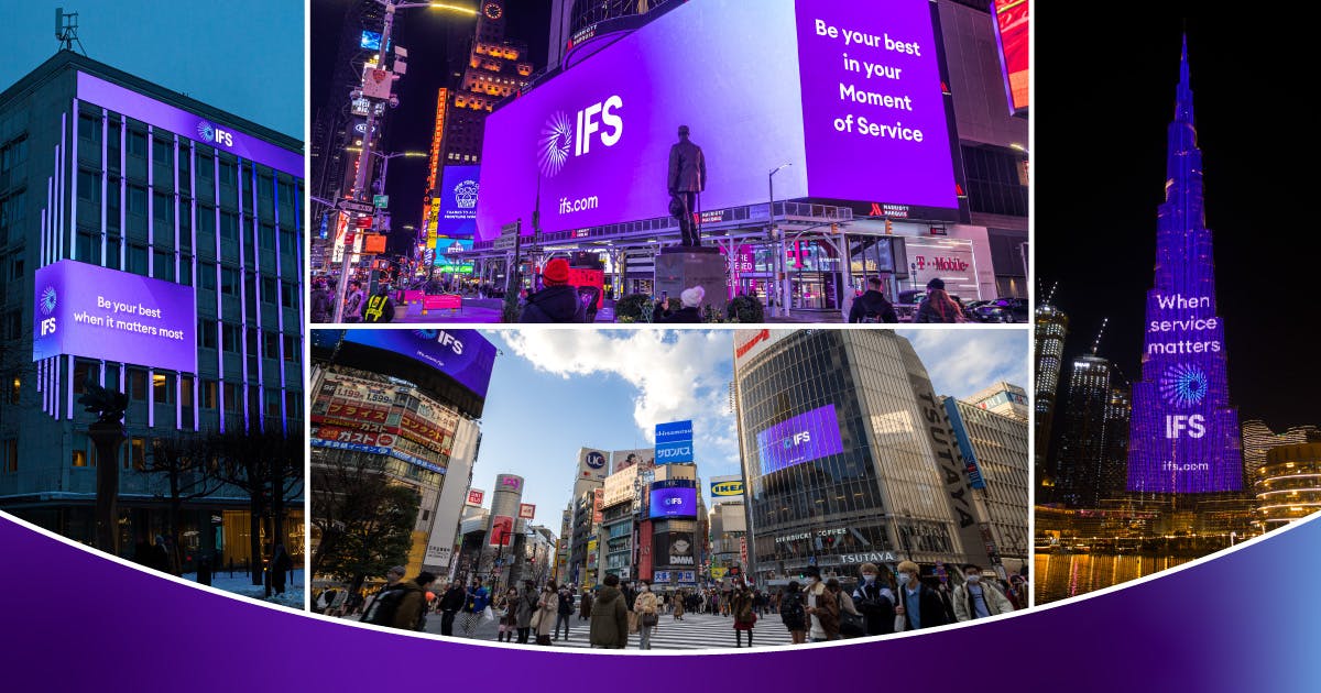
We have always been the purple company, but the logo and visual style has developed over the nearly four decades that we’ve been in business.
What prompted your rebranding? How did that conversation start?
A rebrand is there to show progression and change. In itself, it means nothing unless there is a good reason, and we had at least three of them.
First and foremost, we were going to launch a new flagship product–IFS Cloud–that would be the business's main focus for the foreseeable future. IFS Cloud was different in that it is one solution that can be tailored to an organization’s needs, where previously we had a go-to-market based on a set of different products.
Secondly, we set new ambitious growth targets until 2025 based on a focus on North America and a “cloud-first” strategy, which was also different compared to before.
Third and finally, it had been several years since the logo was updated and we wanted to send a signal to the market that IFS had fundamentally changed since then. The rebrand was drawing a line in the sand between before and after, an old company and a new approach.
Can you tell us more about the rebranding process? Did you encounter any challenges?
We began by asking the big questions: Just how far did we want to take the rebrand process? What should we keep? What needed to change?
After agreeing to change nearly everything but the name of the company, we started working with a creative agency that had a long-standing relationship with IFS and understood the journey we had been on.
Our main challenge was the timeline: to rebrand an entire global company in 50-plus countries in more or less three months. That was a hard deadline since the launch of our new product was already set. We got there in the end, but had to prioritize the main deliverables to make it.
Things like building signs would take longer due to planning permissions, but we got most of the rebrand done in time, especially the digital properties.
What’s the story behind your new logo? How was it conceptualized? What’s the story or meaning behind it?
We needed a symbol to represent the company. Our old logo was just three letters in a box so the creative agency came up with this sun-like icon symbolizing our new dawn, if you will.


It is composed of several strands that come together in the middle for the ‘Moment of Service’--our main message to the market.
What about purple and your new color palette says about your brand?
There are many blues and reds in our industry. IFS has always been known as the “purple company” and you don’t throw away mental real estate like that.
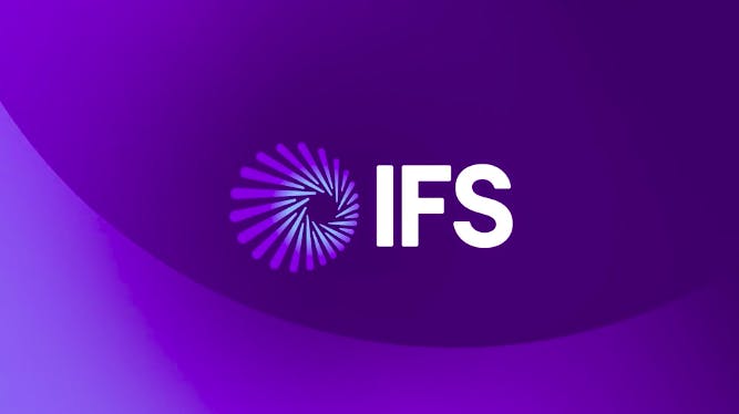
We did update the nuance of purple though, to work better in a digital world and complemented it with a few select colors that worked together with the new color. Less is more.
What about the photos and other design elements you use for your brand? How were they selected?
The short answer is we retook images of people ourselves using IFS staff. That made it unique and more genuine.
As for industry images, we looked at a way to treat images so they would feel less like stock and came up with a design style using curved lines that felt on brand.
How has the new brand identity affected your brand in the last year? Did you get any interesting feedback?
We’ve had a lot of positive feedback from both employees and customers. The fact that we are now shortlisted for three Transformation Awards in 2022 is a testimony to the success of both the new look and how we rolled it out.
An interesting finding was to see in just how many places our old logo has a footprint–in everything from payroll systems, third-party sites, and pass keys for the office.
I guess you never fully appreciate how many touch points a global brand has until you’ve done one of these exercises.
What are your takeaways from this rebranding experience?
One is to always make sure that a rebrand is motivated by a tangible business decision. We had that strong rationale and therefore had no problem getting stakeholders on board in accepting the 'why' and the 'what' of the story.
Speaking of stakeholders, that’s a second main takeaway.
We needed to involve all parts of the organization directly in a sort of steering council to make sure the brand changes had effects on everything from the HR process down to the log in screens for the product.
That synchronization made the impact even bigger and more true than if this had been “just” a marketing project.
