before
after

Gaina Lieu, CEO and Founder of Marin Living Foods, shared how they created a new brand that is bolder than safe and conventional designs seen in similar brands.
Can you share with us how this rebranding came about? How did that conversation start?
We got introduced to The Working Assembly by their great reputation working with founders such as Partake, Haven’s Kitchen, Sweet Nothings, and Sanzo. We were excited about the opportunity to collaborate with them and explore a holistic approach to the brand.
Marin website
We looked at the cultural and competitive environment and saw that within the plant based and milk beverages, everything was very safe and conventional. We had an opportunity to be bolder, bring high design and infuse creativity to the refrigerated aisle.

How did the rebranding process go? Was it all smooth, or did you encounter challenges?
It was exciting to work on this process and we were shown three different directions by The Working Assembly team. Each were very unique and provided a clear perspective, vibe and personality.
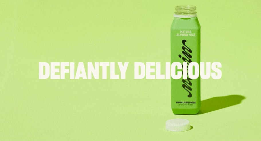
Marin ‘Defiantly Delicious’
One explored the kind of mash up of flavors and included illustrations. Another was very refined and fashion forward.
Ultimately the final brand we landed on felt most like where we could grow as a brand, had a lot of elasticity to continue to expand as needed for future product lines and was very distinctive.
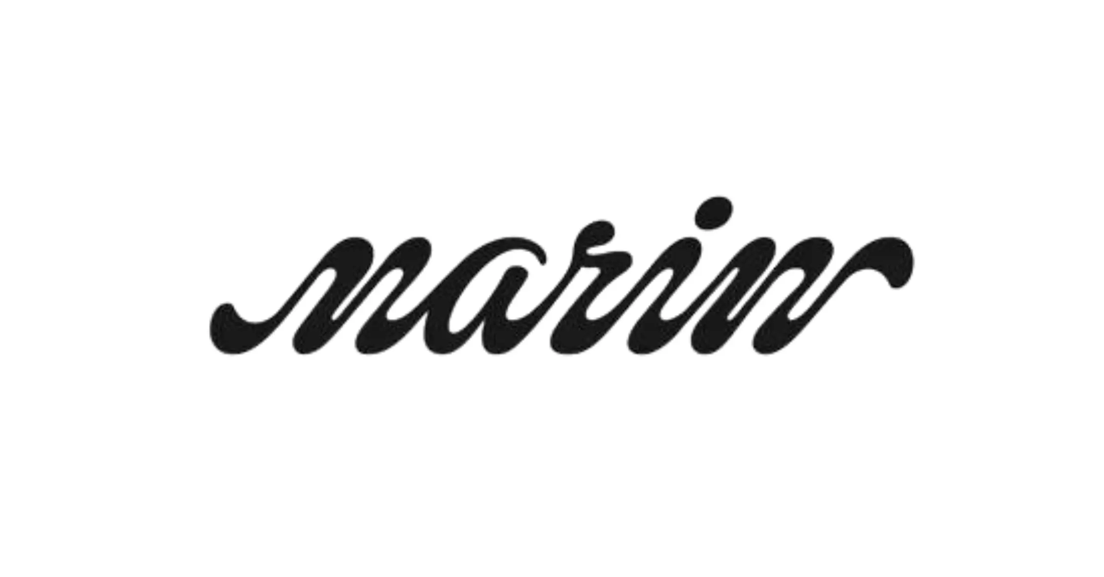
A big change was to your logo. Can you tell us how it was conceptualized?
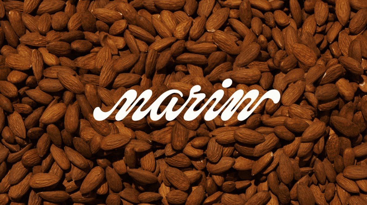
The logo was inspired by the fluidity and creaminess of Marin Living Foods’ almond milks.
Marin logo
The playful and surreal nature of the new brand look and feel, really informed our decision to have a logotype that was equally different with a lot of movement and motion.
How about your color palette? How did you land on these colors, and what do they say about your brand?
Marin Primary Color Palette
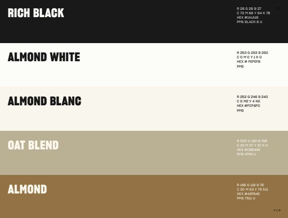
We juxtaposed a black and cream palette with vibrant, ingredient driven colors. The colors really pop and are a nice contrast to the neutral and bold black type.
Can you tell us more about the fonts that you use? How were they chosen? Were they custom-made?
Our typography uses Sharp Grotesk, a Neo-Grotesk with many weights and sizes.
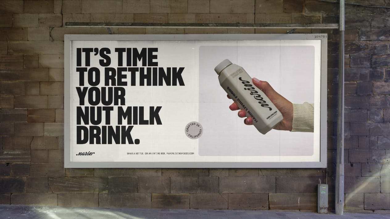
Marin poster
We used an old condensed weight as our primary typeface to really drive the brand in a confident and strong way. Our wordmark is custom drawn.
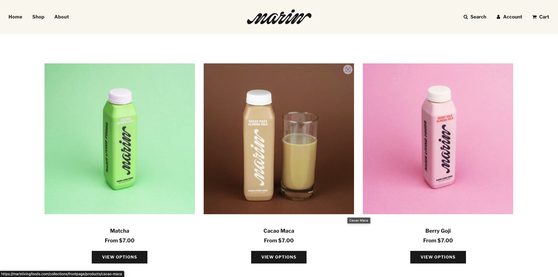
Can you tell us more about the visual approach to your packaging?
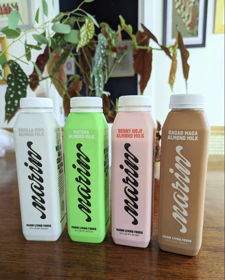
A vertical bottle was a natural translation for the fluidity of the logomark. The wordmark has two very creamy type terminals in the M and the N giving a feeling of fluidity when you see it in a vertical format as it is on the bottle.
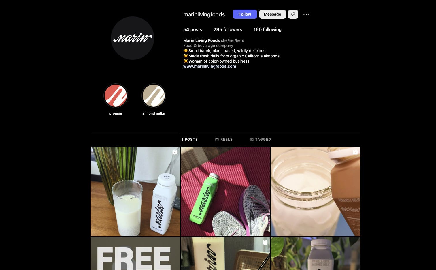
Marin packaging from Instagram
The scripted “Marin'' is written vertically up the bottle to call back the full company name.
What is your major takeaway from this experience? Or, do you have any advice for brands or designers also thinking of rebranding?
Don’t be afraid to push boundaries. We understood that Marin Living Foods as a full name would have certain boundaries when creating a script logo.
Marin Living Foods on Instagram
Having the brand transition to potentially be identified in the shelf as Marin was something that could take time, but that would have great impact as to how it’s perceived in the future.

