


Fernando Gonzalez Pareja, Marketing Director at mesoestetic, talked about revolutionizing the brand for the new age, marketing to different market segments, and their use of white and black for their packaging.
Can you introduce us to mesoestetic and its beginnings?
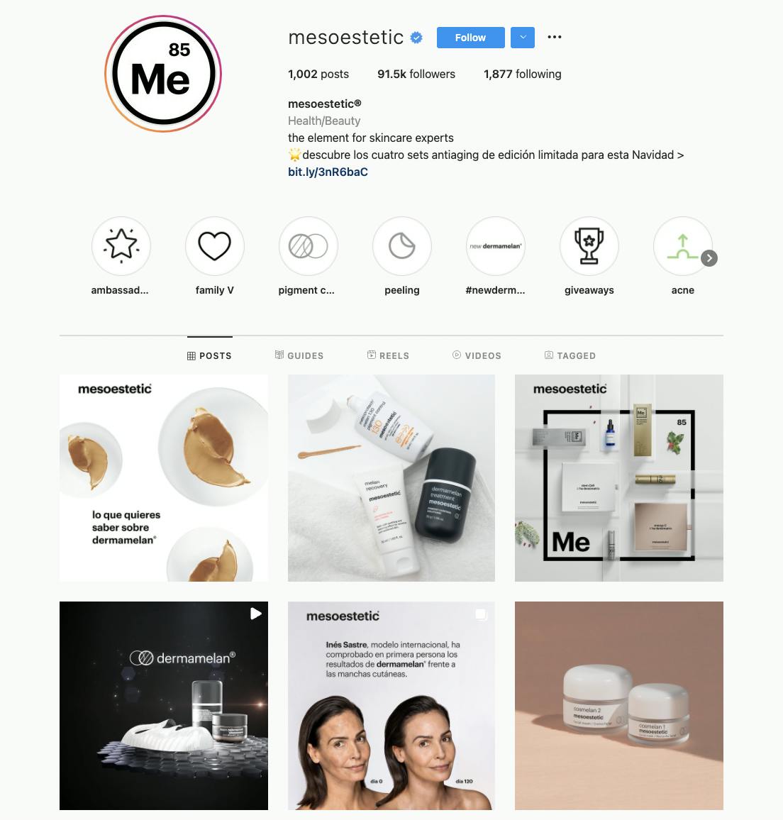
At mesoestetic, we are committed to bringing confidence, clarity, and scientific rigour to the world of beauty. From our beginnings, 35 years ago, we have been committed to creating products of the highest quality and effectiveness backed by the results of numerous studies.
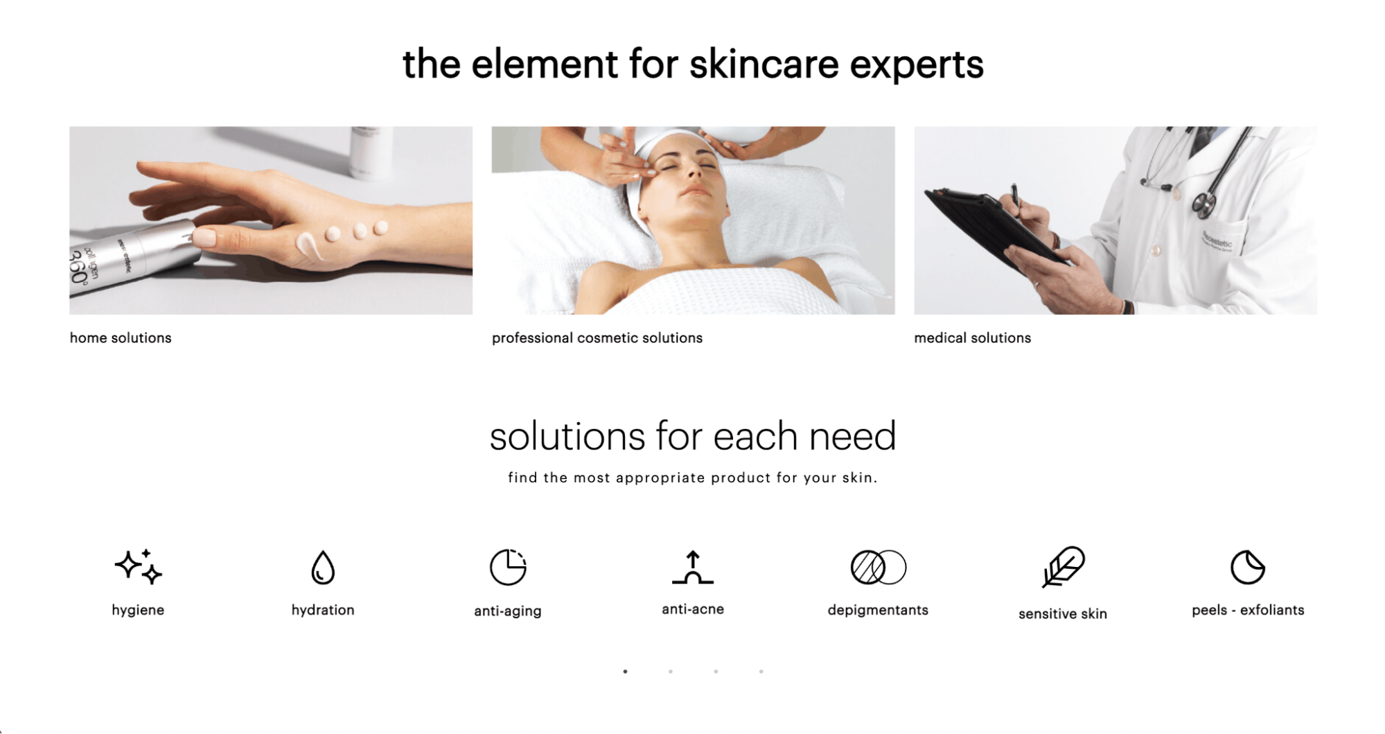
We design home, aesthetic cabin, and aesthetic medicine treatments to offer anti-ageing, anti-acne, body reshaping, sun protection, and depigmenting solutions, where we are world leaders.
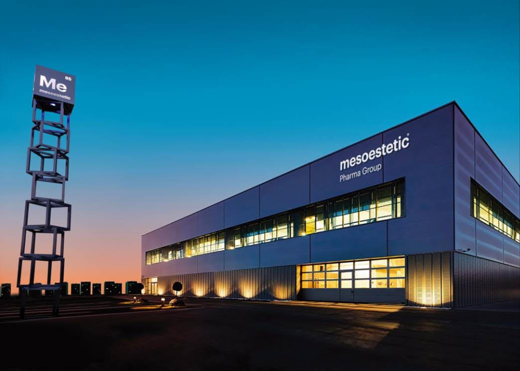
We are a pharmaceutical laboratory and we design and produce our own products at our headquarters in Viladecans, Barcelona. This factor that differentiates us is essential to guarantee the efficacy, quality and safety of all the treatments we develop, allowing us to control and take care of each step of the value chain of our products.
Today, doctors, aesthetic professionals, consumers, and skincare experts trust us in more than 90 countries.
What prompted you to rebrand? How did that conversation start?
Our company has been growing consistently over the decades. However, we saw the need to rebrand for the new age. We needed to prepare our brand, portfolio, and packaging for the future. This makes a lot of sense for us as the DNA of our company is to look for change, to think of the future, and to think of the next 10 to 20 years.
We identified three pillars for this rebranding: review and improve our communication, rationalize, order and restructure a portfolio of + 300 SKUs to facilitate its understanding and use, and we wanted to join the common storytelling about our brand that shows what we are and what makes us different.
From an initial brand evolution, our rebranding became a revolution. The implementation of our rebranding began at the end of 2020 after a year of development and will last until the end of 2022.
Today, with more than 50% of the updated portfolio, and with us having implemented our new corporate image and communication, we are very proud of the changes we've made and the things that are yet to come.
Can you talk about the rebranding process? Did you experience any challenges?
We had meetings and came up with ideas for the rebrand. We knew that we didn’t want to change the personality and the philosophy of our brand. Whatever our brand may look in the future, we wanted to make sure that the “soul” of our brand would still shine through.
We worked with Morillas so that we can show the board what we wanted to do with the brand. It was really important to have a key point, get the board to love the idea--our new logo, claim, and what we are--to get their buy-in and develop the rebranding with them.
It’s also interesting because some of the biggest changes in our company happened in times of crisis. We didn’t let the pandemic stop us or even slow us down. We updated 50% of our portfolio. These are just not light rebrands either, we updated our products significantly.
We changed the packaging, we created new products, and we evolved our formulas. Our rebrand was not just aesthetic changes. This is why we're calling it a brand revolution.
The next step was to make it real. A challenge for us was adapting the changes to our large portfolio. For this to be a success, we knew that we needed to change the packaging and that we’re adapting to our new guidelines.
It’s still ongoing. It’s a live process. We're applying changes on one platform and adapting and arising to the needs of other platforms.
Tell us more about the changes made to your brand’s visual identity.
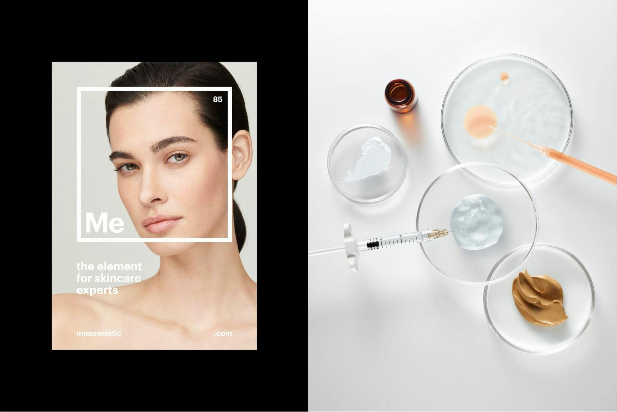
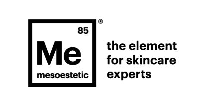
We made use of the periodic table.
For our logo, we used the atomic symbol ‘Me’ with the atomic number 85, which is the year our company was founded. Inside this element is all that we are: our constant search for excellence, our state of the art labs, our long history, our commitment to research, our rigour, and especially our team of professionals and the know-how that differentiates us from our competitors.
Over the last ten years, we’ve used different claims but during the process, we knew we had to find a short claim that explained what we are. So along with the periodic table, we also found our new claim: ‘the element for skincare experts’.
This new claim is how we position ourselves as scientists of beauty. It’s also important to note that for us, the experts are doctors and professionals, but also the end consumers because people who pay for our products really know how it works.
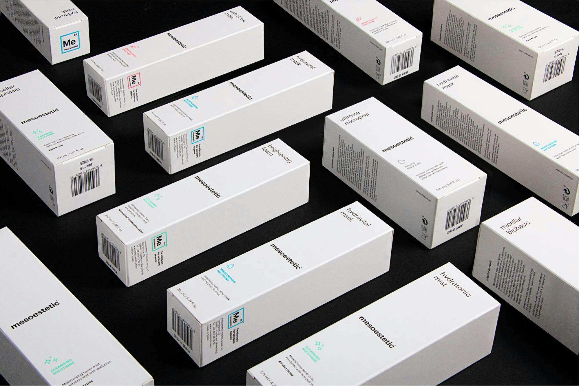
Can you talk more about the use of white in your branding?
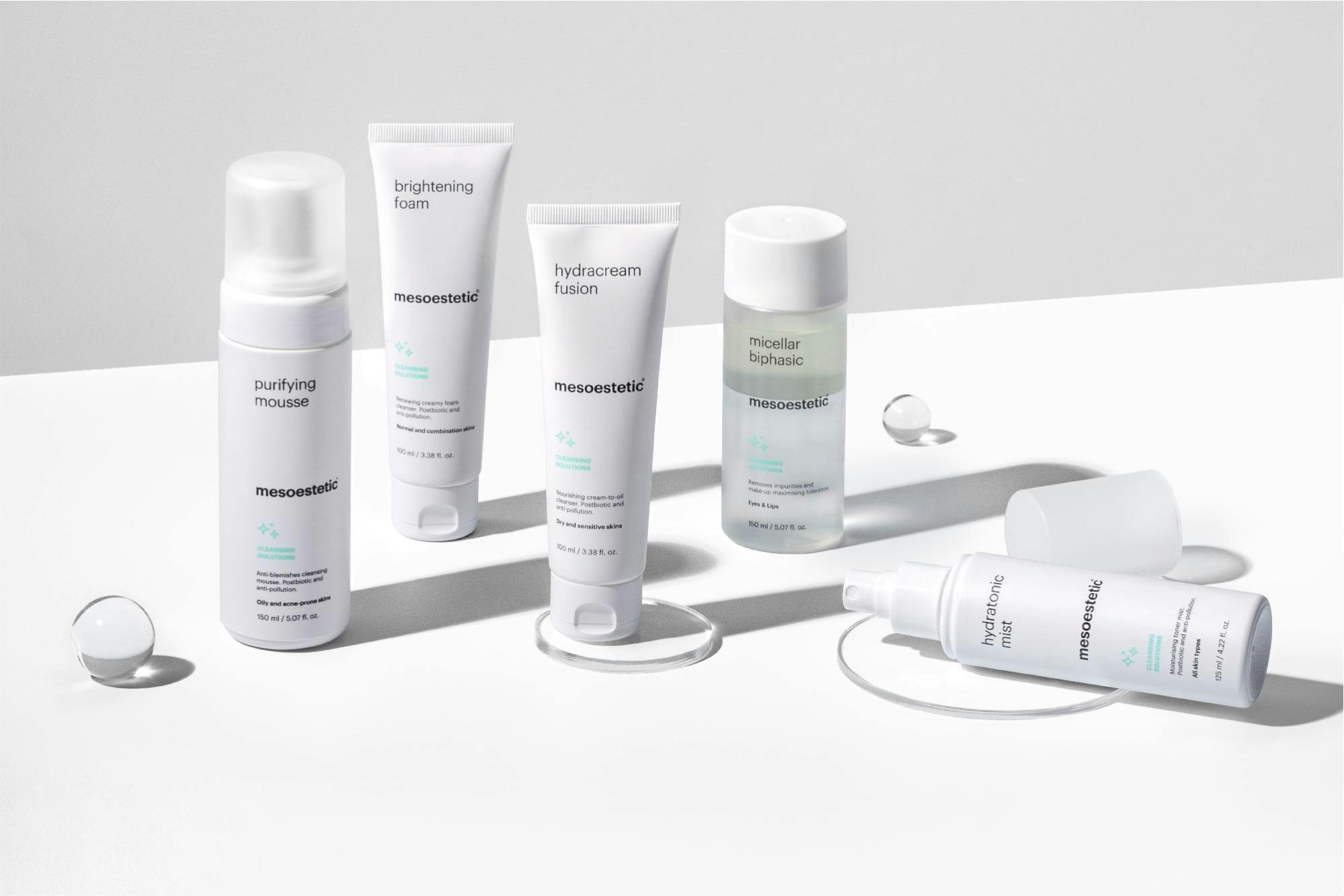
We have always worked with white packaging, a territory that is associated with science, research and pharmaceutical products.
In the end, all our products from medical devices to cosmetics have pharmaceutical rigour and are nourished by the experience of our medical professionals and aesthetics. White also helps us preserve the simplicity and sobriety that characterizes our brand.
How was the experience of rebranding your packaging and products?
In the past, our branding was just communicated to professionals. But now, as we're also targeting end-users, we have to communicate to multiple market segments. We knew we needed to employ a ‘pull’ strategy to get consumers, not just a ‘push’ strategy to get doctors and professionals to choose us.
While we retained our medical white branding for our domestic and professional market, we changed up our packaging for our medical market.
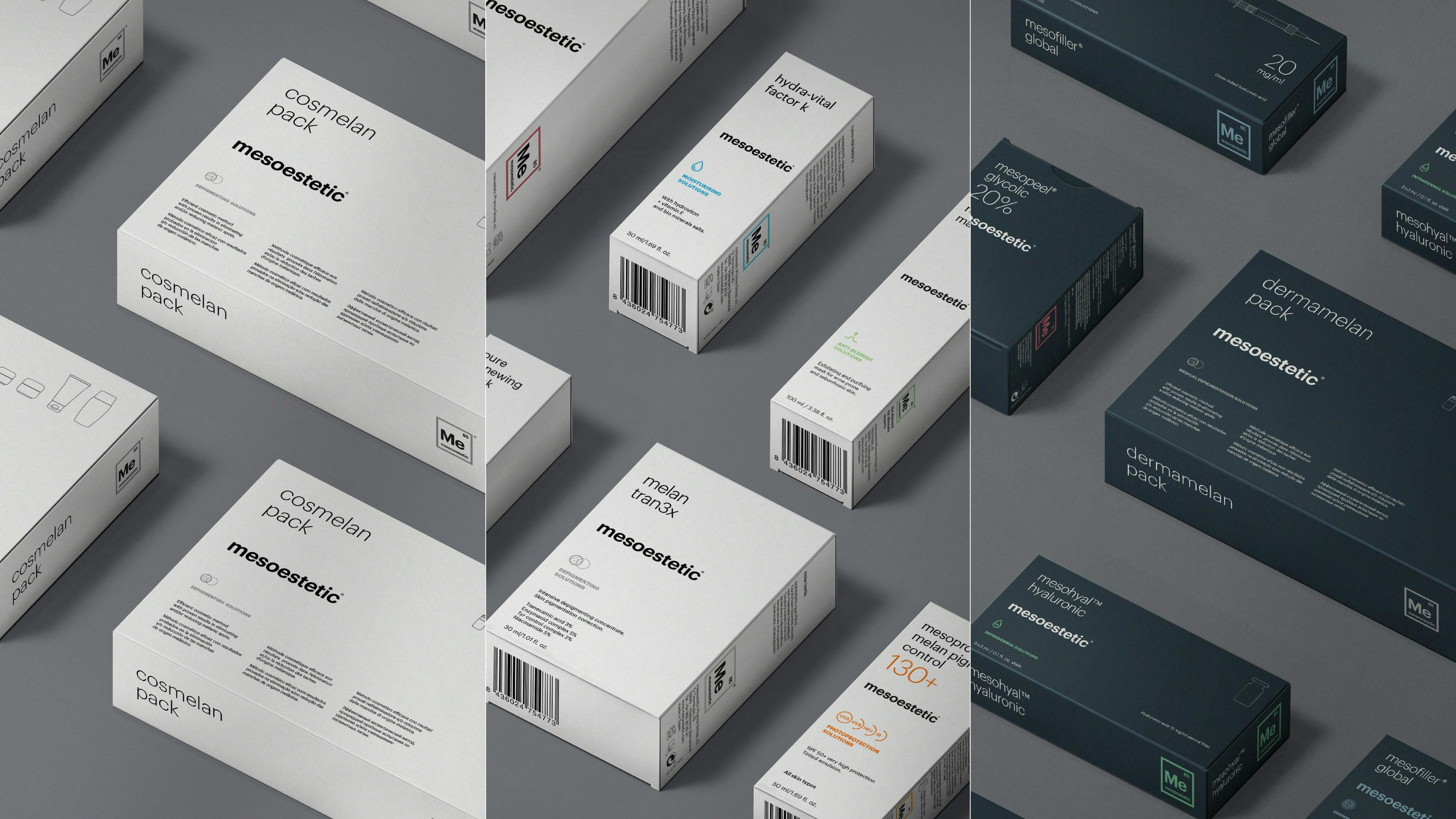
For that segment, our packaging is black because doctors don’t need to be told our products are medical. Instead, we wanted to make something more disruptive.
Along with the packaging color, the information on the packaging is also different depending on whether we’re marketing to doctors, to professionals, or to consumers.
What are the other elements you changed when mesoestetic was rebranded?
We also developed a system of icons that facilitate the understanding of different treatments. We tried to make it easier for our users. The idea is to make it easy for our hundreds of SKUs to find what they’re looking for.
What are your takeaways from the experience?
It has been a tough but amazing experience. And as with most things, the most difficult part was to start.
We learned that when it comes to branding, you have to see the whole thing, not just one part of the process. You can’t just look at changing the packaging, or just the corporate branding--but the whole picture.
It’s also important that you make your people a part of the process, and it’s what we have done from the beginning, making sure the employees were the first to know about the rebranding.