
before

after

Charles Lim, Head of Brand and Communications at PartnerStack, shares the unique challenges of refreshing and codifying the brand of a scaling technology company through design and content.
Can you introduce us to PartnerStack and the brand’s identity through the years? How were the past brands conceptualized
Like many startups, we prioritized speed-to-market, and so we leveraged existing open-source visual libraries to flesh out our initial branding.
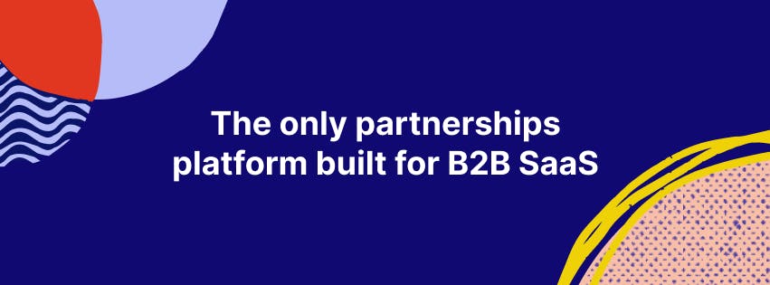
PartnerStack banner
Unsatisfied with our old logo, because of its low contrast, arbitrary form, and limiting minimum size requirements, we wanted to make one that was more elegant, flexible, and visually prominent.
Our rapid growth had introduced some inconsistencies into our processes. Some were simple enough, like colors and fonts, while others were more nuanced, like our voice and tone across our marketing channels.

About this current rebranding, how did it come about? How did that conversation start?
The conversation began around us taking a step back, and looking at all of the ways we were presenting ourselves to the market, to ultimately create a better system that we could nurture and build upon over time.
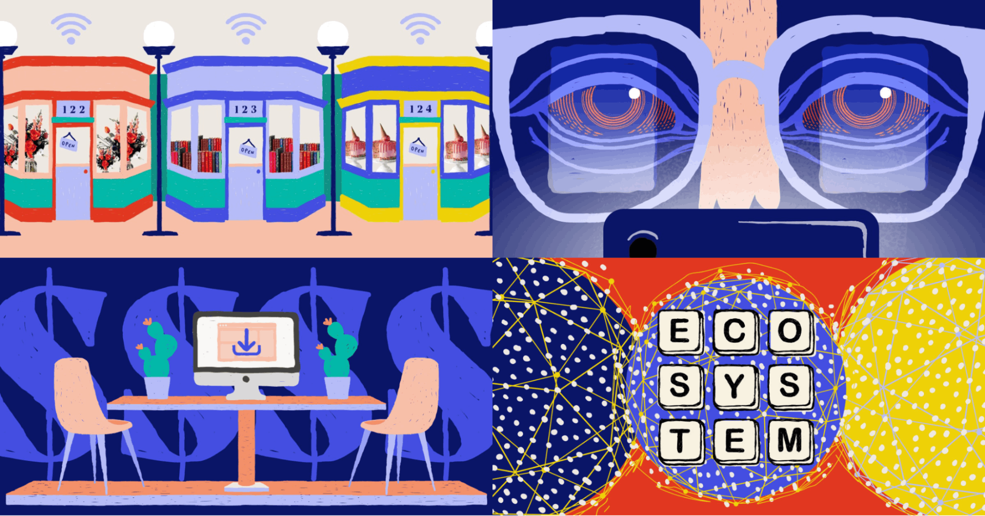
PartnerStack illustrations
I’ve observed at most startups, a Marketing department will initially form around its Demand Generation function first before investing in the Brand side.
PartnerStack is the all-in-one platform for scaling SaaS partner ecosystems. Since we had found early success as the market leader, it became natural and necessary to be more deliberate in how we were showing up.
How did the rebranding process go? Was it all smooth, or did you encounter challenges?
Like many branding projects, much of the process was around the alignment of our value proposition, values, and positioning, and then applying a robust creative process.
We kicked it off with a thorough discovery, and spoke with a lot of our customers, partners, industry experts, and especially our internal folks. We worked with an agency to do the analysis at the beginning.
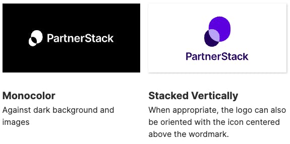
PartnerStack logo usage
We gained a lot of interesting insights, like what our customers perceived as our strengths and weaknesses, what companies and partners were looking for in the space, and how we could contribute our own ecosystem expertise as a company.
We used the data as a jump-off point and tapped freelancers we were able to leverage for their expertise in terms of execution.
You mention working with freelancers. What in your opinion is the anatomy of a good brief for them?
A good brief is brief. It has to be compelling that anyone who reads it would see that it will be good work, that they will be able to see where it is going. You’re almost trying to sell it to the people who are doing the work.
"You want them to see it and think that it will be a good project that they would want under their belt. "
If you shop it around to agencies, they could say, “We don’t like that kind of work so we’re going to just overcharge you for it.” But if it sounds compelling, they might think they want to break into that market or they are incentivized to do partnerships. Opportunities start to come out.
A big change was to your logo. Can you tell us how it was conceptualized?
We were conceptually happy with what our original logo represented, but found that it had fundamental issues in many applications.
Talking to customers, it was clear that they understood that this simple Venn diagram of two ellipses visually represents the connections between companies and their partners, and so we didn’t want a departure.
PartnerStack icon animation
However, we wanted to be able to manage production issues like working in one color, small sizes, and low contrast situations.
We did a lot of iterations to find the right proportions for our icon and wordmark, and we spent some time extending it to animation, to imagine how it could extend to the broader brand system across all of our collateral.
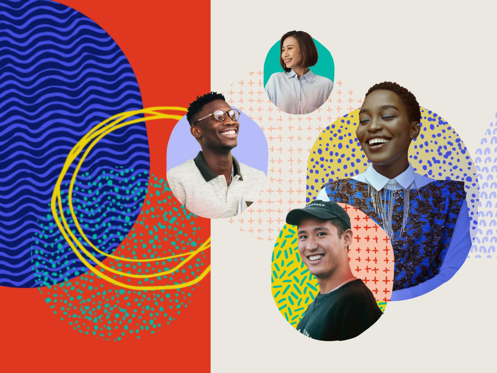
Can you tell us more about your illustration style? How did you develop or design this style for your brand?
We hear over and over again from our customers that they love our people, the fine people at PartnerStack they interface with as they scale their partner programs.
One of the things that differentiates us from our competitors is the people that work with our customers to educate them and help them navigate their partner ecosystems.
"We wanted to make sure that the human side of our business was represented in our marketing, and through a rigorous process, we gravitated towards colorful primary colors and handcrafted patterns."
In particular we were inspired by American artist Jean Michel Basquiat, specifically the work he did with Andy Warhol. The juxtaposition of clean graph lines with his rough gritty, layered textures and materials really spoke to the intersection of humanity, technology and growth that we were trying to express.
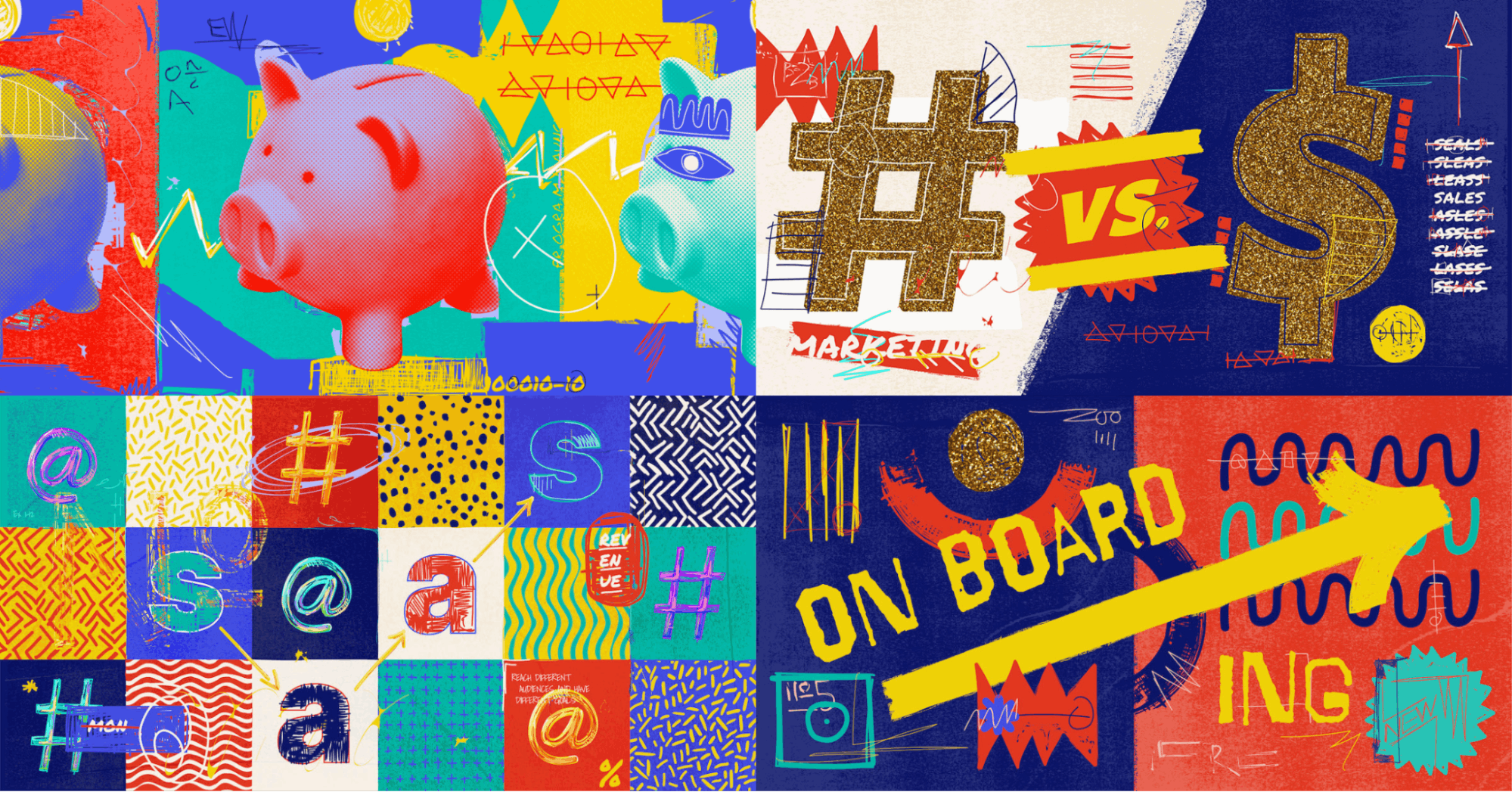
PartnerStack collage
We really liked the notion of a human trying to be a robot, as if trying to draw a straight line without a ruler. The intention is there, but it’s impossible to prevent the beautiful imperfections of humanity from shining through.
As we went through various style options, we were determined to zag against the now-generic flat people illustration (also known as corporate memphis), which we felt misrepresented the real folks at PartnerStack and our customers.
How about the color palette? How did you land on the colors and what do they say about your brand?
Blue was throughout our communications so we didn’t want to lose that recognition. It was the default color on our swag, and was recognizable among our competitors.
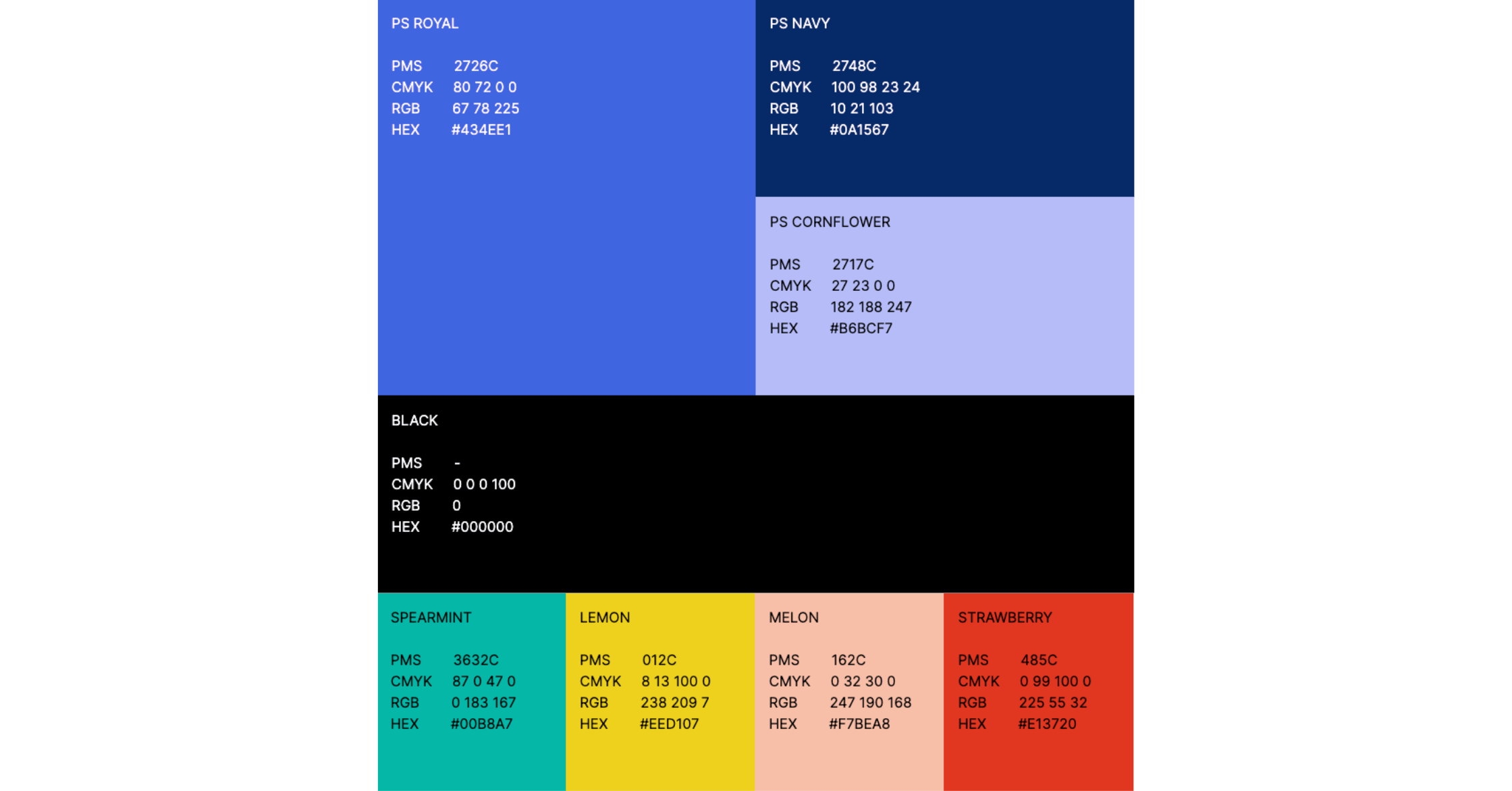
PartnerStack color palette
We chose primary colors for our secondary palette because they butt up against each other in impactful and high-contrast ways.
"While it’s sometimes tempting to revert to our more corporate identity of limited colors with a bevy of tints, our internal guidelines outline how we wish to use our various styles, whether we’re reducing friction when presenting lots of information, or creating visual interest within an experience."
To follow our company’s love of breakfast food (we call ourselves Pancakes), we lovingly named our colors after foods, like our melon coral, cornflower blue, and wheat beige.
How has the reception been of your new brand? Have you noticed any significant changes? It could be through feedback or even a rise in certain metrics.
One of the most valuable parts of any creative process is putting the work in front of customers and industry experts. It helped validate a lot of our decisions and give us confidence that we were on the right track.
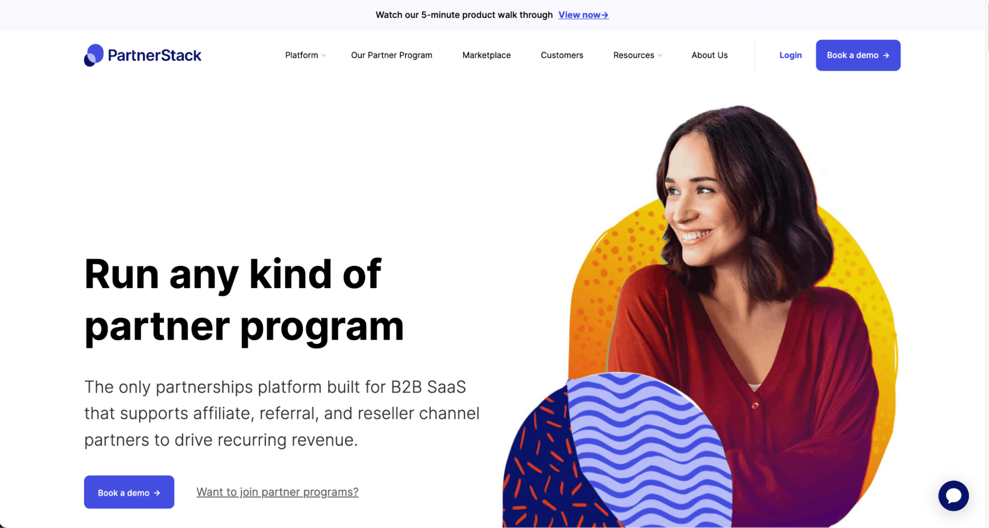
PartnerStack website
The biggest application of the new brand was the redesign of our website. Typically, when changing major parts of a site, you’ll immediately see a dip in analytics. We actually saw a lift across the board in traffic and conversion rate, so we knew we had something special.
Coupled with the increased velocity of production of a growing team, we were excited to tackle old inconsistencies knowing that we were now set up for campaigns to come.
What is your major takeaway from this experience? Or, do you have any advice for brands or designers embarking on rebranding projects themselves?
I’ve been doing this type of work for years, and every client/project is different, but embarking on the rebrand with the team at PartnerStack exposed me to some of the most thoughtful, opinionated and delightful ideas I’ve had the pleasure of engaging with, which I think speaks to the diversity and generosity of the team.
"My advice for brands would be to commit to a rigorous creative process (I myself subscribe to the Double Diamond). "
The key to successful branding is leaving no stone unturned. Predictably driving the project forward means focusing the team on the right details, like prompting the type of feedback that’s required at the various milestones, whether it’s generating new ideas, or refining the good ones.
PartnerStack illustrations
Finally, I would suggest presenting the work with the relevant context to as many folks as possible (both internally and externally) and never shying away from critique.
Where I see design fail in a lot of projects is when they don’t give people the chance to contribute in an open way. It’s not enough to take a screenshot of Figma and toss it over into Slack.
"Feedback in branding is truly a gift, and it helps separate the insights from the messy details."

