
before

after

Katie Wickham is the Marketing Director at Payrix and a creative marketing professional experienced in B2B/B2C payments and the FinTech Space.
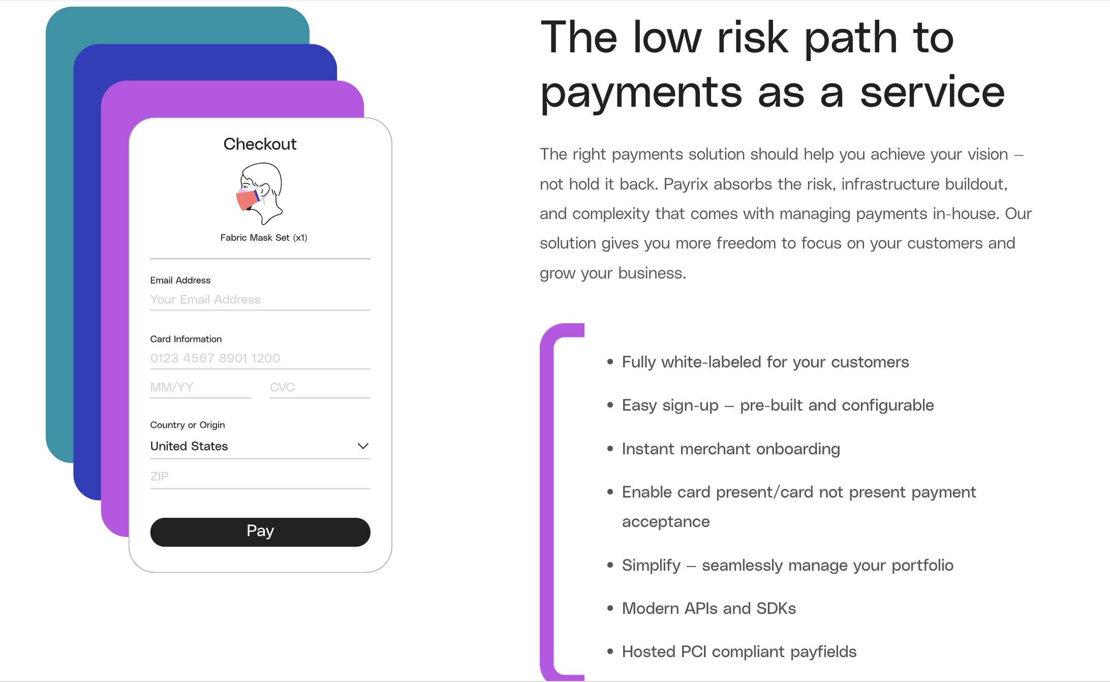
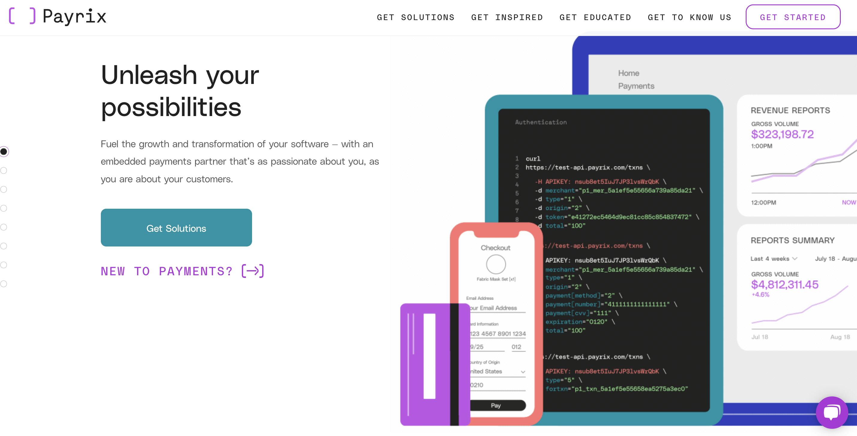
Payrix new homepage
Can you introduce us to Payrix and the exciting things it's doing these days?
Payrix is a passionate global team of payments and software experts. We provide vertical software companies with an all-in-one platform and a white-glove approach to capitalize on the opportunities within embedded payments for growth, innovation, and transformation.
We strive to be the global leader in embedded payments, and are committed to giving our clients more freedom and peace of mind with a proven solution that helps eliminate friction, unleash their possibilities with new revenue, and make their customers’ lives easier. Our clients are entrepreneurial SaaS businesses � like FieldRoutes, Neon One, Acculynx, SupporterHub, SimpleRent, and more �serving verticals like field services, non-profit, medical, and dental.
It has been such an exciting time at Payrix and in our market over the past two to three years. We’ve achieved growth in the triple digits each year, all while enhancing our platform’s capabilities, expanding globally into Australia and bringing in more talent to support our clients. In 2021, we completed a complete refresh of our brand identity and were recognized as an Inc. 5000 company and a Top 100 Financial Technology Company (by The Financial Technology Report). Above all, we’ve stayed focused on client success and have continuously expanded our tech stack to provide more customization, flexibility and efficiency for our clients and their customers.
This year, we have even bigger things in the works for our clients. We were recently acquired by global fintech leader, FIS, which will allow us to expand our global reach and enhance our platform’s capabilities for SaaS providers around the world.

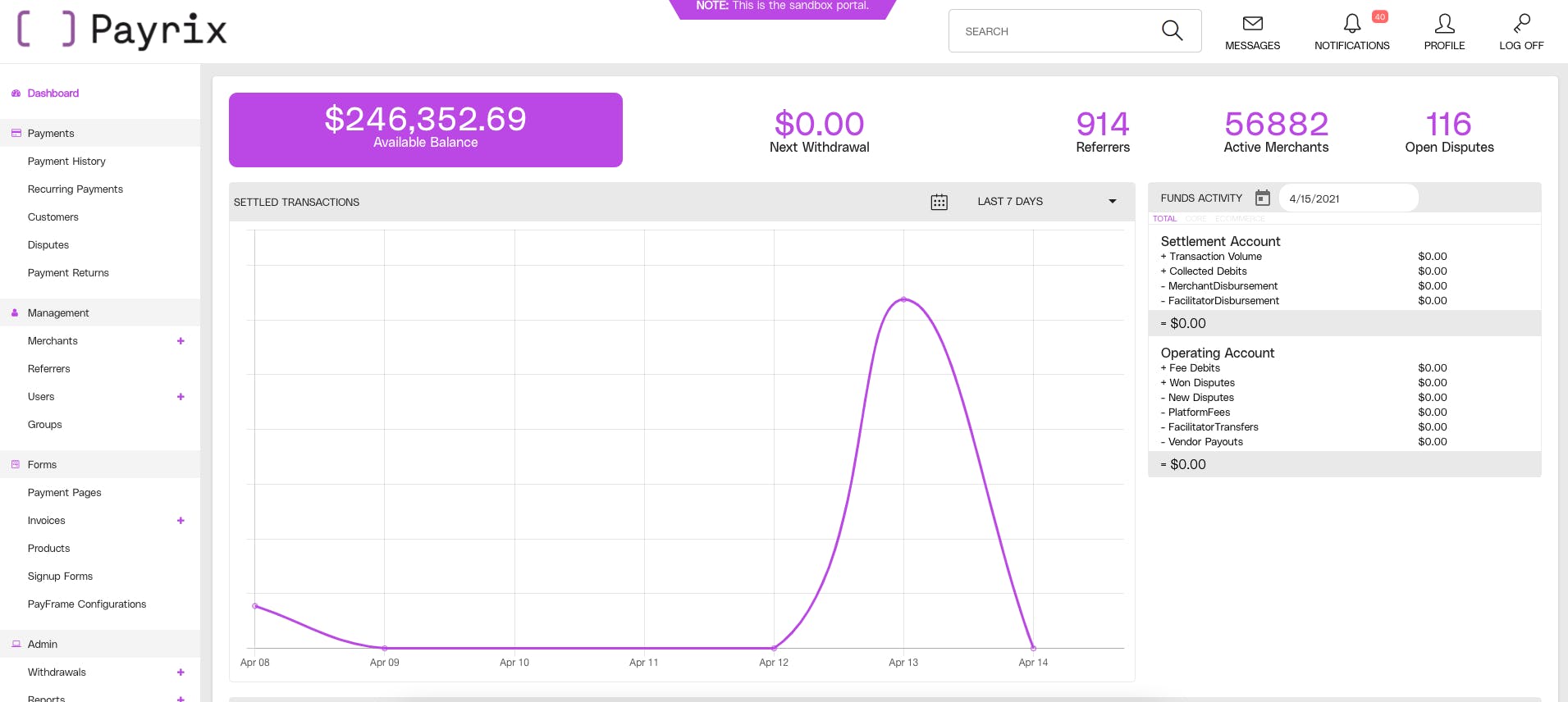
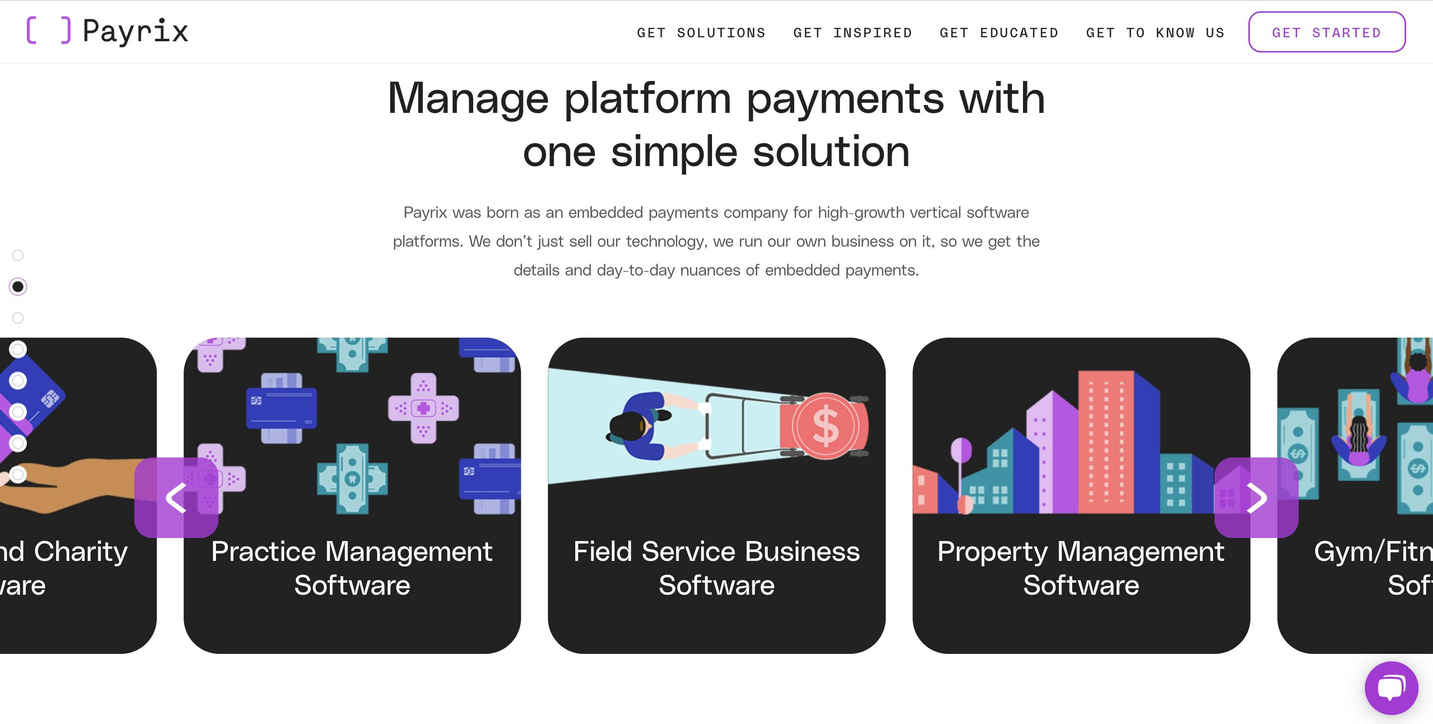
Payrix new dashboard
Walk us through your company’s brand identity through the years. How was the initial branding conceptualized?
I’ll start by summarizing our origin story to give a little more context. Payrix was founded by a team of entrepreneurs who got their start as an ISO (independent sales organization). When customers began leaving for payment facilitators like Square, Stripe and Toast, our team started to question the antiquated technology of legacy processors. As they set out to become a registered payment facilitator, our founders realized there was no technology to connect to the payment processors so they had to build it. They quickly realized that they’d built something that they could market to other companies that wanted to become a PayFac (payment facilitator) and launched Payrix in 2015.
From the start, our story has been about the tech, our passionate team and our SaaS customers. The brand was not really a priority for the first several years we were in business because we were a very lean team of software developers and payments practitioners. Building a best-in-class platform and expert team that could deliver for our clients took priority.
Most people who have been part of a bootstrapped team or worked at a start-up have ended up wearing multiple hats. In the early days of Payrix, it was no different — our COO at the time also wore the hat of graphic designer. He came up with the concept for our original logo and iterated on it a bit with the team before it was finalized. It was only a wordmark and the typeface was very thin. I think our color palette originally had teal, orange, navy and gray in it, and we made some updates to it in 2019 shortly after raising our Series A.
Payrix was still fairly new in the market even in 2019 when I joined the company— and because our solution was disruptive, it required a significant amount of educating the market. We were still testing and developing our brand positioning and messaging internally, so we learned a ton about ourselves and our clients in the process.
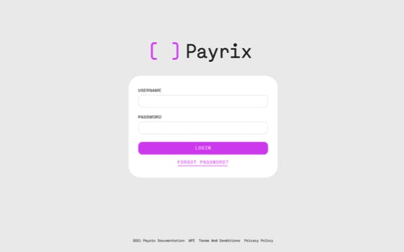
Payrix login portal

Now about this current rebranding, how did it come about? How did that conversation start?
Over time, we got clearer on our ideal client profile (ICP) and refocused our go-to-market strategy. We knew we wanted to build everything we did around our ICP.
In October 2020, we acquired a company in Australia to continue removing barriers for customers. On the heels of international expansion, our business grew into a global payment technology company with loyal clients and a global market presence. We had spent time expanding our product set, focusing on client success and growing functional areas of our business. At that point, we knew it was the right time to unify our company and evolve our identity to reflect the true Payrix.
I knew it, our entire executive team knew it. Based on where we were as a company, it was not all that hard to get the necessary buy-in for this investment. For Payrix, the part that required a bit more consideration was the decision on which agency would help us evolve our business.
With a ballpark budget we wanted to shoot for, we evaluated three very different options. One was a full-service agency, another was a fractional CMO and agency that focused on challenger brands, and the third option we called “the Trifecta.” We recommended the Trifecta � made up of three best-in-breed agencies that planned to divide up our project into three phases: brand positioning and messaging; visual identity and website.
In the process of making a recommendation to our executive team, we got questions about whether we would be able to manage three agencies at once, or if the agencies would be able to seamlessly integrate throughout the process. All were valid considerations. We made sure to keep the dialogue going with the agencies we were considering and asked all of those tough questions to ensure we were comfortable with the approach they proposed.
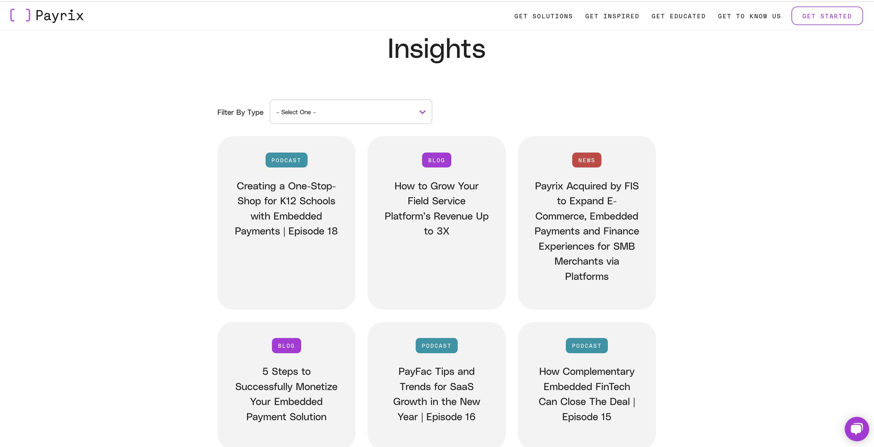
Payrix content
We’d love to know more about the rebranding process. How did it go? Who were the key players in this project? Was it all smooth sailing? Were there surprising challenges that you encountered along the way?
Overall, our rebranding process was an overwhelming success with our stakeholders and audience. With that being said, any big initiative like this where it touches every aspect of the business in some shape or form, there are bound to be challenges.
"I have been blessed with some incredible mentors over the years who have taught me there will always be bumps in the road, and what really matters is how you navigate them."
It wasn’t all smooth sailing, but I think our team accepted that going into the project, and did our best to plan accordingly. It also helped that we had the full support and engagement of our executive team.
When we assembled the team to drive this process forward, the core group was made up of myself as the project manager and two executive sponsors: our Co-Founder/Chief Strategy Officer and our President/Chief Commercial Officer. The three of us managed the vendor relationships and internal review process, along with all of the day-to-day communication and fielding feedback with each agency. Externally, we invited a handful of key customers to participate in the process with us. We also included a cross-functional team of internal stakeholders, like our product and client-facing team members (sales, relationship management, support). Our executive team was heavily involved in the decision-making around our brand strategy (messaging/identity) and weighed in during the website design process.
I’m not sure if I would say it was surprising, because I knew our accelerated timeline would be challenging. Payrix started evaluating vendors in November 2020 and launched the brand refresh in the US in April 2021. After that, we took a quick breather before diving in to launch phase two in September 2021 Australia.
Our efforts in Australia were quite different from developing our brand narrative and identity. We already had our identity, we just needed to pressure test it with the local audience. The focus was on changing the name of the company we acquired and launching Payrix in a different country. There were legal and compliance complexities to navigate; among other things like changing our email domain and the domain for our product. It was more of an operational lift versus strategically repositioning our identity.
Payrix masthead
What’s the story behind your new logo? How was your new icon and wordmark conceptualized?
At our core, we are both a payments business and a technology company. We’d learned it was a tough needle to thread �and positioning ourselves as only one or the other wasn’t quite going to do our identity justice.
We stressed the importance of this so much during the process and we were really pleased with where we landed with the creative team. Our icon pulls inspiration from the humble developer’s brackets, as does the typeface of our wordmark. What I thought was really unique was how the designer chose to flip the brackets inward, forming the shape of a credit card with the two brackets.
Payrix homepage
A distinct change to your visual identity is the color palette. Can you tell us more about how they were chosen and what they say about your brand?
Going into the process, we knew we wanted our new identity to be bold. Standing out to the entrepreneurial SaaS companies we serve was a priority for us, as well as having our identity reflect the passionate team and first-of-its-kind tech stack we have. And as mentioned, we really wanted payments and technology to be strong throughout our written and visual story � including our brand colors, which were actually inspired by a developer coding tool.
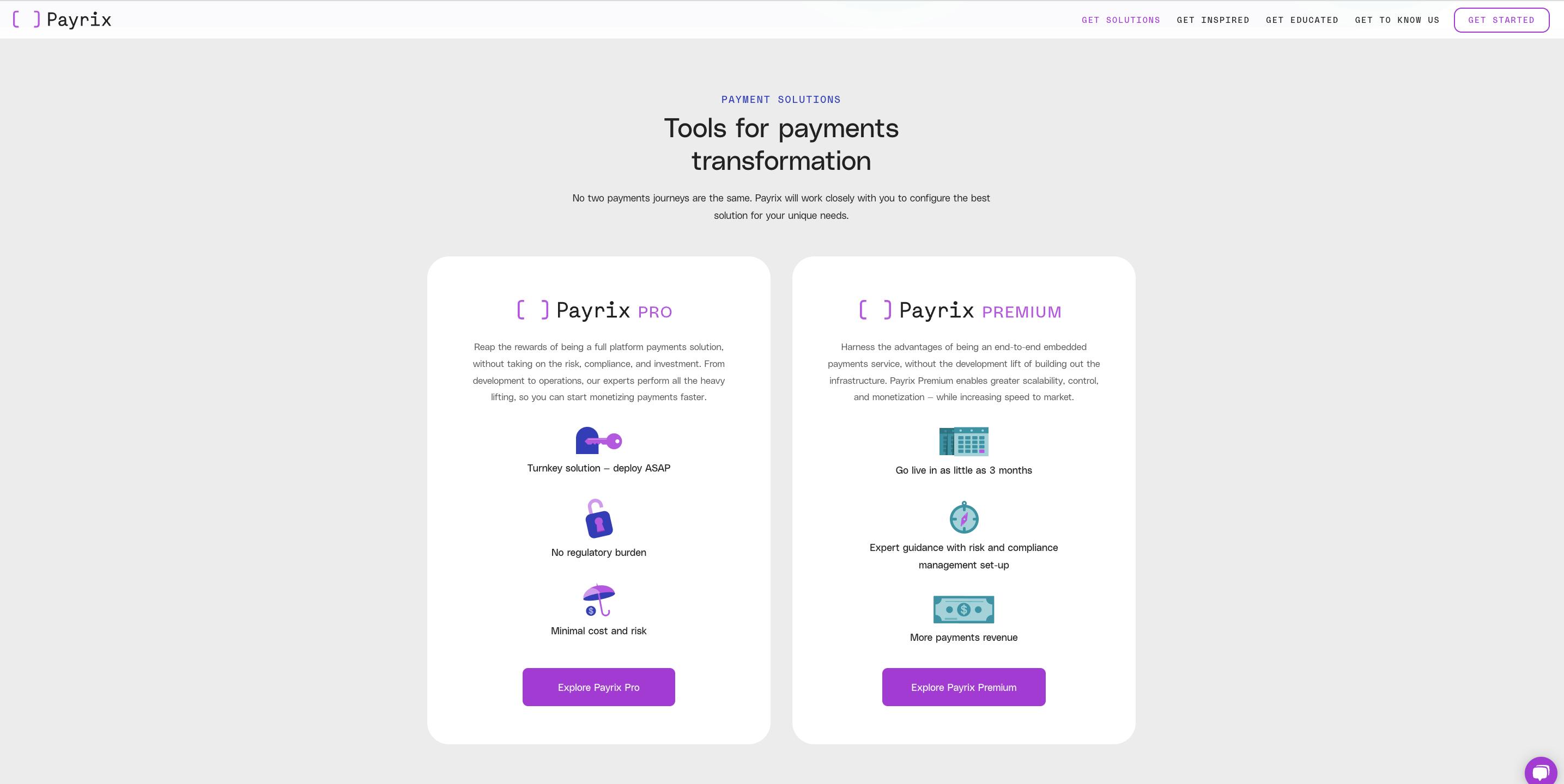
Payrix products
Shapes are also dominant in your design elements such as the rounded squares. Can you tell us more about them?
Even in our design elements, we were aiming to communicate the brand narrative in a clever way. We use a lot of geometric shapes and abstract illustrations that incorporate elements related to payments and software. The rounded rectangles as well as the brackets in our brand mark are in the shape of credit cards.

Payrix Pro logo
You also make use of illustrations. How were they developed, and how did you land on this art style? What was the inspiration for them?
Our goal was to craft a strategic narrative for Payrix that elevates our value by recognizing the B2B customer’s total experience and meeting more of their needs �from the functional to the more personal motivators such as helping our clients achieve their vision for the future.
We pulled inspiration from the humble developer’s brackets and their visual relationship to essential parts of the payment process �credit cards, smartphones and modern UX design — this combines these shapes into colorful, narrative that help illustrate key brand messages in a dynamic and whimsical way.
Our illustrations integrate payments related imagery to create delightful moments of discovery for viewers. We incorporate objects traditionally associated with payments like credit cards, dollar bills, and coins as well as more contemporary payments related imagery like smart phones, charts, and graphs.
Lastly, what would you say is your main takeaway from this experience? Perhaps there’s something you wish you knew before you started, or any advice for designers embarking on rebranding projects themselves?
It was such an incredible process to be a part of from end to end. Definitely challenging, but so rewarding, both from a Payrix point-of-view and for me as a marketer. I honestly can’t wait to do it again!
I would say to others: involve your customers and key stakeholders. Not just at the beginning, but throughout the process too. It doesn’t have to be a rebrand by democracy per se, however, their feedback is important to incorporate.
As you plan for launch, recruit brand ambassadors internally and externally; provide education and create excitement around the new brand so they can champion it with customers and in the market.
