

Beatričė Baronaitė is a lead designer at Étiquette. She lives in Vilnius, Lithuania.
Can you tell us how this project came about? How did that conversation start with Pergalė?
Pergalė (est. 1952) is one of the oldest chocolate factories in Lithuania and the biggest confectionery producer nationwide, exporting to more than 45 countries worldwide, including but not limited to Taiwan, New Zealand, and Australia. The brand always pushes the industry limits with its more than 300 unique recipes, limited-edition lines, and different sweets varieties.
Pergalė described their need for rebranding as a step towards the future — swapping manual labor for robots meant that the old chocolate molds were no longer used. It created a ripple effect since the new chocolate design didn’t fit into the old box while the graphic design was outdated too. So Pergalė approached us to create an entirely new look and feel for a beloved national brand.
How did the rebranding process go? Can you tell us more about it? Where did you start?
We know that big rebrandings tend to last for a prolonged time. That’s why one of our biggest priorities was to create a timeless design that will withstand temporary trends.
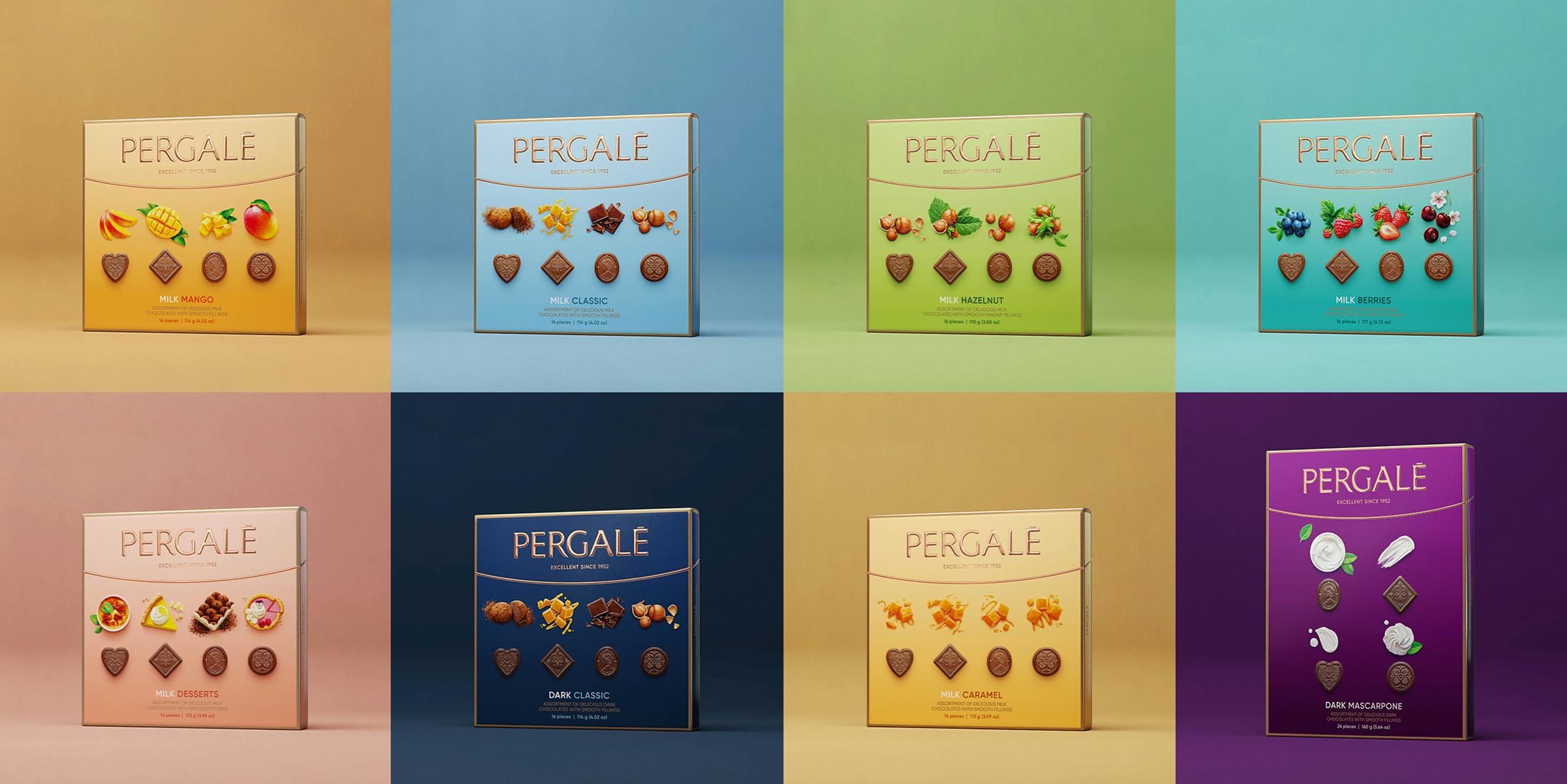
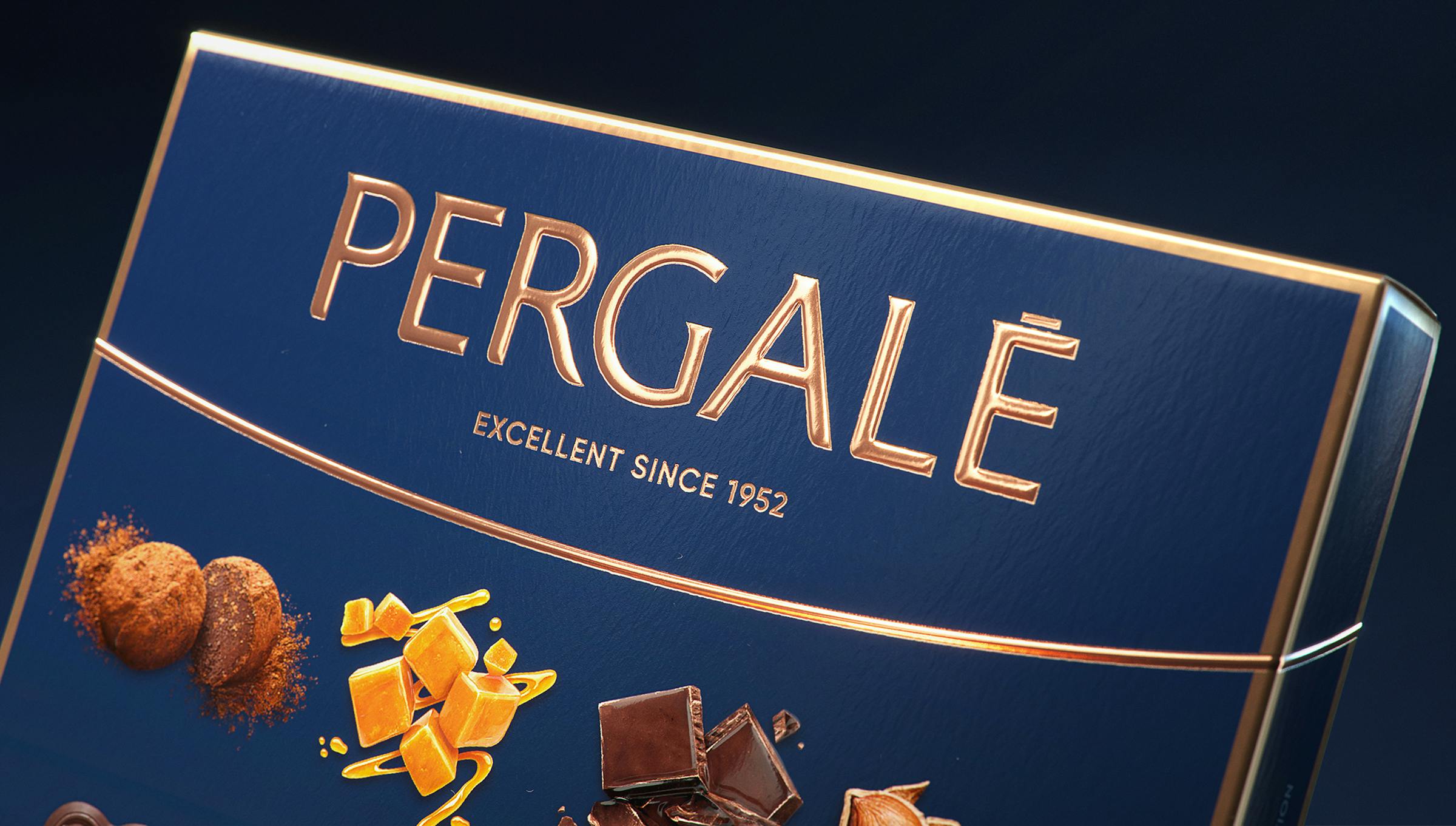
In the beginning, we offered the client a few design concepts. Once they landed on the one you see right now, we began the detailed work of addressing every design element individually. Naturally, we started with the logo as it was the most recognized and essential design element. We kept the Pergalė logo as it is but removed the milk/dark chocolate indication. It allowed us to flatten and simplify the wave into an elegant half ellipse giving the logo a much-needed airy composition.
Moreover, the target audience’s understanding of what luxury is supposed to look like shifted majorly, so we decided to move away from overused gold, substituting it with a copper shade reminiscent of a master chocolatier’s tools.
Were there surprising challenges you encountered along the way?
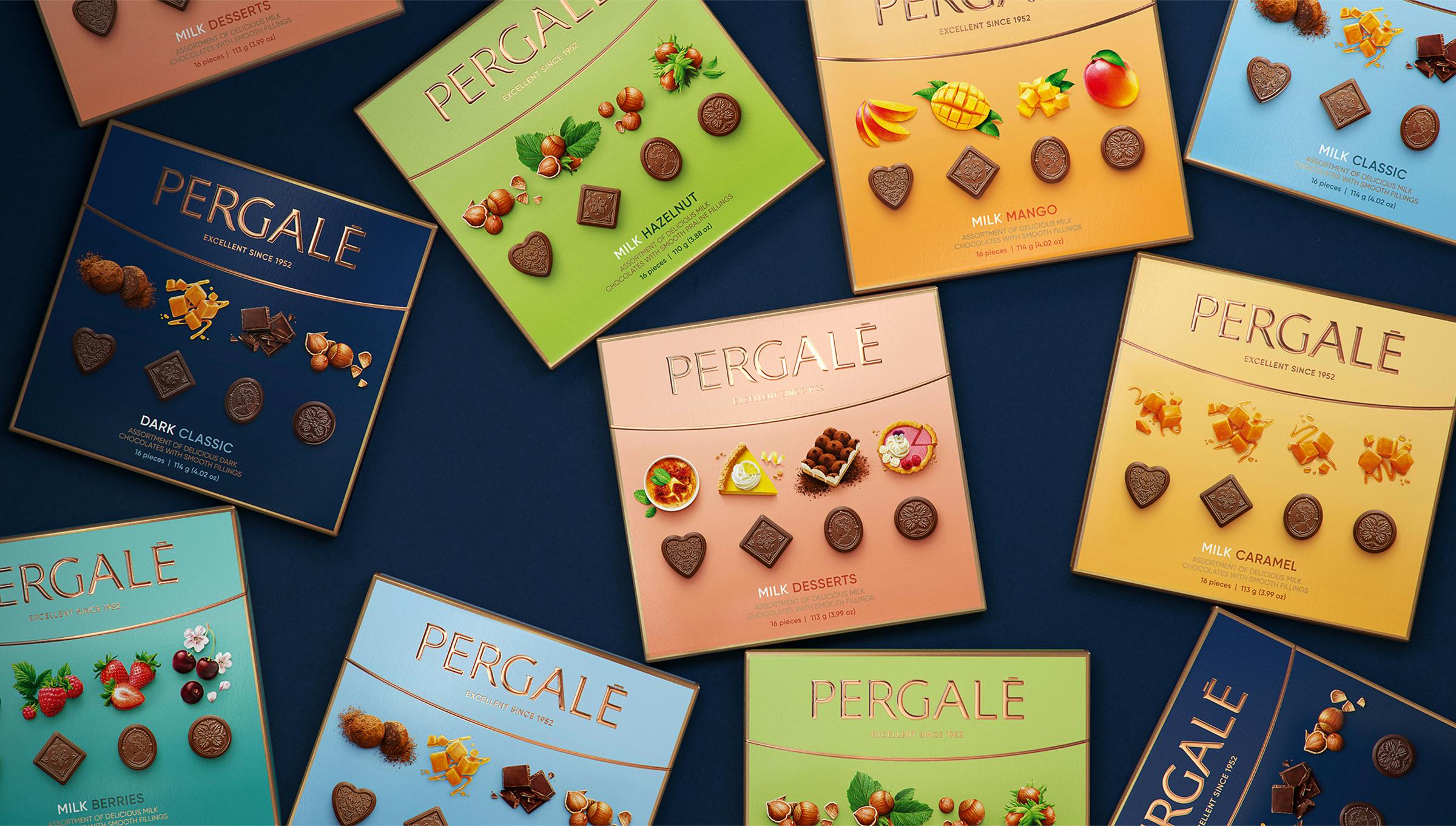
Taking on a project of this length and volume, one of the biggest challenges is thinking 10 steps ahead. How is this going to look in a few years? If the number of SKUs is going to grow, will we have a solid enough design structure to maintain recognisability between, let’s say, 10 flavors? How about 20?
Another thing that is to be considered is the actual printing process — depending on a manufacturer or the technician operating that day (or sometimes even the temperature of the factory), the color outcome might be slightly different every time. How will that affect the overall design? Those were just a few challenges we encountered along the way.
The new visual identity is a modernized but timeless and classical update to the previous branding. How was that conceptualized?
The most significant difference between a brand new design and a rebrand is the audience. Some argue that creating a captivating concept for a new product is one of the biggest design challenges. Still, I believe that rebranding a well-known and beloved product and capturing new audiences whilst staying true to the old ones, is truly a challenge that not every designer is ready to take on.
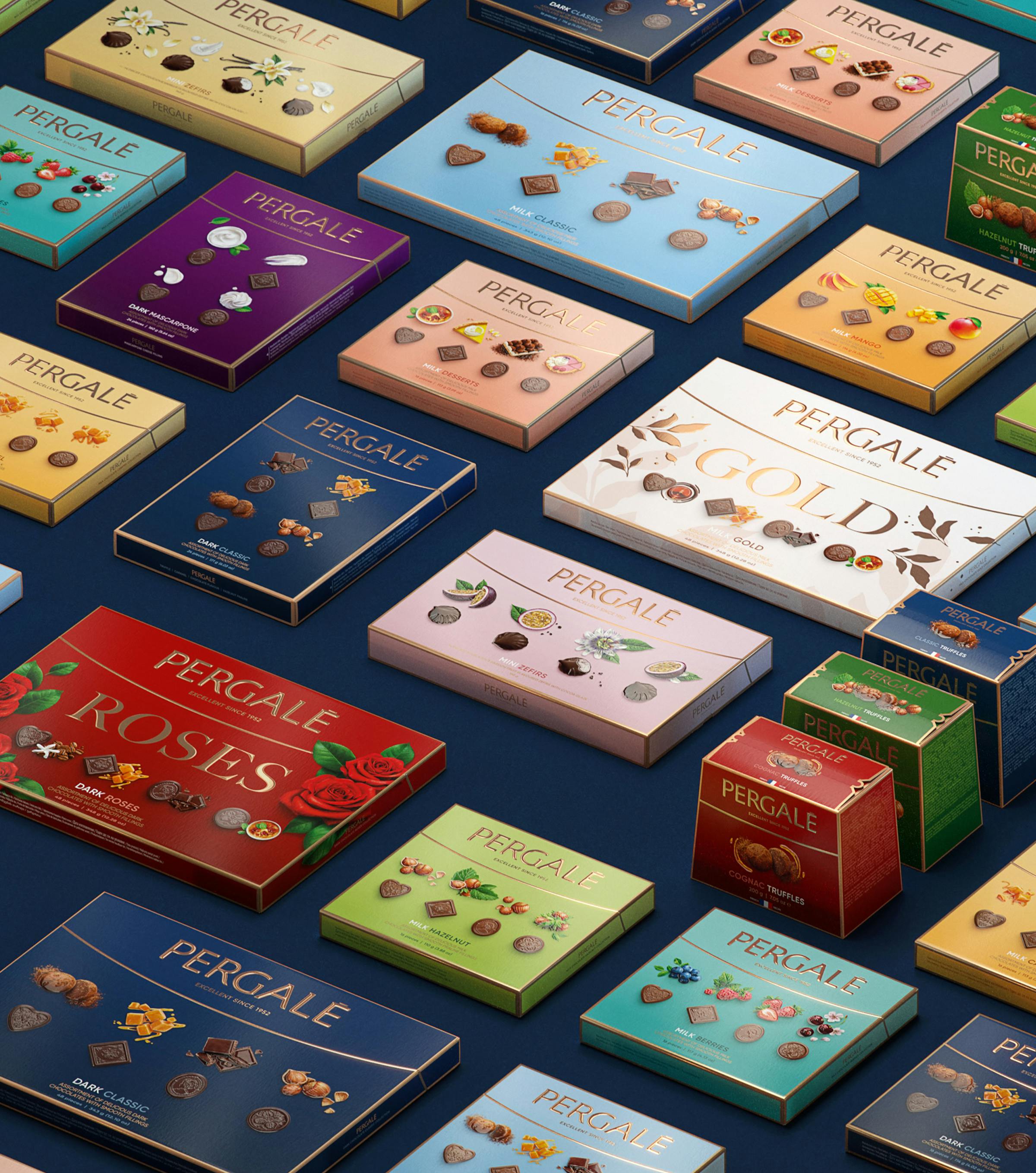
That is why with this Pergalė rebrand, we wanted to create a concept that would both adhere to the well-established rules (an already recognizable logo, straightforward showing of chocolates and ingredients, conservative choice of colors) but do it all with a contemporary and well-designed twist, that would intrigue and please younger generations.
How did you conceptualize or land on certain changes such as the new fonts, the colors, and the gradients?
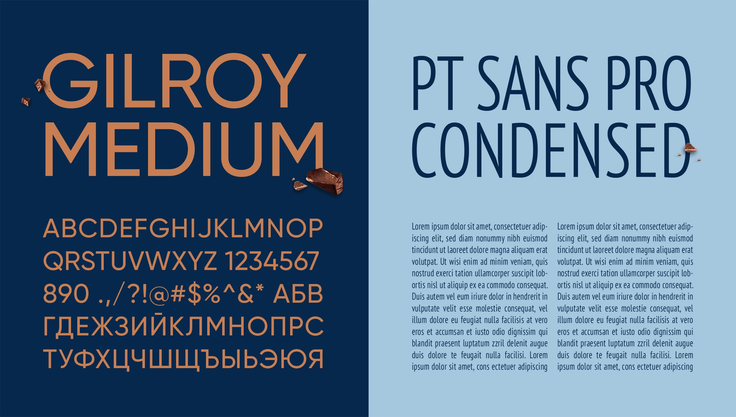
We agreed that the frontside needed to be neat and legible but look modern and crisp. That’s why for headline texts, we chose the Gilroy typeface. Meanwhile, the backside was required to fit vast amounts of text, so a thinner and tighter PT Sans was chosen.
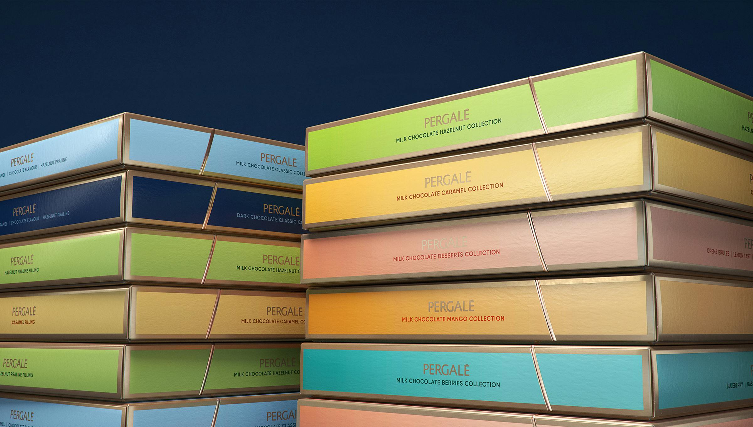
We needed a well-organized color system to span across many SKUs, so we came up with a solution to use lighter colors for milk chocolates and deep shades for dark chocolates. That way, a customer can identify their favorite type of chocolate without reading the description.
A subtle gradient throughout the box was used to create a feeling of depth. It also serves another advantage — once the package is placed on the shelves, it outweighs the inevitable darkening on the top of the box.
Photography is important for a brand like Pergalė. How did you approach photographing and showcasing the chocolates in the new branding?
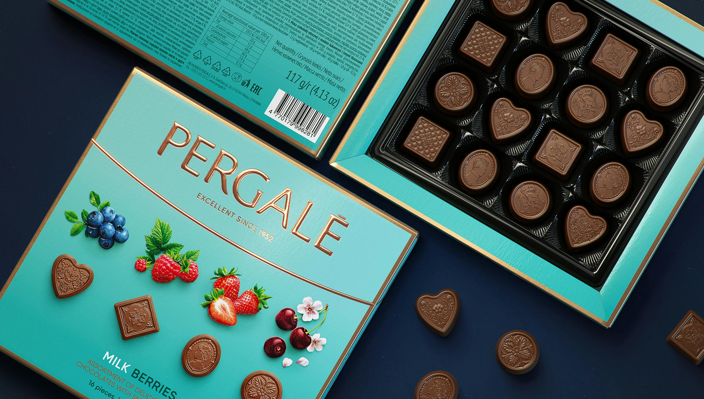
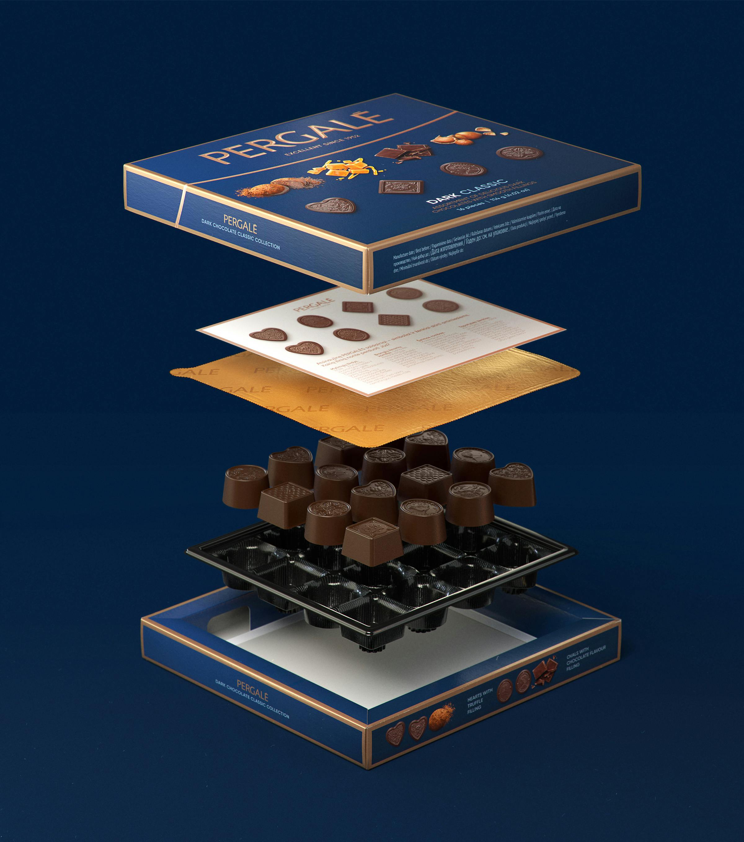
The upper view of the chocolates and ingredients came from two insights. Firstly, this was the best way of showcasing the new chocolate design. Secondly, it responded to the Instagram-inspired global trend — taking a food photo from above.
When it comes to depicting food, designers are usually faced with three choices — you can use photographs, 3D models or illustrations. We decided to merge illustration and photography, choosing photorealism, which showcases the product’s best without looking too artificial or too perfect.
Lastly, do you have any advice or tips for designers embarking on branding projects like this?
There are so many tips that I could write an entire book. But for now, I think I will resolve to just the main three.
Firstly, it is vital to be as organized as possible when dealing with a project of this size. Name all your files, keep track of all the documents, notes, and emails that don’t seem too important right now — it’s easier to delete them afterward than miss some piece of essential information.
Secondly, don’t be afraid to ask for help. More often than not, people are more than happy to help others and share their expertise. It’s okay not to know everything, and we’re all just learning.
And lastly, don’t be afraid to show the client your braver, more “outside the box” ideas. It’s always easier to dial it back than never going there in the first place. You never know if your idea that seemed so crazy at the time might end up being one of the biggest rebrands of the decade.

