


Bunny Tharpe, Vice President of Marketing at Quark, discusses the physics behind their visual identity and revitalizing their brand for the internet age.
What prompted Quark’s recent rebrand? What’s the story behind it?
Quark just celebrated 40 years in business and is best known for QuarkXPress, the software that revolutionized desktop publishing after its debut in 1987. This remains a critical tool for independent designers and creative teams at both small businesses and large enterprises.
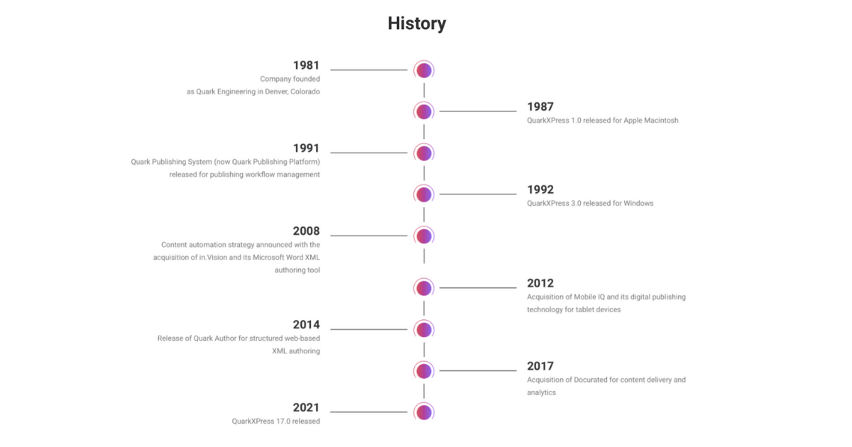
But after desktop publishing became more competitive toward the year 2000, and the internet turned every industry on its head, Quark began looking for new opportunities. It developed software for enterprise dynamic publishing, now referred to as content automation, and acquired other companies for digital publishing and content management.
By mid-2021 and under new executive leadership, it was clear the Quark brand didn’t properly represent the current company, its content technology portfolio, or its broader value.
The Quark story is bigger than content design. Content automation and intelligence are important parts of the larger value proposition for content lifecycle management.
While Quark had name recognition for QuarkXPress, its other solutions weren’t well-known despite being used by high-profile global companies across numerous industries.
We needed to redesign and rewrite the website to explain who we are today and what we offer. But before that initiative could begin, we had to re-evaluate the visual identity system and establish brand guidelines.
Simultaneously, the executive team was meeting to soul search, to answer those fundamental questions about who we are, what we do, why we do it, and what makes us different. The answers to those questions define your brand. It’s the foundation and guiding force.

Quark has been around for forty years. How did you embark on rebranding for this major milestone?
Thankfully, we didn’t have to start from scratch. There were elements we could use, so revitalization became the brand strategy.
For the existing Quark logo, the idea of its icon representing a quark worked for those of us on the inside who realized what that is and the company’s history, including the founder’s fondness for physics. But for those outside who may not realize what a quark is, it also could be interpreted as an eye symbolizing visual communications or even the spark of creativity.
Quarks are real, elementary particles, circular objects, that are the building blocks of all matter. So if a quark in science/physics is the building block of all matter, then Quark – the company – is the building block of all content.
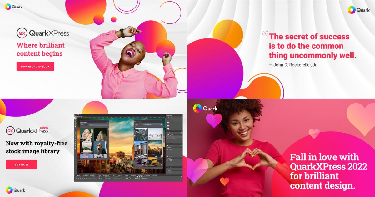
Some of the marketing materials also referenced “making content brilliant.” I really liked that concept: “brilliant content” – smart, bright, colorful, impactful – all those things designers and marketers want their work to be.
But what about the enterprise side of the Quark business that focuses on content automation and intelligence software? Those products help customers publish content that helps them accomplish their corporate objectives and achieve their desired business results.
To net it out, they want content that actually works. So the tagline shook out by combining those two value props, “Brilliant content that works” – brilliant in terms of design, brilliant in terms of strategic business use, and brilliant in terms of intelligence to improve content performance.
Of course, the icon in the corporate logo had to become more vivid, more colorful, more drumroll … brilliant. Our design team at Create Expectations rounded the corners to make it more modern and selected bright, dynamic colors that crystalized our new vibrant foundation. We also kept the moniker.
So again, revitalization instead of a total do-over -- and that decision enabled us to roll out the new brand and rewrite and redesign our corporate website in just three months.
The QuarkXPress icon also was updated. Can you tell us more about the significance of the icon?
The QuarkXPress logo had not been updated in quite some time, so our goal was to simplify and modernize it. We again focused on physics and the literal “quark,” tying in the theme from the Quark corporate logo.
We liked the existing color used for the QuarkXPress brand, now known as “Quink,” and focused on creating an icon with clean lines and a contemporary style.

Plus, the new QuarkXPress logo has two visual representations: the small, circular particle surrounded by the larger line particle represents a pair of quarks, and the circular line with the small dot visualizes a deconstructed “Q.”

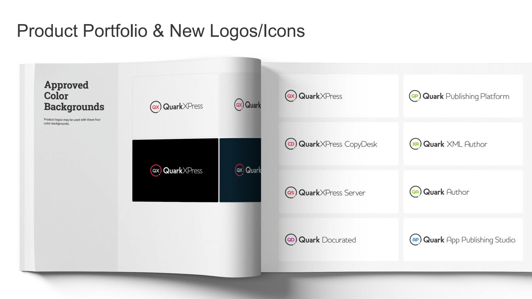
Along with the main logo, what else was updated in Quark’s visual identity?
In addition to the QuarkXPress logo, the Quark Publishing Platform and Quark Docurated logos also were refreshed, using the same particle iconography as the QuarkXPress logo.
Color was used as a means of differentiation between the products as were their product initials: “QX” for QuarkXPress, “QP” for “Quark Publishing Platform,” and the “QD” for Quark Docurated.
Quark Publishing Platform and Quark Docurated carry the science/physics theme to a new level with Enzyme Green and Particle Pink as their identifying colors.
The color palette you use is distinct and vibrant, is there a significance or story behind the chosen colors?
The three product colors are also colors within the icon that’s part of the Quark corporate logo.
All of the colors in the Quark color palette were given scientific names by our design team in keeping with the scientific basis of the company’s name.
They are fun, bold, vibrant – brilliant -- to reflect the company’s new branding, our promise of value.
Do you have any advice for designers who may be embarking on branding/rebranding projects as well?
Understand your why. Our rebrand was part of helping Quark execute a new business strategy while paying homage to the company’s 40-year heritage.
Have brainstorming sessions with business stakeholders and leadership, as well as your marketing and design teams. Talk to customers, partners, and vendors to get input about how they view your organization.
When you’re ready to unveil a new or refreshed brand, remember that you have to evangelize it both internally and externally. Your branding is ongoing and must permeate every aspect of your organization– from products and services to your messaging and how you attract top talent.
Although we pulled off a rebrand in three months, we still have work to do. The frameworks of the main website and a new e-store are in place, but we are launching new versions of our software that must be updated to reflect the new branding – plus we want to update and improve our product documentation.
We’re tweaking our messaging and evolving aspects of our creative because we’re still learning and growing. That means our brand will continue to evolve, but based on the fundamentals we’ve established for it.
Branding, designing, creating – it doesn’t stop. New inspiration and ideas should always be evaluated and infused into your work when they make sense.