before
after

Oliver Moss, UK Marketing Manager of SamBoat, and Dave Rax, Creative Director, discuss how they rebranded after their massive growth over the last few years.
Can you introduce us to SamBoat and the brand’s identity through the years? How were the past brands conceptualized?
Oliver Moss: SamBoat is an easy-to-use boat rental platform. We connect local boat owners with renters worldwide, allowing users to compare and rent over 50,000 yachts and boats in minutes. We have thousands of sunny destinations all over the world, and you can choose to sail away with or without a skipper.
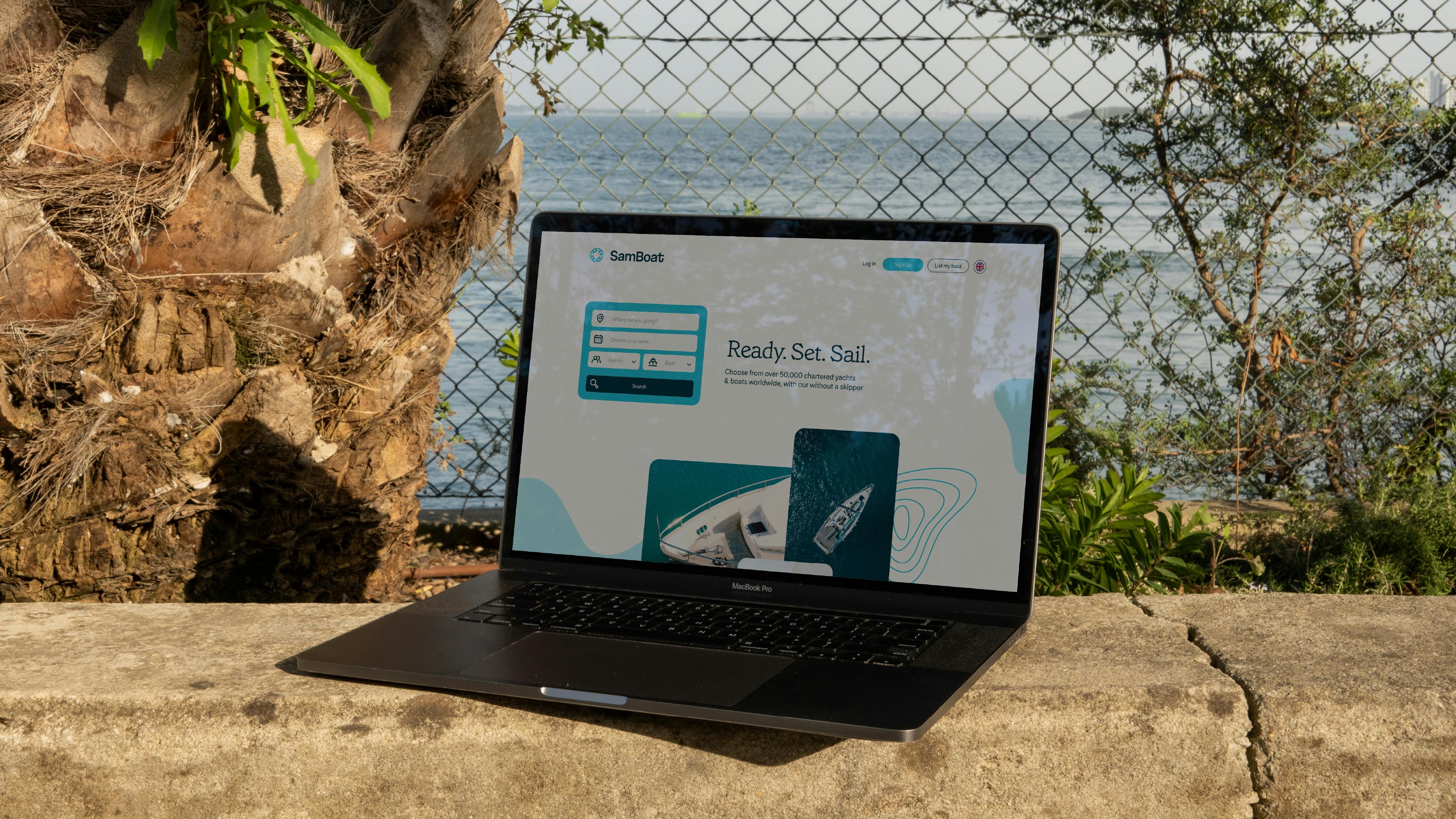
SamBoat online
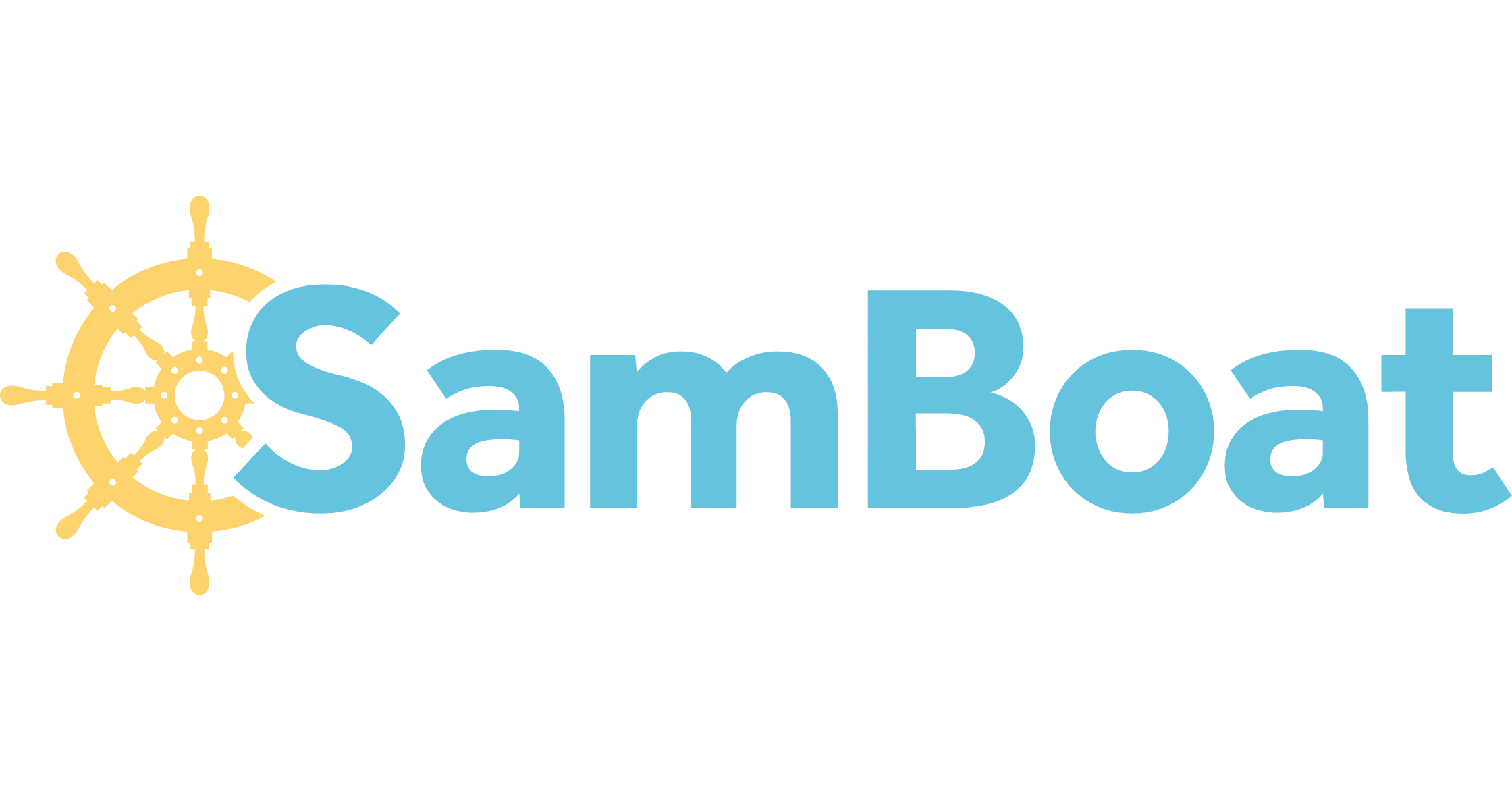
We launched SamBoat in 2014, and the visual brand identity hadn't changed since then, so it was long overdue for a refresh. The whole visual identity was based on the helm, a universally recognisable nautical symbol, in our first logo, which we changed with this rebrand.
We used bright colors, such as blues and yellows, to create a simple and accessible design. The main idea was to show how easy it was to rent a boat and break away from the luxury image, making sailing accessible to everyone.

About this current rebranding, how did it come about? How did that conversation start?
Oliver: The conversation started after experiencing significant growth following the pandemic. We needed a fresh, modern, more iconic, and easily recognizable brand to cater to our international audience. I contacted half a dozen agencies and freelancers, and Dave Rax's portfolio stood out.
We surveyed managers and customers to extract insights and projected where we wanted to be in five years. We also looked at our competitors and target audience. Design-wise, we were pretty open in the beginning, and the brief was open-ended regarding what we wanted to achieve visually.
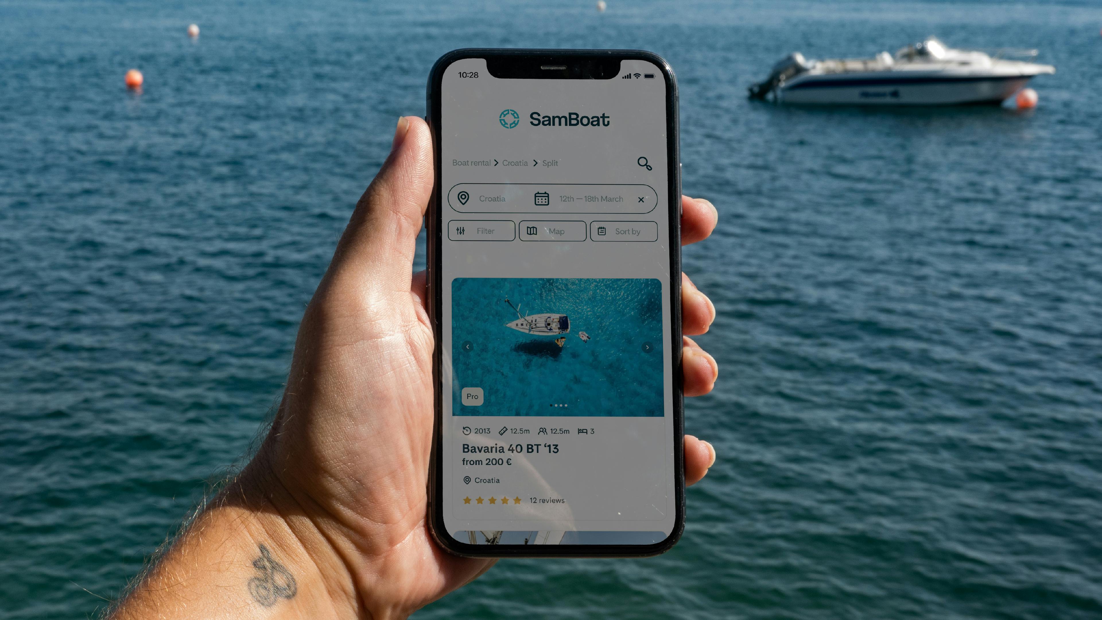
SamBoat on mobile
Dave Rax: We considered the marketplace and market research around competitors. We identified tropes to avoid and areas to maximize. We aimed to figure out the aspects we wanted to lean into and elevate, as well as reimagine others.
Oliver: It’s also important to mention that we have two distinct target audiences: day boats, where a group of mates can rent a boat for the day, and those looking for charter holidays, which involve renting bigger sailboats or catamarans for a week. We had to find a way to distinguish the two and cater to both markets in the rebranding.
How did the rebranding process go? Was it all smooth, or did you encounter challenges?
Oliver: Dave led the process with his method, which really helped us structure the whole thing.
Dave: The process started with discovery, which is integral to any brief. We dug into the current marketplace, conducted competitor audits, and examined the world in which SamBoat previously operated. We aimed to make the brand appealing to a multi-audience group, including day-trippers, seasoned sailors, and boat enthusiasts, as well as boat owners using the platform.
SamBoat pattern
After the discovery phase, we moved into the design phase. This involved visual exploration and close collaboration with stakeholders. There were no big reveals; instead, we had incremental shares to ensure everyone was on the same page and contributed to the rebranding.
"Oliver: The collaborative approach made us feel like we were co-building the new branding, even though Dave was doing most of the work. It felt like a team effort."
Dave: Involving different stakeholders and having various inputs throughout the process really helped form a coherent and collaborative project. It's important to remember that the client is always an expert in their field, so immersing ourselves in their world also contributed to the success of the rebranding.
A big change was to your logo. Can you tell us how it was conceptualized?
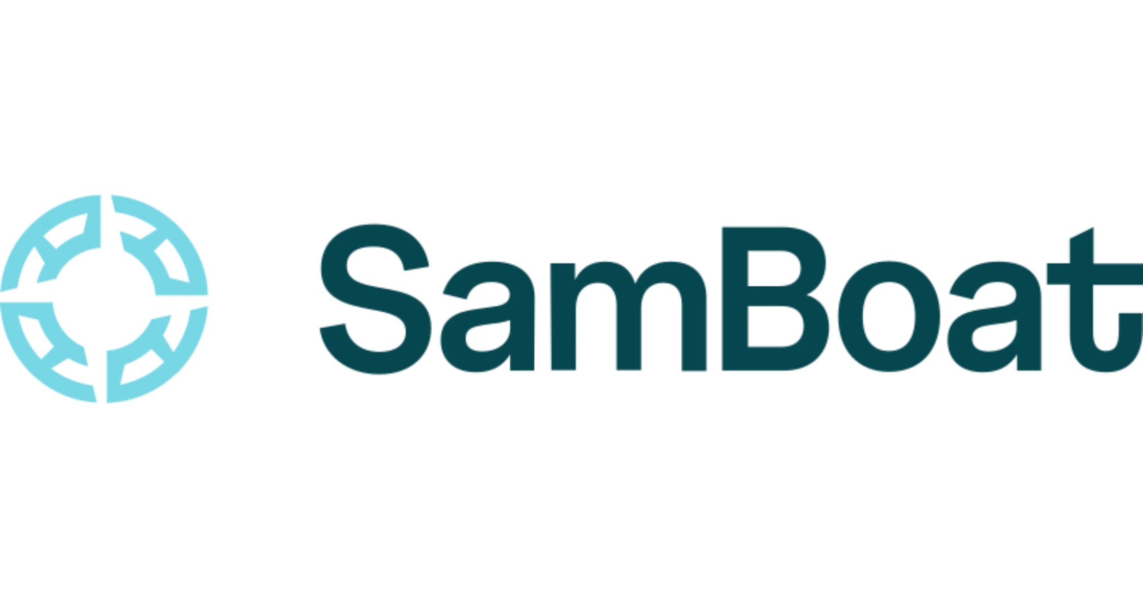
Oliver: We explored various possibilities with the logo, going far with our creativity before returning to our brand's DNA. We had a few adventurous designs, but eventually, we recognized that the helm was a crucial part of our identity. Modernizing the helm wasn't easy, and we went through dozens of different versions.
SamBoat logo
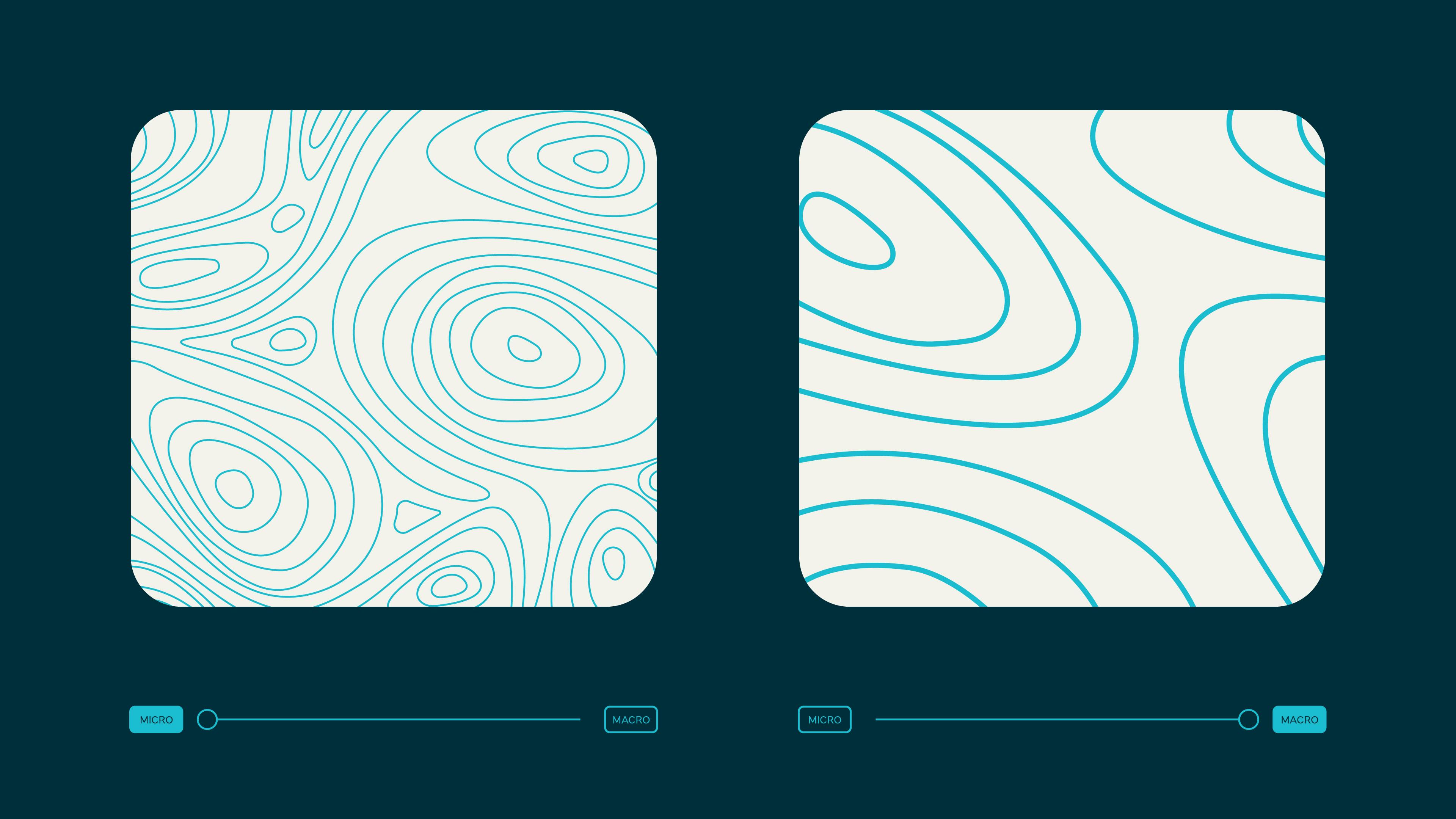
Dave: As Oliver mentioned, we initially presented three different concepts, two of which were more experimental. The final symbol is based on the original helm, but modernized for a digital age. We wanted to capture important themes representing the brand. The boat wheel symbolizes the heart of the brand, while the negative space compass hints at adventure and discovery. Additionally, the spokes of the helm evoke the idea of a sun.
Oliver: It was essential for us to have creative freedom in the early stages to explore new ideas. Although we ultimately returned to our brand's core identity, this process allowed us to rediscover and reaffirm our brand's essence.
How about your color palette? How did you land on these colors, and what do they say about your brand?
Dave: We started by mapping out all the competitors in the marketplace during our discovery phase. What we noticed was a "sea of sameness" in terms of color. However, we wanted to maintain some level of blue, as it's the heart of our business and represents sailing, boating, and being on the water. Our goal was to build on that blue and inject it with more life and vibrancy, making it a distinctive hero color.
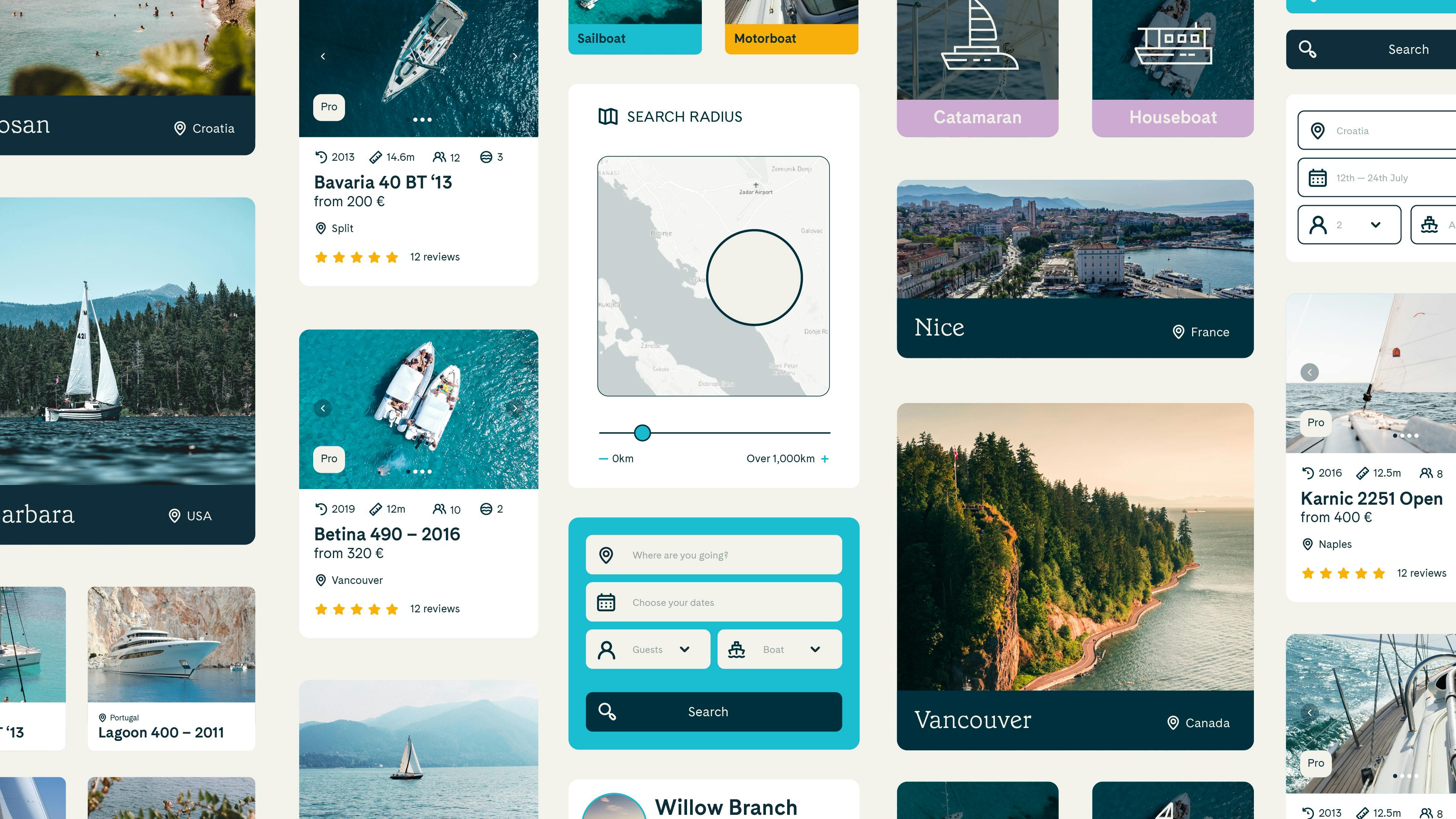
SamBoat UI
Dave: We then developed a core set of tints and tones reflecting the ocean and different bodies of water. We also created a supporting set of colors that gave a nod to the experiential side of sailing, such as sunsets and skies. The combination of these colors provides an emotional dimension to our rebrand.
SamBoat logo
Dave: We even named the color values after specific destinations and oceans available on our platform. For instance, the blue we chose was initially called "Ionian blue."
Can you tell us more about the fonts that you use? How were they chosen? Were they custom-made?
Dave: During the presentation and design phases, we explored different typography combinations. We finally chose Grenette, a soft, modern serif, for our headline typeface. It sets us apart from our competitors and conveys a confident, trusted tone that reflects our expertise.
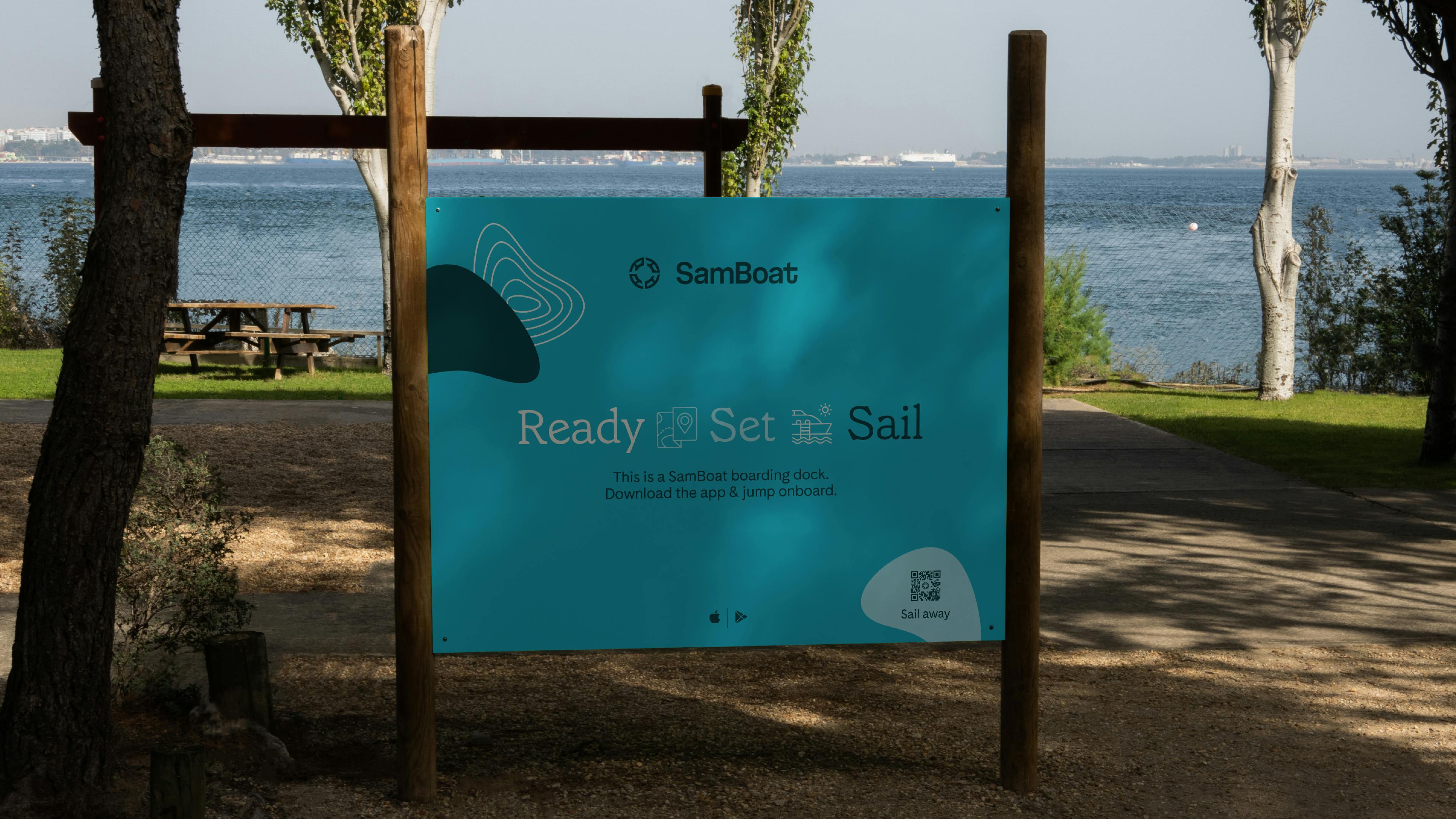
SamBoat sign
For body copy, we selected Cadiz, which is a hardworking sans-serif font. The combination of Grenette and Cadiz strikes a nice balance of playfulness, friendliness, and modernization, updating what previously existed.
Additionally, we customized the wordmark based on the Spezia typeface. We made some adjustments to the letterforms, such as adding a playful flip to the "t" at the end. This subtle anchor-like form helps ground and balance the wordmark alongside the symbol.
How about photography? Can you tell us the photo and video direction for this new brand identity?
Oliver: We want to incorporate boat details, real photography, and help people project themselves into their future trips.
Dave: As Oliver mentioned, we've highlighted categories such as boats and places, boats and people, and boats and details. Our goal is to use art direction and imagery to form a wider narrative and story that evokes a feeling in people and gets them excited about taking a boat out.
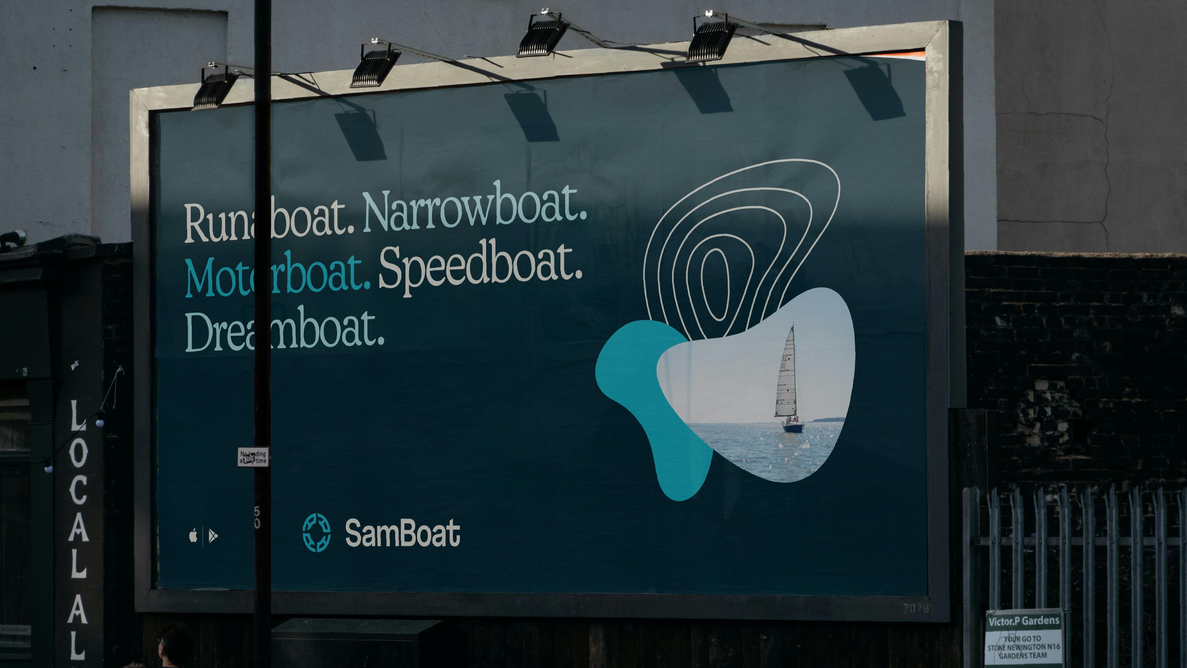
SamBoat poster
It's important to have some top-line guiding principles when choosing imagery in the art direction, even if we're starting with stock photography. This will give us a foundation to build upon as we transition to more bespoke imagery.
What is your major takeaway from this experience? Or, do you have any advice for brands or designers embarking on rebranding projects themselves?
Oliver: My major takeaway from this experience is the importance of preparation. Do all the prep work before you outreach designers: research industry trends, understand your brand heritage, and determine where you want to be in five years and who you're targeting. Make sure what you're going to build aligns with your business targets.
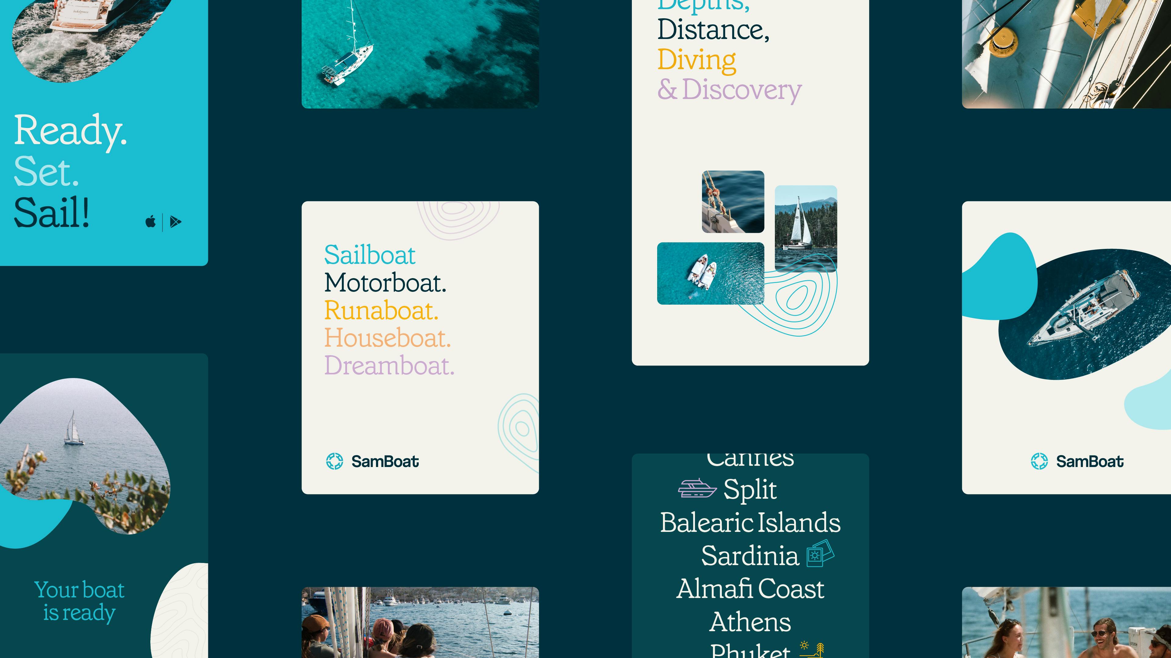
SamBoat social assets
Don't hesitate to reach out to bigger studios, if they're out of your budget; they might recommend someone who is starting a solo career. Identify a project manager to liaise between stakeholders and designers. Spend time explaining your company culture and be flexible, listening to the experts' advice.
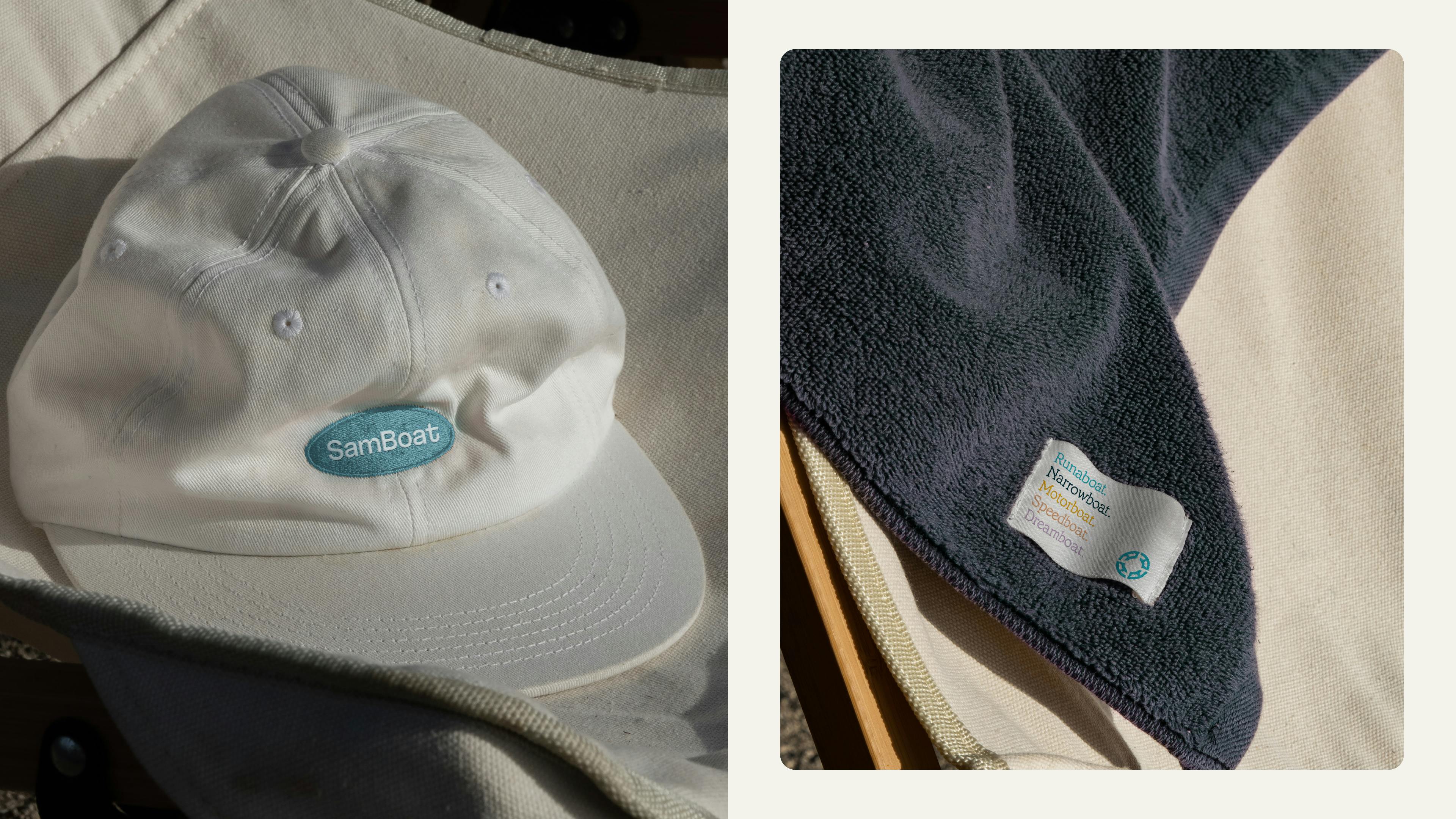
SamBoat merch
Dave: Collaboration is crucial, especially in the end stages of a design project. Make sure everyone feels empowered to roll out the identity and has the right tools and assets to do so. Be reactive and malleable throughout the process, supporting the client's vision by not being too precious about directions and decisions. Essentially, "kill the ego" to ensure a successful rebranding project.

