
before

after

Tom Crabtree, founder and Creative Director of Manual, has spent 20-plus years working in the field of brand identity and experience design across a wide range of industries. Originally from the UK, he moved to California to join Apple's design team in 2006 to helped launch the iPhone. For the past 13 years, he has overseen the creative output of Manual, leading projects for clients including Airbnb, Apple, Boom Supersonic, eBay, Harley-Davidson, Nike, and Strava.
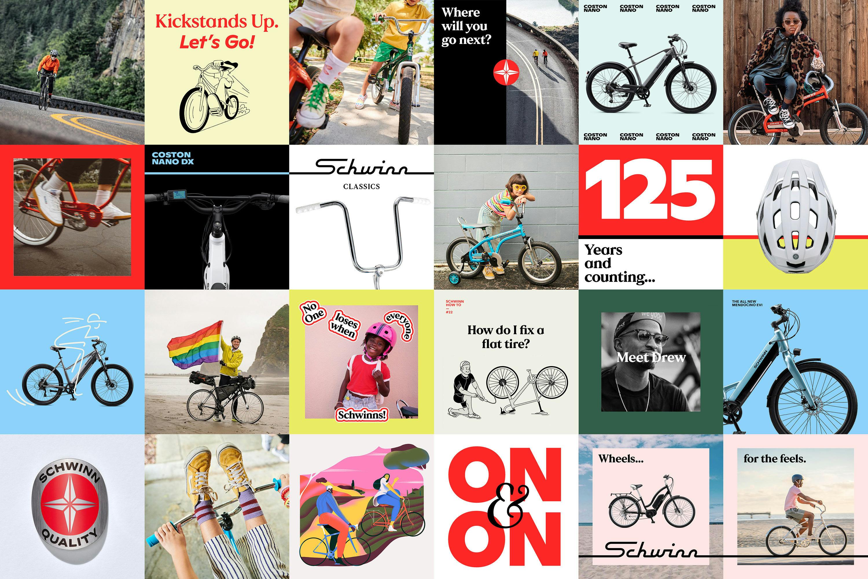
Schwinn posters
Can you tell us how this current rebranding come about? How did that conversation start with Schwinn?
The project arose when a past client of ours, whom we worked with to launch a cycling apparel brand called Kitsbow, called me to let me know he had just joined Pacific Cycle (the holding group of Schwinn) as their VP of brand. He was keen to immediately address some of Schwinn’s brand identity issues, and wanted to get to work right away.
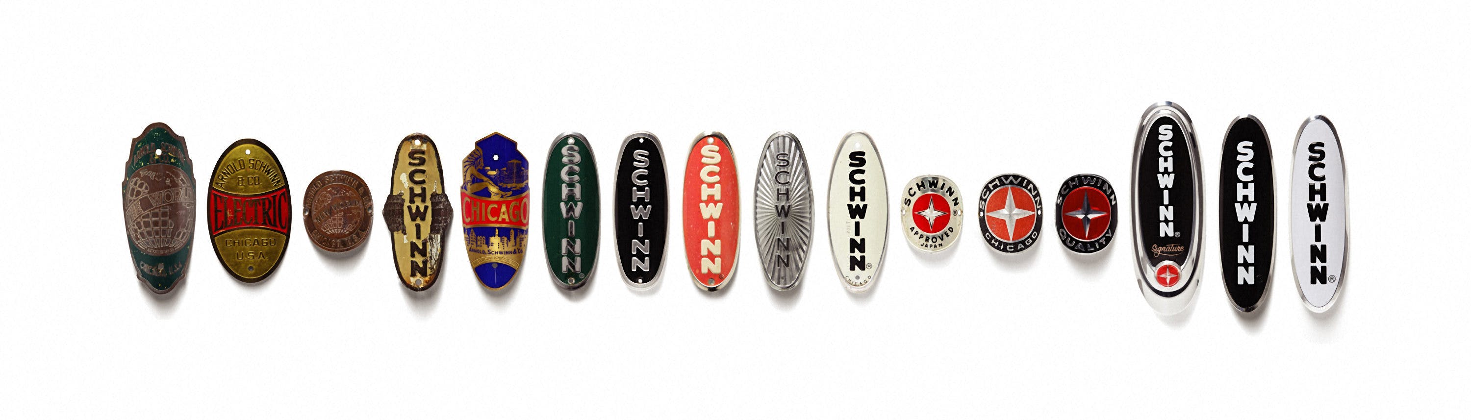
Schwinn Anniversary Headbadges
How about the rebranding process? Can you tell us more about it? Where did you start? Were there surprising challenges you encountered along the way?
We went through the typical process to undertake a brand identity evolution. We started with interviews with key stakeholders to understand their goals, the vision for the brand, and pain points with their current identity and positioning.
Before getting into any design, we first worked on the strategy and messaging–re-stating what was unique about Schwinn, who they are for, and defining the values and personality.
Schwinn internal posters
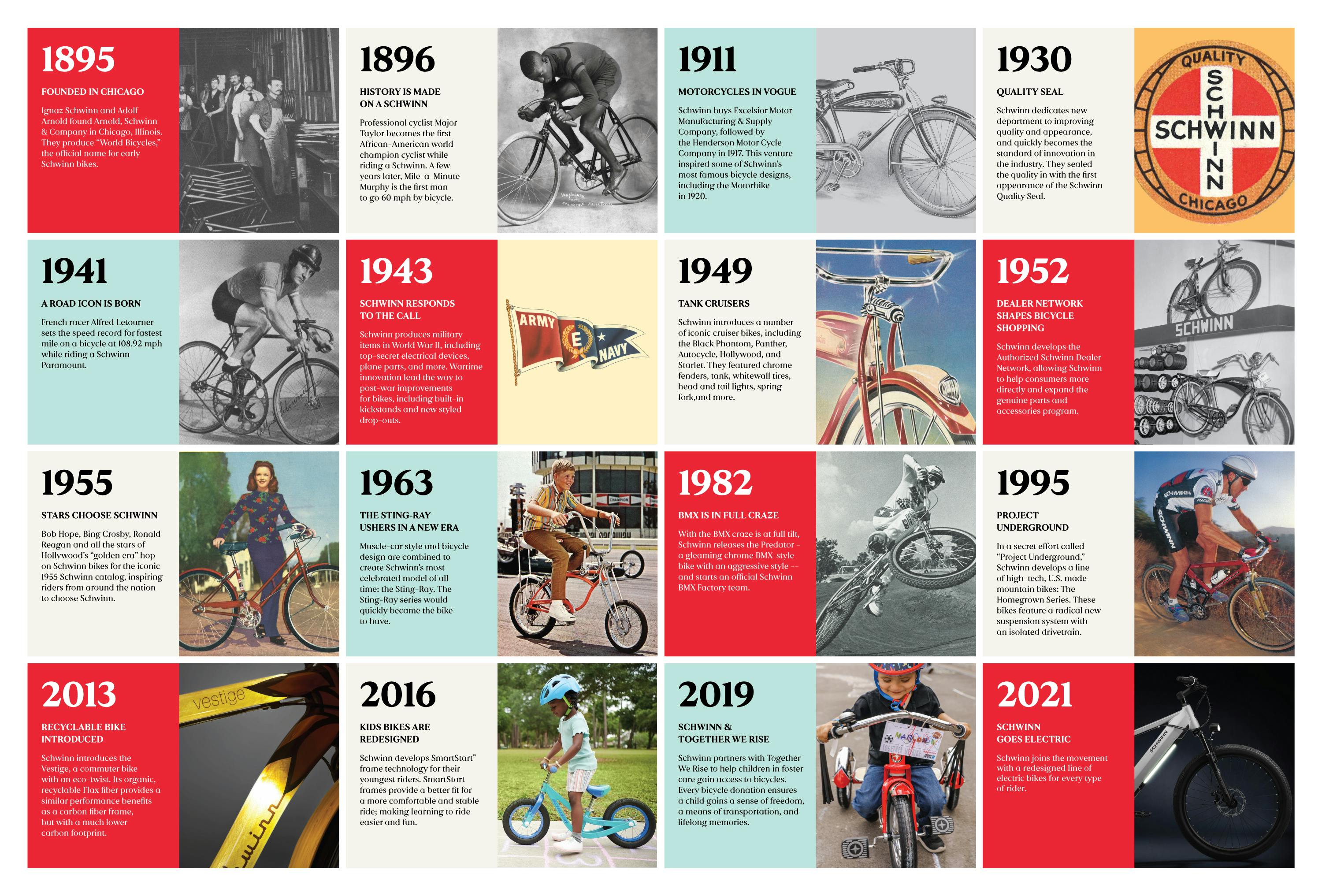
With a brand like Schwinn, with more than 125 years of history, there was a lot of inspiring raw materials for us to dig into and get inspired by, and some very cool facts we learned along the way:
- In 1896 professional cyclist Major Taylor became the first African-American world champion cyclist while riding a Schwinn. A few years later, Mile-a-Minute Murphy was the first man to go 60 mph by bicycle.
- In 1941 French racer Alfred Letourner set the speed record for fastest mile on a bicycle at 108.92 mph while riding a Schwinn Paramount.
- Bob Hope, Bing Crosby, Ronald Reagan and other stars of Hollywood’s “golden era” were featured in the 1955 Schwinn catalog.
- Elvis was presented with his very own Schwinn racer, the ‘Hound Dog’ while filming Loving You on the Paramount movie studios in 1957.
That said, a specific goal of this project was not to look backward.
Schwinn Typography
"With any American heritage brand, there is the temptation to double down on nostalgia and lean on heritage and history as a crutch."
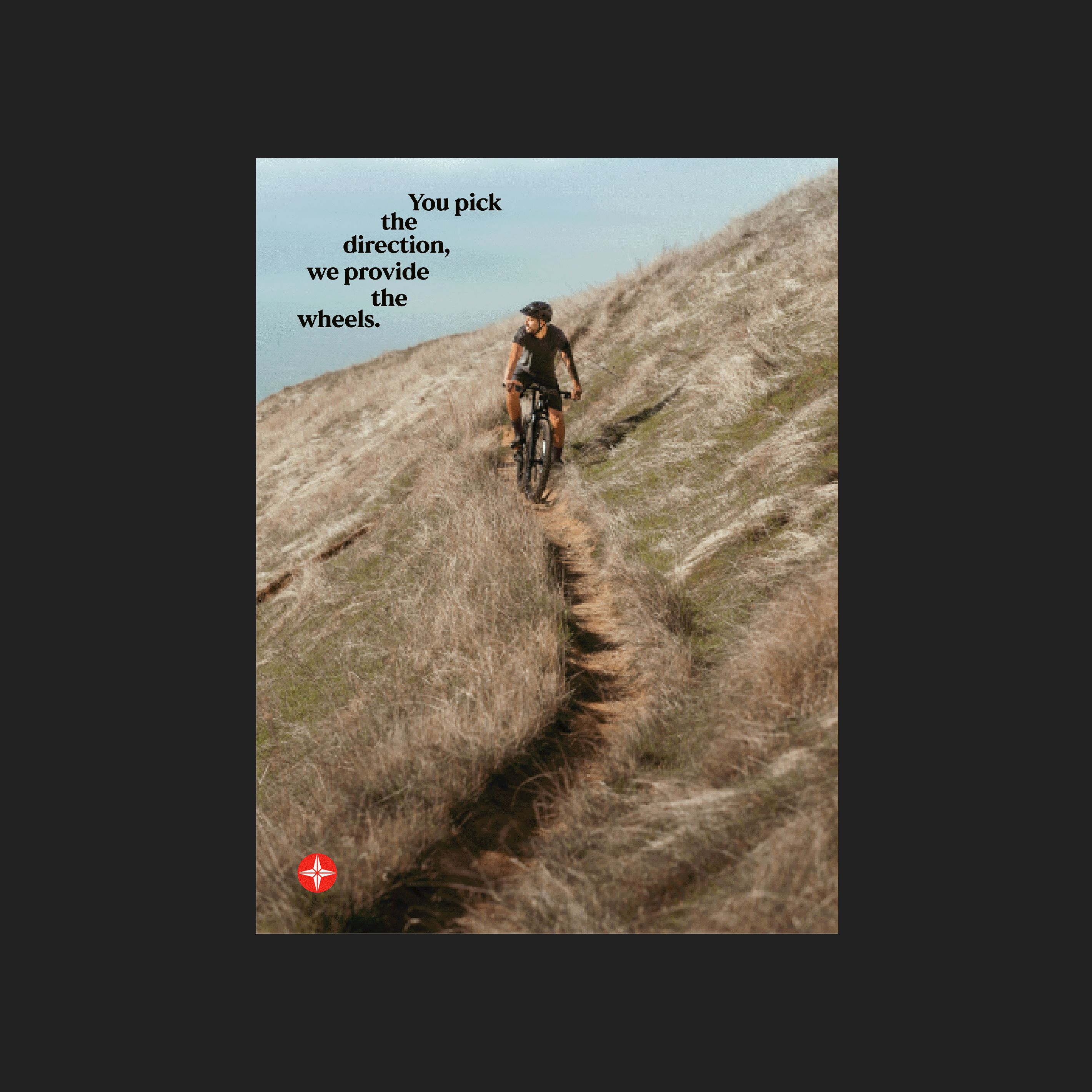
Schwinn’s leadership was very clear at the outset that they didn’t want the brand to lean on nostalgia. It was important that the brand and products look towards the future. Schwinn is investing heavily in a new range of e-bikes and innovations in helmet technology, so the brand identity needed to flex across different products, and speak to different audiences.
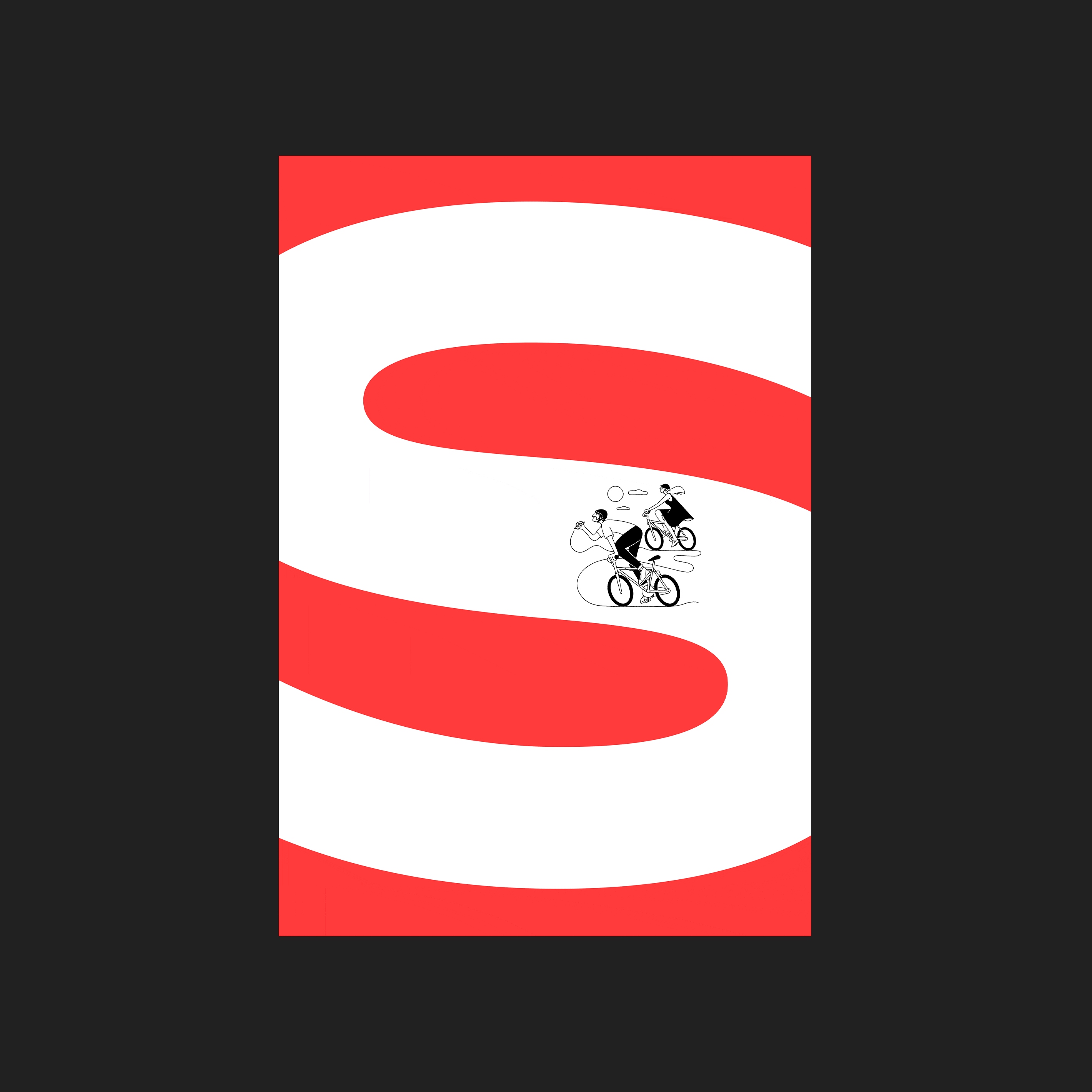
Schwinn Instagram Grid


Can you tell us the story behind the new logo? Does changing up the logo of a brand like Schwinn come with a special set of challenges? Were there other options you presented that nearly made the cut?
Schwinn Badge Book
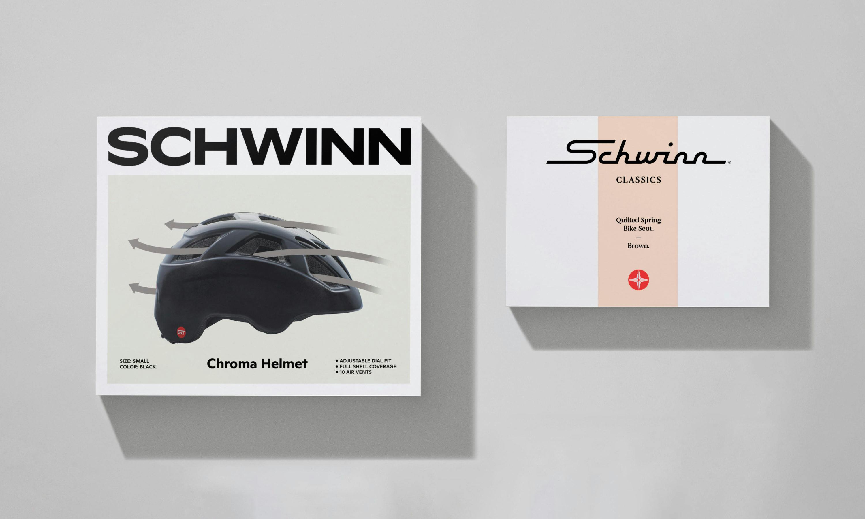
Schwinn packaging
While undertaking a brand audit, we discovered that Schwinn were using many different logos across many products. While they consistently used a simple all-caps word mark at the corporate level and on their website, there was a plethora of other word marks and badges used on products. So a key focus of ours was to simplify and pare back the brand trademarks.
We recommended redesigning three core brand assets:
The core logotype:
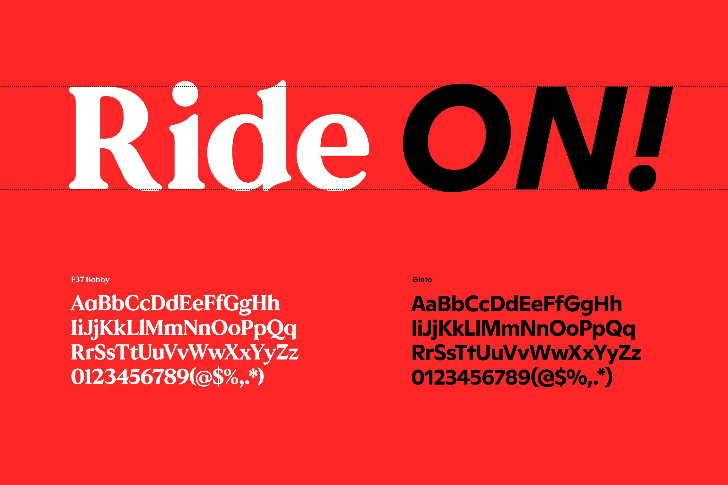
For the core word mark design, we leaned into confident and bold extended typography that we knew would work across a wide range of products. The main focus was on the S and C characters having a sharp, swooping feeling that conveyed just the right touch of sportiness without it feeling too ‘high-performance’.

Schwinn quality star
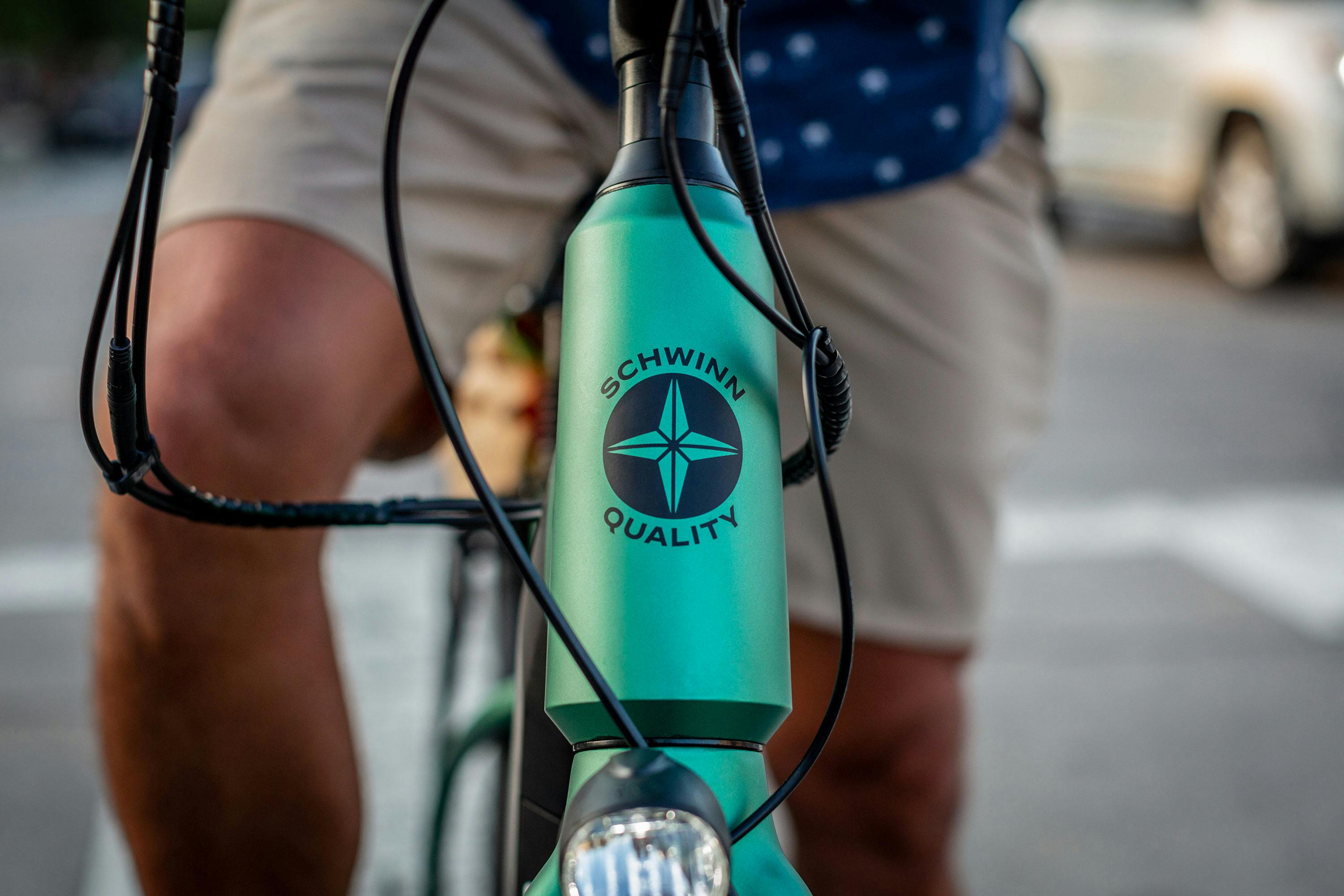
The Schwinn quality star:
Previously the Schwinn star was used as a quality badge, appearing on the front of the bikes. There was some equity and recognition with the star, and we believed this had the potential to be a stronger brand signifier When addressing the design evolution of the star we looked to achieve three things:
"Firstly, we wanted to simplify, and move away from the need to use different tones and colors in the mark."
The previous star used shading to give perceived 3D form to the compass-style arrows, and therefore needed to be printed with tones of black and grey when used graphically.
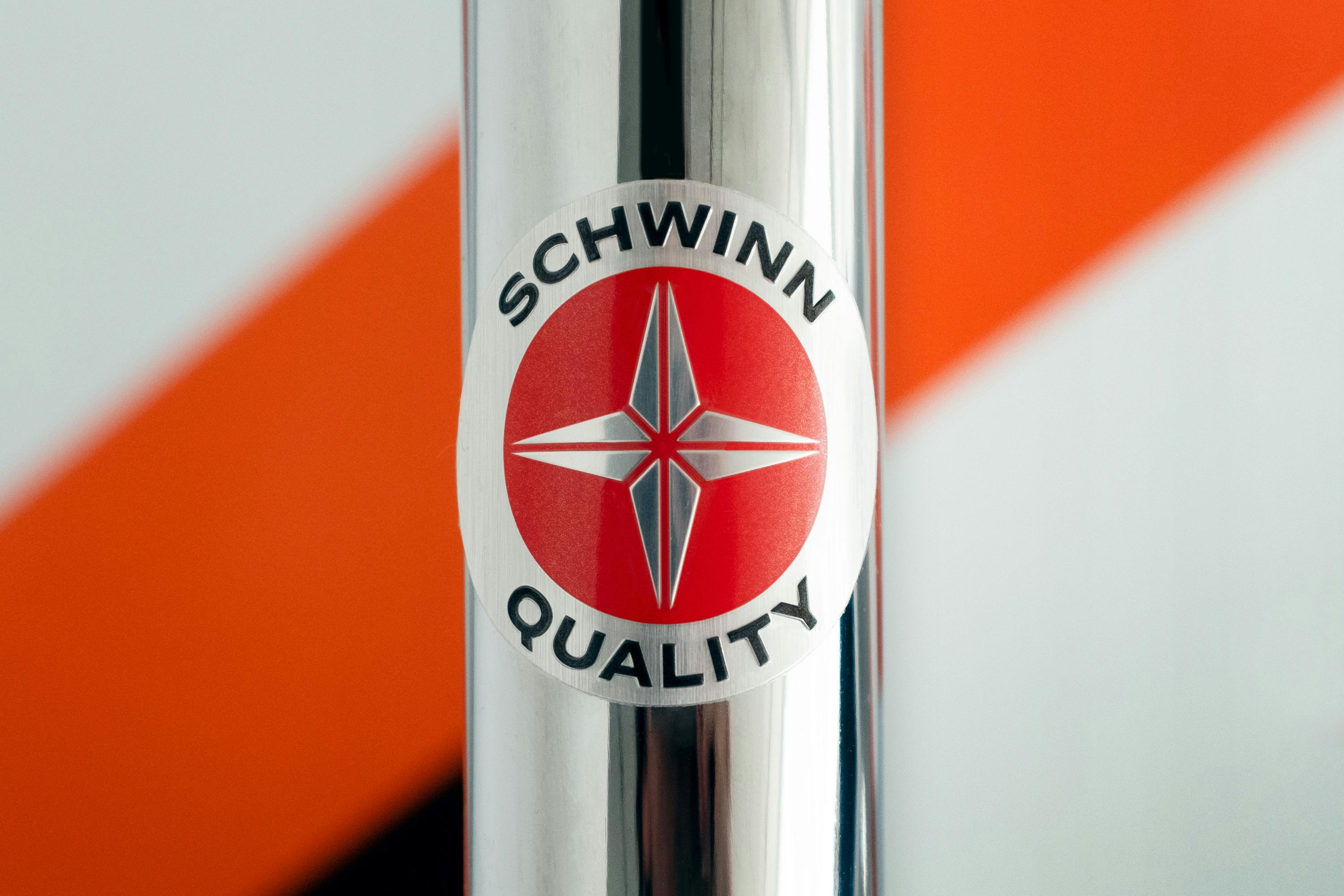
Schwinn quality badge
This also created a disconnect between the physical badge used on product—where the star was created by relief only—and the graphic reproduction used in print & digital, where shading was used to denote depth.
We flattened out the star so it could be reproduced in one color. This would allow for greater flexibility on products, where the badge could appear on a wide array of product colors and retain a more minimal look on e-bikes and higher end products. The metallic badge is reserved for use on kids bikes, cruisers, and classics.
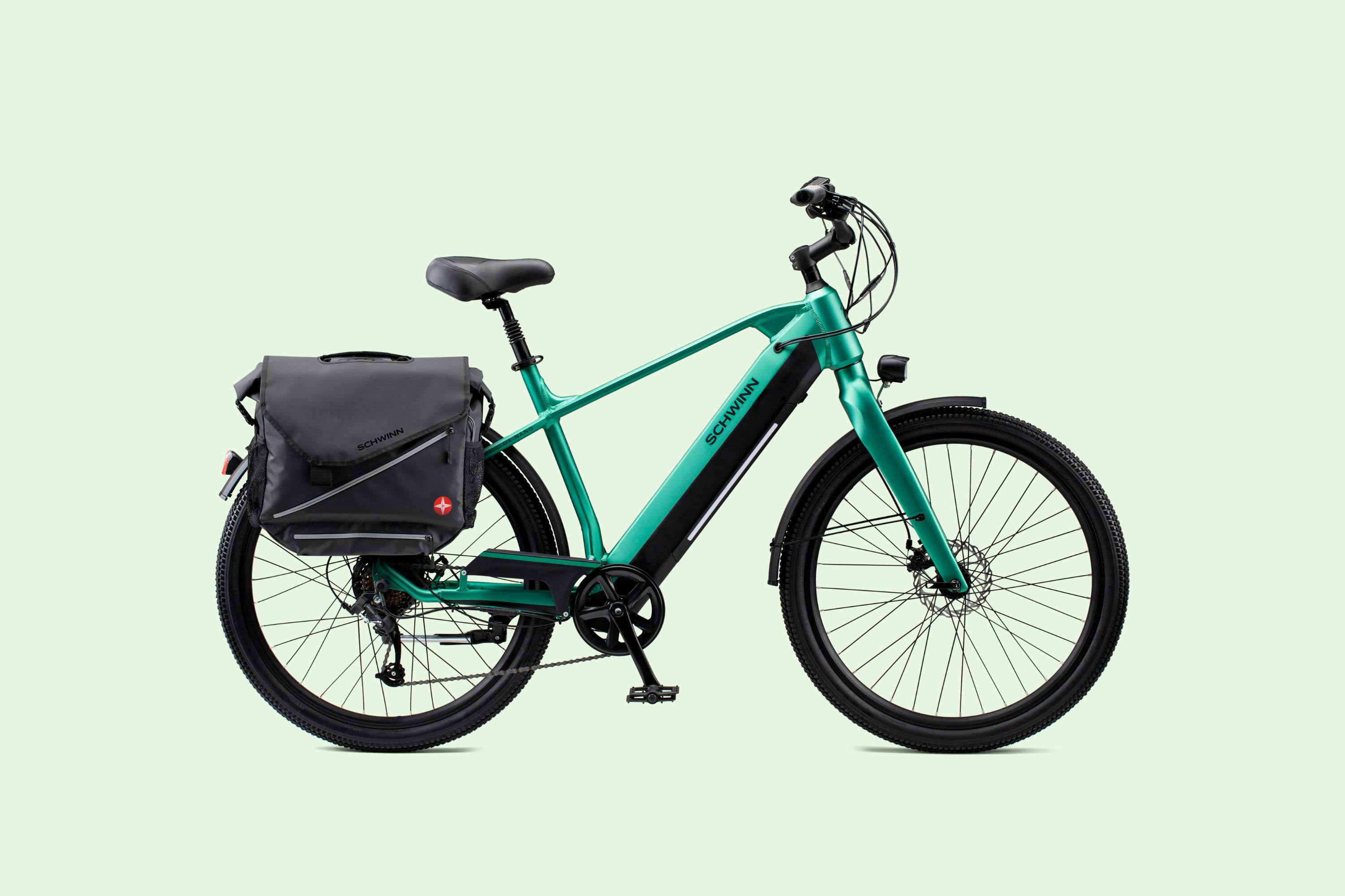
Schwinn bike
Secondly we wanted to introduce a more own-able form that had more to it than just the nautical-arrow connotation of the previous shadow treatment. This would differentiate it from other ‘nautical-star’ logos out there, such as the Stone Island or NATO.
"By using lines to hint at the diamond-beveled nature of the star, the new inline treatment gave the star a spoke-like quality that felt a little more contemporary and crafted."
Schwinn flathead badge
Lastly, we wanted to elevate its usage and visibility. Up until now, the Schwinn star had only existed as part of a quality badge that appeared on the head-badge on certain products. So it didn’t really feel like a ‘logo’ that would build up recognition across all channels.
By pairing the Schwinn star with the logotype, and allowing it to be used standalone as a sign-off for the brand, we began to build more equity and recognition into it. Our hope is that over time the red circle and star would become a recognizable stamp of quality - not unlike the red dot seen on a Leica camera.
Schwinn classics logo
The Schwinn classic cursive logotype
Out of all of the heritage marks, we just had to retain the classic cursive logotype. It is such a charming and quirky piece of endearing typography that brings back nostalgia to a certain generation of Schwinn riders.
We worked with typographer Simon Walker to re-imagine its expression. While we retained the same sleek 50s spirit of the logotype, we completely rethought its structure and style. The resulting logotype is sharper and sleeker, with more flow and forward momentum.

Can you tell us more about the color palette for this rebrand? How did you land on these colors and what do they say about the brand?
Schwinn color palette
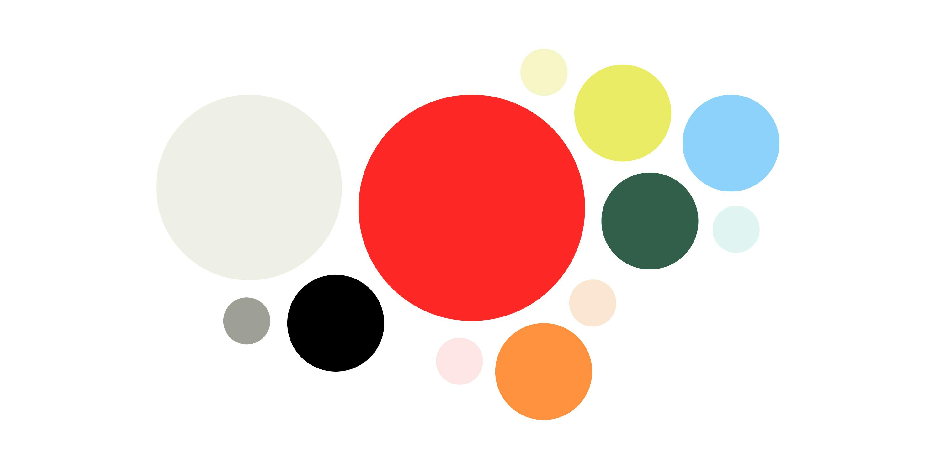
Schwinn was already using red as a primary brand color, though a darker cherry-red which felt a little corporate. So we updated the red to be a more vibrant and ‘digital’ hue that felt more contemporary.
We supported the core black/white/red/ palette with an expanded range of colors, introducing vibrant hues that were inspired by Schwinn’s vast library of 1950s, 60s, and 70s advertising, as well as a set of pastels that would work well as background tones for product images.
The palette allows brand communications to oscillate between joyful / carefree and simple / sophisticated / sporty as needed.
Schwinn icons
How about the illustration styles? Did you work with specific artists for it? How were they conceptualized and why that approach?

Schwinn illustration by Xoana Herrera
We knew that illustration would allow us to introduce a distinct personality to the brand, and exaggerate the feeling of riding a Schwinn.
We couldn’t think of another cycling brand that uses illustration in this way, and felt as though if anyone could use characterful illustration, it was Schwinn.
Schwinn illustration by Christopher DeLorenzo
The Illustrations ensure Schwinn feels as much about the lifestyle of cycling, as it is about bike styles and product features.
Rather than settle on one style for Schwinn, we presented a wide range of styles that could adapt over time. For this initial foray, we loved both Christopher DeLorenzo’s one-color linear illustrative style, and on the opposite end of the spectrum, Xoana Herrera’s vibrant and textured style.

Schwinn illustration by Christopher DeLorenzo
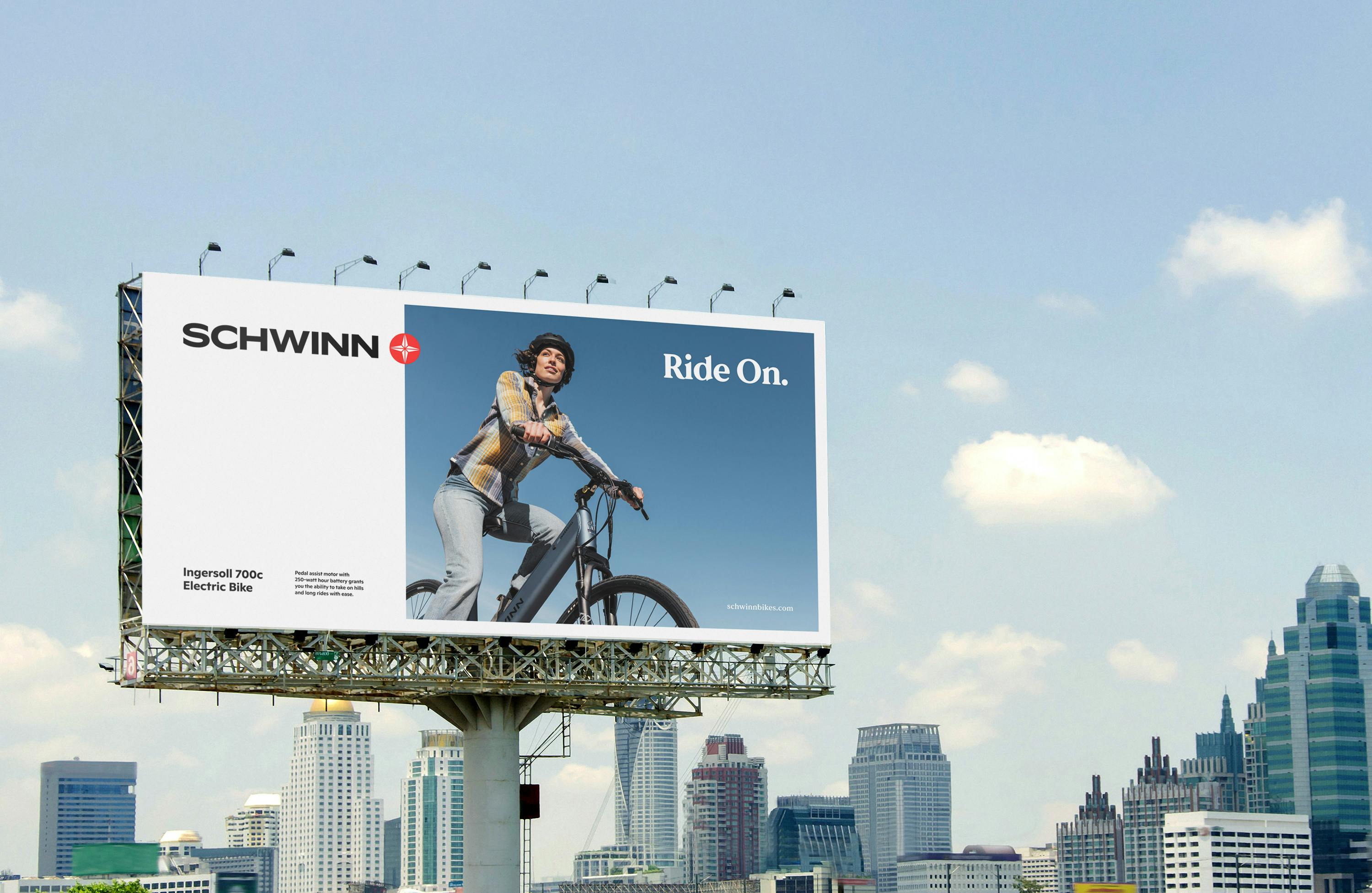
What about the photography that Schwinn uses? How do you use photography to help convey the new Schwinn branding?
Schwinn bike photography
This specific branding engagement didn’t allow for us to undertake any specific photo art direction projects or photoshoots baked on the calendar of new product development, and the project budget, though we do view photography as a critical element of any brand identity project.
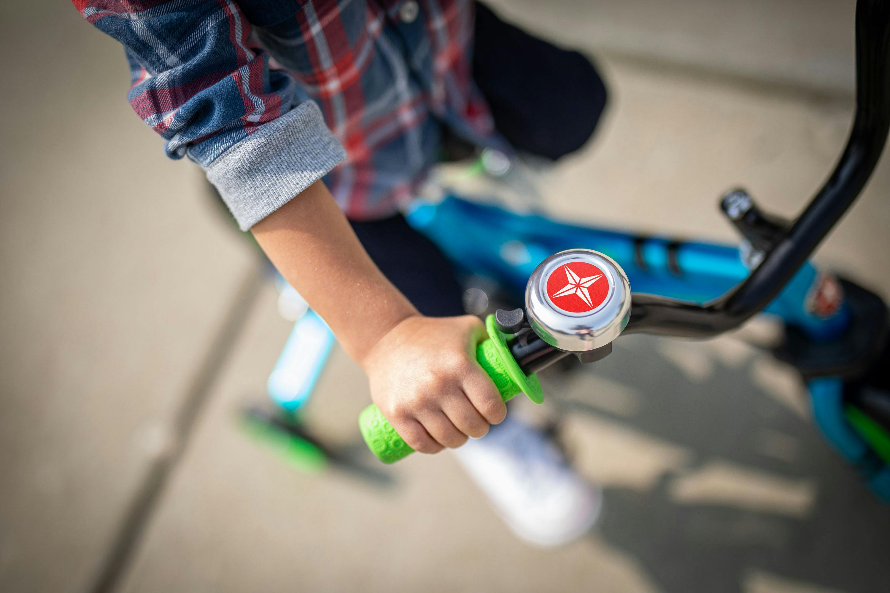
Schwinn bike bell
We designed a photo guidelines document, that outlined a set of standards for future photography, covering everything from in-studio product photography, to on-location lifestyle. We considered audiences and subjects, qualities, emotions, casting, locations, compositions and lighting.
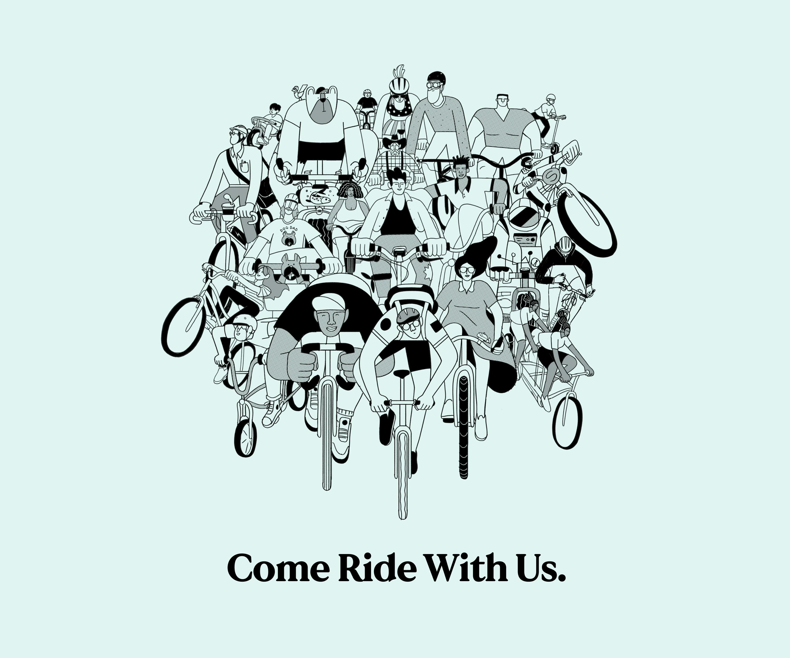
One specific goal of the rebrand was to ensure Schwinn remained welcoming and inclusive.
The bike industry is often both highly technical and highly specialized…not to mention intimidating to the casual rider. We felt it was time to make cycling more inclusive, welcome all experience levels, and invite a more diverse crowd to come join the ride.
Schwinn billboard
Lastly, do you have any advice or pro-tip for designers embarking on rebranding projects like these?
Schwinn history
When we approach a brand evolution, rather than designing a new identity from scratch, we have to look carefully at what exists, and where we need to retain current brand recognition and equity.
"It’s tempting to wipe the slate clean and create new graphic elements, but I often find the best brand evolutions are thoughtful and careful."
It’s a bit like architectural restoration. You want to replace the things that have become a little tired, perhaps the roof, the windows, the paint job, but maintain the integrity of the structure so that the building remains recognizable, and can stand proud in its new skin.
A good brand evolution should feel both fresh, and like it’s always been there.
