before
after

Davina Geschanowski, Head of Design at SIDES, shares the process behind rebranding their name and brand identity to match their big ambitions for the company.
Can you introduce us to SIDES and the brand’s identity through the years? How were the past brands conceptualized?
SimplyDelivery was founded in 2014. In the beginning, it was more of a project within our media agency. We chose the name "SimplyDelivery" because the software at that time primarily focused on food delivery companies. The brand and logo were developed in-house.
Before our rebranding in 2022, we had two logos. The previous brand identity had developed little by little over the years. However, there was a lack of fundamental discussion about where we wanted to go with our brand in the future.
SIDES website
We had a strong feeling that our brand and name no longer reflected our ambitions. Over the past years, our product has evolved into an all-in-one solution for the gastronomy industry. Therefore in 2022, the company underwent a complete rebranding.
Since May 2022, SimplyDelivery has been operating as SIDES with a new visual look and feel. SIDES has also more than tripled in size since 2021 and expanded into the Spanish market.


About this current rebranding, how did it come about? How did that conversation start?
As mentioned, the name SimplyDelivery arose from the original focus on the food-delivery business. However, over the past few years, our company has evolved into an all-in-one gastro software that digitises and simplifies all processes in the business.
"The name did not reflect our ambitions anymore. Also, it created some challenges, since people sometimes thought that SimplyDelivery offers delivery services instead of being a restaurant management software."
In order to address all key target groups, it was important to sharpen our brand image and change our name. Changing our name from SimplyDelivery to SIDES embodies our brand essence even more clearly.
SIDES on Instagram
A nice side effect was also that our expanding team was part of the transition of the company and a lot of new colleagues got the feeling that they are part of something new. The rebranding was also a visible transition of the whole company.
How did the rebranding process go? Was it all smooth, or did you encounter challenges?
The new brand identity of SIDES was developed in cooperation with the agency Helder Brand Design from Berlin. Together with various stakeholders from all departments of the company, a full-day workshop took place.
In this workshop, we worked out our brand identity with the help of various exercises. We actually expected conflicts in the workshops, because we had the impression that the corporate identity was interpreted differently between stakeholders. However, it turned out that we had a common understanding of the company goals and our brand identity.
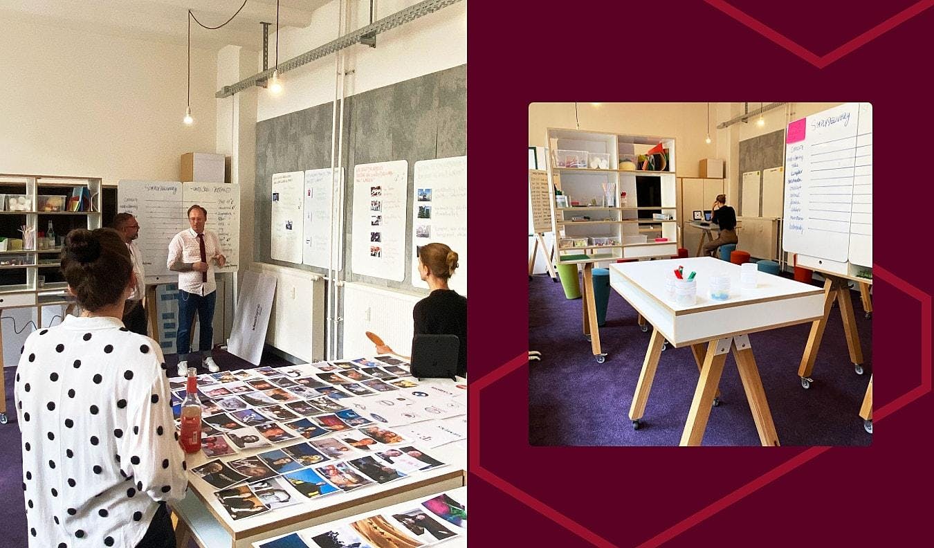
SIDES Brand Workshop
The more complex part was finding the right name. We were looking for a name that still had a connection to the old one and at the same time reflects our ambitions. After several discussions we found a great solution that worked for all three co-founders.
After agreeing on a new name we started on working on our brand identity with the agency Helder. Brand designs were created by us internally and by Helder. The key stakeholders then decided on a new brand design, which was elaborated in more detail by Helder.
A big change was to your name and logo. Can you tell us how they were conceptualized?
Our brand was created completely new. This was a difficult decision after 7 years. As SimplyDelivery, we already had some brand awareness in the German market. But in view of our planned expansion, we knew that this was the last possible time to redevelop our brand. Therefore, we cut all threads of the old brand and rebuilt everything from scratch.
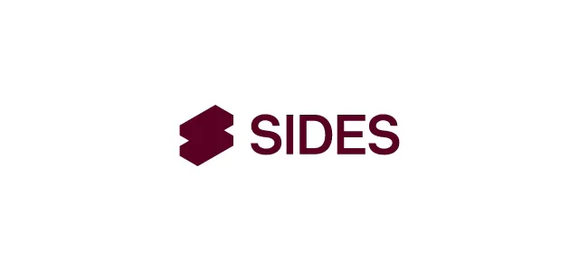
As mentioned before, we were looking for a new name that would at least allow us to build a bridge to our old name. The name SIDES was suggested by Helder. SIDES is a composition of the first two letters of the words Simply and Delivery. The meaning of the word SIDE is like a sidedish, i.e. the sidedish of a meal.
SIDES logo
The name therefore fits perfectly with what we offer our customers: Always at your side–we don't play the leading role, but we complete your vision. With our software, we are at our customers' side and they receive the necessary support from us to run their restaurant digitally.
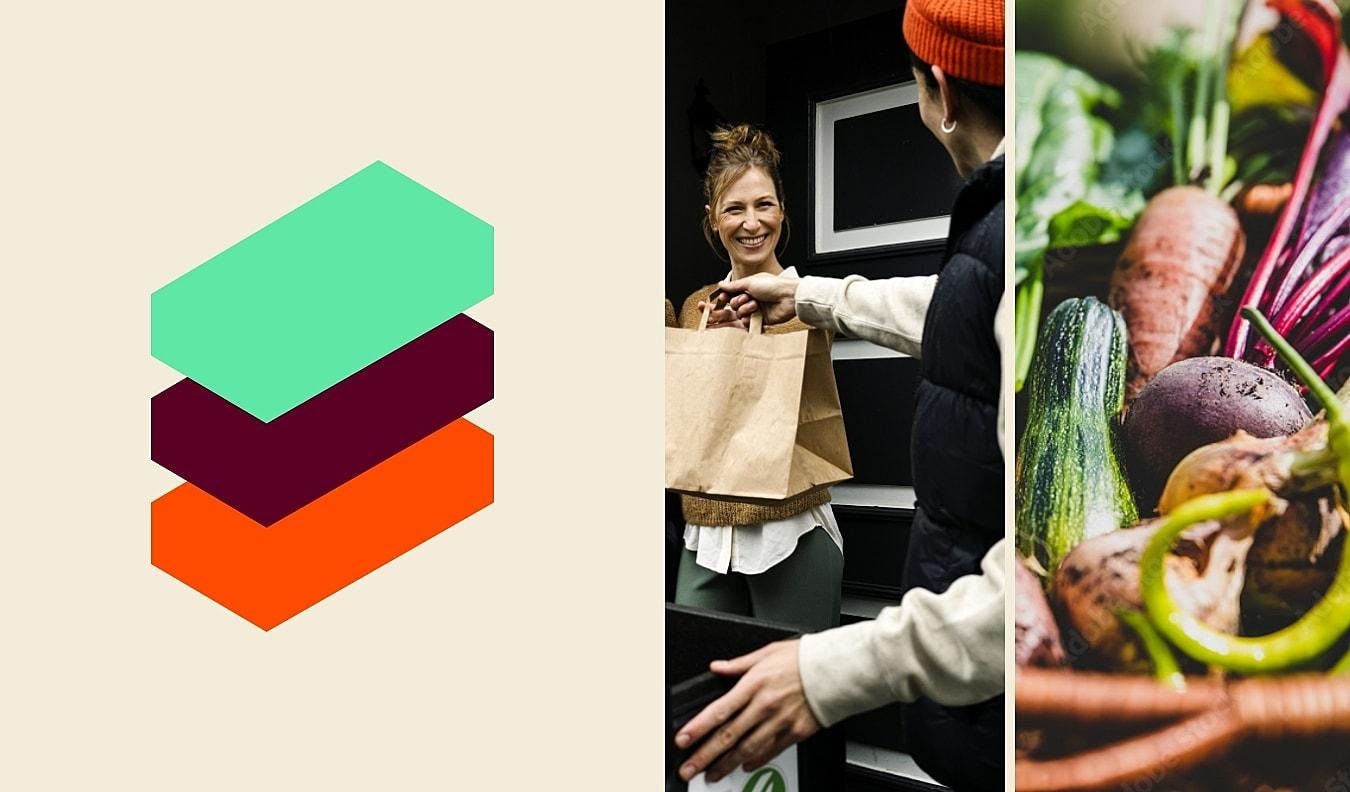
The SIDES logo is a word-image mark made up of two individual modules of the SIDES ecosystem stacked one on top of the other, symbolising the first letter of our brand on the one hand and illustrating our modular and customisable offer on the other.
You also have a new extensive color palette. How did you land on these colors, and what do they say about the brand?
The colours are warm but fresh, accessible and eye-catching. SIDES is a tech company, but at the same time we want to address target groups with our product, who want to realise their dream and secure their existence with us by their side. So this is also about emotions.
"Gastronomy is a hands on business. It's a people business with a very particular vibe. On the one hand, we wanted to create a color palette that fits to that vibe and our customers and on the other hand we wanted to set a unique brand appearance in the industry."
For the technical aspect, we decided on the cool, agile turquoise (LIME). Together with AUBERGINE and CARROT, this forms our primary colours.
SIDES colors
We combined these primary colours with earth tones and colours from the food world to create the perfect mix of cool and approachable. With the naming of the colours, we also wanted to pick up on the theme of gastronomy.
How about the iconography and font that are part of your new visual identity? How were those developed?
Our new font is Inter, which is applied in the cuts shown. The Inter font was created by the Swedish designer Rasmus Andersson. It is a sans serif font that offers a variety of design possibilities with numerous weights.
SIDES font
With its timeless design, it supports the modern and minimalist look that we want for our brand. The font is perfect because it works well in print and digital. The font is also used in our software.
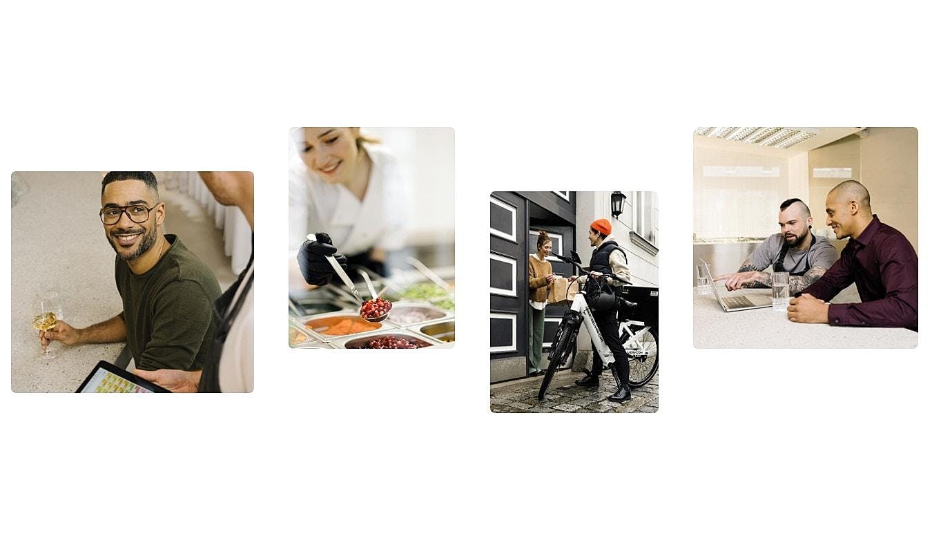
Photography is also a big element of your new branding. What is your new photo direction? How do you take, choose, and edit photos to make them on brand?
Our visual worlds represent various target groups and are correspondingly diverse. It is important to us that we visually pick up on the diversity of our customers and have a clear communication. At the same time, we also want to express how important diversity and inclusion are within our company, because that is what we live and how we want to be perceived.
SIDES images
The image style is modern and clean, but at the same time warm and approachable. We try to take our colour concept into account in the composition of images and scenes in productions and work out the concept for the styling of the actors accordingly.
Location, styling, actors - everything should harmonise with our products and strengthen our visual appearance.
What is your major takeaway from this experience? Or, do you have any advice for brands or designers embarking on rebranding projects themselves?
Sufficient time should always be planned for a rebranding. It is best to weigh up the risks and consequences, such as changing the domain of your own website, in advance.
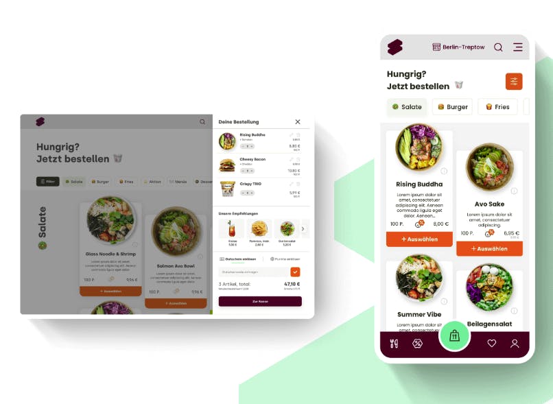
SIDES interface
It is important to have a good understanding of the target group in order to be able to catch them with the new brand later on. Important stakeholders should be brought on board as early as possible. Setting up a detailed project plan will also pay off later.
It can be helpful to involve external experts, because they have a different view on the company compared to long-term employees.
"But the most important thing is: Dare to do something! Design is always a matter of taste and you can never please everyone."
In my experience, critics can often be convinced if you explain motives, thoughts and ideas of the brand to them in detail. You should pick up everyone involved and take them with you on the "rebranding journey".
At the end of the day, what counts is that you don't let yourself be rattled, that you stand behind your decision, and that you work to continuously strengthen the new brand.

