
Alexandru Neacsu, Head of Brand & Creative at Temenos, shares the experience of shifting their brand identity from cool and corporate to warm and client-centered.
Can you introduce us to Temenos and the brand’s identity through the years?
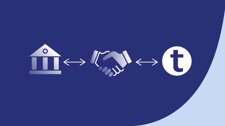
Temenos is a banking software company founded in '93. We are pioneers and offer the world's leading open platform for composable banking.
Composability is where you can pick and choose your own bits and bobs and basically create your custom bank with whatever you need. It’s exciting once you discover how the tech works.
We serve roughly two-thirds of the world's top 1000 banks, and 70+ challenger banks, in over 150 countries.
The name “Temenos'' has a history to it. It's from the Greek term temenos, which was a sacred place in ancient temples, which is where people started doing banking. It’s the beginning of banking.
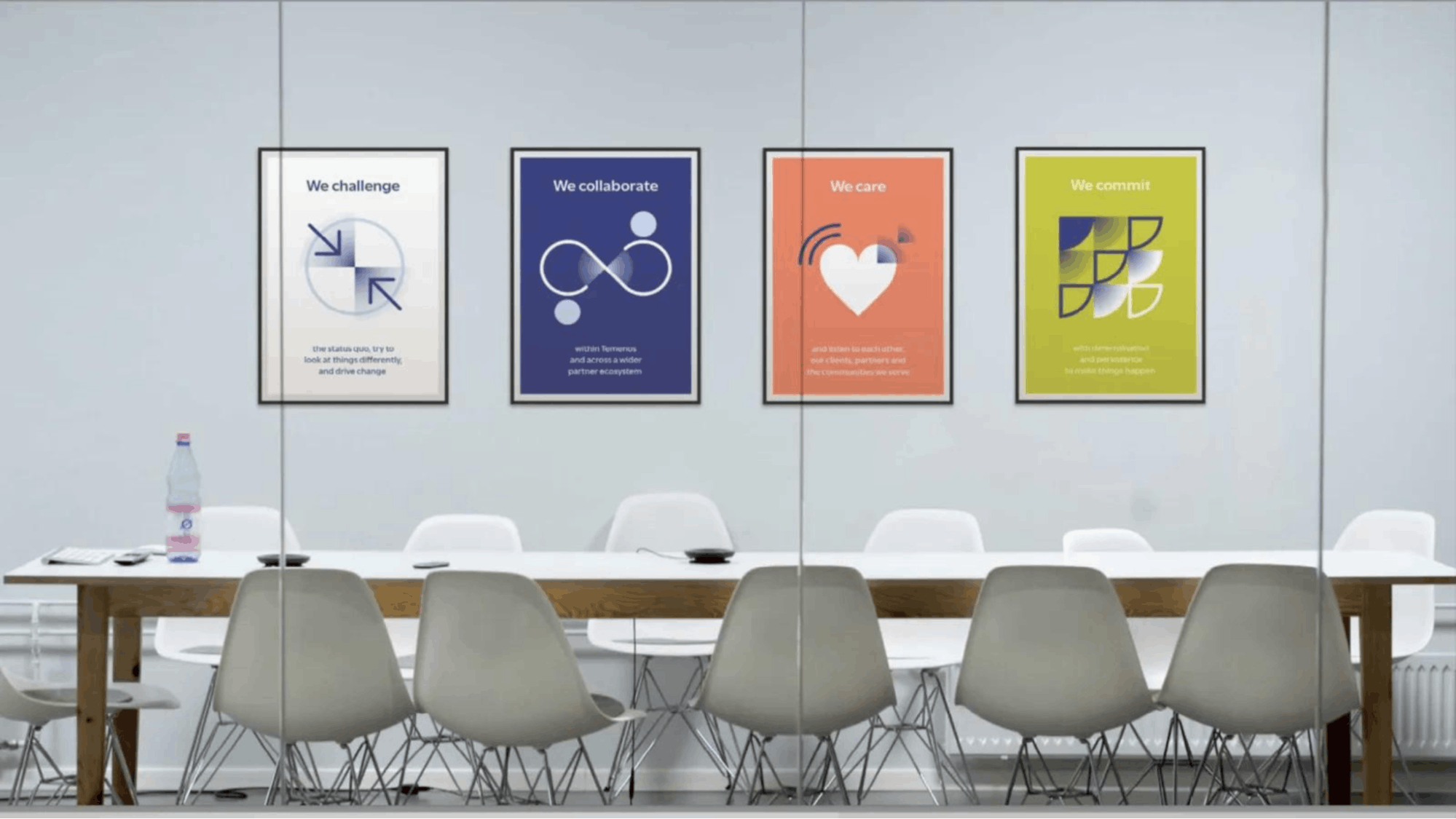
The brands of Temenos in the past were based on showing our expertise and "seeing things differently," which was always a statement of how we presented ourselves to clients and the market.
How were the past brands conceptualized?
In the past, we used to have the Earth shaped as a cube. That was the graphic way of showing, "Seeing things differently." As you can see, in this current rebrand, we dropped the cube, which was a pretty major change for us.
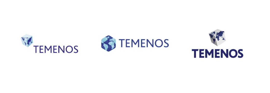
Looking back, we’ve had the cube throughout. First with a spinning effect, then in a more stylized way. We then had a change of perspective, with the cube also being a hexagon. And in the 2018 rebrand we returned the cube back to its normal shape.
For us designers, that cube was both interesting and also a nightmare in every way of designing. We were always asking, "What do we align text to? What's the baseline? Where do we put it?" because it really ruins any type of alignments you have. We had to design a set of rules based on that cube. It was a challenge.
After around 20-something years of having the cube, we dropped it this year. Now we're lower-case, so it’s more friendly, relaxed, and curvy.
You also see that change in our colors as well. Previously, we used a strong and cold blue that was very business-like. Now it’s a warmer blue.
About this current rebranding, how did it come about? How did that conversation start?
Temenos was refreshing and changing itself to mirror the changes happening in the market, our customers and their end users. We wanted to be more human and more simple, as well as retaining the pioneering spirit that has always been key to our success. We wanted a way to mark that shift, as well as bring focus on our new path.
We had opinions from people like, "I know Temenos. It's very good, but it seems a bit legacy." You could tell part of this was a visual ID that didn’t feel modern. It was very corporate, very cool and not a warm, approachable, personal company.
We experienced this every time we would design assets. People would say, "Oh, this looks really cold and kind of harsh," and it's like, "Yeah, that's the brand."
We started in 2020 with a mid-refresh. So we started adding in more orange, both as accents and as color in the images to give them a bit of warmth, like some sun, or some energy.
How did the rebranding process go? Was it all smooth, or did you encounter challenges?
The first thing was finding an agency to help us with the rebranding. Handling a big corporate rebrand isn’t something that can be achieved by a small in-house team, so we got an agency to help us have a nice back story and experience.
After some discussions and a couple of months, the agency returned with this brand early this year and we liked it. It included words as well; how we talk, and how we write.
It’s was a huge shift for a company with almost 30 years of doing things roughly the same way brand-wise. We’ve always been kind of consistent.
We launched a couple of months later as a surprise during an event. When people arrived, everything was in the new brand. Our CMO opened the event by revealing that we have a new brand.
People loved it. We got post-event feedback and everybody loved it. It just brought new energy, which was needed after a while of being consistent. Now we’re able to be fresh, energetic, and more human. People really vibe with that.
But it was also really hard. Change is difficult for people to accept–any change.
I've been through a couple of rebrands. And by the time people see it, I’ve already got to love it because I've seen it for a couple of months and worked with it. But people usually take a couple of months to get used to it, and start applying and loving it.
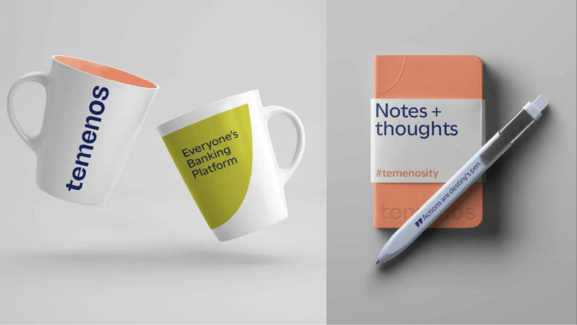
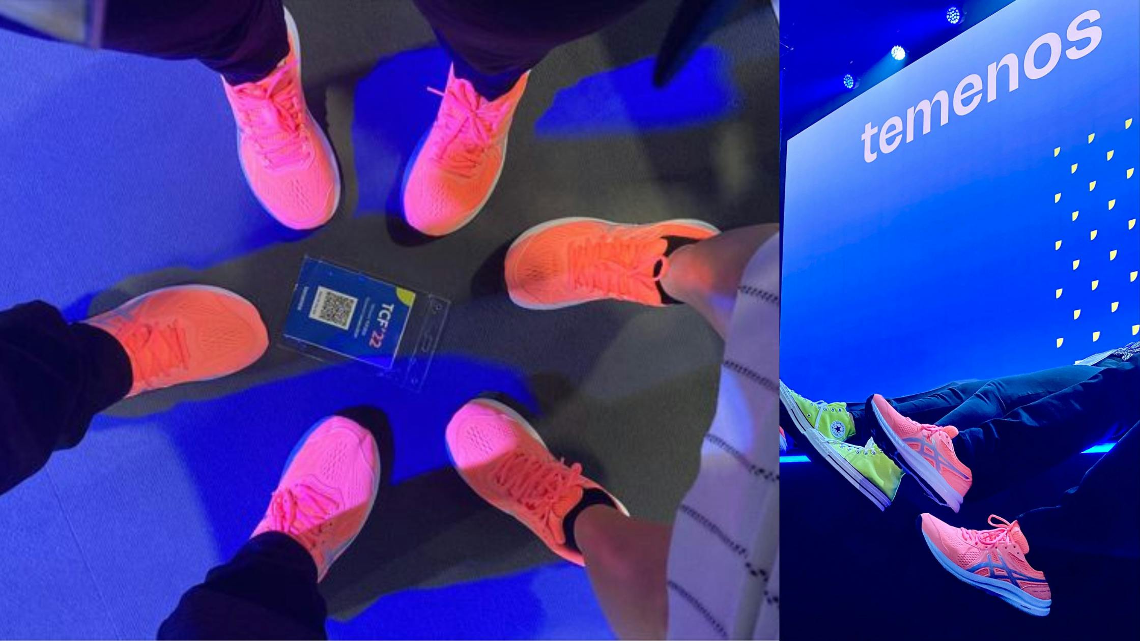
Luckily, this rebrand is more human, friendly, and fun. We have all these awesome colors that people would actually wear, for example. The marketing team all got sneakers in the coral. I found lime green Converse and they looked amazing.
Can you share more about the Temenos curve?
This curve is basically our central design element. We got rid of the cube but we needed something that would represent us.
We went with the arc of an exponential curve, which is an analogy of the potential our platform has. We can help businesses to drive growth and engage users. It's exponential for us and for our customers in ways that traditional businesses models aren’t.
As the visual representation of “everyone's banking platform”, the shape has to be consistent. We can only modify the starting point. It can start and be flat but the growth part is always the same. We apply this to every design, so you cannot stretch the curve upwards or sideways. You can only move the starting element. We can have a longer curve but whenever it starts to go up, it will always have the same arc.
Initially, I saw this as painful because I thought we're missing out on potential design ideas of anything that could be round that we could make work in design. Now, we have this kind of weird shape that we have to handle but so far we've made it into very interesting things.
Your color palette also changed. How did you land on these colors? What do they say about your brand?
The 2018 rebrand colors were dark blue, darker blue, gray, darker gray, shades of blue-gray and some cyan. And that’s where all that coolness came from in feel.
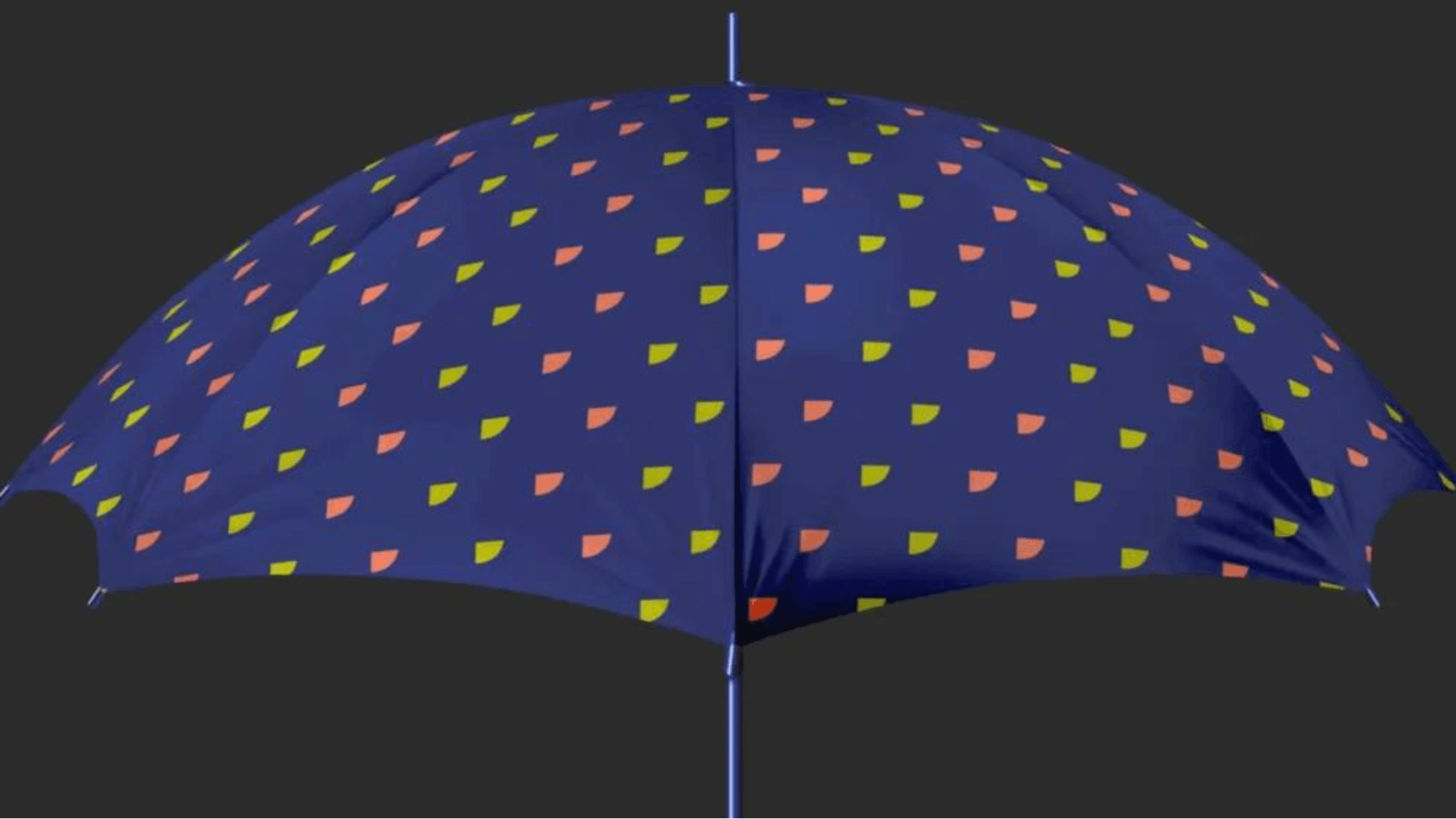
Now, we have this new palette with a warmer blue, coral, moss green, and baby blue. Even as designers we initially thought it was a bit much, but now it has started to grow on us.
The colors have meaning. Orange is for the pioneers. Green is for energy and corporate responsibility. Blue is for warmth, confidence, and our legacy and history. So, it all made sense, but people still needed to get used to it.
Your new visual identity also makes use illustrations and other elements. How were these developed?
We have an illustration style, which is basically taking humans or objects, and mixing and matching with our colors.
It's about focusing on the subject, applying a certain treatment to them. If you have just one color, it's kind of boring, but if you have all of them working in synergy, that's just fantastic.
Another thing that came with this rebrand is the shift from isometric. We had the isometric style in 2018.
We have very difficult concepts to explain: payments, loaning, lending, etc. It's really hard to put into a picture. We went the isometric route in 2018 just because we could build those isometrics out of mix and match.
But it was getting really complex, messy, and difficult to work with. It strays away from being human because it's not a natural shape. The perspective is not natural. The shapes are vectors with gradients, so it doesn't give you that natural feel. So we got rid of the isometric.
What is your major takeaway from this experience? Or, do you have any advice for brands or designers about to do a rebranding?
Based on my experience with a couple rebrands, I think we should not be afraid.
A rebrand can be very difficult, and you might hate the first time you see it or even the first couple of months. It might not fit your style. But it all ties in while you use it.
The whole rebranding is a process that I think every designer should be proud to be a part of, and fearless in doing it. It's your time to shine from a designer's perspective. It's your time to be creative and to set the guidelines for the future. Which is something you don't usually get to do.
Before you might think, "Okay, I'll just work within these walls in this walled garden." But with a rebrand you can build the walls, you can alter the walls, you can select the colors, you can do all that. That's why I think working on a rebranding is fantastic.
Everybody should take the jump and have fun with a new brand. Don't be afraid. Experiment. People will hate it, in 90% of cases people will initially not like it. Because they like what they know. You shouldn't be discouraged by that.
You just have to trust it. If you have faith in yourself and your work, people will end up loving it. Statistically, after one year, people tend to get used to it and love it.
So, everybody who has the option to participate, please do it. Every creative, just do it. Trust it. It might be awful. It might not work. These things happen, but you have to trust it, and you'll end up loving it about 90% of the time.
