


Dave Byrne (Creative Director) and Sheldon Lieberman (Founder) at Bigfish.tv talk about the unique experience of rebranding their hometown and creating a visual identity that Brisbane deserved.
Can you tell us how this project came about? How did that conversation start with Visit Brisbane?
We had just done a small animation for BEDA to celebrate the Brisbane Olympic win. They loved it and it got great reactions on social media.
They asked us if we would be interested in putting in a concept for the rebrand which was already underway. We came in late so didn’t have a lot of time. It was an amazing opportunity for us so we collected our dream team and went for it.

How did the rebranding process go? Can you tell us more about it? Where did you start?
When we start branding jobs, we always make time for experimentation. We briefed the wider team as well as two illustrators without too many pre-conceived ideas of where we wanted to go.
We had a feeling that we wanted to evoke but wanted to keep the initial direction open – just simply, ‘what does Brisbane deserve?’
This open-ended experimentation lead to a visual direction we both didn’t expect but immediately felt right. We reviewed these experiments with the team who helped refine, tighten, and make sense of the visual language.
We often create a large body of work for a single concept, not multiple concepts, then prune down the parts that work best to create the strongest brand possible. The whole process felt like a dream with the direction revealing itself quickly and everyone on board straight away.
Being born and raised in Brisbane, I think we felt we’d been thinking about this our whole lives and this was the moment where it all came forward.
Were there surprising challenges you encountered along the way?
Everyone has a different interpretation of what Brisbane means to them so trying visually to represent this very personal connection to a place is challenging.
Colour felt like the universal thread that united a lot of what people felt about Brisbane – a warmth, friendliness, and quiet confidence that’s sometimes hard to express in other ways.
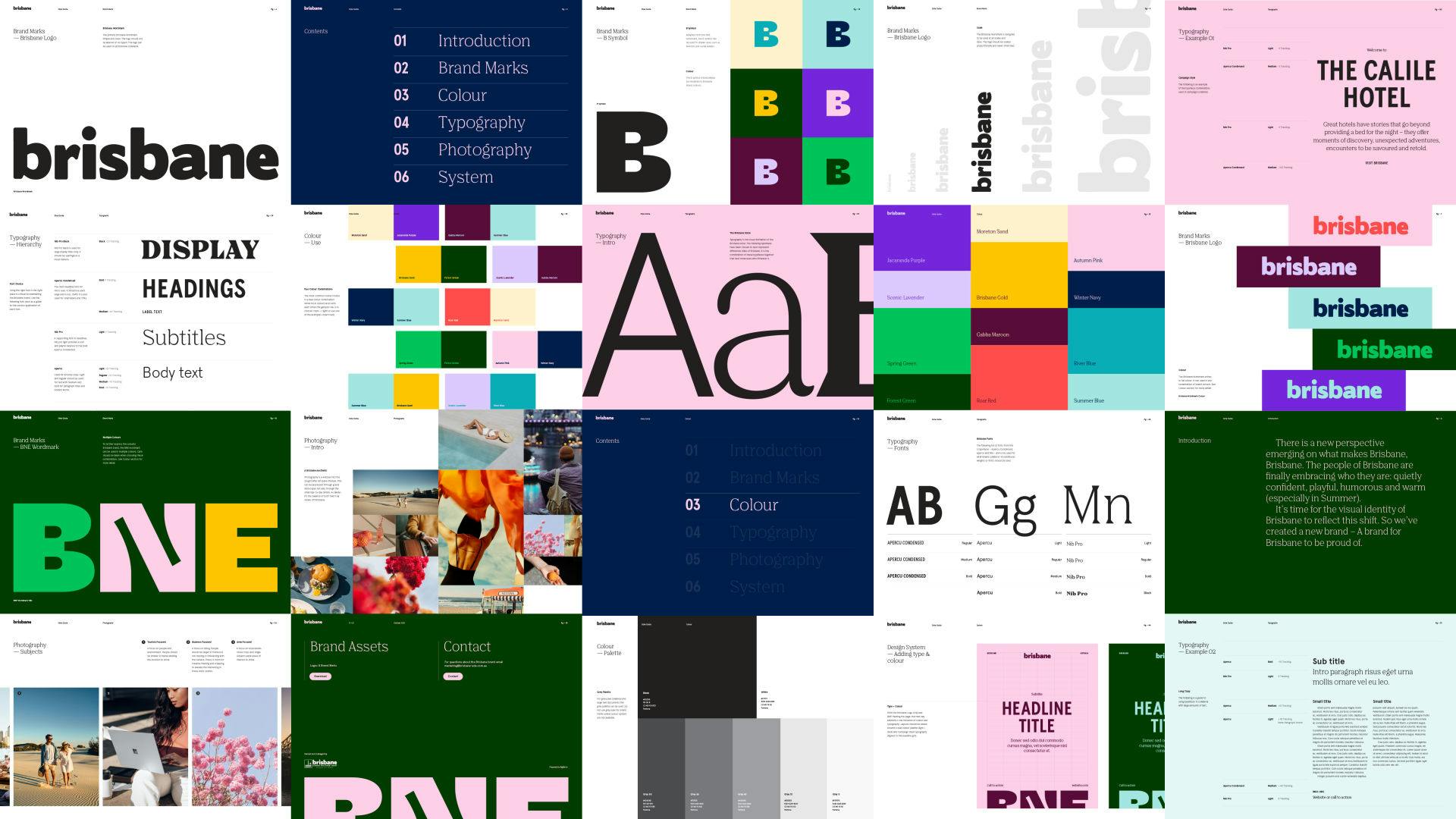
Can you tell us the story behind the logo? How was it conceptualized?
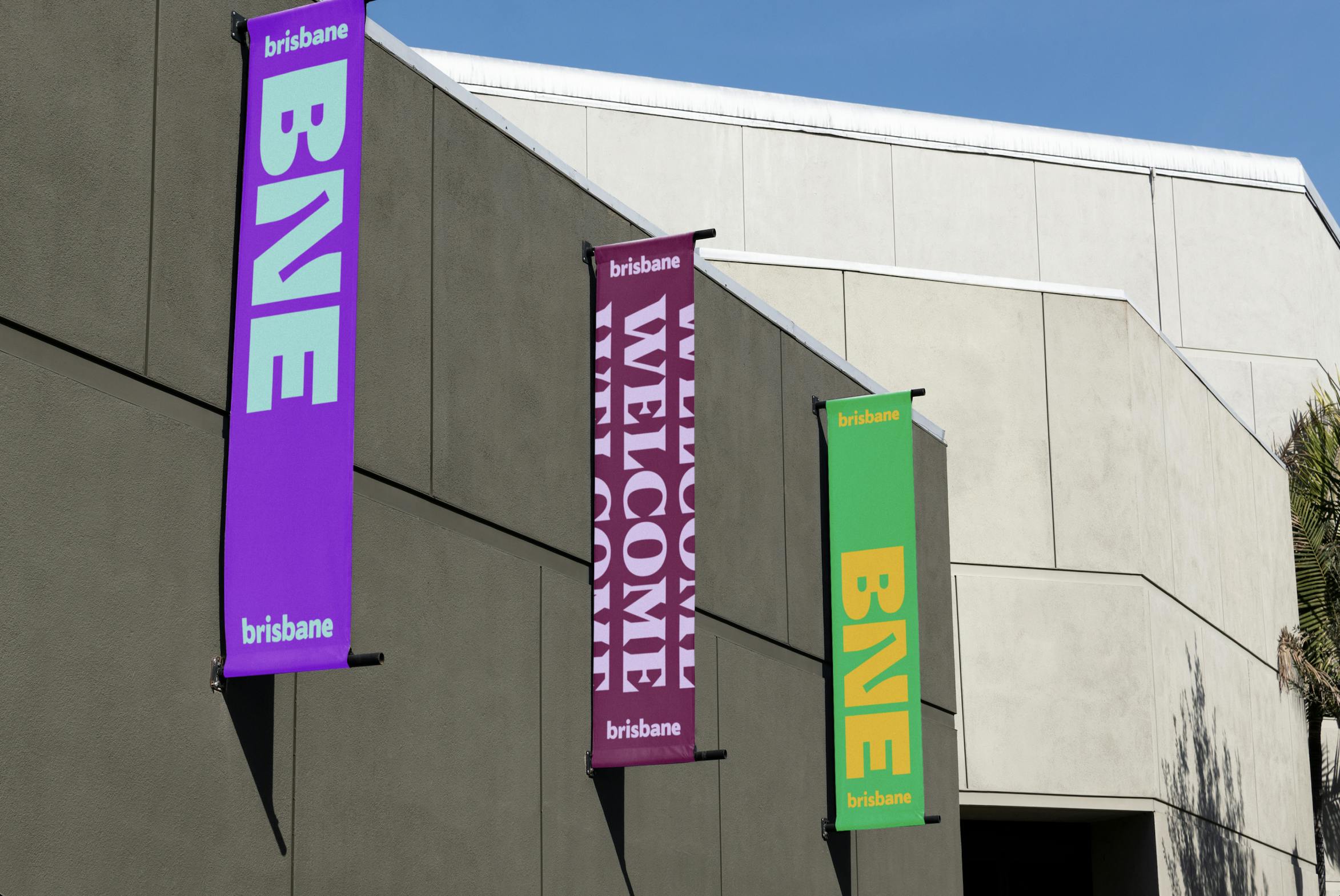
We were asked to maintain the existing brisbane, logo but wanted to add an additional branded element to elevate it.
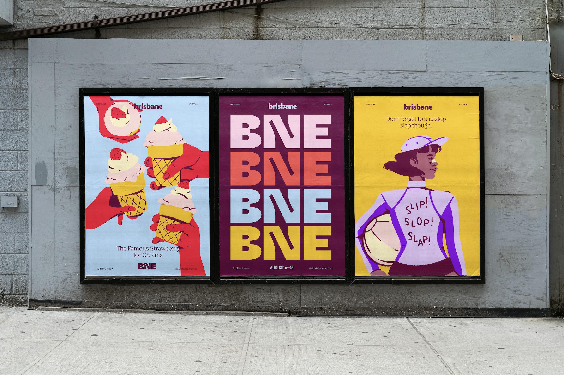
The BNE mark has had a troubled history in branding within Brisbane – from the maligned ‘I 💚 BNE’ logo to the Brisbane Airport logo, it was something we wanted to reclaim as core to Brisbane's identity.
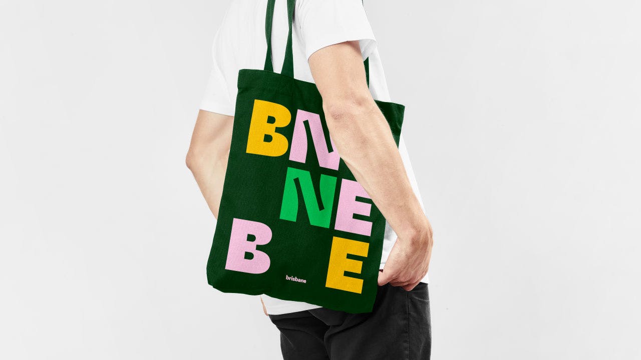
The typeface used to render BNE has a lot of interesting details reflecting the curves of the river and hidden nooks to be discovered but mainly these details allowed it the be shown as scale and maintain visual interest.
We really wanted this element to be the most prominent, so it became really big in the design. It’s there to show Brisbane’s renewed confidence in its identity, not just a small wordmark in the corner.
Put it on a t-shirt and a tote bag and wear it proudly.
The new brand also features a more vibrant color palette. How did you land on these colors?
We had a lot of fun with the colour palette.
Of all the elements, it's the most reflective of the feeling and tone of Brisbane. There’s a brightness and warmth about them with a tinge of nostalgia.
We wanted the palette to be broad, covering a wide spectrum, but also design it so each colour could work together in combination to create different moods.
In-application colours are often used in pairs allowing the combination of specific colours to reflect the many aspects of Brisbane – Moreton Sand and Sky Blue for the beach, Gabba Maroon and Brisbane Gold for sports, Winter Navy and Autumn Pink for the CBD.
In total almost 100 colour combinations are possible with the palette.
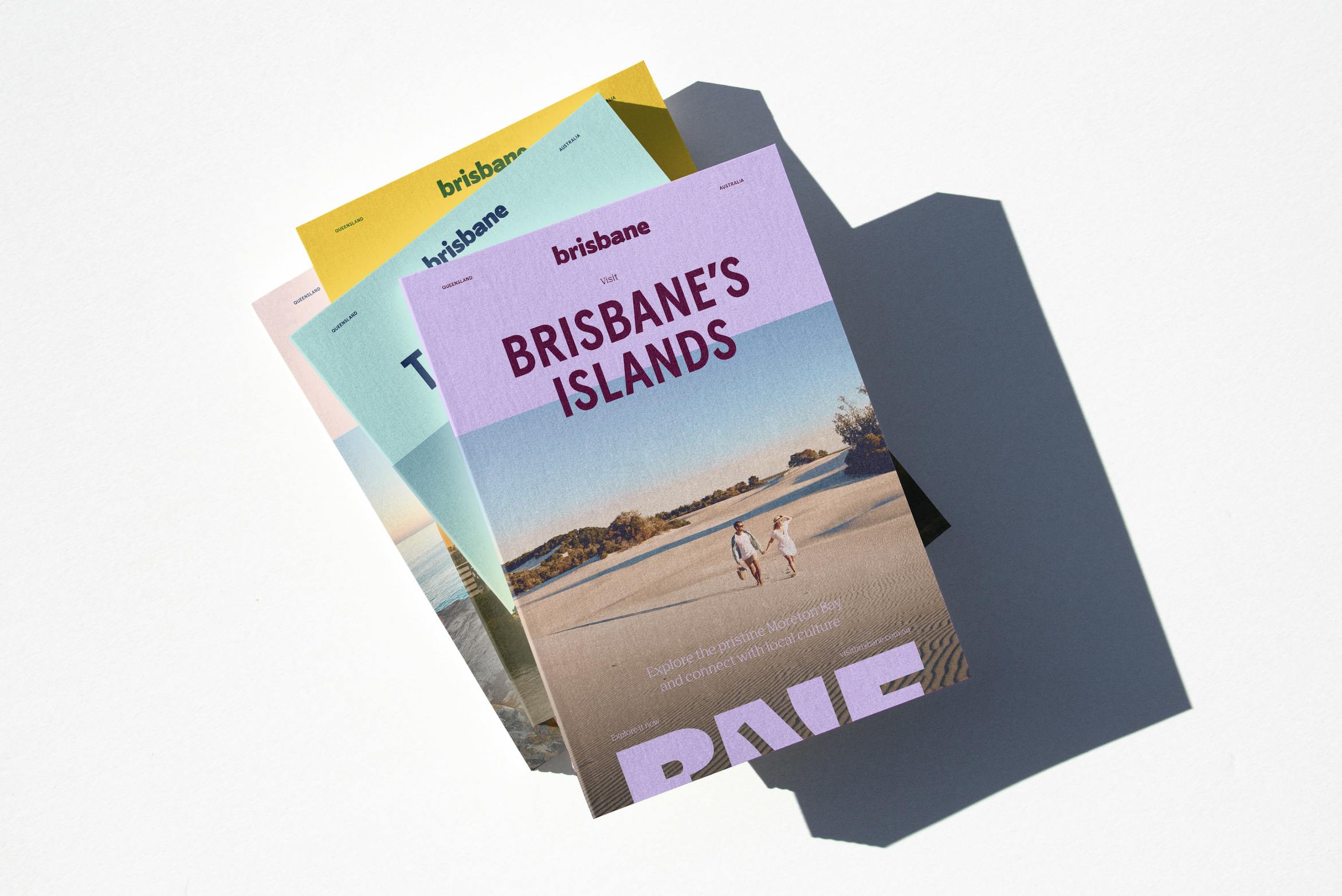
What about the photo direction for the brand? Can you tell us more about the photography for the visual identity?
Photography for a brand at this scale is always a challenge as there is an existing and extensive library already in place. Starting from scratch is both impractical and unnecessary.
Our approach was to create different ways of framing imagery within the design system in order to inject new life into existing images.
We’re also building on this library with new imagery that focuses on smaller moments and details. Our feeling on what makes Brisbane special is not its landmarks but that great pastry you might get deep in the suburbs, or a picnic in a hidden park at the top of the hill.
You also make use of some illustrations. Can you tell us how they were designed?
Knowing we’d be working with a lot of existing photography, we wanted illustrations to be another way to inject personality into the brand and have the illustrations and photography play off each other in lighthearted and humorous ways.
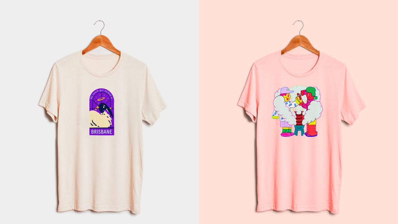
We engaged long-term collaborators Niqui Toldi & Sem Han to draw what activities and objects represented Brisbane to them. Sem, having moved to Brisbane from Korea had his own perspective as did Niqui who grew up in Logan.
They focused on nostalgic elements such as strawberry ice creams as well as small moments like walking a dog which fit in perfectly with our idea of a quietly confident brand.
Their illustrations provided another palette with which to design, whether they’re used prominently or as small details, they always make us smile which is really all we want Brisbane locals to feel about the brand.
Lastly, do you have any advice for designers embarking on branding projects like this?
Branding a city can feel daunting and we were scared of getting it wrong going into this project. But then we thought fuck it, let's enjoy ourselves. What do we have to lose?
For us, it was making it smaller and focusing on the elements that all come together in the end. What are Brisbane colours? What would the typography look like if Brisbane could speak?
We actually imagined Brisbane as a person more than as a city which helped us to design in a way that was more focused. We trust our gut and our process of not always knowing the answer before beginning.
Sometimes you just have to jump in and hope you land in the right place.
