before

after

Sergio Mannino graduated from the University of Florence's architecture program and worked extensively with mid-century design masters Ettore Sottsass and Remo Buti. Having grown up, studied, and worked in Italy, Mannino brings the touch of classic Italian design into every project the Studio completes. From Brooklyn butcher shops to Milano chairs to Shenzhen apartments, it's this quality's coherence with today's spectacle of contemporary design that SM Studio has become known for.
Can you tell us how this project came about? How did that conversation start with A Mano?
The owner of Cain Sloan (the company's original name) contacted me after reading a few of my retail articles on Forbes. She wanted to open a new store and was exploring different ideas.

How did the rebranding process go? Can you tell us more about it? Where did you start?
We have an established process that I have been fine-tuning for many years. It always begins with an analysis of the brand or the client's concept in mind. We have a series of questions designed to spark discussions and make everyone think about the brand, both on my team and the client's side. We ask simple things, such as "where do you see yourself in one year and in five years", "who are your competitors?", "who are the people that will love your brand," et cetra.
But we also ask more vague questions, such as "what if your brand were a car? Would it be a BMW, a Tesla, a Fiat, or a Hammer? With identifications such as these we try to understand the values behind the brand or where we need to take it.

Were there surprising challenges you encountered along the way?
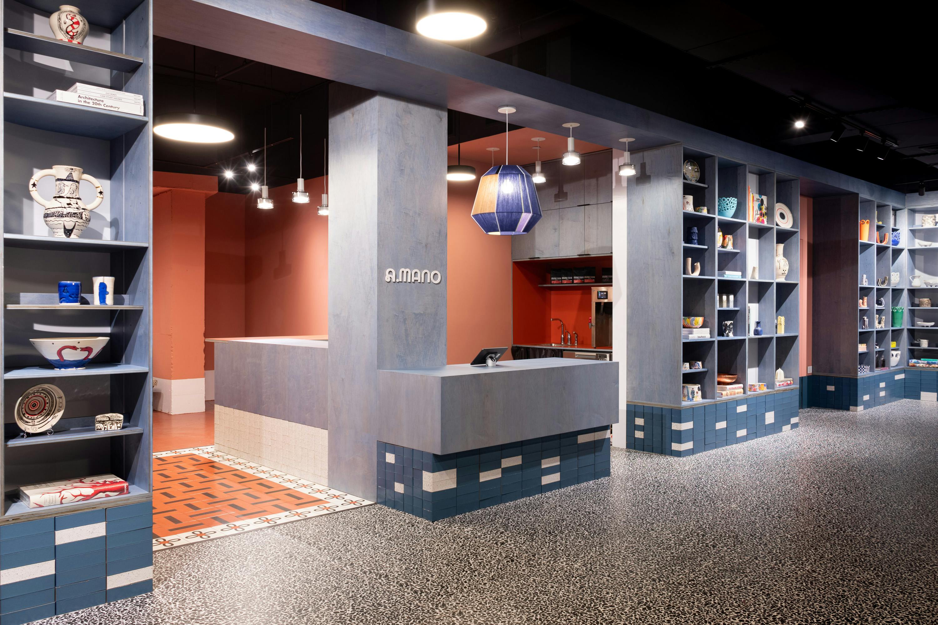
There are always surprises in every project. In this case, the main challenge was the space because it has a lot of natural light but very little space for wall displays. Also, we decided to leave the ceiling exposed for budget reasons, which always concerns me because I am always trying to hide all the mechanics of a project.
"I don't want to see pipes, beams, hinges, or screws."
We painted everything above the shelves in very dark blue, and it worked. When you walk inside the space, you don't look up.
The name and the logo were two big changes to A.MANO. Can you tell us the story behind them? How was the logo conceptualized?
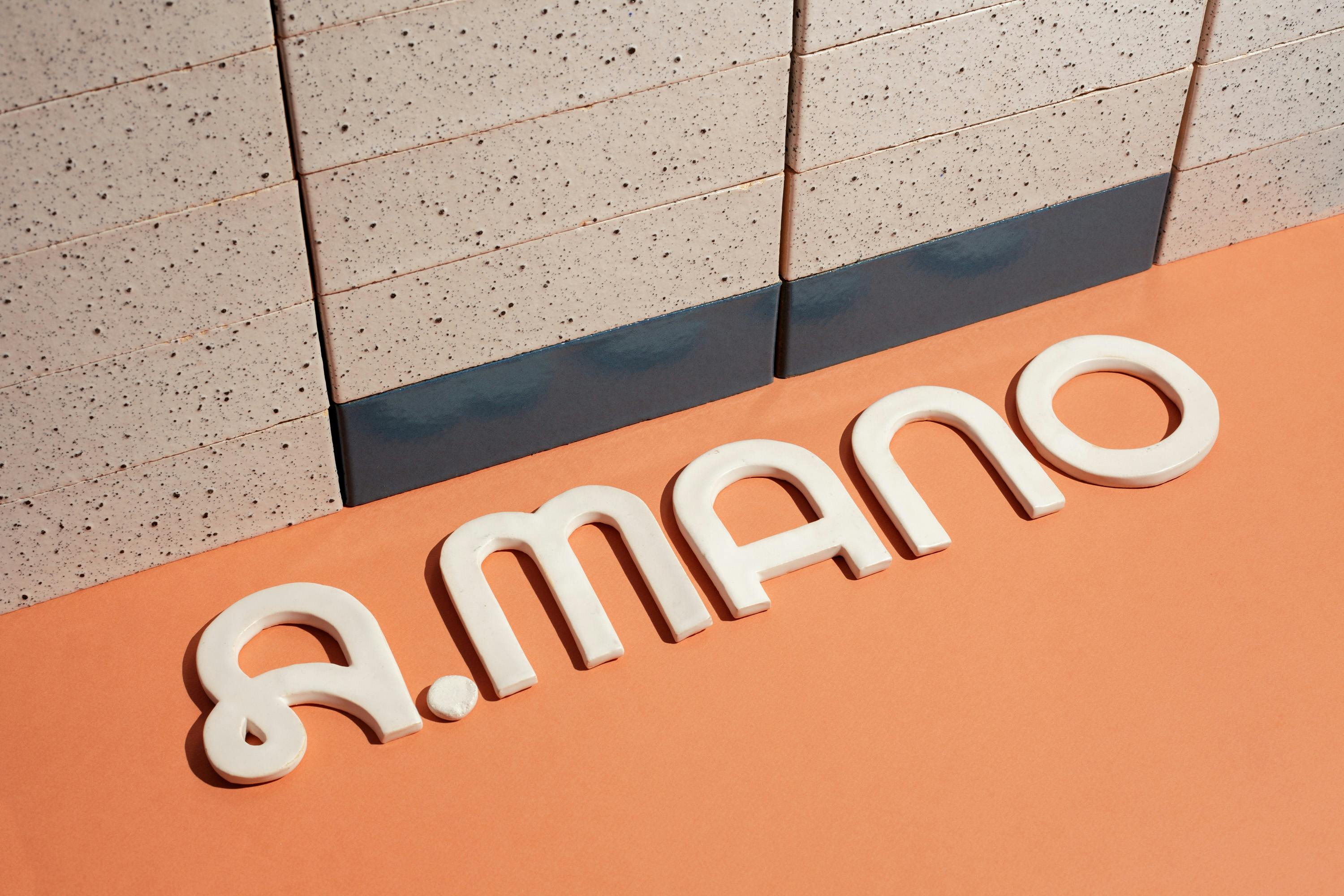
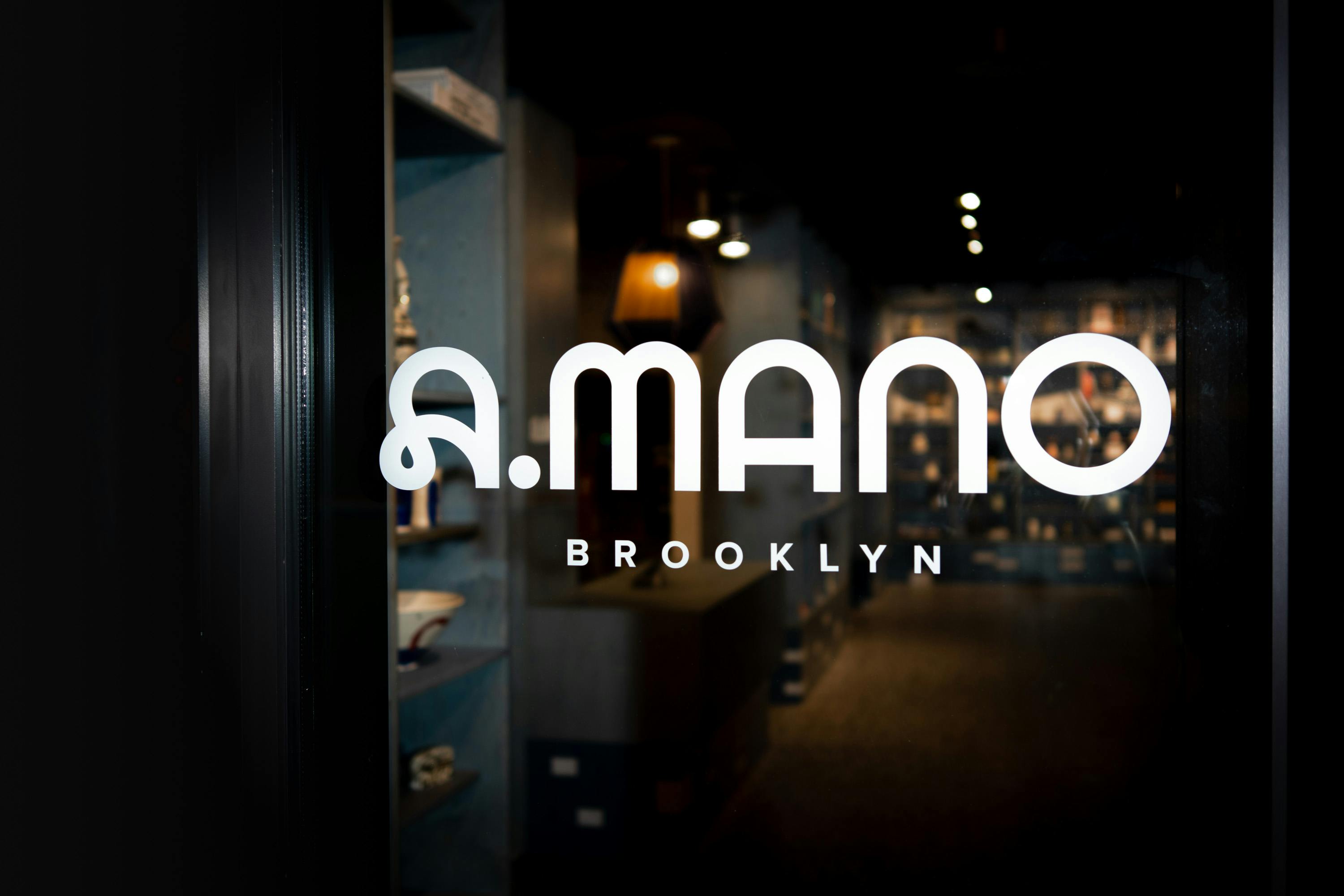
We never liked the name Cain Sloan because it doesn't say much about the brand's story or the products. [The owner] was open to alternatives, but we just couldn't find the right choice to it. In the end, she came up with A.MANO, which I immediately loved because it's simple to remember and it talks about the products sold.
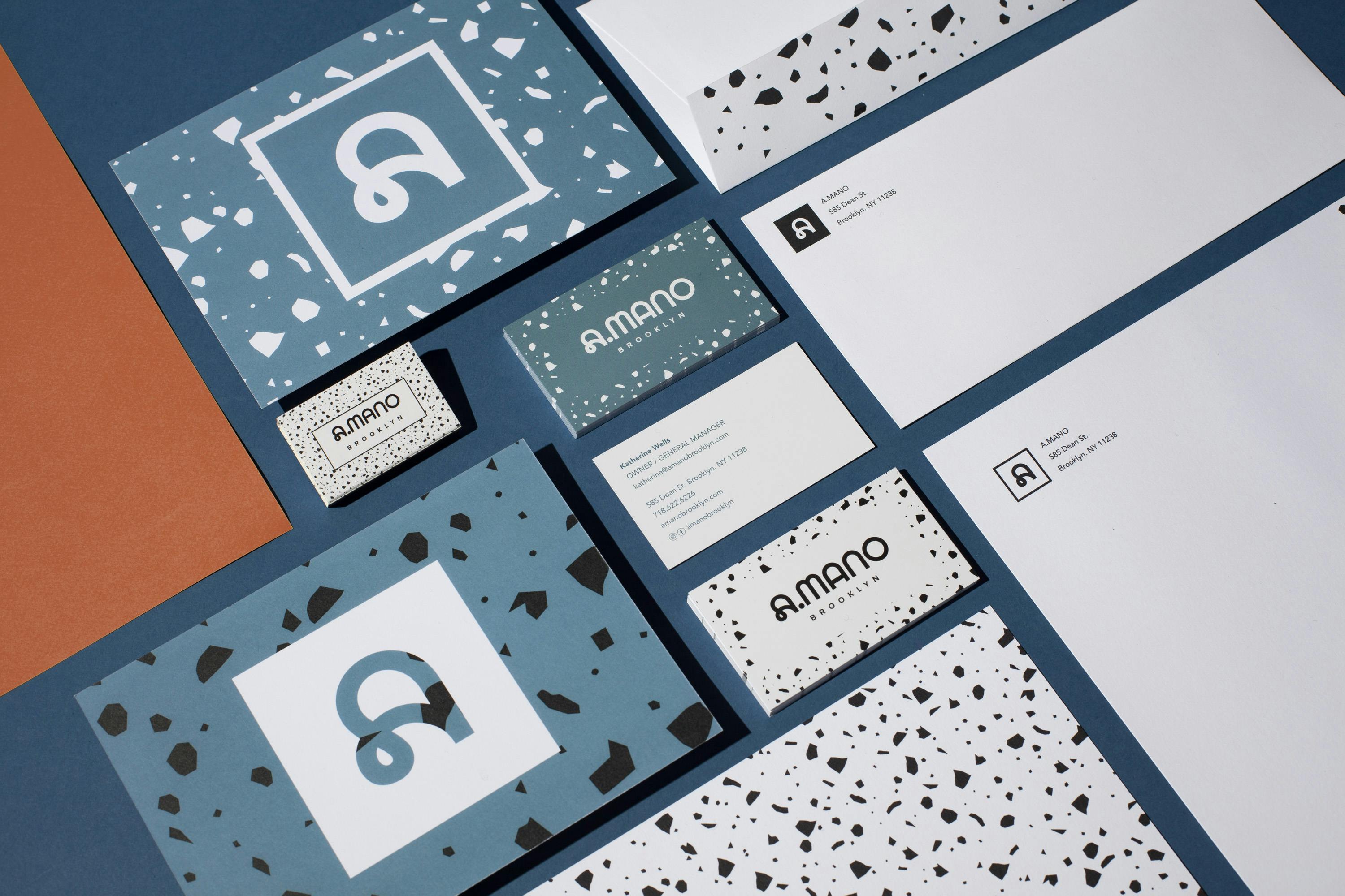
"A mano" in Italian means "by hand," which is exactly what the ceramic pieces are. We tested it with a few groups of people, and we got overwhelmingly positive feedback. The logo has a longer story because we initially designed one that reflected the shelving system but was more abstract and challenging to read.
Our misconception was about the product because we thought it would be much more contemporary and cutting edge. She initially liked it, but then she came back with questions and hesitation. She pushed for something much more romantic and softer, and she was right. The original logo would have worked very well, but the new one tells her own story, and it's a lot closer to who she is.
The brick-and-mortar store was an addition with the rebranding. How did you and the brand develop those simultaneously?
As I mentioned earlier, I have been writing extensively on what it means to own a store today, and we applied some of these principles here as well. We created a dynamic place that can be used to showcase the artist's work and host events, talk with the artists, or just hang out and get a coffee.
At the studio, we work on each project by simultaneously looking at different angles. We are first and foremost architects, and this is where the roots of the studio lie. We believe in the traditional Italian creative process involving various disciplines and facets in the same "bottega". We don't think that a line separates architecture from interiors from graphics or décor. All of these different disciplines are part of the same whole.
A.MANO Brooklyn Store
How about the color palette? How did you land on the colors and what do they say about the brand?
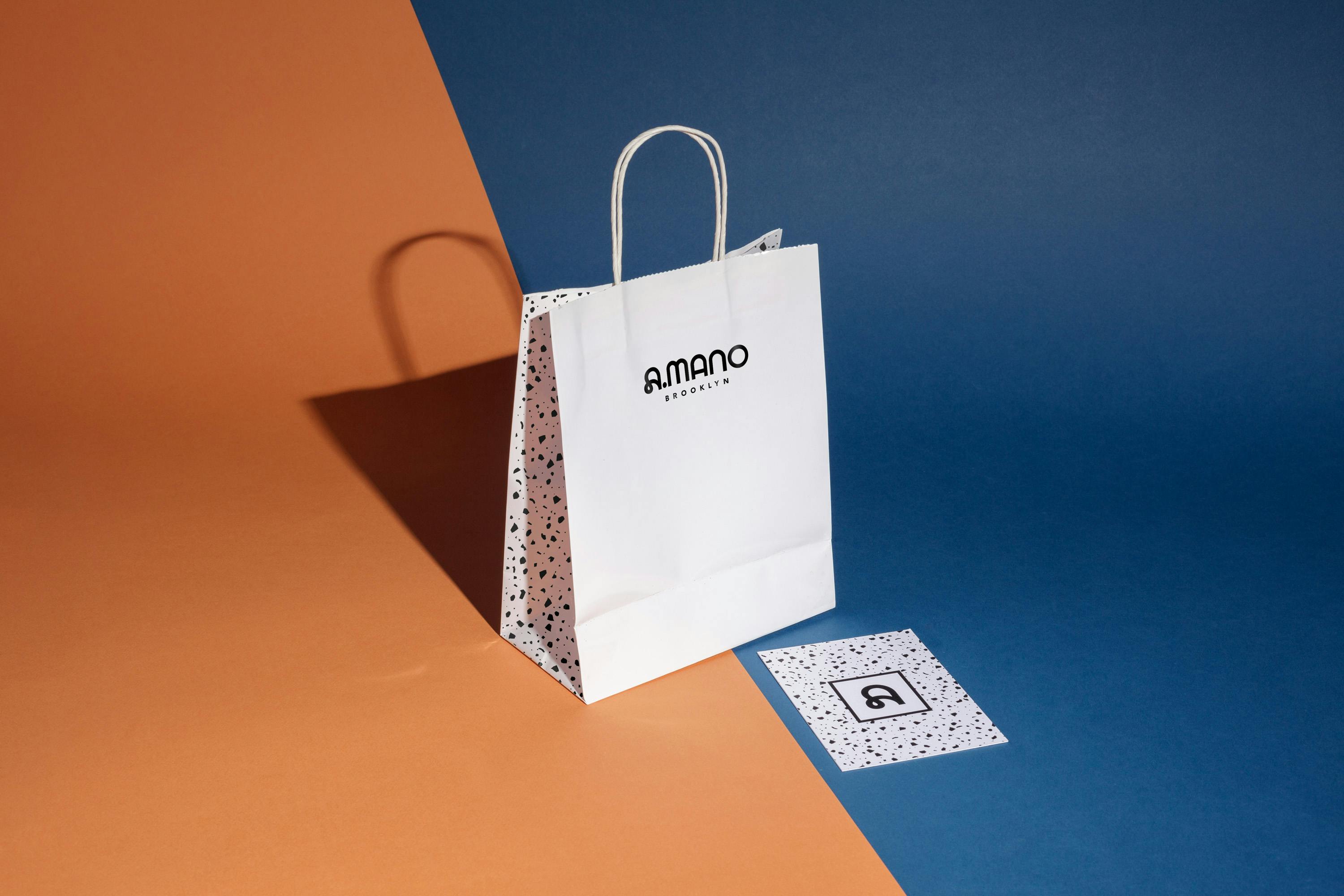
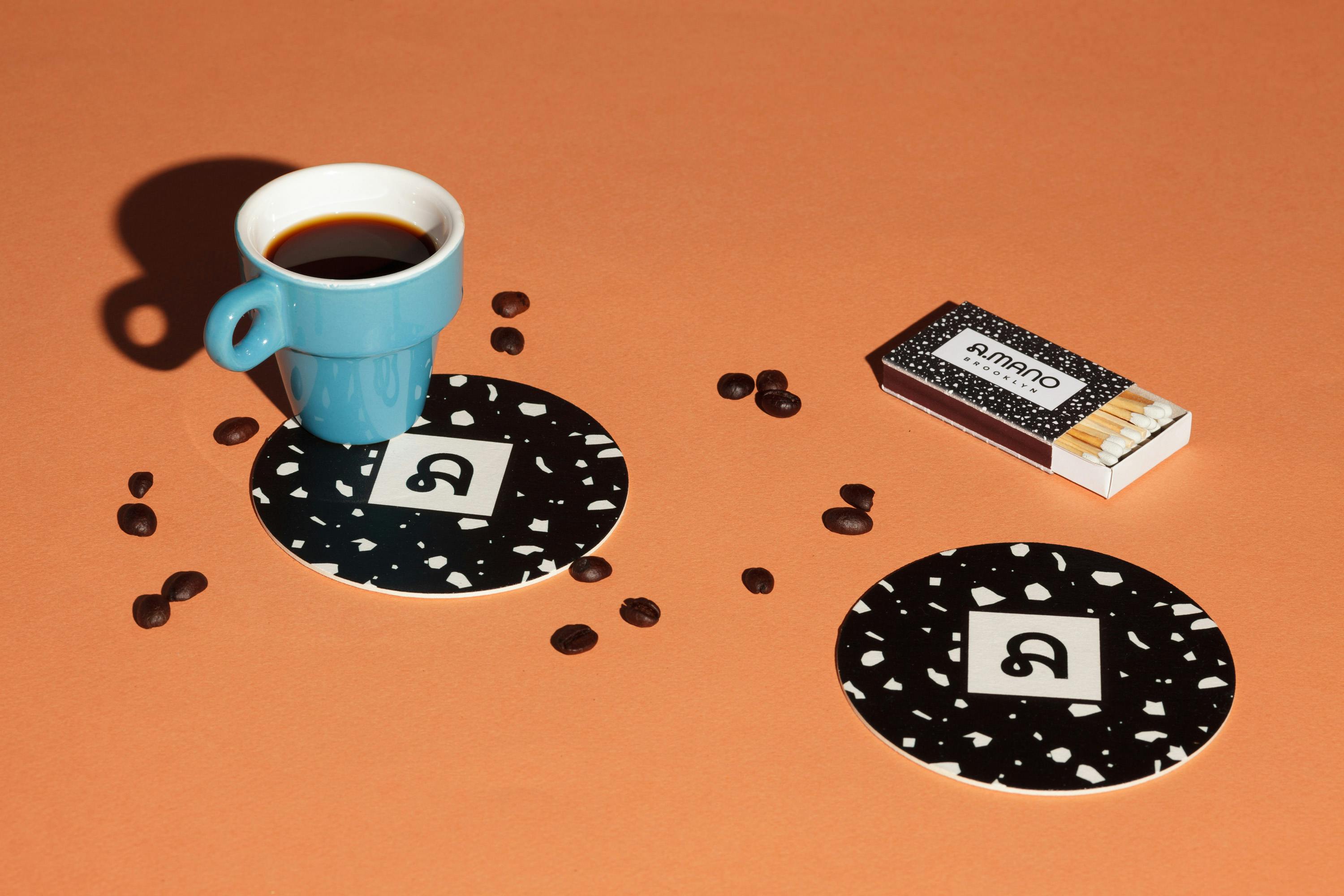
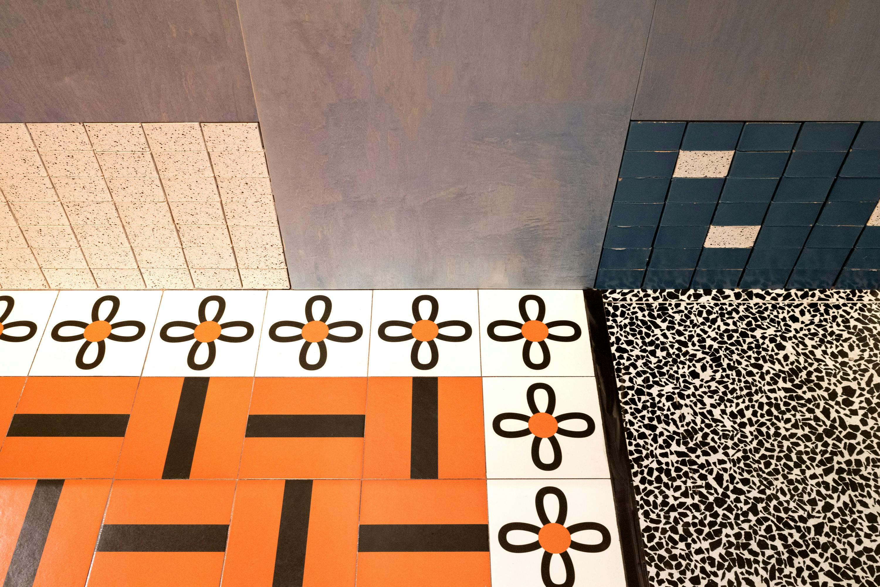
The brand's primary colors are black, white, and smoky blue. All three are reflected in the floor and glazed bricks materials. They have strong character, with contrasting tones and a bold presence. We started our material research by thinking about clay and all the different ways it has been used for construction over the centuries.
"When I moved to New York more than 20 years ago, I was struck by these glazed bricks that you see on building facades, especially buildings from the 60s and 70s."
They are so colorful and powerful, and also they age very well. Unlike terracotta that has almost a nostalgic or traditional look to it, glazed bricks feel much more contemporary to me. So we looked at these materials, and we selected two that would work with the outcome of our brand analysis.
For the interior, we added the terracotta color for one of the floors and a few walls. The brand's secondary colors are a lighter version of the shades used for the interior space, including a light green tint. These colors evoke feelings of warmth, comfort, and nature. They evoke naturally painted surfaces and feel contemporary without breaking with tradition
Patterns are also part of the new visual identity. How were they chosen and developed?
When we designed A.MANO, we looked at each material and element of the space from an architectural perspective and a graphic one. The terrazzo floor we selected for the main room quickly became a pattern for the business cards and the window graphics. Even the logo, in its various iterations from initial sketches to the ultimate version, came from the design of the shelving system.
Lastly, do you have any advice or pro-tips for designers embarking on branding projects like this?
I usually never like giving advice because I feel I know nothing, and the more I get older the more I feel I know less and less. But if I had to give a piece of advice, it would be to spend a significant amount of time researching what the brand is about, where the client wants to go, and ultimately follow your instincts. It's better to design something from your guts than with a precise technical explanation for everything you do. You might not know why it's right, but usually, it is.