before
after

Chris started Nueker with a yearning to work with ambitious clients. His goal was to create meaningful work, subverting market trends, and approaching each project with a more holistic and human view towards their audiences.
Can you tell us how this project came about? How did that conversation start with BRE Group?
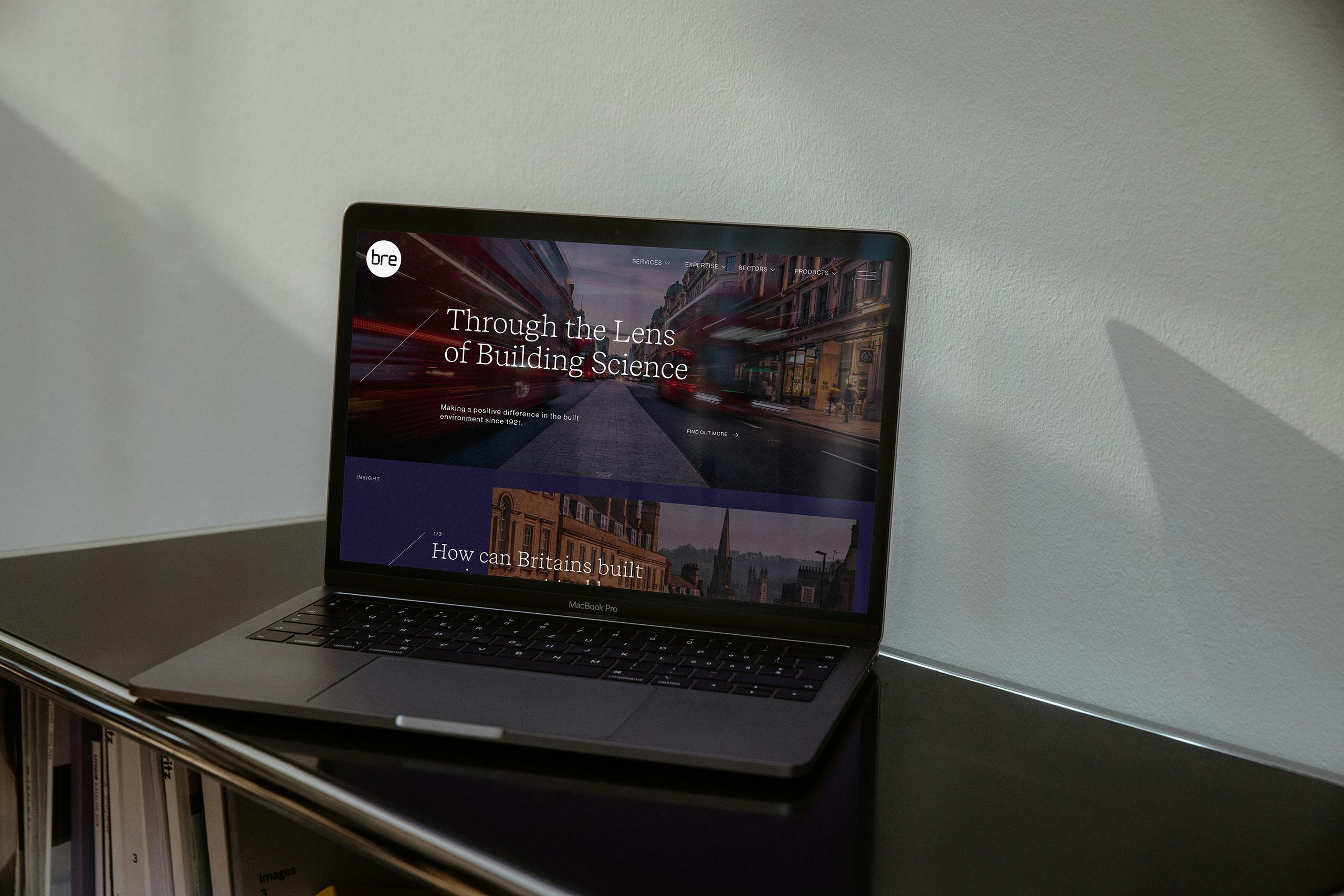
As BRE was approaching their 100 year anniversary, there was a desire to update their existing identity and make it work harder for them in the digital space. The conversation started because of Simon Goodall, of AndThen Associates who we work with regularly. Simon had worked with BRE in the past and had the role of coordinating a new brand strategy to move the company more into the digital era.

How did the branding process go? Can you tell us more about it? Where did you start?
Usually our branding process is quite smooth. I don’t think we have ever had a project where the client didn’t like at least one route or direction, and BRE was no different in this sense.
We try to present 3 built-out identity routes that create a spectrum of measure. One route will be something the client will expect, one may be totally left-field and one may meet the two in the middle. This is quite a useful approach for us, as Nueker doesn’t really have a ‘house style’ but rather we work to the brief and the market the client works in. This method helps us to narrow down expectations from infinity and justify trying to cut through their market in some way.
Were there surprising challenges you encountered along the way?
The challenge of working with a business as big as BRE is trying to create a system that can punch through their competitive landscape, while also being usable for their internal teams and external agencies to use. In that sense, we are always stress testing the design systems against a variety of materials in the concept stage so we don’t shoot ourselves in the foot later on.
Truthfully, they are a huge company and rebrand projects mean the launch doesn’t usually all happen at once, and that you do things in phases. This is more manageable and affordable for clients, but it can also incur worry about other things down the line i.e. if they wanted to do a dashboard platform, have we considered how colors will translate to complex information graphics? Our approach is to create a starting point for our clients, and can be built on later down the line.
Can you talk about the changes to the logo? What’s the story behind it?
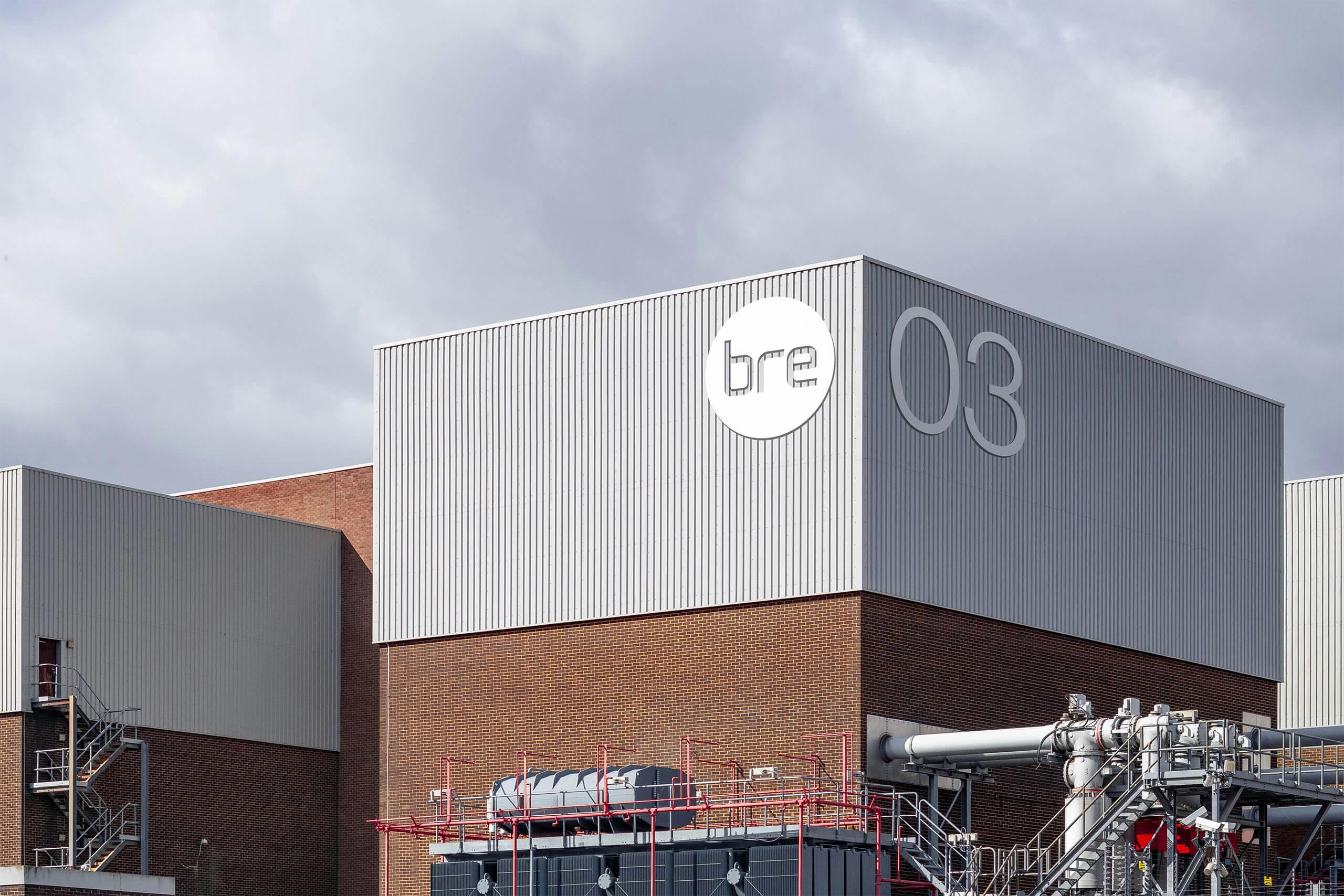
Something we encounter a lot is that businesses have an existing logo that has been in use for some time, and therefore has a decent amount of visual equity behind it. We try not to destroy that, but we also look to try and find a way to craft whatever is there, better. Mainly to improve fidelity, as it can often appear a little homemade or broken.
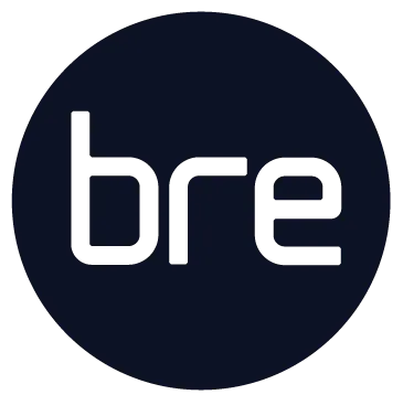
In this sense, BRE had some lettering that was a little unbalanced, almost flimsy. Due to the original forms being quite thin and lowercase, it meant that it often became visually lost on documentation or with other partnership logos. Our first task was to rebuild the letterforms to give them a bit more weight in both digital and print. Then we decided to encase it within a circle to give it visual authority on the range of materials it would inevitably have to be stamped on.
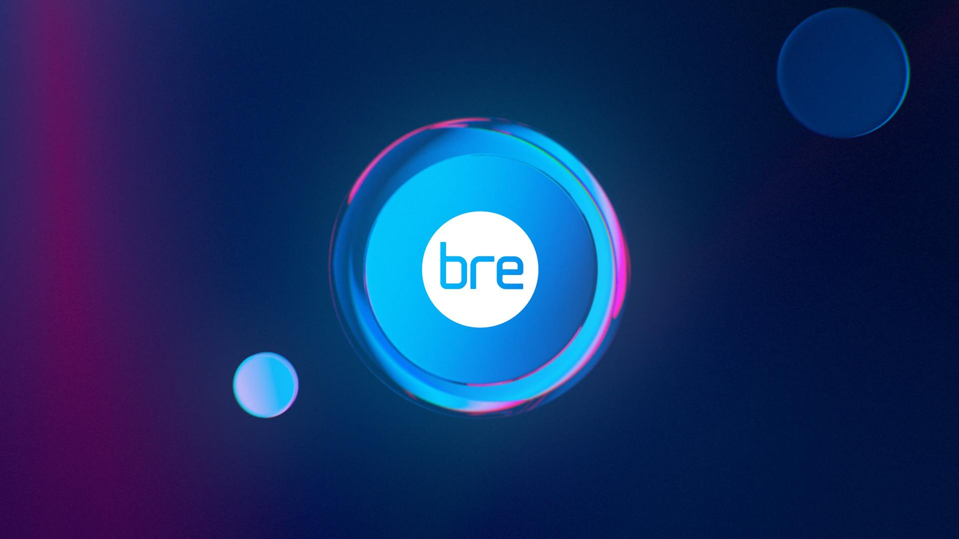
How did you land on the new color palette? What does it say about the brand?
For us, color in brand is much less about personal preference or arcane symbolism, it’s more of a tool to make something stick-out-on-the-shelf, so to speak. If we’re being reductive, there are only really 16 different colors (with a billion different tones within, of course), but this logic can only go so far when it comes to brand.
"As you might gather, our approach is quite blunt; if your market is dominated by a bunch of red brands, be the blue brand. "
So in that sense, we chose the colors due to the abundance of green on the market, probably in the effort to communicate sustainability. Pragmatically though, we often find it’s useful to have less colors to work with. It’s simpler to handle, with less visual dilution, so we went with a two tone approach. One primary color with a red highlight.

How was the iconography developed? How did you choose the style?
An important consideration to iconography is making it manageable for us or their internal/external teams to grow the suite.
The new BRE identity has a thinness of display typography and graphic lines to accent titles. The approach to the icons is similar, rather than solid and chunky, keeping a more outlined style helps keep it within the family.
Can you talk about the development of the animations for BRE’s four pillars: Knowledge, Innovation, Research, and Assurance?
BRE is a building science company, so we had a very simple idea of ‘building, through the lens of science’. The approach to animation was to create these expressive lens’s that could iterate the four titles through movement. I.e. Research is about looking deeper, so the lens becomes a magnifying glass for other elements in the sequence.
To us these four pillars felt like there could be a decent amount of thought-leadership pieces being created, therefore, giving them a branded categorization, would prove useful down the line. We had imagined these animations as an expressive toy that could be used on projections at talks, posts on social media, digital identities around their campus and key reports and presentations within the business.
To produce them, we had the helping hands of a good friend of ours, Dexter George, who is an incredibly talented animator and illustrator.
Lastly, do you have any advice or tips for designers embarking on branding projects like this?
I would say try to forget the self-gratification of wanting to entirely change a business’s brand identity because you want it to be cooler or more current. Think about how you can find the sweet spot of making it visible in the market and make it more manageable to use.
"Tempting as it is to reinvent a company with an identity you wish to push on a client, it can be destructive to a brand identity as you start unraveling the equity they have built over time. "
With a brand update job like this, we tend to try and look for the pragmatic visual improvements we can make, exploding this out into a bigger brand world, and aim to retain the visual core of what it was. The example I always think of is Pepsi vs Coca-Cola rebrands. Pepsi reinvents itself every 10 years or so, whereas Coca-Cola just tends to finesse the lettering of logo and place the logo in different ways, and undoubtedly, Coca-Cola has the stronger brand because of it.
