before
after

Matt Yow, Designer at Census, talked to us about when the company knew it was time for a visual upgrade, his fusion of Vaporwave and Bauhaus to create a visual language, customizing typography for a ‘warmer touch’, and the importance of brand strategy.
Can you introduce us to Census and its initial branding?
I had to learn quite a lot about the data nomenclature and data culture when onboarding. My background is purely design, so it was a learning curve to simply understand the business as well as the industry.
Census is an operational analytics platform, a final piece in the modern data stack. Basically, it’s a vein or highway taking large datasets from warehouses and properly syncing it seamlessly across other CMS platforms.
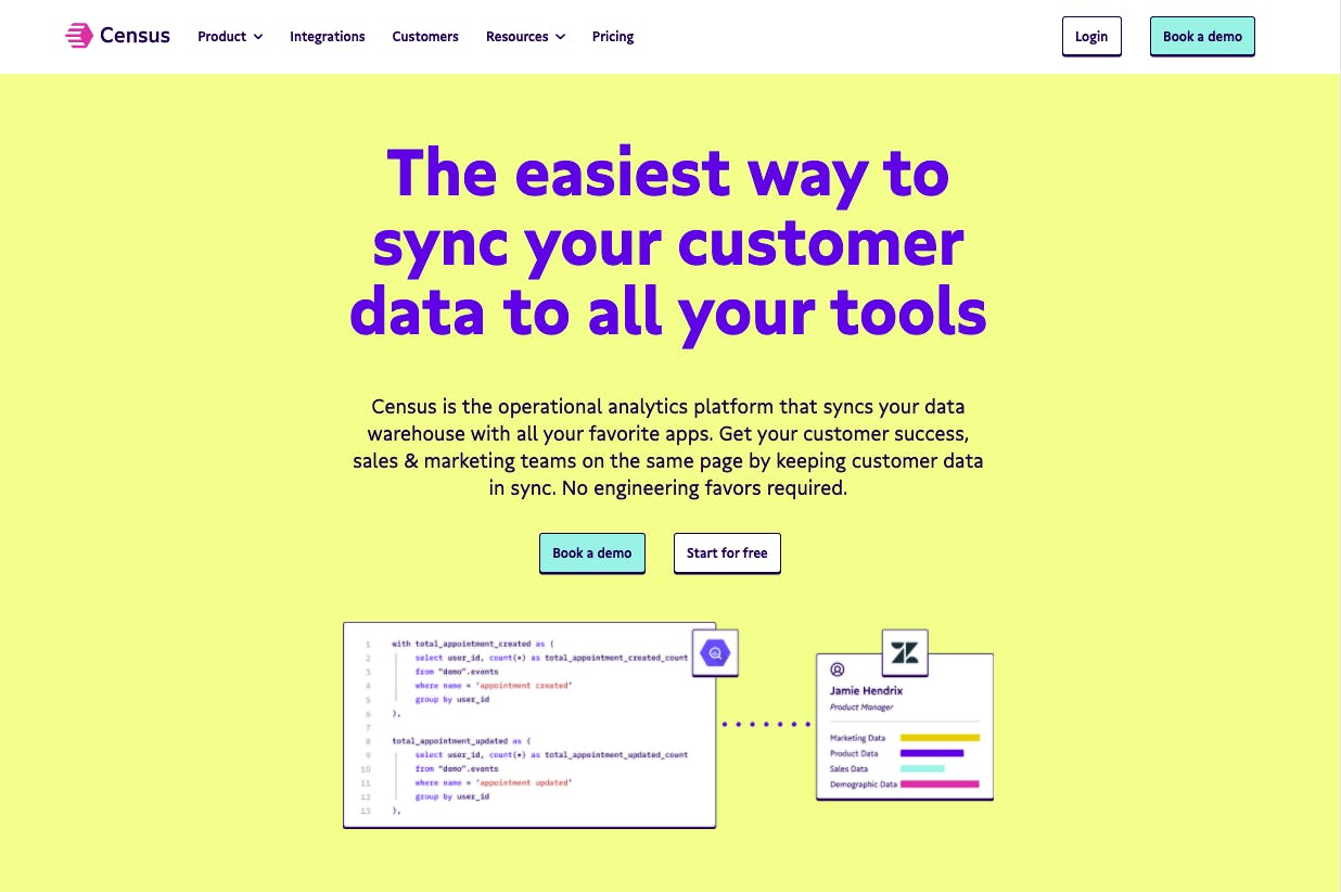
Census's new homepage.
This is a new space so we knew we wanted some kind of splash with the rebrand, but not alienating those unfamiliar with design concepts.
How did you know that Census had outgrown its previous brand identity, and that it was time for a rebrand?
The initial visual identity of Census was the exclusive use of Lato (an open-source Google Font) and a less-than-accessible yellow. There was nothing distinct or memorable about the system.
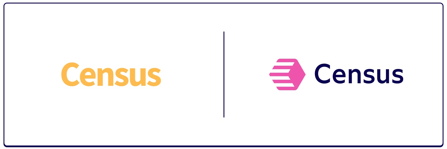
Census before and after.
We had outgrown the identity right when I started: new hires, new customers, new discussion around the growing terms of “modern data stack,” “operational analytics,” and “reverse ETL.” We began leading in this space and needed a visual upgrade to our market footprint.
There was never any pushback or apprehension on the rebrand. We have an incredibly supportive team and a successful redesign was always a priority.
What was the rebranding process like for your team? Who did you work with?
This project was led by myself with support from my manager, a copywriter, and some other marketing (non-design) roles. But for the most part, for better or worse, this was on my shoulders.
I think there was a lot of patience in me learning this industry while also building design systems: what made sense versus what was out of line for the common data analyst.
You used archetypes to guide you in this rebranding. What went into finding this for Census?
If I was never a designer, I would have been a brand strategist. From this perspective, I’ve always loved the verbal side of identity design. I mentioned it in our blog post, but resources came from The Hero and the Outlaw by Carol Pearson and Margaret Mark. Their work is informed by psychologist Carl Jung and anthropologist Joseph Campbell (The Hero with a Thousand Faces).
"We found that Census is a Creator/Sage archetype: the Creator empowers our customers to enrich and utilize their data, and the Sage allows our users to understand data as knowledge and knowledge as power."
Further, we found our brand attributes through a simple exercise and leaned into those pillars throughout the visual development process, ensuring our decisions were rooted in our key attributes (bold/expressive, trusted/dependable, savvy/winsome).
Tell us more about your new logo. What was the process of conceptualizing and designing it like?
Some of my initial metaphors for the company were off track and therefore the designs (they were good!) were simply not appropriate for the audience or a reflection of the organization.
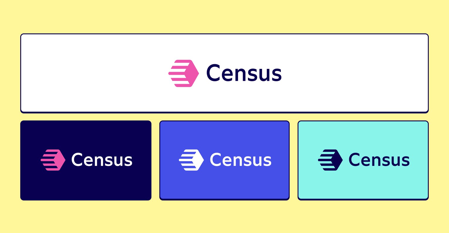
Census's new logo.
Hexagons are a common visual theme in data as a metaphor for data warehouses. This wasn’t a requirement, but it worked out to maintain as a silhouette. The lines simply convey movement. Together, the hexagon and the lines are meant to support the idea of data in motion. It is very plain and not meant to be too complex in symbolism — it is meant to be easily reproduced and remembered.
Can you tell us more about using Vaporwave and the Bauhaus movement for Census's visual identity?
Yeah, from the get-go our internal team loved all things Vaporwave. Even now, the new design isn’t Vaporwave enough for them! But it was a great starting point in terms of saturation, contrast, and tone.
I went into the design exercise with Bauhaus on my mind: harmonious, structured, and very stable. Putting Vaporwave and Bauhaus together somehow just made sense. The two synced across color selections, typography, and the overall direction of the identity system. Our colors contrast well and are simple in terms of aligning with the Bauhaus. But they are saturated pinks, purples, and teals: something that points back to that Vaporwave aesthetic.
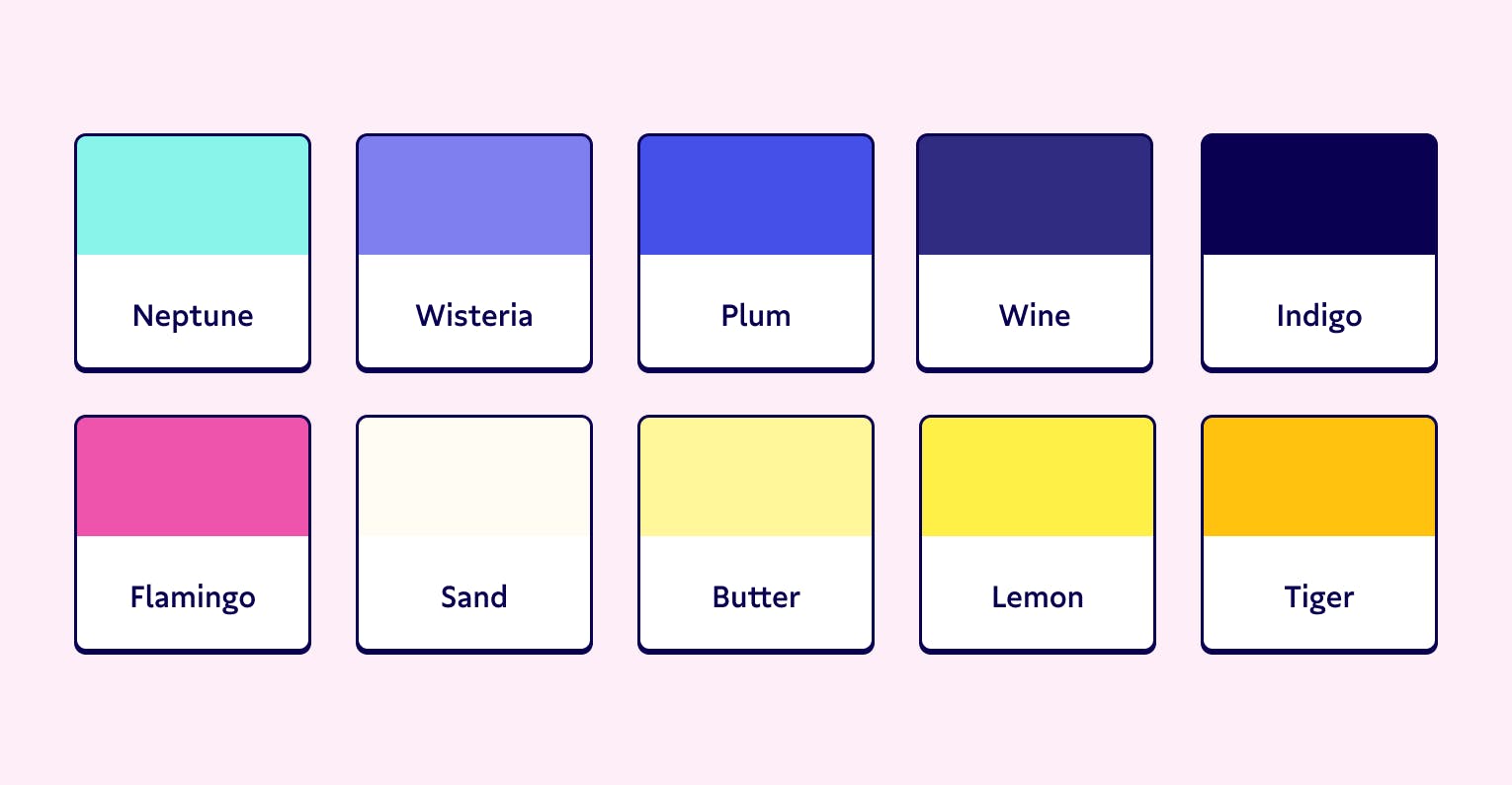
Census's color palette.
(It was also just fun to name our colors: Neptune, Wisteria, Flamingo, Butter, and Tiger to name a few.)
Much like the brand archetypes and brand attributes, we kept these art and design movements in our forefront to justify design decisions and maintain consistency across the visual language.
What’s the story behind deciding to customize the font for your typography?
Working directly with type foundries is always a joy. I had seen TypeMates tease a geometric font on their Instagram account and sent them a message. The font they were working on was called Gratimo and Grato, a humanist and geometric duo that each had their own optical sizes.
Gratimo Classic from TypeMates
Our emails allowed for beta testing to find our preference for Gratimo Classic (the humanist sibling) and eventually swapping an alternate double-storey «g» as the default glyph (versus a schoolbook «g»). This gave the font a warmer touch and improved the overall texture to align with a more formal data-driven software. Now, we also have a healthy license across web and print for our team to use with confidence in our brand voice.
Lastly, any takeaways or learnings from the whole rebranding experience?
Great question! These projects always benefit from project plans and accountability. Design is obviously important, but difficult — maybe impossible — to launch without a capable team.
And I’m going to reiterate that brand strategy portion. Before designing anything there was setting the stage on expectations and parameters within the design itself.
