before
after

Melissa Knight, Creative Director of Marketing at Chaos Group, talked about their new welcoming, creative, and optimistic look, rebranding a whole suite of products, and Chaos as the building block of creativity.
Can you introduce us to Chaos and the story behind its initial branding?
Chaos creates technology that empowers artists and designers to digitally visualize anything they can imagine. Our Academy Award-winning 3D rendering and simulation software is used by top visual effects companies, design studios, architectural firms, and advertising agencies around the globe.
The company was founded in 1997 in Sofia, Bulgaria and our co-founders Vlado and Peter are still at the helm.
The old Chaos Group logo.
Up until 2020 our branding remained pretty much the same as when the company was launched. The style was very monochrome, clean and rather serious in tone. As different software products were developed over the years, these each got their own style of logo.
What prompted the rebranding? How did those conversations start?
Chaos is most well known for creating the rendering software V-Ray—but the development of new Chaos offerings over the past few years has led to an evolving business model.
We now present an ecosystem of products and services and wanted to establish a coherent brand that united everything together under the Chaos umbrella.
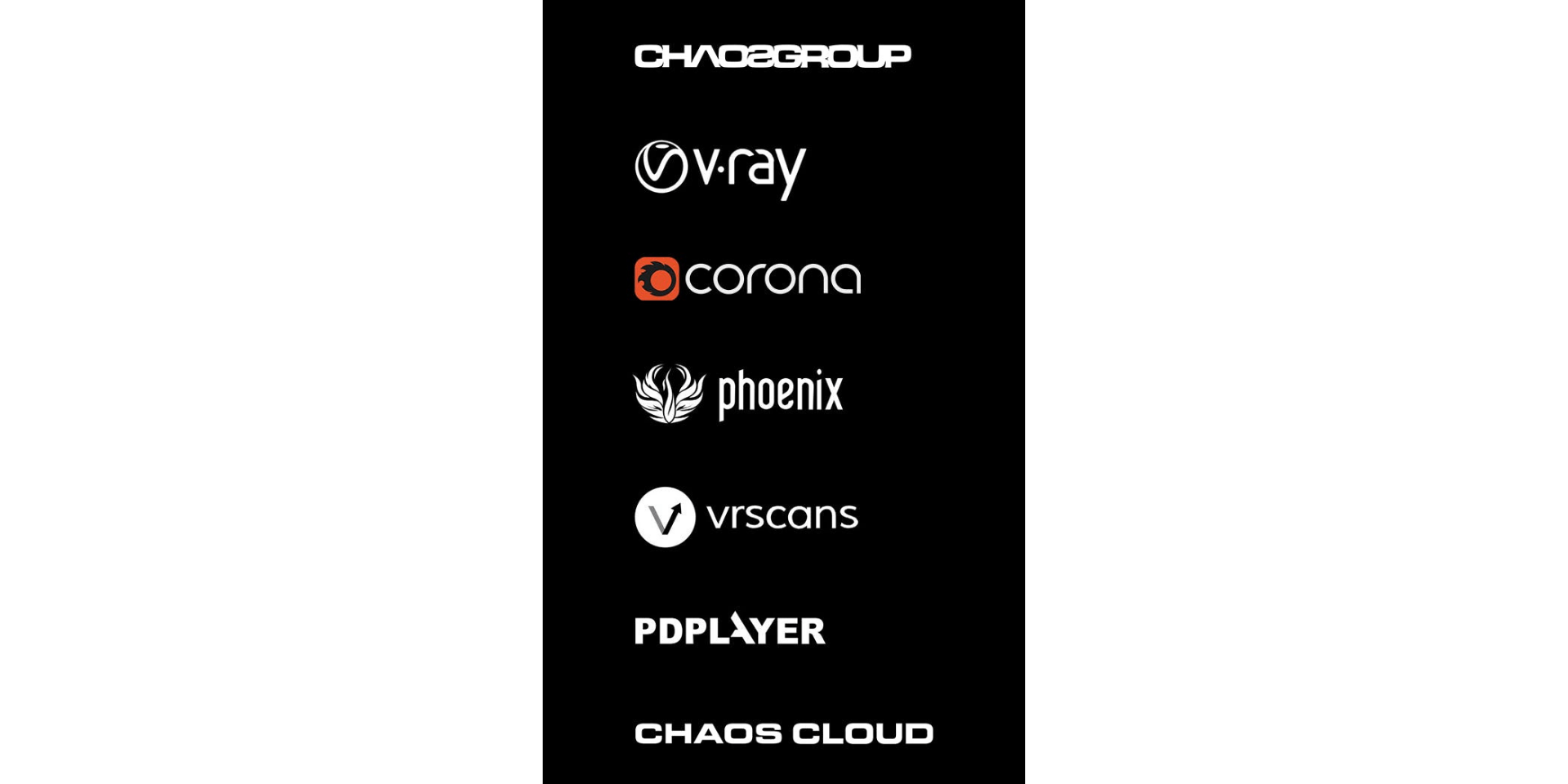
Products part of Chaos Group.
We recognised the importance of creating an inspiring brand style that effectively communicates with our customers.
Can you talk about working with an agency to help with this rebranding?
Uniform has a rather unique set up with two businesses operating under the Uniform Group banner: Continuous, a brand consultancy, and Somewhere, a creative agency for property and place that creates fantastic 3D visuals, animations and VR experiences—including V-Ray renders.
As V-Ray customers, they understand the product and Chaos as a company very well. Not only were they able to offer us a new branding strategy backed up by first-hand experience, but their 3D artists were actually involved in creating some of our new marketing assets.
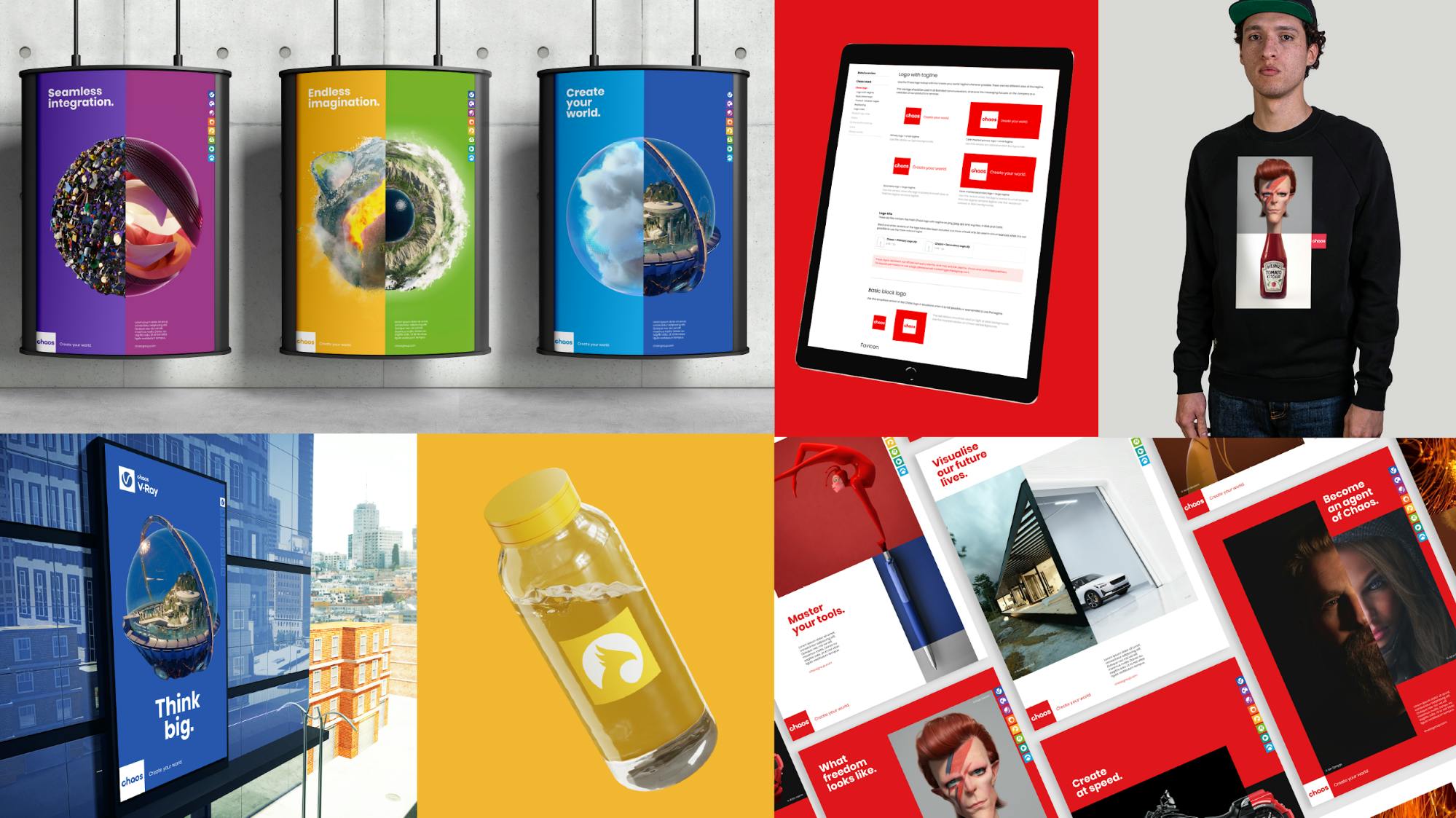
Chaos marketing assets.
We are big fans of theirs—and the feeling is mutual!
What was the process of rebranding for you? Were there any challenges or pitfalls?
Lon (our Director of Creative & Communications) and I managed to attend a kickoff workshop at Uniform in Liverpool, England right before the COVID-19 pandemic took hold. It was wonderful to get this face-to-face time ahead of working at a transatlantic distance for the rest of the year.
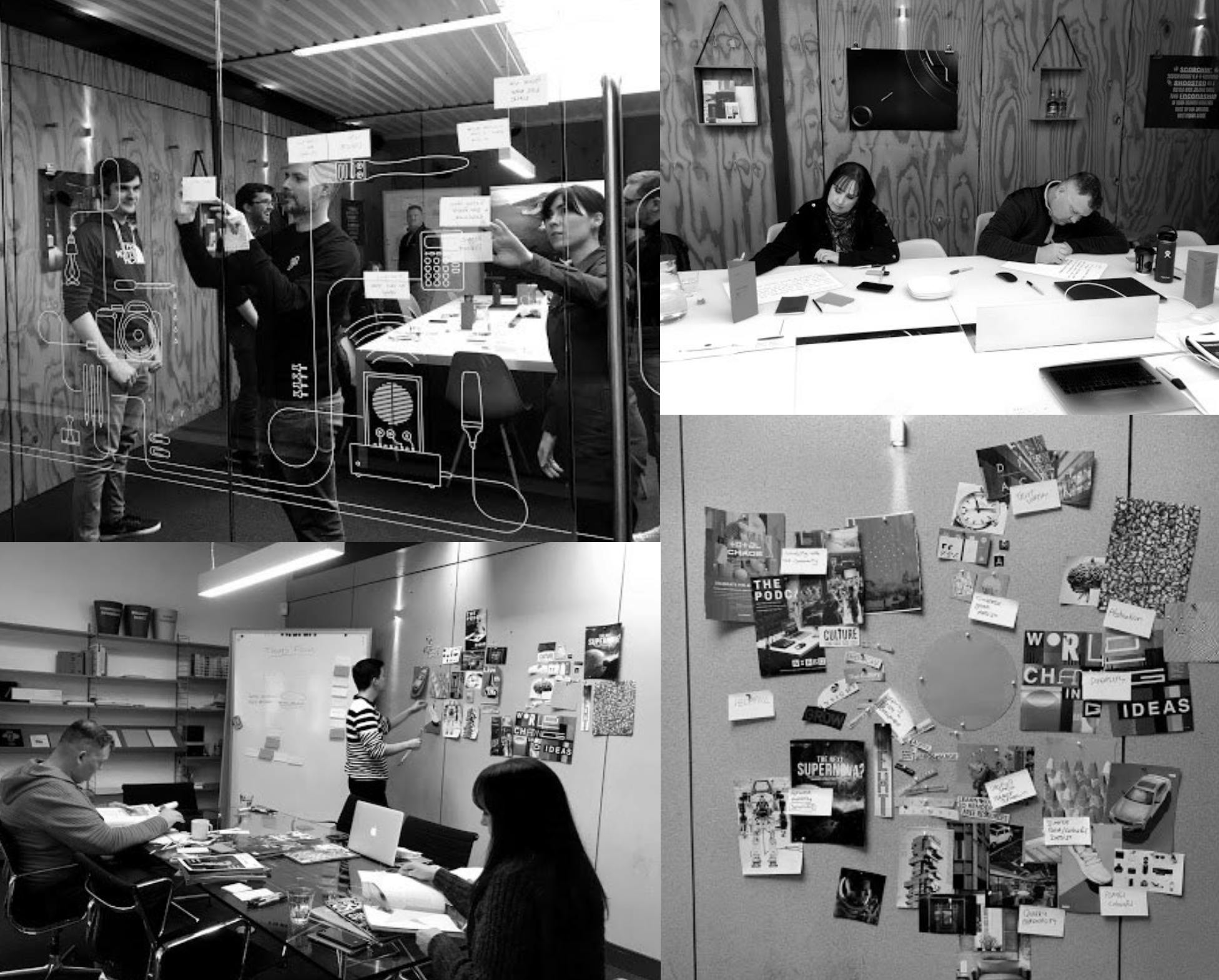
Workshop with Uniform before the pandemic.
Initially we hoped to launch the brand in 2020 but our timeline was protracted thanks to unforeseen limitations due to the pandemic.
"It was important to interview staff, industry partners, experts and customers to get a clear understanding of how the company was viewed and what our new branding strategy should look like. "
We had regular sync calls with Uniform and kept the key stakeholders at Chaos up to date with our progress and ideas.
Can you talk us through the new logo? What’s the story behind it?
Not only did we decide to update our company logo—but the name changed too.
Chaos sounds more modern, approachable and less corporate than Chaos Group. It's a shorter word and is much easier to work with as a logo.
The new Chaos logo.
It’s also great for community branding such as Total Chaos (our yearly conference) and #AgentsOfChaos (a favourite tag on social media).
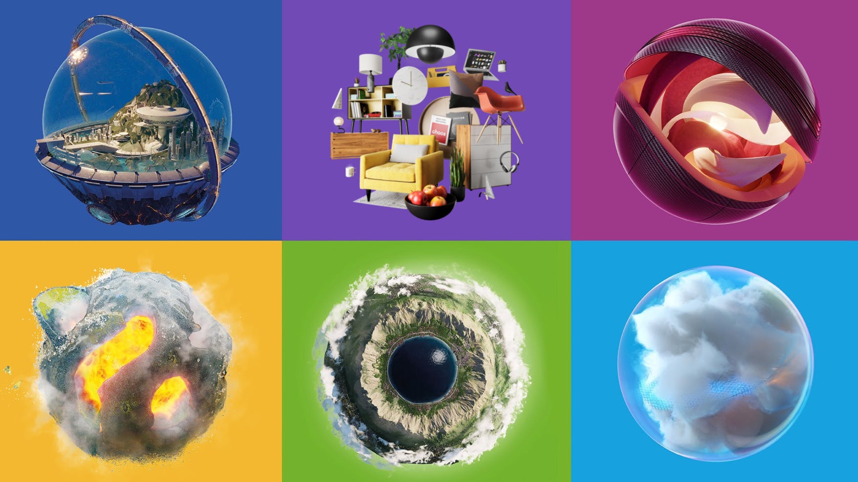
"Our new brand strategy centers on the concept that the Chaos ecosystem offers our customers the building blocks of creativity, empowering them to create their world."
The square Chaos logo is the core building block. The red is vibrant and the letter forms are solid yet curved—strong and friendly!
Your individual products also went through rebranding. Can you talk us through rebranding a whole suite of products?
Previously there was no clear design relationship between the company brand and the various styles of our product branding.
It was important to update company and product logos to ensure they worked together as a family and conveyed the interconnectedness of our ecosystem.
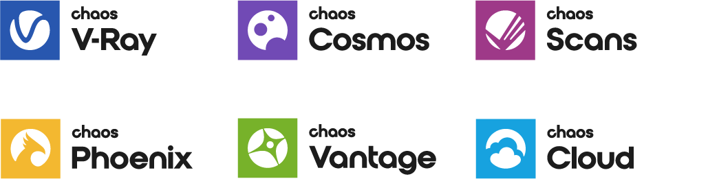
The new rebranded suite of products.
Products and services had their names updated to include the word ‘Chaos’ to help build equity in the master brand. Each product logo also becomes a building block echoing our Chaos logo.
Icons were created to represent the name and the functionality of each product. We created designs that were clean, simple and unique and looked great alongside each other.
What are the stories behind the new logos for your products? How about the choice of color palette?
It was incredibly refreshing to move away from our old black and white branding! One of our customers described it like coming out of a dark basement!
"There seems to be a tendency for tech companies to stick with one colour and use a dark palette—but we decided to take a chance on something different that feels welcoming, creative and optimistic."
From a practical perspective, the different colours also help you identify the product you are looking for. One important consideration we always had in mind was to capitalize on the established brand recognition for V-Ray and Phoenix, which in the past have used blue and yellow respectively in their logos.
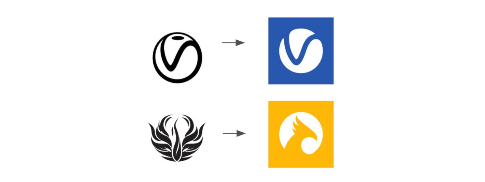
Established brands V-Ray and Phoenix.
Existing customers will also notice their new icons bear a strong resemblance to the old logos.
Some of the icons look rather abstract at a first glance and we had great fun bringing them to life in animated form. This helps deliver an ‘aaaah!’ moment of realisation as the story behind the shapes is revealed.
One extra detail I will share with you is my personal favourite. Eagle eyed viewers may notice that the c in the Chaos logo is tilted. The angle is 23.5 degrees—the same tilt as the Earth.
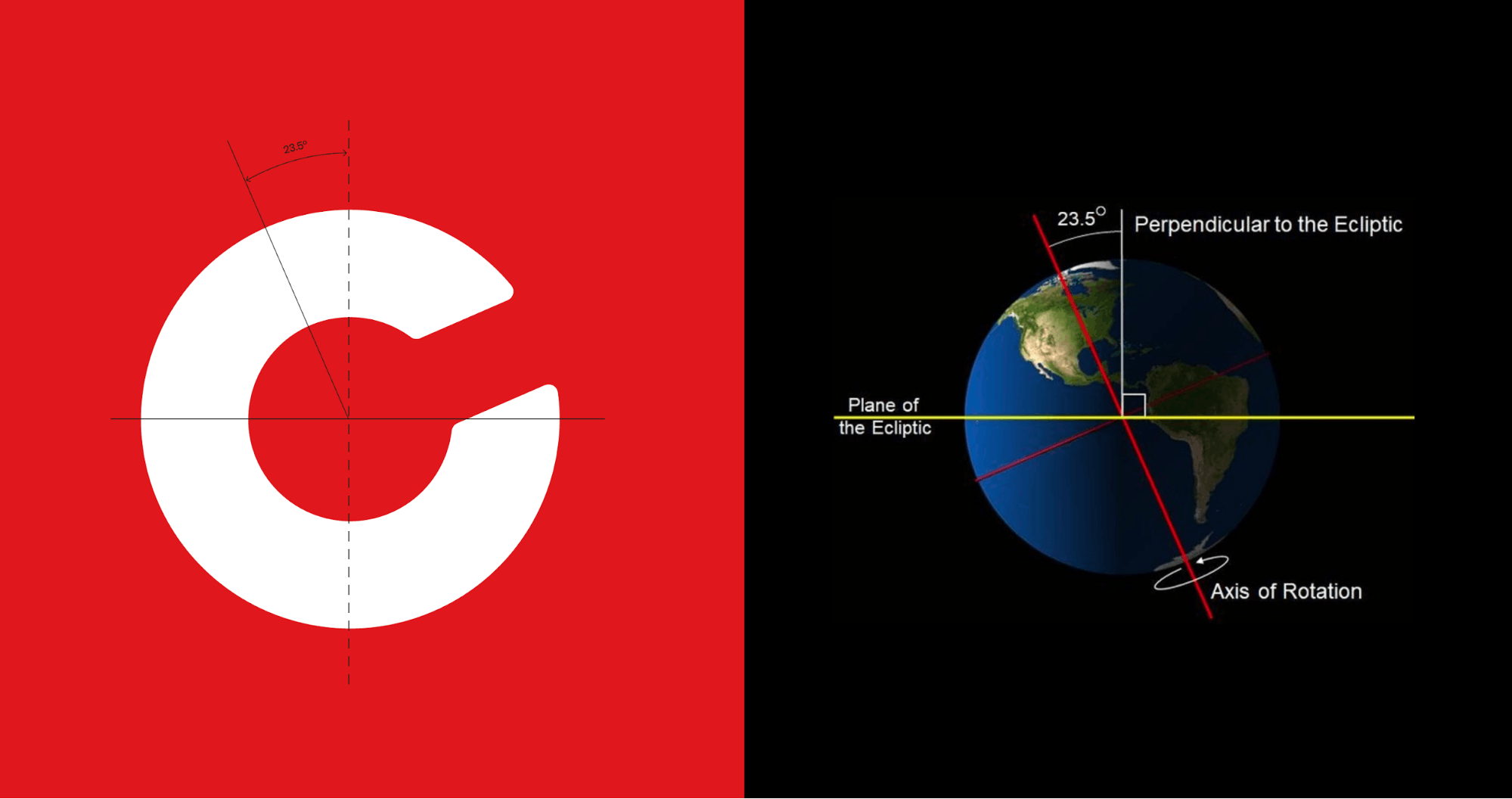
The tilt of the ‘C’ is the same angle as the tilt of the Earth.
This is a nod to the seemingly chaotic evolution of the world, a detail that made our planet the wondrous place it is today. I hope this easter egg is something our community of designers and technicians will love!
What would you say is your biggest takeaway from the rebranding experience?
Since our new look launched in February 2021, I have been amazed at how seemingly effortlessly the brand has been adopted and accepted.
Of course the whole project was a mammoth effort and involved the dedication and hard work of numerous teams within Chaos!
We made some big changes and to see the new branding serving its purpose and effectively tying our products and company together is very rewarding. Careful strategizing has paid off and having a strong attention to detail helped a lot.
I’m looking forward to seeing how the branding evolves and picking a new colour for the next Chaos product!