before

after

Asher Erskine, Senior Designer at E1, shares rebranding their sports and entertainment brand and the importance of collaborating well with an agency.
Can you introduce us to E1 and the brand’s identity through the years? How were the past brands conceptualized?
E1 was and still is a relatively new brand, which makes working on the design side so exciting right now. The original brand identity was born a little over a year ago, while the team was still in its infancy and our vision being defined.
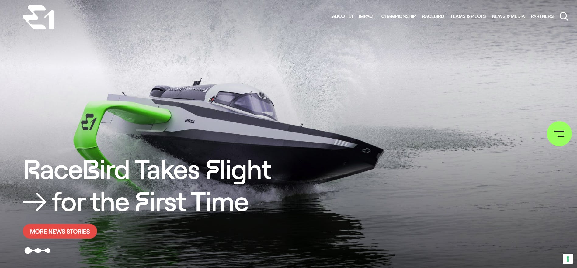
E1 Series website
Since then, the team, culture and mission of E1 has grown tremendously and so it felt only natural to implement a rebrand and show the world exactly who and what we are all about.

About this current rebranding, how did it come about? How did that conversation start?
We saw a lot of exciting ideas following an RFP, however, the team at Mother Design really stood out and already seemed very inline with our thinking and hopes for how we could develop our brand.
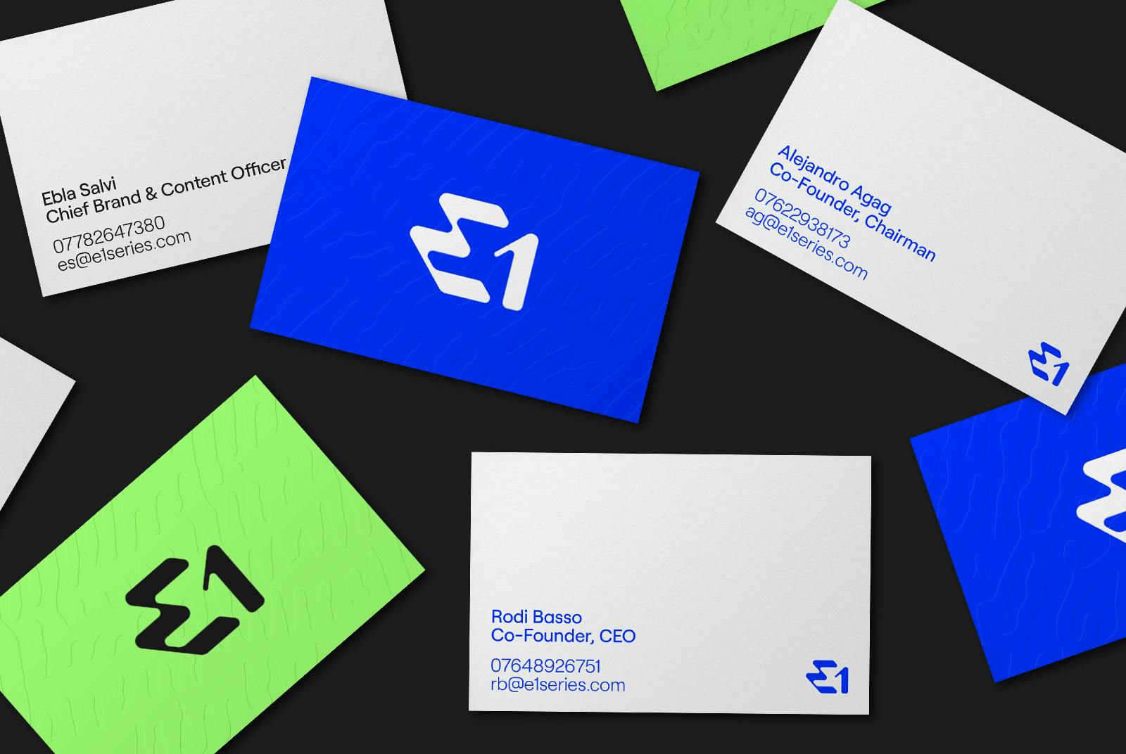
E1 business cards from Mother Design
What they presented inspired everyone at E1 immediately, and it was an unanimous decision to work closely with them from then on.
How did the rebranding process go? Was it all smooth, or did you encounter challenges?
Overall, the entire process of working with Mother Design was smooth sailing (or hydrofoiling in this case!). They have a wonderfully collaborative approach, so it was a real joy to be heavily involved the whole way through each stage of design development.
As with any piece of creative work, some things happen almost naturally, while others take a few rounds of revisions or even a completely fresh approach.
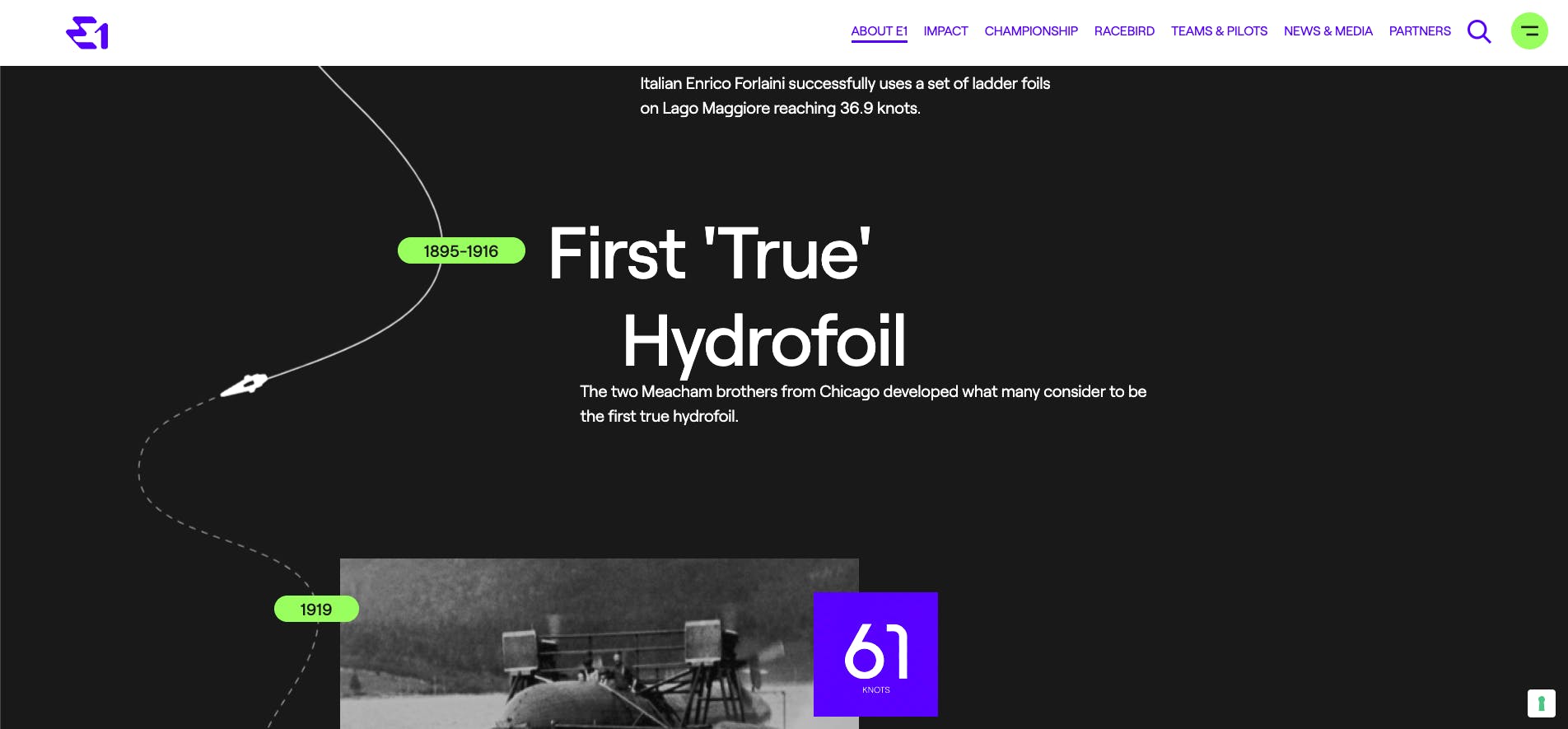
E1 website
The majority of our new brand identity materialised and developed effortlessly, while some other things like the logo and colour palette took some extra attention to end up where we are now.
It’s always a challenge when you’re not starting with a clean slate, although people were welcome to the change, there’s obviously a sense of personal attachment to what’s been before. Just like all things in life, people feel comfortable with what they know and change can often be unsettling.
Association with brands has a really important psychological element to it – people naturally have differing tastes depending on a huge variety of factors.
"A major challenge with a rebrand for a global championship is finding a framework that works across the different sensitives of multiple countries, cultures and styles."
A big change was to your logo. Can you tell us how it was conceptualized?
We knew right away the logo had to be something iconic. While E1 falls into the sports and entertainment category, we also touch on areas like technology, innovation, and marine restoration.
It was really important that our new logo captures these elements but stands out as a disruptor in a somewhat busy field.
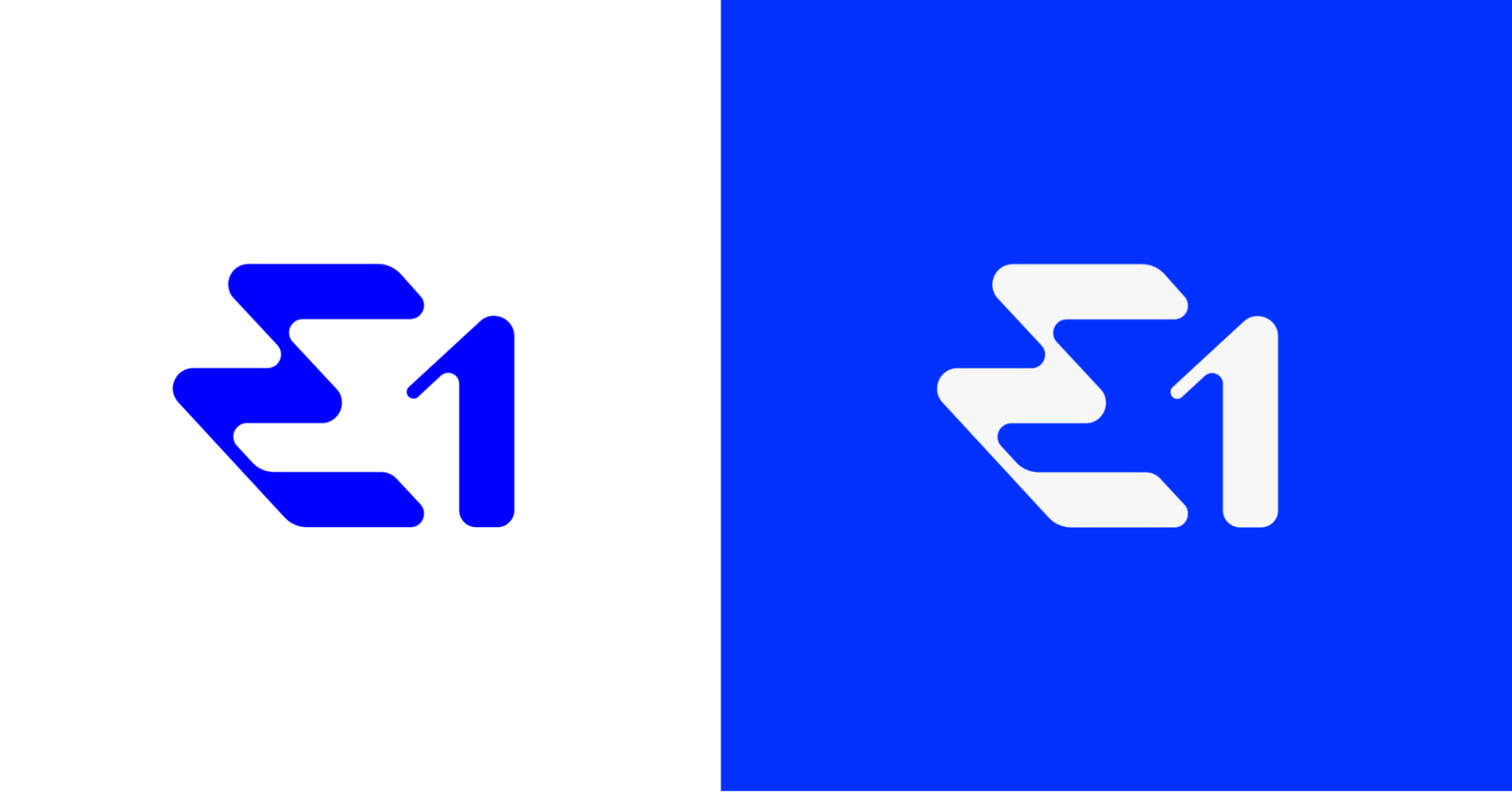
E1 logo
We also wanted it to give subtle cues to the shapes of the boat or the racetrack and communicate the futuristic nature of what we’re doing.
Needless to say this was a big ask of Mother Design, but they really excelled. At one point we were close to taking a slightly different direction, with a logo inspired more by the shapes of water droplets, but this final logo really does hit each of the major pillars that define us.
How about your color palette? How did you land on these colors, and what do they say about your brand?
Colour was an interesting one to work out. This area, perhaps more than any other, was vital to strike a delicate balance of sitting well next to our sister companies Formula E and Extreme E, while still maintaining our own identity.
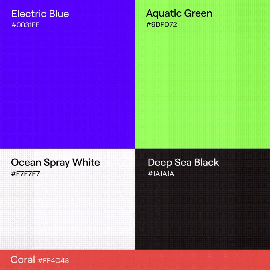
E1 color palette from Mother Design
Electric Blue and Aquatic Green take their cues from the rich and vibrant colours of the ocean. They’re immediately striking and help to really capture people’s attention at a first glance. These are complemented by Ocean Spray White and Deep Sea Black, again taking inspiration from the water.
We also decided to include an extra colour, called Coral Pink, for special use cases such as on-water branding. It was important that we had a colour with maximum contrast to the water as so much of what we do will be on the water’s surface.
Can you tell us more about the fonts that you use? How were they chosen? Were they custom-made?
The new brand makes exclusive use of the Roobert typeface. It’s a mono-linear geometrical sans-serif font family that feels beautifully sophisticated while still maintaining a feeling of technicality.
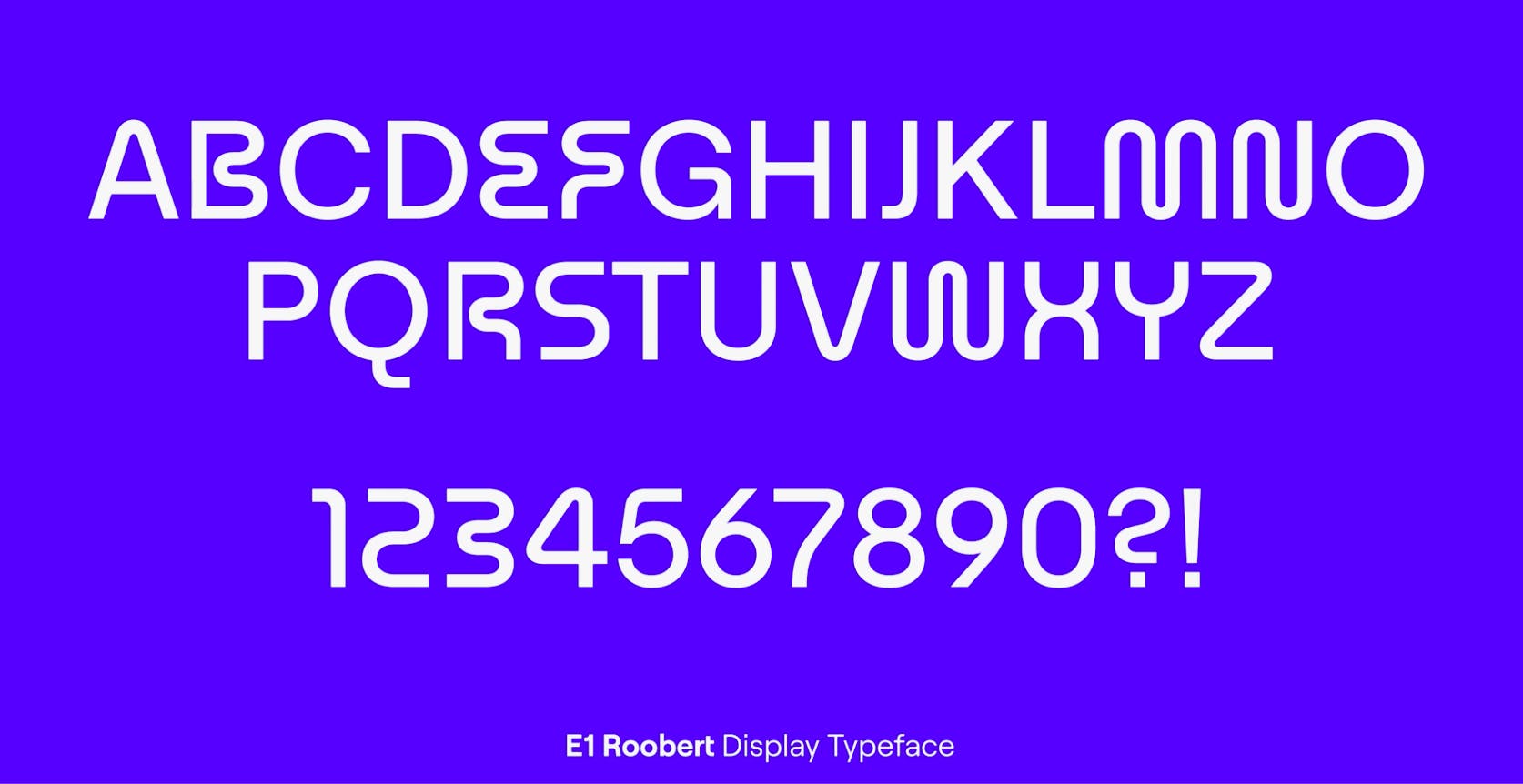
E1 typeface from Mother Design
We were fortunate enough to have a bespoke ‘E1 Roobert’ display typeface created, that brings in some very sculptural characters. Letters like ‘w, s and m’ feature deliberately stylised curves that complement our logo and mimic the shape of our racetracks. It’s both distinctive and playful.
You also make use of patterns in your visual identity. Can you tell us how they were developed?
The patterns were designed to add an extra layer of interest to large surfaces and further hint at the oceans and bodies of water that inspired us.
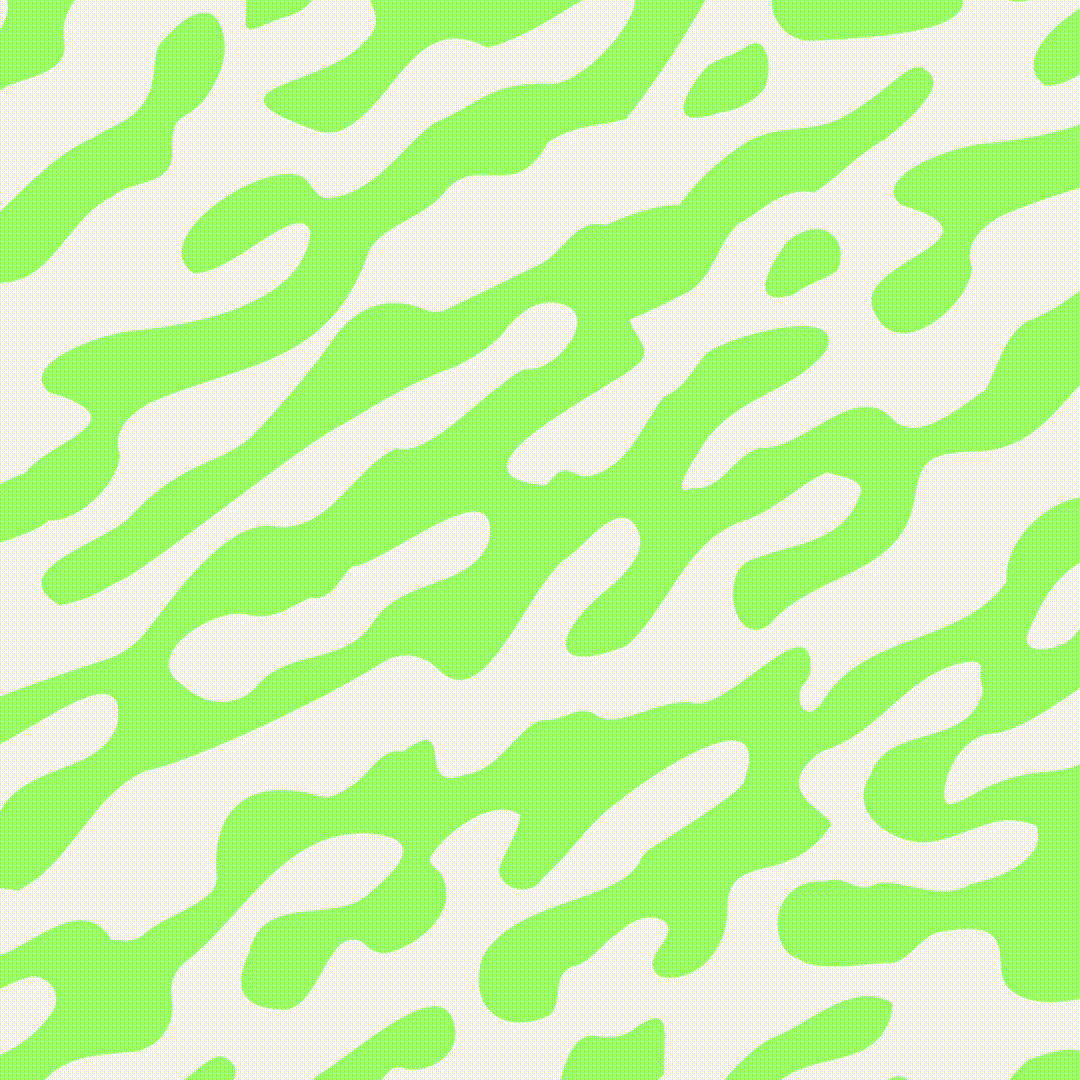
E1 patterns from Mother Design
Some patterns are formed looking at the contrast on the surface of water - the rippled texture created by varying heights - while others reference the underwater world, things like coral and the undulating surface of the seabed.
What is your major takeaway from this experience? Or, do you have any advice for brands or designers embarking on rebranding projects themselves?
Working with an agency that is collaborative and that share your enthusiasm is a must. Mother Design were incredible to work with, which I think has been the key to the success the rebrand has already seen. The whole team really got caught up in our world and went way beyond what we’d hoped.
"I’d also say be bold. Good things take time and really great work doesn’t come easily. If you want to do something new, you’ve got to have the confidence to stick to your vision and defend what you’re doing. "
This applies to anything in the design world. If you can justify your rationale, you’re halfway there already. It’s also an experience you have got to enjoy – if it’s forced and for the wrong reasons, the outcome is likely to mirror that.
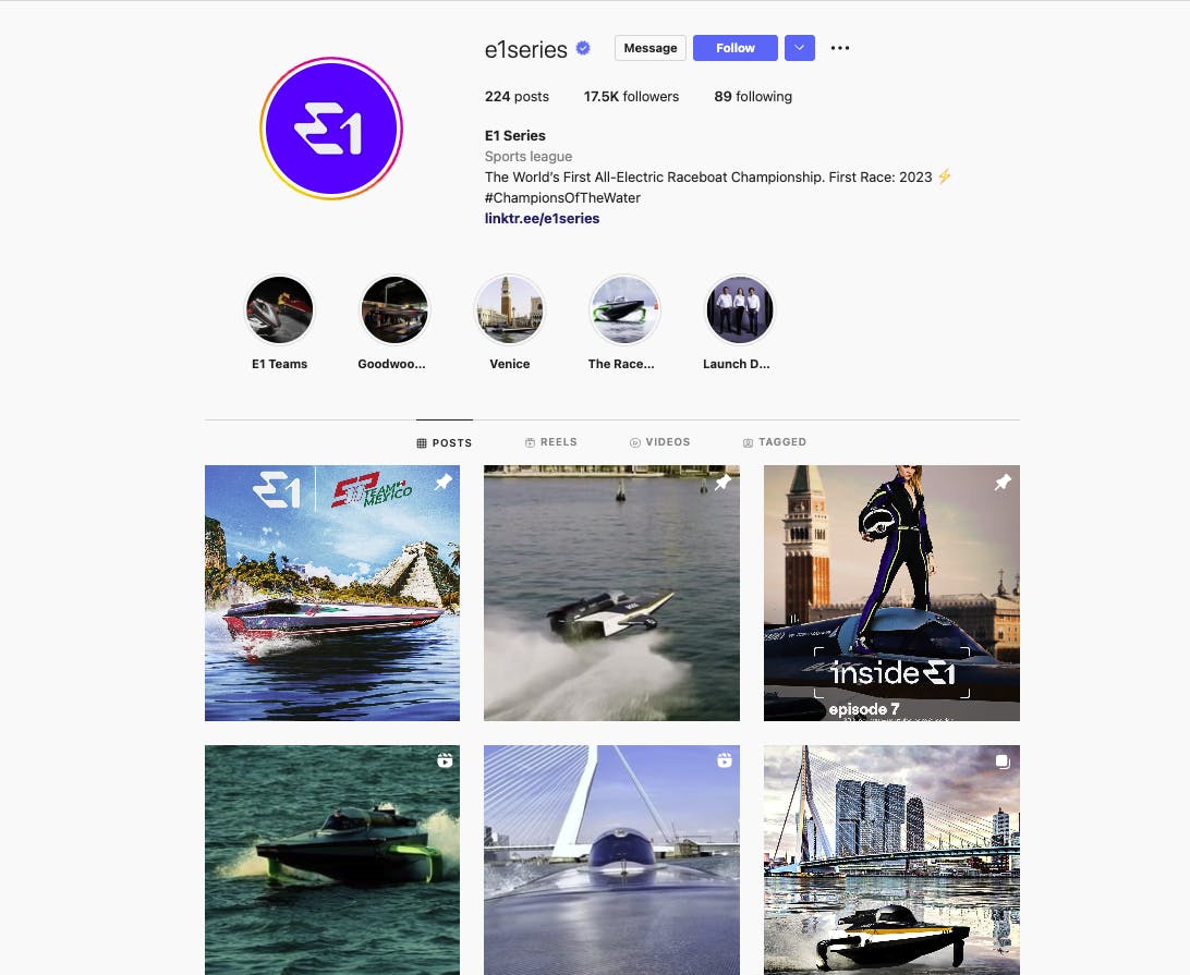
E1 on Instagram
It’s also an amazing learning experience that really forces you to look at your brand in incredible detail. Only after you’ve clearly defined what your brand represents from every possible angle, can you hope to emerge with something new, authentic and exciting.