
before
after

Manuel Ortega Marquez, Marketing and Sales Corporate Director at EFE, shares the 80-year-old agency’s process in modernizing their prominent Spanish brand while upholding their meticulous and truthful values.
Can you introduce us to EFE and the brand’s identity through the years? How were the past brands conceptualized?
EFE was founded in 1939 and is the world’s first Spanish-speaking news agency. It has more than 3.000 workers in more than 180 cities in 110 countries and several editing desks in different continents.
In its 83 years of existence, the news agency has had four logos. The first, descriptive of the journalistic business in those days, around 1939, the word "EFE", written with teleprinter tape and framed within a world globe. It was not until 1986 that the first renovation took place. A simpler line was sought which remained until 2006.
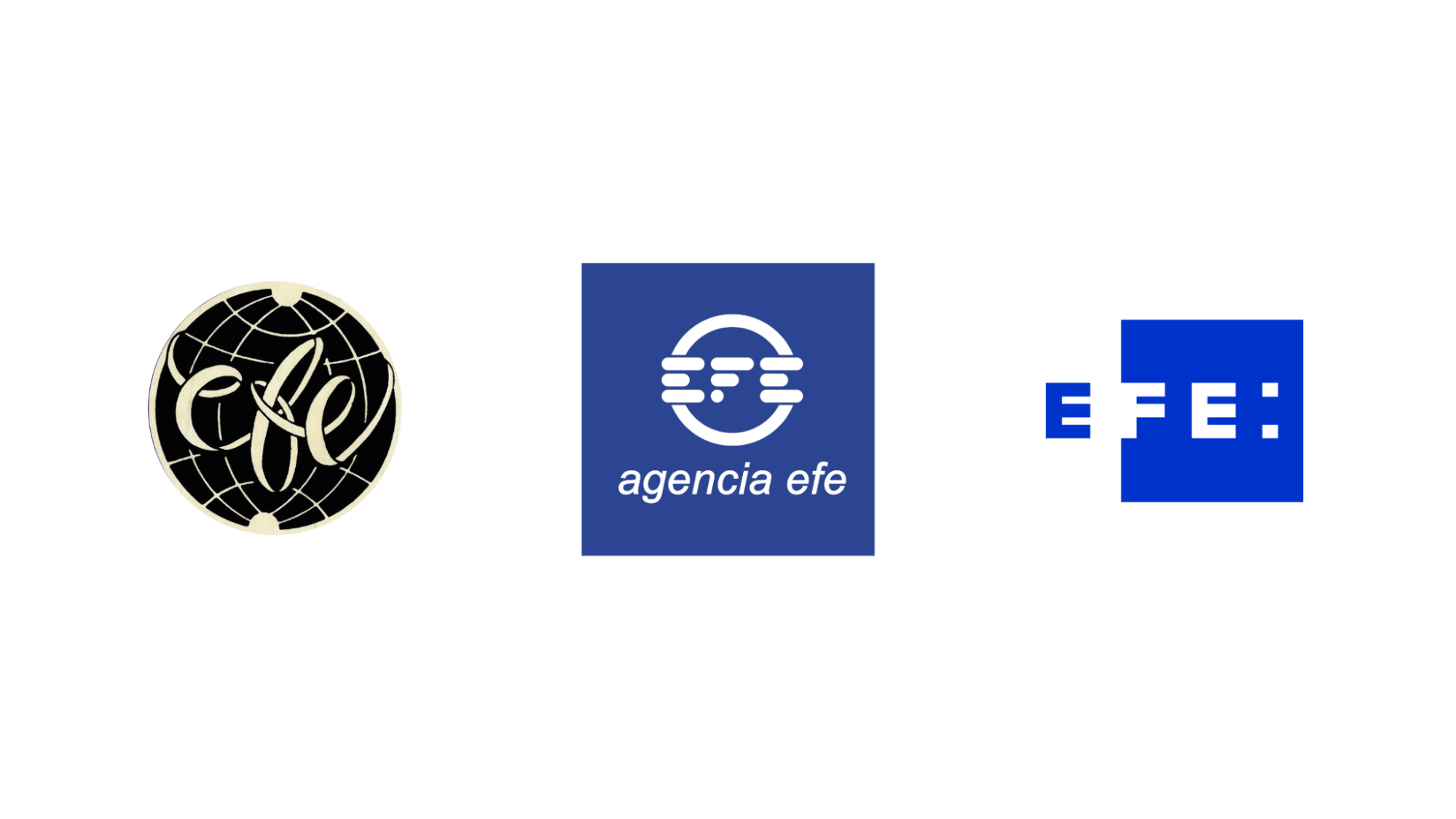
EFE past logos
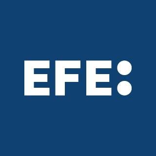
The latter was a more radical change, introducing the square shape and the use, for the first time, of the two points: as an expression of the mission and activity of the news agency, which has been maintained giving it a greater role in the most recent redesign. The letters F and E were kept inside the square and the first E, out of it with the two points after the word EFE.

About this current rebranding, how did it come about? How did that conversation start?
According EFE President, Gabriela Cañas, the decision on the redesign "has been a natural process, a thoughtful reaction in response to the current situation of the company and the journalistic line of business."
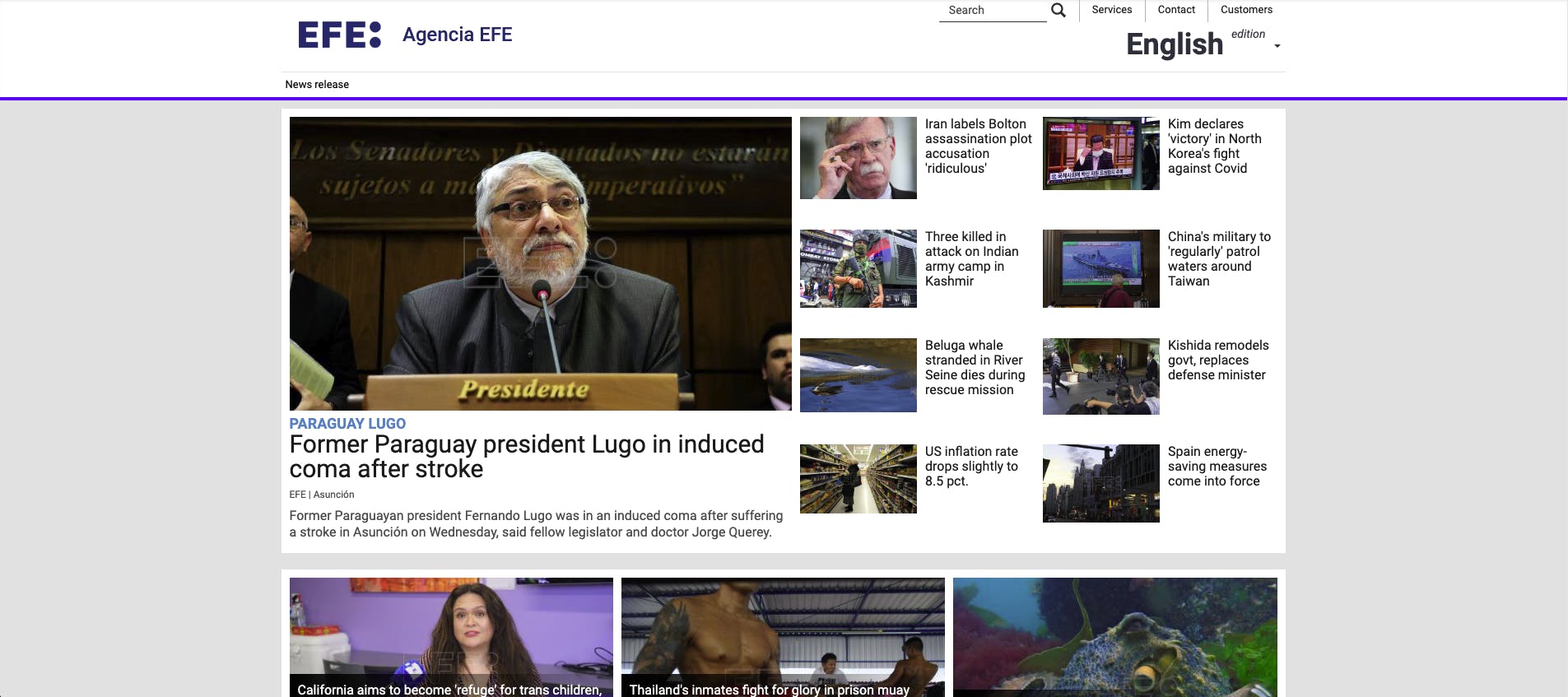
EFE website
The new logo now, according to Cañas, is a "distinctive feature of the new times. It is the result of an evolution, of a need to modernize the image of the Spanish news agency EFE and make the brand even more recognizable and visible."
How did the rebranding process go? Was it all smooth, or did you encounter challenges?
Like every creative process, you have to explore different paths until you find the right one, and this was the same. In that process, our main concern was not to distort EFE's image–a company with more than eighty years of experience–but instead improving it.
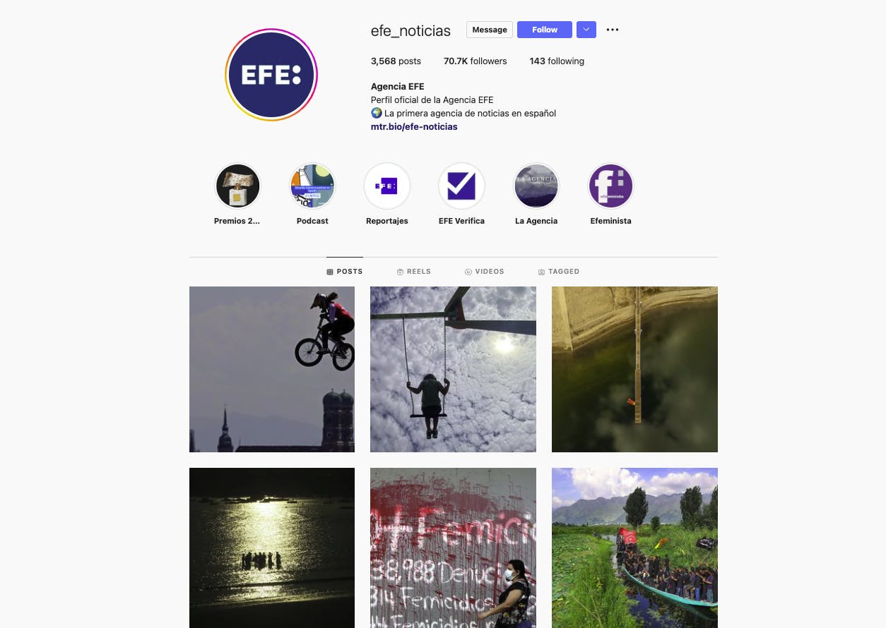
EFE on Instagram
In that sense, we believe that the result has been positive. The new logo manages to be visually more balanced, coherent, recognizable, and faithfully represents the values of a company that is a benchmark in Spanish journalism.
A big change was to your logo. Can you tell us how this was conceptualized?
We were looking for an evolution of our image with the aim, mainly, of solving the different problems of application that we found; modernize the brand and strengthen the position of the company as one of the most important news agencies in the world.
"To do this, it was decided to look for a simpler, direct, and compact concept to reflect the soundness and dynamism of EFE. The square that framed the previous logo in favor of legible and solid typography was dispensed and the two points were given greater prominence as a representation of meticulous, truthful, and impartial journalism."
The new logo homogenizes and gives greater visual coherence to all company communications, both internal and external.
How did you land on the typeface used? Was it custom-made?
The typography used is tailor-made. In order not to lose sight of the fact that we are facing a redesign, it was important not to lose that common thread between both previous logos.
EFE’s new logo
One of those elements that we wanted to maintain was compact typography. But that needed greater symmetry, balance, and better readability. That’s what we did.
Are there other changes to your visual identity along with your new logo?
We have taken the opportunity to change everything we wanted to change to reinforce our brand values: objectivity, thoroughness, credibility, and neutrality.

EFE banner
One example is colour, which we have sought to represent our international reach and reinforce the image of a serious and credible company. The color used for the design evokes ultramarine.
"From the Latin 'ultramarinus' it comes to mean "from beyond the sea" and highlights the geographical dimension of EFE, with its presence in 180 cities in 110 countries of the world."
It is also a color that reinforces the "dimension" of EFE as a public institution of normative reference, which brings seriousness and credibility, without stridency.
How has the reaction been to the change? How about significant effects of the new logo that you’ve noticed so far?
We are happy. The reaction has been very positive.
"There was that feeling in EFE that a change was necessary. We were no longer the same agency we were in 2006, when the previous identity was created. With this redesign, we have managed to reinforce the pride of belonging to a media agency such as EFE."
According to our Director of Strategy, Soledad Álvarez, the new brand transmits "seriousness and credibility" as befits a public media outlet that, "with more than 80 years of history, is a benchmark of journalism in Spanish".
What is your major takeaway from this experience?
In this experience, the biggest challenge has been to be able to completely understand the reality and needs of the company to make the changes that such an important brand really needed. Another is not to lose a shred of your personality.
EFE’s new icon
We have achieved this as our president has said that the new logo improves brand identity.

