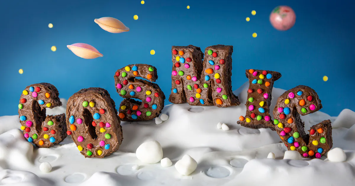
Danielle Evans is a multi-disciplinary artist who uses food and objects to create powerful, emotional connections. She calls herself a food typographer (and pioneered this sub-genre of design in 2013), which is part photographer, part designer, with a dash of food scientist. All her work is composed in analog and in-camera but relies on technology to be digested. These pieces become statements on social issues, consumerism, and the joy of human connection.
How would you describe your design and photography style?
I usually describe my work as food typography, but it’s a mysterious title! I function somewhere between designer and photographer with a dash of food scientist. The work takes on many forms, but it is colorful, elegant, made entirely IRL while unpredictable and surprising. If I do the work correctly, there’s almost a fine art aspect.
While I use real life objects, I capture my work via technology. I use robotic rigs, stop motion, even AR to make this work come to life. I tell people I’m making the future palatable. The unknown is scary, but it’s easier to stomach when it’s wrapped in a familiar package.
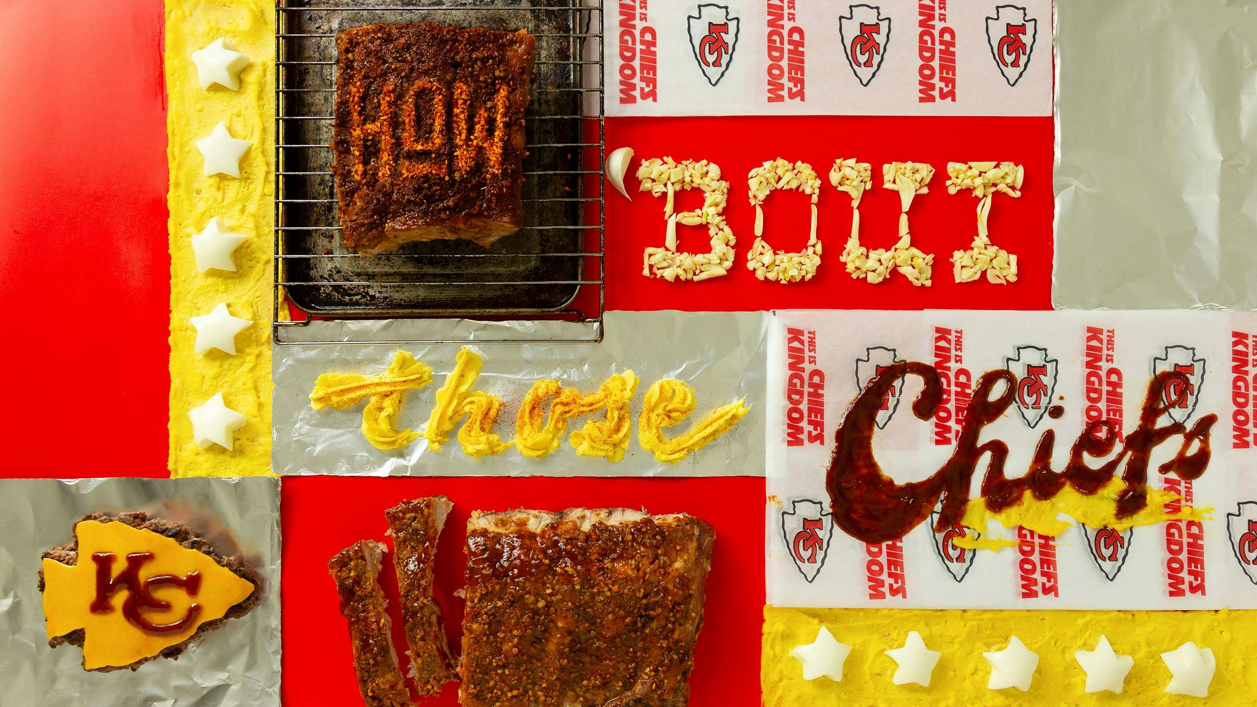
Kansas City Chiefs food typography
You are known for your work with food, and your food typography. Can you tell us how you got started working with food?
This process started when I was a child. Instead of book reports I’d sometimes bring in a cookie map or cake replica of a building and give an oral presentation. My family was lower class, so food was how we traveled, dreamt, and explored. As I got older, my divorcé dad couldn’t afford many activities, so we’d eat at various ethnic restaurants. I’d try anything once. This was where I started forming connections between food and the human condition.
Fast forward to post-college. I graduated with an illustration degree and discovered design on my way out the door. I knew I wanted to live somewhere between illustration’s world-building and design’s application, but I didn’t know how. I decided lettering was that gateway, but I wasn’t great with digital programs. So I started playing with everything in my house; food was a multi-purpose, multi-sensory tool that became art before transforming into a meal.
I felt the most joy working with fresh ingredients. For the first time I was present, totally immersed and knew how to finish a project. I threw several pieces online and the interest exploded!
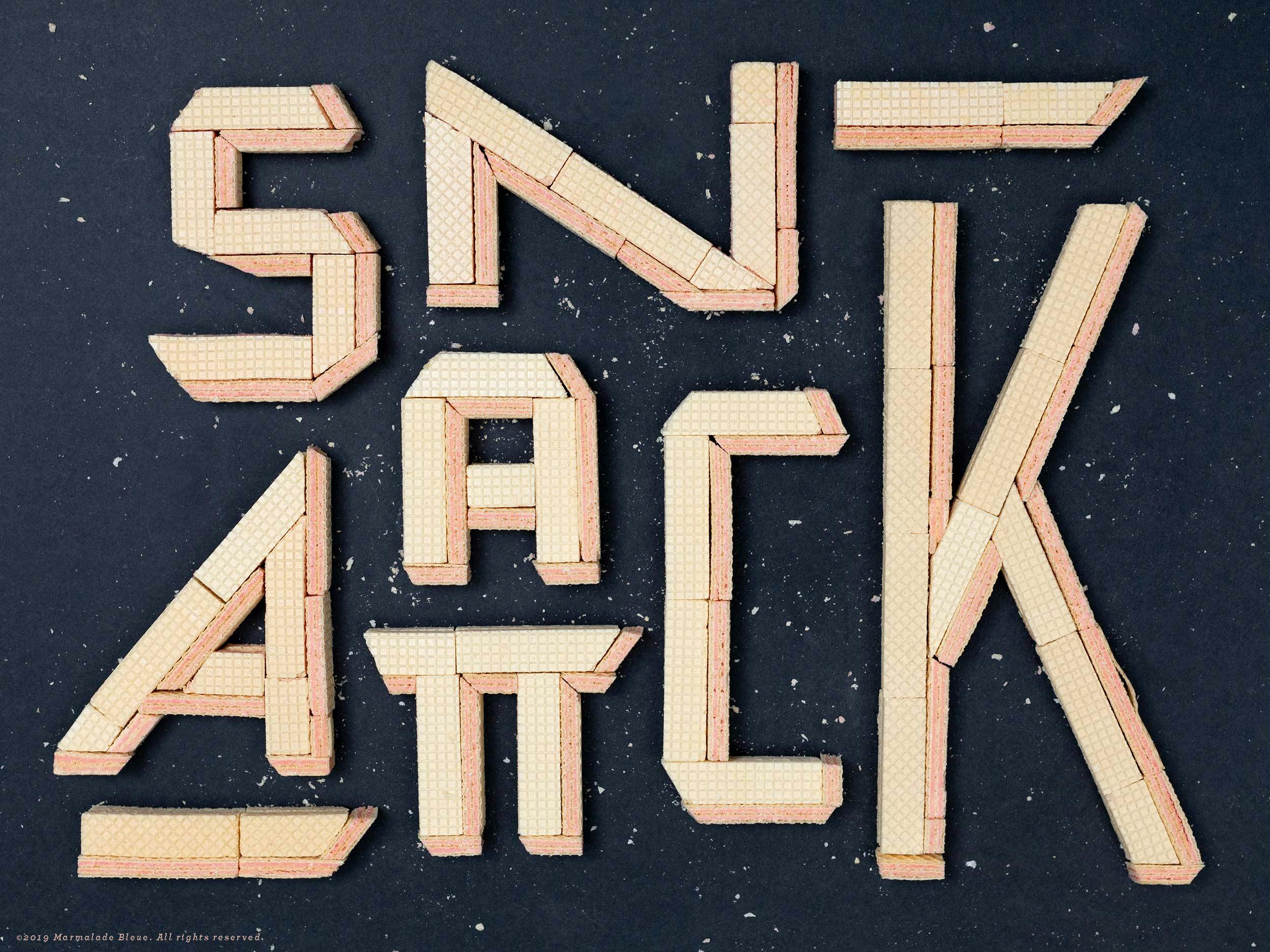
Snack Attack
Walk us through your process. Do you have a process that you follow religiously, or does it change depending on what you’re working on or who you’re working with?
My process changes every time! I tell other creatives it’s like moving from Photoshop to Illustrator, to actual painting, to actual sculpting, back to Premiere. However, I have an internal pyramid on which I build my work: style, writing, materials. When a project materializes, I usually have one or two of these pieces fleshed out. I take time to actively locate the third, and this alchemizes the testing/sketch phase.
The rest is action. Prep and ideation take the most time so action can be quick! I have to figure out the half-life of the materials, their limits and strengths, as well as the final form. Will this be a video, set of images, a gif?

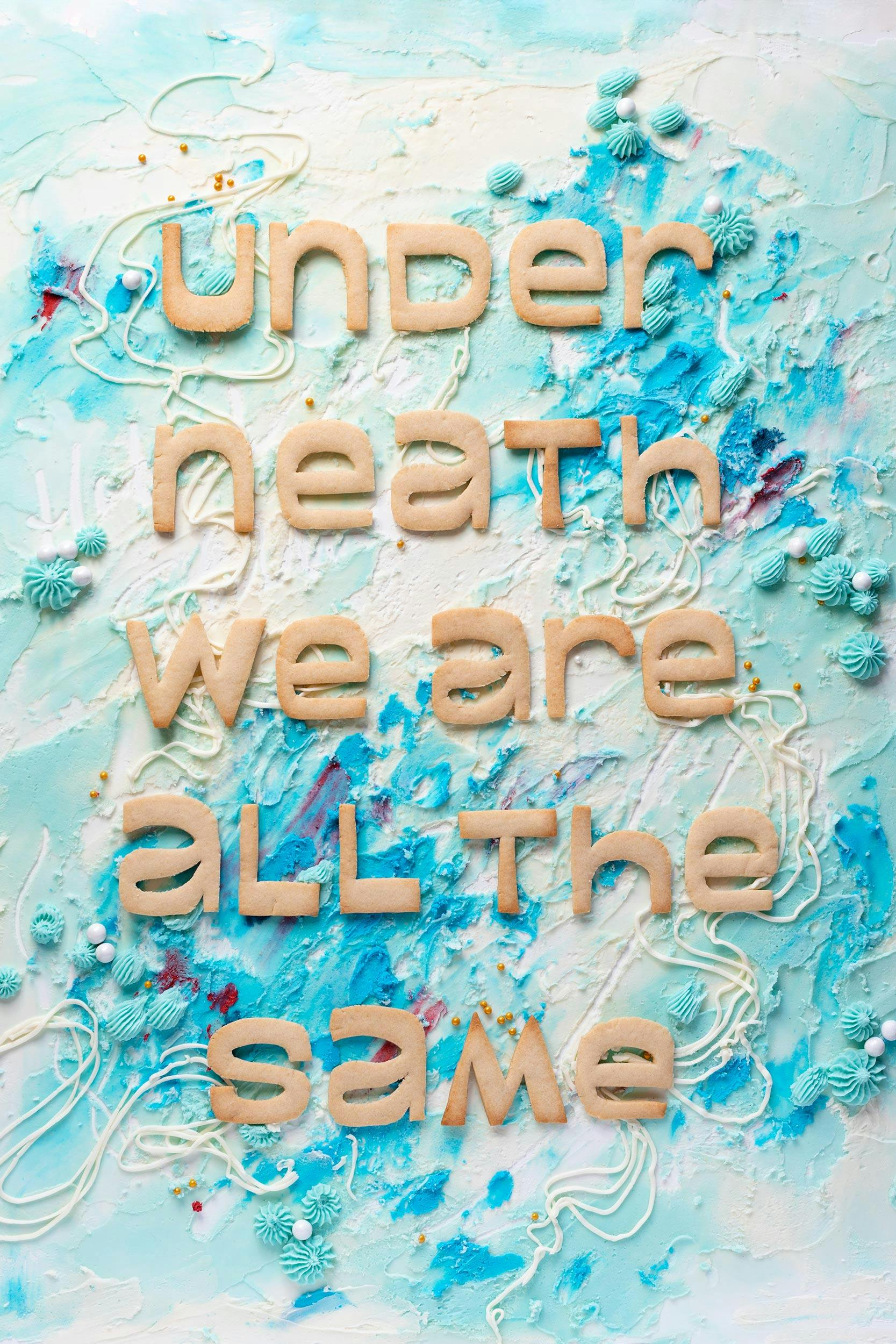
"We Are All The Same"
When it comes to working with food as your design medium, what would you say are its unique and surprising challenges? And inversely, what makes it a great medium for art or design?
Food is a 4D substance. Unlike paint or pixels, food is impacted by time and space. All food has a half-life. Seafood has 40 minutes under lights, max. Leafy greens are vibrant for maybe 20 minutes before wilting. The environmental temperature, humidity, light direction, viscosity all impact how legible the message is. I’ve had to account for the percentage of crystal growth on my armatures. My work relies on organic science to various effects. One of my favorites challenges is working with blacklight responsive foods. Anything with animal proteins can glow under the right conditions!
"I love food as a medium because it intensifies the message."
Writing something in ink is one thing, but what if we used wine, chocolate, blood? Without having a concept your brain can still conjure one at the mere mention of these items. We associate feelings and traditions with every ingredient in our cabinets or fridge, and those are amplified in a design context.
Like a typeface, food has a voice, range. I’ve used chocolate to be sweet and sensual. I’ve also used it to discuss war and slavery. All of these sentiments are part of its history, which is why we find these messages interesting.
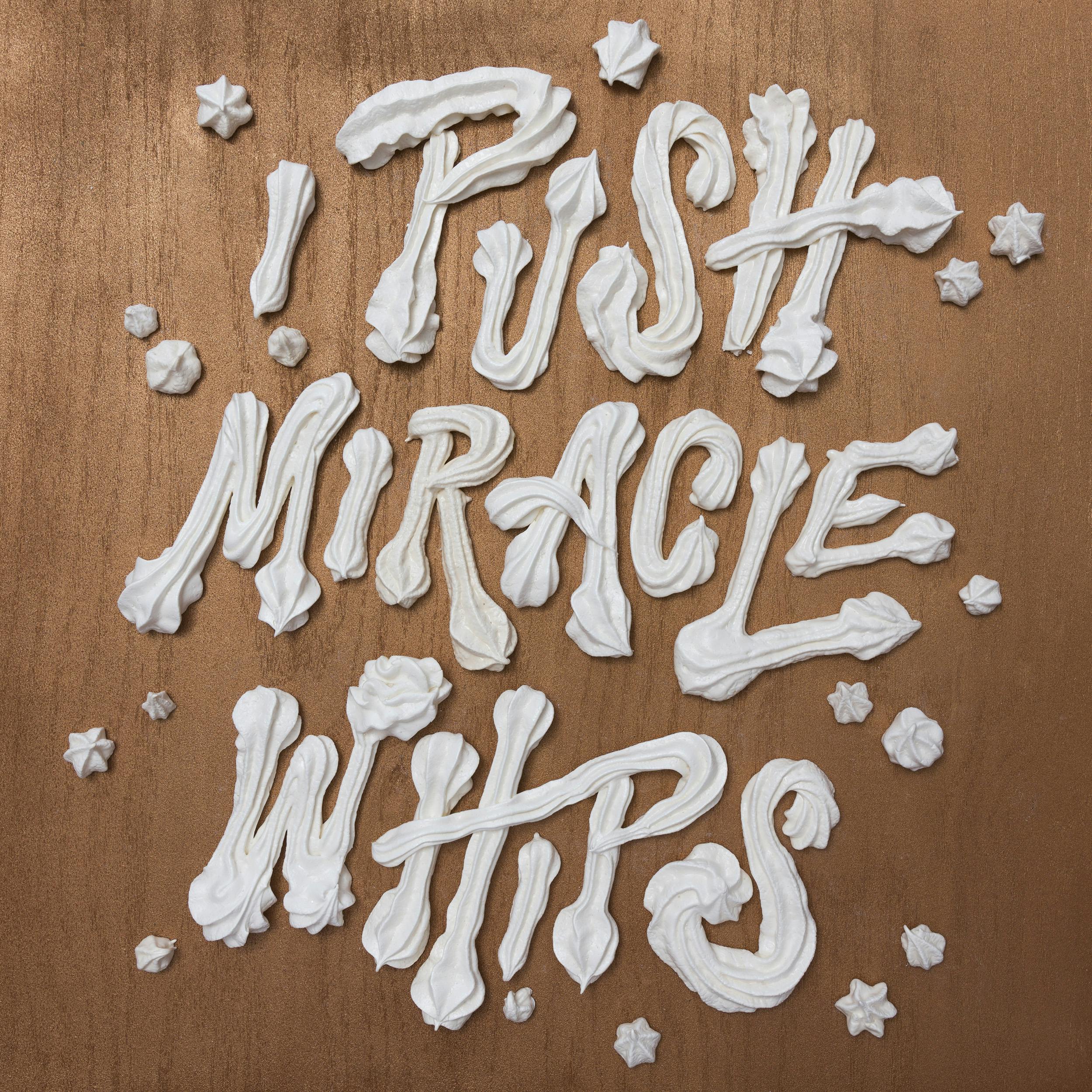
Kanyegg Miracle Whips
Some of your work is with NFTs. How is your experience of NFTs so far?
Admittedly, NFTs are a bumpy ride. Every part of this industry is challenging, but that’s a byproduct of new tech! Artists can be directly paid for the work they publish online for the first time. However, you’re starting from scratch in many ways: new audience, new processes, new community building. In many cases you’re the only one from your prior industry floating in this new space. It can be exhilarating and also lonely.
I’m happy to report that World of Women just added one of my first NFTs to their collection! They chose one of my favorites, an animation I made to represent the confusion I felt being in a foreign country with a broken right hand. I could understand when people spoke to me, but barely.
NFTs are a fascinating new field, full of pitfalls and surprises. I hope to find success in this world. Working with food is one of the fastest ways to stand out because it runs counter to the high gloss futurism and irreverent nihilism populating crypto art. Yes, there are problems, but this field is full of curious, intelligent people eager to work through complexities.
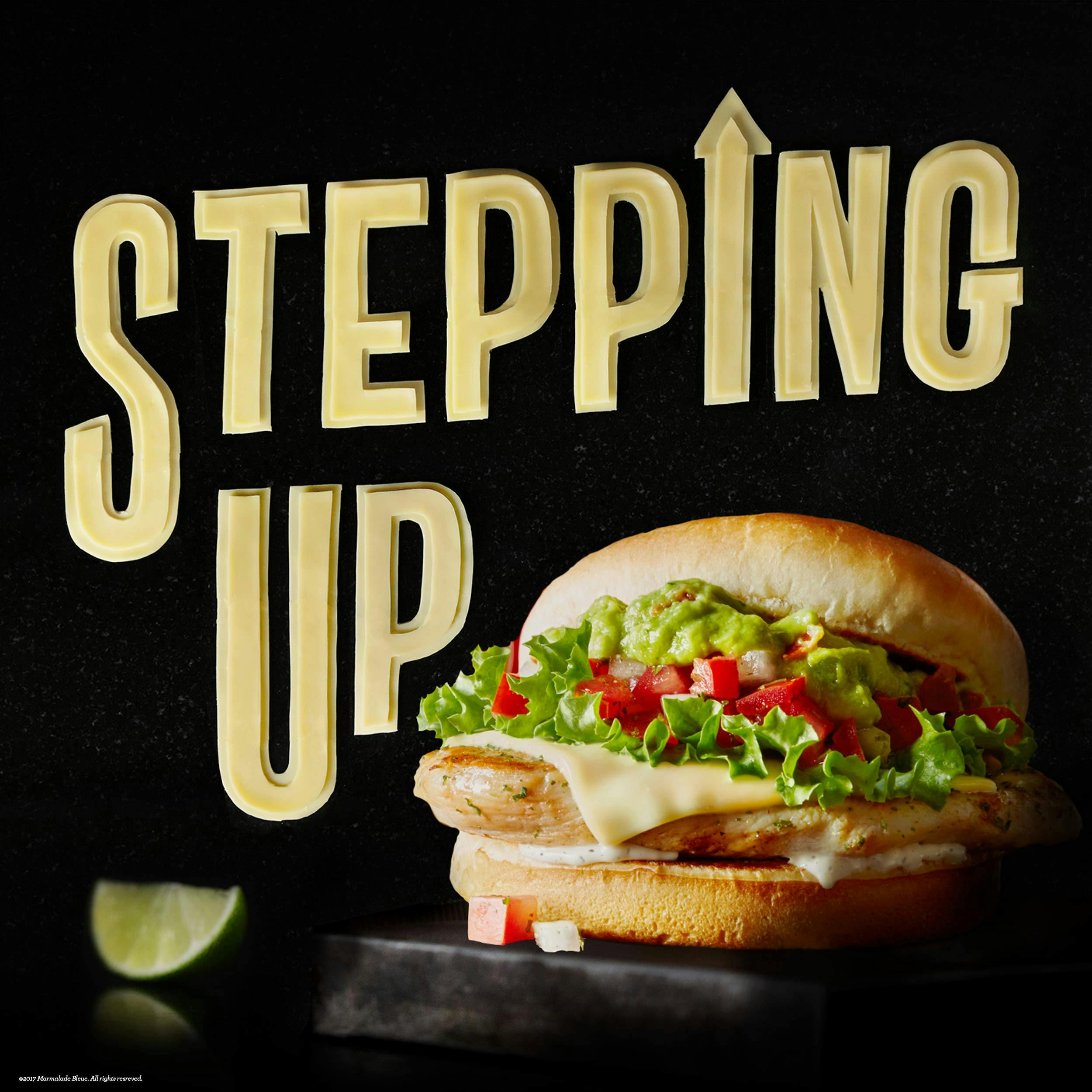
McDonald's Stepping Up
Do you have any particular projects or pieces that you’ve done that stood out for you?
I’ve worked for some of the world’s biggest brands. I’m proud of those projects, the sheer force of effort or artistry involved, but my favorite pieces service bigger ideas. I recently made a poem to raise funds for Ukrainian refugees impacted by the war. I wrote "The Bittersweetness of War" during the invasion. I wrote instinctively and later noticed my comparisons between chocolate metaphors and the struggle of a nation.
I had no prior experience with tempered chocolate, but the poem craved chocolate. Like peace between nations, tempered chocolate is delicate and complex. I used the lettering style to create disruption, much like the disruption war creates in everyday lives. The lettering fights to return to normal, a paradox which must occur and never will again.
This is the largest project of my career, the most verbose I should say, spanning 4’ x 3’ in size.
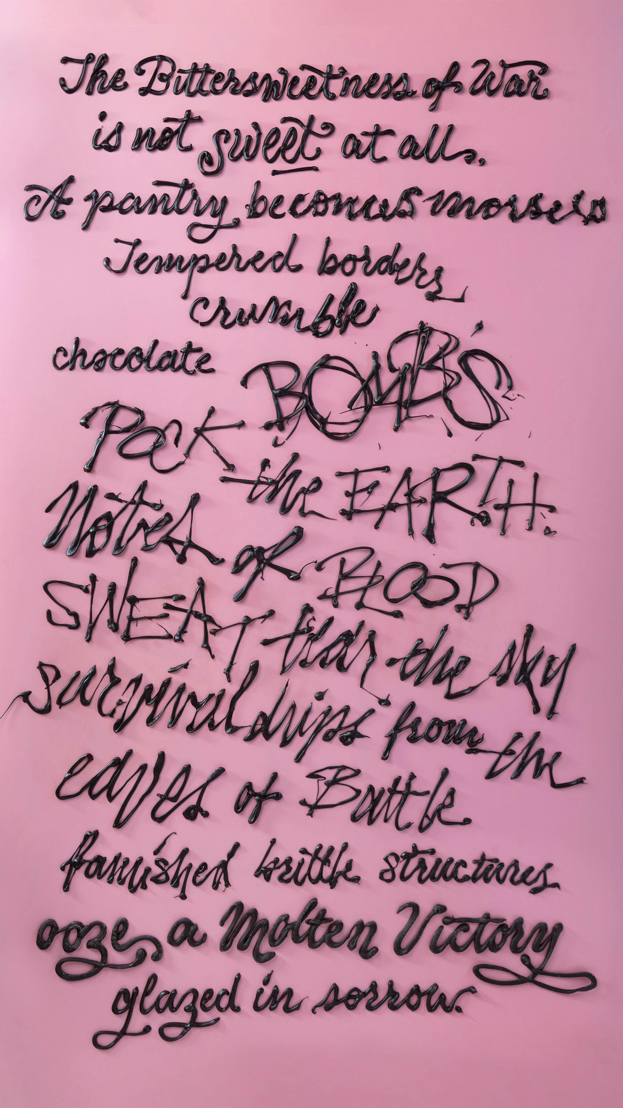
"Bittersweetness of War"
What projects are you currently working on that you can share with us?
I can’t talk too much about this yet, but I’m working on an AR series that encourages viewers to rediscover their environments. So many of us are still cooped up during pandemic recovery, I thought AR would be an accessible way to find joy in our current containers. I’m testing and re-testing currently and will be offering these on the blockchain.
