Intro: The Streaming Name Game
Rebrands are supposed to offer clarity, a new chapter, maybe even a bit of buzz. But in the case of HBO Max’s identity rollercoaster, the result was a branding plot-line more tangled than your average prestige drama.
Over just three years, the platform formerly known as HBO Max became Max, and then—you guessed it—HBO Max again. Each logo change brought a new promise. Each reversal exposed a deeper identity crisis. And if you’re confused, well, so was everyone else. Honestly, it's like trying to summarize a season finale with five cliffhangers.
ACT I: 2020-2022 — The Birth of HBO MAX
When HBO Max launched in 2020, it wasn’t just another streaming platform. It was the streaming platform from the house of Game of Thrones, Succession, and a vault of Warner Bros. Classics. Its bold purple-gradient logo stacked "HBO" atop "max," visually blending legacy with ambition. The message: Prestige meets more.
Despite the crowded streaming landscape, HBO Max stood out—leaning hard into the brand equity that HBO had built over decades. Purple became synonymous with premium.
HBO Max Logo 2020-2022
ACT II: 2023 — Just "MAX"
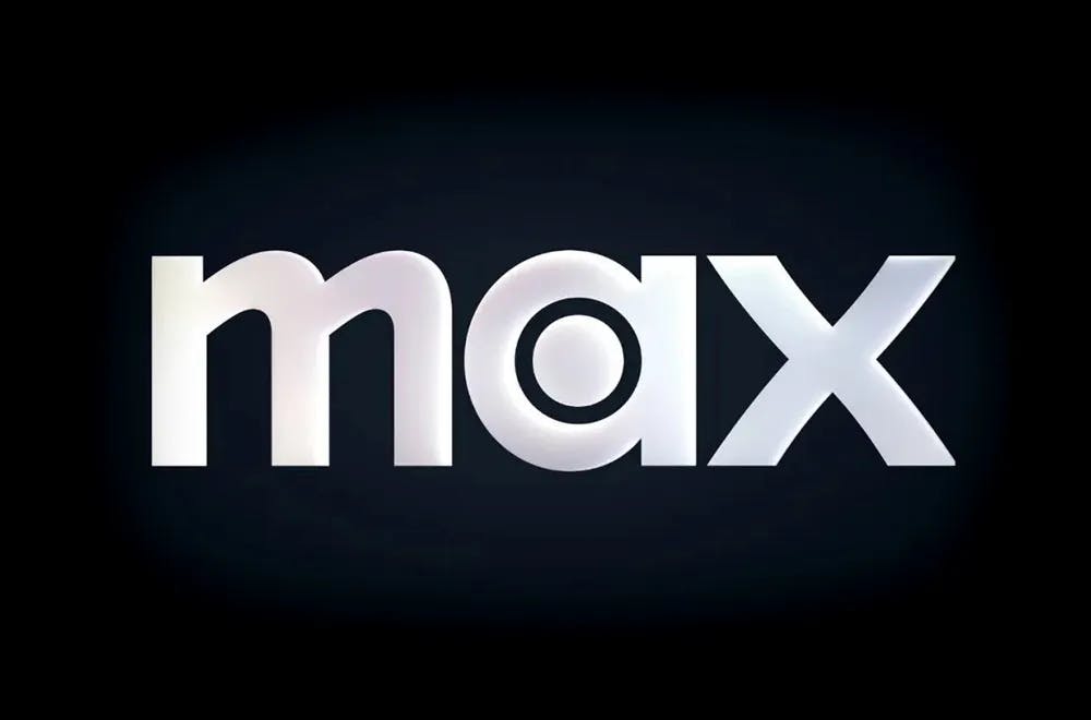
After the WarnerMedia and Discovery merger, the strategy shifted. Enter Max, a move designed to shed the "elitist" HBO skin and appeal to a wider audience. Out went the purple. In came blue. Out went the legacy. In came simplicity. The rebrand was executed with the help of UK-based agency DixonBaxi.
According to DixonBaxi, the logo was crafted to reflect both the future and the past. It combines the HBO bullseye and Warner Bros. curves into a warm, modern wordmark. The lowercase design added a friendlier feel, while a custom typeface—Max Sans—was developed in partnership with type studio F37 to ensure unity across the identity. Max Sans is geometric yet expressive, adaptable across weights and styles, and designed for maximum legibility.
Max Logo 2023
Color also became a core part of the identity: a "rich blue rooted in a glorious past," drawing from the iconic Warner Bros. palette and reimagined to signal premium storytelling.
The new logo dropped "HBO" completely and gave us a lowercase, soft-edged "max" on a blue background. Warner Bros. Discovery pitched it as "the one to watch." But for many consumers, it became "the one to squint at."
Critics pounced. Where was the HBO DNA? Was Max now about docu-series and home renovation shows? Without HBO in the name, audiences didn’t know what to expect.
Image Courtesy by DixonBaxi
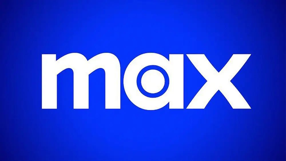
ACT III: 2025 — MAX Goes Monochrome
In early 2025, Max attempted a classier aesthetic. The familiar blue was dropped in favor of a black-and-white look. The logo now appeared in stark monochrome, aiming for sleek and modern, suggesting the service wanted to lean back into its premium positioning. According to Variety, the company said this visual shift was designed to be more "elevated" and cinematic.
The type remained soft and geometric, but the mood had changed—less vibrant, more serious. Fast Company noted that the update felt like Max was "trying on its grown-up clothes," but also hinted at indecision. Was Max a platform for everyone, or trying to reclaim a specific kind of highbrow viewer?
Max Logo Early 2025
Even The Verge highlighted how the shift, though subtle in design, marked another pivot in tone. Internally, Warner Bros. Discovery was reportedly facing churn and confusion, prompting this visual tweak in hopes of rebuilding clarity.
It was monochrome. It was serious. But for many, it still wasn’t quite HBO.
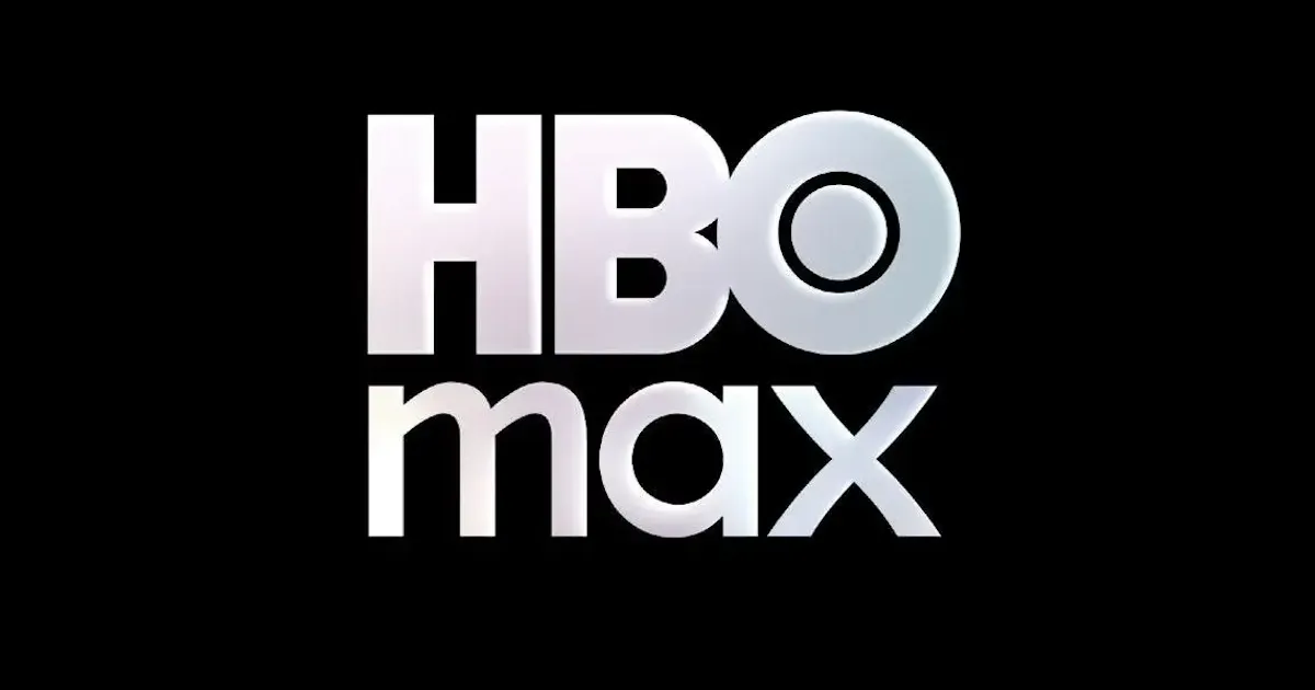
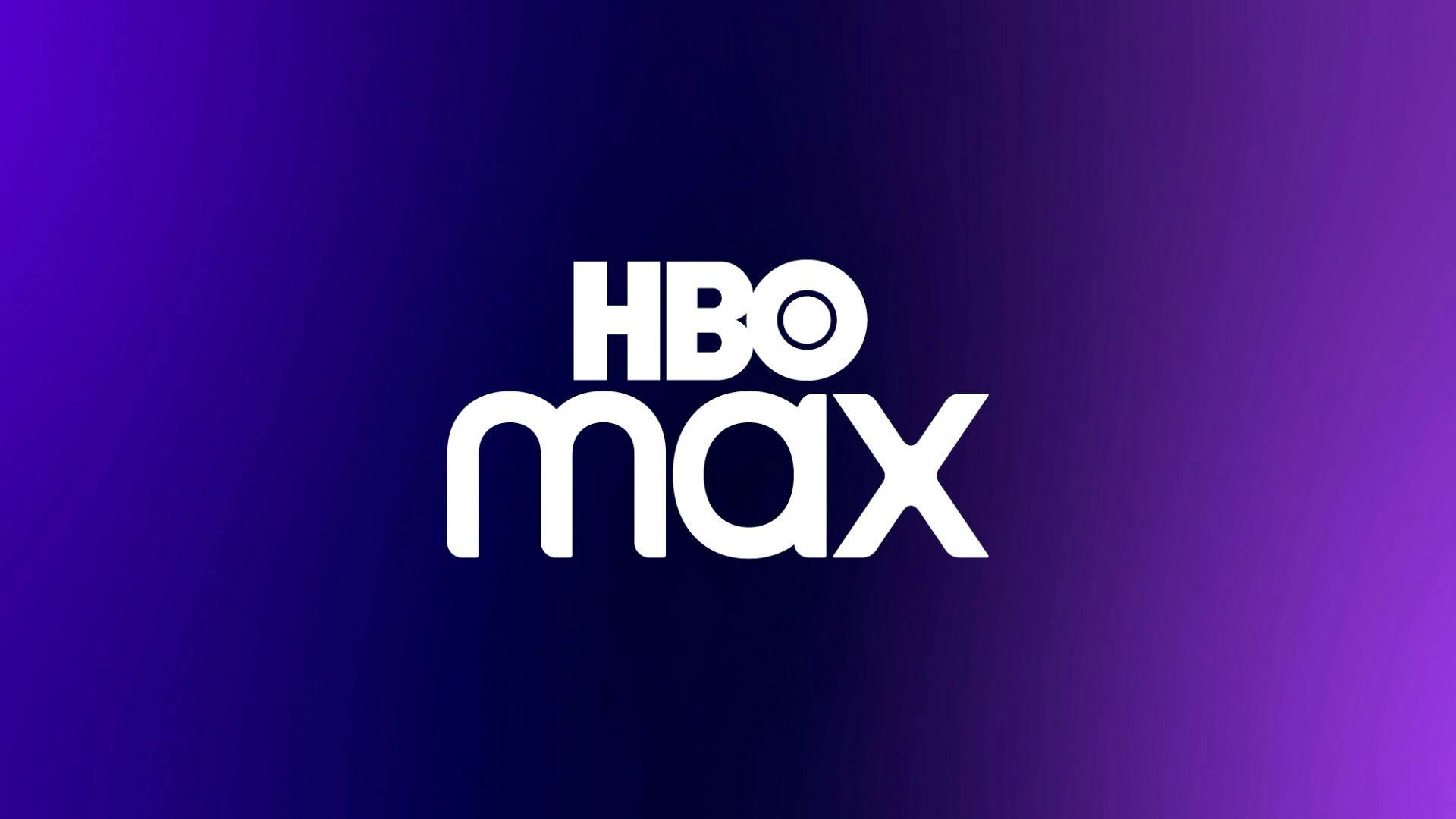
ACT IV: 2025 — The Return Of HBO MAX
So in May 2025, they reversed course. Max would officially revert to HBO Max. The new (or is it old?) logo brought back the HBO wordmark, married with a modernized "max" in grayscale chrome. HBO was home again.
Warner Bros. Discovery CEO David Zaslav made it clear: HBO remains their north star. And this new-old logo reflects that.

HBO Max Latest Logo
EPILOGUE: Who Are You Really?
In the end, HBO Max’s brand saga wasn’t just about logos. It was about identity. The logos changed, the colors shifted, and the name flipped back and forth—but one thing remained: the audience’s relationship with the HBO brand. HBO Max is back—a little shinier, a little wiser. And the road here is a case study in how not all brand experiments go as planned, but some do come full circle.
Even their official Instagram (@streamonmax) seems in on the joke. Their bio reads: "These rebrands are trying to murder me." If that’s not brand self-awareness, what is? It captures the fatigue, the absurdity, and the humanity behind every major pivot—proof that even mega brands know when to laugh at themselves.
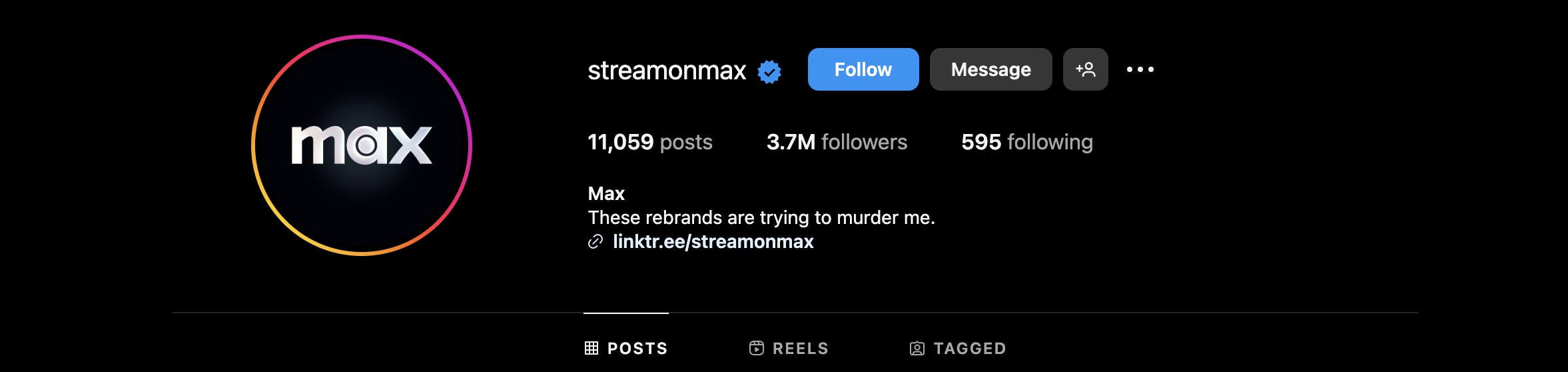
Hbo Max Instagram's bio
If this saga proves anything, it's that sometimes the boldest move isn't reinvention, but remembering who you are.
