before

after
Herman Miller has always been the cool kid in the office furniture world—think less “cubicle farm,” more “museum-worthy lounge.” But even icons need a refresh, and in 2024, the company rolled out its first major rebrand in over two decades, proving that you can teach an old chair new tricks.
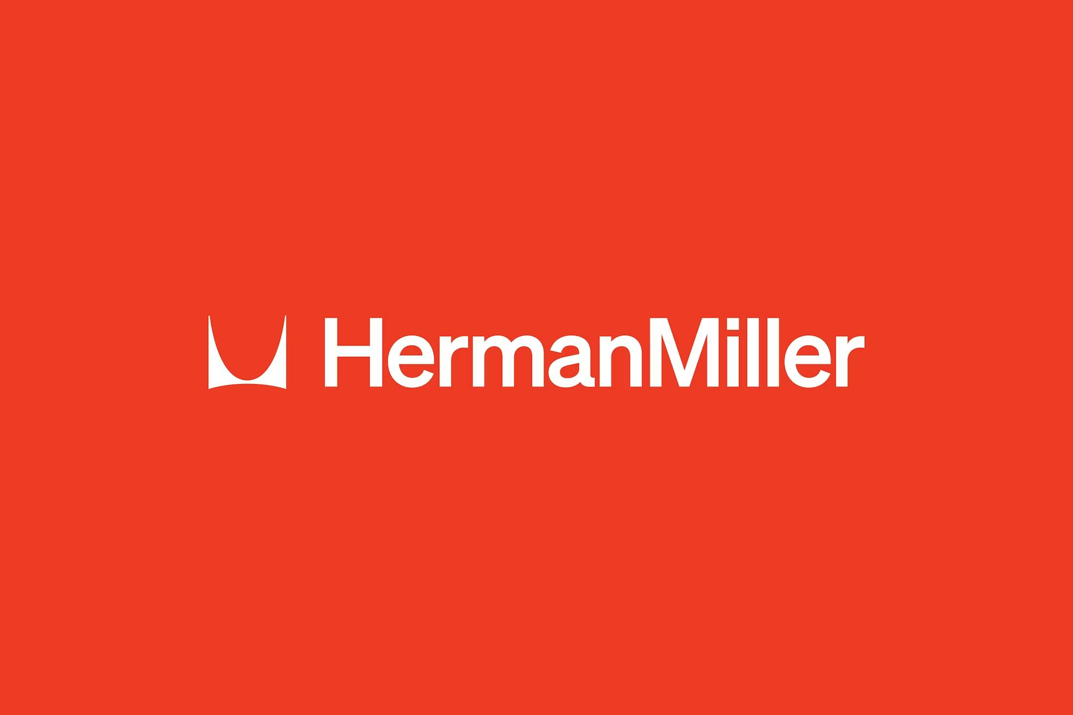
Image courtesy of Order
Let’s rewind a bit. Herman Miller started life in 1905 as Star Furniture Co., but things really got rolling in 1923 when D.J. De Pree and his father-in-law, Herman Miller, took over and gave the company its now-famous name.
From the start, the company was a rebel, ditching fussy, old-fashioned designs for sleek, modern lines. With design legends like Gilbert Rohde, George Nelson, and Charles and Ray Eames on board, Herman Miller’s name became synonymous with mid-century modern cool.
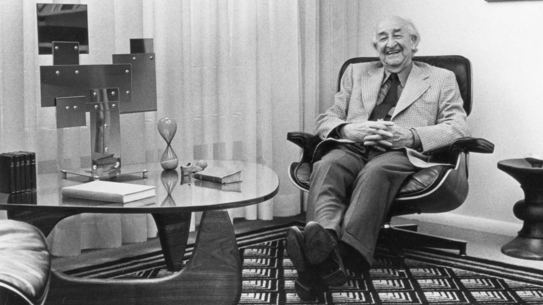
Herman Miller’s first President, D.J. De Pree.
Over the years, the brand has evolved from making traditional home furniture to inventing the modern office as we know it—think open spaces, modular systems, and ergonomic chairs that make your back sing. The company’s design DNA has always been about blending form and function, with a dash of optimism for good measure.
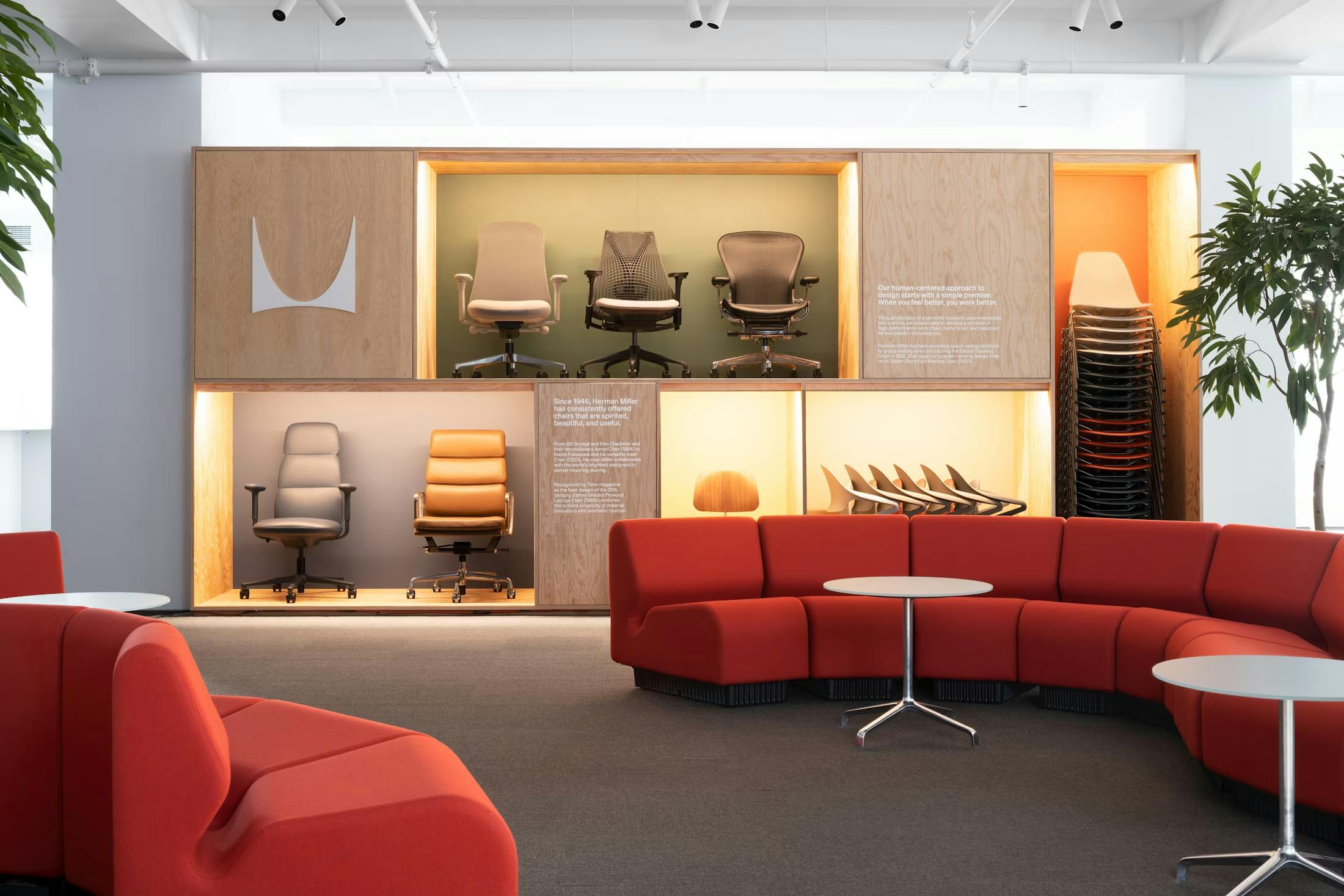
Image courtesy of Herman Miller
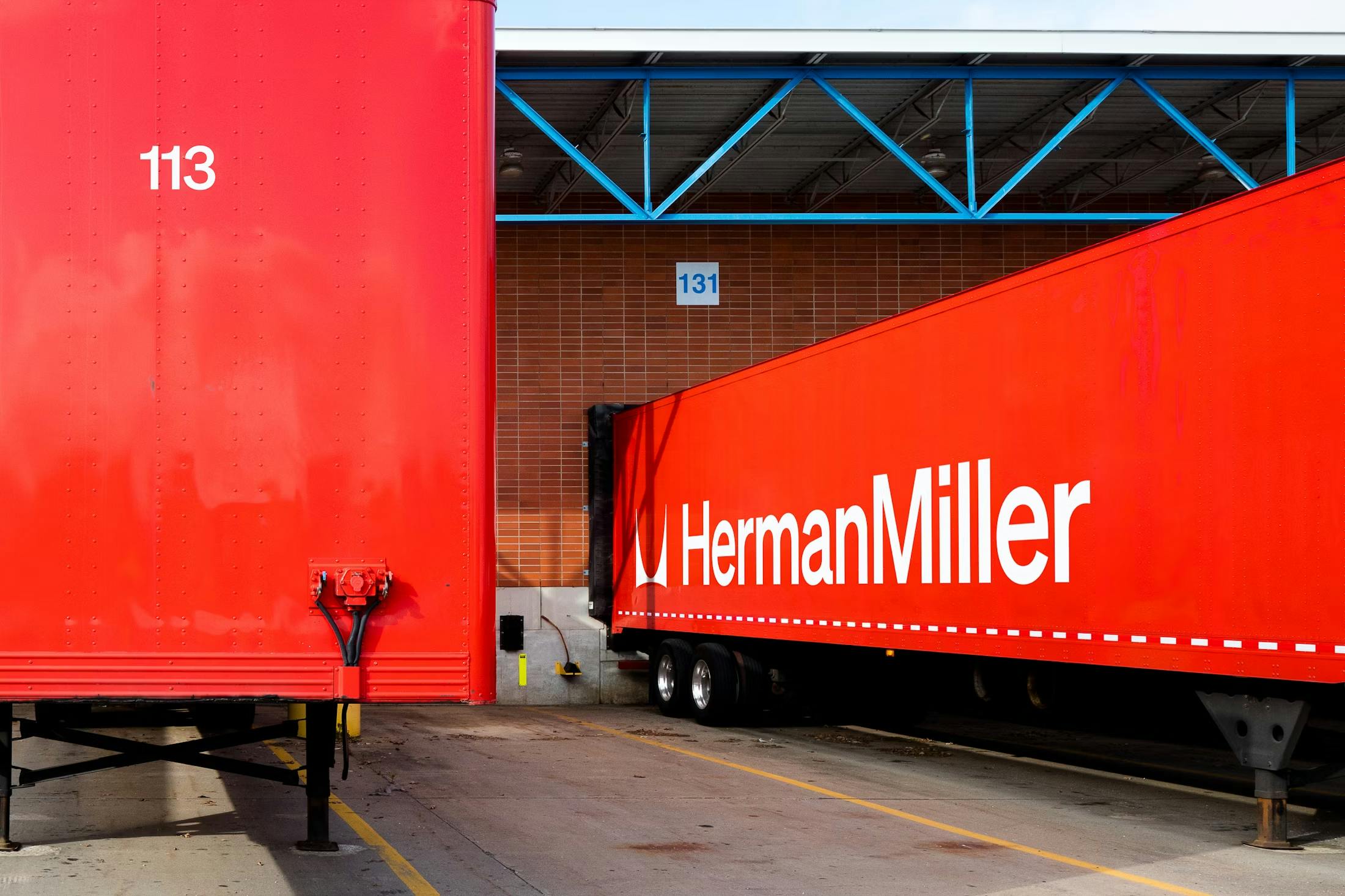
Image courtesy of Order
Now, about that rebrand: Herman Miller teamed up with New York design studio Order to give the brand a 21st-century facelift, while still tipping its hat to its modernist roots. The most noticeable change? The famous “M” logo, designed by Irving Harper in 1946, has been set free from its red circle prison. No more being boxed in—now the “M” can strut its stuff as a standalone graphic element, showing up on everything from tote bags to trucks.
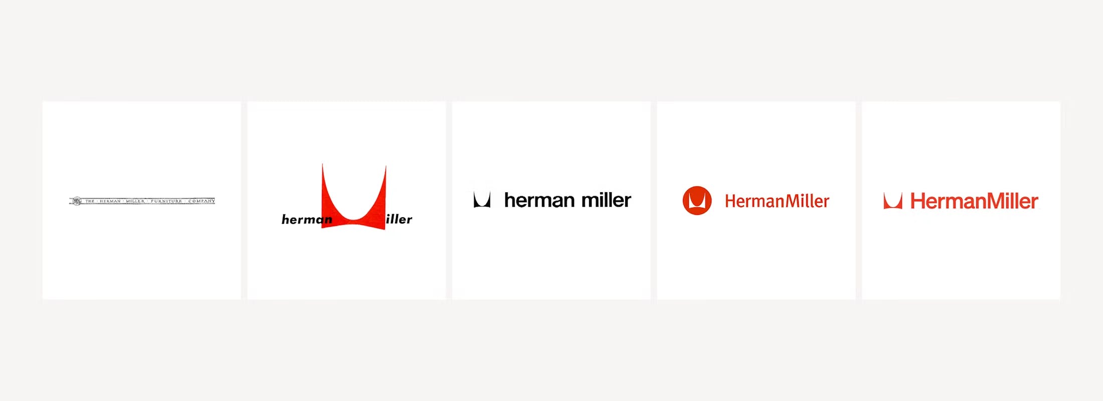
Logo Evolution
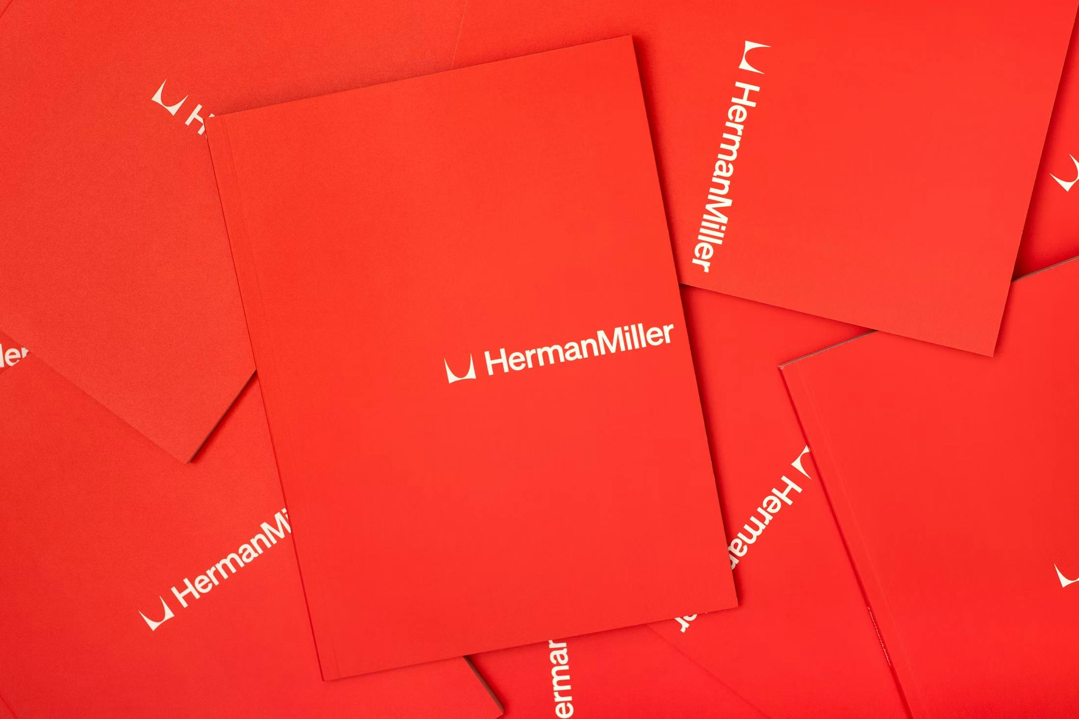
Image courtesy of Order
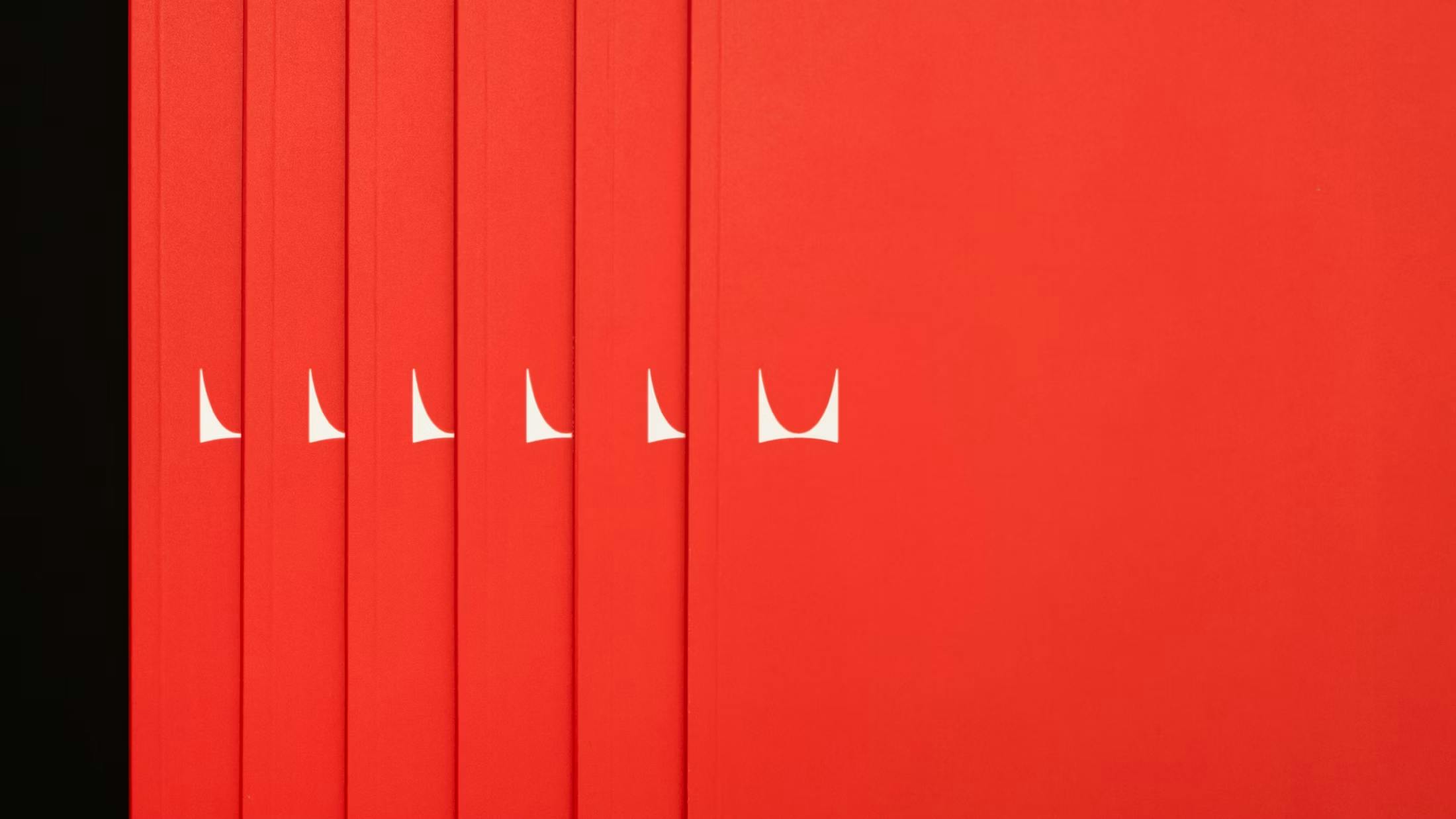
Image courtesy of Order
The wordmark also got a glow-up, swapping out the 1990s’ FF Meta font for Söhne, a typeface that pays homage to the Helvetica used in the late 1960s. This isn’t just a font change; it’s a nod to the era when Herman Miller really hit its stride and became a design powerhouse.
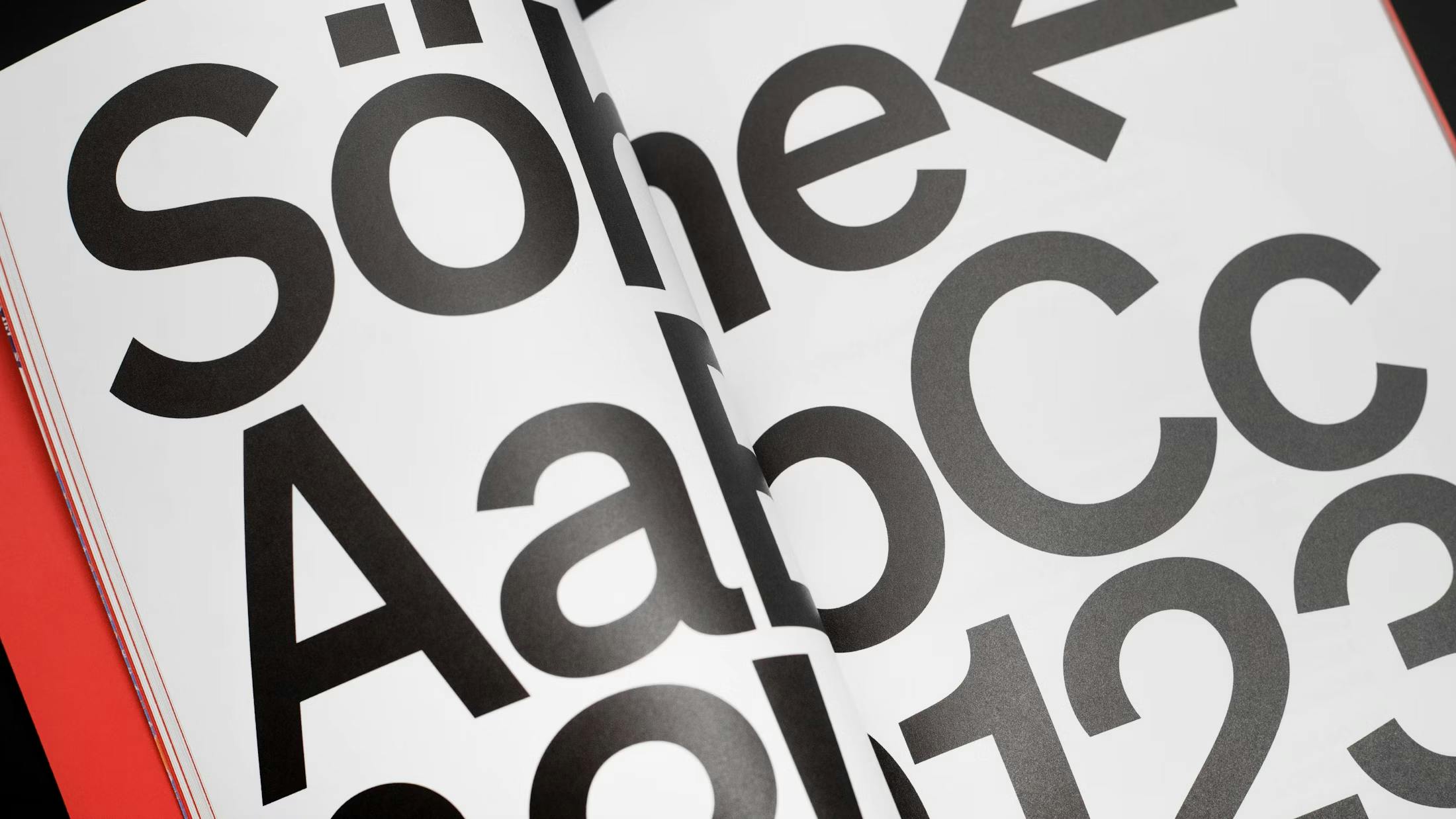
Image courtesy of Order
The expanded color palette brings back some of the brand’s historic bold hues, adding a bit more joy and playfulness to the mix. Herman Miller Red still leads the pack as the primary brand color, but now it’s joined by a full spectrum of vibrant shades. These new additions aren’t just for flair—they add depth and flexibility to the brand’s expression, helping it feel more alive and versatile in every space, digital or physical.
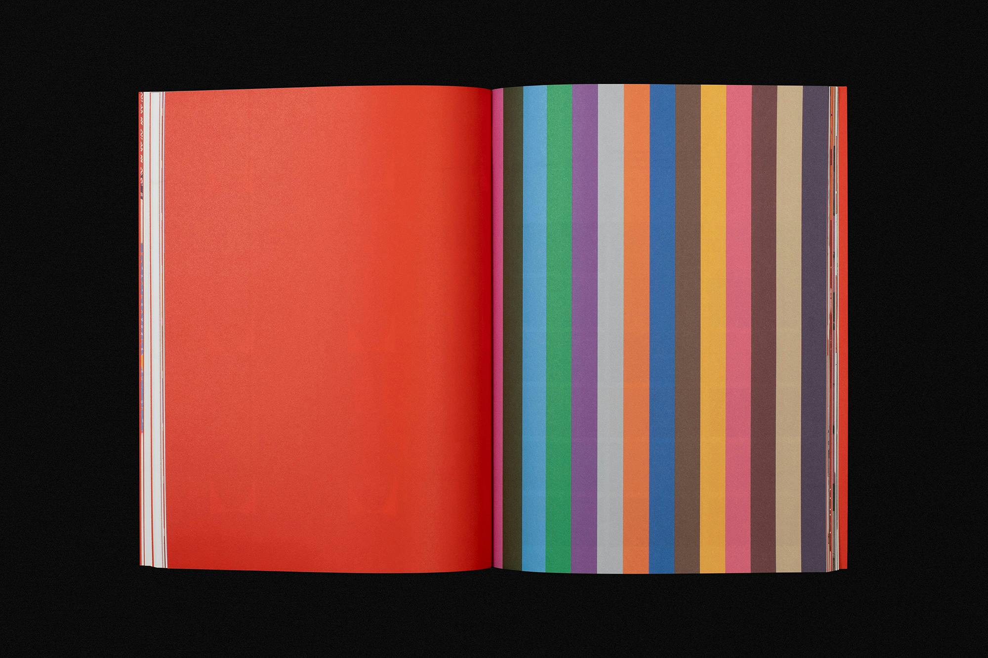
Image courtesy of Order
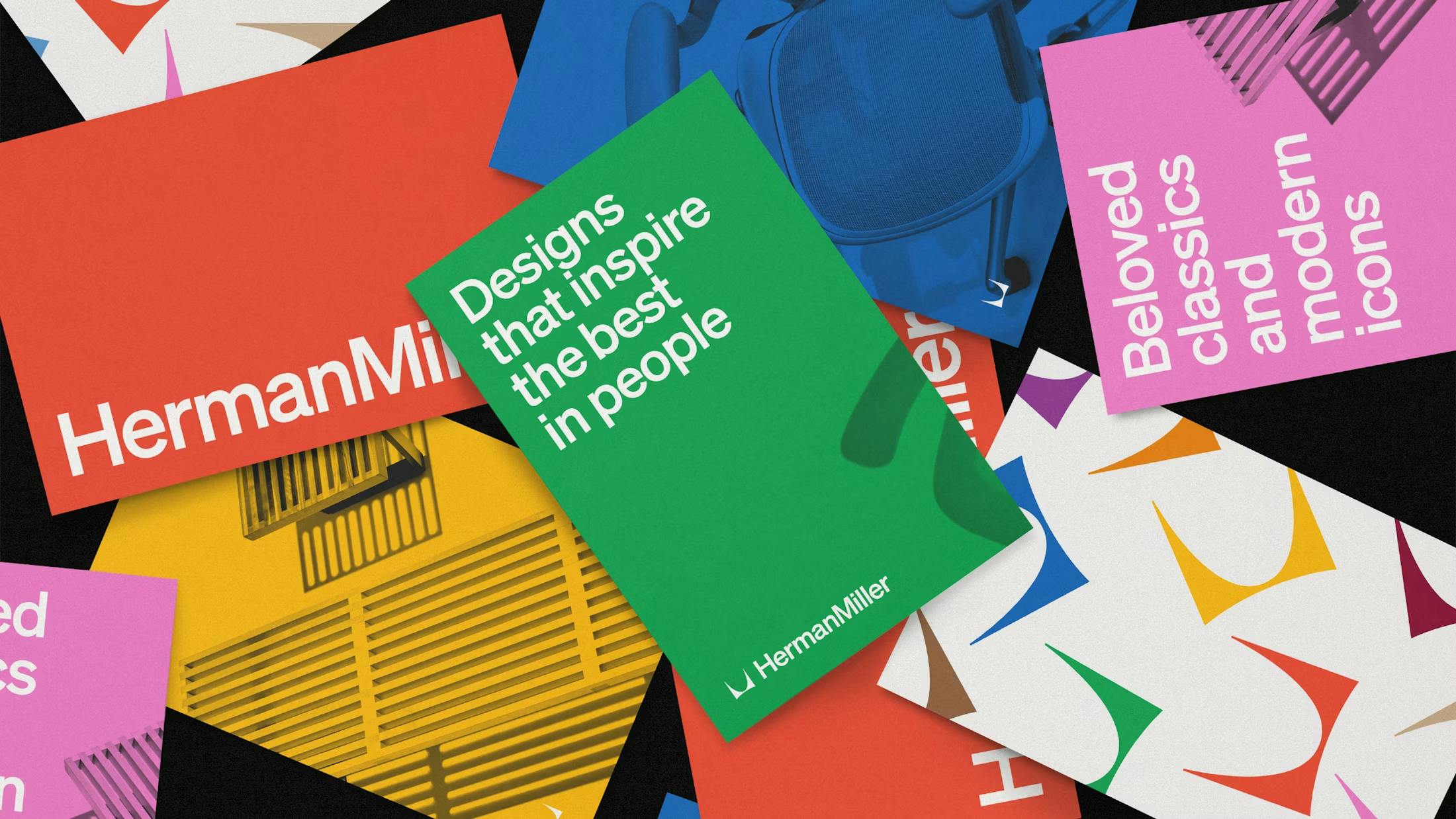
Image courtesy of Order
Why all the fuss? Flexibility. The new identity system is designed to look just as sharp on a mobile screen as it does in a sprawling showroom. It’s about being bold, legible, and unmistakably Herman Miller, wherever you spot it.
As Herman Miller celebrates more than a century of innovation, this rebrand isn’t about forgetting the past—it’s about carrying the best parts of it forward, with a wink and a smile. After all, good design never goes out of style; it just gets a little more comfortable over time.
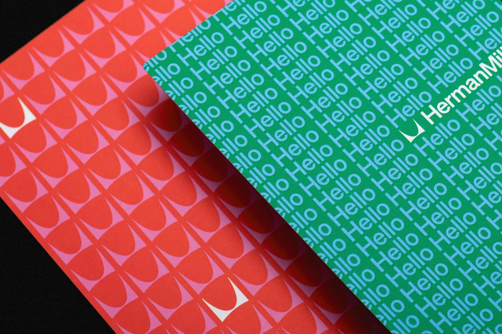
Image courtesy of Order

Image courtesy of Order
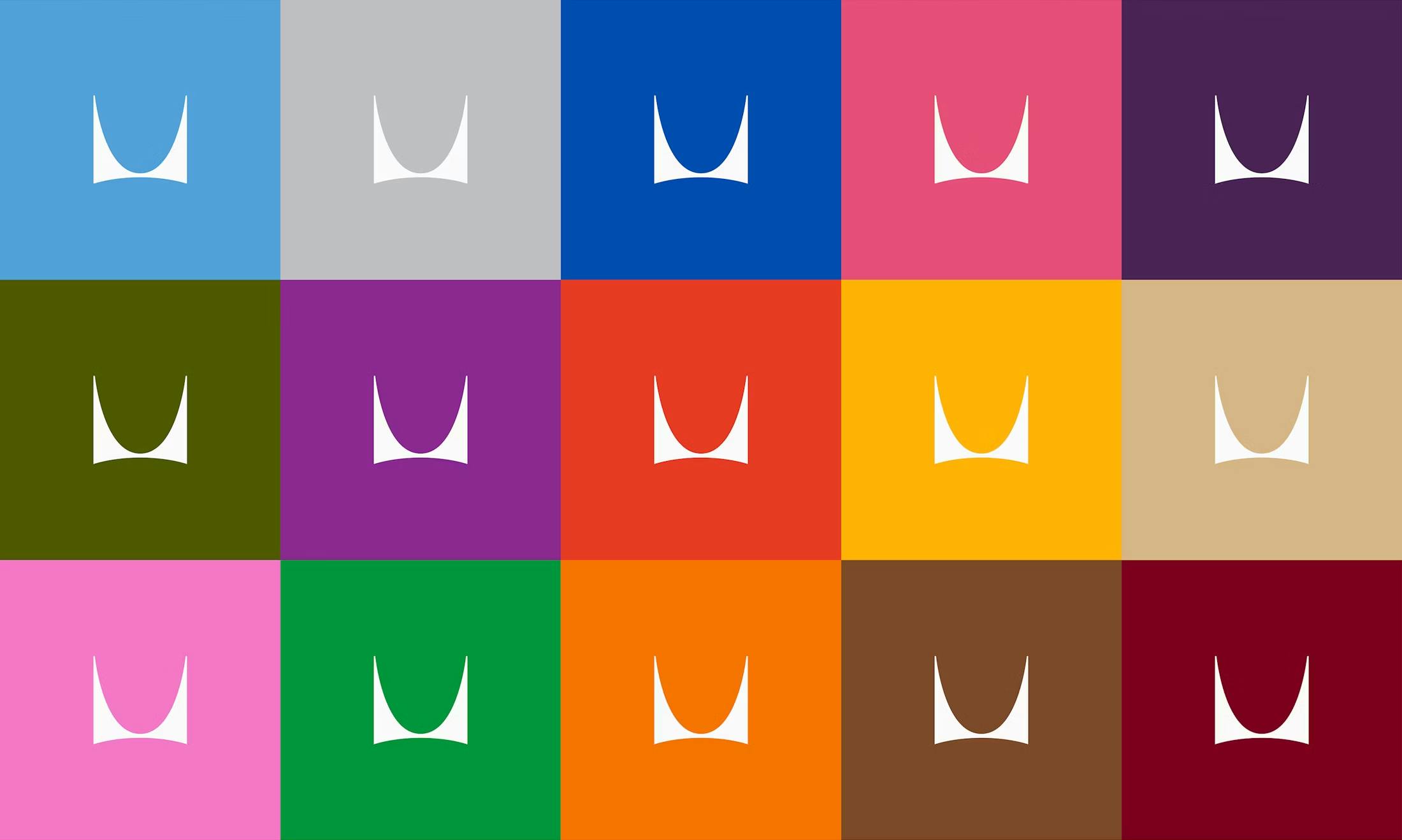
Image courtesy of Order
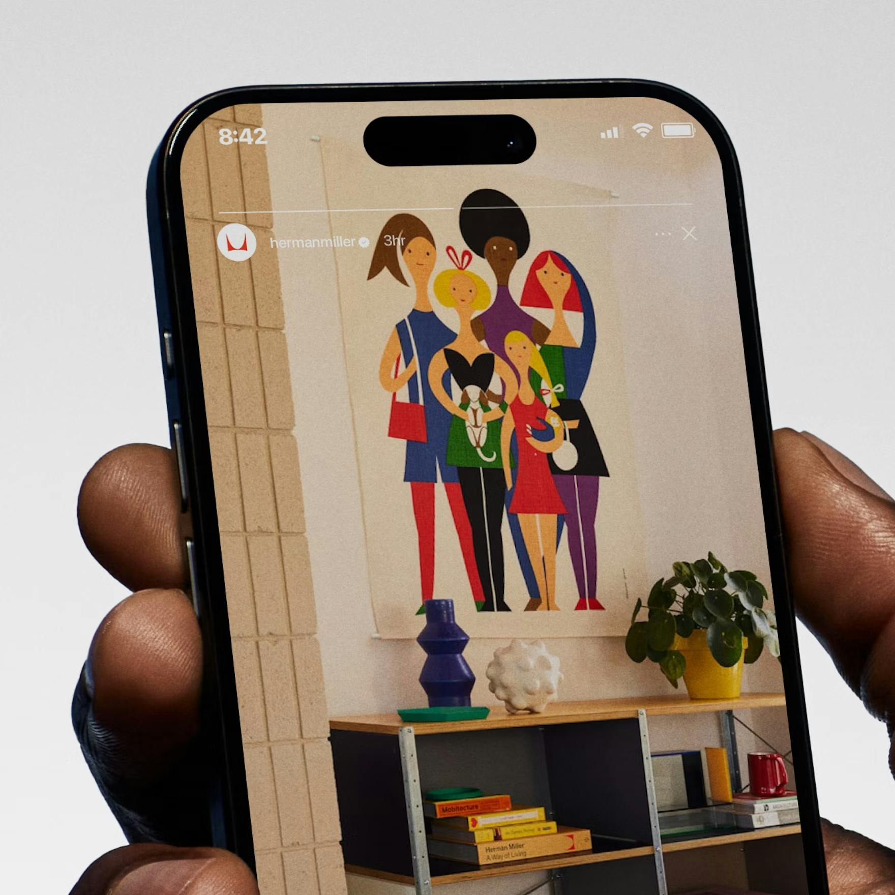
Image courtesy of Order
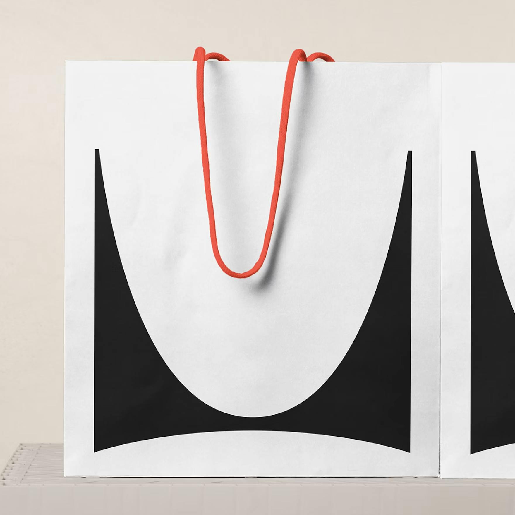
Image courtesy of Order
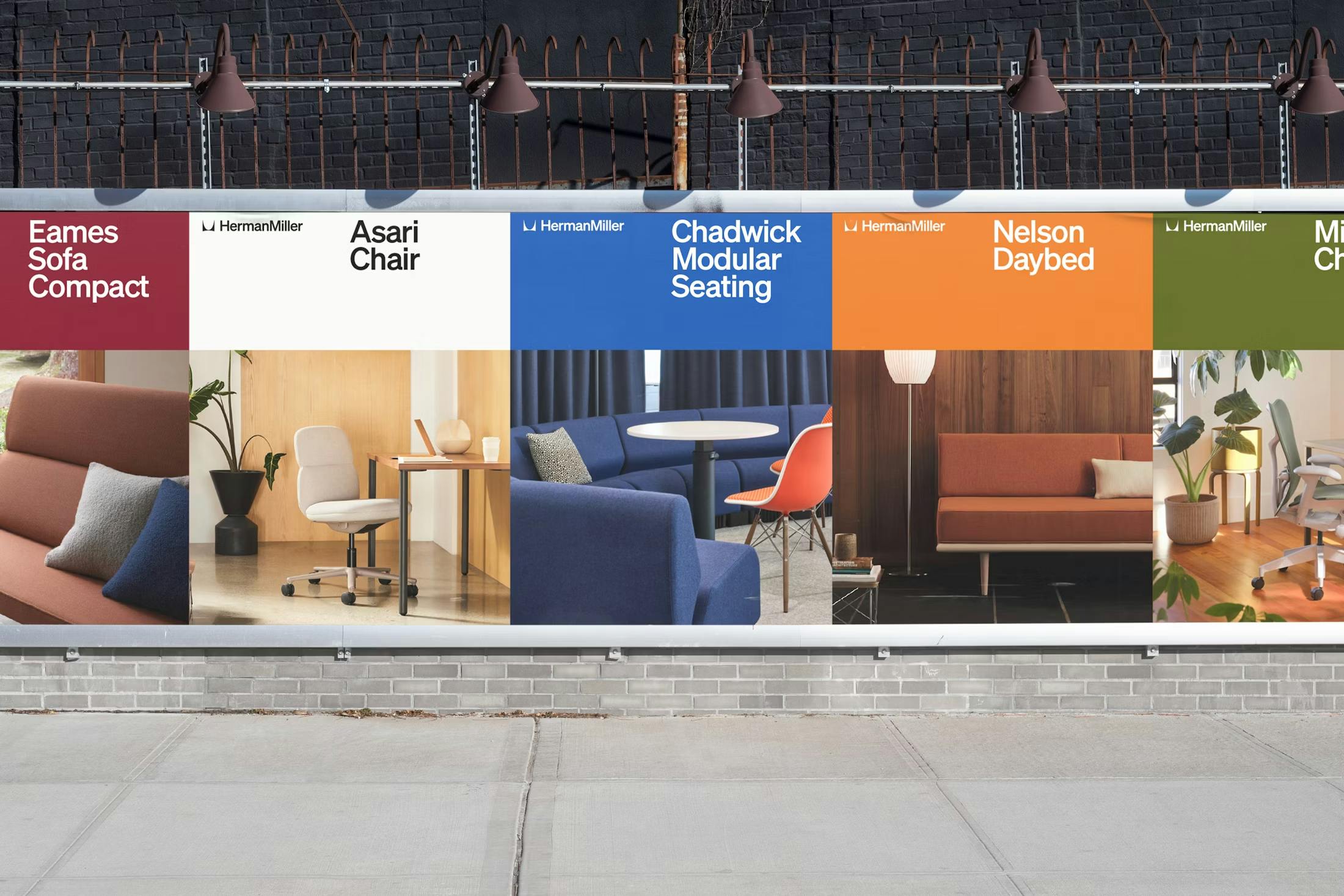
Image courtesy of Order
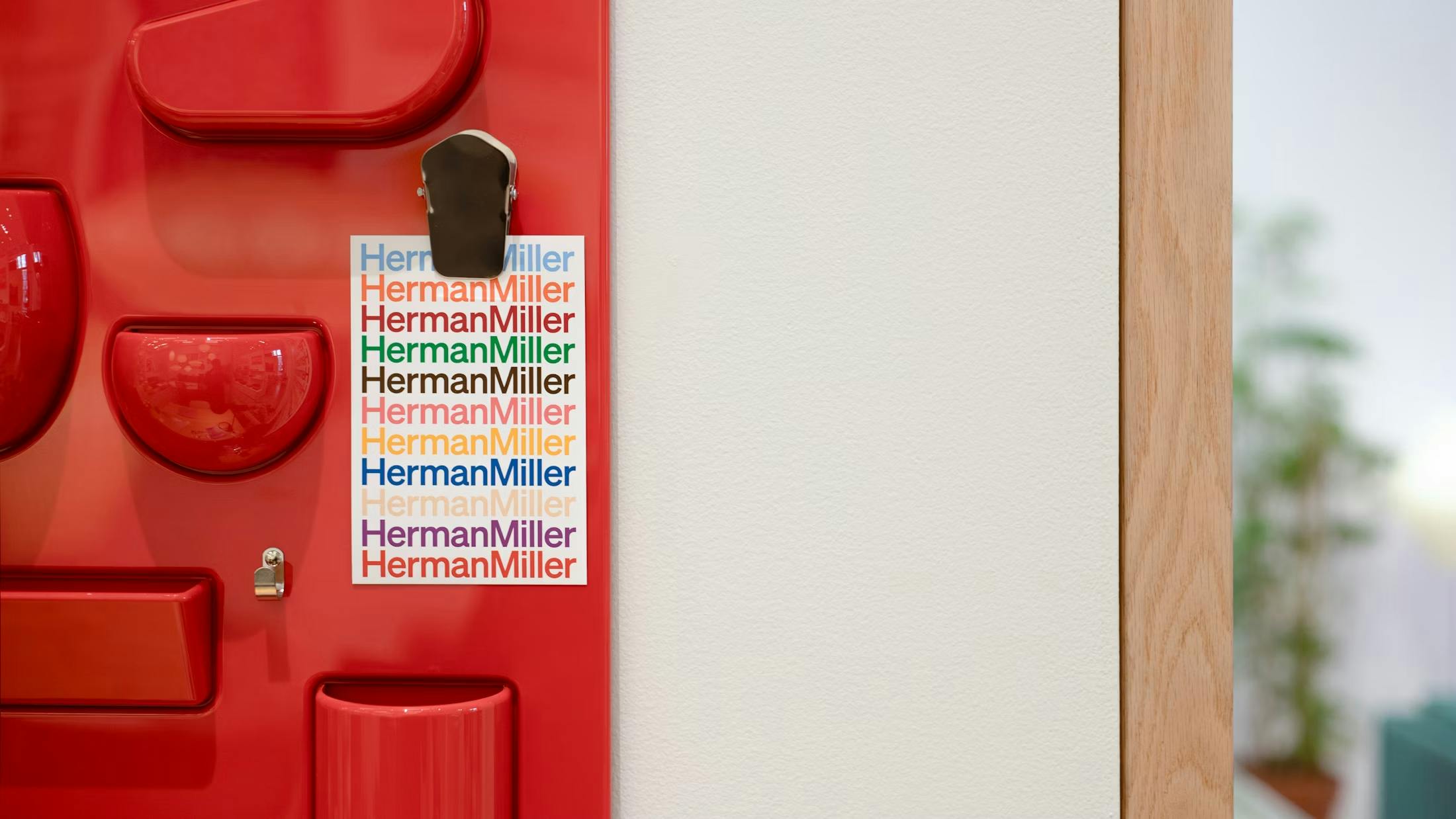
Image courtesy of Order
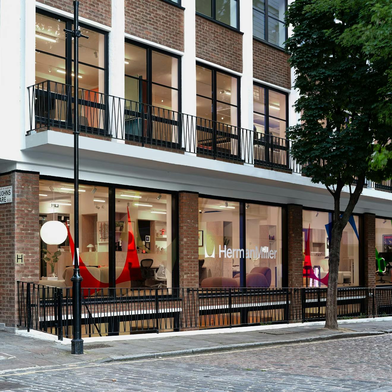
Image courtesy of Herman Miller
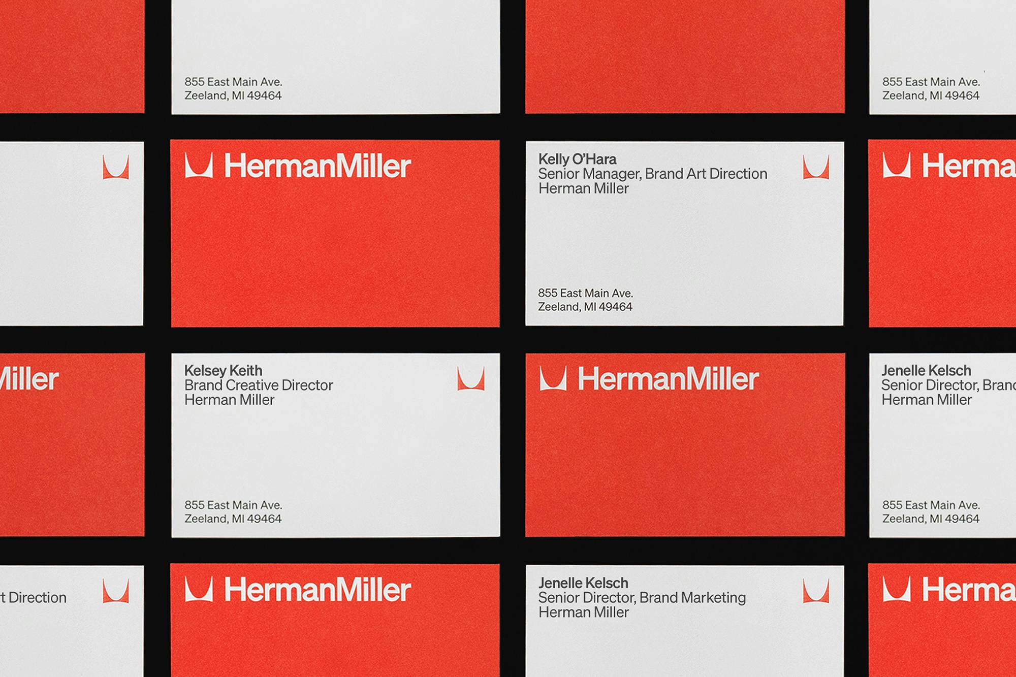
Image courtesy of Order
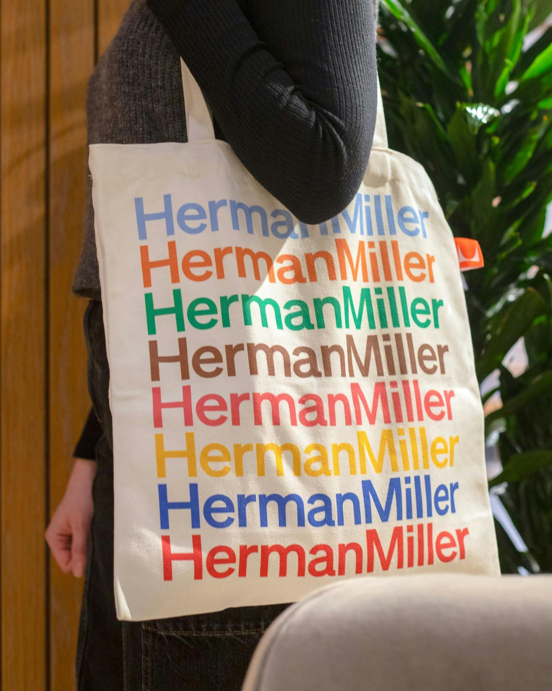
Image courtesy of Order