before
after
DO is a branding studio led by David Orkisz & Carolyn Gordon. We are small, adaptive and aim to use only great ideas to give the work we do a creative soul.
Can you tell us how this project came about? How did that conversation start with HomeAid West Lothian?
HomeAid had undergone a change of management with a new CEO stepping in to take the charity forward. The new CEO was a previous client of ours with the Murrayfield Racers ice hockey club, and he had established a few areas which needed some improvement. The first of these was branding, so he got in touch.
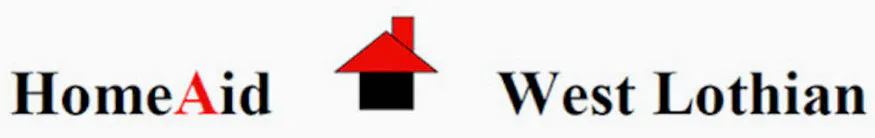
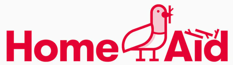
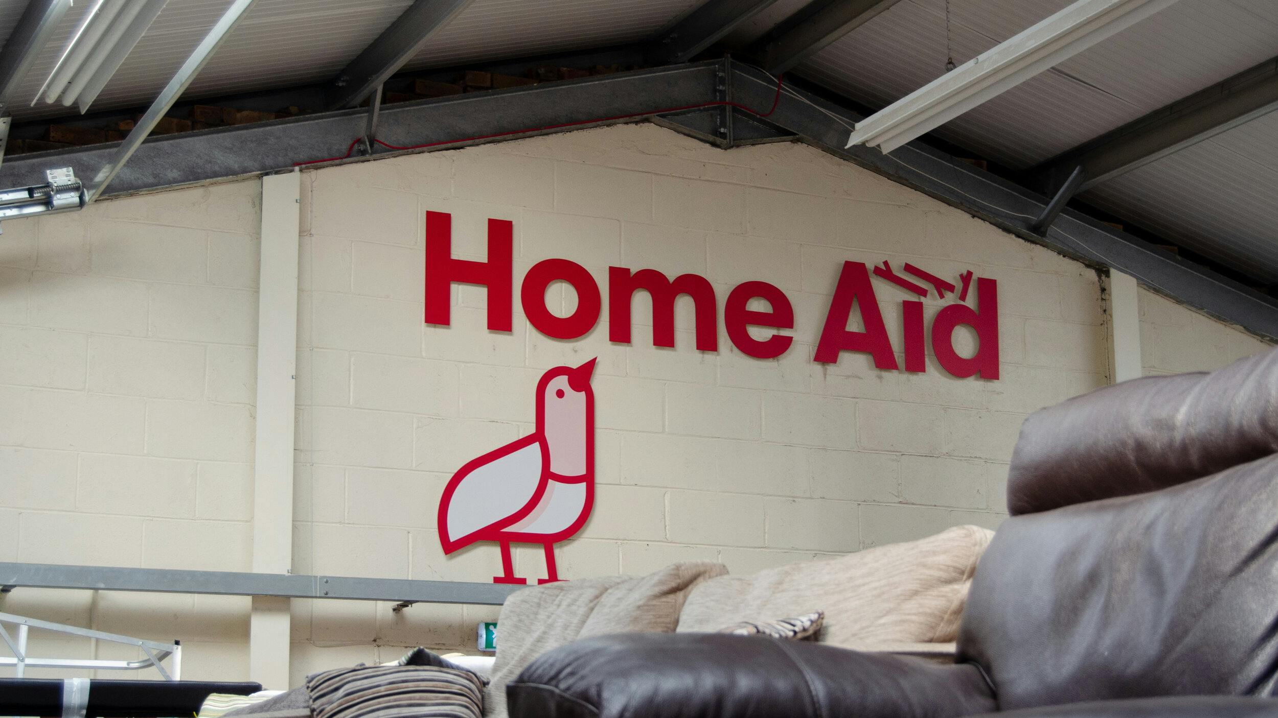
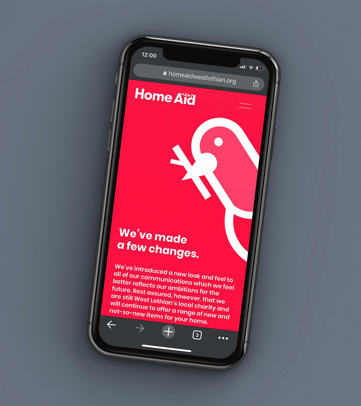
HomeAid West Lothian's new logo
How did the rebranding process go? Can you tell us more about it? Where did you start?
HomeAid has a close-knit team and it was important to engage with them throughout. The project was started with a brand workshop and insights session to gain a true understanding of the business and their customers.
As with any branding projects, we started by getting away from the studio and started sketching as many rough ideas in a notepad as possible (with a few of our favorite logo and branding books to flick through for inspiration). Although I do the general day-to-day design, Carolyn has just as much input into the initial stages, often being the honest critique that is needed to push an idea further.

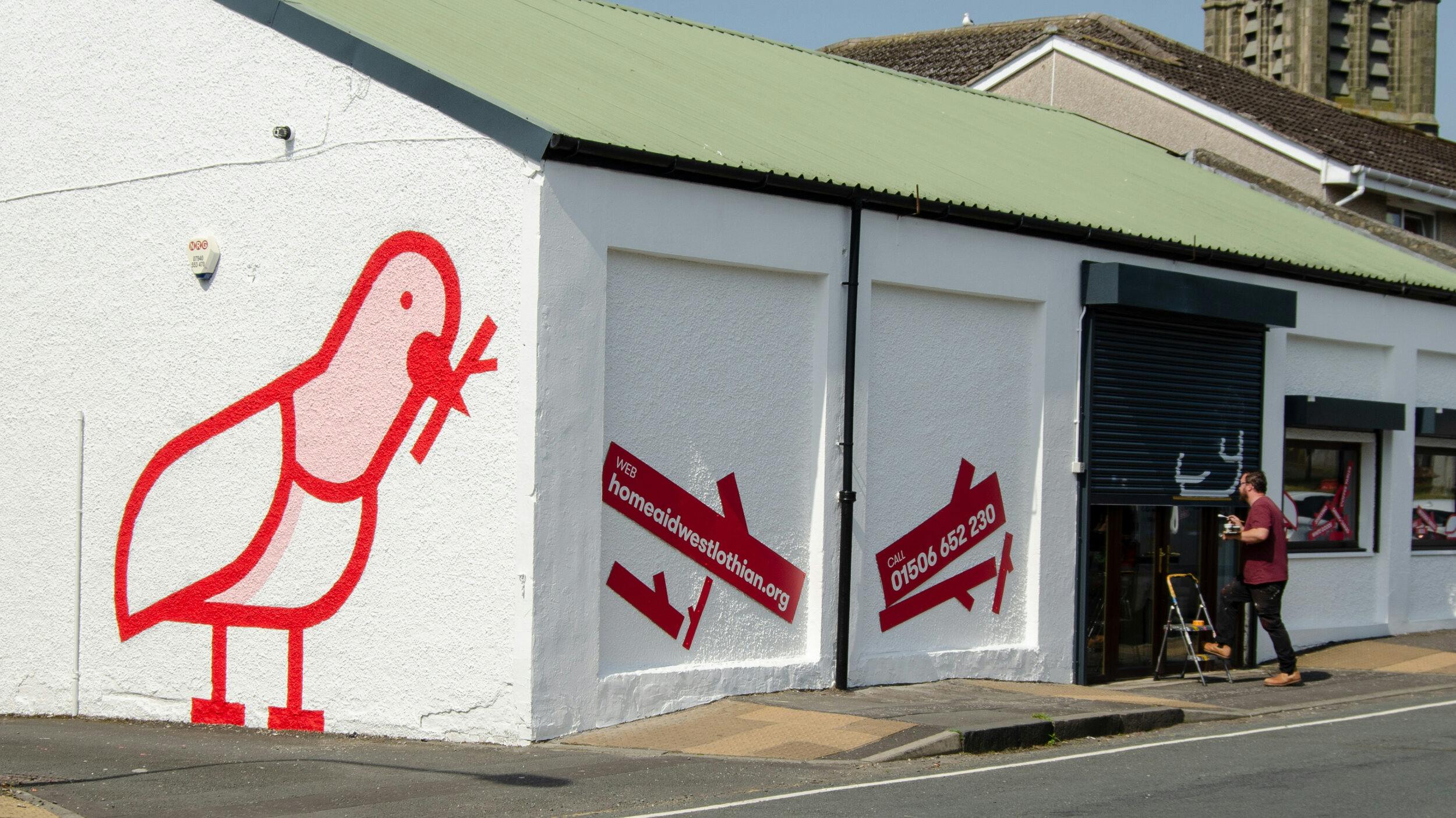
HomeAid West Lothian Building Art
Can you tell us the story behind the new logo? How was it conceptualized?
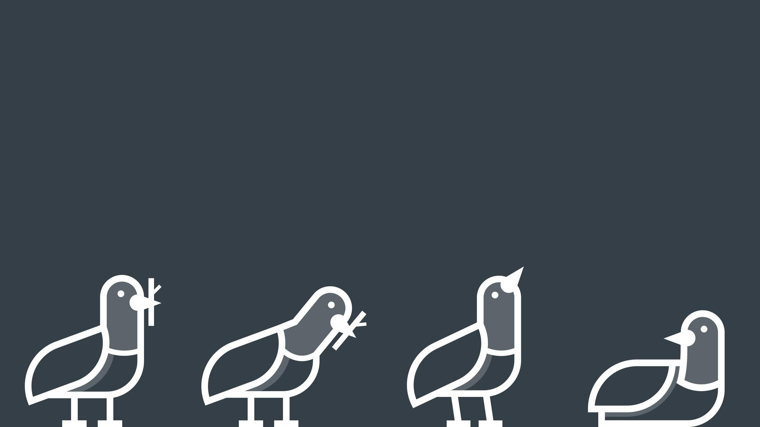
Whilst considering alternate ways to communicate the idea of home-making, one of the ideas I sketched out was this little bird which had a certain personality to it. I wanted to develop this idea further so added these little graphical 'twigs' to form a nest.
Weirdly, at the same time, a little pigeon couple had just laid an egg on our balcony. One would always sit on the nest while the other would bring food and top it up with more twigs and sticks. So we expanded the cast of 'characters' to allow for a variety of circumstances and roles to which people might relate to. Naturally, you had the one on the nest, one placing the twig, but also one without a nest looking upwards towards someone else's.
"It was important to us that people saw these little birds building their nests with twigs and related to this when it came to them building their homes with furniture. "
As you can imagine, our initial starting point, however, was a bunch of little houses, first aid symbols etcetera, but they all felt a little safe and obvious. One of the routes presented very much went down this path to test the water, but the client was more than willing to take the riskier option, so our little pigeon friends were hatched.
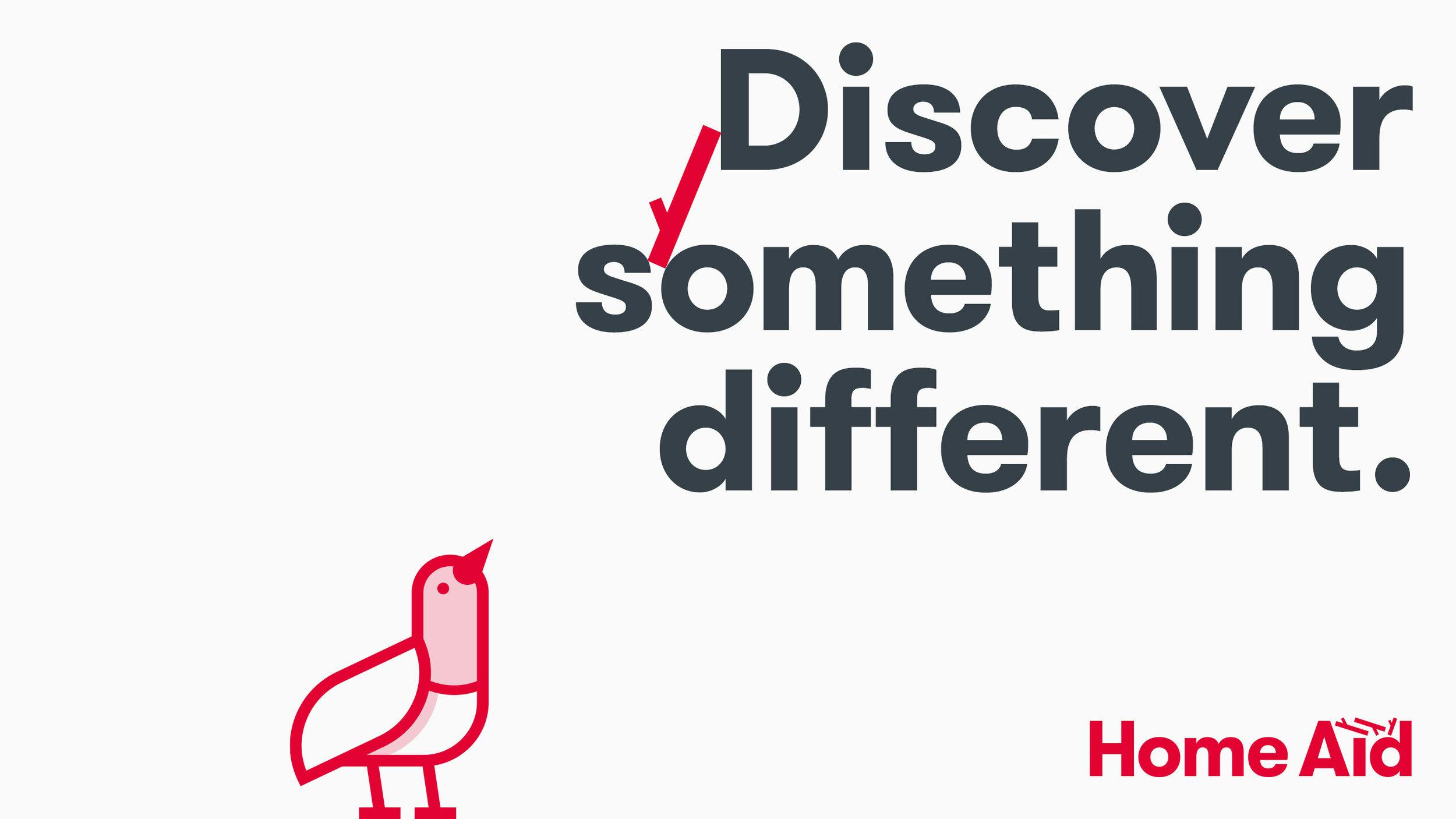
HomeAid West Lothian says, "Discover something different"

Were there surprising challenges you encountered along the way?
I think the main challenge with developing, essentially, a character-led brand was injecting the right amount of personality whilst maintaining that the pigeon very much still had to function as a logo (on letterheads, funding applications, etcetera). So it needed to be an extremely simple illustration but also be relatable to the audience. That was tricky.
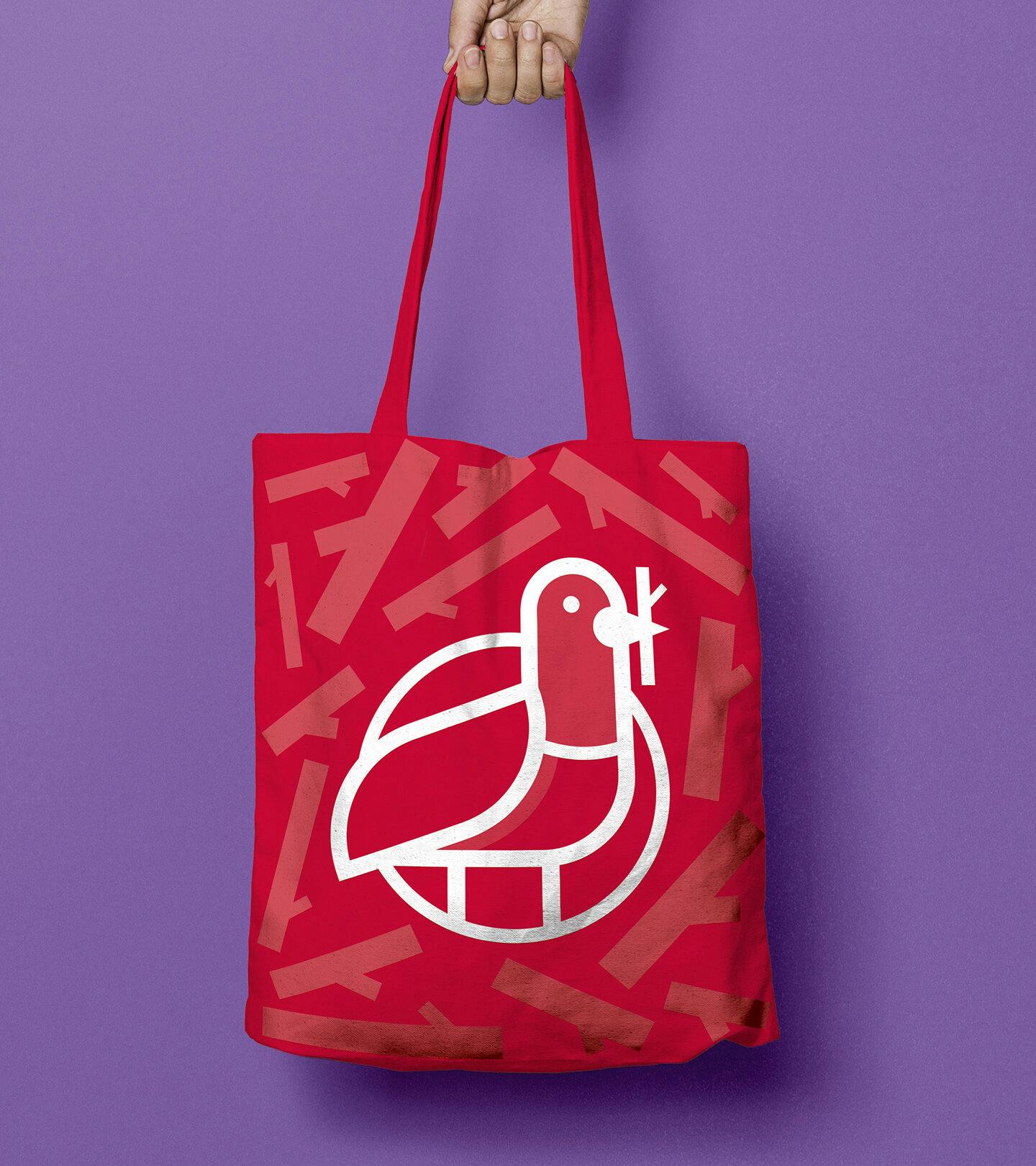
HomeAid West Lothian bag
How was the color palette selected? What does it say about the brand?
The red had been part of the brand since the formation of the charity (1996) and it was agreed that this should be maintained so that those already aware of HomeAid still had something to tie the old and new together. The supporting palette, however, was completely open. With the main idea of the brand surrounding a homemaking pigeon, the colors were naturally derived from the plumage found on a pigeon, specifically those everyday ones you see around towns and cities. It gave us a really nice gradient of greens, pinks, and grays to draw from to give a bit of extra life to all the communications.
HomeAid West Lothian building
Along with the visual identity, part of your work with HomeAid is copywriting. Can you talk about helping develop the brand voice?
The tone of voice was pretty important. HomeAid itself is very much targeted towards the local people of West Lothian, Scotland and the way we communicated had to reflect that. People in Scotland are quite direct, but we also like a laugh so there is a touch of humor in there without it trying too hard. Add to that, the serious nature of the work that the charity does to help low-income families and the homeless transition towards a more positive future, the language had to be clear and honest. We avoid anything too verbose, preferring to get straight to the point.
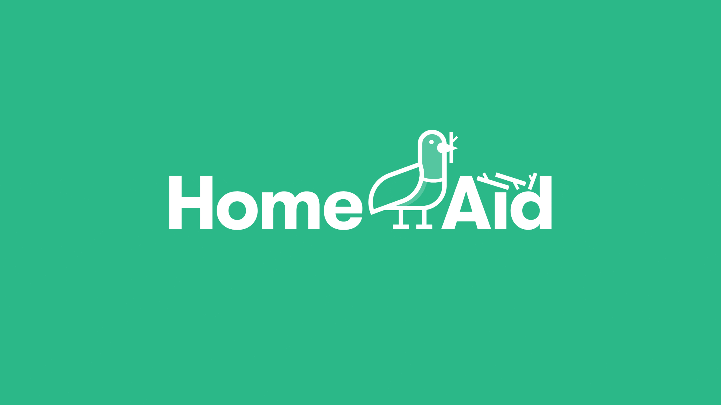
HomeAid West Lothian birds
Lastly, do you have any advice or pro-tips for designers embarking on branding projects like this?
Get out of the house or studio. If the initial idea is solid, everything else comes naturally, so sometimes going somewhere different in that initial ideation stage can help unlock something you hadn’t considered before.
HomeAid West Lothian phone
