
before

after

Richard Hedberg is Design Director at OKTO with over 10 years of experience working with global brands, startups, and other organizations.
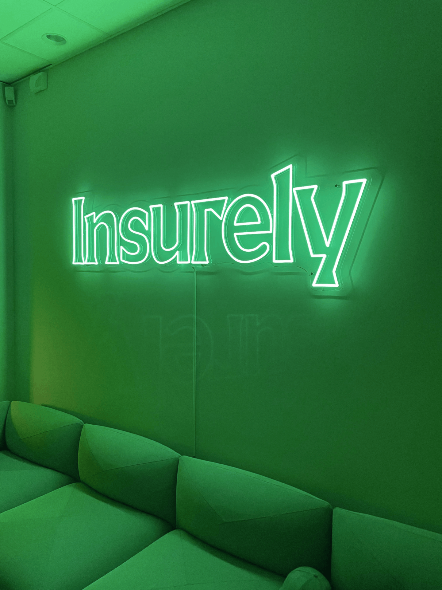
Insurely neon lights
Can you tell us how this project came about? How did that conversation start with Insurely?
A sizable part of our business is helping scale-ups with brand strategy and identity. It’s always gratifying to work with really driven people who want to take a great idea to the world. And we love to help shape their brands into something that commands the space outside of the tech world, reaching consumers. Insurely was one of those projects and after some initial dialogues we really clicked and got started with the brand strategy.

How did the rebranding process go? Can you tell us more about it? Where did you start?
In order to ensure that we do what’s optimal for our clients, we rely heavily on strategy. So the initial phase was to dig deep into what Insurely is, what it stands for, and in which direction it will be heading. This was done by extensive research and stakeholder interviews. After this initial phase, we worked out the brand platform, tonality, and messaging matrix. When the strategic components were in place, we started with the brand identity.
"We started by holding workshops together with the client, collecting inspiration and doing research on competitors and the market segment."
Based on this and the strategic foundation we created a number of initial creative directions that were presented to Insurely. In close collaboration with the client we then crafted each individual part of the identity.
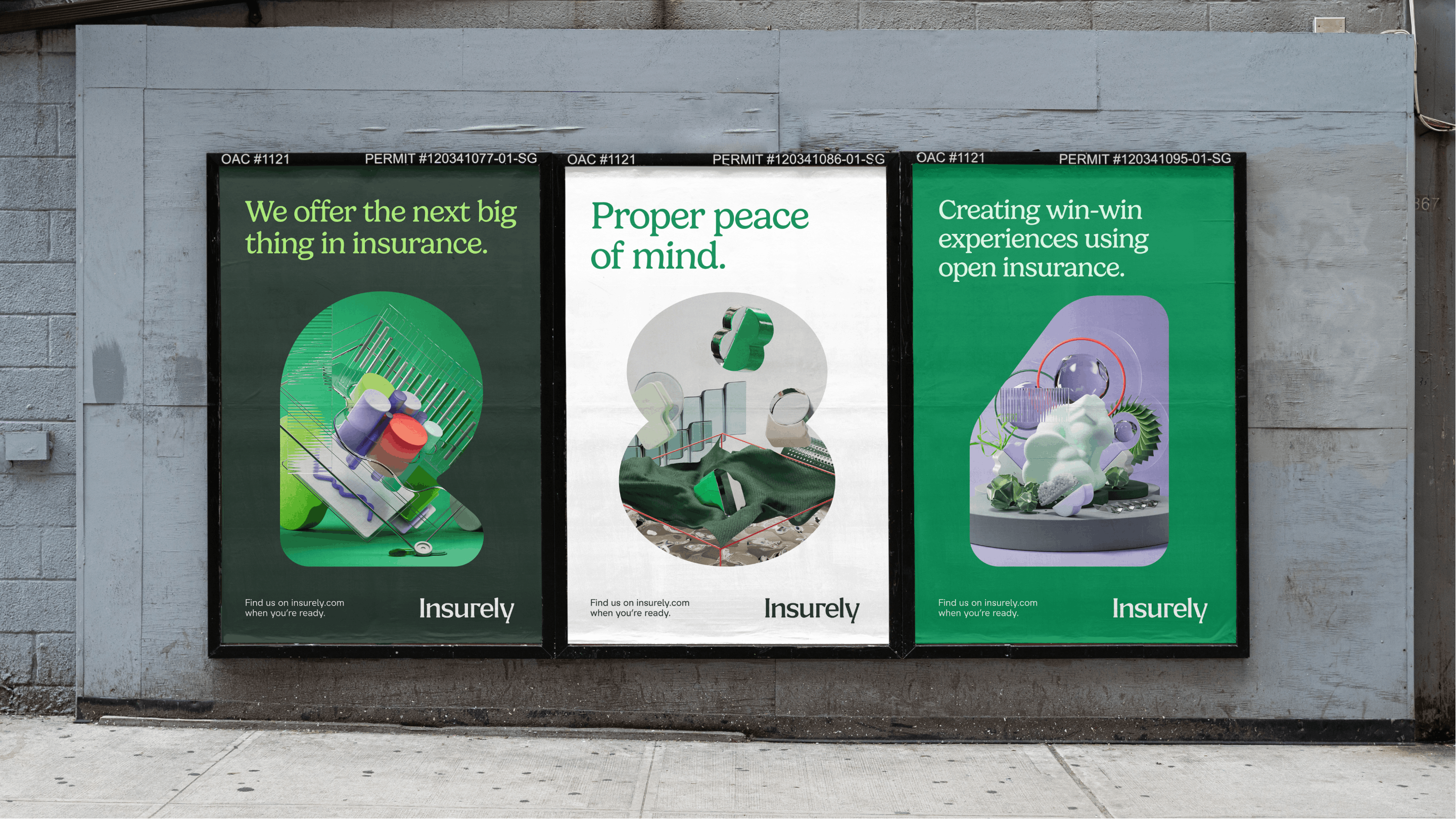
Insurely posters
Were there surprising challenges you encountered along the way?
One of the main challenges was positioning the brand. Insurely mainly offers technical solutions for the open insurance industry, but also offers consumer solutions that also works as a testing ground to innovate on their product. And the balance between being both a disruptor that drives change and a collaborator was initially a tough nut to crack.
But by positioning the brand as an innovator to drive change by innovation we feel that we successfully found the perfect fit for both business and brand. A brand that stands out in the crowd, works for transparency and ultimately helps both insurers and consumers win.

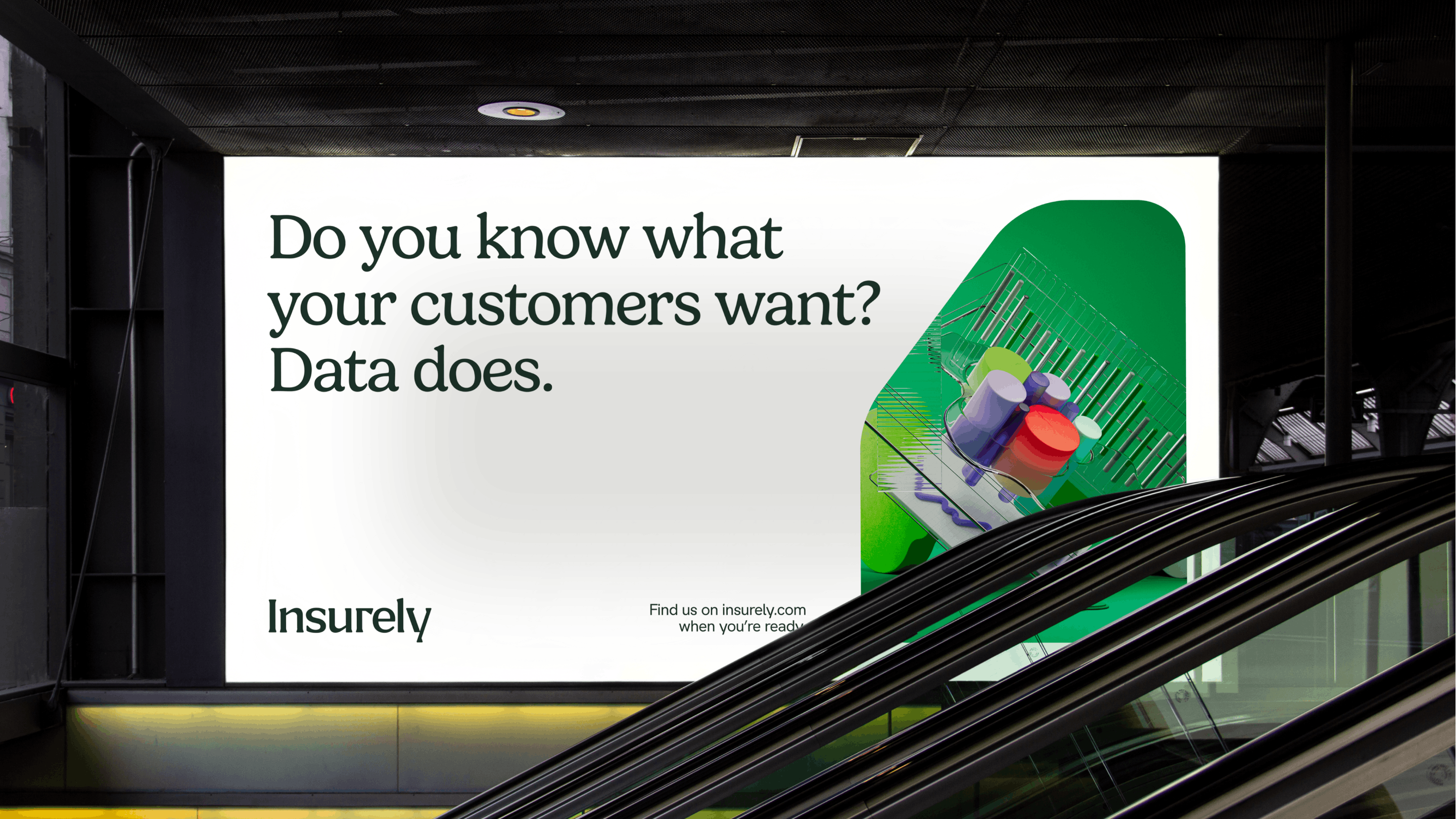
Insurely ad
Can you tell us the story behind the logo? How was it conceptualized?
We wanted a logotype with a friendly and playful feel, but that still pays homage to traditional tech expressions and works well in that context. It was important that it felt crafted and distinct, and that it played well with the rest of the identity. The wordmark is custom drawn but we took a lot of inspiration from the typeface Blaak by Måns Grebäck. We liked the combination of the straight terminals together with the flared serifs. And by adding a bit of roundness when drawing it we felt it created a really good bridge between Gelica that we use as headline typeface and Insurely Sans.
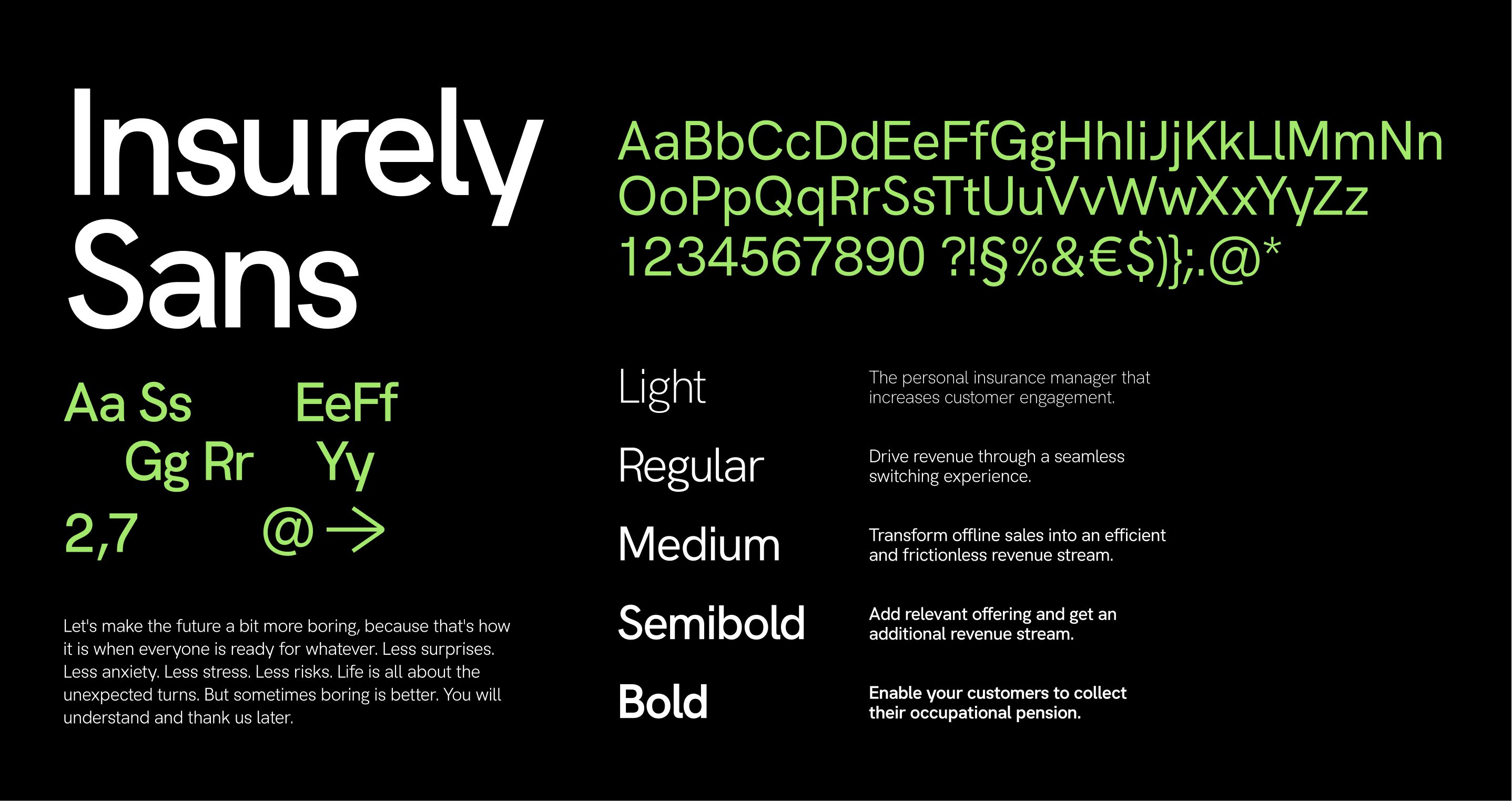
Insurely Sans font
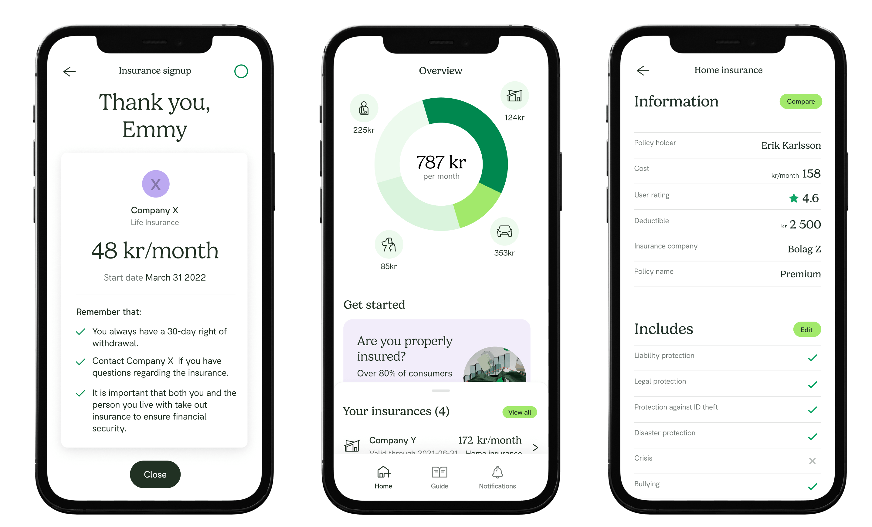
Insurely mobile
You also developed a shapes library for the brand. Can you tell us more about that?
Since Insurely develops solutions for the insurance industry and the focus is on simplifying a world that is quite complex and intimidating, we based the concept of the brand shapes around numerals and operators, and simplified them into organic shapes.
"The shapes are meant to connote their original meanings, without being overtly obvious. "
This to add a bit of playfulness that bridges into technology and is flexible enough to be used throughout the brand identity in all touchpoints, from digital design to out of home print.
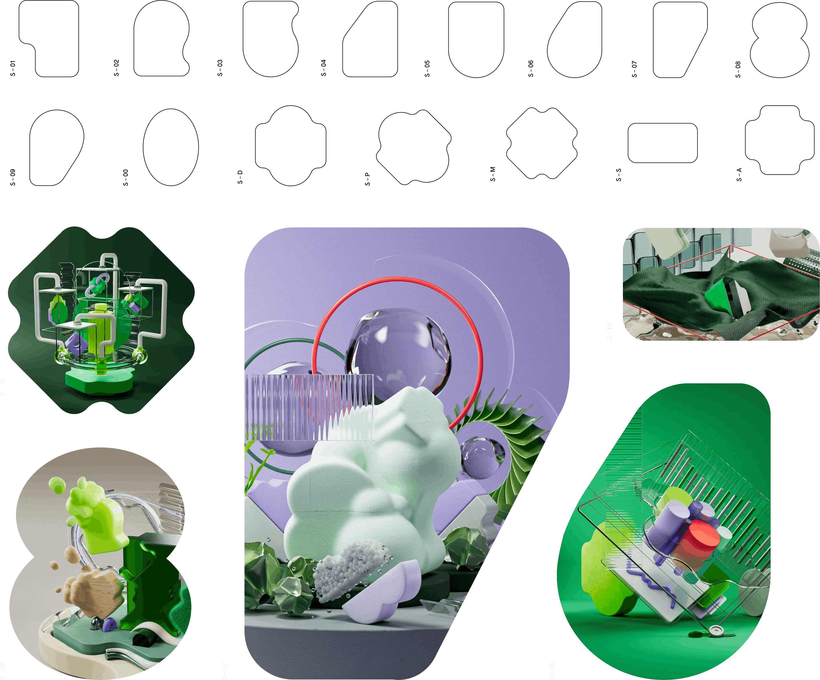
Insurely shapes
How about the iconography? How were they designed?
We wanted the iconography to be fairly clean and sophisticated, both to bring some strictness to the identity and to make it easier to maintain and expand on for the client. However, we wanted to bring a level of aspiration to the visual language.
So instead of purely sticking to expected shapes, we wanted icons to represent something that felt more elevated. Instead of just the traditional shape of a house we aimed for a modern home, instead of just a regular car shape, we tried to capture a vehicle that feels like the car you’d own. You take out insurance on the things you love and we wanted the icons to reflect that, without adding too much complexity.
Insurely icons
How about the color palette? How did you land on these colors and what do they say about the brand?
If you look at the color spectrum of the insurance industry, traditionally there’s a really high prevalence of blue and red, so we wanted to avoid that. An important strategic outcome from the project was the importance of working alongside the big players in the insurance industry and try to drive change by innovation and edge competence rather than revolting against them.
Green was identified as a good neutral option that still felt modern and exciting, allowing us to stand out, especially compared to the other competitors in the insurance B2B segment. We complemented it with shades and contrast colors to create a palette that was scalable in its expression and dynamic enough to work over time.
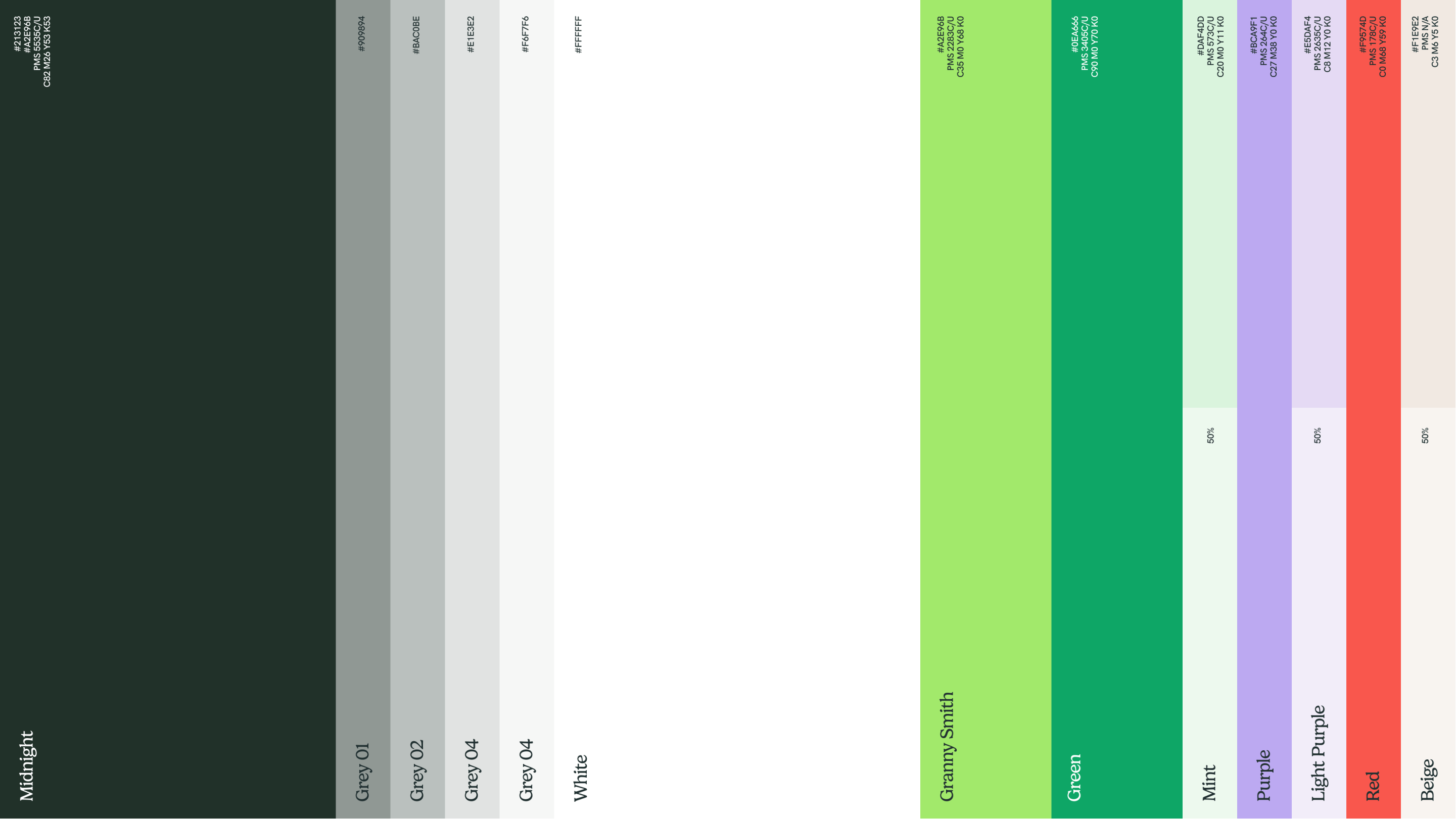
Insurely color spectrum
Lastly, do you have any advice or pro-tips for designers embarking on branding projects like this?
Spend the proper time on preparatory work, take time to truly understand the client, discuss early ideas and learn from each other – and the rest of the process will work a lot more smoothly.
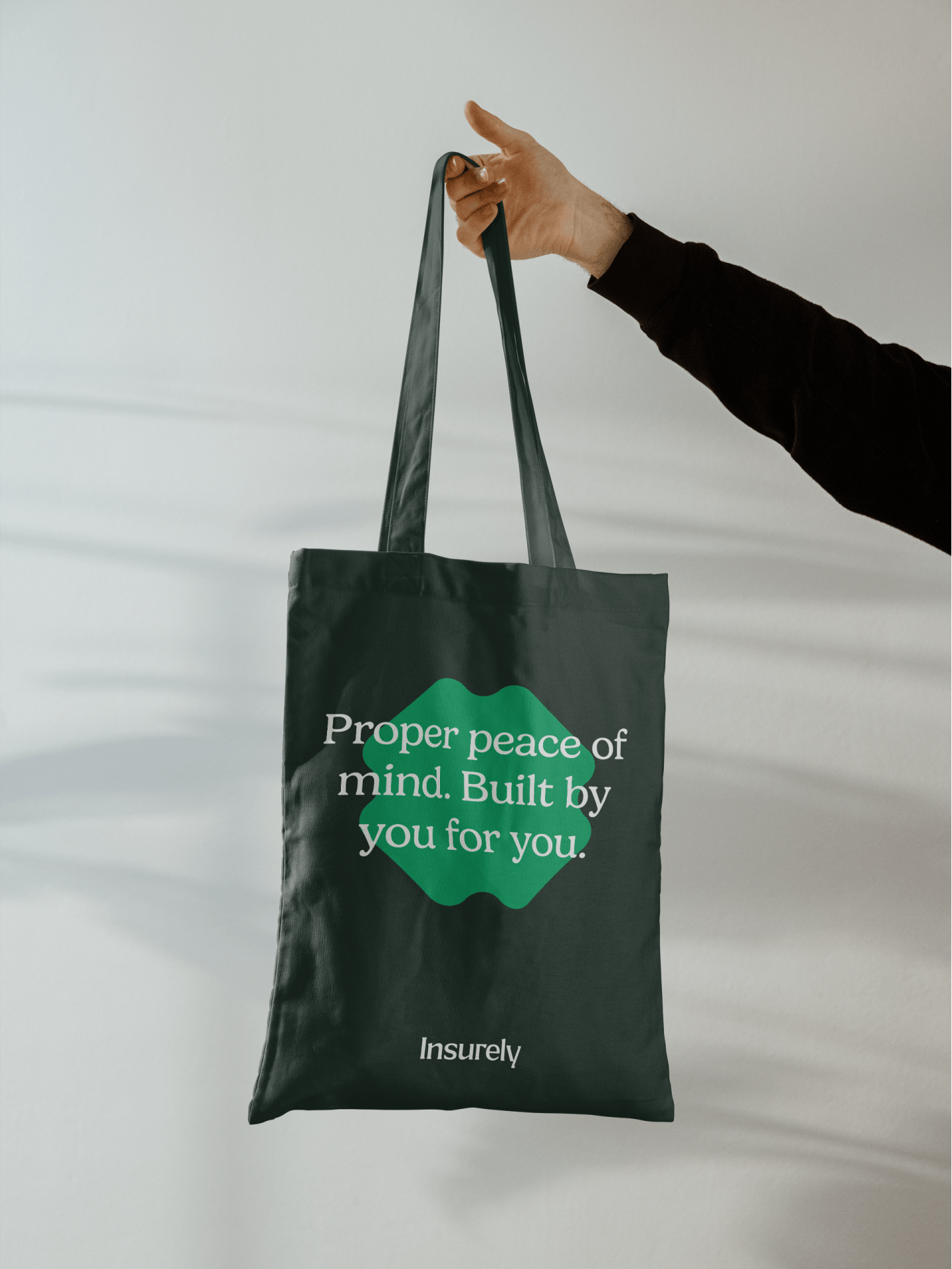
Insurely bag
