before
after
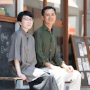
Interview with Hiroko Asabu (alongside Osawa), Creative Director at MUI Coffee Roastery.
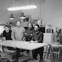
Federico Galvani (Founder & Creative Director), second from the right, with the team at Happycentro.
Can you share with us the history and development of MUI Coffee Roastery, and explain how the idea of rebranding came about?
MUI Coffee Roastery was founded in 2013 by Mr. Osawa, former head roaster at Horiguchi Coffee, a pioneer in Japan’s specialty coffee scene. With the vision of “bring special moments into your everyday,” MUI focused on delivering high-quality coffee to the lives of people who truly love the essential goodness. Over the years, it built a loyal following, but shifts in the industry led to challenges that prompted the need for rebranding.
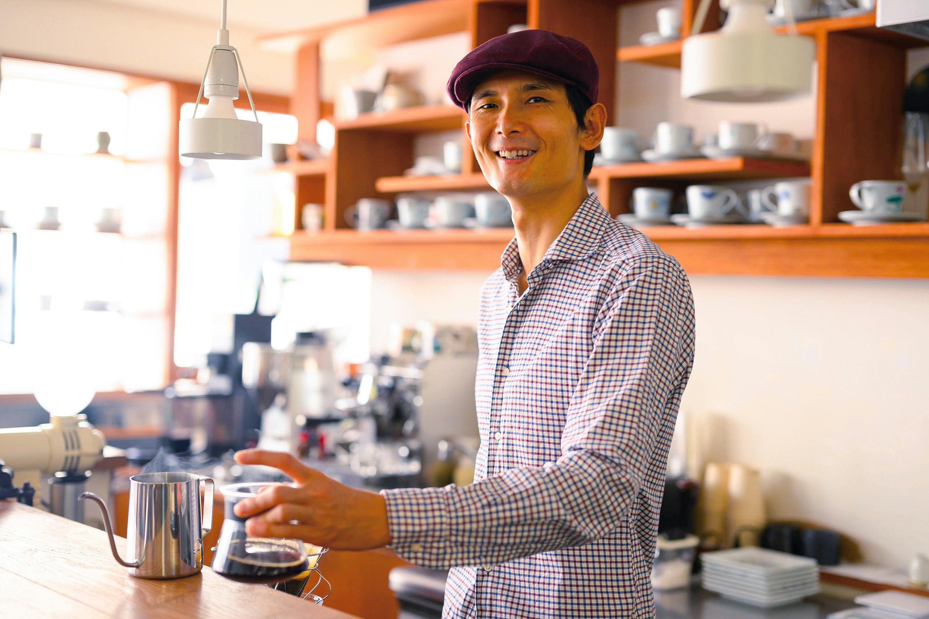
Osawa - Image Courtesy by MUI Coffee Roastery
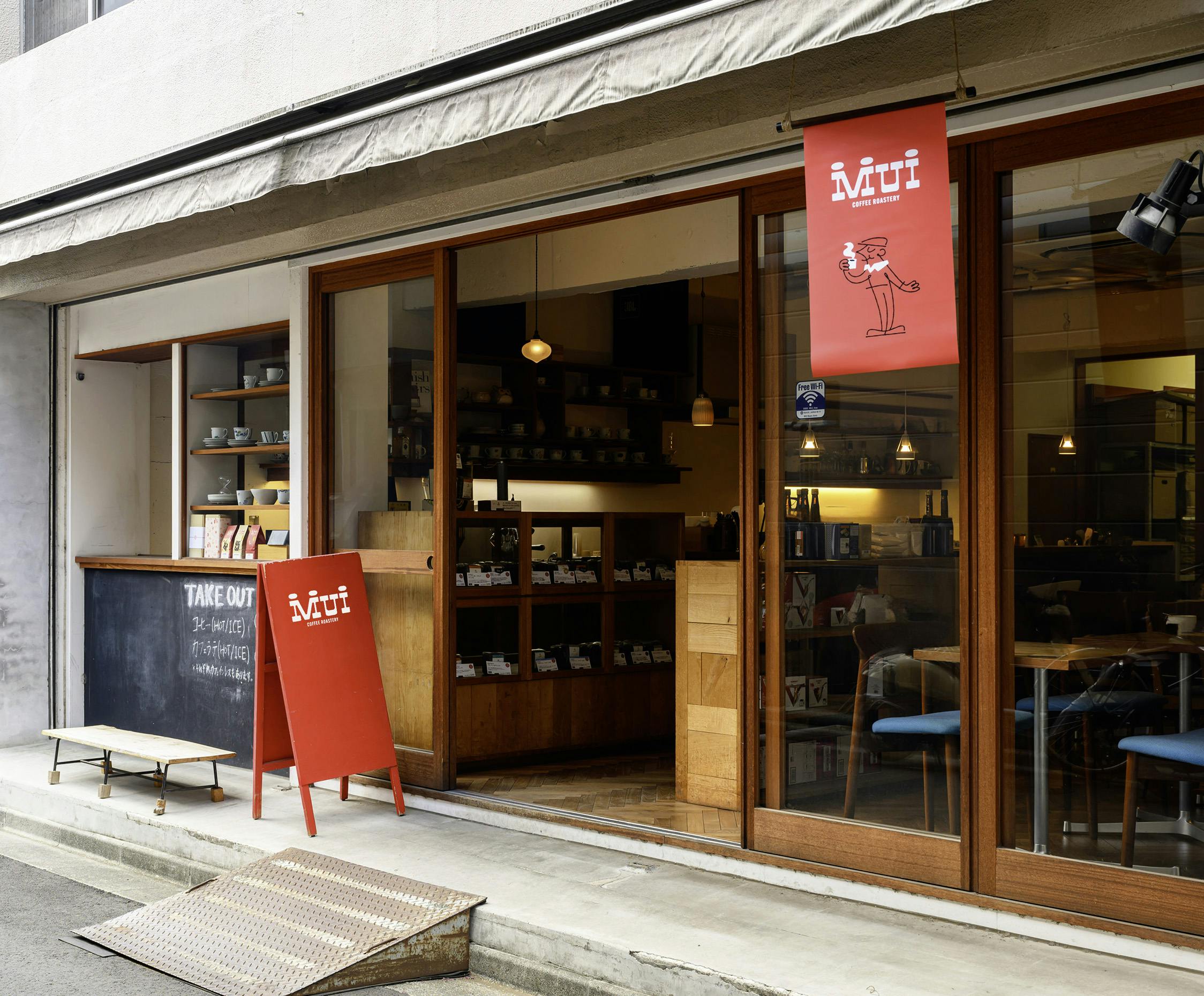
Image Courtesy by MUI Coffee Roastery
What motivated MUI Coffee Roastery to rebrand?
The coffee market changed drastically, presenting two major issues:
- Information Overload – The rise of social media made it easier for misinformation to spread (misconceptions about roasting, fermentation, and brewing methods), leaving consumers unsure of what to trust.
- Market Saturation & Misguided Differentiation – The pandemic led to a surge in new roasters due to easier access to roasting technology and e-commerce. Many brands prioritized uniqueness over quality, making it harder for consumers to find truly great coffee.
In response, MUI rebranded in 2024 to position itself as a trusted brand for those seeking genuinely good coffee.
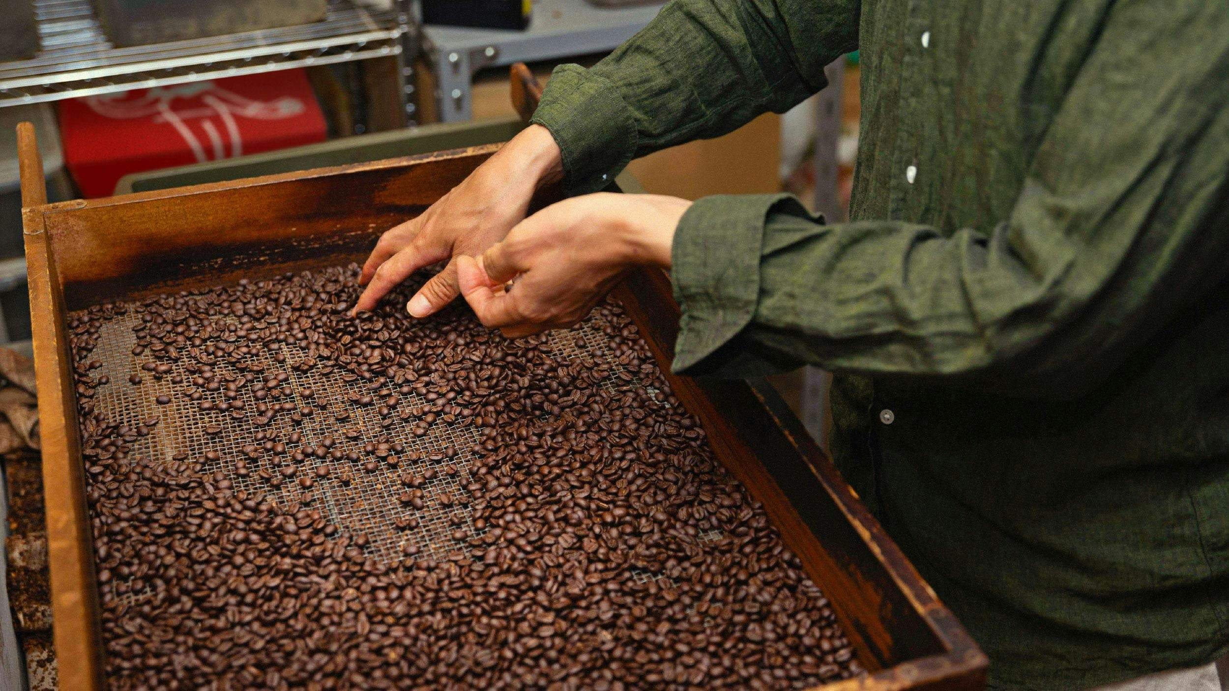
Image Courtesy by MUI Coffee Roastery
How did the rebranding idea take shape and why did MUI choose to collaborate with Happycentro?
MUI’s original branding lacked a clear representation as a coffee roastery. The logo was minimalistic but didn’t communicate its focus on coffee, and the packaging wasn’t designed to grab attention.
On its 10th anniversary, MUI sought a new identity that would:
- Clearly express its role as a specialty coffee roaster
- Create eye-catching packaging that connects emotionally with customers
After searching for a local design agency without success, MUI turned to Happycentro, an Italian design studio known for its work in chocolate packaging, aligning with MUI’s vision for thoughtful, artisanal design.
Though MUI had no prior connection with Happycentro, they reached out enthusiastically, confident that the studio’s expertise and creative approach would be the perfect fit for their rebrand.

Happycentro Team
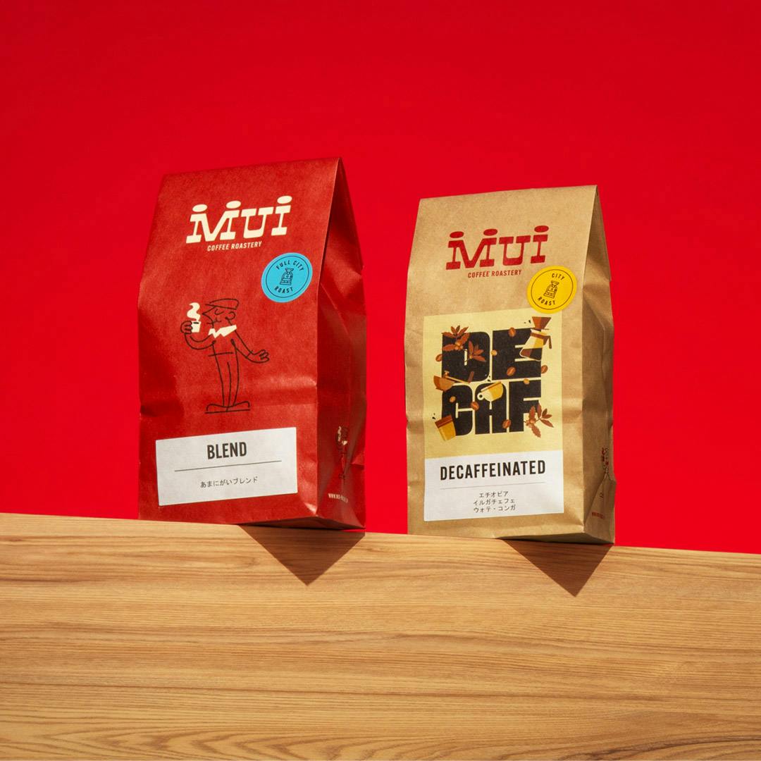
Image Courtesy by MUI Coffee Roastery
Can you share more about the concept behind using illustrations inspired by Italy's Carosello TV show?
Carosello was a big part of Italian advertising history, known for its creative and playful storytelling. It had a simple, memorable style that made ads feel fresh, positive, and easy to understand. Many people still associate it with the charm of Italy’s Dolce Vita era, a time known for elegance and enjoyment.
By using this inspiration, MUI and Happycentro wanted to create a unique and recognizable brand look. The hand-drawn illustrations give the packaging a friendly and nostalgic feel, making it easy for customers to connect with. The slightly naïve style isn’t just visually appealing—it also brings out warmth and emotion, helping MUI feel both sophisticated and approachable.
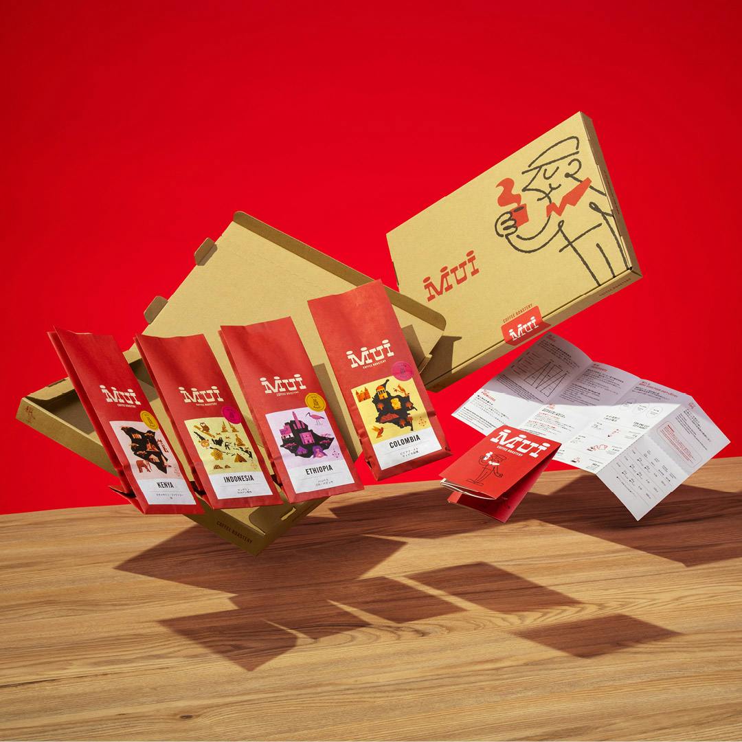
Image Courtesy by MUI Coffee Roastery
What inspired you to blend Italian and Japanese cultural elements in MUI Coffee Roastery's new brand identity?
Both Italy and Japan have a strong culture of using mascots in advertising. In Japan, this is often described as “KAWAII”, meaning something cute and charming.
Adding a character to branding—especially one that feels lively and animated—helps create a fun and engaging connection with people. It doesn’t just appeal to children but also speaks to the playful side in all of us. By blending these cultural influences, MUI wanted to build a fantastic and immersive brand world that feels inviting and memorable.
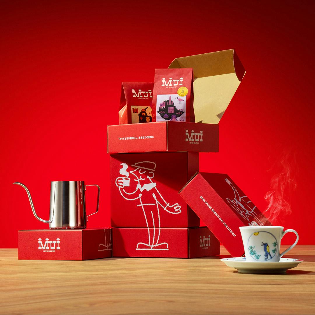
Image Courtesy by MUI Coffee Roastery
What were the main challenges in redesigning MUI Coffee Roastery's brand identity?
The biggest challenge was finding design elements that could keep MUI’s visual story consistent and meaningful. The solution came in the form of the two dots above the “M” in the logo.
These dots represent two coffee beans, but they also symbolize two characters holding hands, expressing the idea of sharing and connection—just like a coffee break brings people together. This small but powerful detail helped maintain the brand’s identity while adding a deeper message.
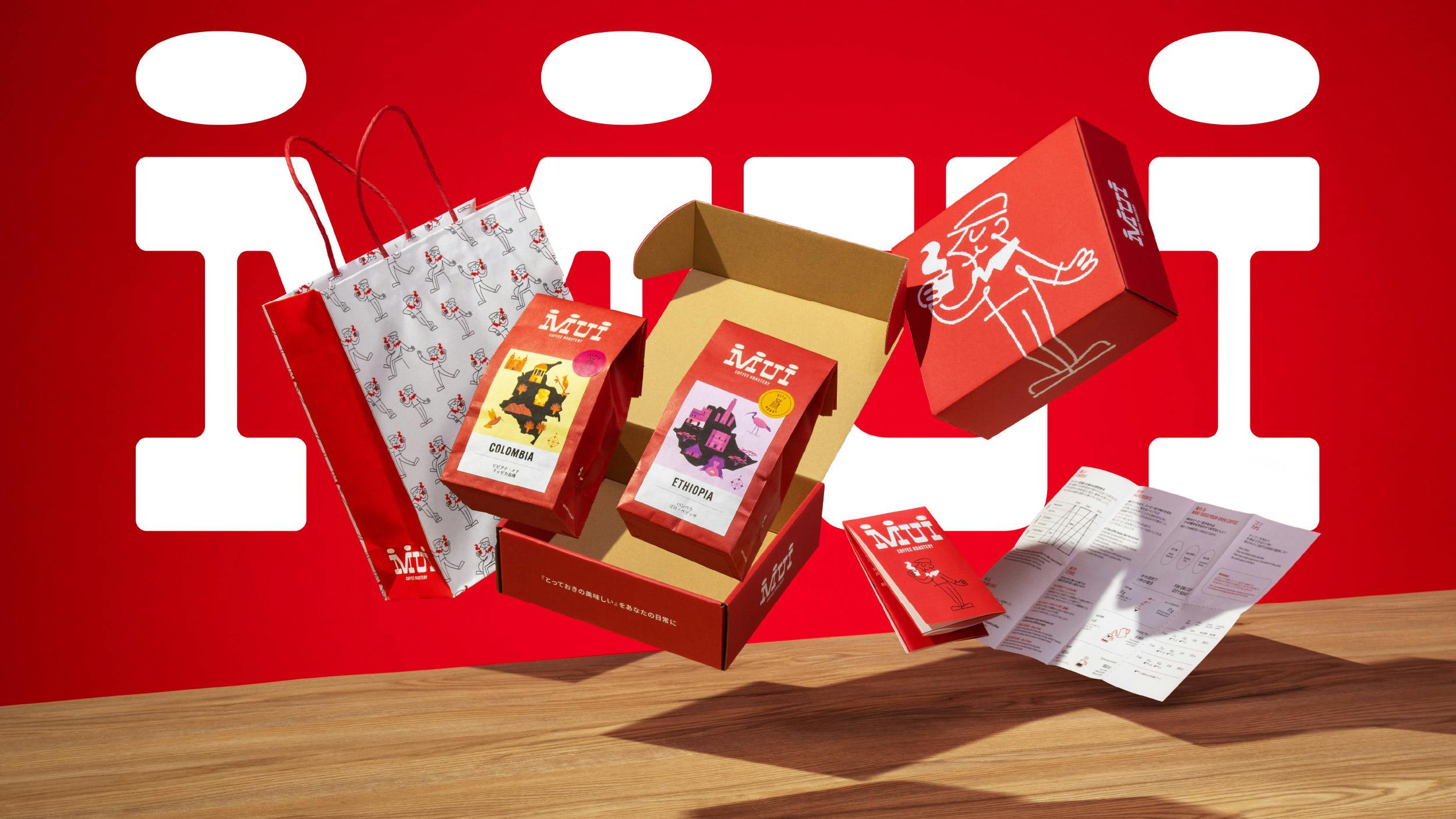
Image Courtesy by MUI Coffee Roastery
Can you share with us the reason for choosing red as the primary color for the brand?
While the coffee labels come in different colors to distinguish varieties, the overall brand is deeply rooted in red. This bold shade was inspired by the sun in the Japanese flag, symbolizing energy and vitality. In addition, a red signboard has long been a mark for the MUI store and loved by locals.
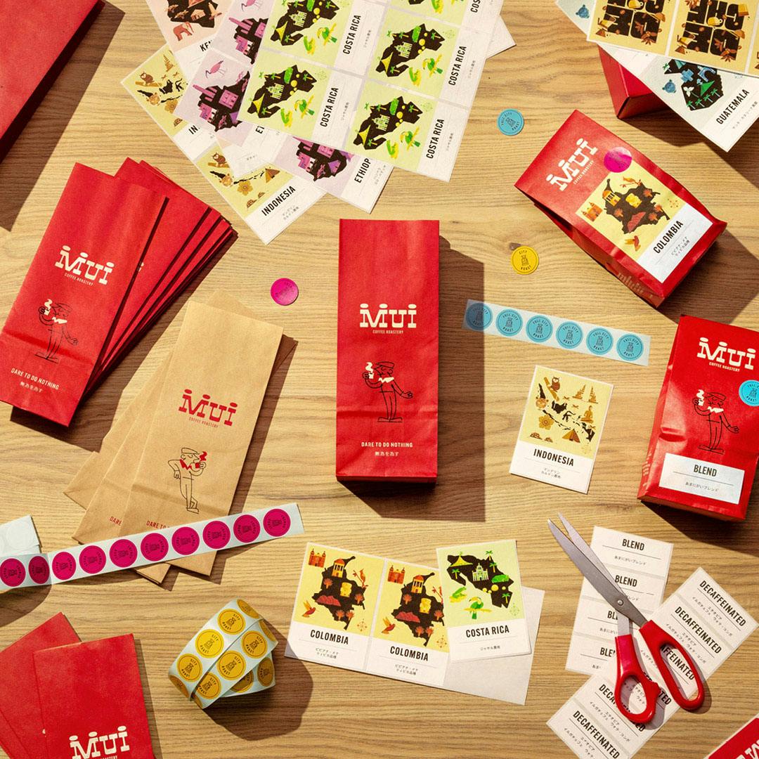
Image Courtesy by MUI Coffee Roastery
Red also reflects the natural color of coffee cherries when they ripen, just before they are harvested and roasted. This connection to both Japan, MUI’s heritage and the coffee-making process makes red the perfect choice to represent MUI Coffee Roastery.
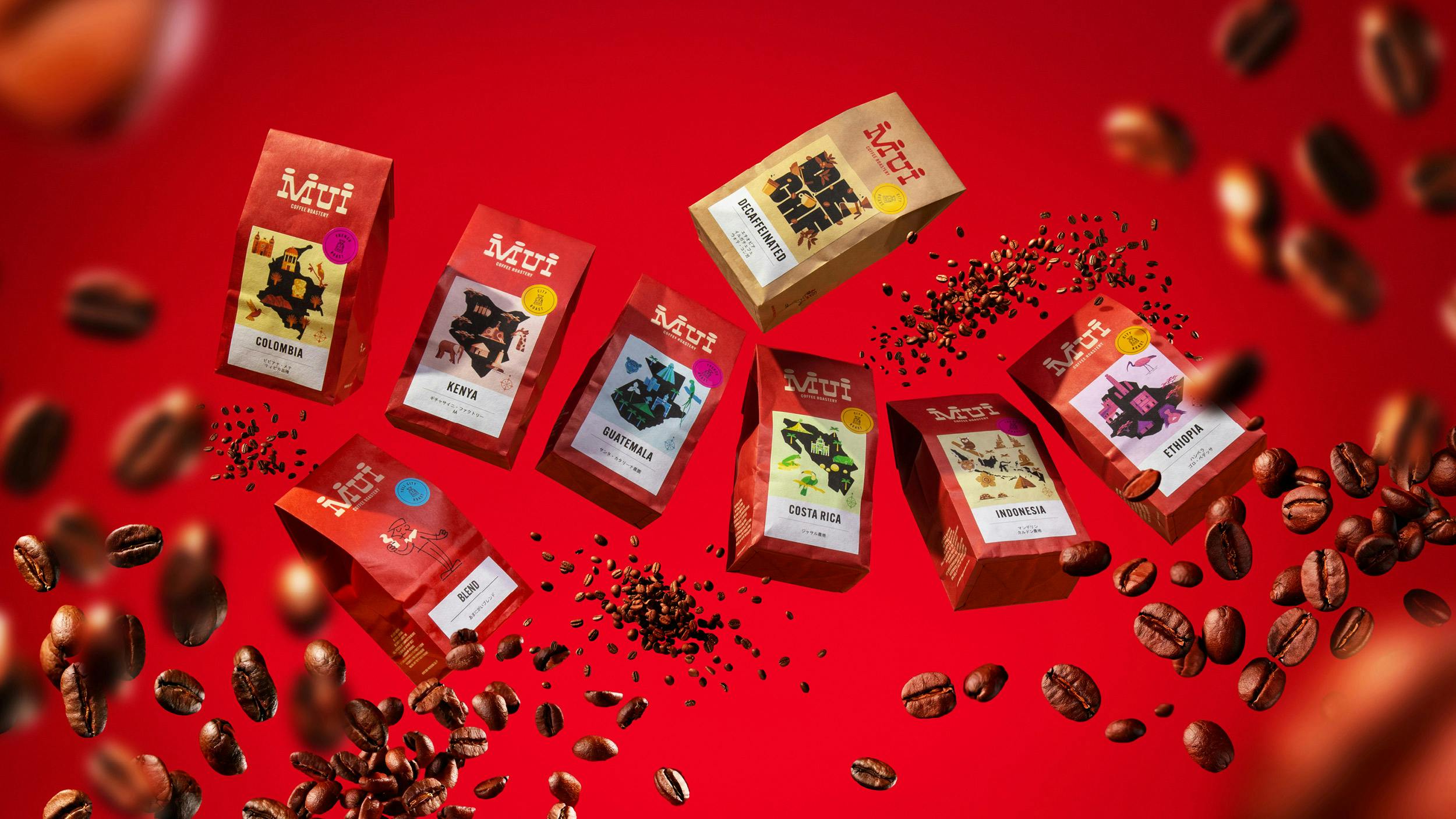
Image Courtesy by MUI Coffee Roastery
In what ways does the rebranding aim to differentiate MUI Coffee Roastery from other coffee in the market?
MUI Coffee Roastery is a small-batch roastery that focuses on using only the finest ingredients and perfecting the roasting process. The rebranding was designed to reflect this dedication to quality and craftsmanship.
One of the standout features is the illustrations on the packaging, which visually tell the story of the coffee’s origins—down to the name of the farm where the beans were grown. This creates a "bean-to-bar" experience, making the journey from farm to cup more transparent and engaging.
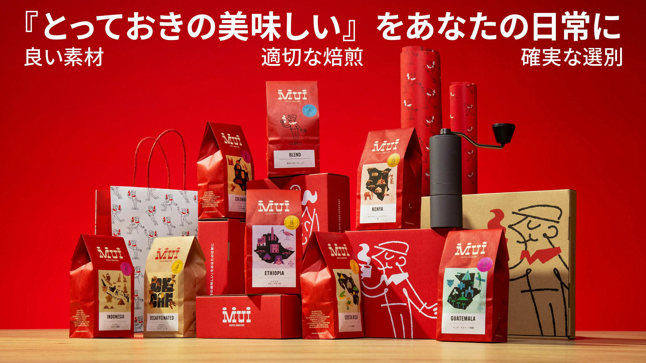
Image Courtesy by MUI Coffee Roastery
Additionally, each package is handcrafted with great attention to detail. The labels and stickers are applied entirely by hand, reinforcing the artisanal nature of the brand and setting MUI apart in a market filled with mass-produced products.
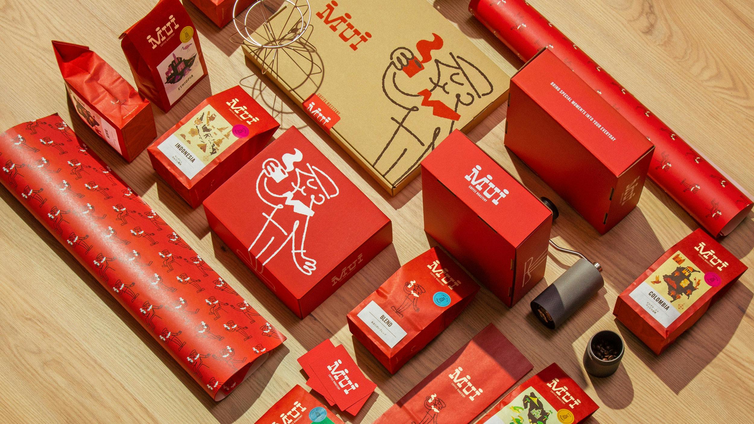
Image Courtesy by MUI Coffee Roastery
Is there a specific part of the rebrand that felt especially rewarding or significant to you?
We are very happy with the overall result. One of the biggest challenges was designing a packaging system that could handle many different combinations, materials, and formats—from coffee boxes to gift packaging and shopping bags.

Image Courtesy by MUI Coffee Roastery
At first, organizing all these elements was difficult and required a lot of effort. But in the end, we created a system that is both highly practical and visually engaging. Seeing everything come together in a way that works efficiently while still looking fun and unique made the whole process especially rewarding.
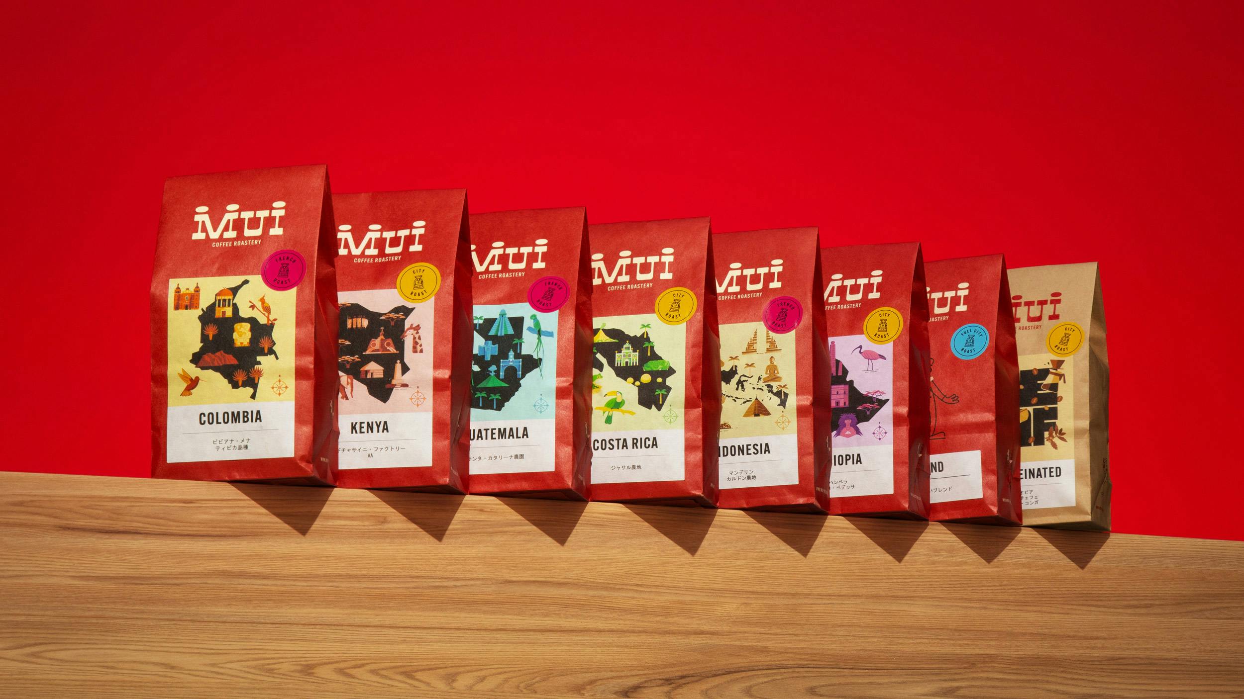
Image Courtesy by MUI Coffee Roastery
"We wanted our brand to tell a story—one that reflects the care in our roasting, the journey of our beans, and the joy of sharing good coffee. Every detail, from the illustrations to the handcrafted packaging, is designed to create a meaningful connection."
