before

after

Alex Leduc is the CEO and founder of Perch. Prior to starting Perch, he worked in the real estate sector for eight years in various corporate finance, strategy and analytics roles. In addition to hands-on experience in the industry, he is a graduate from the Ivey Business School (Western University) and a CFA Charterholder.
Perch logo animation
Can you introduce us to Perch and the exciting things it is doing these days?
Perch is a tech company that gives personalized financial insights to help optimize a buyer's path to homeownership. Once a homeowner, we enable them to build wealth by putting their home equity to work. All of this is made possible through a highly skilled network of professionals and our proprietary analytics platform.
Recently, Perch became the first in Canada to release a tool that provides users with real-time mortgage rate quotes through predictive modeling.

Walk us through your company’s brand identity through the years. How were the past brands conceptualized?
When the company was first founded in 2018, we were called “Mortgauge”. We were purely a tool that helped people compare mortgage rates (gauge their mortgage options, hence the name). As you may have guessed, I came up with the name myself and had the logo created through a round-robin UpWork proposal where a bunch of designers I paid $20-50 submitted proposals.
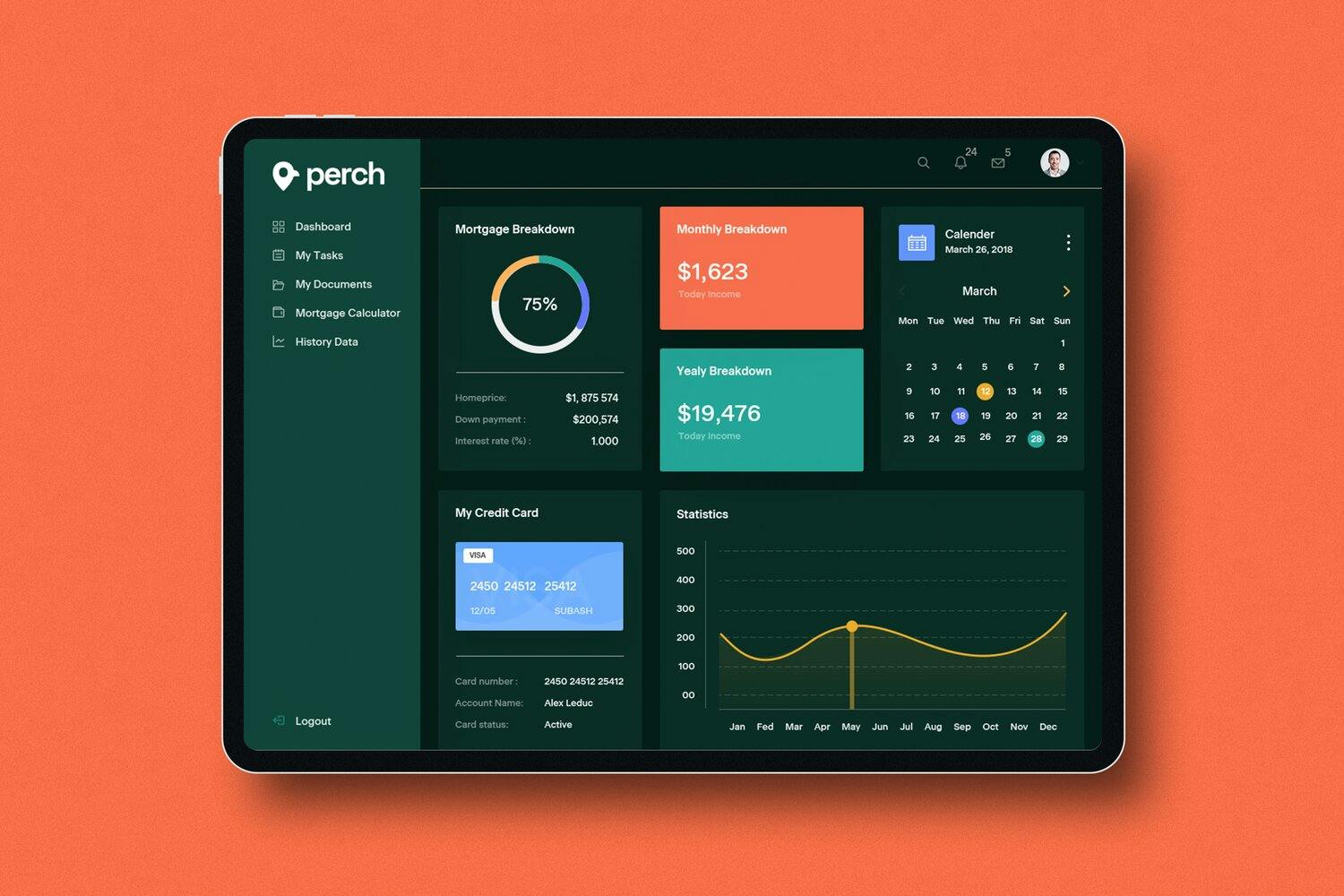
Perch website dashboard
However, our users validated that the mortgage experience itself isn’t the main driver, but rather it’s homeownership that is the primary motivator. Taking that feedback into consideration, we then expanded our product verticals to help users achieve those goals, while still helping them with their mortgage as one part of a bigger journey.
The product vertical expansion helped us find product-market fit, but then we realized our name wasn’t working for us anymore. To come up with a new name, we hired Rethink (a creative agency out of Vancouver) to help us come up with a new name and a new logo. It was a really great experience and we are all happy with the outcome.

Perch color palette animation
About this current rebranding, how did it come about? How did that conversation start?
Our old name was giving us a ton of problems, to name a few:
- It was too close to the word “mortgage”. So people would assume that they only needed us later on when they needed a mortgage when the reality was that we could help them build a plan to buy a home even if they’re over one year from buying.
- Our product suite and company mission expanded. We moved away from focusing strictly on selling mortgages to offering services that enabled people to build wealth through real estate
- Many of our customers also had trouble remembering the unique spelling and pronunciation of the name ‘Mortguage’ and they didn’t “get” the play on words with “gauge” referencing an instrument to measure or calculate.
- It was an SEO nightmare. Google auto-corrected us to “did you mean mortgage?”, so it essentially made our organic search visibility non-existent. Not exactly a good start to building trust with clients when they can’t even search your name.
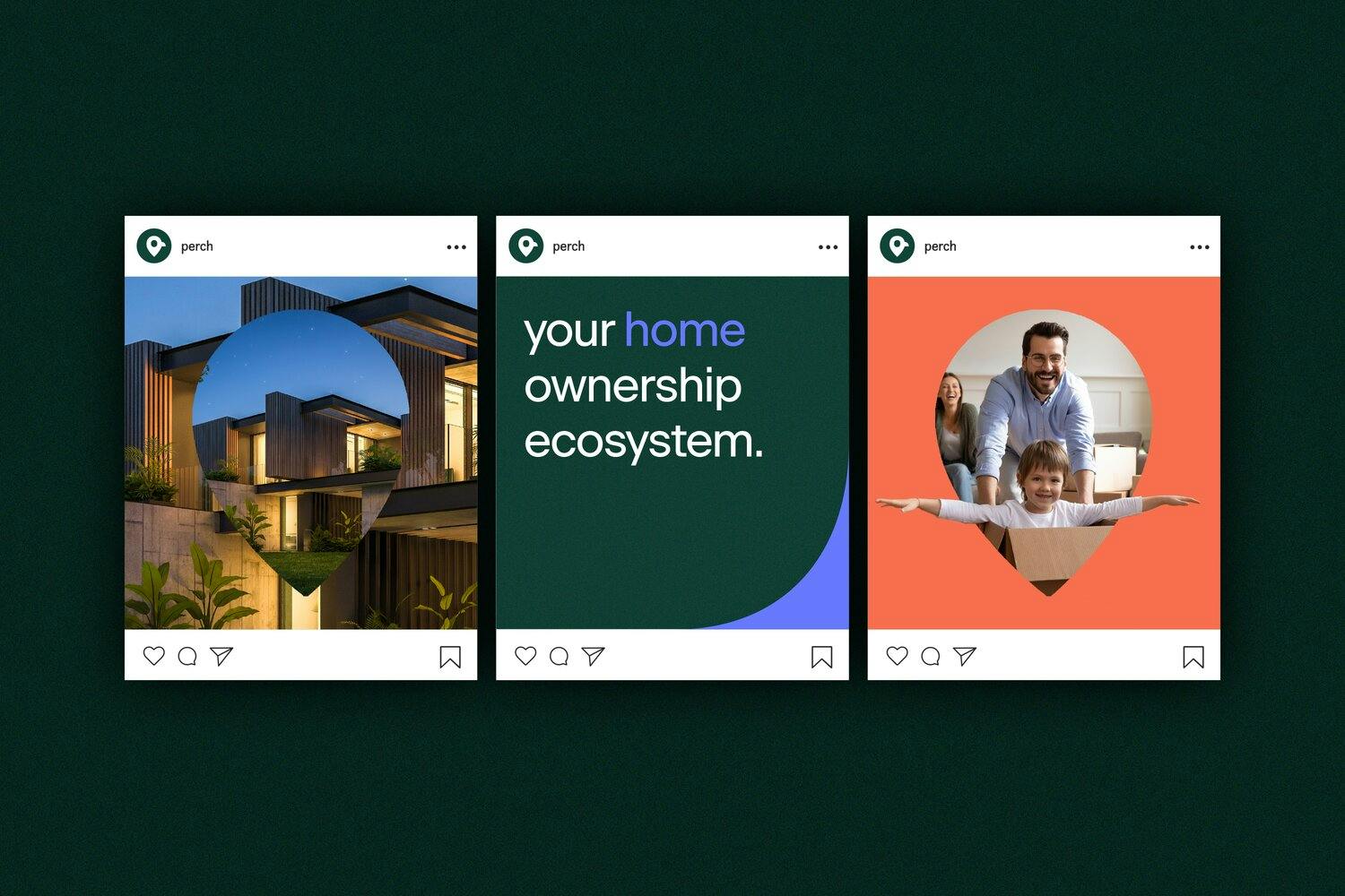
Perch Instagram posts
Perch pins animation
How did the rebranding process go? Was it all smooth, or did you encounter challenges?
The challenge we faced was deciding whether we should rebrand now, or later as we started scaling. Based on our product roadmap, we knew our offerings would be evolving and moving away from being centered on mortgages. We decided it was better to “rip off the Band-Aid” and rebrand now, rather than doing it later when we had more customers and more products to convert over.
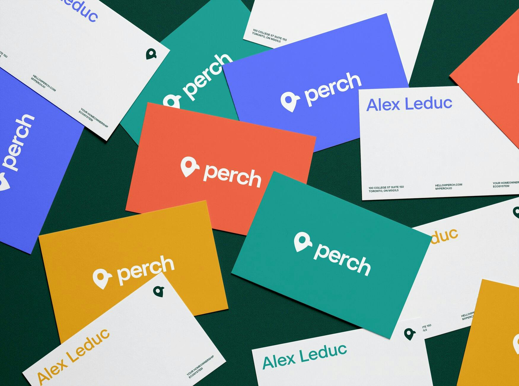
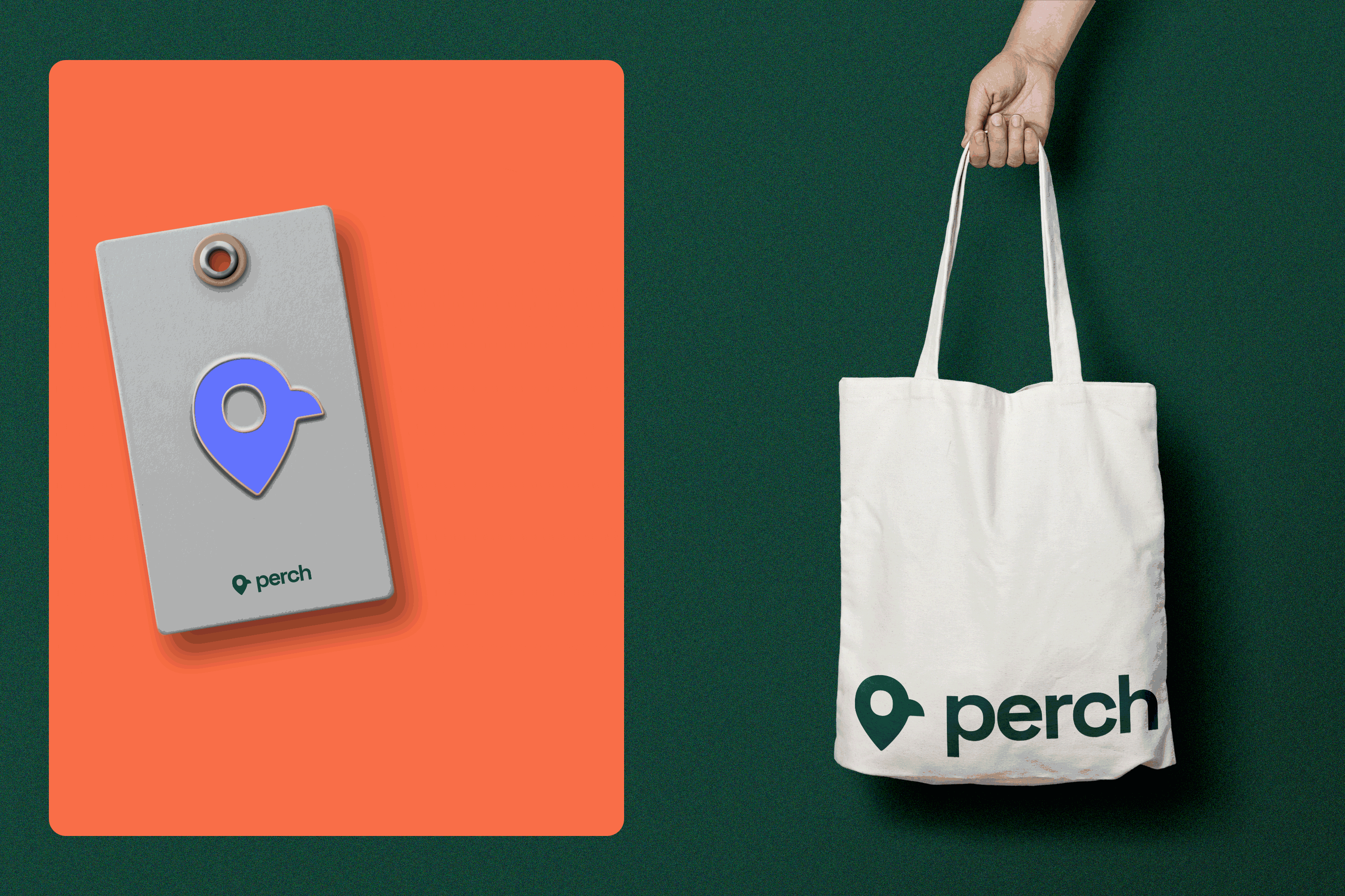
Perch business cards
A big change was to both your name and logo. Can you share with us that process? How was the logo conceptualized?
After working with the creative agency, we chose “Perch” for a variety of reasons:
- A perch is an elevated vantage point. We resonated with this because our platform helps users see opportunities that commonly would get overlooked by our competitors.
- The bird relates to a nest and a nest is the home.
- The name is easy for people to pronounce and spell
- People have no problem finding us on search. We just had to compete with fishing websites and quickly were able to rank on the first page.
As for the logo, we landed on a logo that incorporated a location pin and a bird which is associated with locations/properties. Especially for our target audience, our products resonate with first-time home buyers, millennials and those who are tech-savvy so the location pin was familiar to anyone using Google Maps.
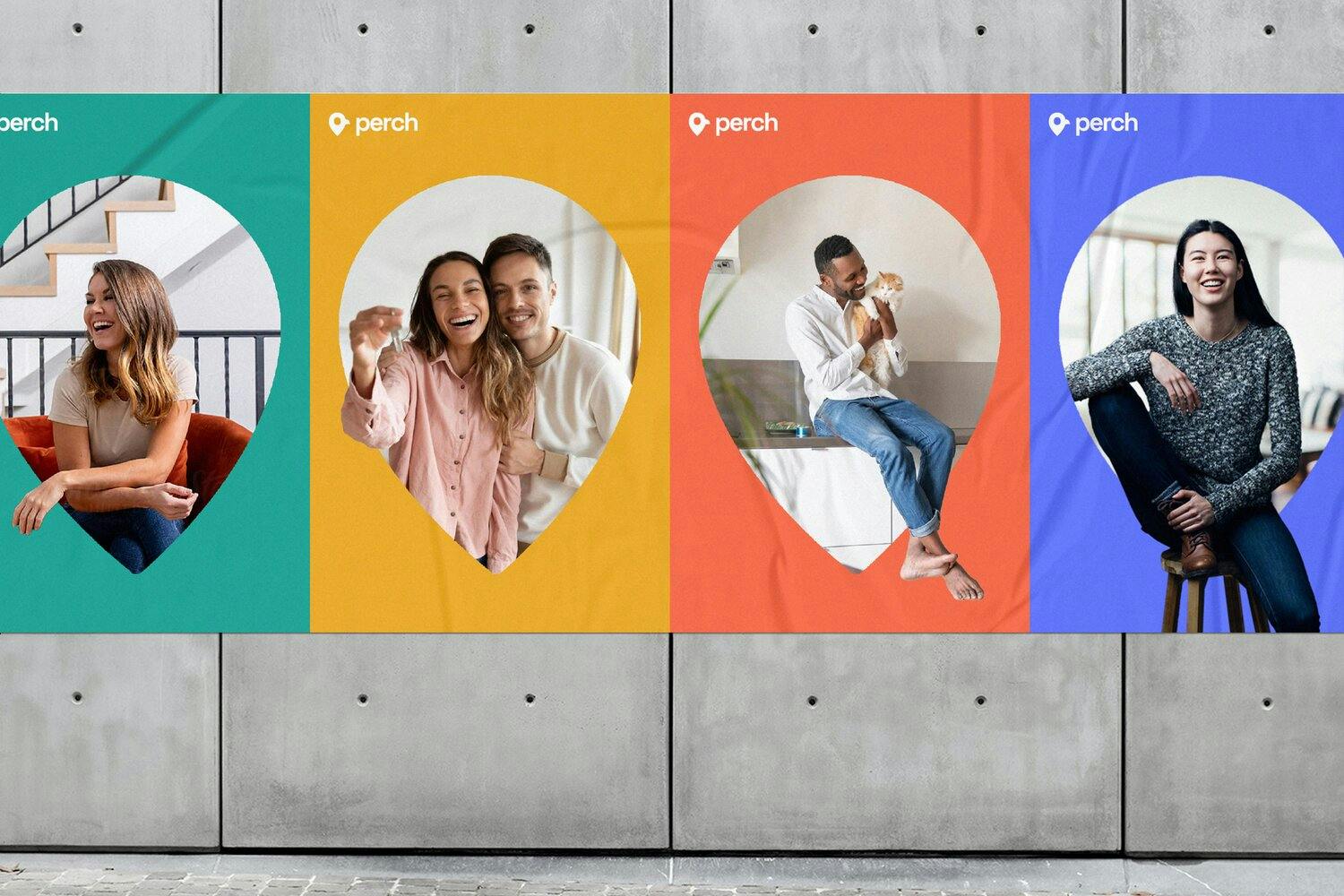
Perch posters
The color palette is also something that changed. How did you land on these colors?
We wanted to transition away from primarily purple hues (typically connected to wisdom, bravery, and spirituality) and towards a more versatile palette that would align with the tech and finance industries. We chose a deep green because we wanted something that is trustworthy and techy. In addition to the primary colors, we also chose secondary colors for flexibility, so we don’t have to stick to one or two colors all the time.
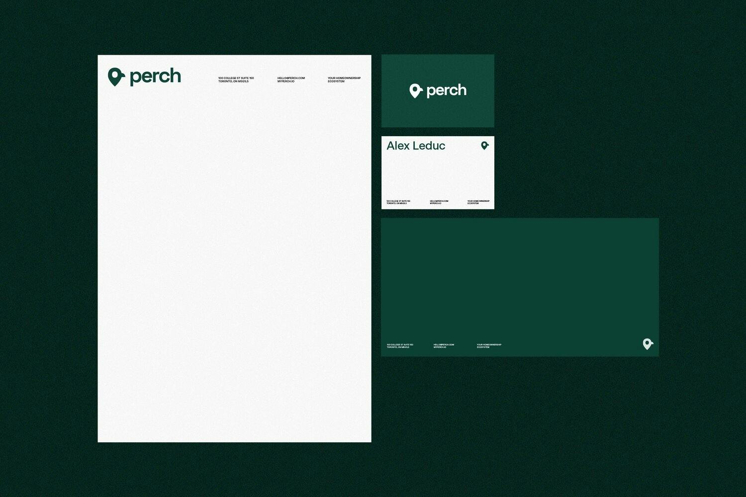
Perch stationery
Your new visual identity makes use of photos. Can you tell us more about your new photography direction?
We take a lot of pride in the connections we make with our customers/clients and using photography allows us to connect with our audience and relate to them. Taking on an illustration-heavy visual style didn't communicate the level of simplicity and authenticity we wanted. With photos, it gives us a chance to show real people and real use cases for what we have to offer, the lifestyle our users get to live, the problems we help them solve and more, instead of just a bunch of blue cartoons you can't really relate to. The human brain processes images 60,000 times faster than text, making it the fastest way for us to communicate information with anyone interacting with our brand.
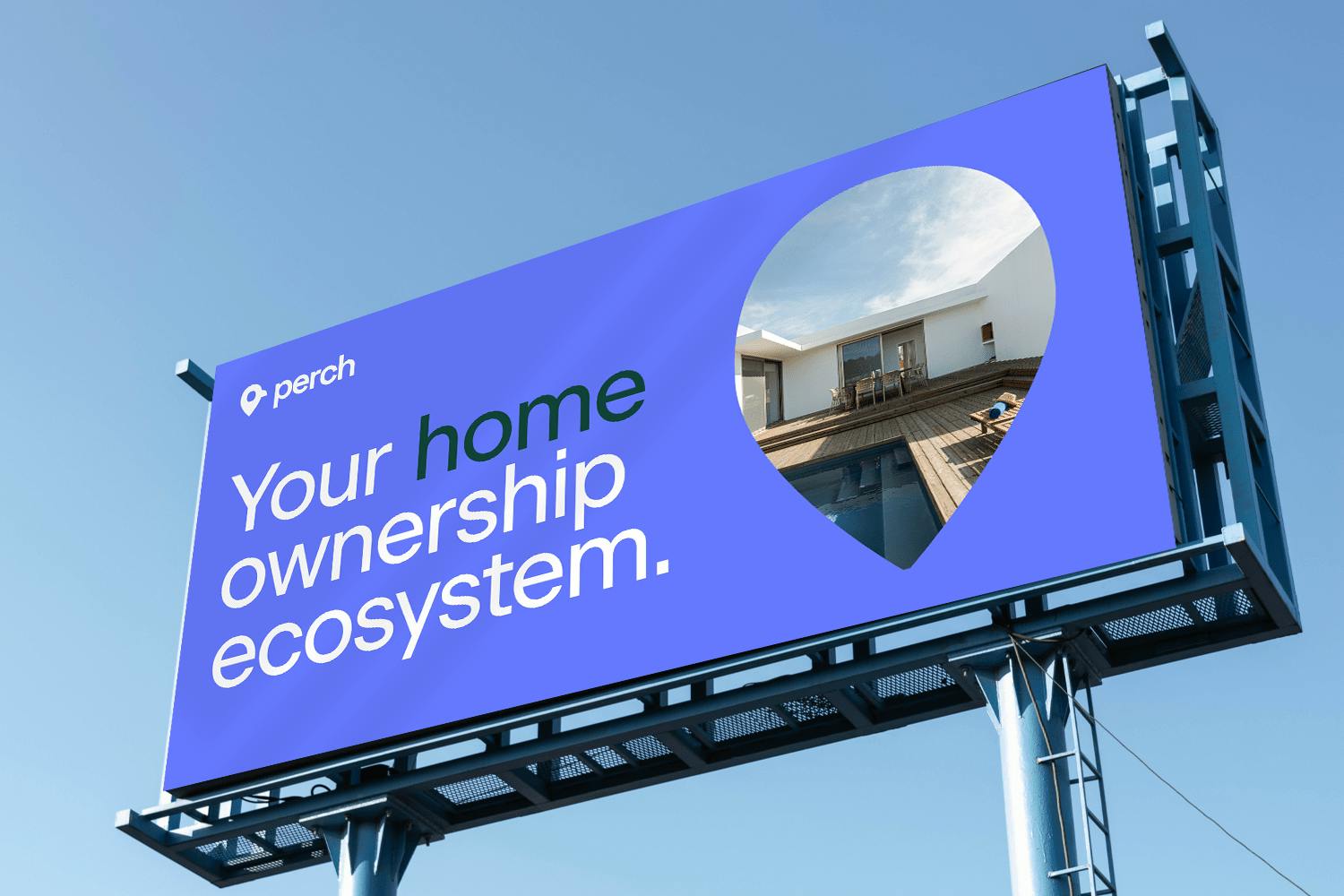
Perch billboard
Perch app icon
What is your major takeaway from this experience? Or, do you have any advice for brands or designers embarking on rebranding projects themselves?
The first thing before you even start to rebrand is to be sure to check for domain and social media handle availability. You want to ensure those are available for you to use. If you’re constantly having to explain your name or how to pronounce it, then the name may be too confusing or too clever for people. Another important takeaway is to know when to engage an agency versus doing it in-house. We didn’t have enough rebranding experience or creative resources to handle the development of a new identity ourselves. Finally make sure you’re aligned on the final deliverables, we received a new name, brand colors, fonts and examples on visuals, but it would have been nice to discuss positioning and copy direction as well.
For advice to brands or designers embarking on rebranding projects themselves, make sure you're doing it for the right reasons. Is your brand communicating with your target audience in the way you want it to? Is your brand memorable or is it confusing? Do you personally just want to rebrand because you're bored, or will it actually have an impact on your business' success in the long run? More often than not, you're not actually your own target market so don't make big decisions like this without gathering and analyzing some data first to ensure this is the right move.
All assets courtesy of Rethink.
