
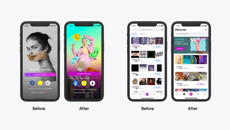
before

after

Shachar Aylon, Executive Creative Director at Picsart, talked about the importance of strategy, the value of having a well-defined brand persona, and working with different companies to focus on different aspects of the rebrand.
Can you tell us the story behind Picsart’s rebranding?
Over the year, Picsart has evolved from an app to a design platform. If you think about what users did with Picsart in the past, it was mostly self-expression — filters, stickers, brushes, selfies — things that helped a whole generation find a creative outlet, in ways they couldn't have in the past.
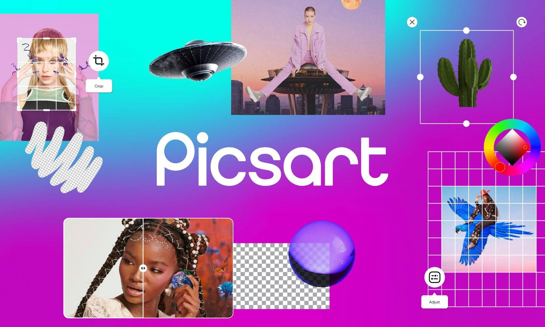
Picsart's new brand
So that begs the question, can we extend that offering to go beyond just self expression? When we look at the landscape today, especially with COVID, we see opportunities to help people with design well beyond just personal use.
"If we think about this new emerging economy — the creator economy — there is a lot of need for design out there that is not being met."
There are now all these platforms to help people start their own businesses online, and this is an opportunity for us to help them promote themselves with better design.
Were there any specific events that prompted this rebrand? Was it all smooth or were there pitfalls?
Before joining Picsart, during the interview process, I was surprised to discover that it has 150 million active users, 1 billion downloads, and consistently ranks at the top 20 free apps in the app store. Those are major signals that there’s already the right kind of attention, and that people really love the platform.
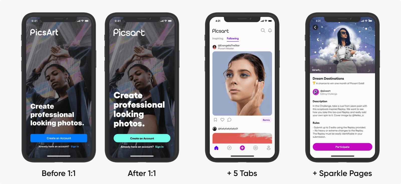
Picsart's mobile app
What was missing is that brand recognition. Picsart is not a household name or the app you immediately go to when you think about creating something . So I joined Picsart with that intention and challenge in mind.
"How do we take an already great product with a huge user base and make it even more well-known and accessible, not only for Gen Z, but beyond that?"
What was very clear to me when I joined is that before we even talk about a rebrand, before we even touch the design itself, we need to know what we want to say, how we want to position the company, and how we want to achieve that. So essentially, strategy and brand positioning. Aka brief.
"We spent three months in the beginning just identifying what our strong suit was, and how we wanted to stand out among the competition."
Where can we win in the market, how we want to position the company, etc. So those were some of the initial conversations that made the process pretty smooth internally.
Being aligned on our positioning, and where we want to go as a company also simplified our collaboration with external stakeholders.
Can you share with us the reason behind the change in your wordmark?
Changing a capital ‘A’ to a small ‘a’ may look like a small change, but for us, it is a big deal. It’s not only the name of the company, but symbolically it represents a new stage of Picsart.
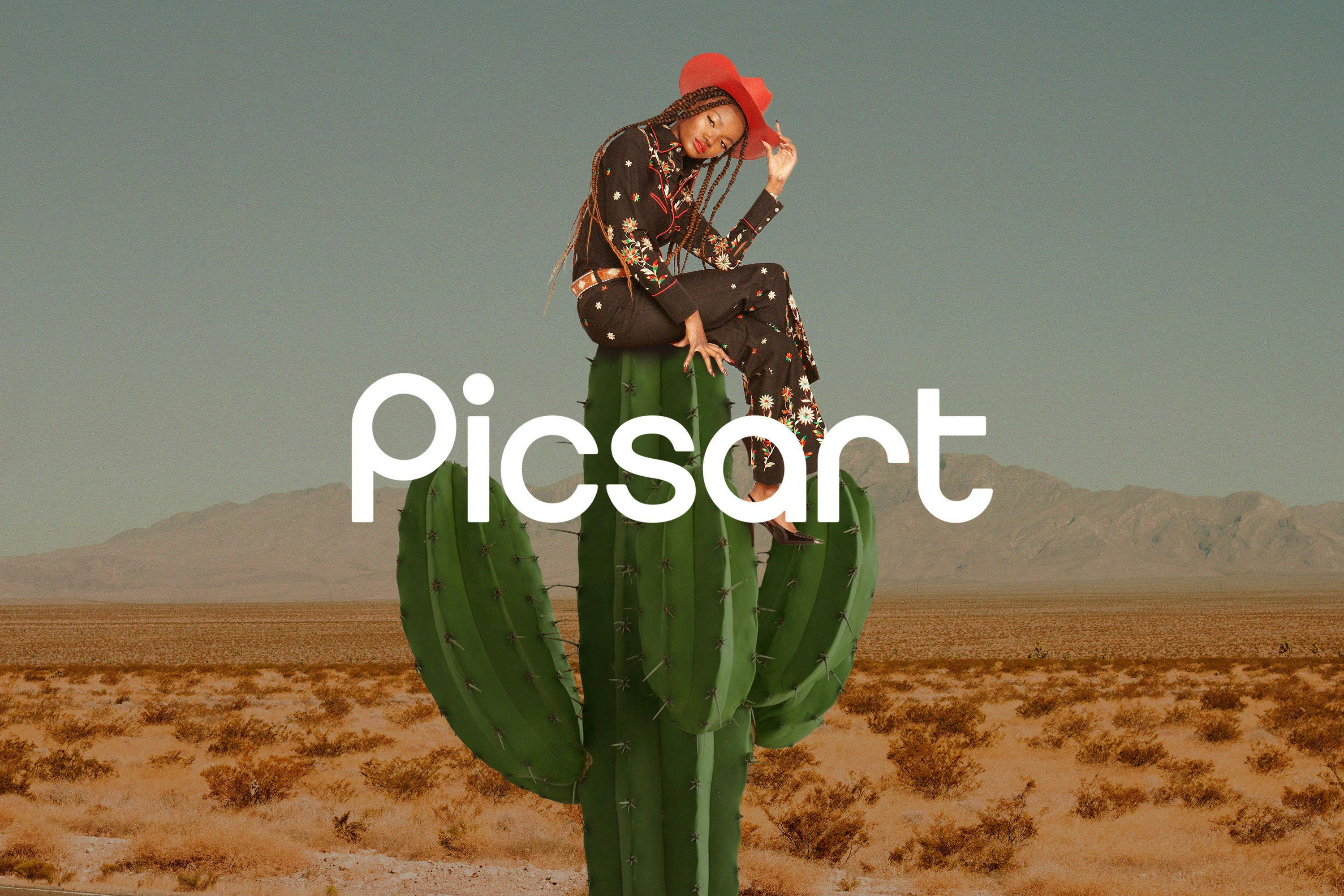
Picsart's wordmark
As a platform, we have gone way beyond just pictures and self-expression. We wanted to focus on the general idea of Picsart which is a design platform that allows you to design in a way that is easy and fun rather than only focus on ‘picture’ and ‘art’.
We wanted people to think about us as one idea rather than two separate thoughts or services.
What about your brand persona? How did you land on the archetype of the ‘rebel art teacher’?
Once we knew the strategy, and we started thinking about the visual identity of the brand, we knew immediately that the voice or how we come across in writing is just as important. We wanted to give that attention so we started working with Hermit, who helped us with the tone of voice.
As I mentioned in our blog post, the brand persona is a reflection of the personality, and type of person you'd like the brand to embody. This embodiment reflects in every touchpoint from our copy to our images and reflects how we come across.
Picsart's brand persona embodies the archetype of the "rebel art teacher"
We actually explored five different personas, and finally landed on one that we dubbed as the rebel art teacher. It felt like a perfect fit because we're trying to encourage a whole generation of people to take on a new skill, and we'd like to give them the confidence to design.
"If I'm going back to our strategy and thinking about what we're trying to offer people, it's that idea that anybody can design, so the archetype of the rebel art teacher that gave you the confidence to try new things felt natural."
We wanted that voice to be the anchor to our visual identity. If the visuals are expressive and pop-y and colorful and vibrant, we wanted a confident voice that pushed you to try new things, take on a new challenge, and maybe step beyond your comfort zone.
So I think the archetype of the rebel art teacher embodied that idea.
How did you choose Picsart’s new typography?
On a more conceptual level, we know that type has personality. Beyond what words we choose to use, what typeface we choose also emits a personality. So we explored a few typefaces during the early stages of the rebranding.
We landed on a typeface called Gilroy that represents that roundness, that kind of friendliness that the rebel art teacher has.
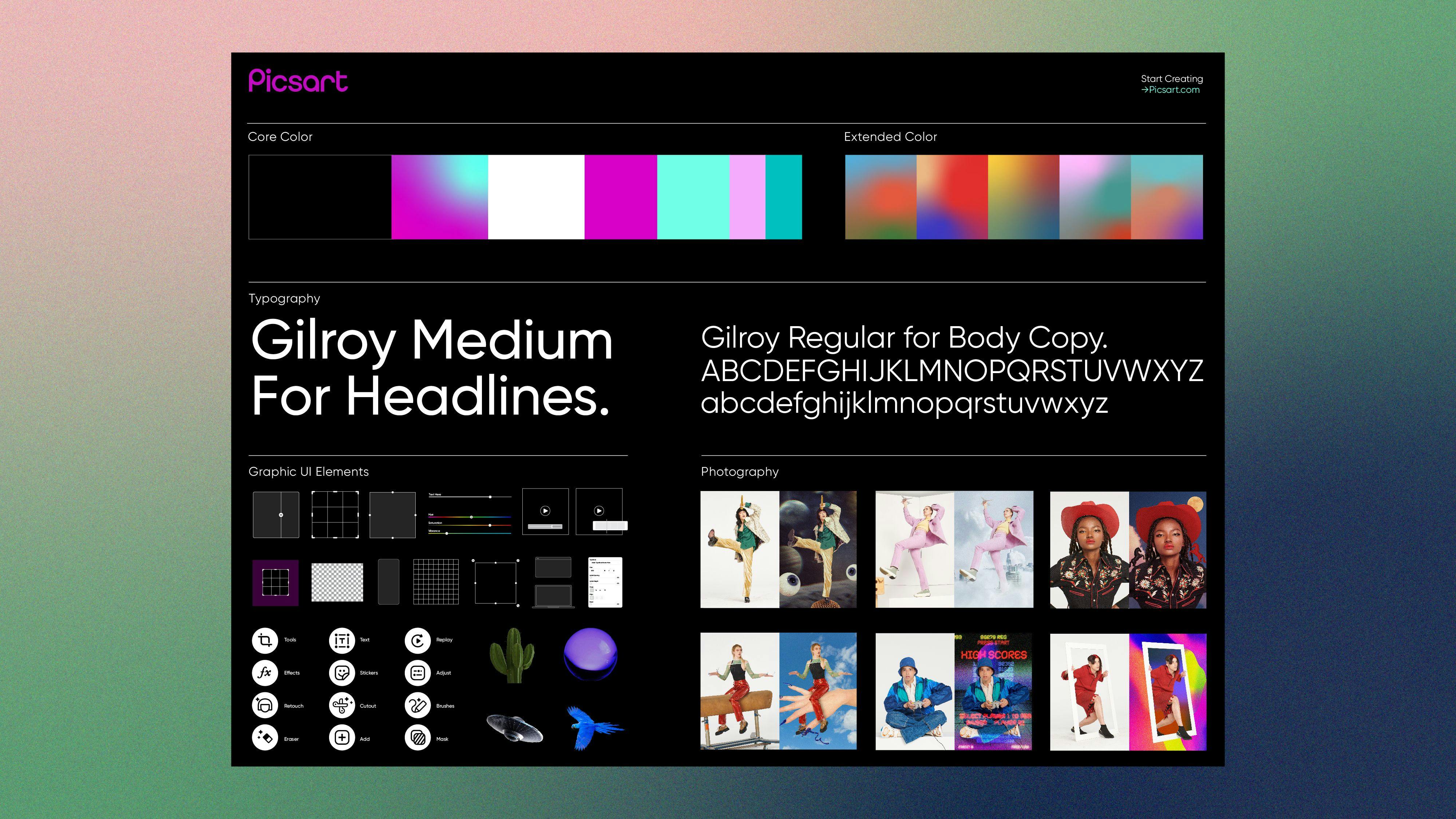
The Gilroy typeface
So that relationship between the tone of voice and the typeface needs to be a strong one. Sans Serif or Serif, cursive or big chunky letters? They all have their own personality. Knowing how you want to write, the tone, and what their relationship is with the typeface you choose is important.
What we also discovered throughout the process is that what might work very well in some channels like blogs, emails, advertising, might not work as well on small digital screens.
We had to think about all the different types of use cases for a typeface. And knowing that it can translate to multiple languages, work on different devices, different printing techniques, or different displays was important.
So beyond just the design aesthetic, there are a lot of technical aspects that you need to make sure that you vet before you invest in a typeface.
A big part of your new visual identity is your brand photography. How was this conceptualized?
What I loved about working with New Company and Jacq Harriet for photography is that it made us evaluate the function of brand photography when it comes to a design platform like Picsart.
Often, I've worked on brands or companies where brand photography is just people using the product. But here, photography is almost like our canvas, rather than starting with a blank white square.
"Photography is like our canvas, rather than starting a design with a blank white square."
When I think about our users, their starting point is actually photography. Maybe it’s a selfie, maybe it’s a photo of their product. But it usually starts with a photo. So we knew that we needed to reimagine what our version of stock photography is.
We wanted something that represented our user base and our type of expression, whether it's for your business, or for your self-expression, or for your personal use. We wanted to make sure that it came across as a strong visual identity of the brand.
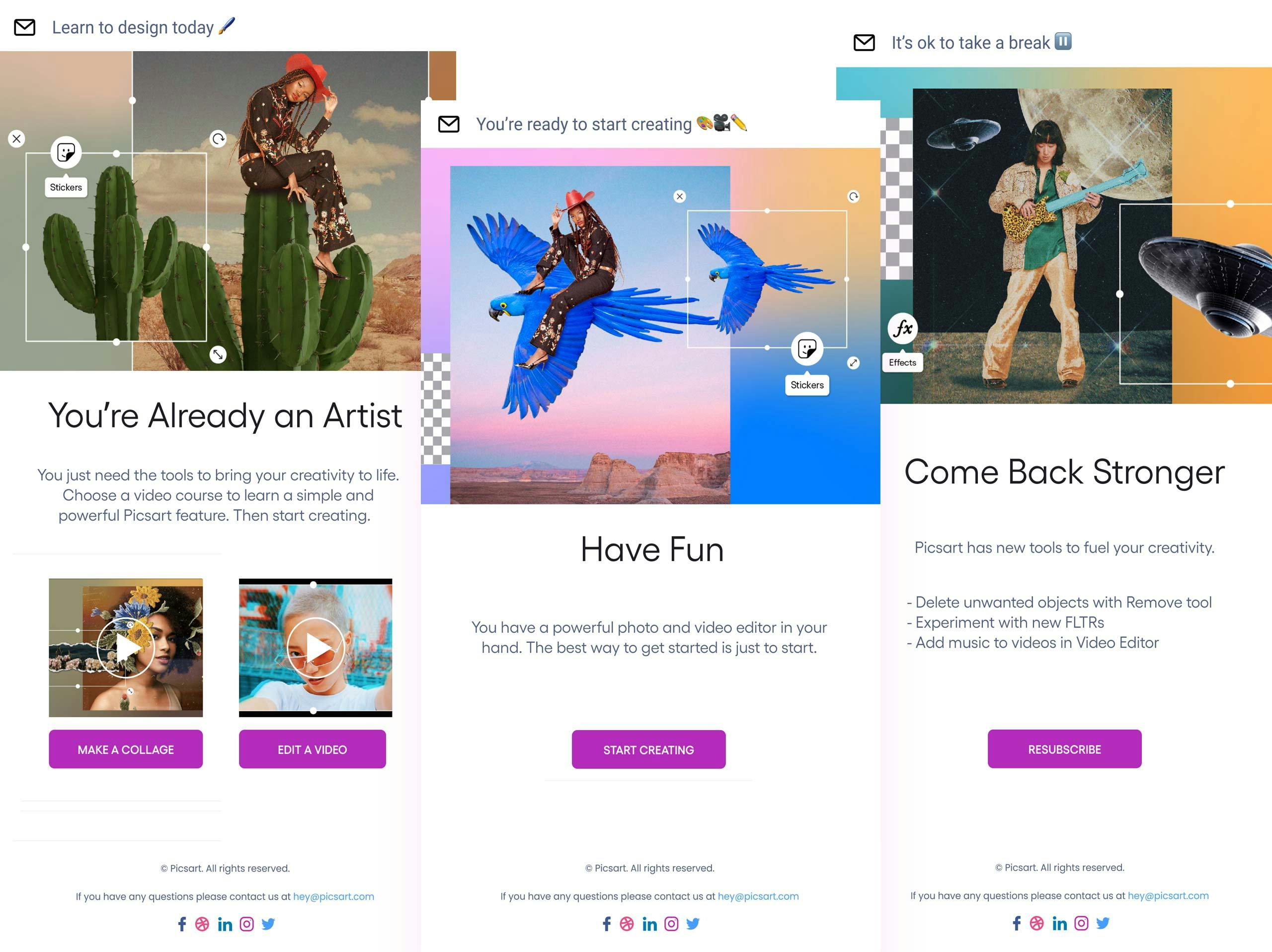
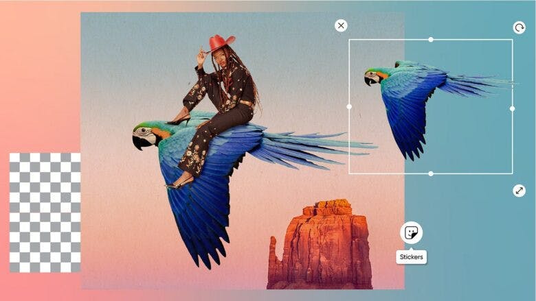
So we basically created our own version of a brand stock library, where we shot it all on white backgrounds, with the intention for designers to remix it into their own thing.
"We needed to reimagine what our version of stock photography is."
So that ability to reinterpret images feels like a perfect representation of our community because that's exactly what they do. They take one image, remix it, and then put it out into the community to be reinterpreted again.
You also make use of frames in this rebranding. Can you tell us more about this?
When I think about Picsart and what's great about our user community, they pretty much create every type of design out there: from fancy black and white photography to frenetic and expressive collage art. There’s every type of design on the platform.
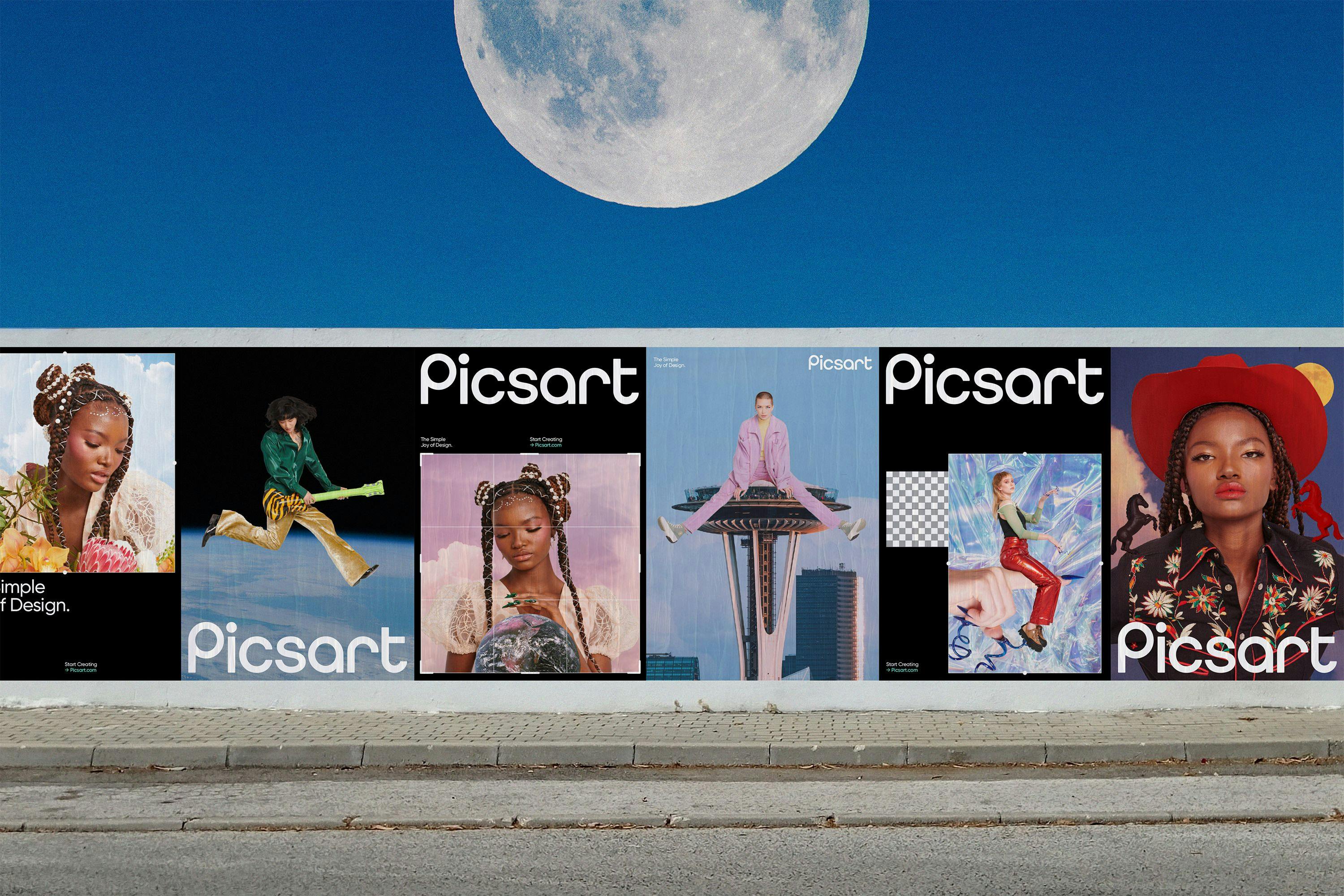
So that’s a unique design challenge for us. Because how do we hero these designs? How do we give a platform for all of these types of designs while keeping them consistent?
"I want to make sure that when we put out an ad or do something that is branded, that people immediately have that moment that they’re like, “I know that’s Picsart!”"
So our idea was that of a frame. It’s the same thing as in art museums and galleries. They have so many different types of arts, from oil paintings to digital photography and they still manage to keep it consistent.
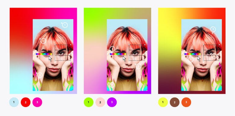
Around every image, every composition that we showcase or hero, and with our branding and advertising, we surround it with colors that are complementary, that is taken from the image itself. This basically adds a consistent element that is still variable to that image and creates a nice relationship between the brand and the composition we’re highlighting.
Finally, do you have any advice for designers who are embarking on rebranding projects?
I would say that before you even touch the visual frameworks, before you even do your logo or design, think about your positioning and your strategy. How do you want to come across to the world? That’s what we asked ourselves internally.
"Strategy is so important to get that end result in a smooth way without too much back and forth."
I think without knowing your goals or what you want to accomplish, it can potentially create chaos for you or any potential designer that might be working on the rebrand.
"You need to know what you want to do first, and then execute."
So I would just stress the importance of thinking upfront about what you want to accomplish.
If you think about the job of designers, you never jump into a finished composition. You always start with thumbnails. You start with different ideas, sketches, and then you identify the right solution.
