
Founded by Lane Cope and Sofía Vargas in 2016, Heavy is a branding studio based in Guadalajara, Mexico that focuses on creating brands with visual and emotional weight. The studio ethos stems from the idea that "brands are people," which carries throughout their method combining craft and creativity to create vibrant solutions for brands worldwide.
Can you tell us how this project came about? How did that conversation start with Señor Gonzales?
The project came about when the client reached out to us via email (I know, exciting stuff). She had seen our work on Behance and some design publications and was looking for a studio from Mexico to rebrand the restaurant.
This was one of the first projects we had worked on in the Middle East, and the prospect of working on a brand in Dubai was fascinating. Plus, a Mexican restaurant was a comfortable way for us to get a feel for future projects in that region. We were intrigued by the cultural differences but were acutely aware of the obstacles that it could bring about.
How did the branding process go? Can you tell us more about it? Where did you start?
The initial thought when we took on the brand was, "How do we make this obviously Mexican without making it the most cliché thing you've ever seen?"
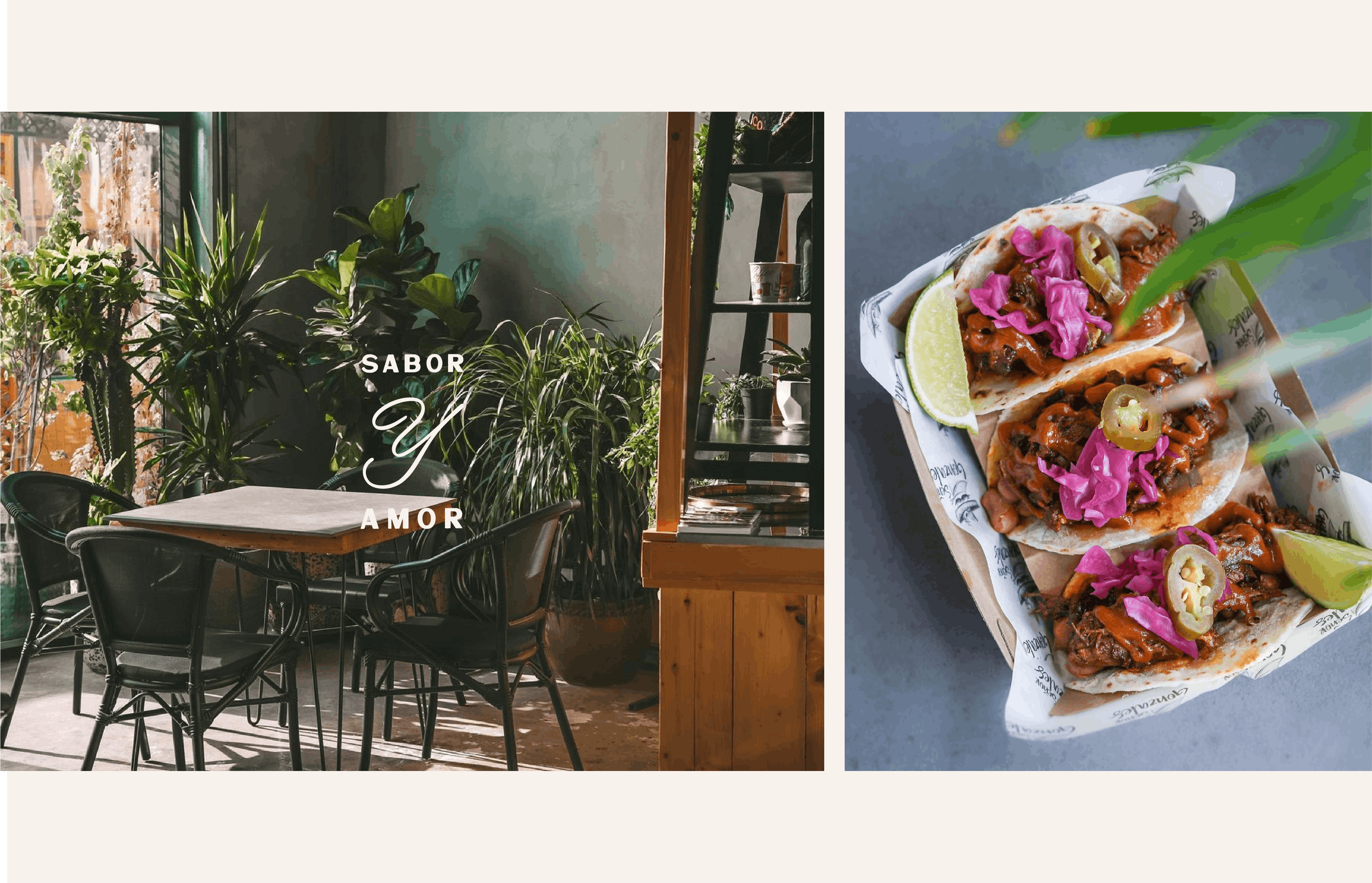
The way we conceptualized the brand during our process was that Señor Gonzales was an ex-pat that was excited to celebrate his roots. The core idea was that "Mexico is wherever you want it to be if you have the right attitude" (attitude being the keyword here). This freed us to approach the visuals in a more festive and contemporary way while firmly rooted in Mexican culture.
Our projects start with a solid Brand and Verbal Strategy that includes moodboards with visual paths the project could take. We had a couple of options for visuals, but in the end, the most illustrative and festive (and fun) was chosen.

Were there surprising challenges you encountered along the way?
One of the biggest challenges with the brand was not falling into the stereotypical tropes of what "a Mexican place" should look like. Obviously, we used a lot of visuals that lean on Mexican imagery, but the most difficult part was landing on a single style that we were happy with!
Also, during the development, we made some illustrations that were a little risqué and had to be pulled from the brand. This is a clear example of those cultural differences we talked about, which definitely caught us off guard. Fortunately, it wasn't a huge deal since we already had a pretty big surplus of visual assets, but always remember to do your cultural research!
Can you tell us the story behind the logo? How was it conceptualized?
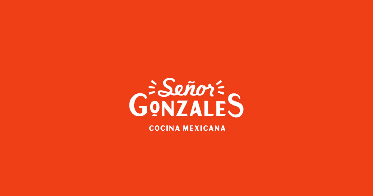
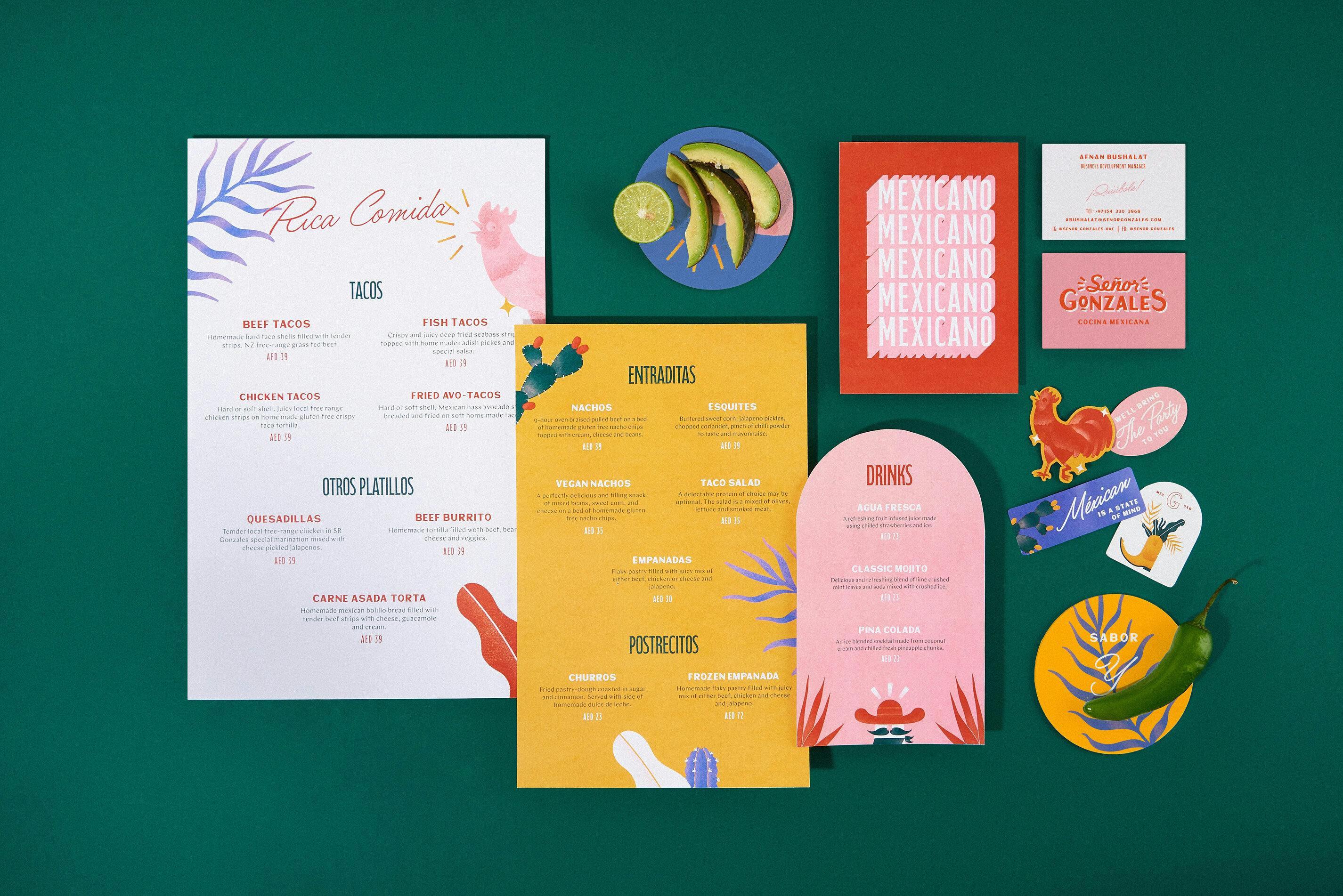
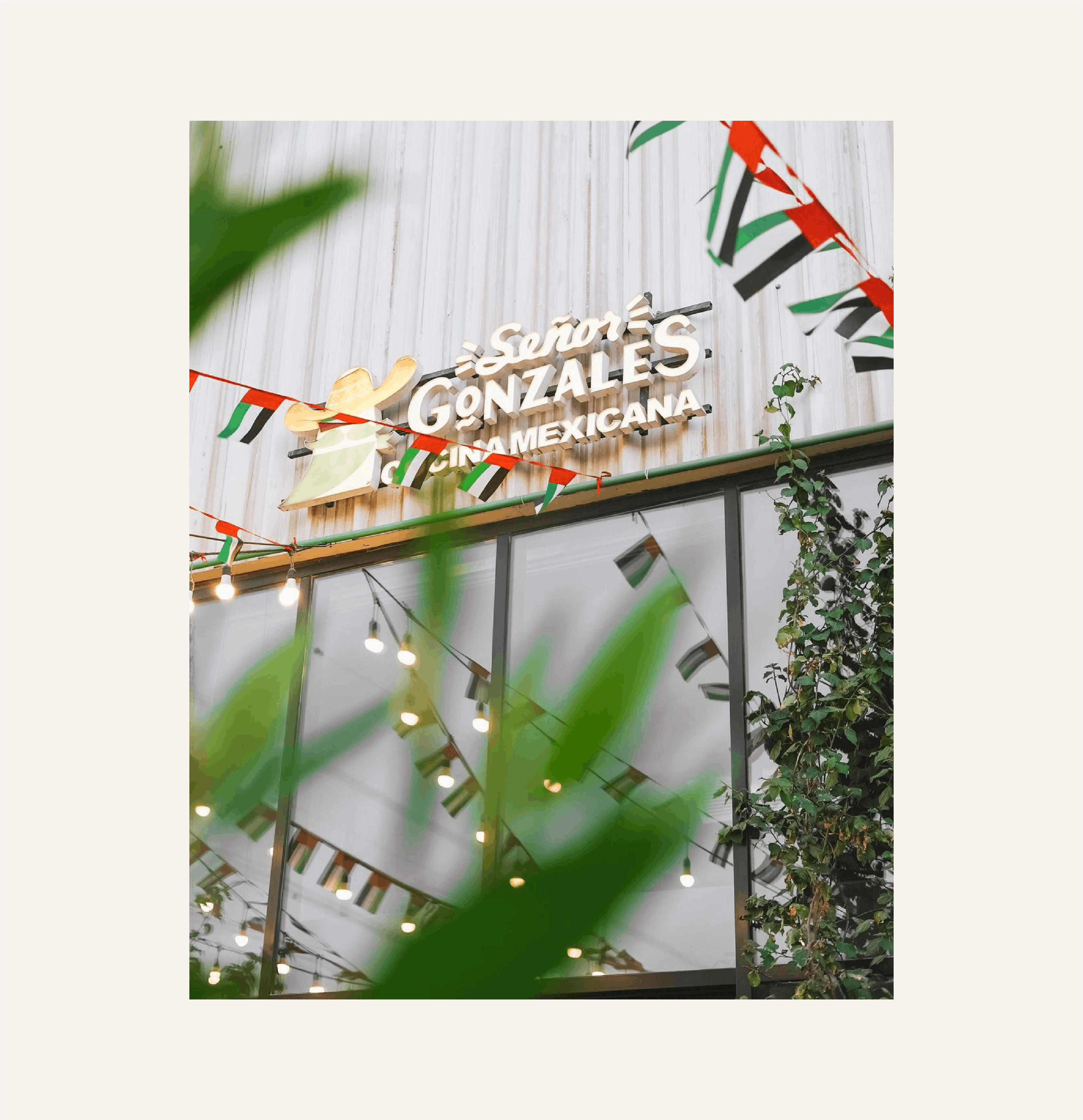
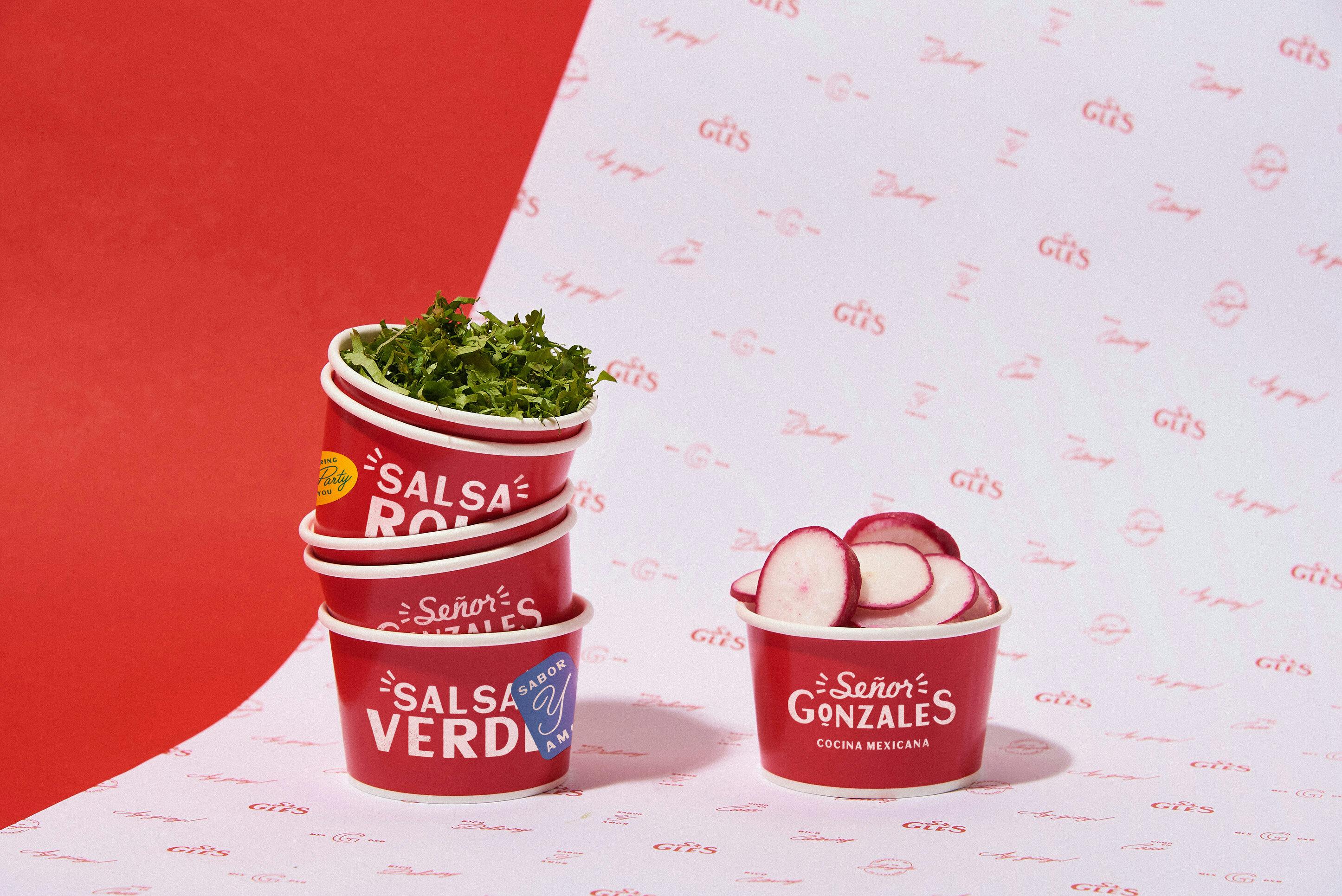
A common visual theme in Mexican towns is the hand-lettered signs and murals that decorate their locales. The tilde under the O and the action lines around "Señor" are direct references to this style. This was a lot more common in the XIX and XX centuries, but it's a central motif of Mexican design that we decided to bring in for wordmark's treatment.
"At the end of the day, we wanted it to be loud, crafty, and festive, celebrating the brighter side of Mexican culture."
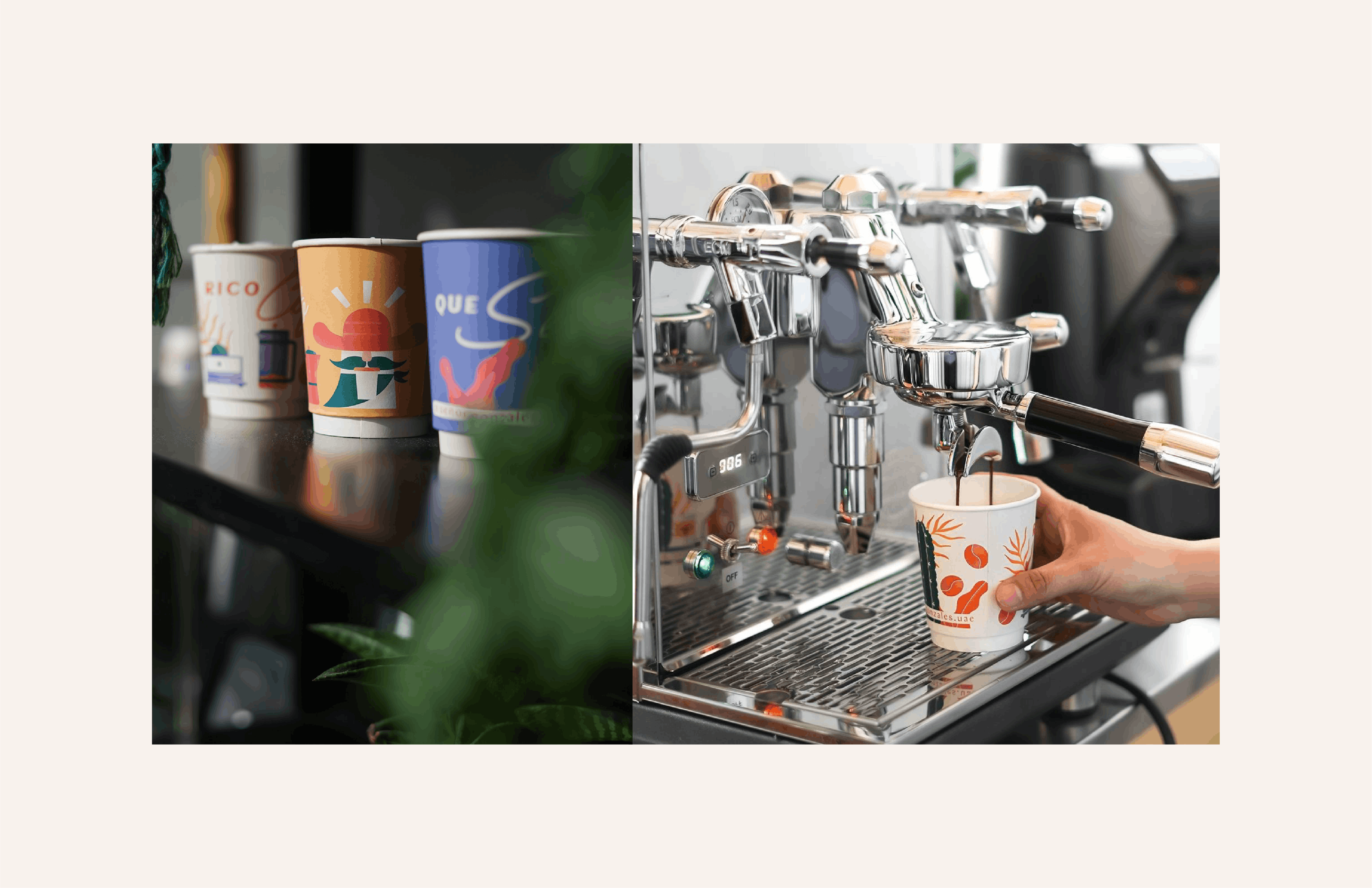
The digital illustrations are a big part of the visual identity. How was it developed? How did you land on this particular art style?
As mentioned before, we were looking for a way to differentiate the illustrations from a stereotypical style, which ended up being about experimentation. We knew for sure that we wanted something relatively streamlined and geometric but without losing the crafty nature of the brand. Many of the references from the moodboard art decó posters and editorial illustrations, so it was pretty clear to us that we were going to use a grain shader.
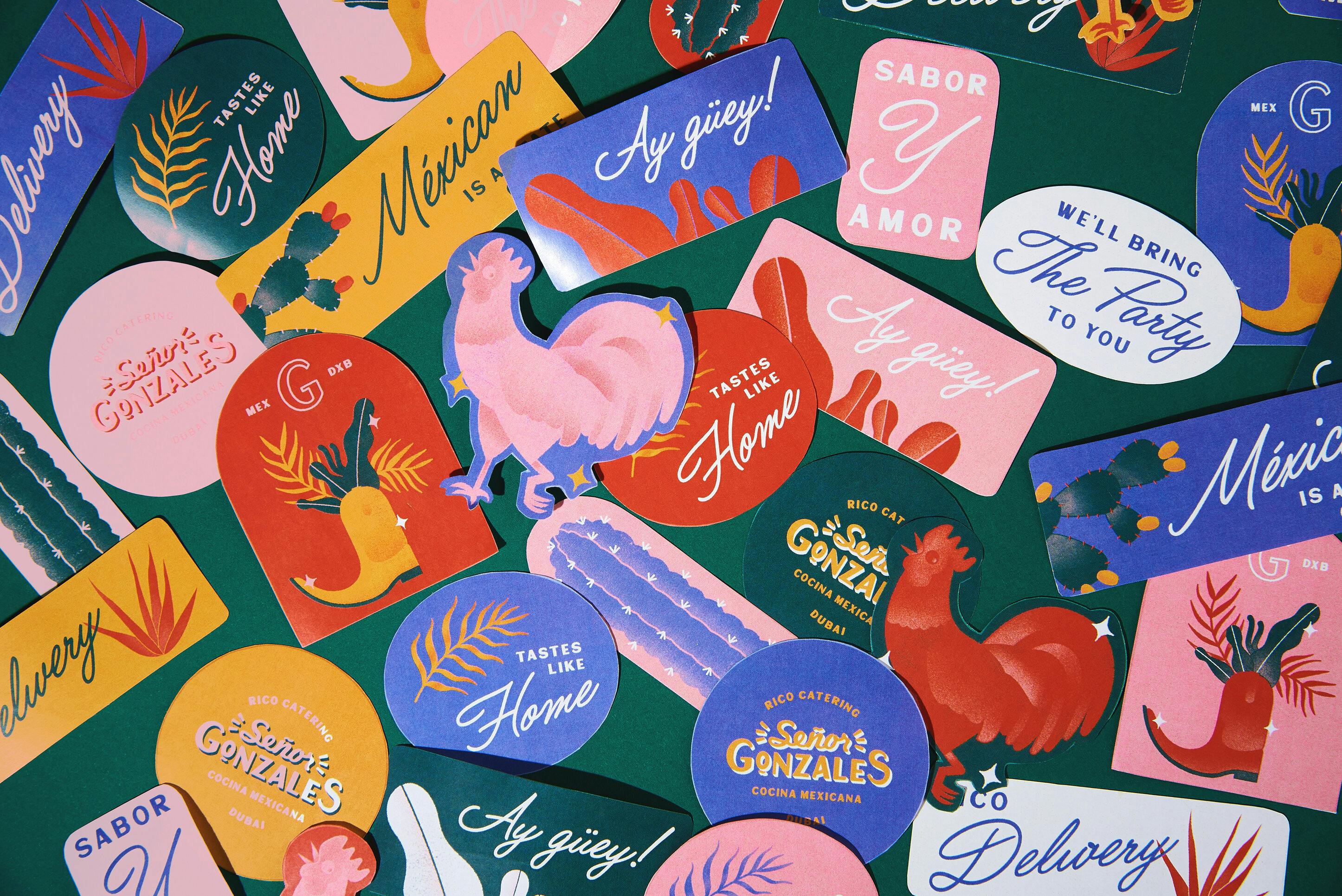
The first one we made was the rooster, and initially, it was just a simple sketch vectorized in different colors, like a regular line-less drawing. Then, we decided to shade it in photoshop just as a test, and I accidentally filled all of the layers with one color, which we ended up liking more! It allowed the lines to be indicated masks from the grain shader, which set the style for the rest of the illustrations.
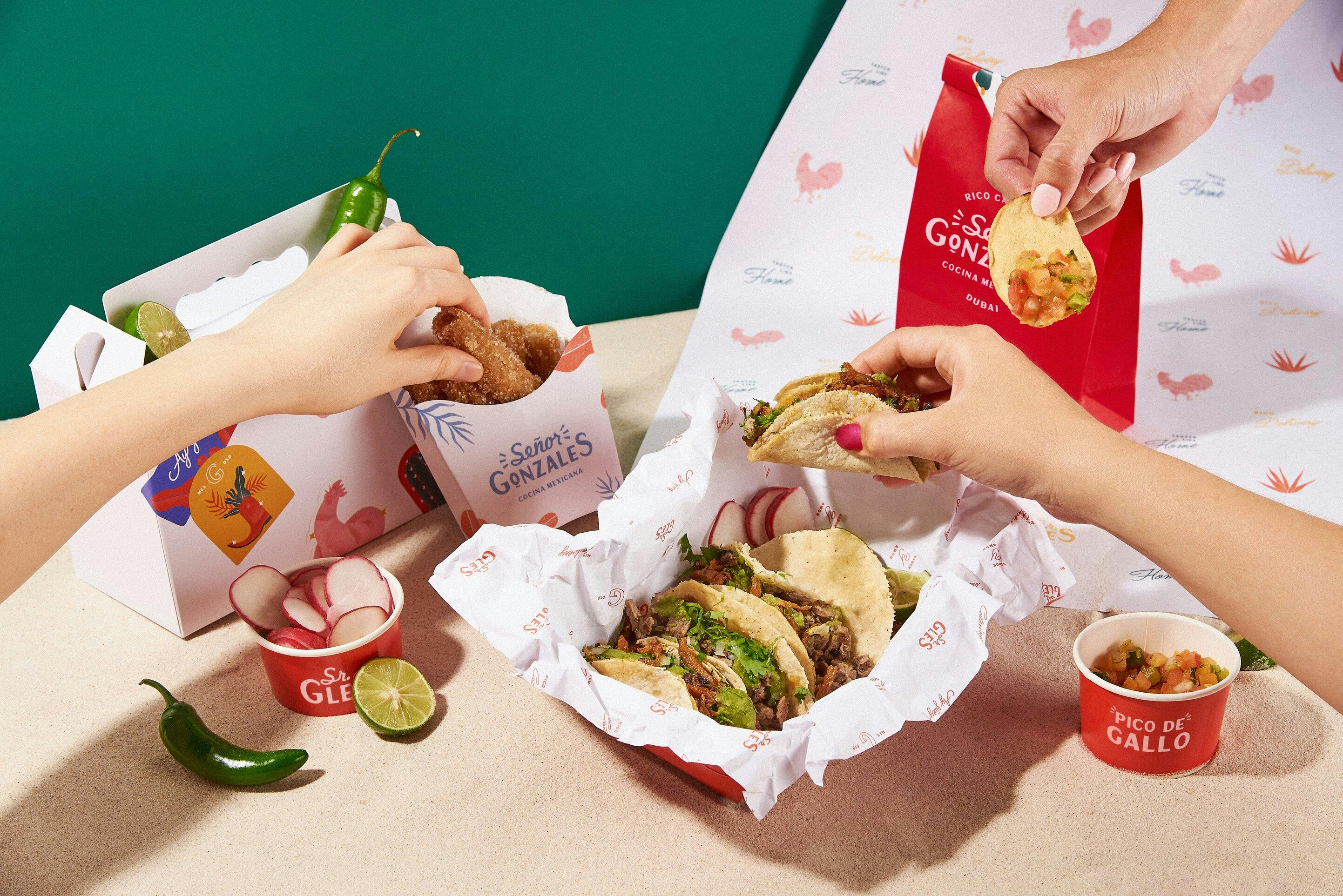
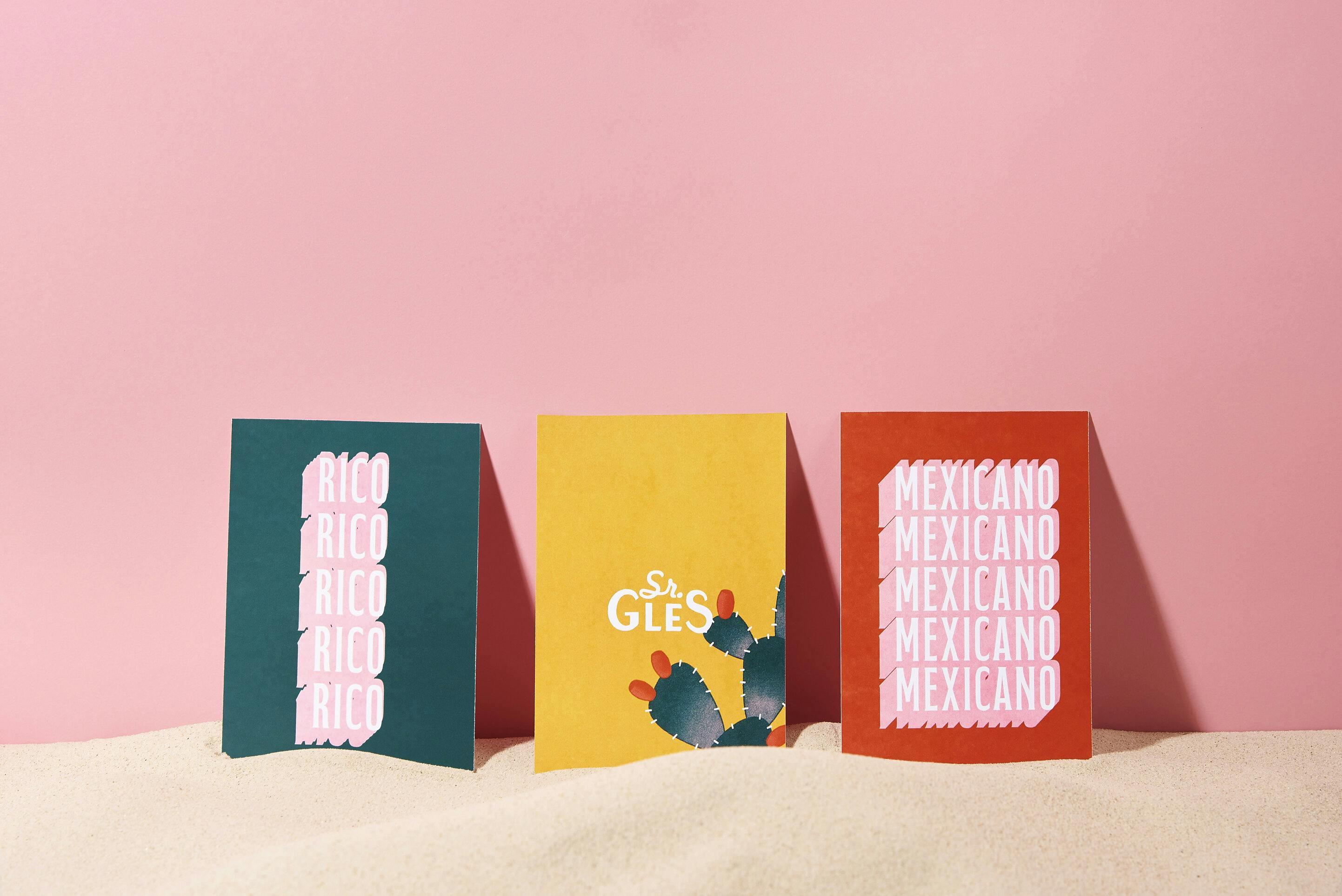
The color palette is very vibrant. How did you land on these colors and what do they say about the brand?
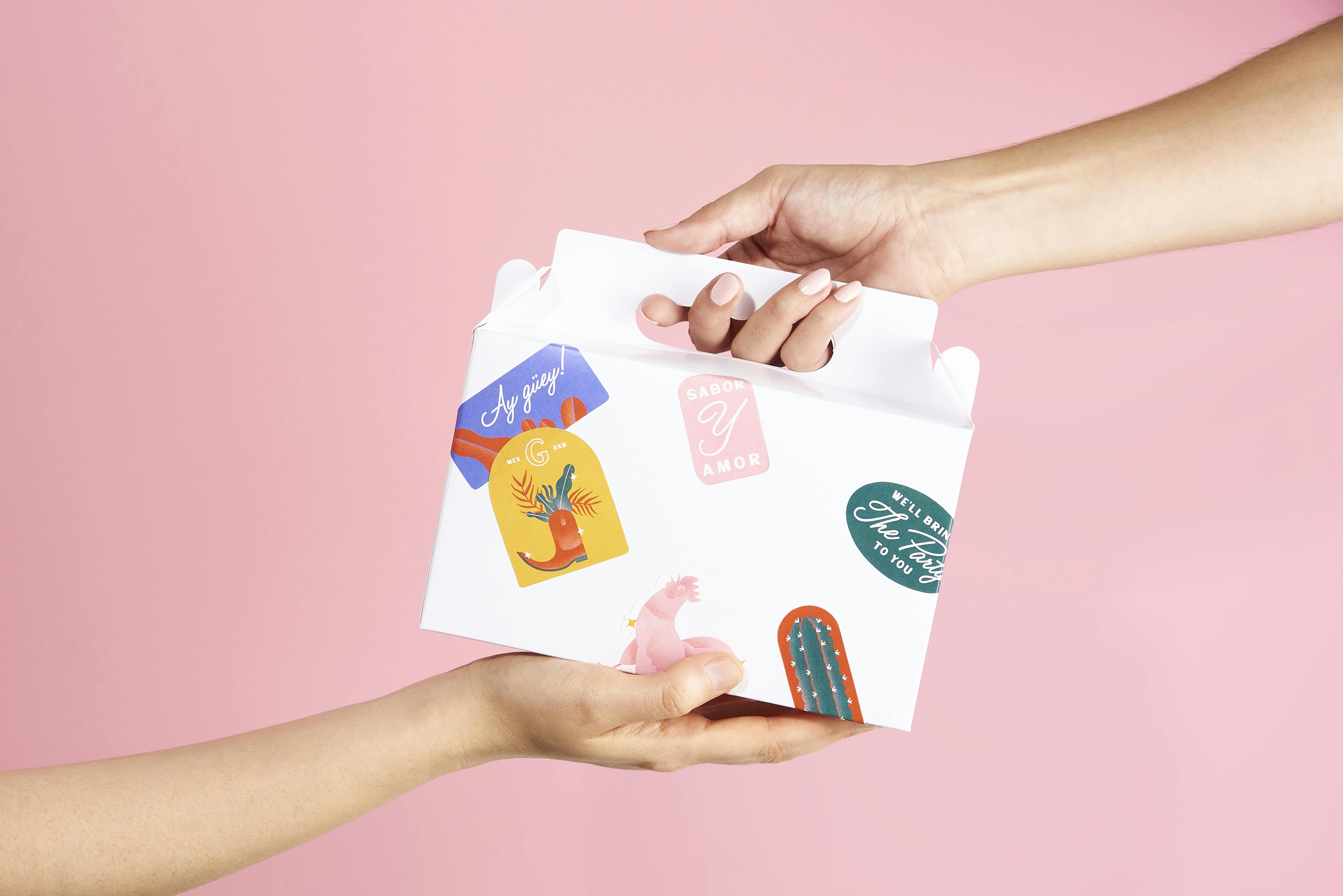
Since the idea was to celebrate the culture, we decided to use a festive color palette. You would see these colors on traditional flowers, textiles, and festivals in Mexico, lightened a little bit so that everything contrasts in the right way.
Can you also talk about the fonts you use for the brand? How were they chosen? Were they customized?
One of the biggest font inspirations for the project was an ad from a Mexican newspaper from the 1930s. The font pairing was really varied and gave us the idea of using many different typefaces for the brand.
The main pairing we used was a "roughened-up" deco-inspired sans serif called Sunmore and a condensed serif called Fabulous Caps (the best-named font ever). We used Chap as a body text, which looked like a cleaned-up version of Sunmore, and a classic, flowy Filmotype script as something to give it a bit of human touch.
We also mimicked some classic Mexican lettering shadows on Fabulous Caps to add a little diversity and visual punch on certain pieces.
Lastly, do you have any advice or pro-tips for designers embarking on branding projects like this?
The biggest takeaway from this project was understanding the cultures you are working for, especially when it's on the other side of the world.
"Not everyone sees design the same way and gaining cultural insight into a project can help bridge that gap not only design wise, but when communicating with clients as well. "
Another piece of advice would be to build your visual references. One of the most effective tools we have as designers are the references we collect in our daily lives. Having a good visual backlog and educating your "eye for design" is key for experimenting with your proposals. It's important for us to exercise in digesting and combining these references to create something that excites us as well as the client!
