
before

after

Kamil Krupski, Head of Design at Sololearn, talks about rebranding the company to showcase how their platform is fun and accessible.
Can you introduce us to Sololearn?
At its core, Sololearn is a teaching platform that focuses on code. I think what makes us unique is how we try to make everything fun and accessible for users. This is what we’re trying to build with the brand and the product: that coding is fun and simple and that you can actually do it.
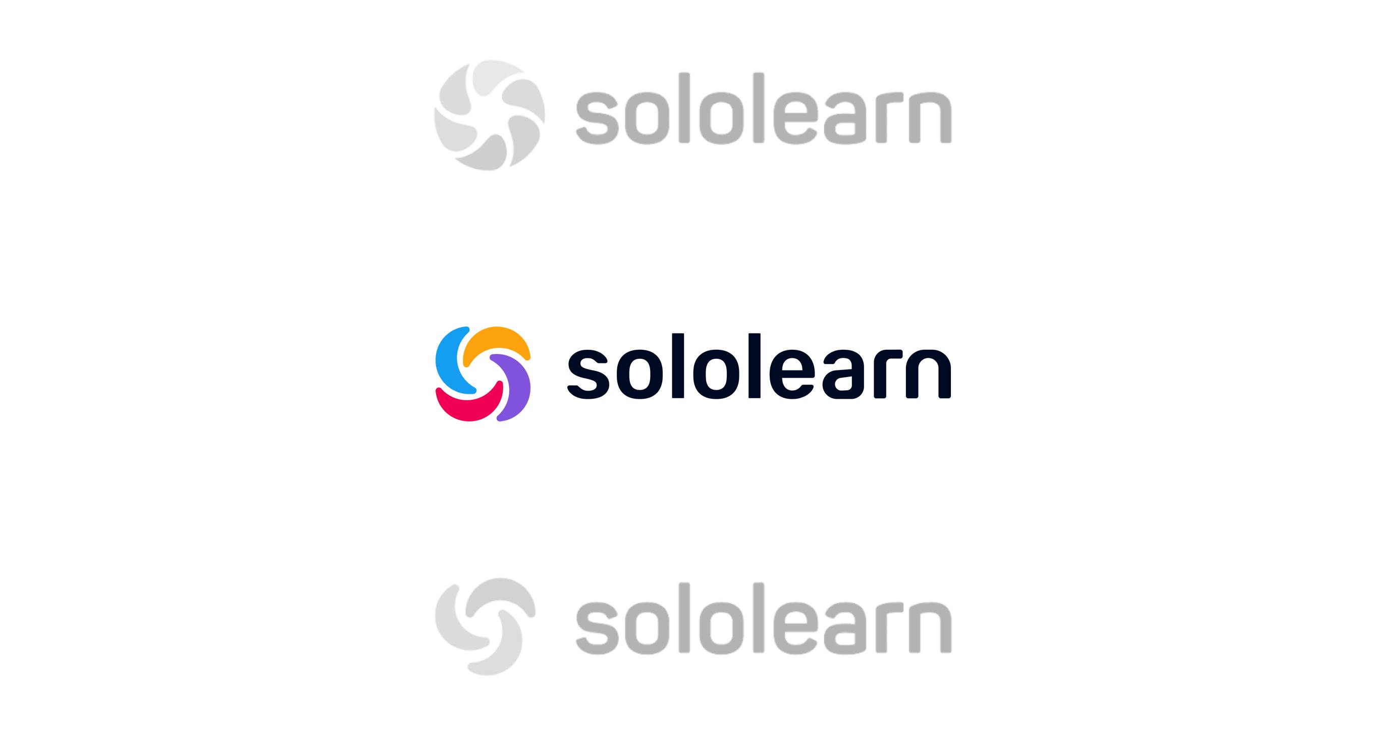
Sololearn logo options
We started as a mobile teaching company. Right now, we’re a little more platform-agnostic with users being able to switch between desktop and phones. But we believe in very concise, bite-sized lessons; minimal amount of theory with a focus on active learning and a lot of practice. It’s the idea that we can get people who are absolute beginners and get them to use our platform for 15 minutes a day which serves as their personalized daily dose of learning.


Can you tell us how the initial brand identity was conceptualized and how the conversation for this rebranding started?
The initial logo was created by the wife of one of our co-founders. The idea was petals in a circle. The petals symbolized our diverse community. Every petal had a different color, which symbolized our learners that are learning how to code. I believe it was good for the time. The community loved it and it served us well for 6-7 years. But when the company grew and we started to build the design team, we started having a lot of different needs.
We started realizing that it has its issues, like how it is constructed with the words being separated and we didn’t want that because you’re not learning alone when you’re on the Sololearn platform.
Sololearn’s new logo
It was also complicated in terms of sharing and using the old logo. It was breaking down when it was in smaller sizes. The colors also made it hard to use with anything around it. We were encountering these visual problems every day, which had been the first spark to that conversation of trying to understand who we are and if this visual identity really describes or represents us.
We have also seen that among our competition, it was standing out and not in the best light.
Additionally, we also never had that conversation with our users or even within the company about what Sololearn really is. Before, it had only been a general understanding. Everyone believed that they knew what Sololearn is, but we never really looked at it and validated it.
The visual challenges had been the spark, but we used that to focus on seeing who we are and how people perceived us.
How did you go about with the rebranding?
Firstly, we gathered a lot of knowledge from early employees like our CEO, Co-Founder, COO, and some other people that have been part of the company for a long time. We started with organic conversations, then interviews with a simple questionnaire for the most senior people. The answers we got were very reassuring because there was a lot of overlap. A lot of people were thinking similarly about what Sololearn means.
From there, we surveyed everyone in the company to get a very clear picture of how employees see Sololearn and to see if there’s any disconnect between the leadership and the actual employees. After that, we surveyed many users as well, such as our moderators who have been part of the Sololearn community for a very long time. It’s great to be able to talk to them because they provided a different perspective.
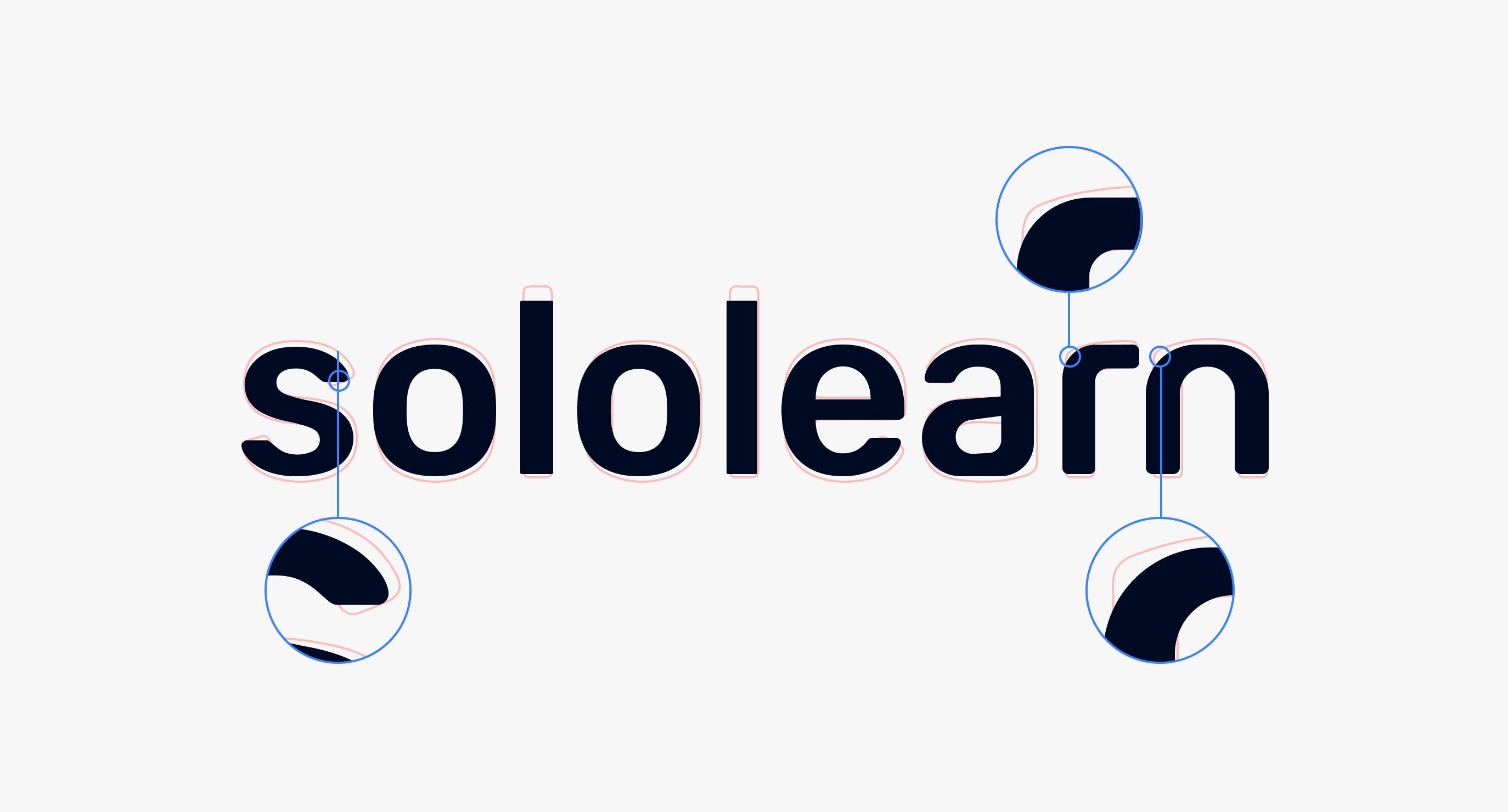
A closer look at Sololearn’s wordmark
Fortunately, there weren’t a lot of disconnect in what Sololearn means for these different people. There might have been small misalignments that we had to work on to gain a little more trust in some areas, but in general it was encouraging to see that a lot of people see us as a supportive and fun platform. Like a trustworthy and supportive teacher that is maybe a little bit quirky.
"This somewhat was always at the back of every branding decision that we made from that point on, that we are not a university. We are something else. ‘Fun’ and ‘simple’ are always part of the conversation. We’re not afraid to be a little bit quirky or silly because it makes us unique."
From all the data we gathered, we built a brand pyramid. With the brand pryamid that we constantly polished and our strong conviction that how we see Sololearn is aligned with how other people perceive us, we built the backbone on which we created our visuals, aesthetics, etc.
Tell us more about the new logo. What changed and what did you retain?
When we had a pretty strong image of what we wanted to achieve after the research, we knew we needed to visualize and execute it correctly. At the time, we didn’t have the resources to do it in-house so we started working with a freelance designer, Ani Tarjumanyan. Doing so proved to be very helpful because they were able to translate our needs into clear visuals.
It started with the logo. Our guiding force for that had been knowing who we are and not wanting to change it. The same principles we had from the beginning stayed, and along with that, the petals remained the correct metaphor to convey that.
I would say that this is more of a facelift than a rebranding. We started with different variations of the petals. We experimented with different shapes, different amounts of petals, and so on. We ended up with four, because from a functional perspective, it’s simple enough that you can use it in every form. You can resize it and it’s instantly recognizable, and it still has a very similar shape to the previous one we had. It’s the same idea but it’s easier to use and a bit more modern.

Sololearn icon development
How we think about it, there’s no actual meaning to the logo. We actually like the vagueness of it. You can see it any way you like. One of the ways would be how these are people hugging each other when you’re viewing it from up top, symbolizing community. You can also look at it as a galaxy expanding, or a galaxy of knowledge. You can build different metaphors on it. In fact, we’re building some campaigns on different potential interpretations of the logo.
"Along with the logo was the wordmark. Initially, our problem had been that it was broken into two words: ‘solo’ and ‘learn’, which we wanted to avoid. We unified it and moved the icon outside of the word which gave us efficiency and flexibility in terms of usage."
We also wanted to come back to the simplicity and fun factor. We wanted a typeface that would be softer than Helvetica and have a little more character. We went with one that is a little bit more personalized. It’s a little bit different. When you see it, you know that it’s not from a university. It’s a bit more playful and fun.
Your new palette is very colorful. How did you land on these colors?
I think the colors are a big part and even a cornerstone of our identity. We’re still trying to figure out how to use them exactly, but the main thing is that when you’re learning, by default the majority of the content you will view could be black on white or white on black. We wanted to differentiate ourselves from Courseras of the world--MOOCs, and other companies or universities.
"With that, we wanted something more bold, modern, and playful. This is how we landed on strong, oversaturated colors. They serve a lot of different purposes. In terms of differentiation, it’s making us more loud and in some ways, allowing for different types of marketing and communication. It’s also very functional in terms of our UI."
We use them as splashes of colors in the lessons to make it a little more engaging and keep you focused on the content. Along with that, there are also meanings to them. They represent different qualities that are present in the company.
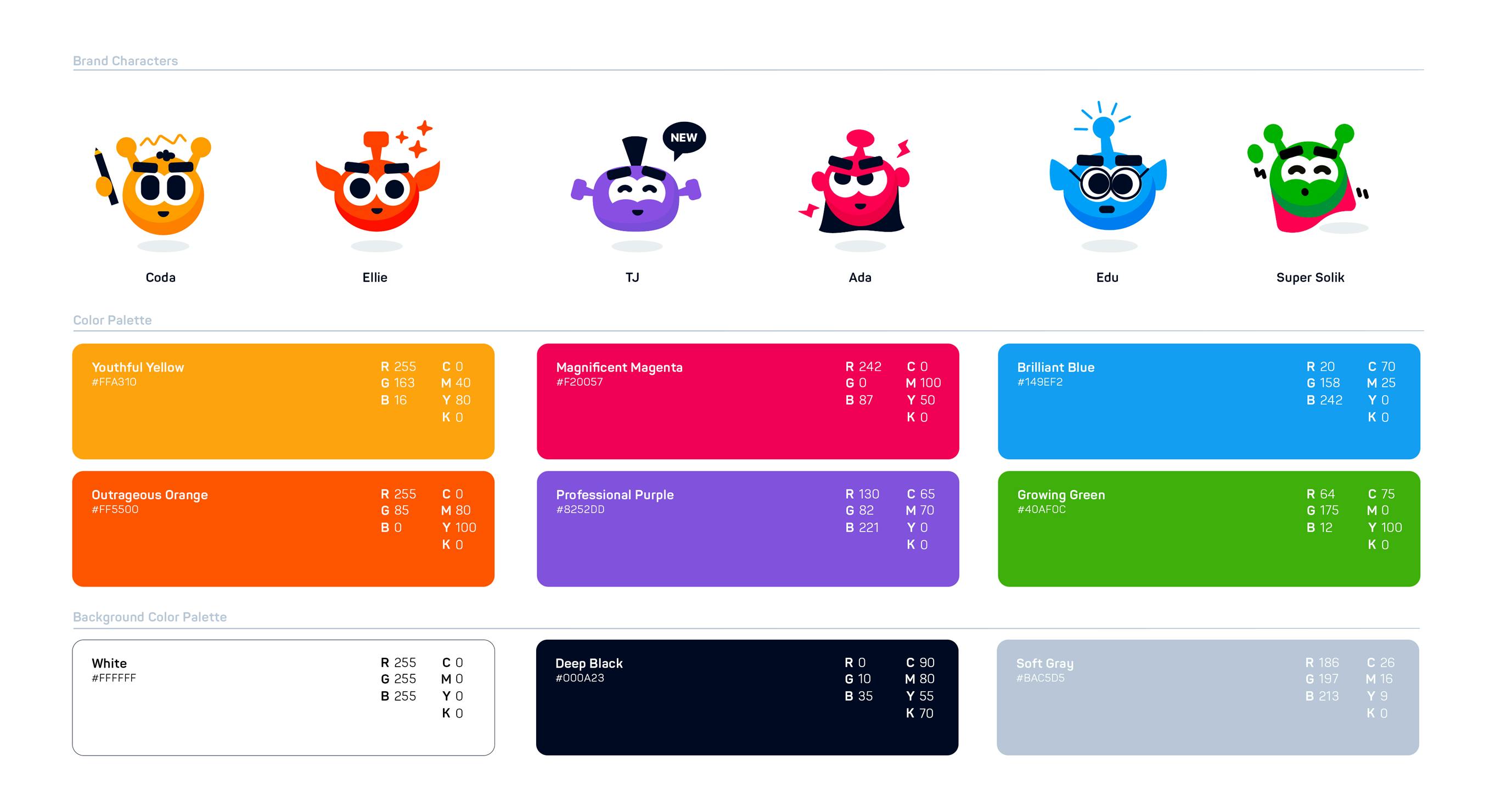
Sololearn’s new color palette
Blue is the main anchor color for a lot of the UI elements. It’s usually associated with information and education as well. We definitely knew that we wanted some bluish accents in the logo. As for yellow, our company is young with a lot of people working here that are in their early 20s. They’re bold and like to experiment, so yellow is the youthfulness and how our team is willing to try in our company.
Purple is the more experienced and calmer side of our company. We have several years of experience in learning. We understand what we are doing very well. As for magenta, it’s a wild card color. It shows that we are not afraid to challenge the status quo or experiment with different ideas such as code-learning on the phone.
What is your biggest takeaway from the rebranding experience?
The main thing for me is realizing that you or your in-house team don’t have to do everything yourselves. Many times, we’ve tried to do a facelift to the brand, but we always postpone it because of different deadlines.
The main problem had also been because we were a much smaller team back then. We were also organized as a product team and not a brand team. When we realized that we could ask outside the company for help, everything fell into place. We knew what we wanted, we just needed someone to execute it correctly.
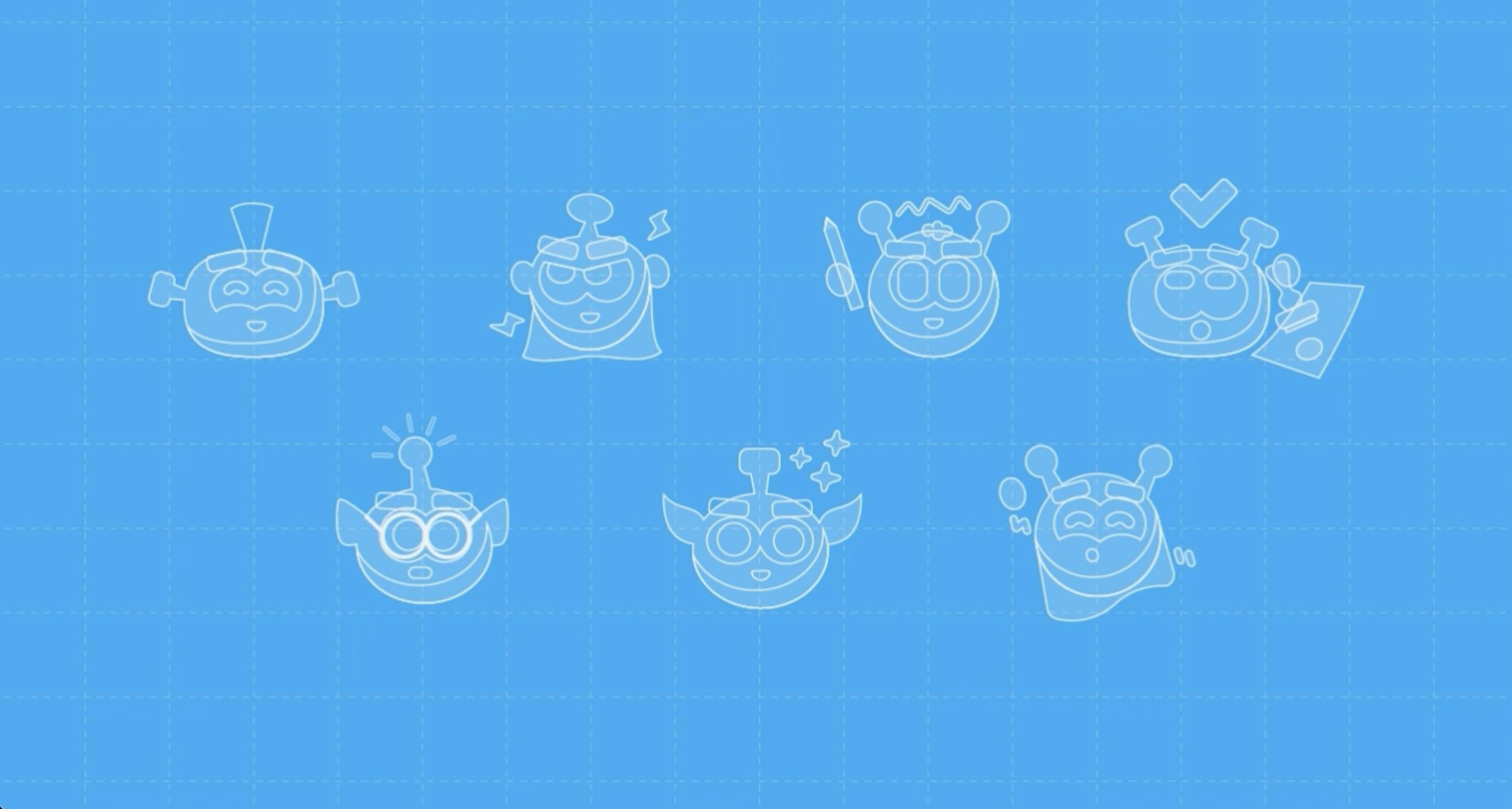
Sololearn character shapes blueprint
My advice is actually to be open to finding someone—whether a creative agency or a freelance designer—who is comfortable working in the style you’re looking for. Fortunately for us, we found a designer who does the similar style we’re looking for. The experience had basically been without problems.
What’s next for Sololearn?
We’re going into the second stage of the rebranding. I think what we’ve done so far is a good start. It was a good facelift, but we’re still building guidelines, illustrations, imagery, and so on.
"The biggest thing that people usually associate with code-learning is that it’s hard. This is something we disagree with. For us, it’s a new literacy."
Whatever you’re doing, you don’t have to code for a living but you have to learn how to code to understand what people around you are talking about.
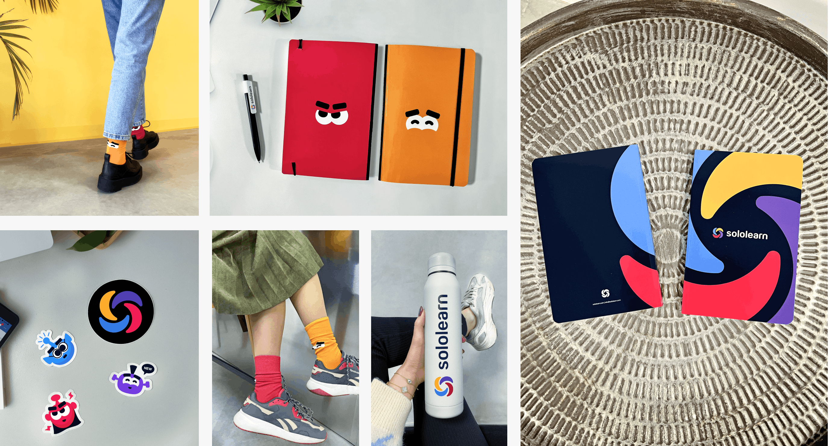
Sololearn merchandise
You can also optimize your work if you know how to code. It’s an amazing outlet for creativity as well. We want to reach out to people who don’t think coding is for them to just show them that it’s doable for everybody and that it can help them a lot. For that, we want to move the brand towards that direction. We have a very good base now where we can layer on different experiments and campaigns.
Now, we have an amazing Art Director, Leonardo Valadao, taking ownership of the brand so he’s going to explore and take it further, bringing coding into the consciousness of people who might not be interested in it.

