
before
after

Natalie Burns is the Strategy Partner at UnitedUs, a Brighton-based independent branding agency that unites people, purpose, and potential for clients like LEGO, Aon, and London Irish.
Can you tell us how this project came about? How did that conversation start with The Circle?
Following the appointment of an ambitious new Chief Executive, Raakhi Shah, The Circle had taken stock of its overall strategy as a charity. For a long time, the organization had supported women across the world in myriad ways, which, while important, created challenges for the organization in differentiating itself from other organizations in the space.
Raakhi’s new strategy aimed to zone in on two big, interlinked issues and provide that much needed clarity; ending violence against women and girls and igniting female economic empowerment. It was at this point of inflection that we were approached to help The Circle externalize this new focus through their brand.
How did the rebranding process go? Can you tell us more about it? Where did you start?
Critical to our involvement in any branding project is a period of embedding ourselves in the organization; understanding where they’ve been, who they are, what challenges they face, and where they can, or should, be having the greatest impact. We truly believe that great brands aren’t created by the isolated actions of a brilliant designer, they emerge through coordinated design, strategy and people.
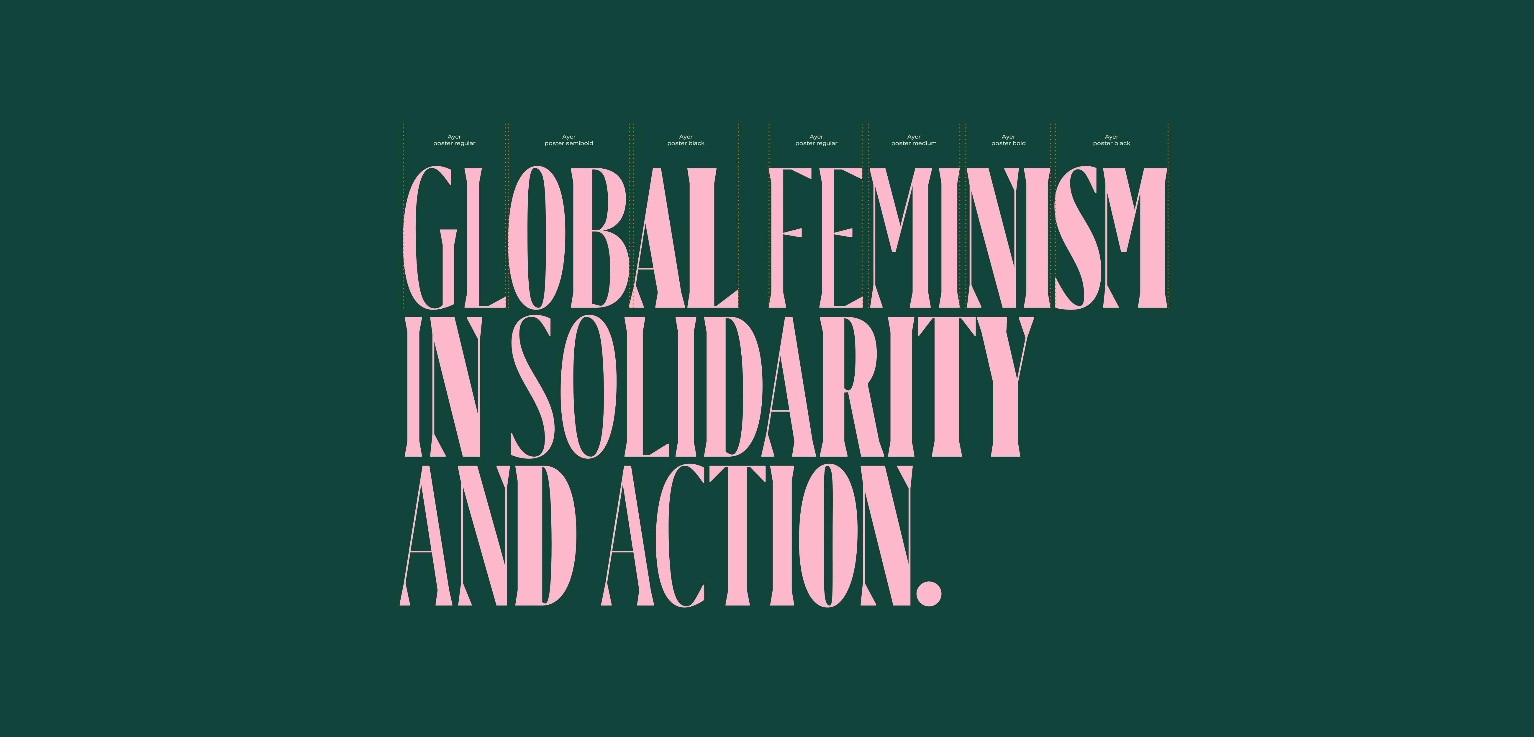
The Circle typography
To that extent, we kicked off the project by speaking with as many people involved in The Circle as possible -- from the core team, Board members, Annie Lennox, their Founder, and members of Circle. We wanted to understand what drew them to the organization and what they hoped to achieve together. That’s where we began encountering the conversation about ‘Global Feminism’ as an emerging understanding of intersectional, third-wave feminism.
Were there surprising challenges you encountered along the way?
The biggest surprise is how much The Circle has been able to achieve with such a small core team. It really is a testament to the unspoken movement that it’s members represent, and the voices we have aimed to amplify through the new positioning and visual identity.
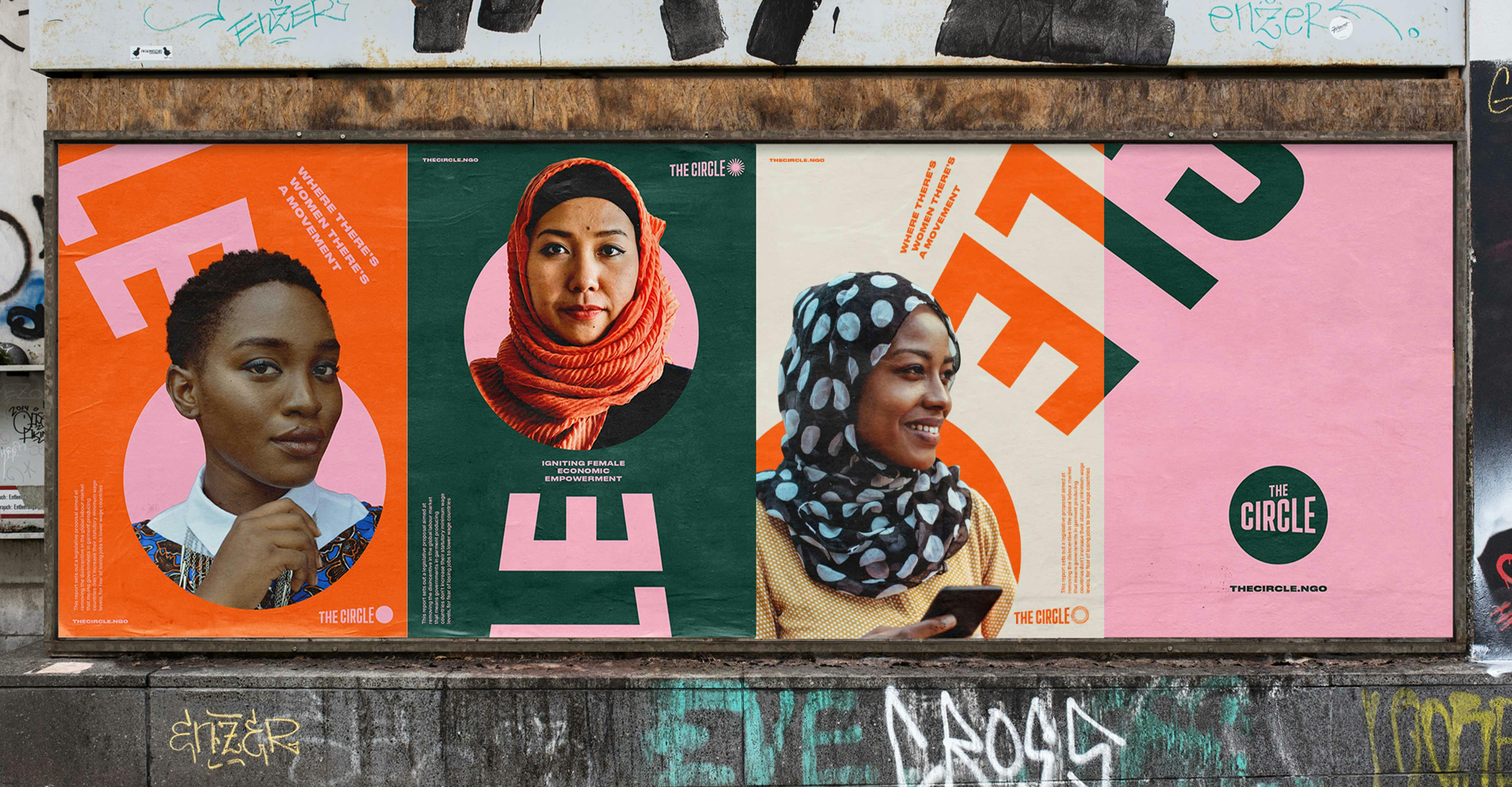
The Circle posters
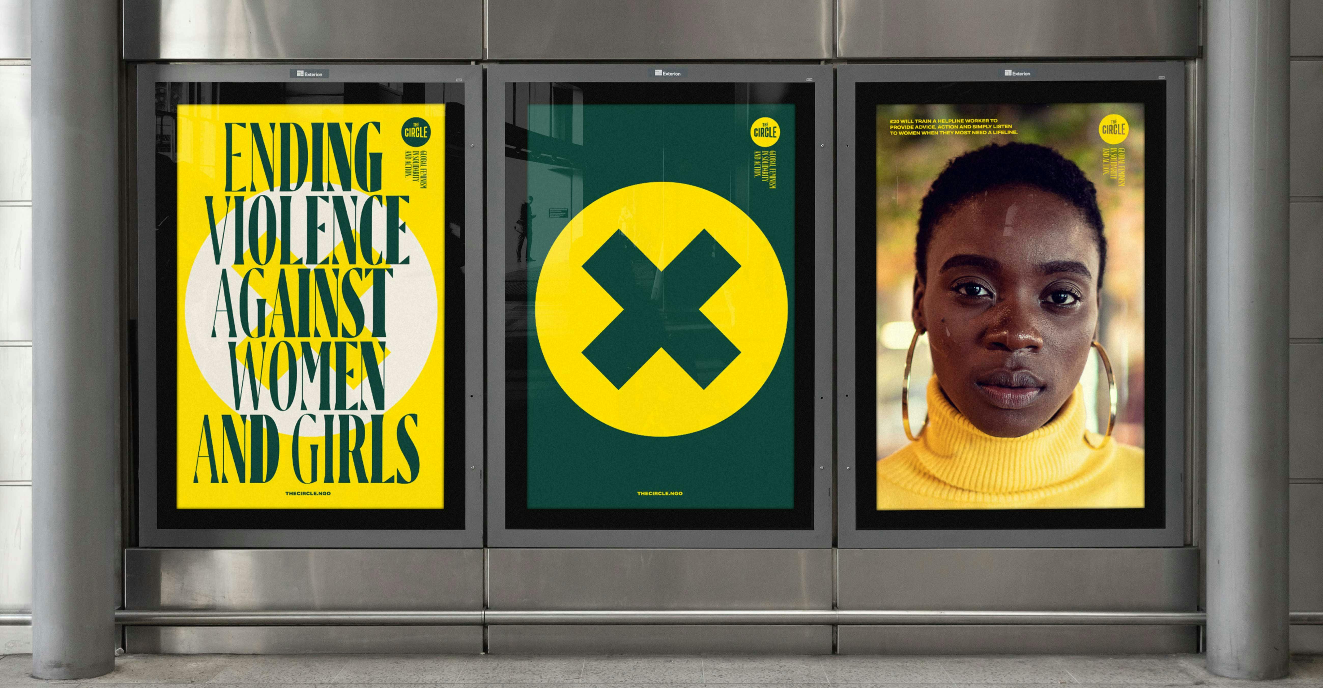
The Circle posters
From a design perspective, The Circle operates in a crowded environment of broad NGOs and a variety of feminist organizations -- both well-established and grassroots -- bringing about its own challenges in ownership, differentiation and ethics. Our design team worked incredibly hard to interrogate our choices of color, imagery and iconography and build an identity that alludes to some of the rich history and semiotics of the feminist movement, while also ensuring that The Circle speaks to a new ethos of Global Feminism.
So you’ll spot the lilacs and greens of the women's suffrage sashes, but integrated with a richer palette of orange, sand and blush, to add both a modern energy and take the identity beyond a palate associated predominantly with white feminism.
The logo was a big change in this rebrand. Can you talk about how it was conceptualized?
Across the charity sector, organizations are grappling with their emotional engagements with their audiences. In more obvious cases, this could be asking whether it is appropriate to hinge a campaign on an image of someone who is clearly being presented as a victim, or being othered. Not only does this kind of image take away the agency of the people you are claiming to support, but it relies on the donation audience to be motivated by guilt, a sense of duty, or at worst, underlying racial biases. These challenges don’t just exist in image selection, but in how charitable organizations present themselves overall.
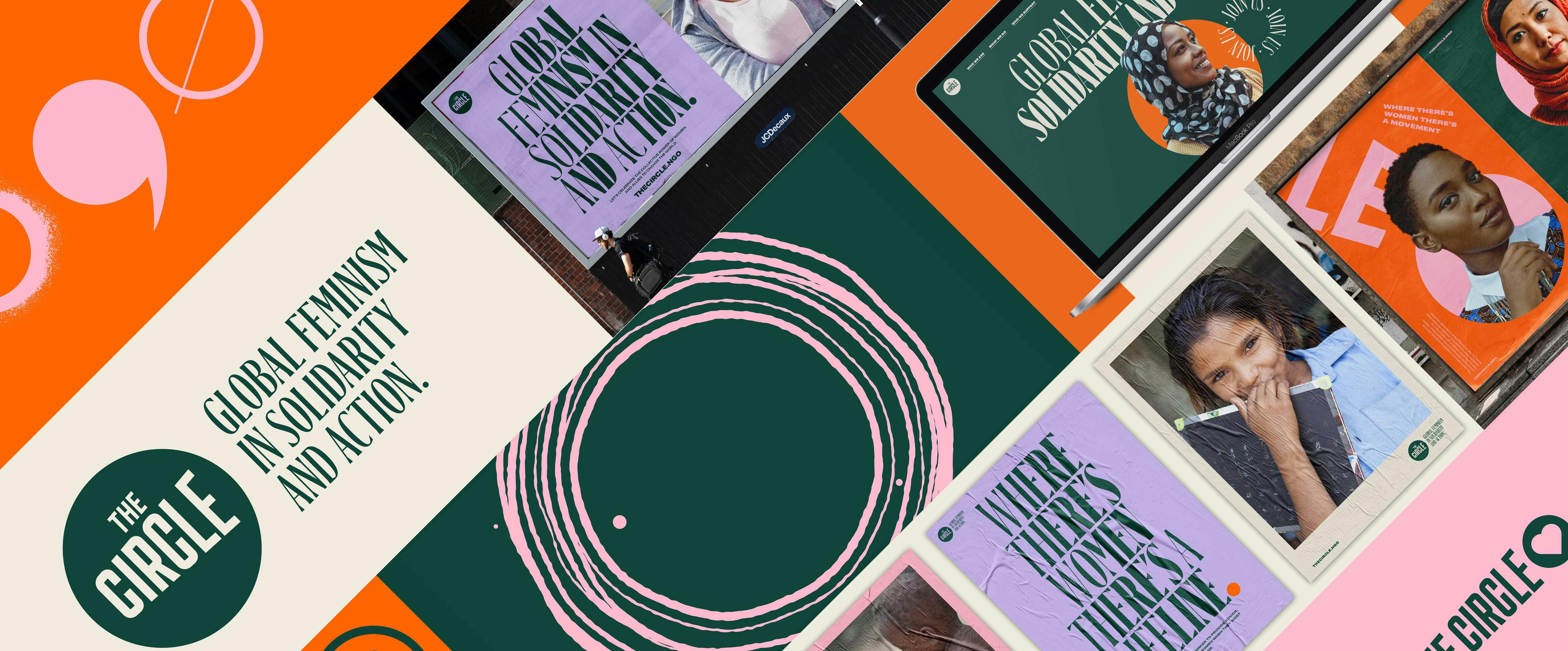
For The Circle, their previous logo was a solid black rectangle, cut through by a hollow circle. The circle was the negative space, the gap or missing piece in an otherwise dark setting. While that’s a nice graphic device, we believed that it was important for the logo and its variants to embody the positive energy of The Circle. It should represent the sense of Global Feminism that the organization stands for; not the absence of something, but the presence of many women and allies standing in solidarity and action.
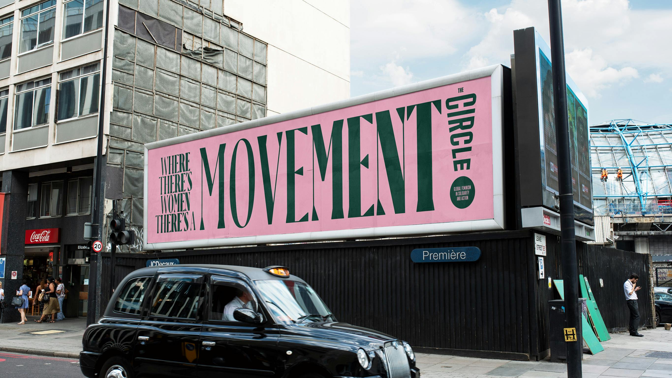
The Circle billboard
‘The Circle’ now sits within. It’s the center. Its typography is amplified, scaling from left to right to convey a sense of raising voices. Its secondary usage, where the circle itself becomes the variable punctuation mark at the end of the name is intended to reflect the clarity and boldness of what The Circle asks of its audience: be a Global Feminist. Stand in solidarity. Come together in action.
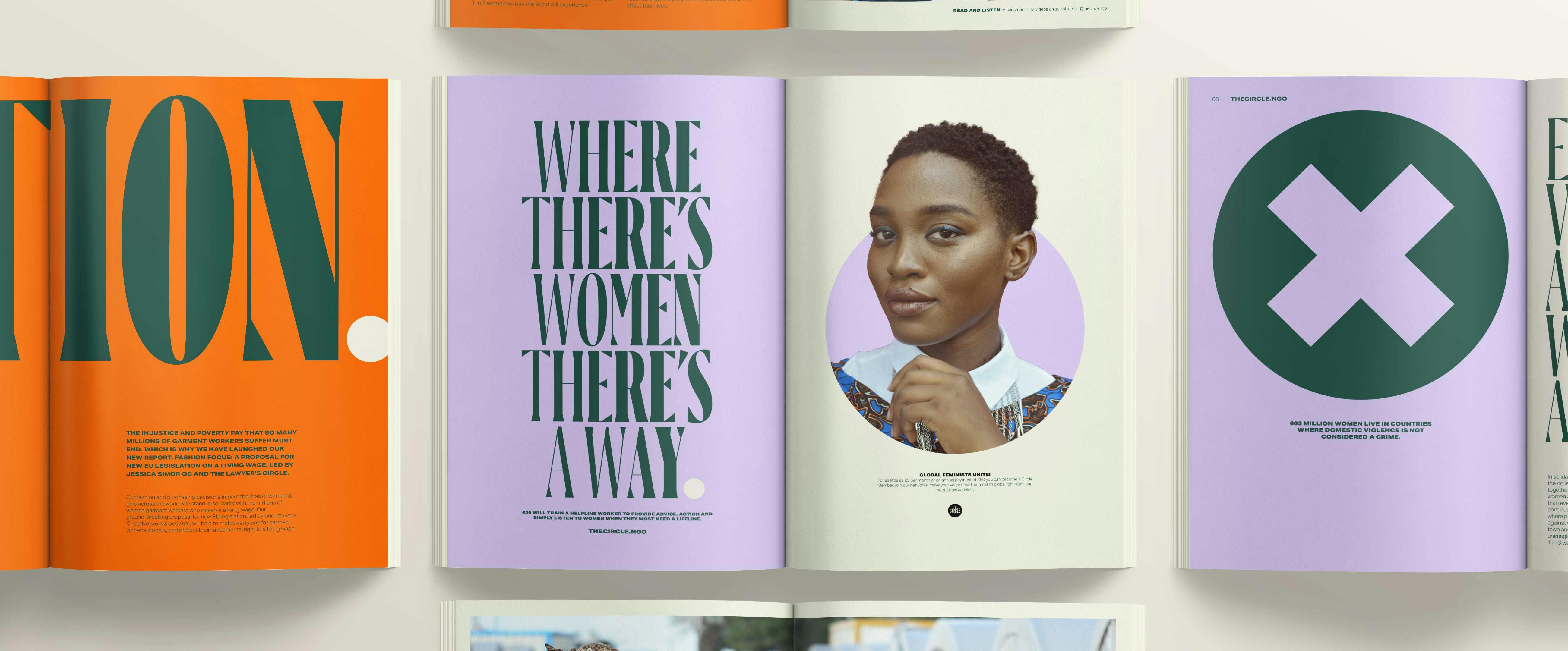
The Circle magazine layout
You mentioned in your case study that intentional imagery is very important for this brand. Can you tell us more about that?
As I mentioned earlier, design teams have a duty to be really critical about their use of imagery in any project, but certainly more so when working in the NGO/charity sector. For The Circle, whose membership is majority Western women, and whose recipients of funds and resources are largely women and girls in emerging economies, or living in areas of conflict, we needed to ensure that the images were representative and realistic. The depictions of women in The Circle’s brand are empowered. They aren’t victims.
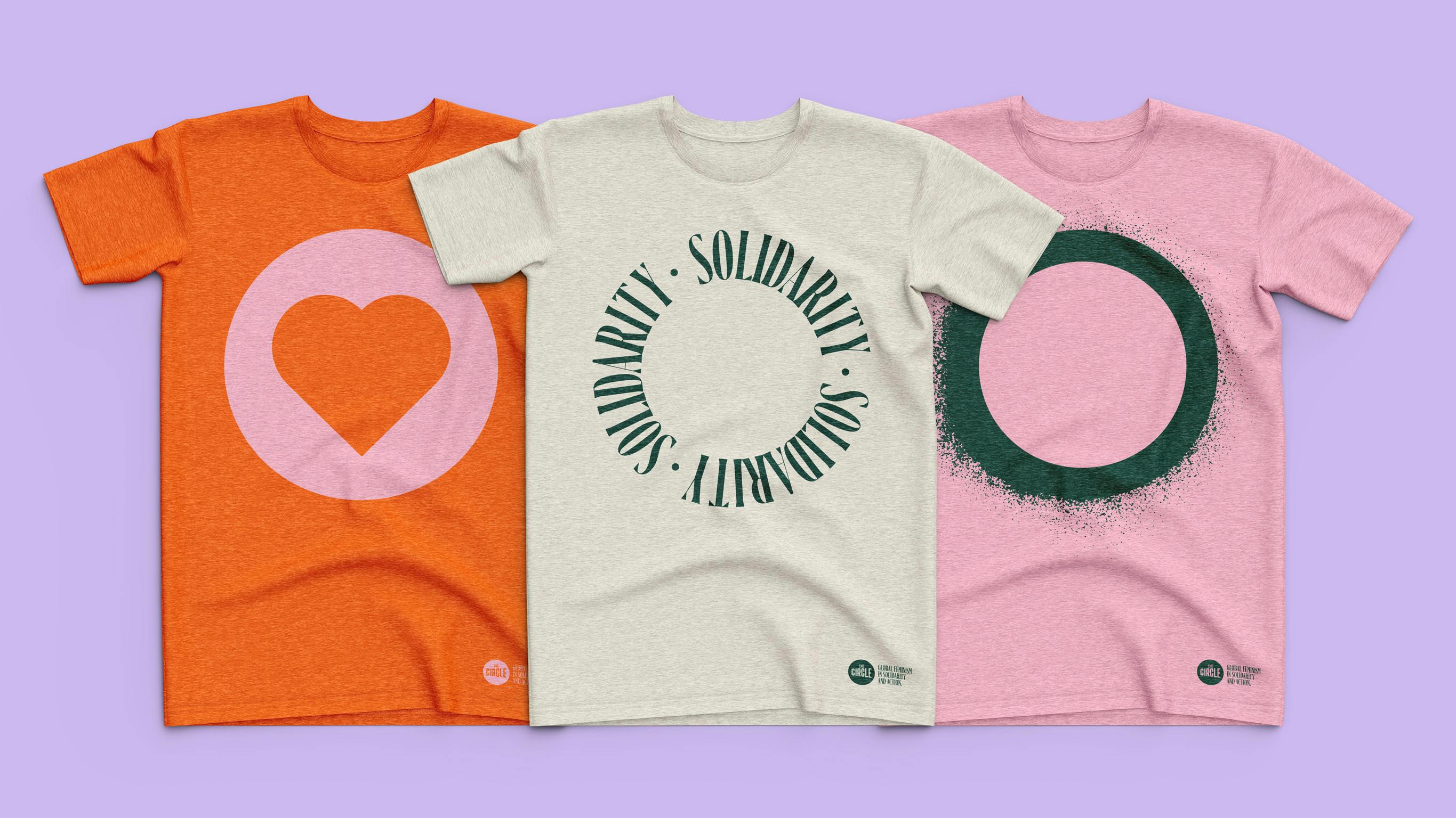
The Circle tee shirts
This new brand identity also has a variety of icons shown with the logo. Can you tell us more about them? How were they designed and what do they mean?
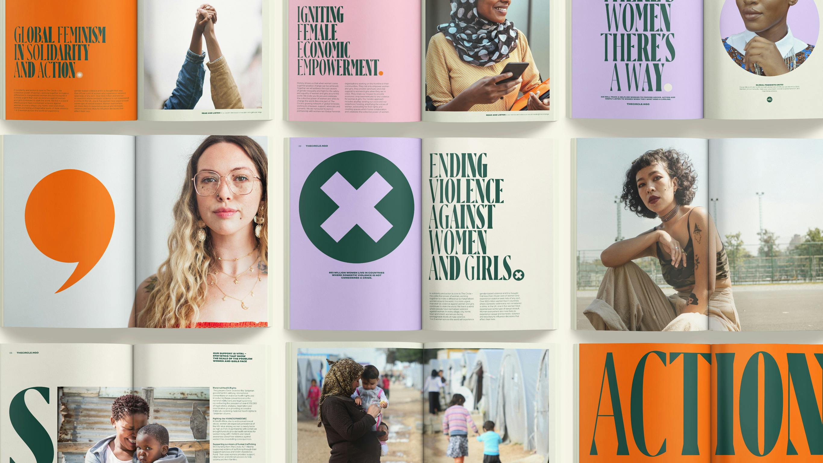
The Circle magazine spread
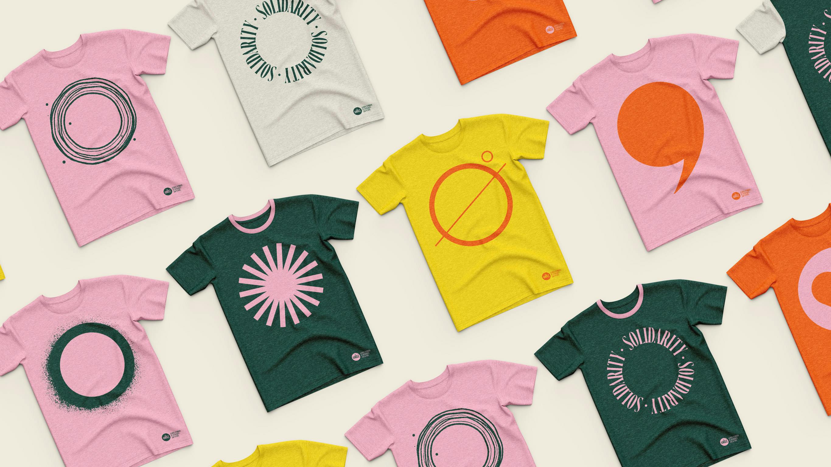
Movements need marks; simple, replicable graphic assets that anyone can pick up, paint onto a placard and call their own. For The Circle to be synonymous with Global Feminism, it needed to create this visual language that is open for everyone to adopt, to claim and use. The different circle marks are also open to interpretation. While we have worked with the team at The Circle on how some of them can be used in existing campaigns, the meaning behind each mark is for you to decide. So if you’re reading this and you’re a Global Feminist, take it, roll with it, play with it.
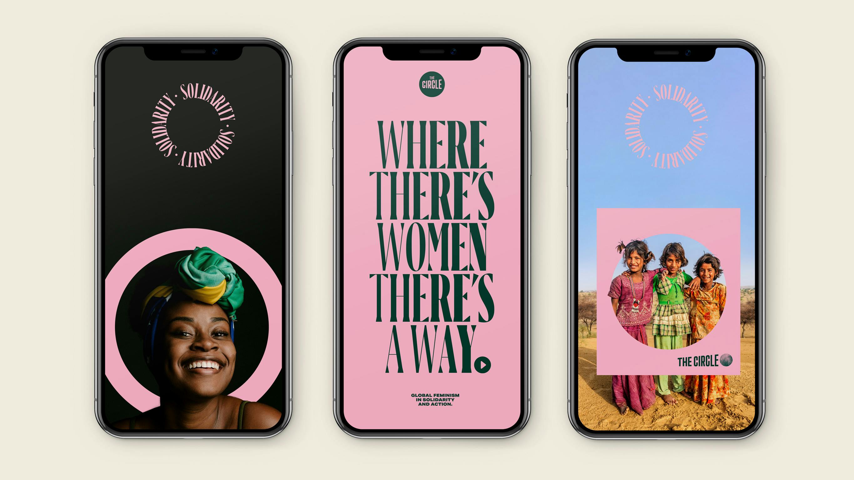
The Circle phones
Lastly, do you have any advice or pro-tips for designers embarking on branding projects like this?
I really love this question because it addresses one of the big challenges of any brand project: what happens when you hand it over to the client. In this project, the client was The Circle team, their board, the incredible creative Annie Lennox, but it was also everyone out there who wants to call themselves a Global Feminist.
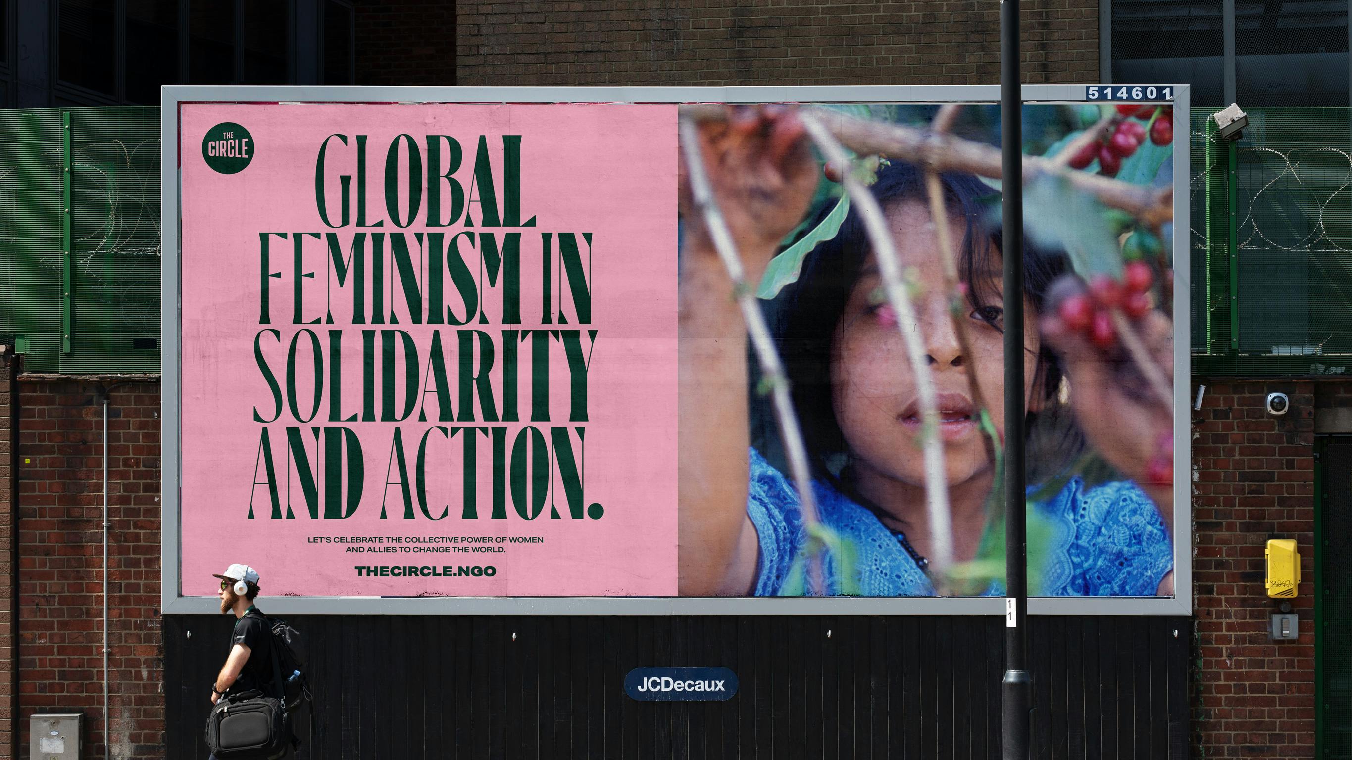
The Circle billboard
Like any great movement, it has to have strong foundations that provide the footing for freedom and creative expression. Really sweating those decisions and working with the client to bring them on a journey of demystifying the creative process will deliver a stronger and more cohesive brand outcome. And thinking about your audience beyond those in the room forces you to put principles of accessibility and diversity first. It actively encourages design teams to think more expansively about how the identity might be used.
So I guess the pro-tip from us on this project is; ask yourself how bigger audiences can use your brand. And see where that takes you.

