before
after

Mikael Tonning is Design Director & Founding Partner at the Scandinavian design agency Everland. For the last 25 years, he has crafted brand identities and packaging designs for market leaders - and those with the ambition to become one - including Carlsberg, Danone, Arla, REMA 1000, Danish Crown and many more.
Click here to check out more of Everland's work with brands like La Vie and REMA 1000.
Could you start by giving us an introduction to Everland?
Everland is a consumer branding agency working globally out of Scandinavia with offices in Copenhagen, Oslo and Stockholm. We partner with brand owners worldwide to define and design market leaders – and those with the ambition to become one. Brands who want to be loved by many and liked by all. Our clients include REMA 1000, Carlsberg, Danone, GP Batteries, TiNDLE and Orkla Foods.
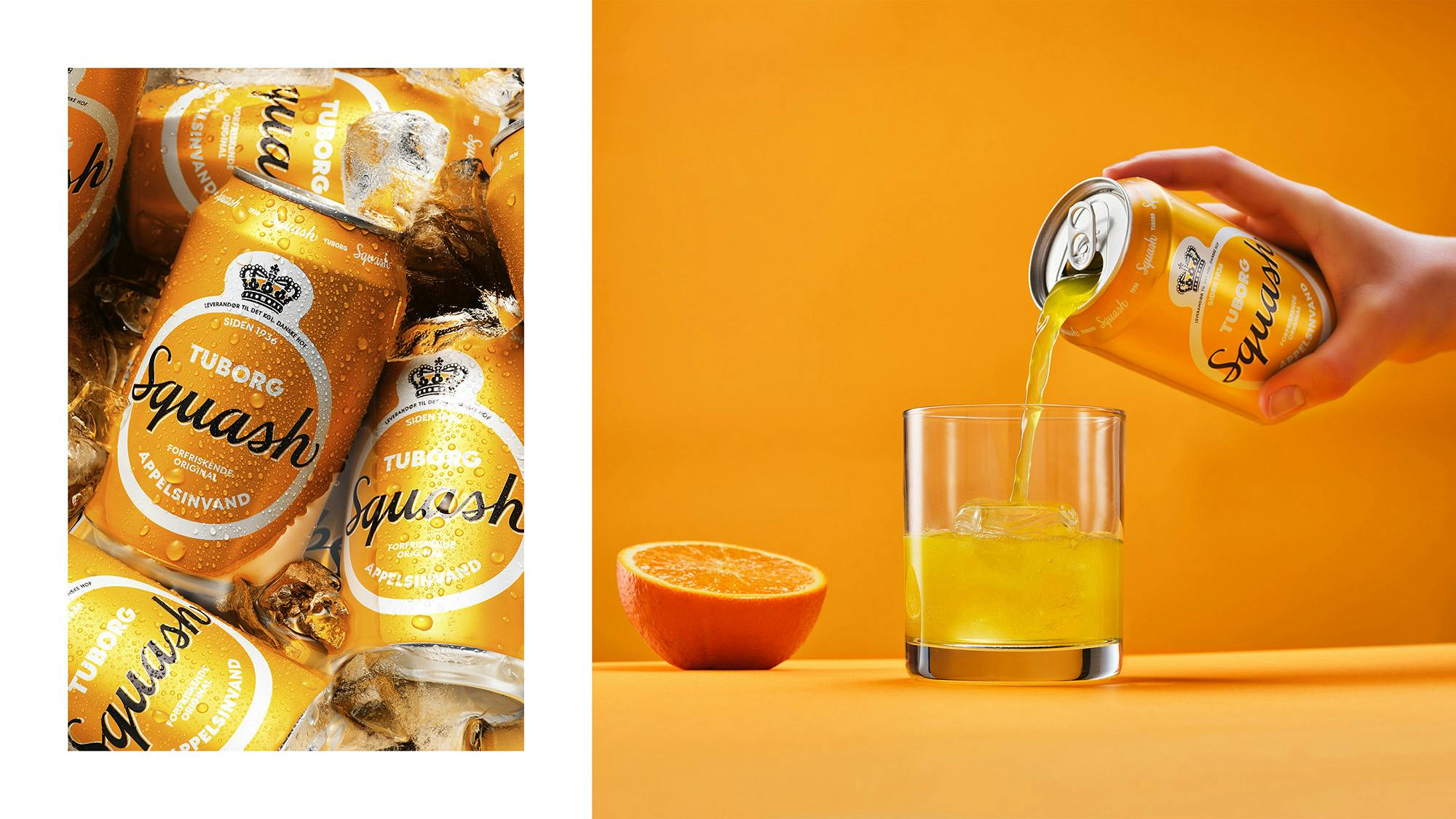
Tuborg Squash's new logo: "A Danish Icon"
Tell us about Tuborg Squash and give us a general overview of how you became involved in developing their brand identity.
Tuborg Squash is a Danish soda icon, a true classic introduced in 1936. However, the design needed an update, as it had lost some of its magic over the years. So when our good friends at, Another, a Danish advertising agency working on their positioning, approached us with this task, we were naturally excited.
How did the design process go? Who were the key players in this project? Was it all smooth sailing? Were there surprising challenges that you encountered along the way?
We worked closely with Another and Tuborg on this project. When rebranding a beloved Danish icon, you want to honor its heritage while rejuvenating it in a modern way. So, for us, the biggest challenge was mostly about balancing the heritage and the fresh approach. Fortunately, Tuborg’s brand managers were ambitious and confident in this project which was crucial for succeeding.

Among the new assets, you say you’re “respecting the legacy.” Could you tell us how you achieved that?
We wanted to boil down the communication to its most key messages to achieve a stand-out design. We dissected and inspected the previous design, looking for legacy elements we could refresh and use in a new and modern context. Then we compared each component with the surrounding culture, category and consumer to better understand what would resonate with the Danes.
Once we had a solid and clear understanding of the message, both strategically and visually, we amplified the design. Respecting the legacy by speaking a visual language that feels similar to the Squash heritage.
You also say that Tuborg Squash “is shrouded in storytelling and tradition.” How do you reflect this in the branding?
When examining the design history of Tuborg Squash, we discover some traditions and elements which we wanted to keep alive to respect the legacy and strengthen the storytelling.
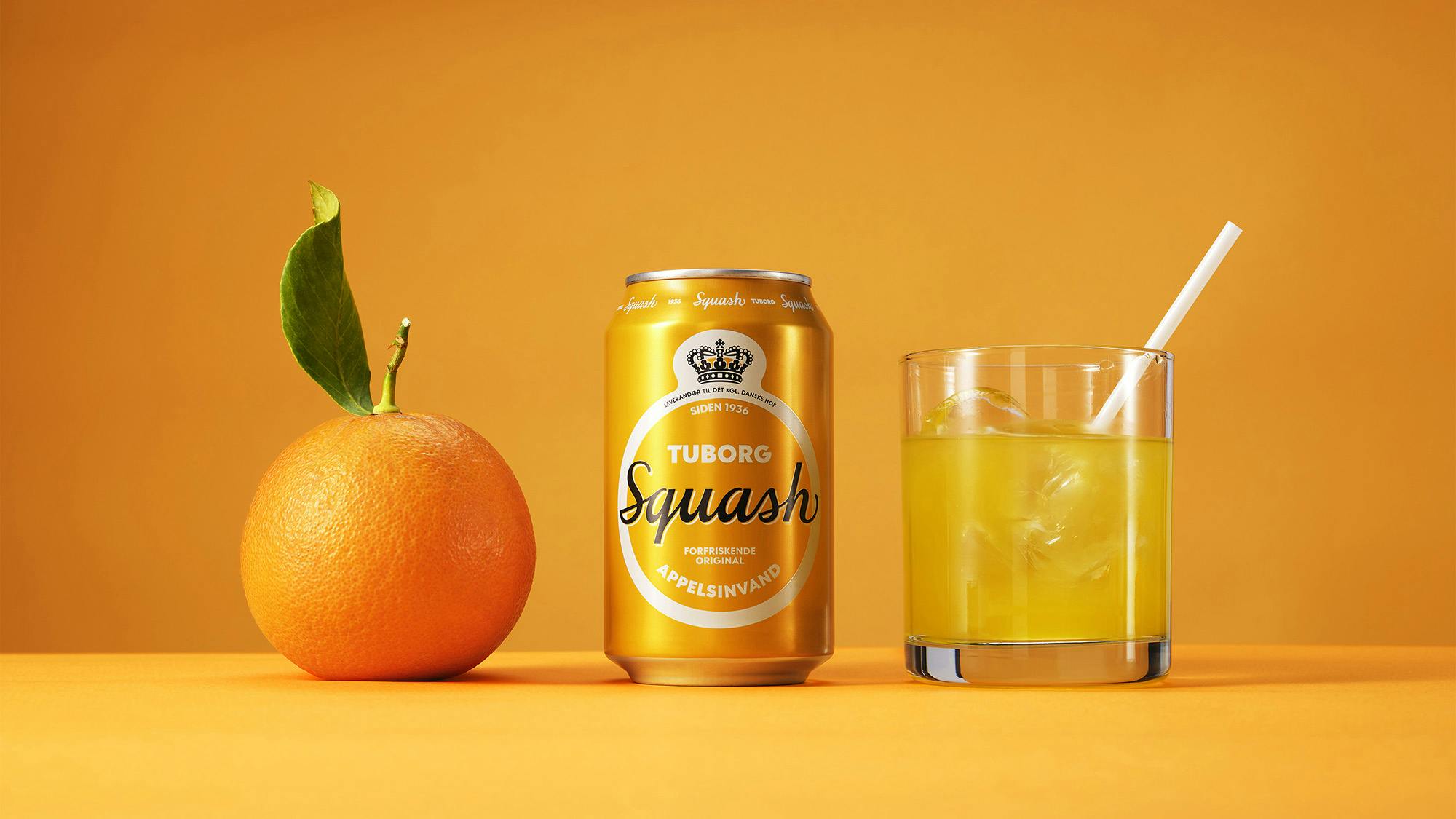
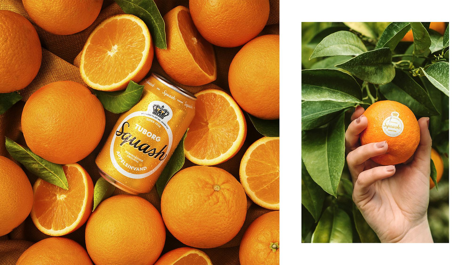
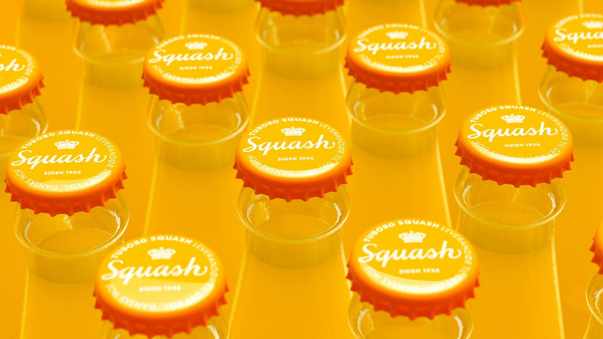
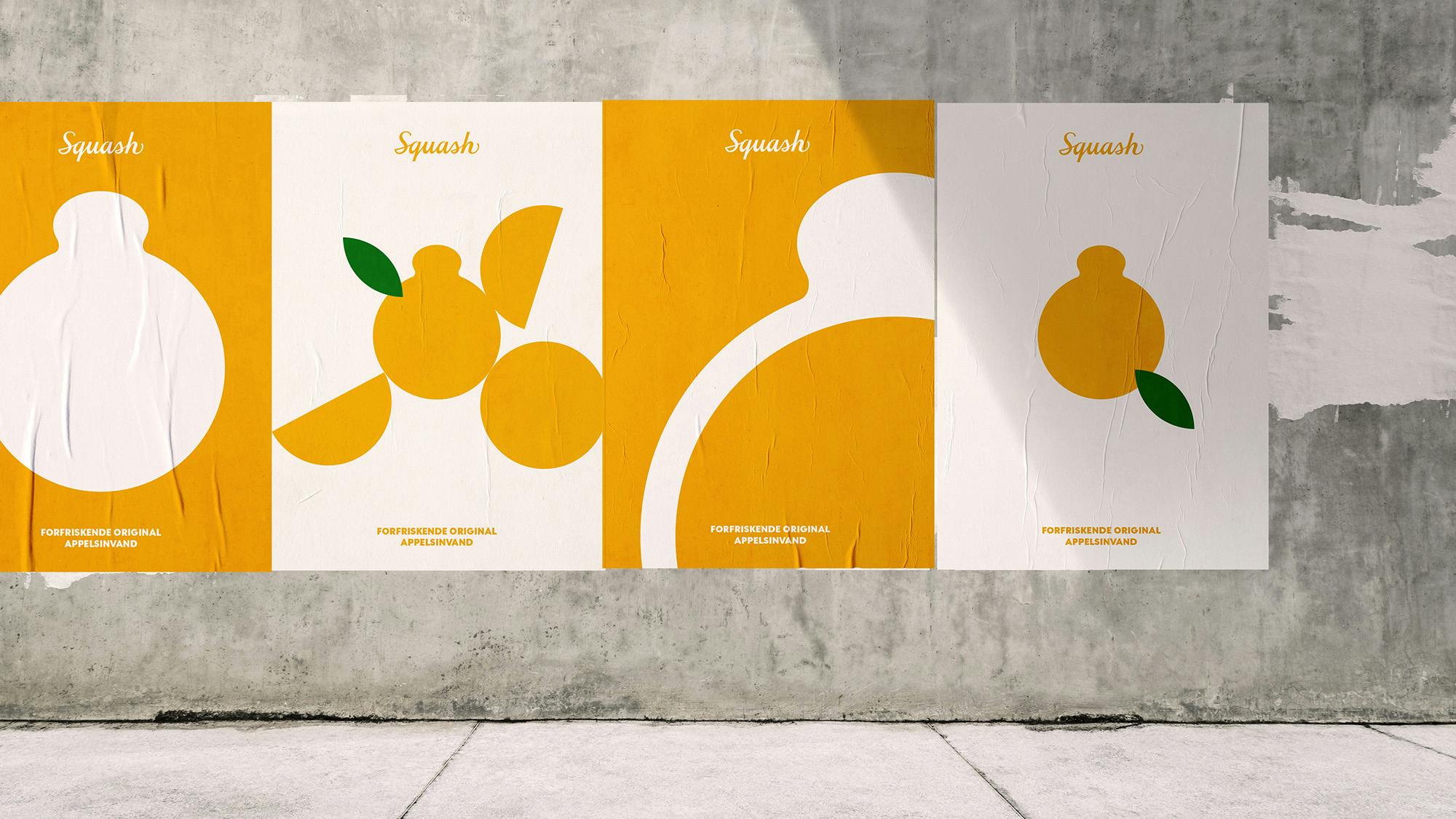
One of these traditions was the two-orange rule; in every Squash was the equivalent of two oranges. Naturally, we couldn’t help incorporate this into the new design. The first orange is the round label shaped like… well, an orange. The other orange is hidden inside the label’s top crown to focus on this legendary soda water’s legacy and pride.
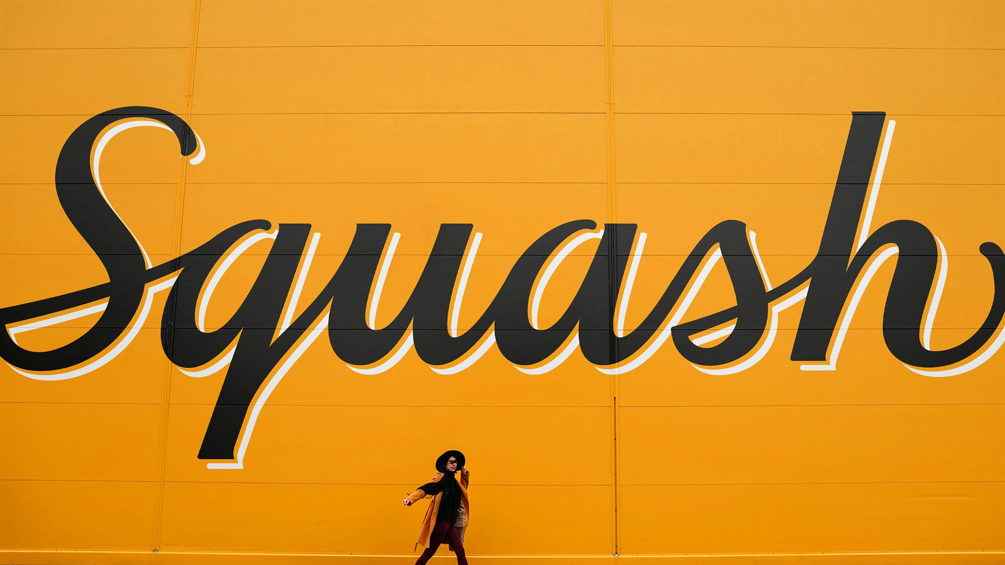
However, the real change in the design is the liquid typography used in the new logotype. We interpret traditional and personal details and convey them into a modern logo. By respecting what has worked in the past, we induce new life to the label. The lines become playful, with soft, silky movements, and if you look closer, you can see the S-letters greeting you with a friendly smile. Details like this spark the imagination and make for good storytelling and iconic design. That, and an original, refreshing taste.
What message are you trying to convey through the logo and brand identity you’ve created for Tuborg Squash?
We want to rejuvenate a Danish soda icon with the new brand design. It should connect with a younger audience, but at the same time, it should appeal to existing fans. It should emphasize the tasty orange flavor and just be more Tuborg-ish. Refreshing, without getting too fresh, and original without becoming old-school.
Lastly, what would you say is your main takeaway from this experience? Is there something you wish you knew before you started or any advice for designers embarking on branding projects themselves?
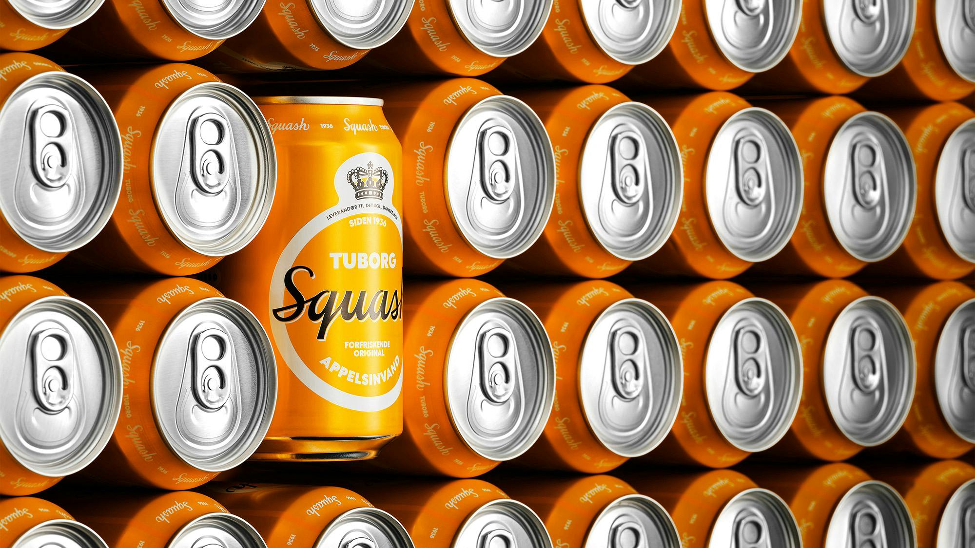
I would say there are two things we have been reassured about. First is the importance of keeping a simple design to make it pop on the shelves. Today, too many brands end up competing on noise, clutter and confusion. Rather, brands should boil down their communication. It’s the only way to make sure people remember and pick your brand.
Second is the importance of aligning your brand design with your context. This is crucial for being relevant in consumers’ eyes. Building on your company’s existing and promising brand assets. Explore the competitive landscape and see where the market is heading. Uncover consumer needs, demands and trends in order to stay relevant. Finally, dive into the culture and inspect the culture of the brand and consumers.
