
Carl Johan Larsson is Creative Director & Partner at the Scandinavian consumer brand agency Everland. For 15-plus years, Carl has worked at leading design agencies in Scandinavia. His versatile skills have helped his teams win numerous awards, working with clients like REMA 1000, Carlsberg, Danone, GP Batteries, Cloetta, and Orkla Foods. Click here to check out more of Everland's work with brands like Tuborg Squash and REMA 1000.
La Vie packaging
Can you tell us how this project came about? How did that conversation start with La Vie?
We have previously worked with La Vie’s CCO & CMO Romain Jolivet on other projects with great success. So, when he joined this new startup we were invited to pitch on the rebrand. Once again, our chemistry helped develop a brand identity that truly stands out in its market and among the competition.
The whole process was a close collaboration with La Vie. Together, we visualized and verbalized the brand, creating the brand strategy, foundation, and tonality.

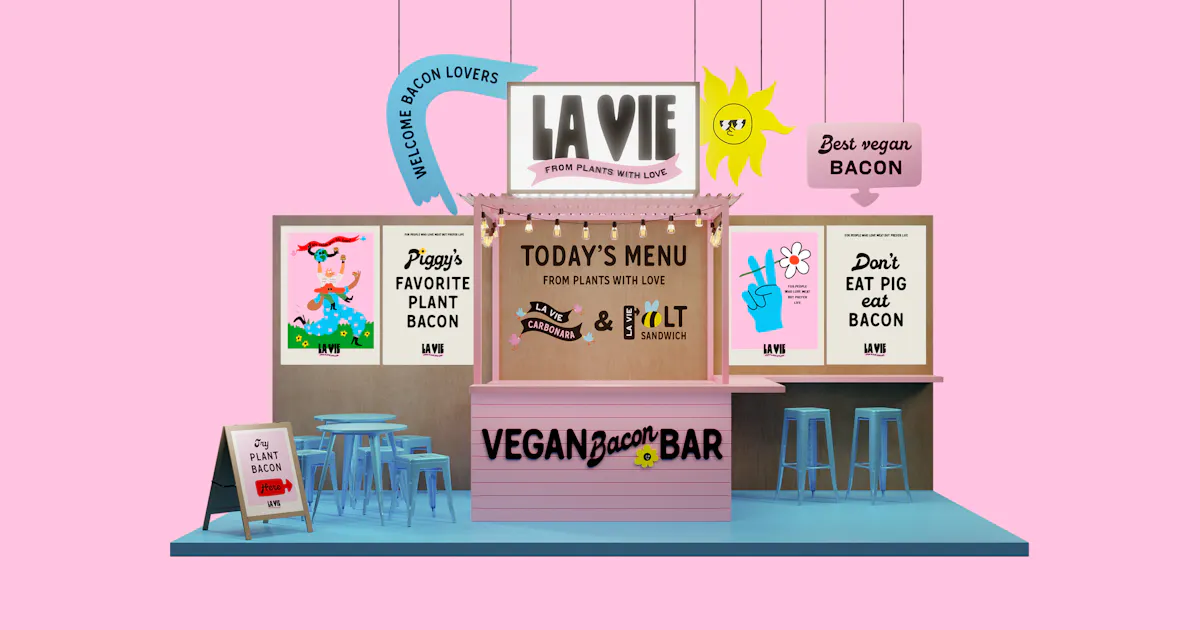
La Vie overview
How about the branding process? Can you tell us more about it? Where did you start? Were there surprising challenges you encountered along the way?
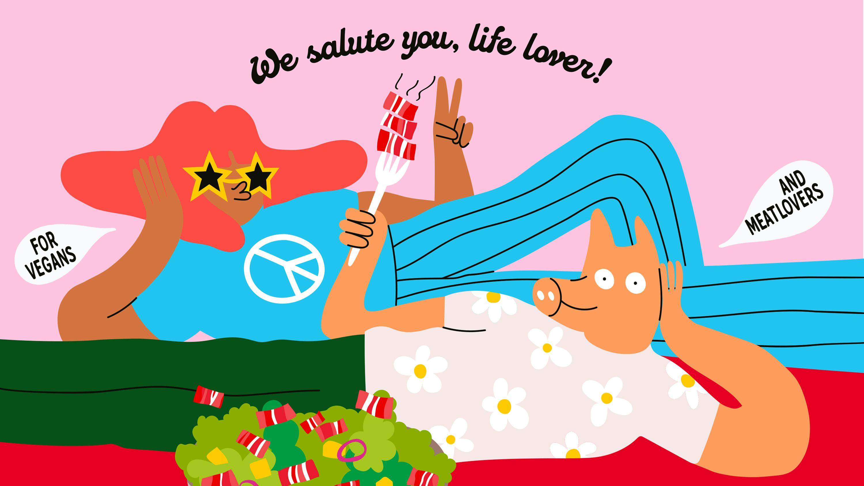
La Vie takes a different approach to branding plant-based foods. They seek to unite vegans and meat lovers. And they do so by celebrating life, the thing we all share. This attitude is a relief to a society that is tired of compromises and hearing what they can’t do or should be doing. La Vie brings people together rather than separating them.
"After all, we are all humans, sharing this planet together with the animals. No need for social shaming. It’s also counter-productive to sustainable solutions."
To stand out and seduce beet and beef lovers alike, La Vie wanted a whole brand universe with a brand identity, a cheeky tonality, and packaging that questions the mainstream conventions in the category. This however is provided with the biggest challenge: to help consumers understand the product and, at the same time, challenge the category. Balancing the semiotic codes while building something consumers can relate to emotionally. Fortunately, La Vie is brave, ambitious, and talented. So, they’ve got the chops to succeed in this matter.
La Vie plant-based foods
What were your inspirations when coming up with a brand identity for La Vie?
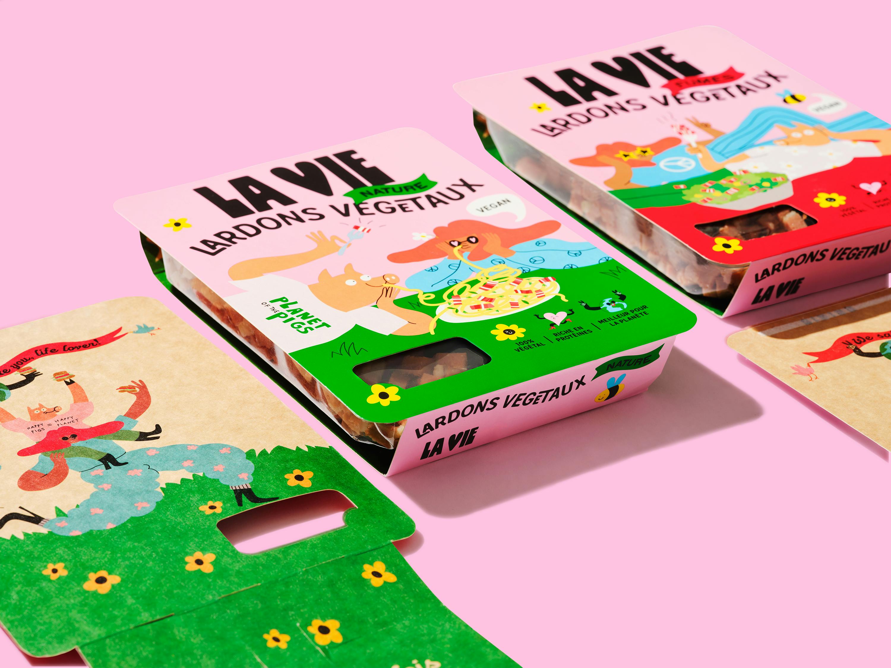
Traditionally, this category mimics meat packaging aesthetics with a vegan twist. For example, one cliché is having a brand name with “plant” in it or being too focused on every functional benefit of the product, spelling them out with endless splashes. With La Vie, we focus on people’s feelings and celebrate life.
The inspiration and the energy were drawn from the strategy and the foundation of the brand, the ”from plants with love” mentality. Bringing it to life became quite easy. We couldn’t compromise when it came to colors, styles, typography, messages, et cetra. Everything needed to be as loving and as bold as the strategy.
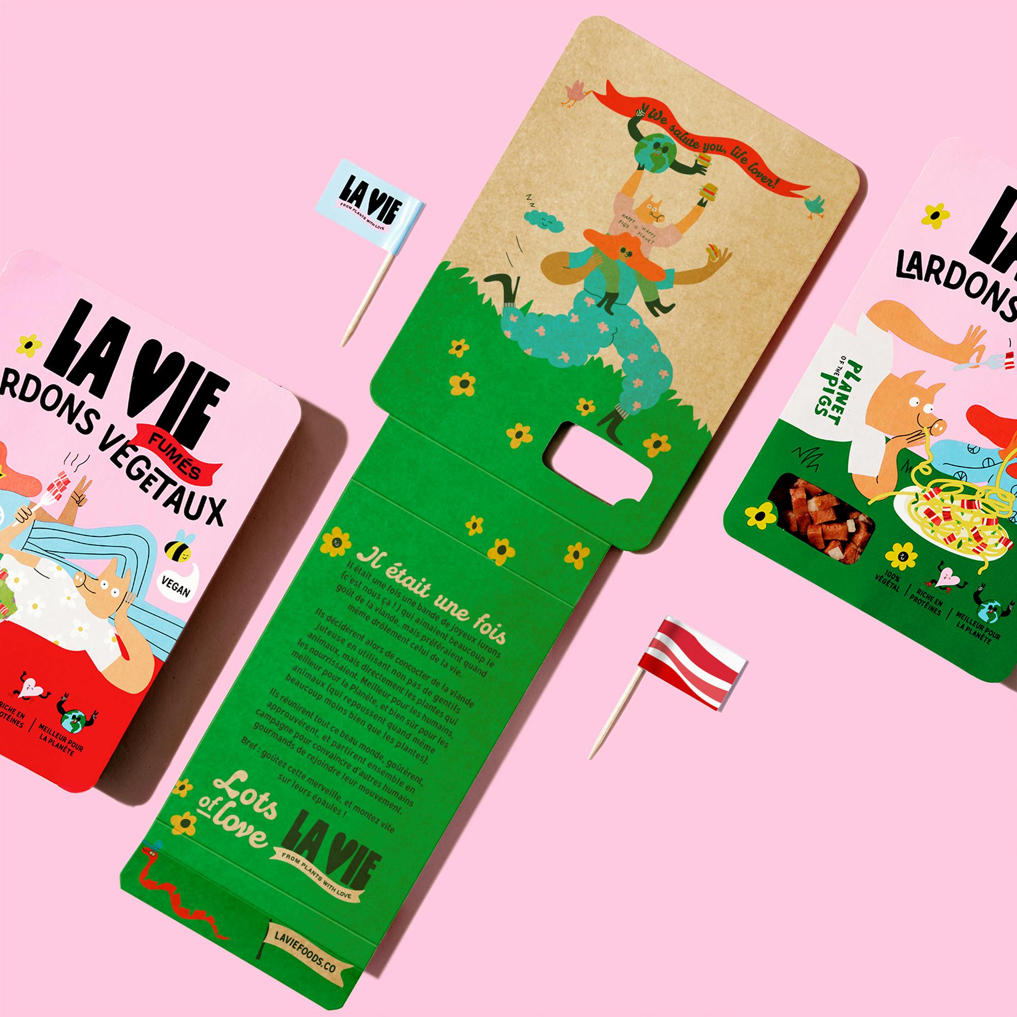
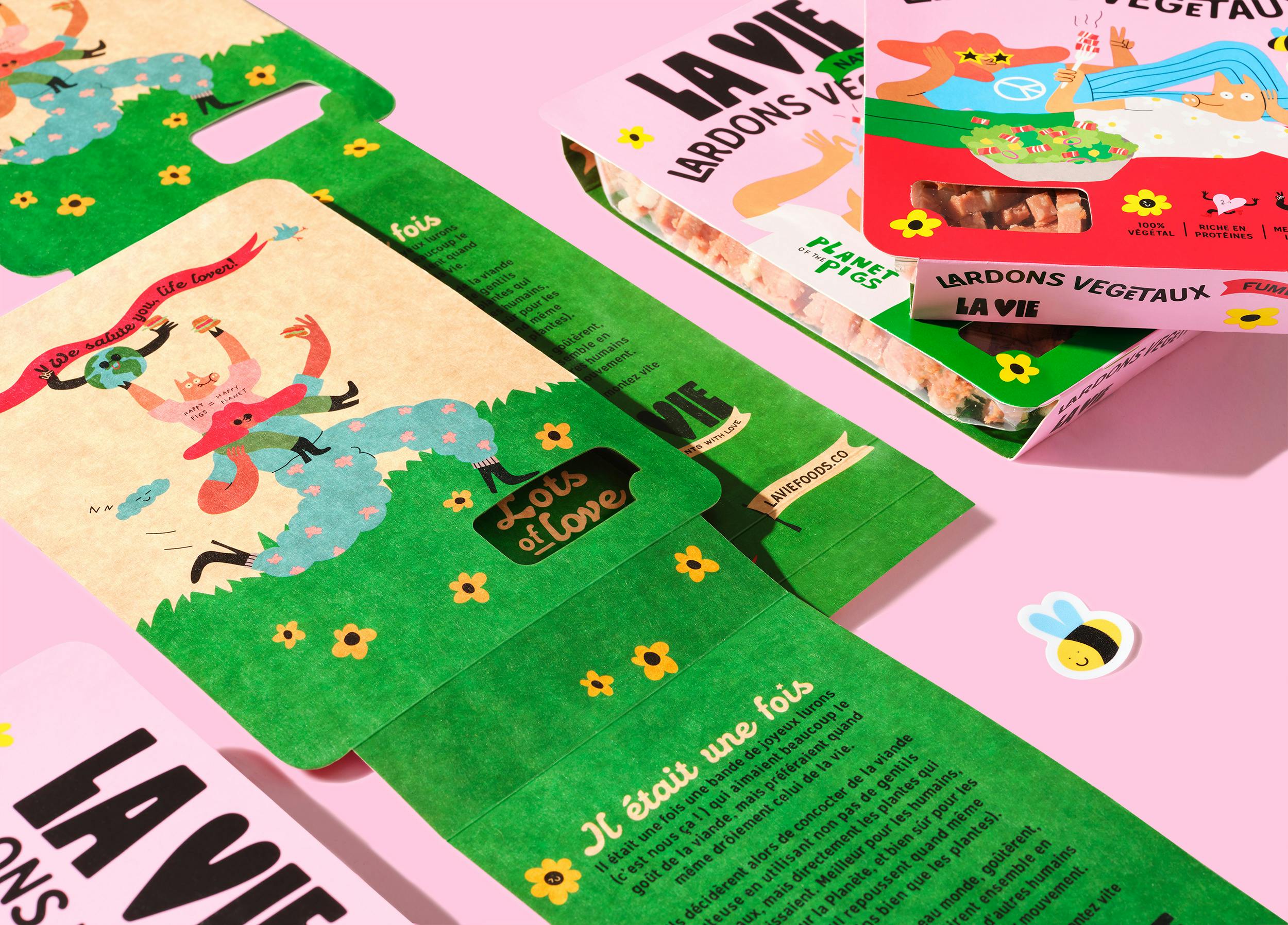
La Vie foldout packaging
What's immediately striking about La Vie’s brand identity is the illustration style. Can you tell us how that was conceptualized and how you landed on this style?
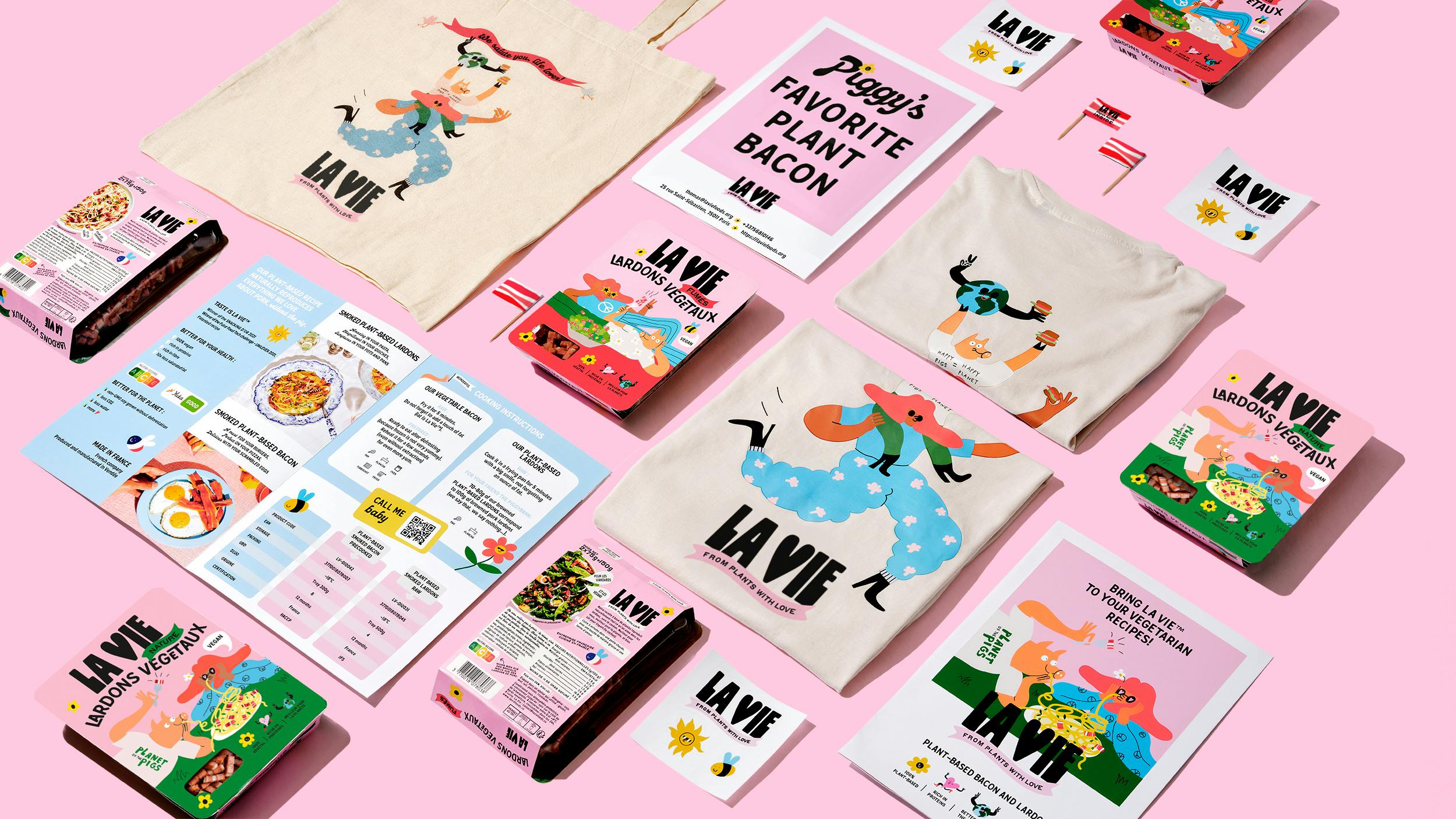
We needed something that would pop on the shelves. A brand element La Vie could use for building a brand universe, something flexible that could be used across touchpoints. Illustrations are ideal for this.
Both La Vie and our team had seen Egle’s amazing creative work for Apple, Google, Adidas, Nike, and Volcom. Her unique style adds character and personality to the La Vie universe. It brings some of the warmth, edginess, and humor. We were thrilled that she wanted to work with us on this project. And well, the results speak for themselves.
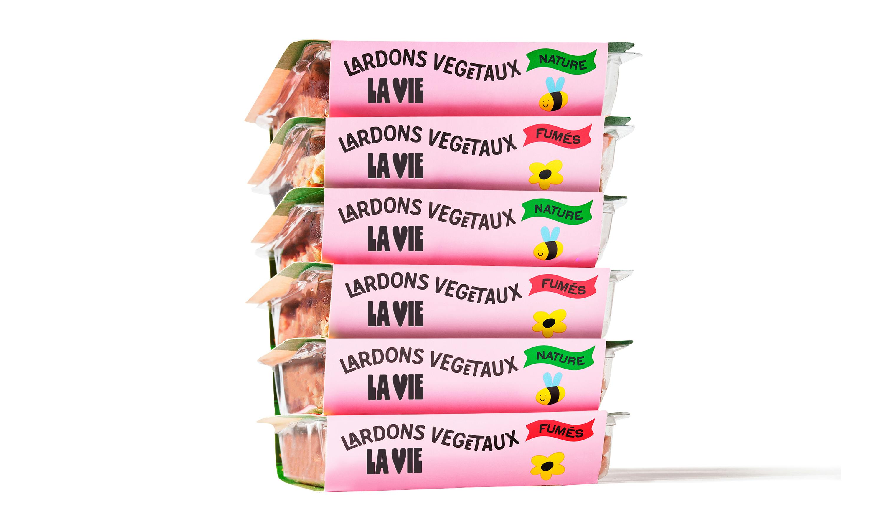
La Vie packages stacked up
Can you tell us more about the logo? What’s the story behind it? Were there other versions that nearly made the cut?
The logo highlights the love for life and plants strategy. Let’s be honest, it’s not super unique to use a heart as a symbol but in this case, it made sense. It fits well with the typography we used and we worked a lot with the balance so the heart feels like a natural part of the logo.
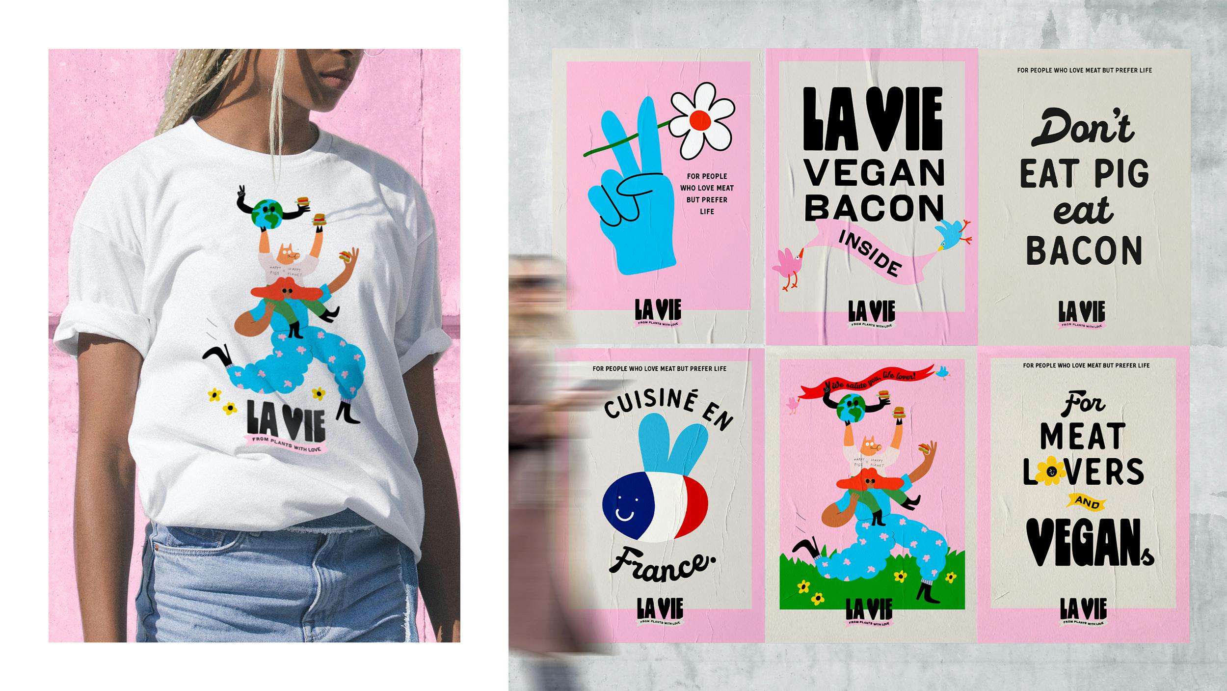
La Vie tee shirt and posters
Can you tell us more about the color choices? How did you decide on the color palette and what does that say about the brand?
We chose a color palette that celebrates life. Pink is positive and powerful and the dominant color, flirting with the bacon color. Then we add some green and red to support the main color and differentiate the products. Finally, some black for contrast and boldness. All in all, it makes a cohesive look that makes you smile and feel energized, just like the food itself.
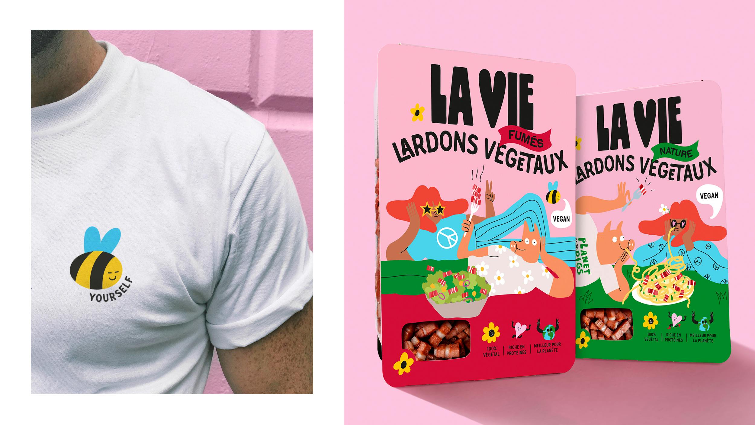
La Vie tee shirt and package
Lastly, do you have any advice or pro-tips for designers embarking on projects like these?
One of the blessings of this project was the collaboration between us and the client. We really challenged and pushed each other in building this together. Another success factor was having a strong and understandable, yet not obvious, concept. We used it as a springboard for everything we did.
And last but not least, try to connect with the ones who inspire you. That’s how we found Egle Zvirblyte. We didn’t want to compromise on the look, energy and integrity of her illustrations so we didn’t try to find a substitute. We went to the source and luckily we got her onboard.
La Vie vegan branding