before

after

Interview with Becca Kingsbury, Senior Business Partner at YouCanBookMe
Can you share with us the history and development of YouCanBookMe, and explain how the idea of rebranding came about?
YouCanBookMe (YCBM) was launched in 2011 by Bridget and Keith Harris, starting from their dining room table. While YCBM is their most recognized project, it wasn’t their first. One of their earlier tools, WhenIsGood, is still live today. It’s a free tool designed to help groups coordinate schedules easily.
At the time of YCBM's launch, Bridget and Keith were working full-time jobs and raising two young children. They built YCBM during late nights and eventually transitioned to working on it full-time, growing it into a profitable business with a global team.

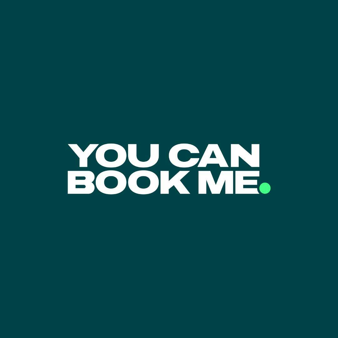
YCBM's Old Identity
After 13 years, the rebranding felt like a natural step. The original logo was inspired by the old calendar grid from the system’s earlier user interface. While it served its purpose, the tool’s UX had evolved significantly, and the logo no longer reflected its modern design.
The rebrand also aligned with a broader strategic pivot. YCBM shifted its focus to small businesses, solo-preneurs, and startups. Unlike competitors that prioritize enterprise customers, YCBM emphasizes accessibility and human support for everyone. The new branding reflects this commitment to being a real company for real people.
What inspired the design of the new logo, and what message or emotion were you aiming to communicate through it?
The biggest inspiration for our new design is its simplicity and universal recognition. Our new logo and iconography look completely different from the old version, and a key element is the bright green dot.
The green dot is a universally understood symbol for availability. Whether it’s on Slack, Facebook Messenger, or other platforms, the green dot signals that someone is online, available, and ready to connect. That’s the message we wanted to convey—“I’m here, I’m available, you can meet with me.”
This bright green, what we call “availability green,” is central to our branding. You’ll see it throughout, from the "Y" in YouCanBookMe to other iconography, always accompanied by the green dot. It’s a simple but powerful way to communicate connection and accessibility.
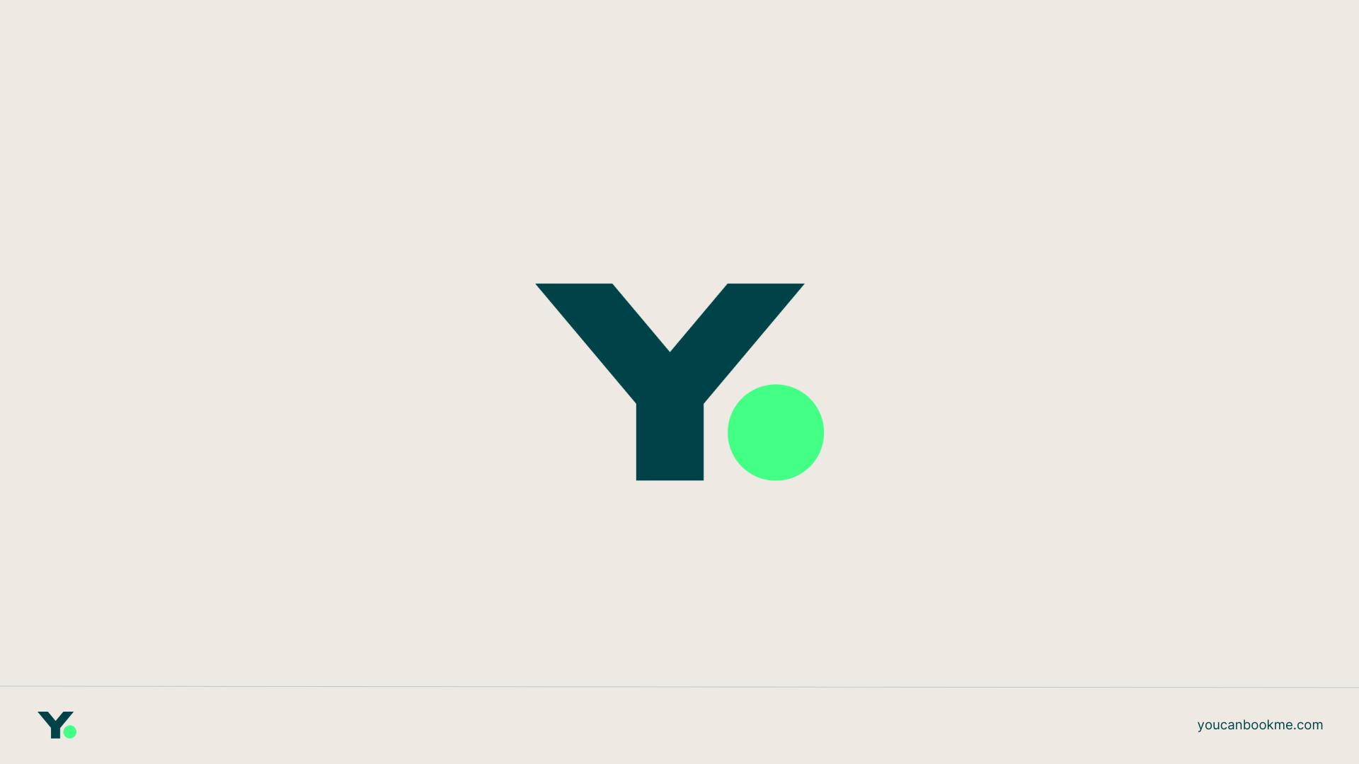
Image courtesy by YouCanBookMe
Why did you decide to rely on your in-house team, particularly your Creative Director, for the rebrand instead of hiring a creative agency?
We’re fortunate to have an incredible Creative Director, Rob Lafratta , who has been the visionary behind all our designs for years. Whether it’s the platform, user app, or website, everything you’ve seen has come from Rob’s talent and creativity.
Rob’s deep understanding of the product made him the obvious choice. His designs aren’t just visually beautiful but also enhance user experience. He knows YCBM inside and out, and his heart and soul are in everything we create. For us, there was no alternative—it had to be Rob and his team.
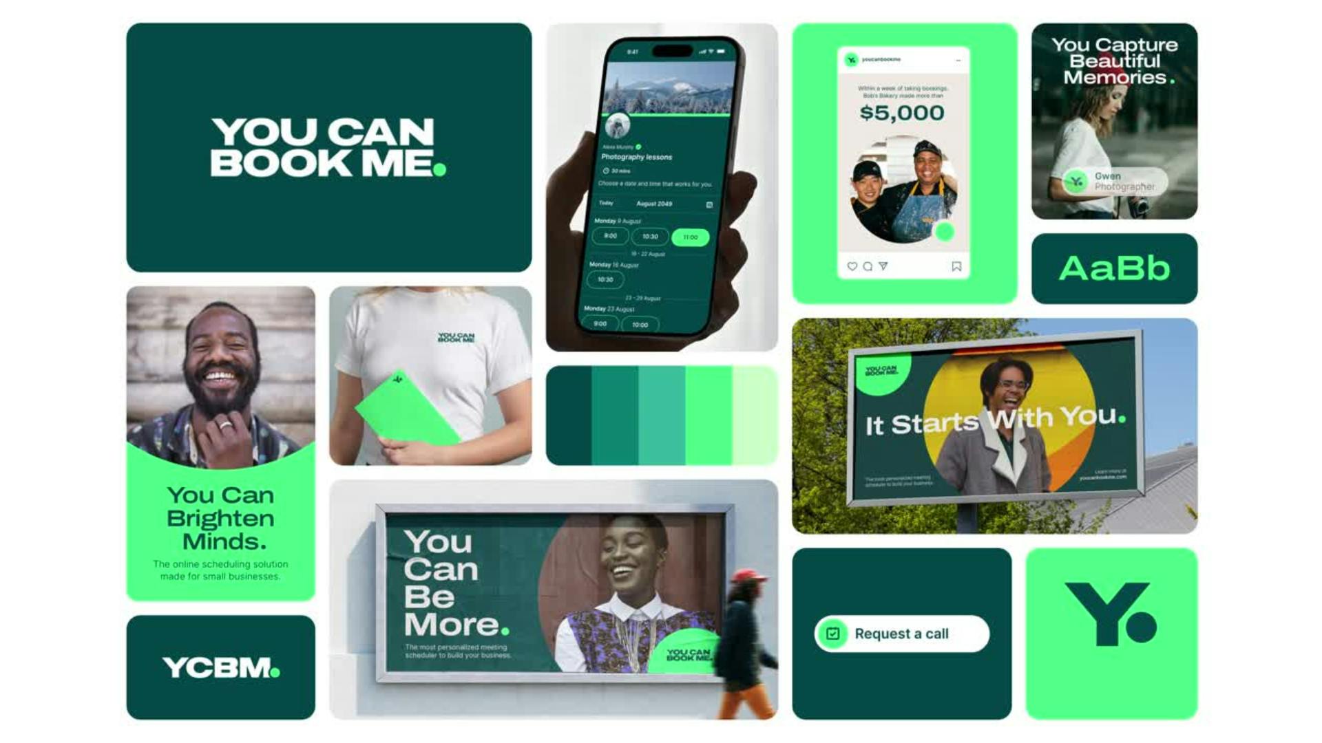
Image courtesy by YouCanBookMe
During the rebrand, did you face any challenges? How did you overcome them?
The biggest challenge during the rebrand was ensuring that every single instance of our logo and branding online was updated. After 13 years in business, our digital footprint was massive, and tracking down every place our old branding appeared was a daunting task.
To tackle this, we built an extensive checklist in the weeks leading up to the rebrand. We listed every location we could find where our branding was present—whether it was a prominent site or a long-forgotten blog post from years ago. Nothing was too small or obscure to include.
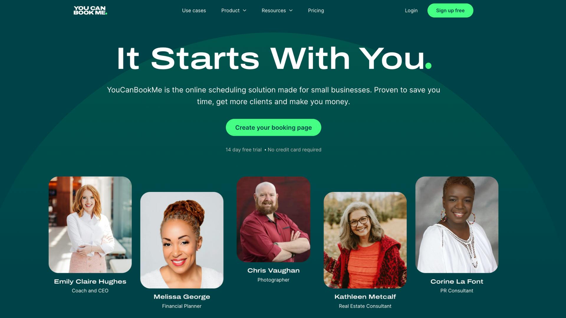
Image courtesy by YouCanBookMe
When the time came to roll out the rebrand, this comprehensive checklist became our guide. We systematically worked through it, ensuring everything was updated. And as a bonus, we turned this checklist into a reusable resource. Now, if we ever make changes to our brand in the future, we already have a roadmap in place, saving us from repeating the same research.

Image courtesy by YouCanBookMe
Are there any sort of new features that YCBM introduced when rolling out the new look?
Yes, we introduced 15 product updates in the months leading up to the rebrand, thanks to our incredible development team. Here are some highlights:
- Location Dropdown: Bookers can now choose where and how they want to meet—whether it’s a phone call, Google Meet, Zoom, Microsoft Teams, or even an in-person meeting at a coffee shop. It’s all customizable.
- Custom Backgrounds: You can now personalize your booking page with flat colors, gradients, or custom images. This feature allows businesses to fully align their booking pages with their branding.
- Analytics Dashboard: Users can track bookings, monitor no-show rates, and gain insights at a glance with our new analytics feature.
- Custom Offline Messages: If you’re unavailable—whether it’s for a vacation, full bookings, or any other reason—you can now create personalized messages for your booking page. Messages can also automatically update when you’re back online.
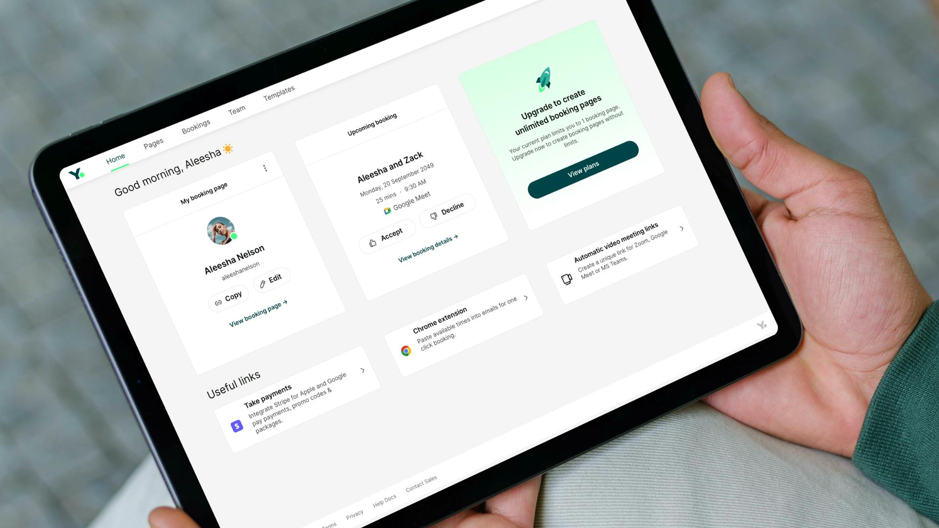
Image courtesy by YouCanBookMe
- HubSpot Integration: Our improved integration syncs all booking activity, reschedules, and cancellations directly with HubSpot CRM.
- Booking Notes: Add private notes to bookings to keep track of follow-ups or reminders. These notes are visible only to the team, not the booker.
- Zapier Automations: With 12 Zapier triggers, users can automate more processes and reduce manual work.
- Enhanced Embedding Options: We’ve added three new ways to embed booking pages directly into websites, making it easier to match different styles and workflows.
- Chrome Extension Updates: The Chrome extension now offers quick access to upcoming meetings, booking links, and suggested times for email—no need to log in.
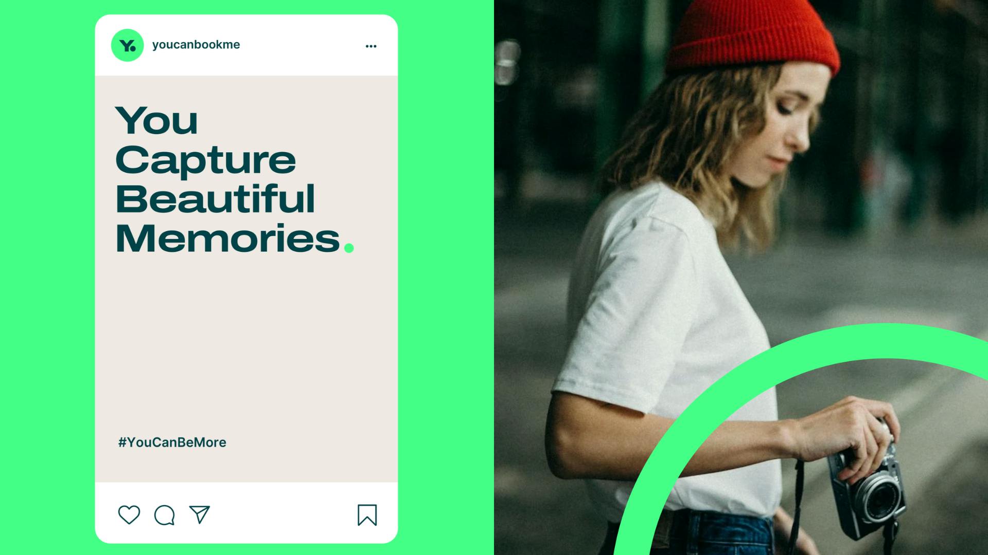
Image courtesy by YouCanBookMe
- Outlook and Apple Calendar Integrations: These new integrations help keep all your scheduling in sync.
- Booking Add-Ons: Businesses can now offer add-ons to bookings, like treatments, products, or additional services, creating a seamless booking experience for customers.
- Email/Domain Blocking: Block bookings by specific email addresses or domains to maintain control over your schedule.
- Advanced Tracking: Full integration with Facebook Pixel, LinkedIn, and Google Analytics for comprehensive tracking and data insights.
These updates reflect our commitment to making scheduling more intuitive, flexible, and aligned with the needs of small businesses.
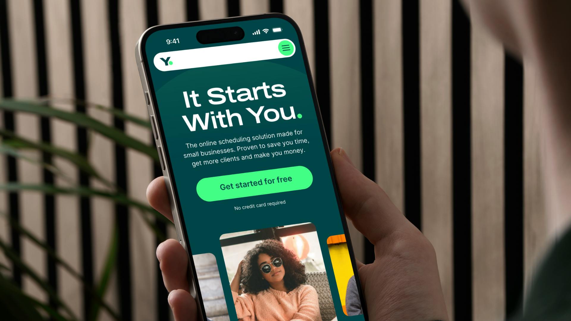
Image courtesy by YouCanBookMe
In what ways does the rebranding aim to differentiate YouCanBookMe from other scheduling tools in the market?
There are a few key ways we set out to stand apart. To start, we analyzed our competitors by gathering screenshots of their homepages, logos, and branding. What we found was that most of them look remarkably similar—same colors, same SEO keywords, and many of their names or logos include “CAL.”
We wanted to break away from that. Our goal was to create something unique, visually and strategically. As the online scheduling tool built by and for small businesses, we focus on accessibility and real support. Unlike others, even users on our free plan can talk to a real person for help.
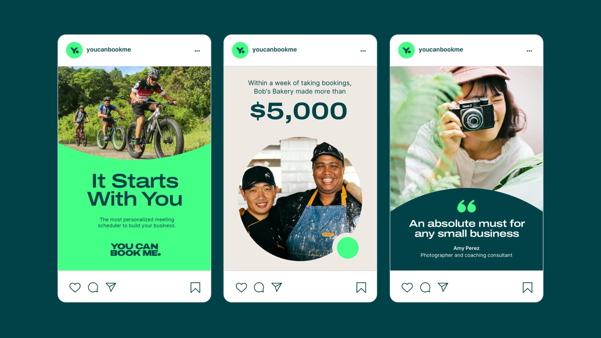
This commitment to small businesses is central to our messaging, and the rebrand ensures that every part of our identity reflects this focus.
What are the most helpful tools that you used during the rebranding process?
Miro was our go-to tool for brainstorming and building out ideas. When it came to creating assets, we did about 90% of our work in Canva.
The reason we relied so heavily on Canva is that we’re a fully remote team, and having everything centralized in one place was essential. It allowed anyone on the team—regardless of their graphic design skills—to access and create assets as needed. For instance, if someone needed to get a social media post out but our graphic designer was unavailable due to time zone differences, they could step in and create it themselves.
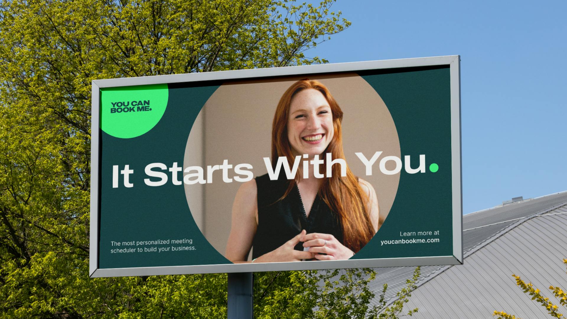
Image courtesy by YouCanBookMe
We also used Notion to keep everything organized. I put together a document for the team that included all the new branding guidelines, logos, and an explanation of why and how we rebranded. It was a one-stop shop to ensure everyone was on the same page.
Additionally, we created a library of pre-made social media posts—not for YouCanBookMe’s social channels but for our team members. These included visuals and copy they could use if they wanted to share about the rebrand on their own social media.
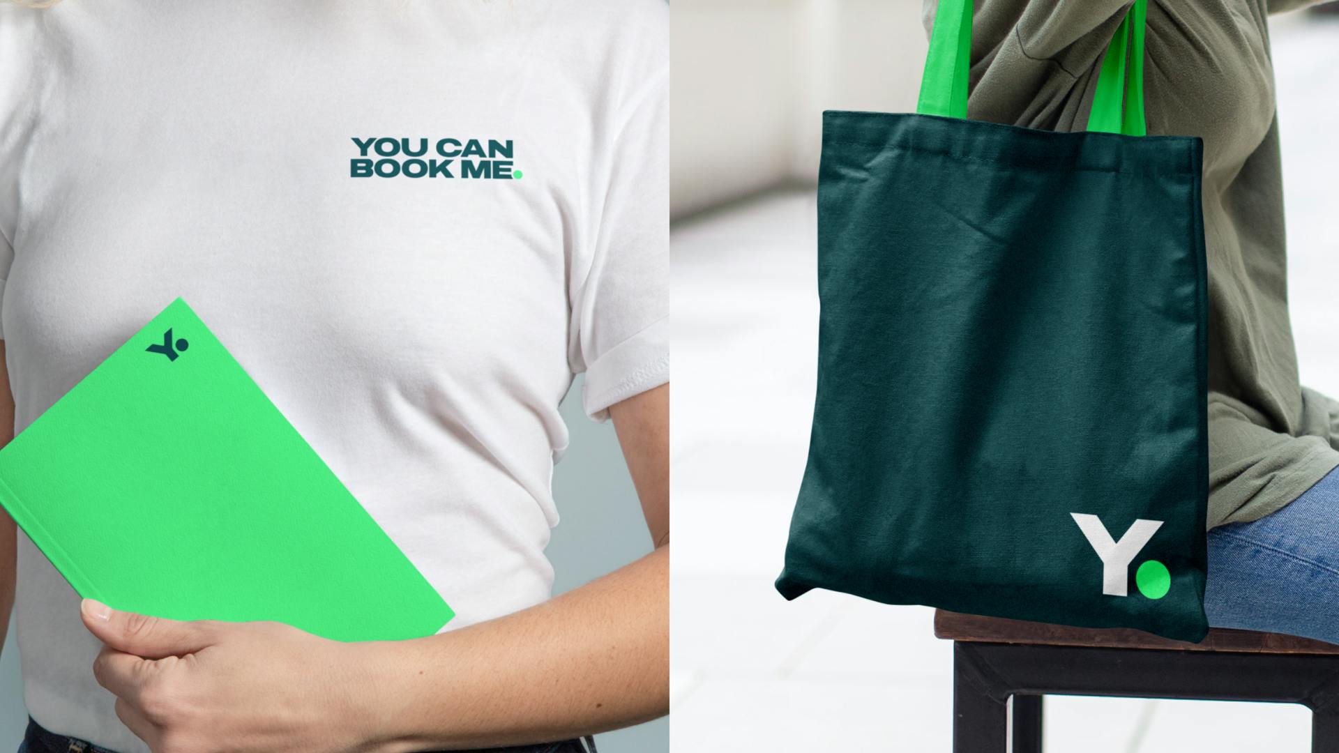
Image courtesy by YouCanBookMe
Is there a specific part of the rebrand that felt especially rewarding or significant to you?
One of the most rewarding aspects of the rebrand was how it became more than just a redesign—it was a complete reset of our brand’s messaging and strategy. This wasn’t about updating a logo or refreshing colors for the sake of appearance.
It was about creating something that truly encapsulated the voice of our audience and aligned with their needs. That deeper mission made a huge difference and created real buy-in from the team. Everyone was on board because they believed in the purpose behind the rebrand.
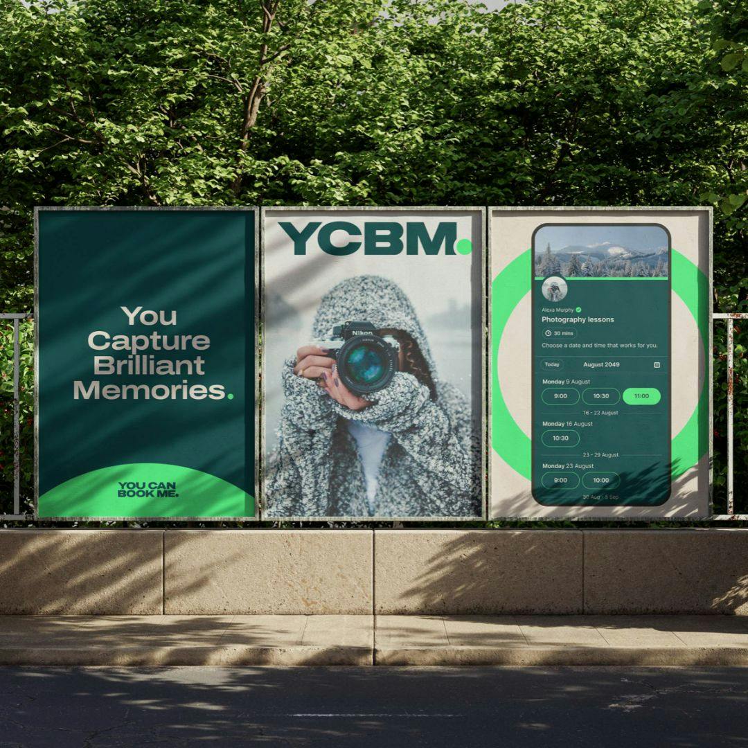
Image courtesy by YouCanBookMe
As we worked through the process, we also learned to be realistic and prioritize. “Rome wasn’t built in a day,” and neither is a rebrand. We focused on the most customer-facing areas first, like high-traffic spots, and left less critical areas, such as older YouTube videos, for later. It’s important to give yourself grace during a rebrand and recognize that some things can wait.
Image courtesy by YouCanBookMe
What truly stood out, though, was involving our customers in the process. We invited a group of customers we have close relationships with to join a series of calls where we shared the rebranding vision and gathered their feedback. It was an incredible experience. Not only did we get valuable insights, but we also created a moment of connection. Our customers started networking with each other—some even appeared on each other’s podcasts or began supporting each other’s businesses.
"It wasn’t just a rebrand for us—it became a way to bring people together and foster a sense of community, which was a beautiful and unexpected outcome of the process."
