
before

after

Jason Egnal, Chief Marketing Officer at Zenfolio, talked about their new logo and font type, what he would have done differently in their rebranding process, and “The Bigger Picture”.
Can you introduce us to Zenfolio, its beginnings, and what it’s about?
Zenfolio was launched in 2006 for those passionate about photography and who wanted an end-to-end solution for marketing, portfolio presentation, client galleries, and selling photos.
Over the last two years, Zenfolio has been rebuilding its 15-year-old solution, improving the backbone of the Classic product to enhance stability, performance and security, while in parallel, building a brand new user experience on a new, cutting-edge platform.

Our new solution caters to the needs of all photographers, from aspiring photographers to part-time and full-time professionals.
Today, Zenfolio is mobile-first, has built-in social features, and AI capabilities. We help photographers be more productive by automating every aspect of their business so they can grow efficiently.
You’ve updated your technology and systems. Why also do a rebranding on top of that?
When we analyzed the market, the competitive landscape, how the photography industry had evolved, and the new, highly differentiated product we were about to launch, we saw an opportunity to redefine ourselves as not only an established, reliable player, but as a fresh company with new management, new technology and inspired new ideas.
A company with the credibility and passion to help photographers succeed in doing what they love.
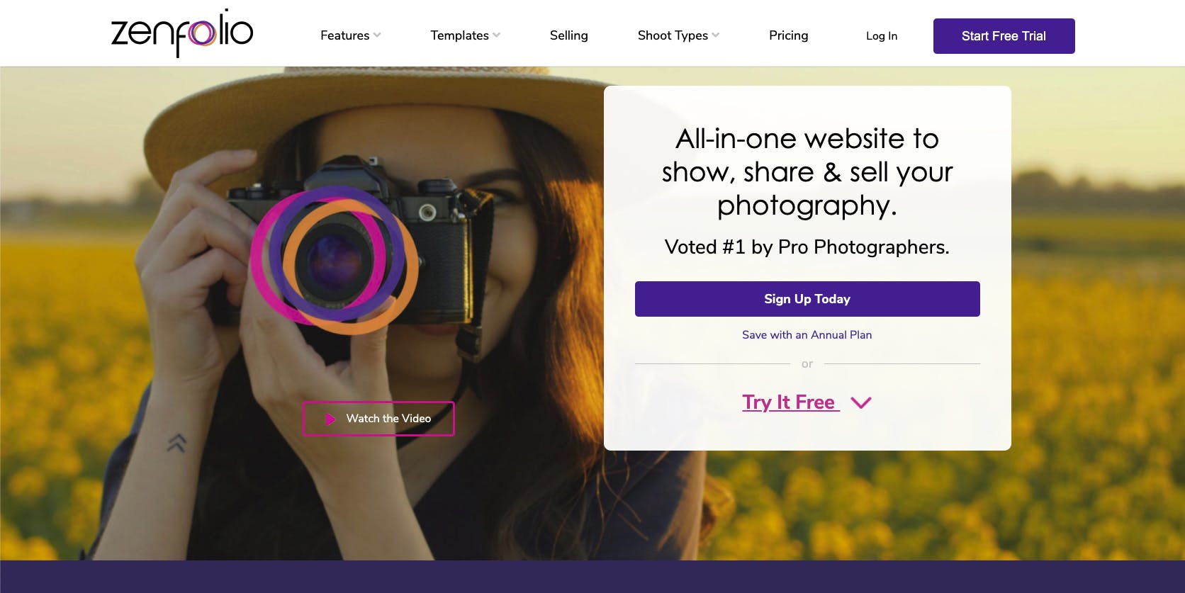
Zenfolio's new homepage.
There are many reasons to rebrand: Changes to the product offering, shifts in customer behaviour, targeting a new audience.
There was also the boom of the gig economy, shifts in the political environment, and of course the COVID pandemic. It’s become more important than ever for a brand to have a voice.
We needed to find our voice, our brand, our positioning, to define who we are in the modern era.
"All of these reasons provided a very strong argument for saying, "Look, the company has been reinvented and the world has changed. We can't just do a brand refresh, we need to completely reimagine the brand.""
How did the process of rebranding go? What kind of prep work did you do before rebranding?
We decided to work with a branding agency because we didn't have the bandwidth internally as our marketing team was working with our existing product to find creative ways to help our photographers generate revenue during COVID.
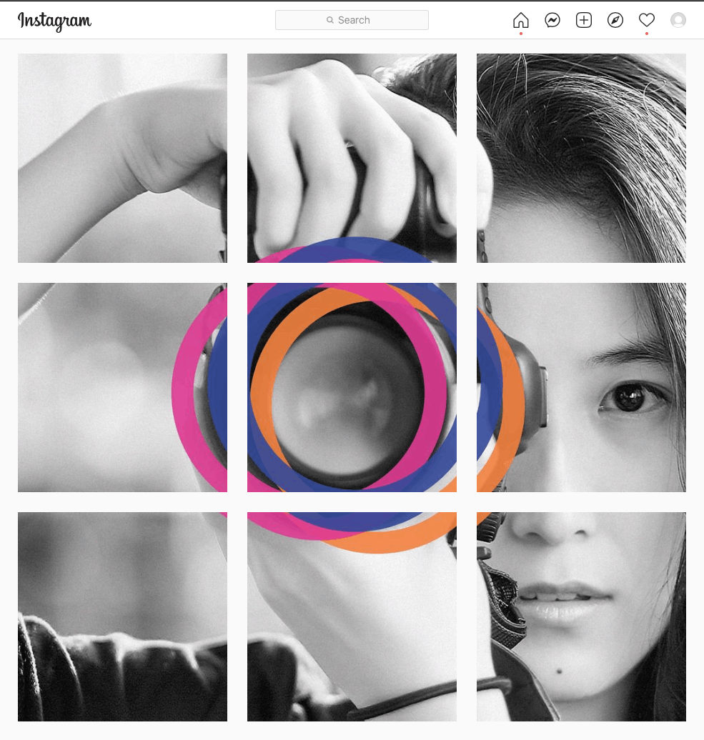
Zenfolio on Instagram
We did extensive research into the positioning, messaging, and voice of our competitors. We also looked at successful brands in the SaaS space and in the consumer space, and at social media brands.
"We wanted to create a brand that was dynamic and fresh and would resonate with photographers of all levels of experience across multiple photography genres."
When creating the logo, we were looking for something that represented photography, but didn't want something as obvious as a camera.
We wanted it to be indicative of different elements of photography, things that are recognizable to photographers, but also represent the changing photography industry, the flexibility of the digital format, the increasing importance of video, and new revenue opportunities for digital art.
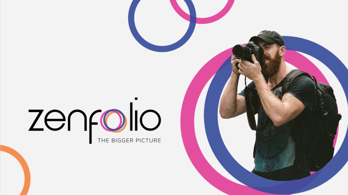
Tell us more about your new logo. What is the significance of the rings?
The circles are meant to be interpretive. They can allude to lenses, or represent f-stop, aperture, and focus. They are not perfectly aligned, as if their movement is frozen in an unexpected moment, indicating the dynamism of photography.
We decided to not be too prescriptive about the color of the rings, indicating flexibility and willingness to embrace change. We can use seasonal colors, or event-based colors.
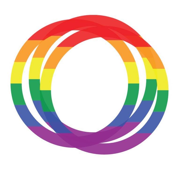
Zenfolio's Pride Logo
For example, during Pride Week, we used the logo to indicate the importance of diversity and inclusion. We also spent time on how much transparency there should be on the different colored rings so that they showed through to highlight their asymmetrical and unusual placement, showing movement and energy.

Zenfolio's magenta rings.
We decided to go for magenta, appealing to our growing audience of young, aspiring photographers. The blue is powerful and universal, and we kept the orange as a reference to our original brand.

Focus Your Passion
We've got 15 years of experience, we know what our customers need, we’re a successful company, we're profitable. We're looking to the future, but our history is important. The orange is a tribute to our successful past.
What about changes to the font type and other parts of the visual identity?

Zenfolio's new logo and typeface
You may notice that there are some unusual elements in the font type. For example, you’ll see that the vertical line on the ‘F’ is longer than the vertical line of the ‘L’. The tittle on the ‘i’ is a little higher than it should be. It doesn’t fit. It takes your eye up and forward — a positive movement.
"The unusual elements create dissonance, making the logo more interesting and more engaging. Not conforming to a standard helps us with our brand positioning. It’s unusual. It’s unexpected. It indicates that Zenfolio is a home for the creative and artistic."
One of the frustrations that the creative team had with our old brand was that the logo was just a word in a standard font, and the color palette was orange, gray, and navy. They were limited in their creative output, and our collateral was not as inspiring as it needed to be.
Zenfolio's old logo
We needed the brand to be flexible, to have a larger color palette that appealed to all of our user-personas, ranging from young, social-savvy 25 to 35-year-old aspiring photographers to older, more established professional photographers (who are just as social savvy and creative).
We also want to connect with the professional studio photographer who is running a business with a team of photographers. So the rebrand needed to have broad appeal.
Your tagline is ‘The Bigger Picture’. Why did you choose that slogan?
The tagline is an important one. We had many in mind, but this one was the most inspiring, was liked immediately by everybody, and perfectly tied to our mission.
A huge piece of what differentiates Zenfolio from our competitors is that we automate photographers’ business processes using machine learning and artificial intelligence. Our AI platform acts like a digital assistant working behind the scenes while photographers work behind the lens, making them more efficient and helping them earn more.
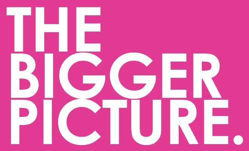
The Bigger Picture.
Zenfolio is more than just a technology partner for photographers. It’s their customer support, their admin helping them run a business, and even advising them. It’s their marketing and sales team.
Zenfolio is an end-to-end solution helping our photographers’ businesses become bigger and better. It's the bigger picture.
Could you share with us a takeaway or learning from this entire experience?
I started the rebranding maybe a month after joining Zenfolio. The company was not expecting a complete rebrand, so we had to do it in three months from start to finish in order to be ready for the launch of the new product. That was a very compressed timeline.
I think we came up with a beautiful design that is very meaningful, but the short timeline put pressure on the team.
"The biggest lesson: Energy and passion is not enough - give a rebranding initiative the time it deserves."
If we’d started sooner, the brand would have been established before we started product design, making it much easier to create brand consistency through every touchpoint.
Incorporating the original orange in the new brand provided compatibility with both the Classic product and the new product. That made things a bit easier.
"But branding is not only about the visuals, right? Finding the right tone and voice defines the brand, tells its story, and gives it life. We put a lot of energy into creating the right voice. "
In a perfect world, I would have rolled out the rebrand globally all at once. As time was not on our side we had to make compromises and trickle the rebrand out.
If I had to redo this experience, I would've preferred to launch the brand with a bang, not a whimper.
What’s next for Zenfolio?
We have a very agile development team, so every two weeks, we’re adding and launching new features. We're also focusing on our Future of Photography initiative to support photography students by giving away over $1,000,000 worth of subscriptions to our Portfolio plan.
We help photographers showcase their work, delight their clients and make their passion for photography a viable business. Our new platform is fresh and exciting, and although the company has been around for over a decade, this is just the beginning.
