

Gavin Strange, Director and Designer at Aardman, shares rebranding with modularity and variety, keeping that 'human touch,' and embracing fun and a bit of silliness.
Can you introduce us to Aardman and its brand identity through the years?
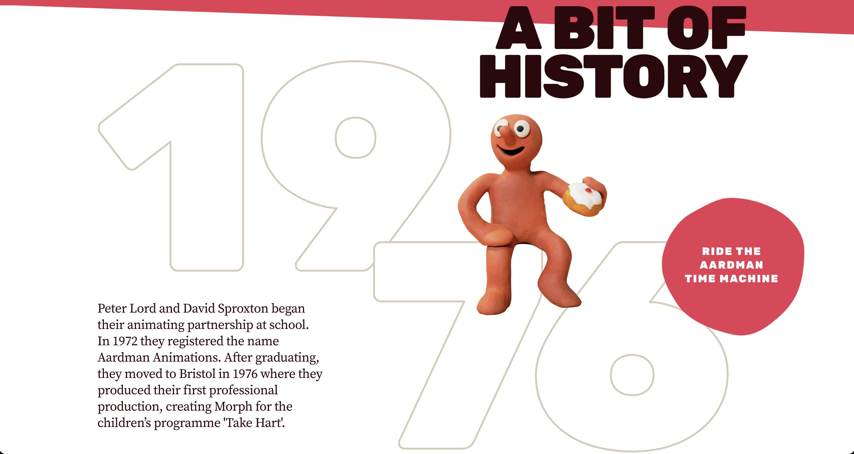
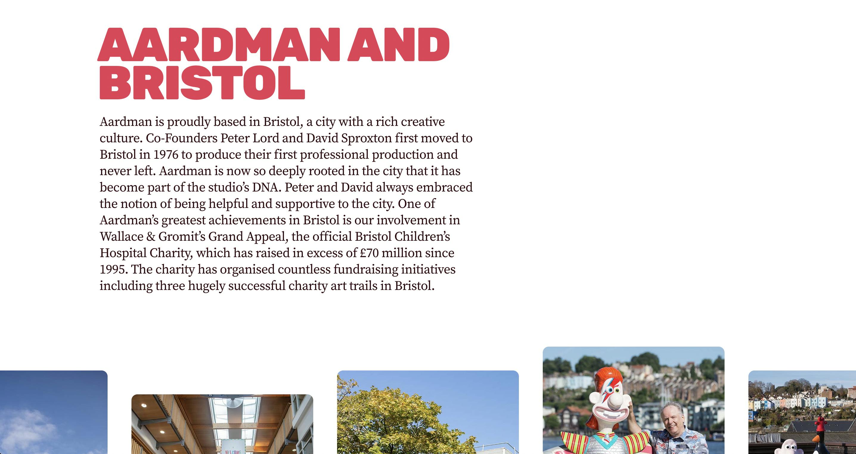
Aardman is an animation studio based in Bristol, started by two friends, Peter Lord and David Sproxton who were united in creativity and started Aardman with pure joy and enthusiasm. Their first animation work was for the BBC, which had been a series for deaf children called Vision On.
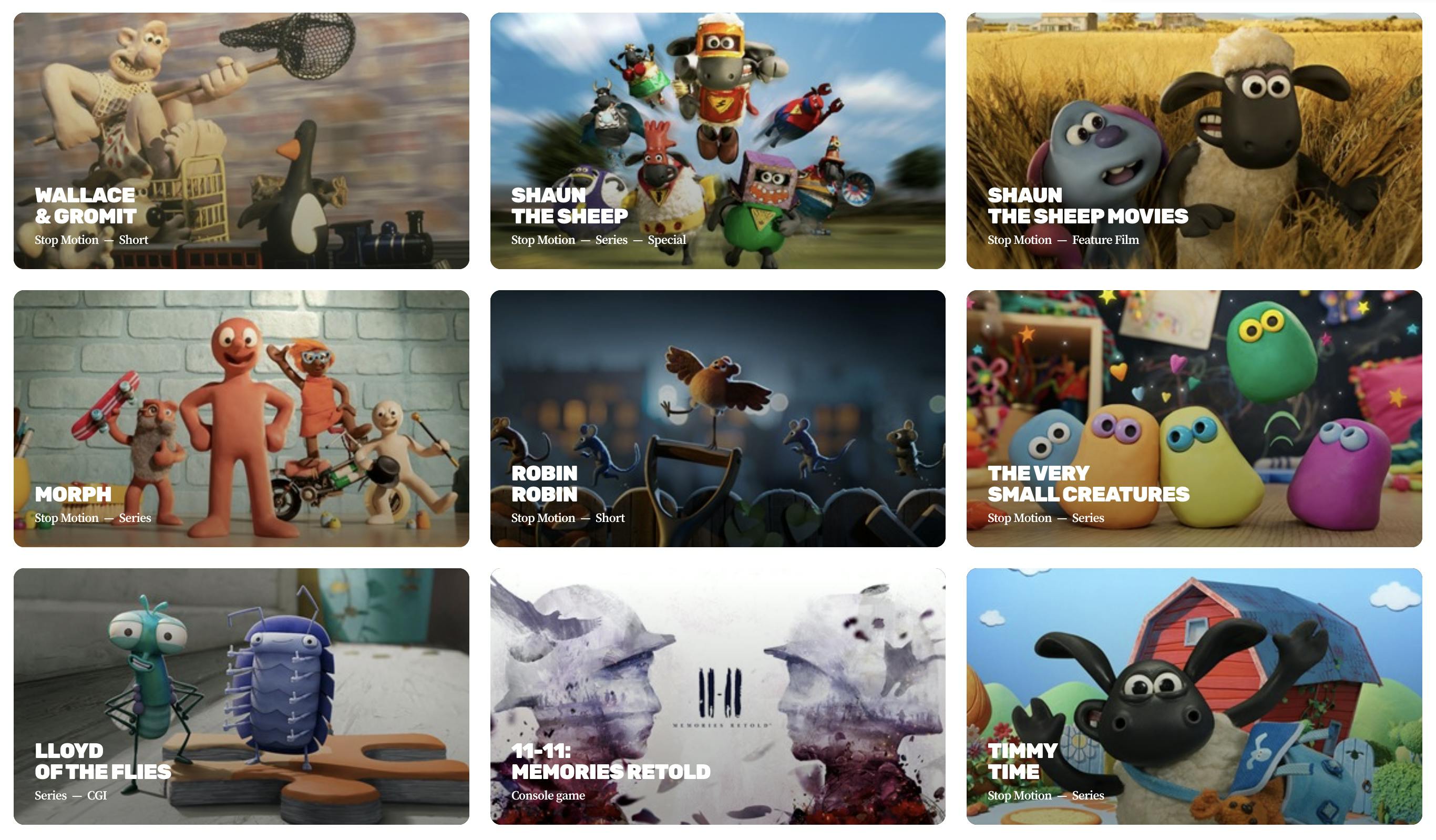
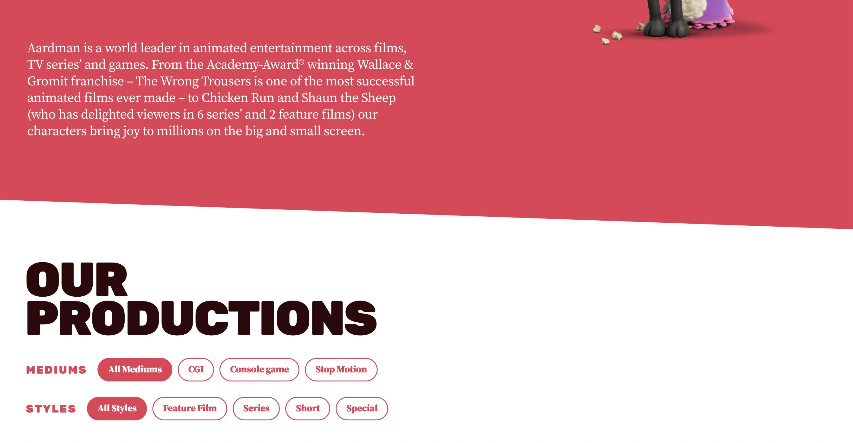
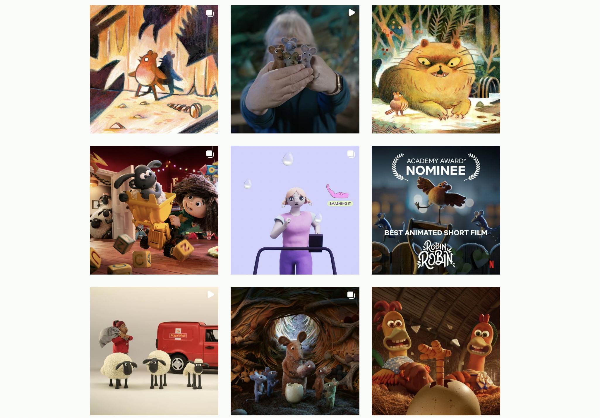
Over 40 years later, it has grown into a studio with over 500 employees who are really passionate to be there. Some Aardman titles include Wallace and Gromit, Chicken Run, and Shaun the Sheep.
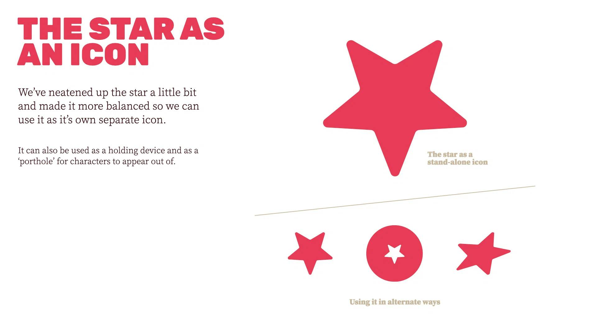
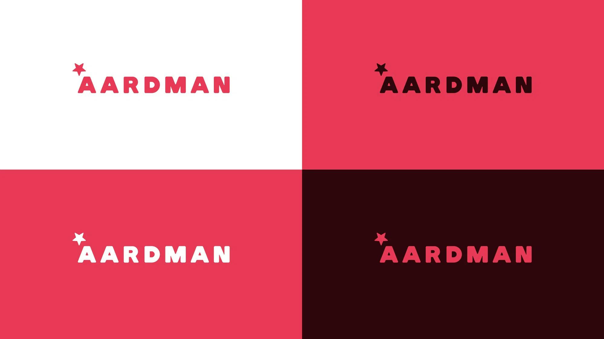
The graphic history of the Aardman brand is a bit complicated because no one fully knows who did what back then. The logo that we had since 1998-1999, which had the big red star, no one seems to know who did that.
In 2014, we did do a brand refresh. We didn’t change the logo, but we did change certain things like the website. The brand refresh was because we needed a more contemporary and modern look because obviously, everything was online by that point.


About this current rebranding, how did it come about? How did that conversation start?
We’ve been mainly focused on moving image, animation, films, games, shorts–all that stuff. Graphic design was never always fully represented so the brand always just kind of existed, which was fine. But as Aardman grew, more graphic designers joined our team and graphic design as a principle became a more important part of Aardman.
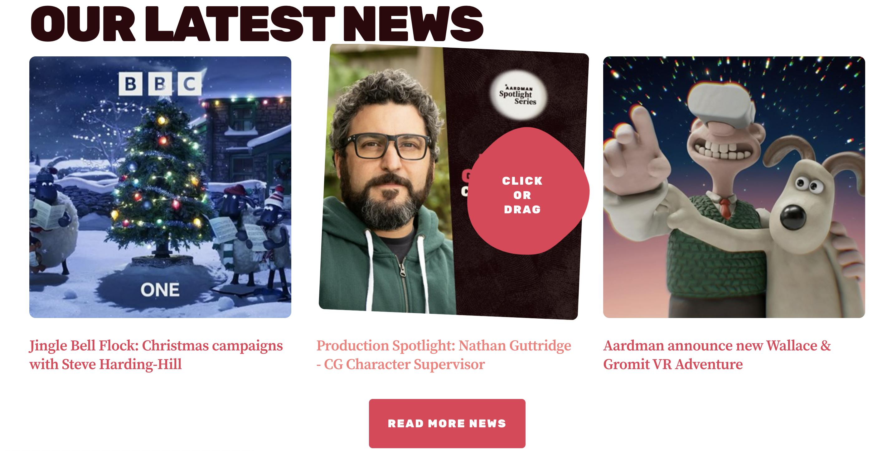
When we started the rebranding process 2 years ago in 2020, that was when we really saw that people knew our titles like Shaun the Sheep, but they didn’t know it was Aardman. That had been a big driving force behind the decision to rebrand. Not everyone knew the name Aardman even though they might know the things we’ve done.
We also wanted to tell the world that we do more than what they might know like Wallace and Gromit and Chicken Run. We wanted them to know that we also make games, events, short films, commercials–many of the brilliant things that people at Aardman do. That was when we thought to look at the logo and do a full rebranding.
Additionally, the world has also changed. How a brand exists now is so different to how it was five years ago. Social media and phone screens are huge parts of how people interact with a brand, and we needed to update our brand into something that would be easier to use. The old logo had a really big star which meant it never really center aligned. It was quite hard to use. What we’ve got now is very similar, but we’ve tried to make a system that works for everyone inside the company.
With that new system in place, even if you’re not a designer, hopefully with our new templates, typography, color system, it would be easier for them to make nice looking things quickly because it was always kind of tough with the old logo where we had all these legacy hang-ups because we only slightly change the brand.
Now, we fully looked at everything. It works a lot better for everyone, which is the whole point: make something that works for us that hopefully also looks lovely in the world.
When we were having conversations about the rebranding, it was just a logo, just a group of colors, typography. I’m not under any illusions that it will change the world, but I think what we wanted it to do was have pride and have a celebration with the brand. That logo is a stamp that is a collection of everyone that’s worked really hard.
How did the rebranding process go? Was it all smooth, or did you encounter challenges?
The Aardman internal branding team wanted to do it for ourselves. I was the only designer on it and they gave me a small brief of what they wanted to achieve, which was modularity, to grow the brand, and to be recognizable.
We talked to our Managing Director, Sean Clarke. He’s worked at Aardman for 20 years. When we talked about looking at the logo and doing everything from scratch, he was fully on board with also wanting a fresher, newer, updated brand. So we got his blessing to do it.
From there, it was just good old sketchbooks, doodling, drawing, thinking about the company as a whole. Writing down lots of words about what Aardman means to me as an employee, what it means to people outside. What are people’s perceptions? What values do we want to say with the brand because ultimately, the brand is for them.
Sometimes brands can fail because they’re trying to be everything. They’re trying to be what they think people want them to be. When you do a rebrand, it’s a big change and people do go, “I don’t like that logo,” but if the company is happy with it, and it’s the logo they want, then that’s the right logo for them.
We definitely tried not to worry too much. We wanted to think about the image we wanted to portray. We didn’t want to lose the tactility. We wanted to reflect warmth, charm, employee ownership. We wanted to have something that worked for us visually and a logo that’s easier to work with.
And then, we knew that if we were going to change the logo, that would eventually lead to a website. So we did all the design in-house at Aardman, but the website came later with True Digital.
The process had been a lot of thinking time, and then basically iteration after iteration, sharing, showing, double-checking. The rebranding was across two years. We didn’t have a particular deadline as we were such a small team. It was always happening in the background and then we would reach a point where we would share what we have with a wider group and the executive board.
Once we knew the logo, the brand colors and typography came quite quickly. It was the application that took time. We had to think about what documents, print ads, business cards, etc looked like.
When we launched the new brand back in January, it was a ‘phase one’. Everything changed visually, but we hadn’t done any print work yet. It was mostly a digital update.
Rebranding is an evolving thing. Something new is always coming up, presenting us with a new design problem, but I find that to be exciting. As designers, we live for the fresh challenge of making beautiful things within a system that already exists.
A big change was to your logo. Can you tell us more about how this change was conceptualized?
It went from doodling and drawing to Illustrator. I started with the old logo and I just duplicated and duplicated, changing the existing logo in little bits.
Even if in your head you think what you’re doing is not going to work, that it will look silly, do it anyway. Because sometimes there might be one detail–like how you rendered or tweaked–that ends up being interesting. There are no silly ideas.
That’s basically how I did it. I just kept showing, sharing, and refining until we got to our logo.
Animation is also a big thing for us. We’re a company that mainly operates in animation so our logo should move as well.
So for our first phase launch, we did an animated reveal on Instagram, which I did using After Effects. But, Aardman makes so much more in different mediums, so our dream is to make a much bigger animated logo that shows off all the different mediums we do in one logo reveal.
It took a lot of work for us to get to the point of getting the new system up and getting all of our employees on board, but what’s really exciting is that this is only the start. Rebranding doesn’t just stop. It grows all the time.
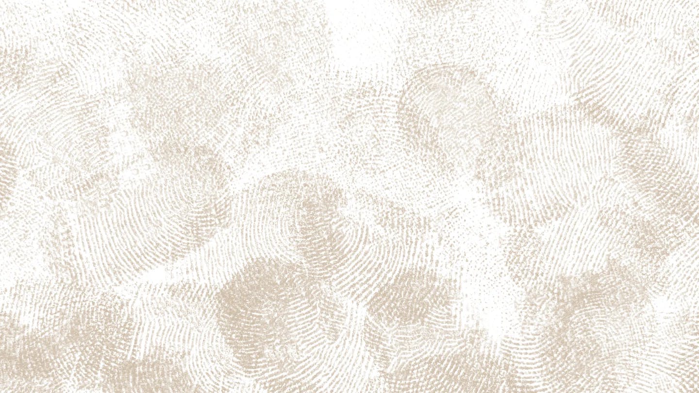
A striking part of your visual identity is the thumbprint, can you tell us more about that?
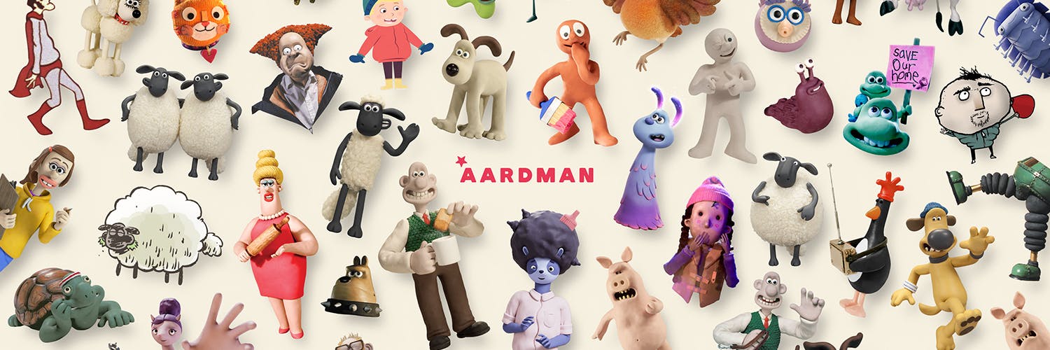
For those who know Aardman, they associate us with the modeling clay, which was the technique we’ve embraced. When you’re manipulating clay, you see human thumbprints. We don’t want to hide them. We want you to see that human touch on the animation.
At the same time, if you focus on that, it makes people think that it’s all you can do. We are incredibly proud of the modeling clay technique, it’s a huge part of Aardman, but that’s not the only part.
So, we wanted to flip it. We wanted to keep that tactility, warmth, and human charm, but we wanted it to mean bigger. During the rebranding process, we went back and forth about using the thumbprints, but in the end we decided to embrace it and take pride in it.
It’s because ultimately, what the thumbprints mean is up to us, and for us it means pride in our human touch. For us, it means every human part of Aardman that’s touched a project, whether it’s digital, pixels, or screen print.
It has an even bigger meaning now since the rebrand came after we became an employee-owned company.
Can you tell us more about the ‘wonk’ element in your visual identity?
When we started doing the rebranding, we knew the design had to be modular.
If you need things to be modular, you can’t make every single thing bespoke. The logo, typography, texture, etc., has to work in lots of different instances.
So I’m glad we have things like the thumbprint to bring back a bit of that charm. Along with that is the “wonk”.
If we ever have straight lines, it’s always just nice for us to turn them a bit wonky. It’s a small and simple thing, but it’s intentional. Today, a design framework needs to work on every screen size whether it’s a 100-inch cinema screen or a mobile phone. To inject a little bit of fun that’s also subtle, we come back to that wonk. It’s part of us keeping that human touch anywhere it’s possible.
We also worked with True Digital, an agency in Boston. They built the website for us and their developers helped build the wonk system. They built special pieces of code that can randomly create that wonk on different sections. It’s a small thing, but it was really tricky to achieve and they were able to do it. They got our philosophy of having a bit of playfulness.
These days, updating brands, or having a modular design system can cause them to lose their personality. So, with these little bits that we have like the wonk, or our hover interactions that are a bit wobbly and dynamic, it brings a bit of fun and silliness for us to reclaim a bit of that energy.
I think every branding exercise has to be a compromise of making something that’s uniquely you, but also able to be used and fit the needs of your brand. It’s been interesting to find that balance.
How about Aardman’s color palette? How did you land on the colors?
We expanded our color palette. The Aardman logo was always red. Initially, it was quite a harsh, blood red. Because of that, the red that we would use in printed materials had to be a different shade of red because the logo red was too bold.
When we came to do this rebrand, we were able to consolidate colors because it’s just crazy to have two different types. We knew we needed to pull it back a little bit, so our red is now a softened, slightly more pink red which is pleasing to the eye.
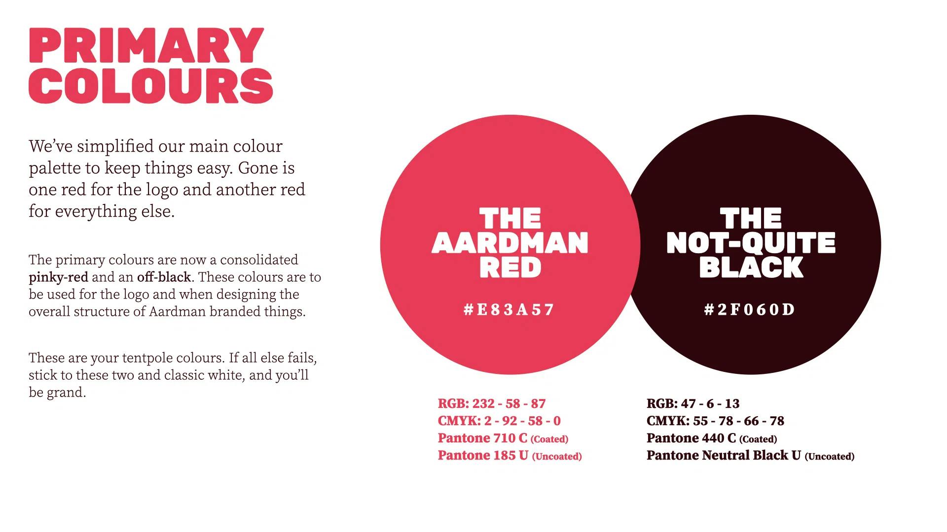
We also use an off-black, which in the style guide I call ‘Not Quite Black’ because it’s not full black. There’s a bit of red in it, and it needed to be slightly softer than full-on black.
In the past, because red and black are quite harsh colors, the only natural sort of partner we could use was gray, but those colors always felt a little harsh. So now, what we did was create a series of colors. The primary colors are the softer red, the not quite black, and we’ve got the secondary color palette where we swapped the gray for an olive color.
Olive has got a bit of warmth to it. It’s a lot softer when pairing it with our primary colors whereas when you use a lot of black and gray, the brand could feel quite cold. We also added some more supporting colors and tertiary colors so when people start doing big documents or big diagrams, they don’t run out of colors quickly or invent them.
Our tertiary colors are also a little graphical nod to the Bristol skyline which is the waterfront and the houses that are painted in beautiful pastel colors of greens, blues, pinks, and yellows. It’s a little nod to our Bristol heritage.
It’s been nice applying the same principles of modularity to our color palette where our first module is our core colors. If you need it, we have our second module of colors. If you need more, we have a third group of colors. But hopefully, when you all see them together, they all have a connection. They have a meaning and weren’t just randomly picked out.
Tell us about your new typography. How were they chosen?
It was about picking something that was rounded and soft because the logo is custom. We wanted the typography to be big, strong, in all caps, and easy to read. But we also wanted a softness. Big blocky typography would be a little too harsh for us.
What we needed was a bit of softness that could somehow mimic the logo or mimic Aardman's sensibilities, so we chose Rubik Black, which is a brilliant open source font on Google. Accessibility is also a really important thing for us as well as usability for the whole company and partners who might need to use our branding.
To pair with it, I wanted something that was legible. I also naturally enjoy the pairing of Sans Serif and Serif. We did lots of tests of what would go well with Rubik until we found Source Serif Pro. It’s so good because Rubik is so big and heavy, you can’t use too much of it, but having Source Serif Pro as a secondary header looks really nice because you can use it with black, or with black in italic.
It’s really useful to be modular. We give everyone all the weights. We advise when it’s best to use regular, semi-bold, bold, etc., but if partners want to use all of it, they can. It’s so flexible. We can do secondary headers, tertiary headers, body copy, big quote copy–all of those things.
Having that flexible font that lets us feel on brand, but still fresh, helps that modularity and variety. They also look great both online and in print. Since they’re open source, it adds practicality because we don’t have to tell partners that typefaces cost a certain amount just for them to work with the Aardman IP itself.
What is your major takeaway from this experience?
I think it’s important to make all the mistakes, errors, and missteps because that’s how you get to the end goal.
If I were to give any advice, it would be to just start. Just begin, whether you’re working for someone else or you’re in charge of the rebrand, or you’re having a hard time doing your own branding and you never know where to begin–I think you just have to begin.
You’ve just got to start that journey because you’re never going to get momentum unless you start walking. You’ve got to take those first steps. Just doodle, just draw. It can be overwhelming especially when you’re working on a rebrand for someone. That’s huge, but you’ve got to start smaller.
It can be as small as taking the original logo and drawing over it. Make baby steps. Just get cracking and see where it takes you.
