


David Byrne, Creative Director at Bigfish.tv, shares the process of rebranding an iconic festival, keeping elements that the locals know and love while creating a cohesive and creative new look.
How did Bigfish rebranding Brisbane Festival come about? How did that conversation start? How were the past brands conceptualized?
We've been semi-involved with Brisbane Festival since 2012, mainly doing their website. For their design, they’ve been working with Kevin Finn. He had a ‘B’ with a squiggle line that has been the core identity for 10 years.
The brand has also been passed around a few different agencies. When we stepped in, it had been changed four different times by a couple of different people. They wanted to centralize it, take disparate stuff and have a bit more plan or strategy for the brand instead of just tweaking and fixing the previous years.
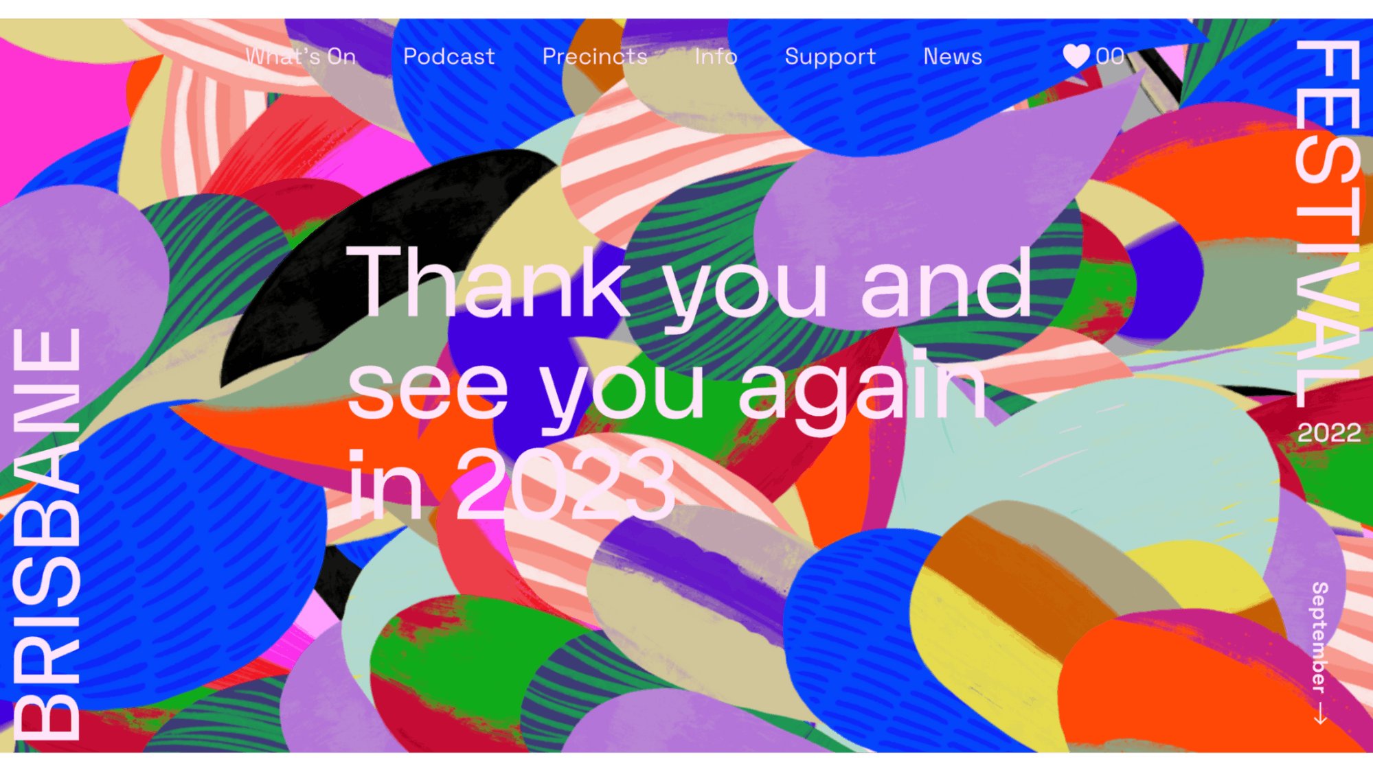
It was the right time as well to make the brand more celebratory and a bit more Brisbane. It was a bit too corporate before. We wanted to give it a lot more energy as this was after festivals not being able to go as big as they usually were in previous years.
We were able to start fresh. We weren’t restricted by anything that’s been there from previous years. It was a nice open brief of, “Make it new.”

Can you walk us through the rebranding process?
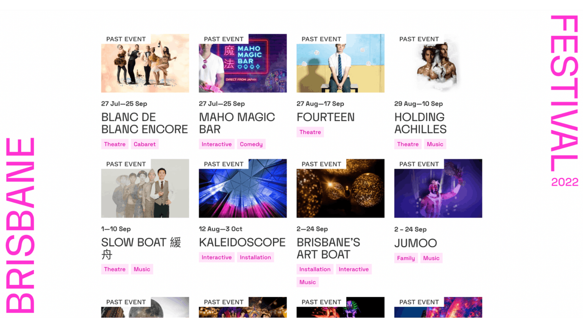
We've been to the festival for many years. It’s a strange festival because it wants to be a high-end art festival but it’s also quite a family friendly event.
The balance between those two things has been hard. I think previous festivals have gravitated to showing certain types of shows like circus or cabaret because threy’re visual and exciting, appealing to that kind of mass market.
This year, we wanted to make it a bit more contemporary and into the contemporary art side of things but still have this identity that is bright and colorful that appealed to the family friendly side of things. We tried to find a way to marry those two worlds together instead of just picking one of them.
We picked a place to start and let the design evolve naturally. We tried not to have too much of a pre-conception of where we want to go. We had a plan, a mood, and an idea that we want to get to, but it wasn’t like, “This is exactly how we want it to be, let’s go execute it.”
The final product is not really exactly what I intended it to be, but I’m happier with what it was than what I was originally hoping for. It’s an exploration / experimentation style and being confident enough to allow it to evolve as you go along.
Can you tell us more about the illustrations and other elements?
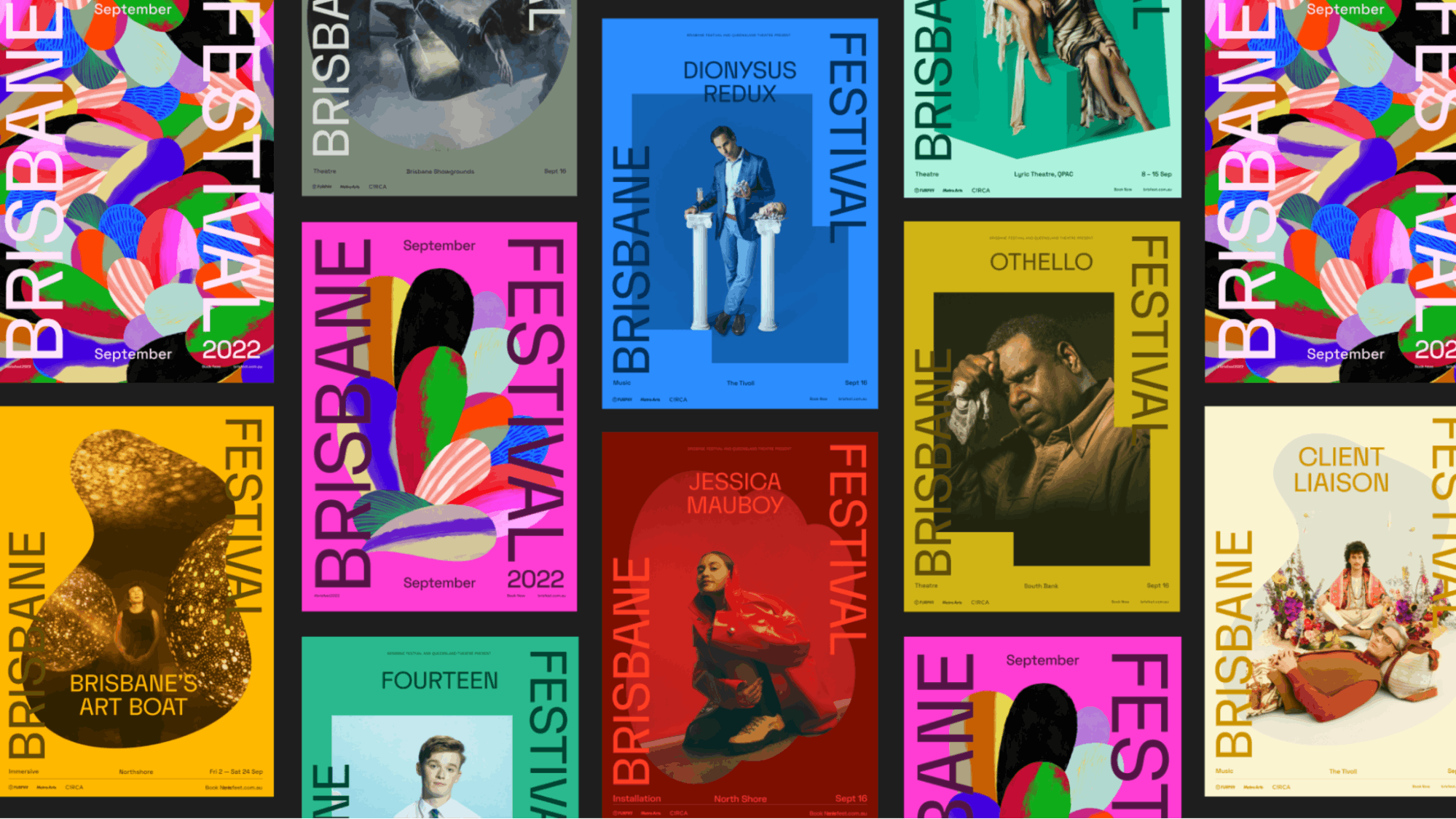
I talked to an illustrator, Sam, and asked him to create really abstract and illustrated ‘B’s. One of those B’s became the actual final petal or firework or feather. The whole brand evolved from that one little illustration.
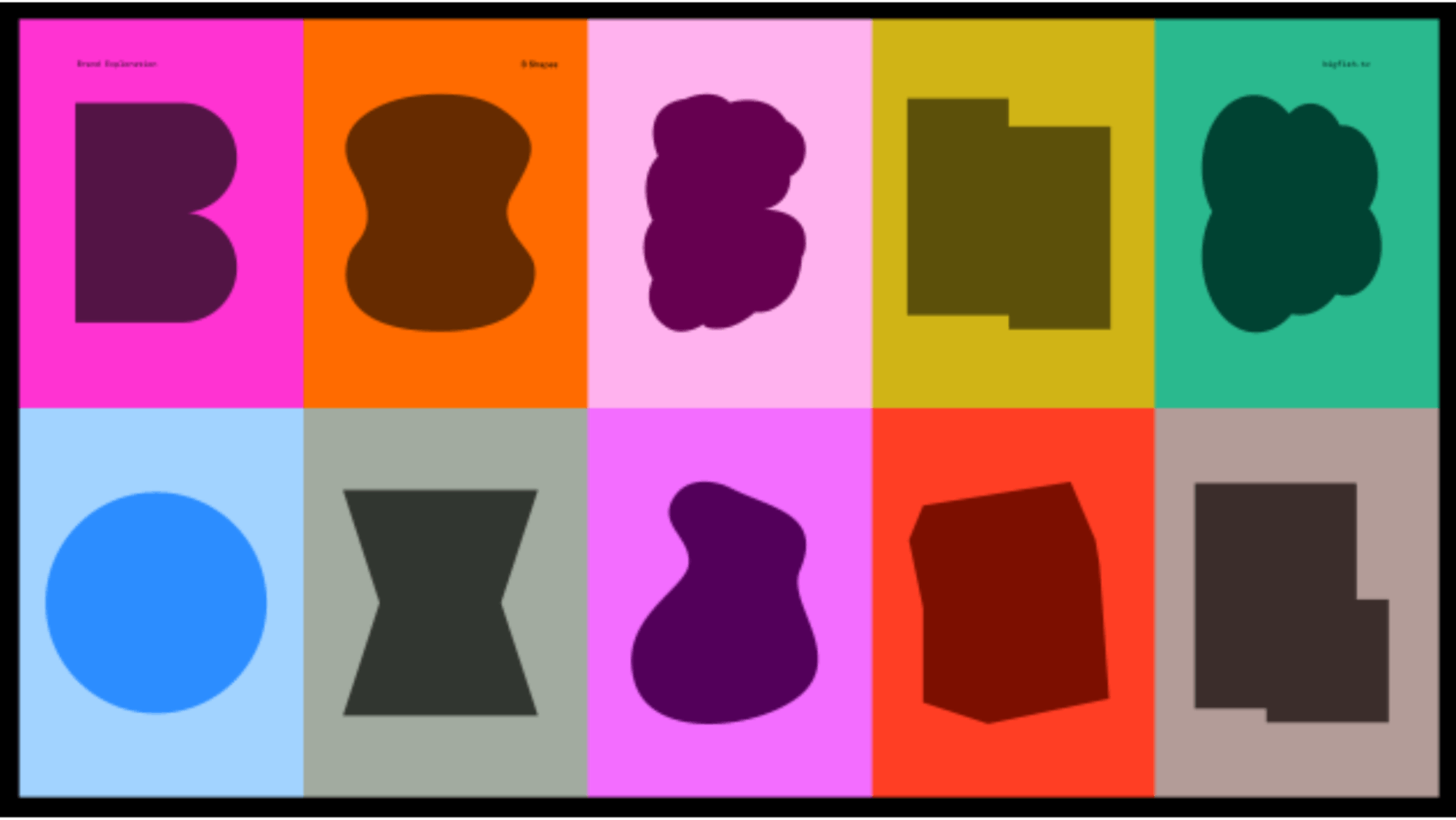
That’s also how a lot of those shape elements came into play. A lot of them are just me tracing over some of those explorations that he did, making a simple shape out of them. I ended up using those as where images were contained within. That became a really prominent graphic element throughout the whole brand.
That was a really nice way just sort of kickstarting everything.
A big change was to your logo. Can you tell us how it was conceptualized?
The upside-down was part strategy, part accident. With those B illustrations that Sam did, I was trying to find a way of putting a logo around something so dominant and so I ended up having them as frames around the sides.
"Brisbane'' and "Festival" are sort of sitting kind of like there's a cover artwork, but that actually is what became part of our work, where "Brisbane" was going one way and then "Festival" is coming down the other way.
That was my way of framing an illustration, containing all the artwork. The logo is in this semi-consistent position, always anchored to the bottom left and the top right. No matter what the dimensions of the page are, the logo always just remains in that position.
But then, I needed it to be a logo standalone. It couldn't just be this really flexible logo. It kind of had to still have that thing that you put in the corporate brochure. I just took what this bottom left and top right logo was and put them together and then turned it around.
I couldn't quite figure out what the arrangement was going to be and then it just sort of naturally happened through playing around with layouts.
Can you tell us more about the fonts that you use? How were they chosen? Were they custom-made?
The typeface–FK Display–was very much, “I wanted to use that.” Before I even started, that was the main thing that I began with because Brisbane's a river city and it's known for its sharp river bends.
The name, "Brisbane" in the Aboriginal language, the name is ‘meander’ that actually means the sharp point.
This typeface had these really cool bends and then they go really far into the B. It just really reminded me of some of these really sharp river bends. That was one thing I liked about the typeface, even though it's quite small and quite subtle.
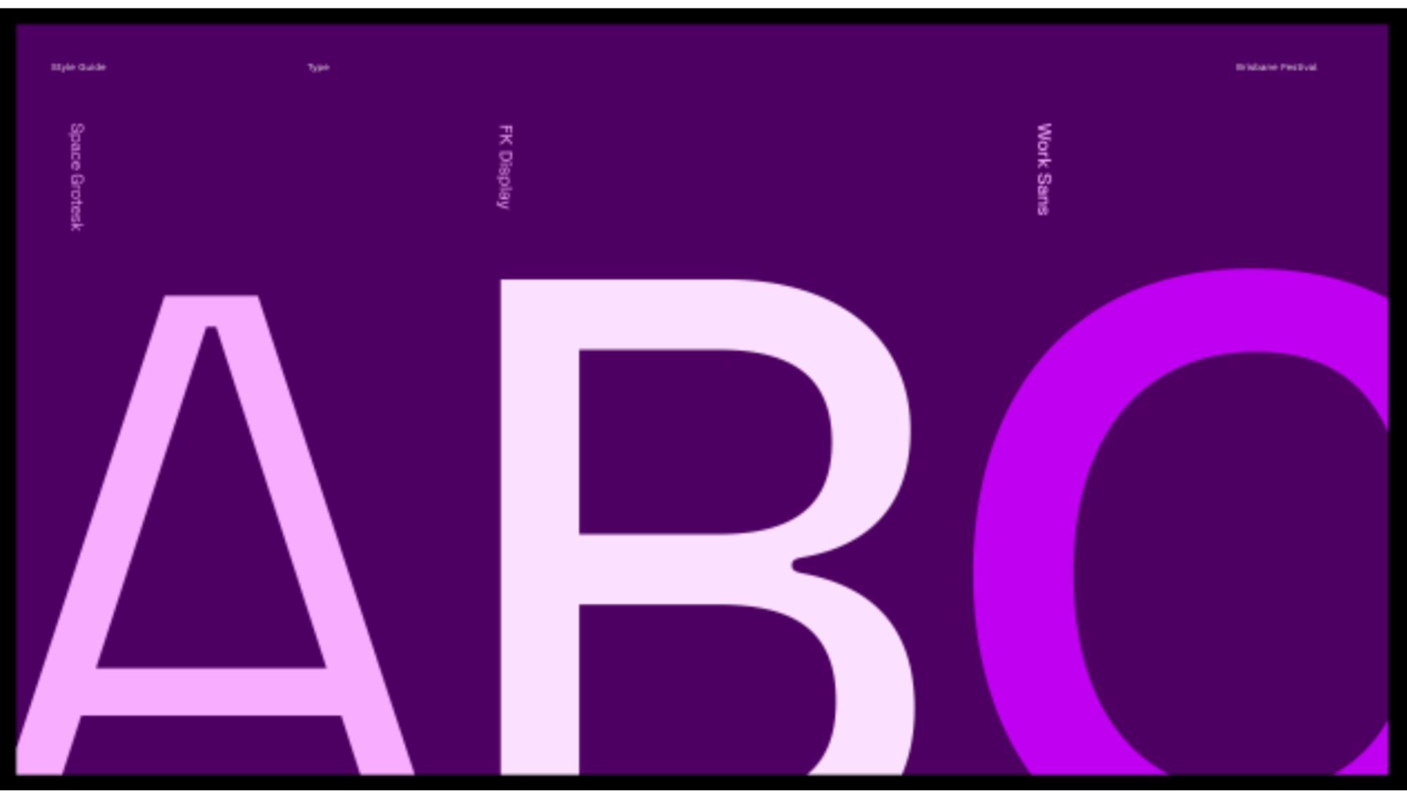
Along with FK Display, Space Grotesk is meant to be the free font partner to that.
I'd love to like do a typeface completely from scratch, commissioned one day. I just need to convince a client that that's valuable. But for a festival, it's a bit more picking and choosing what you put your money towards.
How about your color palette? How did you land on these colors?
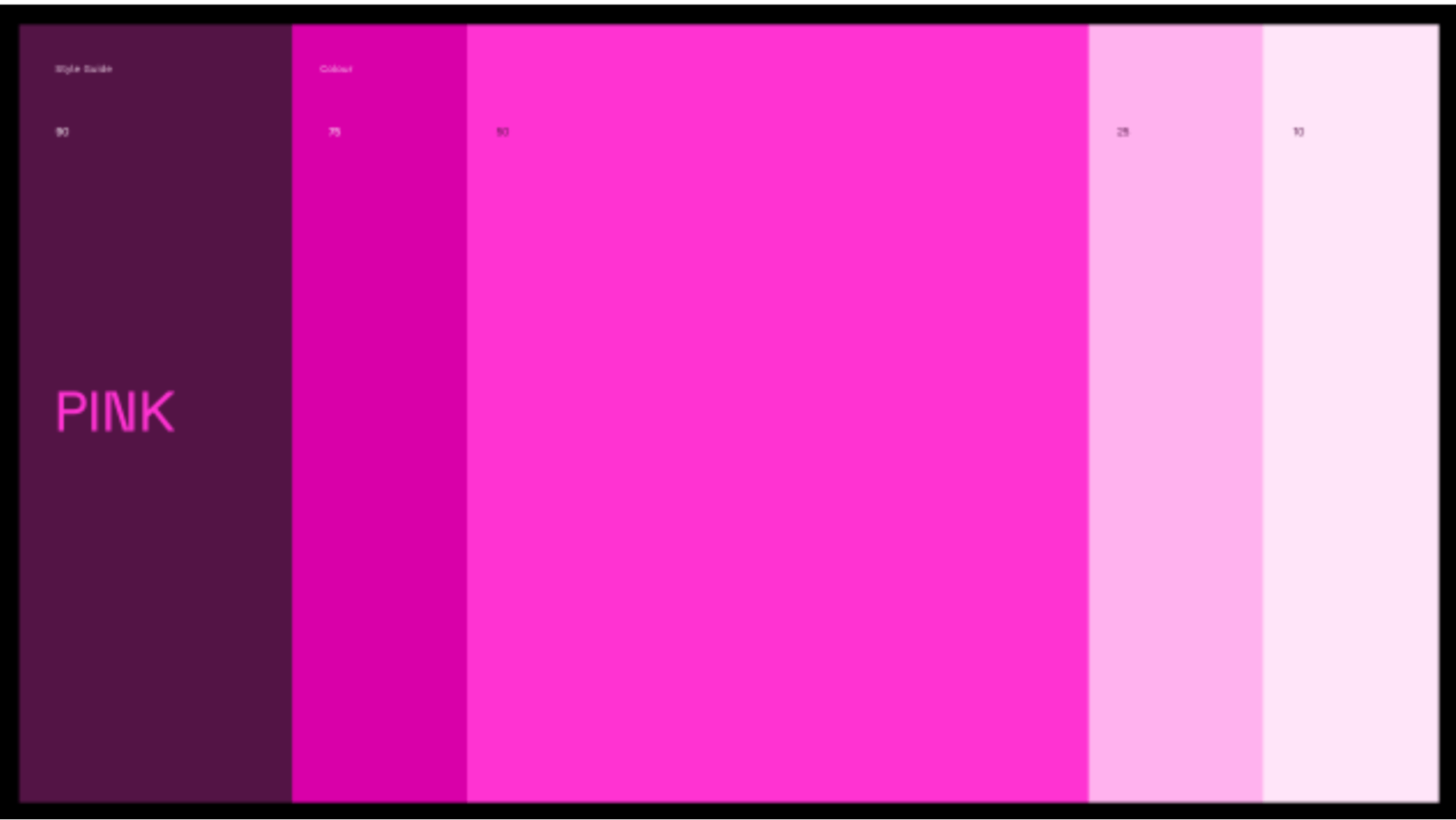
The main thing for this rebrand is the use of pink. That’s always been a constant for 8 years. No one’s really sure why, but if you’re in Brisbane during the festival, there’s pink banners everywhere. It became something that was bigger than the design or the brand.
Pink became something the community identified with. Basically, September was pink in Brisbane.
We were happy to continue that, but we tweaked it slightly. It was a bit more reddish before. We made it a bit more purplish this time, making it a more RGB color than a printed kind. We also pushed the saturation up about 10%.
I was actually picking the color palette as my way of starting because sometimes, if I'm not 100% sure what to do, I'm searching through typefaces and then creating color palettes just to try and create the right feeling before I even start designing.
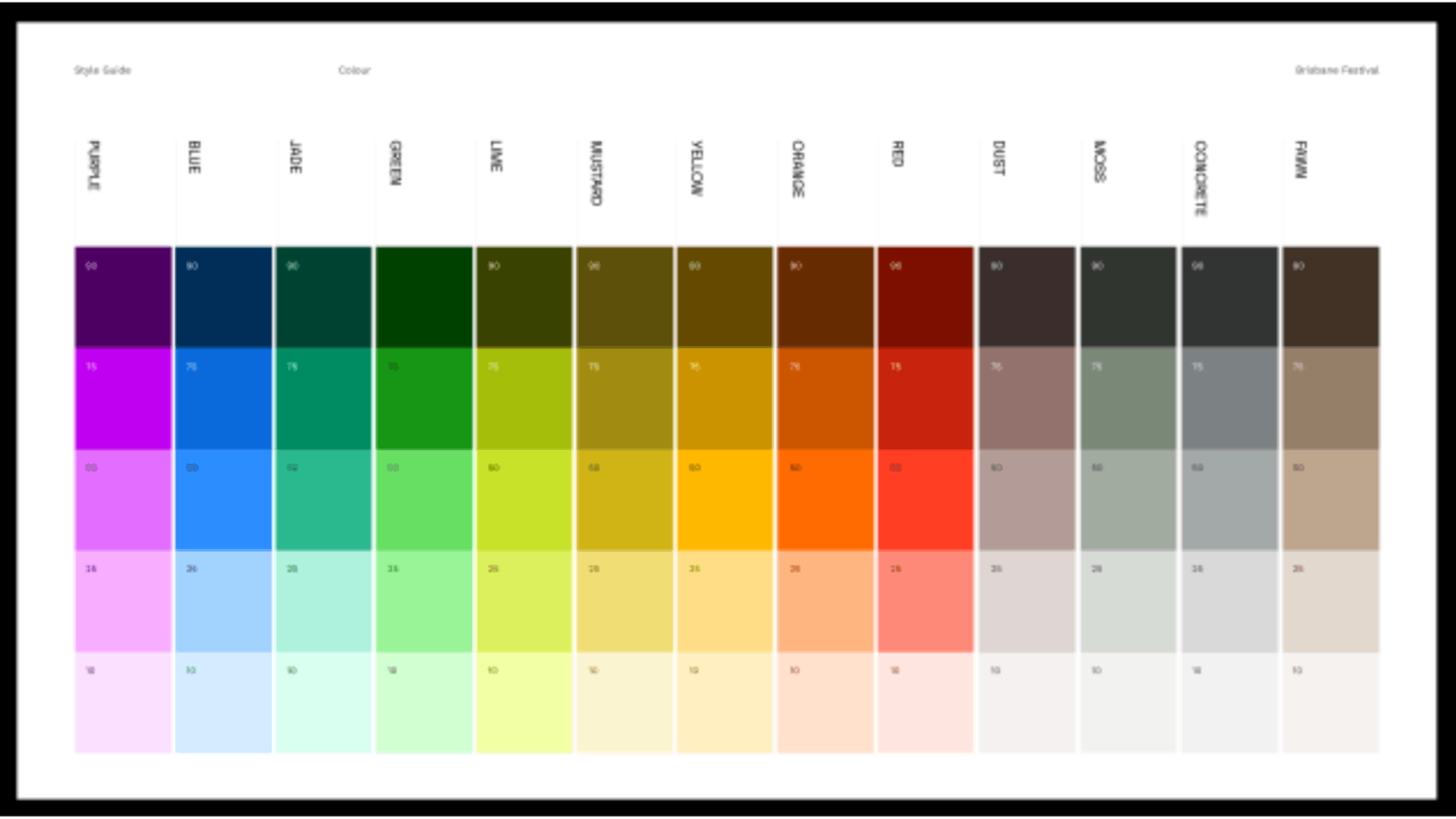
I ended up doing this enormous color palette of 70 colors. It was a way of giving myself a mood for Brisbane Festival because it would be completely unmanageable from a client’s point of view to have 70 different colors.
Instead, it turned into 14 different mini palettes. Each palette has five different colors to it and then you assign different things to these mini palettes. So, a show might be the yellow palette, or the pink palette. There's so many colors, but they have all these rules around them that make it quite easy to assign to a show.
It's an enormous palette but really restricted in its use. That color palette allowed the different shows to have different voices. Having those make it all feel like one festival, but enough room that the shows could feel individual.
That was always a balance we'll try to maintain.
What is your major takeaway from this experience? Or, do you have any advice for brands or designers embarking on rebranding projects themselves?
Trust in being okay with not knowing where it's going.
I think sometimes that's a scary thing for a designer: to let go a little bit of the preconceived solution and being okay with exploring and finding the solution by doing.
This was not a usual project for us. we would normally really have all these sketches, and all these ideas that we want to execute. I think the way this project evolved was so nice.
I think we're going to try and do this process a few more times of just starting and being–just doing and coming to a solution, allowing that process to happen. It was very freeing.
