
before

after

Morani Jersey, Social Marketing Manager at BUFF Gaming, and Assaf Dagan of Any Studios, share how to rebrand a company that caters to gamers.
Can you introduce us to Buff and the brand’s identity through the years? How were the past brands conceptualized?
BUFF is a gaming loyalty program. We currently have a desktop app and a mobile app. Our clients are gamers who play games like Valorant, LOL, Apex, and other popular games.
Founded four and a half years ago by three guys in a garage, the company has 70 employees and is listed on the Tel Aviv stock exchange.
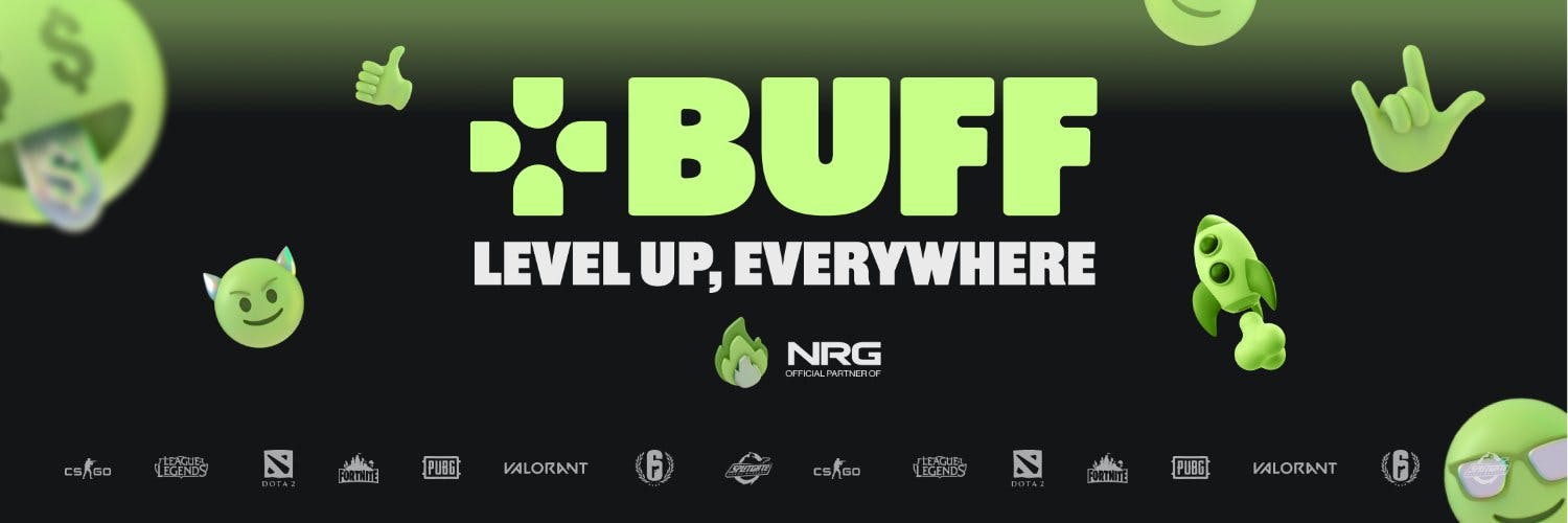
Buff banner
The initial branding was influenced by other gaming brands when they started. We have observed that most gamers use black with specific colors, such as black and green or black and purple. Gaming gear companies typically use black colors. In the end, the team decided to go with black and green.
During that time, only one designer was responsible for everything, from the logo to the elements and the app's design. In addition to guidelines, the designer was instructed to use black and green colors that are associated with gaming.
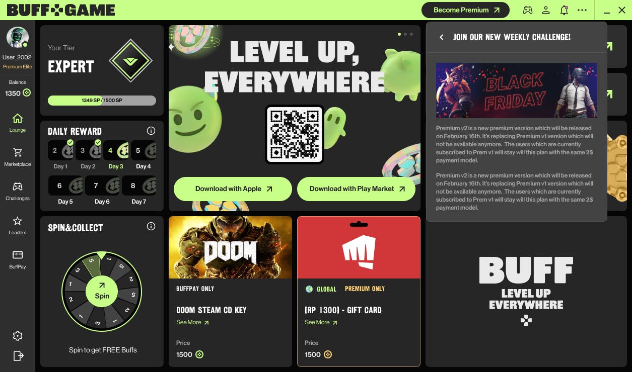
Buff desktop interface
For the first four years, design was done in sprints. Each new feature was designed in the style of the leading brand as soon as it was added. It was decided not to focus on the look but rather on having a great product.

About this current rebranding, how did it come about?
Four years ago, gaming was considered a niche industry. Today, it's very mainstream. Nowadays, everyone plays video games. As a result of this growth, BUFF has also decided to look more open rather than stay within the 'gaming branding.'
The re-branding conversation began by studying where BUFF intended to be in the next 3-5 years: Which was a genuine connector between in-game achievements and real-world rewards.
This vision contrasted the existing brand language, geared towards younger, less financially independent audiences.
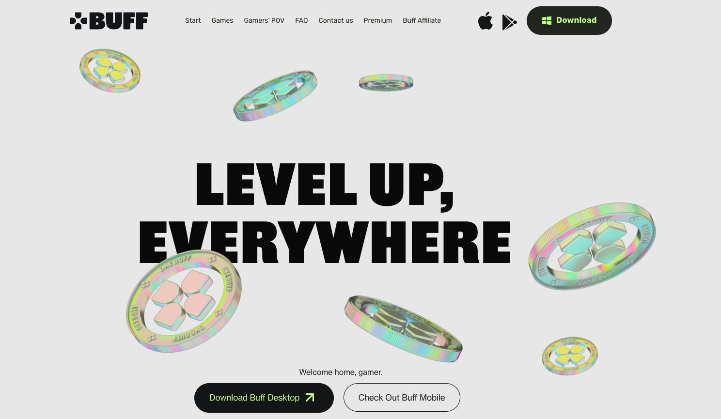
Buff website
Also, people were skeptical that they could play their favorite video games and earn.
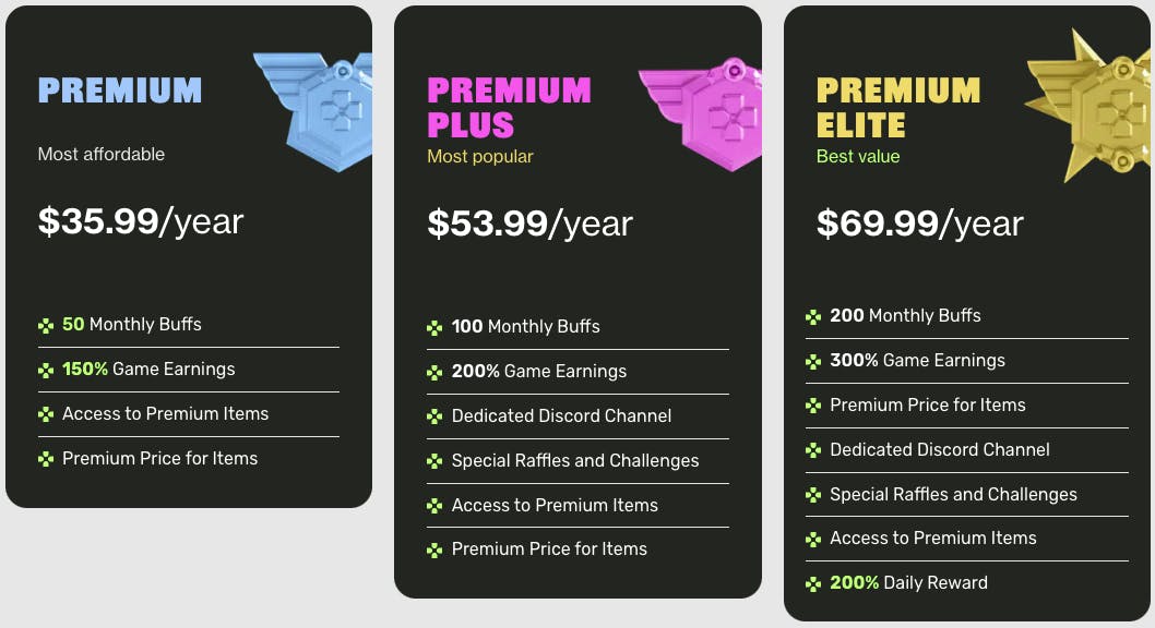
Our app rewards gamers with BUFF points when they play. Using those BUFF points, they canted items. Therefore, one of the main reasons for the rebranding was to be recognized and trustworthy. redeem them for items in our marketplace- including gift cards, gaming gear, and other gaming-related items.
How did the rebranding process go? Was it all smooth, or did you encounter challenges?
The rebranding process took six months, a highly systematic process, with questionnaires and interviews to distill the founders’ vision for the company - so the strategy phase went smooth.
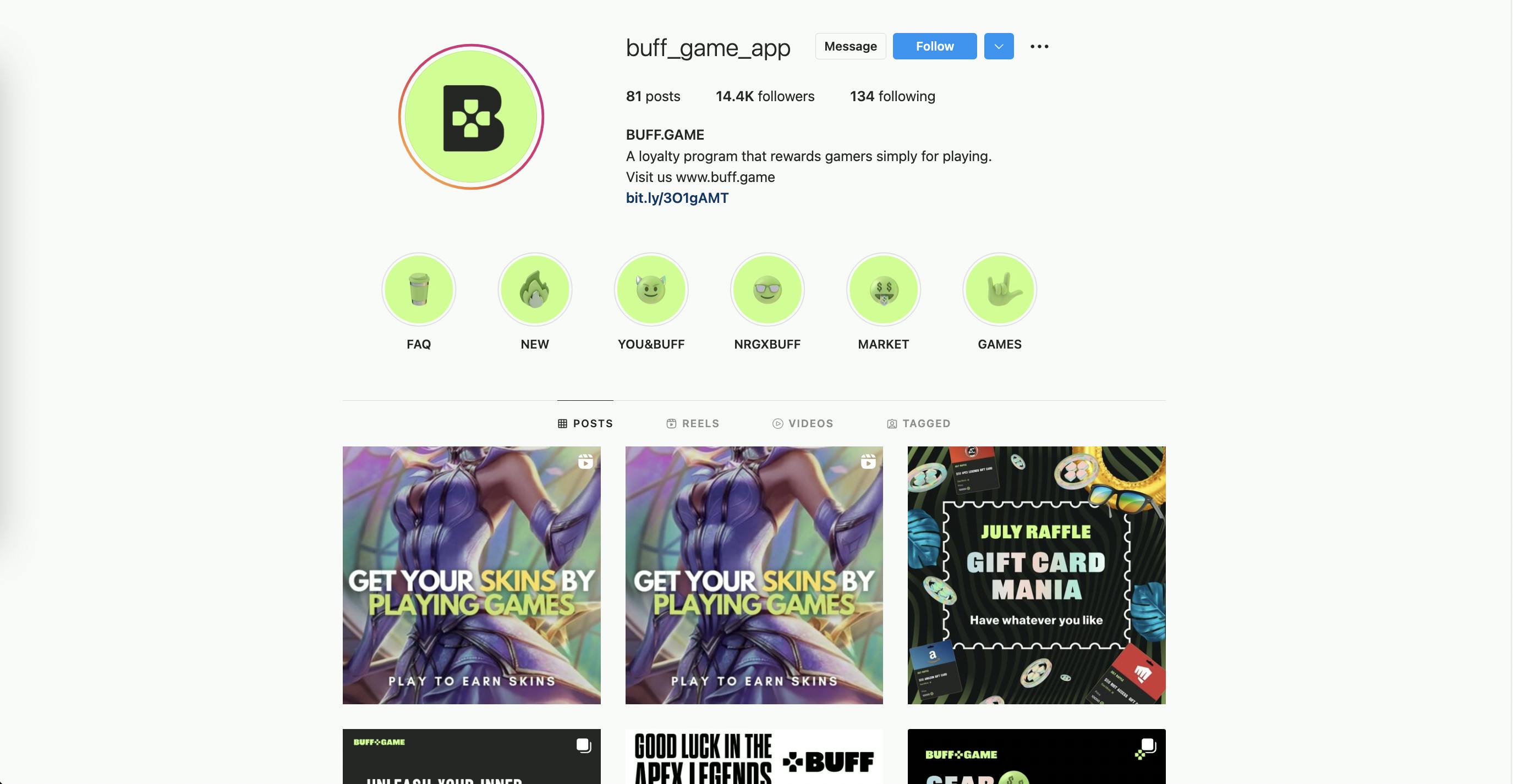
Buff on Instagram
During the process, we rebranded the desktop app, mobile app, marketplace, each page on our website, as well as future social assets. Rebranding was required for everything, even the smallest details.
A big change was to your logo. Can you tell us how it was conceptualized?
Because we’re a gaming company, our symbol is controller keys. It symbolizes gaming. We use them as buttons or elements on the app.
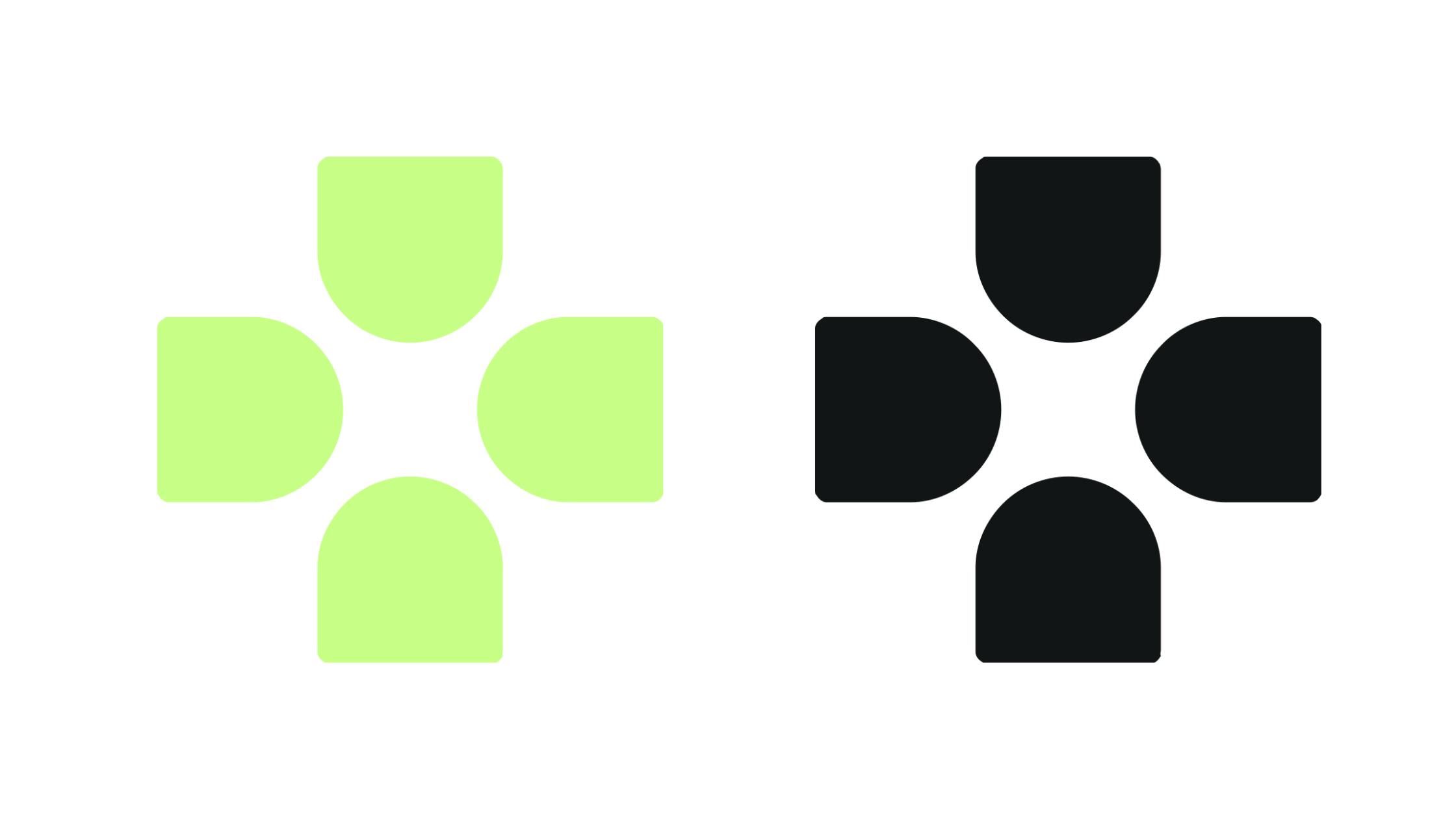
Buff symbol
It’s also the symbol of our ‘coins.’ We don’t love to use the word ‘coins’ because it’s not money. We call them BUFF Points.
Your color palette has also changed. How did you land on these colors, and what do they say about your brand?
We’ve decided to push for this green since we wanted to be reminiscent of the previous brand color being dark green.
Buff primary color palette
However, we felt that the updated color was much more memorable and fashionable, and expressive enough without more colors added to the mix.
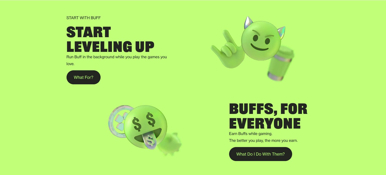
You also make use of graphics and other elements. How were they developed?
Our design and elements were created by Any Studios.
At the base of the graphic elements was the sense of community-- we took emojis and icons that are used in chat conversations like Discord and created them in 3D, in our colors to show a side of BUFF that's playful and fun.
Buff website
How about your brand fonts? How were they selected? Did you get a custom design?
We used Railroad Gothic for titles and headlines: very broad and thick typeface, and a finer, Neue Haus Grotesk for body texts and messaging.
These are intended to meld BUFF’s visual presence and tone of voice together. It expresses BUFF’s playfulness and speaks to contemporary internet culture and community. We want our typography reflect this expression while maintaining accessibility.
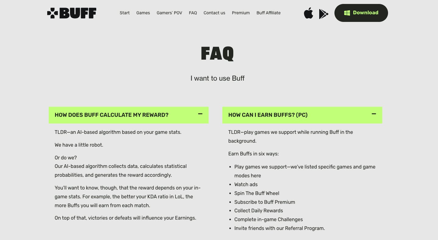
Can you tell us more about changing your language for this rebranding?
It's all about gaming in our language. We've changed our slogan to "level up everywhere." We use short words in our app. Slang from the gaming industry is used here.
Buff website
We also keep our texts simple. If you look at our Q&A page, we have long answers, but there are also TL;DR versions.
Lastly, what is your major takeaway from this experience?
The main takeaway from BUFF brand design rarely starts from the aesthetic aspect of a brand but rather from taking a deep dive into the target audience and culture of the brand.
Buff website
In this case, the deduction that everyone is a gamer led us to leave the classic ‘gamer’ branding and attach ourselves to trends in fashion and technology to adopt the brand to fit a more mature American audience.

